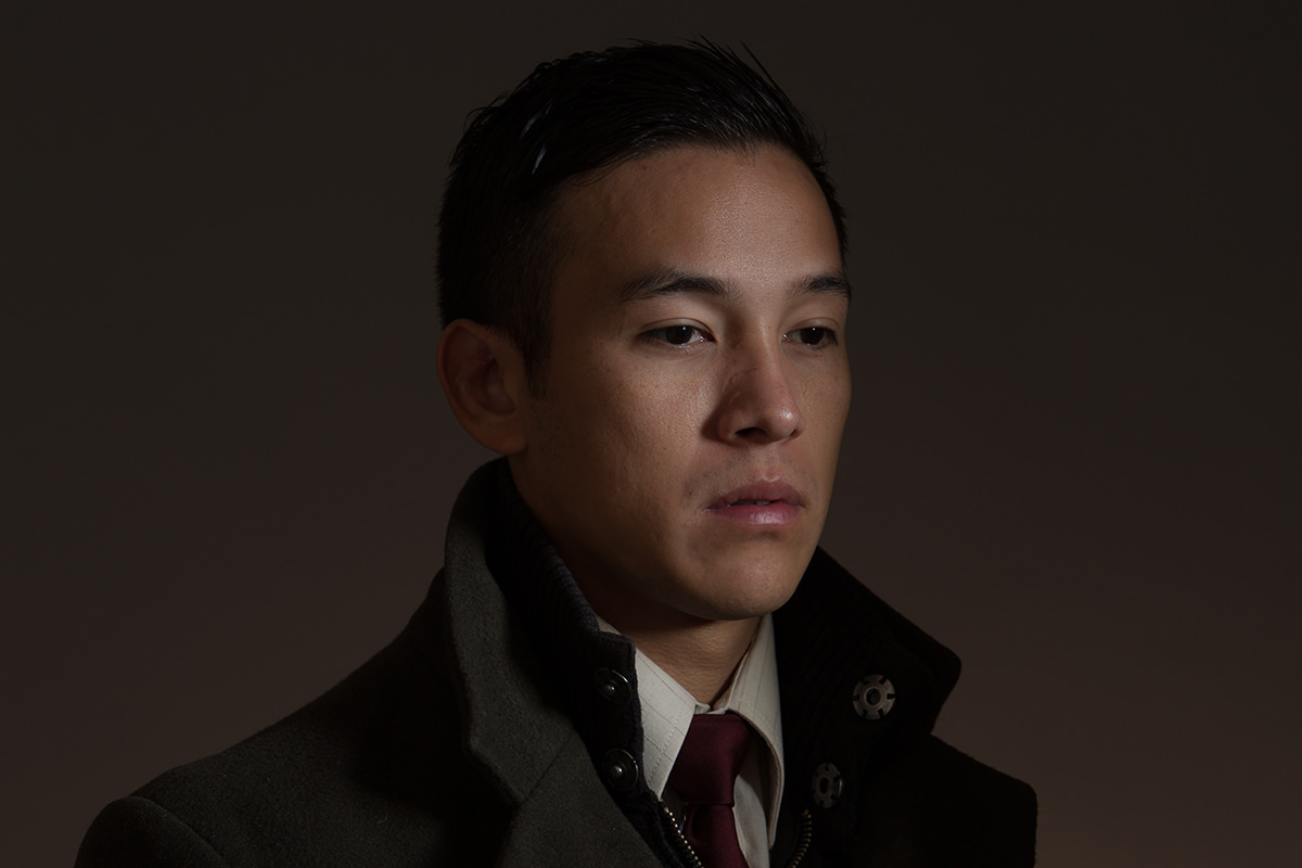

Copying a photographer you admire is one of the oldest ways to learn, provided you say so. This breakdown reverse-engineers a Dan Winters portrait in two halves: the on-set lighting, from beauty dish and bounced fill to the flags that shape the face and the strip box that gradients the backdrop, and the Photoshop pass that pushes the background green, cools the skin, and builds specular highlights from channels.
We publish a new free tutorial every week, each one with sample images and PSDs you can download and follow along with. Sign up and they land straight in your inbox, along with early word on sales, events and subscriber-only offers.
Dan Winters Style Photo Shoot: Lighting and Color Grading
Studying and imitating another photographer’s lighting style is a legitimate, time-honored way to learn, as long as you are honest about where the inspiration came from. This shoot recreates the lighting and color feel of a Dan Winters portrait, using musician-turned-model Sam Luna as the subject, breaking down both the on-set lighting setup and the Photoshop color work used to match the original’s distinctive greenish, desaturated look.
Analyzing the Reference Photo Before Shooting
Before setting up a single light, the process starts with carefully studying the reference image to figure out what is actually creating its look.
-
Study Where the Light Is Coming From
Look closely at the direction and hardness of light in your reference. In this case, the subject’s face was clearly lit from the side, with the far ear left completely unlit, a strong clue that no light was wrapping around from the front.
Why Studying a Reference Beats Guessing
Small details in an image, such as an unlit ear, a soft gradient on the backdrop, or shadows that are dark but not fully black, each point to a specific lighting choice. Reverse-engineering those details one at a time is what makes it possible to recreate a complex lighting setup instead of approximating it.
Building the Key and Fill Lighting Setup
With the reference analyzed, the actual lighting setup was built to reproduce each of those observed qualities.
-
Use a Beauty Dish as Your Key Light
Position a beauty dish to the side of the subject as the primary key light, matching the harder, side-lit quality seen in the reference.
-
Add a Second Light for the Jacket Area
Add a second light, such as one in an 11-inch reflector, to bring up the light on the subject’s jacket or shoulder area, since a single light did not fully cover what the reference showed.
-
Add a Fill Light for the Shadows
Aim a light into a back wall to bounce soft fill light back onto the subject, keeping shadows dark but not fully black.
Why Bounced Fill Light Works Better Than a Direct Fill
Firing a light directly at the shadow side of a subject can flatten out the lighting and undo the mood created by the key light. Bouncing light off a wall instead softens it considerably, lifting just enough shadow detail to avoid pure black without erasing the directional lighting.
Creating a Gradient on the Backdrop
The reference image showed a soft light-to-dark gradient across the background, which needed its own dedicated light source to recreate.
-
Add a Strip Box Behind the Subject
Position a strip box low and behind the subject, aimed at the backdrop, to produce a gradient that fades from light near the bottom to darker toward the top.
Shaping the Face and Controlling Spill With Flags
Beyond the main lights, several flags, meaning large black panels used to block light, shaped exactly how the light fell across the subject’s face.
-
Use a V-Flat to Create a Subtle Shadow
Position a large black V-flat to block a portion of the beauty dish’s light, creating a faint shadow that rounds one side of the subject’s face.
-
Add an Overhead Flag to Control the Forehead
Add a flag above the subject to prevent light from hitting too high, keeping the forehead from reading as overly bright compared to the rest of the face.
Gelling Lights for Color Balance
Color gels on specific lights kept the warm and cool tones in the shot balanced rather than skewing the whole image toward one temperature.
-
Gel the Backdrop Light Warm
Add a quarter CTO (color temperature orange) gel to the light hitting the backdrop for a slightly warm tone.
-
Gel the Subject Light Cool
Add a quarter CTB (color temperature blue) gel to the light on the subject to balance out the backdrop’s warmth and prevent skin tones from reading too orange overall.
Pushing the Backdrop Color Toward Green in Photoshop
Rather than trying to nail the reference’s distinctive greenish backdrop entirely with gels on set, the color was pushed the rest of the way in Photoshop.
-
Add a Hue/Saturation Layer and Sample the Color
Add a Hue/Saturation adjustment layer, use the eyedropper to target the backdrop’s existing color, and shift the hue toward green while lowering saturation and brightness slightly.
-
Mask the Effect Off the Subject’s Skin
Since the hue shift will likely affect skin tones too, add a layer mask and paint black over the subject to restore their original skin color, leaving the green shift only on the backdrop.
Fixing Color in Photoshop vs. On Set
A color like this could also be achieved on set with a greener gel or by adjusting the camera’s white balance toward tungsten. Both approaches are valid, and choosing between them often comes down to how much shoot time you have versus how comfortable you are pushing color afterward in Photoshop.
Desaturating and Cooling the Skin Tones
The reference photo’s skin had a notably desaturated, cooler quality that needed its own separate adjustment.
-
Use Selective Color on the Reds
Add a Selective Color adjustment layer, target the Reds channel, and pull down black while reducing yellow and adding a touch of cyan to desaturate and cool the skin tones.
Using Channel Selections to Build Highlights
To recreate the reference’s specular, slightly blown-out highlight quality, a channel-based selection technique isolates just the brightest parts of the skin.
-
Duplicate a High-Contrast Channel
In the Channels panel, duplicate whichever channel shows the most contrast on the face, often the Blue channel, since Red tends to show detail too evenly.
-
Adjust Levels to Isolate the Lights
Open Levels on the duplicated channel and shift the midpoint slider to the right, so only the lighter areas of the face remain visible when the channel is loaded as a selection.
-
Load the Channel as a Selection and Fill With White
Command-click (or Ctrl-click) the duplicated channel’s thumbnail to load it as a selection, then create a new layer and fill the selection with white to brighten just those highlight areas.
-
Repeat for an Exaggerated Specular Layer
Duplicate the channel again, push the levels further to isolate only the very brightest highlights, and paint white on a new layer using that selection for an extra specular pop.
Why Use Channels Instead of Blend If
Blend If sliders can achieve a similar highlight-isolating effect, and either approach is valid, since Photoshop consistently offers multiple paths to the same result. Working from channels here simply makes the tonal separation easy to see and adjust precisely before committing to a selection.
Finishing the Color Balance With Curves
With the highlight work in place, one last Curves pass removes any color cast the earlier adjustments left behind.
-
Pull Red Out of the Midtones With Curves
Add a Curves adjustment layer, switch to the Red channel, and pull down a midtone point slightly to reduce any lingering red cast, then brighten the RGB composite curve a touch.
Adding Texture With Layered Backdrop Photos
A final finishing touch brings in photographed paper textures to make a simple studio backdrop read as far more expensive and detailed.
-
Bring In Texture Images and Set to Soft Light
Add several photographed paper or texture images as new layers, desaturate each with Shift + Command + U, and set their blending mode to Soft Light.
-
Group and Mask Away From the Subject
Group the texture layers together, add a layer mask, and paint the texture away from the subject so it only affects the backdrop, not their skin.
Why Texture Belongs Only on the Backdrop
Applying paper or grain texture across a subject’s skin tends to read as dirty or damaged rather than atmospheric. Masking the texture away from the subject and keeping it confined to the backdrop gets the expensive, detailed look without compromising the portrait itself.
More Free Photoshop Tutorials
If you enjoyed this behind-the-scenes breakdown, these free tutorials cover related lighting and color techniques worth exploring next:
- How to Color Grade in Photoshop Using Camera Raw
- Understanding Color Channels in Photoshop
- How to Select Subjects and Refine Edges in Photoshop
Why This Approach Works
Recreating another photographer’s style works best when it is broken into two clearly separate problems: getting the lighting direction and shape right on set, and getting the color and tonal feel right afterward in Photoshop. Trying to nail every last detail purely in-camera, gels included, would demand far more setup time for marginal benefit when a Hue/Saturation shift and a Selective Color adjustment can finish the job in minutes. Working channel by channel to isolate highlights, rather than relying on a single blanket brightness adjustment, is what allows the specular, slightly blown-out quality of the reference to be matched precisely rather than approximated.
Final Thoughts
Learning to imitate a photographer whose work you admire, while being upfront that it is an homage rather than an original style, is a genuinely effective way to sharpen your own lighting and color-grading instincts. The real skill demonstrated here is not recreating this exact green, desaturated look. It is the process of studying a reference image, identifying the individual choices that create its mood, and rebuilding each one deliberately with lighting on set and color work in Photoshop afterward.
Related Tutorials
Master Photoshop, Lightroom and Photography
Join PHLEARN PRO for $12.99 a month or $99.99 a year. Cancel anytime, with a 100% money-back guarantee.





