

Download Assets
This tutorial includes 3 sample images, 2 sample PSDs and 1 PDF guide. Downloads are free with a PHLEARN account.
- Download the sample images and PSDs from every free tutorial on PHLEARN
- New free tutorials published every week
- One free account — sign up once, then download anything
Free PDF Guide · 5 Pages
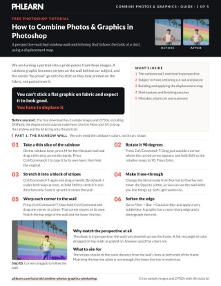
This Tutorial as a Step-by-Step PDF
The guide covers warping a rainbow slice to the wall with Cmd/Ctrl-drag corners, cutting out the lettering with Color Range and Expand 1 pixel, building a displacement map with Image > Apply Image, running Filter > Distort > Displace at Vertical 4 and Horizontal 2, then bringing back the shirt texture with channels. Keep it next to your keyboard.
description
Combine photos and graphics in Photoshop so the artwork looks printed on the fabric rather than pasted over it. A displacement map is what makes the difference.
Turning a simple portrait into a finished pride poster means stretching a rainbow graphic into a perspective-matched background, cutting a text graphic out cleanly with Color Range, and making that flat text look genuinely printed on fabric with a displacement map built from the photo itself. None of these techniques is hard alone, but together they turn two unrelated stock images and a portrait into one believable composite.
Enjoying This Free Tutorial?
We publish a new free tutorial every week, each one with sample images and PSDs you can download and follow along with. Sign up and they land straight in your inbox, along with early word on sales, events and subscriber-only offers.
Image Source
Photos via Adobe Stock: LatinX Man Hanging Outside, Rainbow Half Arc Shape and Be Proud Words in Rainbow Colors

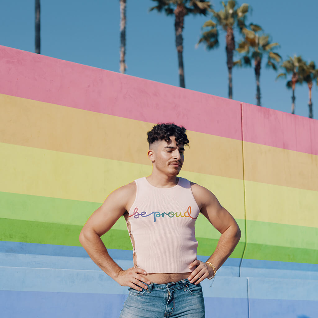
How to Combine Photos and Graphics in Photoshop
Turning a simple portrait into a finished pride poster in this tutorial means stretching a rainbow graphic into a perspective-matched background element, cutting a text graphic out cleanly, and then making that flat text genuinely look printed on fabric using a displacement map. None of these techniques are difficult on their own, but combined they turn two unrelated stock images and a portrait into a single believable composite.
Building a Perspective-Matched Rainbow Background
Rather than using a full rainbow flag shape, a thin horizontal slice of rainbow color stretched and warped into the photo’s own perspective reads as a much more natural background element.
-
Take a Thin Slice of Your Color Source
Use the Rectangular Marquee tool to select a thin horizontal strip from your rainbow image, then press Ctrl/Cmd + J to duplicate just that slice onto its own layer.
-
Rotate and Stretch the Slice
Press Ctrl/Cmd + T, hold Shift while dragging a corner’s rotate handle to snap to 90 degrees, then stretch the shape horizontally (holding Shift again to constrain the stretch to one direction) until it reads as a vertical color block.
-
Lower Opacity and Change Blend Mode to See Through It
Set the shape’s blending mode to Overlay and lower its opacity so you can see your background photo through it while positioning it.
-
Warp the Corners to Match the Photo’s Perspective
Press Ctrl/Cmd + T, then hold Ctrl/Cmd and drag each corner individually to match the vanishing lines already present in your background — a wall’s edge or a receding line in the photo, for instance.
-
Add a Subtle Gaussian Blur
Apply a very light Gaussian Blur to soften the shape’s edge, since a photograph rarely has a perfectly crisp, graphic-style edge the way a flat shape does.
Why Match the Perspective at All
A flat rectangular color block dropped into a photo with strong perspective lines reads as obviously pasted on, no matter how well the color itself works. Warping each corner individually to follow the photo’s own vanishing lines is what makes a simple color shape look like it was actually part of the scene rather than an overlay added afterward.
Cutting Out Your Subject to Layer the Background Behind Them
Once the background shape is in place, your subject needs to sit in front of it rather than behind it.
-
Select Subject on Your Background Photo
Go to Select > Subject on your original photo layer to automatically select your subject.
-
Load the Selection into Your Background Shape’s Mask
With that selection active, click the layer mask icon on your rainbow shape layer — since a selection made first loads automatically into a mask created afterward.
-
Invert the Mask if Needed
If the mask hides the wrong area, select it and press Ctrl/Cmd + I to invert it, so the color shape is hidden behind your subject rather than covering them.
Cutting Out a Text Graphic with Color Range
A simple text graphic on a plain background is a good candidate for Select Color Range rather than a manual selection tool.
-
Select the Background Color with Color Range
Go to Select > Color Range and click the background color (white, for instance) with the eyedropper.
-
Expand the Selection Slightly
Go to Select > Modify > Expand and add about 1 pixel — enough to eliminate a thin white border left over from the original selection without noticeably altering the text shape.
-
Load, Invert, and Apply the Mask
Click the layer mask icon, invert it if needed with Ctrl/Cmd + I, and then apply the layer mask permanently (right-click the mask and choose Apply Layer Mask) once it looks clean, since the next steps work better with the mask baked in.
Copying a Layer Mask Between Layers
Holding Alt/Option and dragging a layer mask thumbnail from one layer onto another copies that exact mask shape onto the second layer — useful any time you want two different layers to share the same visible area without redoing the selection.
Integrating the Graphic onto Fabric with Multiply
Once your text graphic is repositioned onto your subject’s clothing, a blend mode change is the first step toward making it look printed rather than pasted.
-
Position and Scale the Graphic onto the Fabric
Use Ctrl/Cmd + T (holding Alt/Option to scale from center) to size and place your text graphic onto the area of clothing you want it to appear on.
-
Set the Blending Mode to Multiply
Change the graphic layer’s blending mode from Normal to Multiply, which blends the graphic’s dark colors with the fabric beneath it rather than sitting as a flat, opaque overlay.
Creating a Displacement Map from Your Own Photo
A flat graphic printed on fabric should follow the fabric’s own folds and texture rather than sitting perfectly flat, which is exactly the problem a displacement map solves.
-
Merge a Flattened Copy with Apply Image
Hide your graphic layer, create a new layer, and go to Image > Apply Image with the layer merge option, which stamps everything currently visible onto one new layer while leaving your original layers untouched.
-
Desaturate and Boost Contrast
Press Shift + Ctrl/Cmd + U to desaturate this merged layer, then use Ctrl/Cmd + L (Levels) to increase contrast, making the light and dark areas that will drive the displacement more clearly defined.
-
Save the Layer as a Displacement Map PSD
Go to File > Save As and save this desaturated, high-contrast version as its own PSD file — this file is what Photoshop’s Displace filter will read to determine how the graphic should warp.
Applying the Displace Filter
With a displacement map saved, the actual displacement effect on your graphic takes just a couple of settings and a bit of trial and error.
-
Open the Displace Filter on Your Graphic
Select your graphic layer, go to Filter > Distort > Displace, and set both Horizontal and Vertical Scale to a starting value like 5.
-
Choose Stretch to Fit
Select Stretch to Fit as the displacement map placement, since a map that’s the same size as your image needs no tiling or repeating.
-
Select Your Saved Displacement Map File
Confirm the dialog and choose the PSD you just saved when prompted for the displacement map file.
-
Adjust the Scale Values and Reapply as Needed
If the first result looks too strong or too weak, undo and reopen the Displace filter with different Horizontal and Vertical Scale values — the right combination is usually a matter of a few quick tries rather than calculation. On this photo, 5 and 5 came out too strong, so after an undo, running Displace again with a Vertical Scale of 4 and a Horizontal Scale of 2 was the keeper, since the ribbed fabric moves more vertically than horizontally.
-
Soften the Displaced Edges
Apply a very subtle Gaussian Blur to the displaced graphic (Filter > Blur > Gaussian Blur, 0.2 to 0.3, with 0.3 the magic number here), since the displacement process can leave edges looking slightly more jagged than the resolution of the rest of the photo.
Why Stretch to Fit Matters Here
Building your displacement map from a merged copy of the exact image you’re compositing into guarantees it’s the same dimensions as everything else in the document, which is what lets Stretch to Fit work cleanly — no repeating pattern or awkward seam to worry about, since the map lines up with your composite pixel for pixel.
Bringing Back Fabric Highlights Using Channels
A displaced graphic looks convincing in shape, but it’s still missing the natural sheen and highlight variation real printed fabric would show — which channels can recover more precisely than a rough color selection.
-
Find Your Highest-Contrast Channel
Open the Channels panel (Window > Channels) and check the Red, Green, and Blue channels individually to find whichever one shows the most contrast in the fabric area.
-
Duplicate That Channel
Drag your chosen channel down to the New Channel icon to duplicate it, rather than editing the original (which would alter your image’s actual colors).
-
Boost Contrast on the Duplicated Channel
Use Levels on the duplicated channel to darken the shadows further, sharpening the separation between light and dark fabric areas.
-
Turn the Channel into a Selection and Layer Mask
Hold Ctrl/Cmd and click the duplicated channel’s thumbnail to load it as a selection, return to the Layers panel, duplicate your background photo, and click the layer mask icon to apply that selection as a mask.
-
Position the Highlight Layer Above Your Graphic and Clip It
Drag this new highlight layer above your text graphic, right-click, and choose Create Clipping Mask so the fabric highlight detail only shows within the shape of your text.
Finishing Touches: Saturation, Edges, and Focus
A handful of small color-theory and focus adjustments push the composite from “good” to genuinely convincing.
-
Fade the Mask Edges Where the Graphic Should End
Paint black directly on your graphic’s layer mask to fade it out naturally where it should end on the fabric, rather than leaving a hard cutoff.
-
Desaturate the Shadow Areas
Add a clipped Hue/Saturation adjustment layer, lower saturation, invert its mask to black, and paint white only over the shadowed portion of your graphic — since a photograph naturally shows less color saturation in shadow than in highlights.
-
Smudge for Depth of Field
Use the Smudge tool (with Sample All Layers turned off) very lightly on areas that should read as further from the camera, softening detail the way a real lens naturally would with distance.
Organizing a Composite for Handoff
Right-clicking a layer or group’s visibility icon lets you assign a color label, which is especially useful when handing a multi-layer PSD to someone less familiar with Photoshop — grouping and coloring every layer related to one graphic element (a rainbow background, a text overlay) makes a complex file far easier to navigate than an unlabeled stack of dozens of layers.
Common Mistakes to Avoid
The most common mistake is skipping the perspective warp on a background shape and leaving it as a flat rectangle, which reads as obviously pasted on no matter how good the color choice is. It’s also easy to apply a displacement map without first boosting contrast and desaturating it — a low-contrast map produces a weak, barely visible displacement effect, while genuine light-and-dark separation is what drives a convincing warp.
Why This Approach Works
Every technique here solves the same underlying problem from a different angle: a flat graphic dropped into a photograph never automatically looks like it belongs there, because photographs carry perspective, texture, focus falloff, and color behavior that a flat shape simply doesn’t have.
Matching perspective on the background color handles geometry; the Displace filter handles surface texture, using the photo’s own light and dark information to warp the graphic exactly the way real fabric folds would; and channels recover the specific highlight detail a rough color selection would miss. Stacked together with smaller touches like shadow desaturation and a touch of Smudge-tool softening for depth, the composite ends up responding to the same physical rules the original photograph does, which is what actually sells the illusion, more than any single step on its own.
Final Thoughts
Displacement maps in particular are one of those techniques that sound more intimidating than they actually are to use — the real cost is a couple of extra intermediate layers and a bit of trial and error on the Scale values, not any special complexity. Once you’ve built a displacement map from a photo once, applying the same idea to any other graphic-on-texture composite — a logo on wrinkled paper, text on rippled water — is exactly the same handful of steps repeated on new source material.
Quick Reference: Keys, Menus and Settings
- Slice the rainbowM for the Marquee, then Cmd/Ctrl + J to copy the strip
- Rotate, stretch, warpCmd/Ctrl + T, Shift to snap or stretch one way, Cmd/Ctrl-drag each corner; Overlay blend mode
- Cut out the letteringSelect > Color Range, Select > Modify > Expand 1 pixel, mask, Cmd/Ctrl + I
- Build the mapImage > Apply Image (Merged), Shift + Cmd/Ctrl + U, Cmd/Ctrl + L, File > Save As PSD
- DisplaceFilter > Distort > Displace, Stretch To Fit, Vertical 4, Horizontal 2; Gaussian Blur 0.3
- Shirt texture backWindow > Channels, duplicate Blue, Levels, Cmd/Ctrl-click, mask a Background copy, Create Clipping Mask
- FinishClipped Hue/Saturation on the shadows; Smudge tool with Sample All Layers off
Free Downloads
Follow Along on the Same Photos
Get the portrait, the rainbow and the Be Proud lettering, the finished PSD plus the DISP displacement map PSD, and the 5-page PDF guide. Free with a PHLEARN account.
Combining Photos and Graphics: Common Questions
How do I match a graphic to the perspective of a photo?
Press Cmd/Ctrl + T, then hold Cmd/Ctrl and drag one corner at a time so each moves on its own. Match both the top and lower lines of the wall, not just one.
How can I see the photo through a graphic while I line it up?
Change the layer’s blend mode from Normal to Overlay and lower the Opacity a little. Soft Light works too.
How do I put a graphic behind my subject?
On the photo layer, go to Select > Subject, then click the graphic layer and click the layer mask icon. If it hides the wrong part, click the mask and press Cmd/Ctrl + I to invert it.
How do I cut out text without a white border?
Use Select > Color Range on the white background, then Select > Modify > Expand by 1 pixel before you make and invert the mask. One pixel removes the white line without eating into the letters.
Which blend mode makes a graphic look printed on a shirt?
Multiply. It mixes the graphic’s dark colors with the fabric, where Normal sits on top and hides the shirt. Overlay or Soft Light can work, but Multiply works best here.
How do I make a displacement map in Photoshop?
Hide the graphics, create a new layer and go to Image > Apply Image with Layer set to Merged. Desaturate it with Shift + Cmd/Ctrl + U, add contrast with Cmd/Ctrl + L, then File > Save As a PSD.
What Displace settings should I use?
Go to Filter > Distort > Displace and choose Stretch To Fit. Aaron starts at 5 and 5, finds it too strong, undoes and keeps Vertical Scale 4 and Horizontal Scale 2, then adds a Gaussian Blur of 0.3.
How do I bring the fabric texture back over the graphic?
In Window > Channels, duplicate the channel with the most contrast (Blue here), darken its darks with Levels and Cmd/Ctrl-click it to load a selection. Mask a copy of the Background with it, move it above the lettering and choose Create Clipping Mask.
Why desaturate the graphic in the shadows?
A photo has less saturation in its shadows than in its highlights. A clipped Hue/Saturation layer with its mask inverted, painted white only over the shadowed letters, fixes it.
Are the sample files free?
Yes, with a free PHLEARN account. You get 3 sample images, 2 sample PSDs and 1 PDF guide: the portrait, the rainbow and the lettering, the finished file plus the DISP displacement map, and the step-by-step guide.
Master Photoshop, Lightroom and Photography
Join PHLEARN PRO for $12.99 a month or $99.99 a year. Cancel anytime, with a 100% money-back guarantee.





