

Download Sample Images
Download Assets
This tutorial includes sample images and 1 sample PSD. Downloads are free with a PHLEARN account.
- Free sample files with every tutorial on PHLEARN
- New tutorials published every week
- Unlimited downloads with your free PHLEARN account
PSD Download
Download the completed PSD file here (144 MB).
description
Learn how to create a popular YouTube thumbnail style in Photoshop! Quickly cut a person from their background, help them stand out by adding a white border around them, and then finish things off with some text and simple design elements.
Making YouTube thumbnails doesn’t need to be a chore, and now that process is smoother than ever!
Enjoying This Free Tutorial?
We publish a new free tutorial every week, each one with sample images and PSDs you can download and follow along with. Sign up and they land straight in your inbox, along with early word on sales, events and subscriber-only offers.
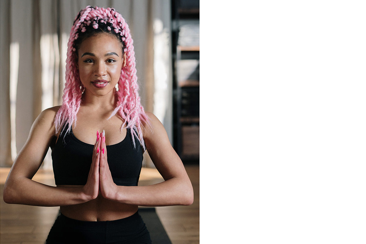

The White Outline Trick That Makes a Thumbnail Readable
Thumbnails have one job: be legible at about 200 pixels wide, competing against a wall of other thumbnails. Almost everything that makes an image work at that size comes down to separation — the subject has to detach cleanly from the background.
The reliable way to force that separation is a white stroke around a cut-out subject. It’s the technique behind an enormous proportion of the thumbnails you scroll past without registering why they read so clearly, and it takes a few minutes.
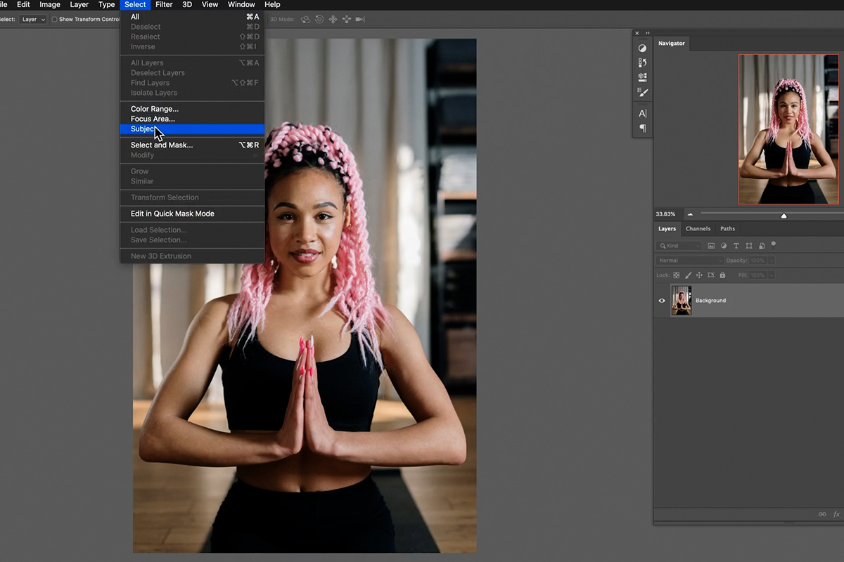
Cutting the Subject Out in One Click
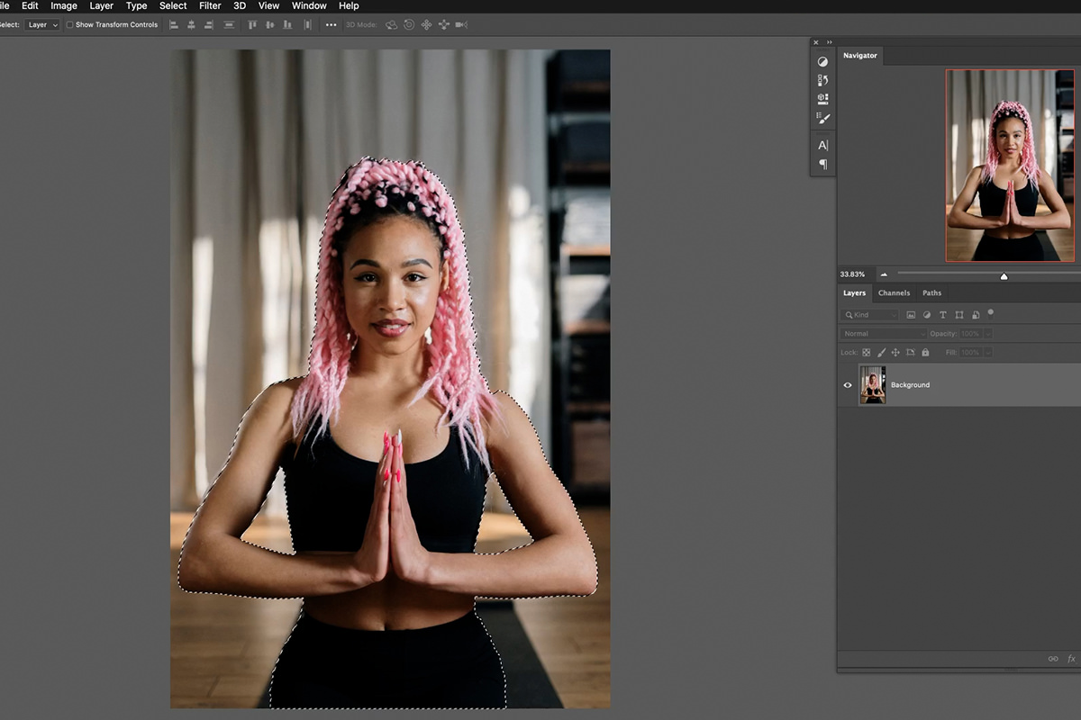
Photoshop’s Select › Subject identifies the main subject and selects it automatically. On a person against a reasonably distinct background it is remarkably good.
-
Select › Subject
A selection appears around your subject.
-
Click the layer mask icon
Bottom of the Layers panel. The selection becomes a mask and the background disappears.
Don’t stop to perfect it. The selection won’t be flawless, particularly around hair — and it doesn’t need to be yet, because the white stroke you’re about to add changes which imperfections are actually visible. Refine afterwards, when you can see what matters.
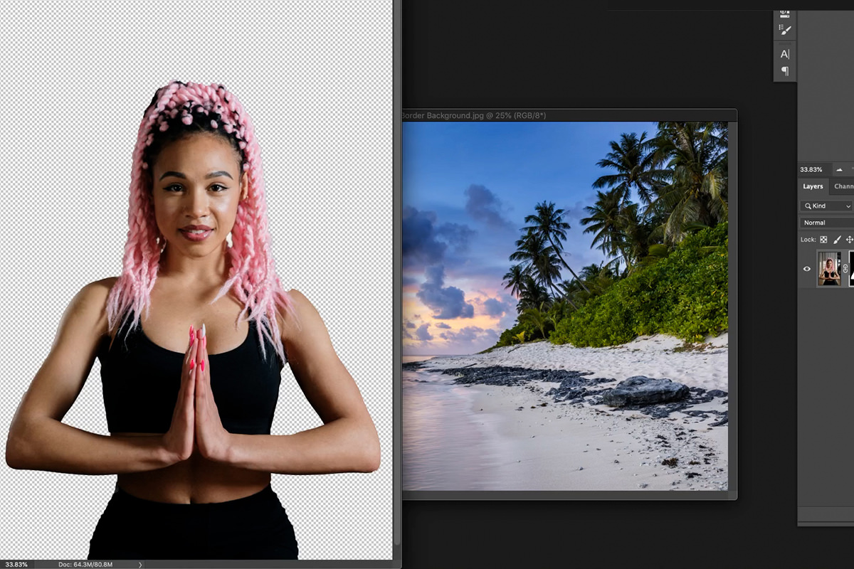
Adding the White Border
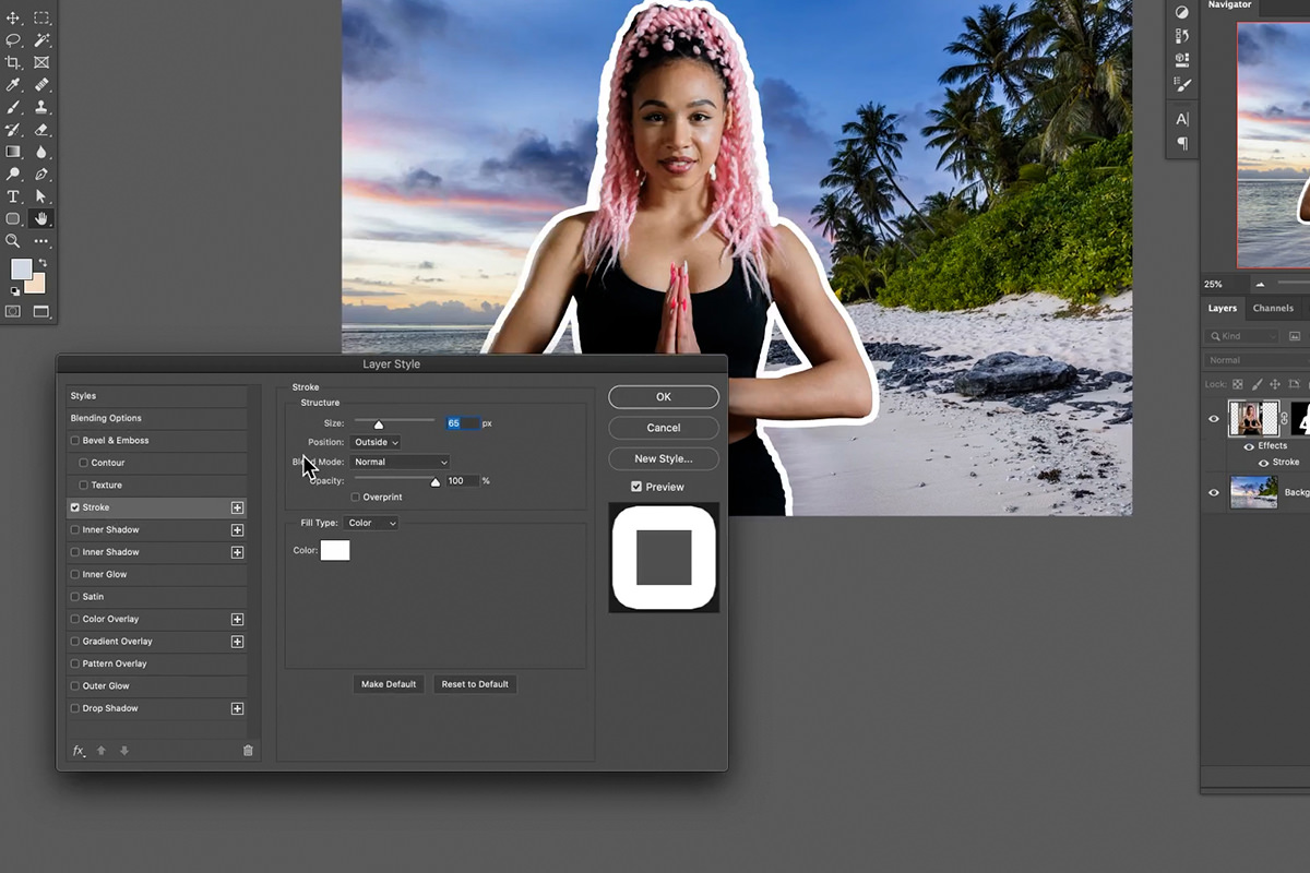
Bring in your background image, then drag the cut-out subject onto it with the Move tool. Now the important part.
-
Double-click the subject layer
Opens Layer Style. Drag the dialog aside so you can see the canvas.
-
Tick Stroke
And click the word itself, not just the checkbox, to see its options.
-
Set Position to Outside
This is the setting that matters. Inside eats into your subject and Center splits the difference; Outside puts the entire stroke beyond the subject’s edge, so nothing is lost and the outline reads as a deliberate border.
-
Set the size
Judge it at the size the thumbnail will actually be viewed, not at 100%. What looks heavy full-screen often disappears at 200 pixels wide.
-
Leave the colour white
White works against nearly any background, which is why it’s the convention. Click the swatch if you want something else.
Because this is a Layer Style rather than a painted outline, it stays live — and it follows the mask. Every refinement you make to the cut-out from here updates the border automatically. There’s more on this in our guide to Layer Effects and Layer Styles.
Refining the Cut-Out — Now That You Can See It
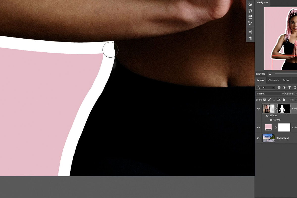
With the border in place it becomes obvious which parts of the selection actually need attention. Two tools, for two different situations.
The Brush, for most of it
Click the layer mask and paint. Black hides, white reveals — and the white stroke redraws itself around whatever shape you leave behind, in real time.
That feedback loop is what makes this fast. Painting away a ragged clump of hair doesn’t leave a hole; it leaves a clean bordered edge. For thumbnails, simplifying a messy edge is usually better than trying to preserve every strand, because none of that detail survives at thumbnail size anyway.
The Pen Tool, for edges that must be smooth
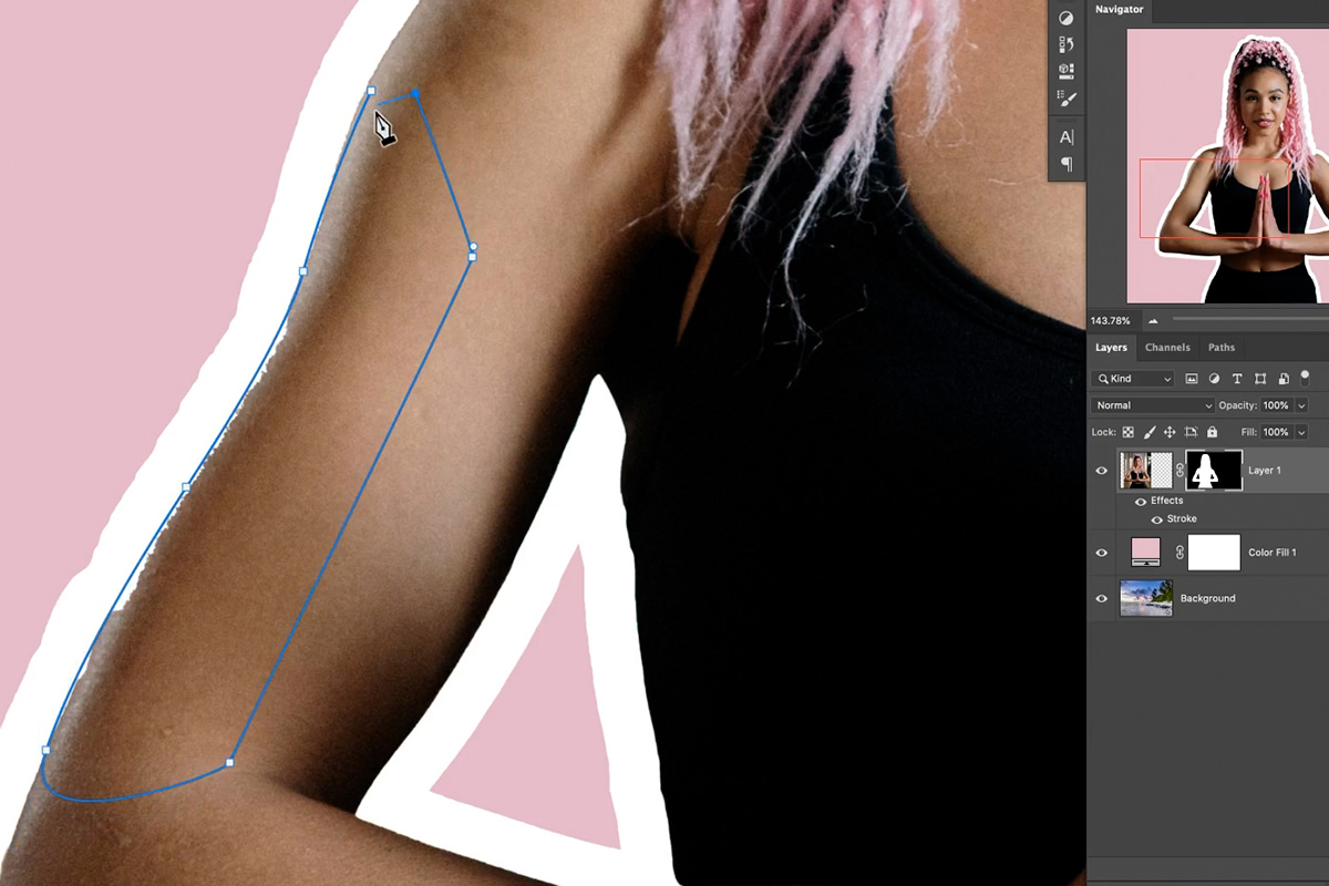
Hard-edged shapes — a forearm, a shoulder line — show every wobble when brushed by hand. The Pen Tool produces genuinely smooth curves.
Press P, click and drag to lay down curved segments following the edge, close the path, then right-click and choose Make Selection. With the mask active, paint white inside that selection and the edge becomes perfectly clean.
The honest trade-off: the Pen Tool is more precise, the Brush is much faster, and for most thumbnails the Brush is good enough. Save the Pen for the two or three edges a viewer’s eye will actually land on. Our guide to mastering the Pen Tool covers it in depth, and making accurate cutouts, masks and selections goes further on difficult edges.
Building the Background
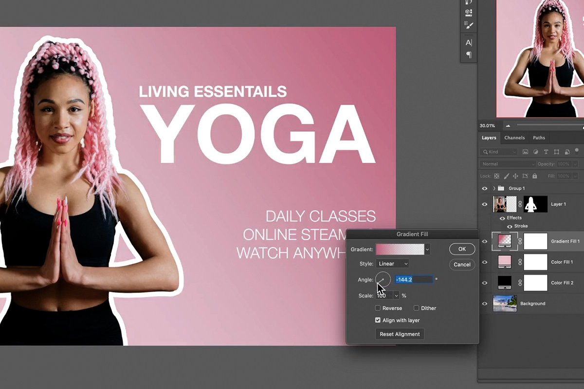
A photographic background often competes with your subject. Simpler usually wins at thumbnail size.
-
Add a Solid Color fill layer
From the adjustments icon. It appears above everything, so drag it below the subject layer.
-
Sample a colour from your subject
Double-click the fill layer’s swatch and use the eyedropper to pick a colour directly from the image — hair, clothing, a highlight. This is the step that makes it look designed rather than assembled, because the palette can’t clash with a colour that came out of the photograph.
-
Or keep the photo and mute it
Put a black fill layer over the background and lower its opacity. You keep context while the subject and any text stay legible.
-
Or add a gradient
A Gradient fill layer running from your sampled colour to a deeper version of it gives depth without introducing anything new. Drag on the canvas to position it and adjust the Scale.
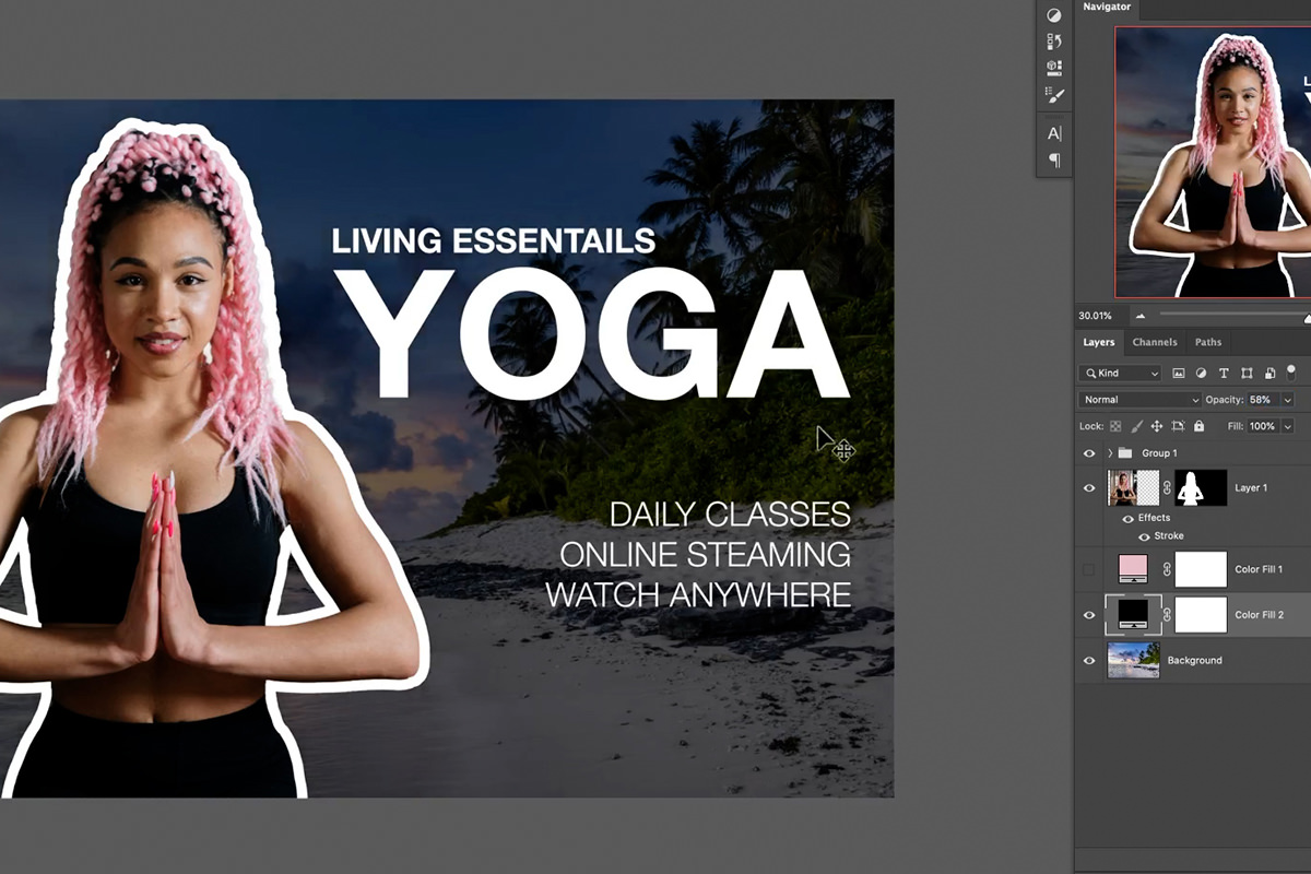
Then add your text. With a cut-out subject, a white border and a controlled background, text sits legibly almost anywhere — which is the entire point of the exercise.
Getting the Specs Right
YouTube’s recommended thumbnail is 1280 × 720 pixels, 16:9, under 2MB, as JPG, PNG, GIF or WebP. Their support page has the current requirements.
The number that actually matters, though, is none of those — it’s how it looks at around 200 pixels wide, which is where most people will see it. Zoom your document out until it’s roughly thumbnail-sized and judge it there. Text that seemed reasonable at full size frequently turns out to be unreadable, and a border that looked heavy turns out to be exactly right.
Where Thumbnails Go Wrong
Setting the stroke to Inside
It eats into your subject instead of surrounding them. Outside, every time.
Perfecting the cut-out before adding the border
The stroke changes which flaws are visible. Add it first, then refine what actually shows.
Judging at 100%
Everything works at full size. Zoom out to thumbnail scale and decide there.
A background that competes
A busy photograph behind a subject means neither reads. Mute it, replace it, or gradient over it.
Introducing colours from nowhere
Sample your background colour out of the subject and the whole thing coheres automatically.
Too much text
Three or four words at thumbnail size. The title beside it does the rest of the work.
More Free Photoshop Tutorials
- Compositing, Masking and Cutting Out Subjects — accurate selections, in depth.
- Layer Effects & Layer Styles in Photoshop — the live effects system behind the border.
- How to Remove Backgrounds in Photoshop — when Select Subject isn’t enough.
- How to Master the Pen Tool — smooth precise edges.
Build It Once, Reuse It Forever
Save the finished file as a template. The stroke, the fill layer, the text placement and the sizing are all reusable — swap the subject and resample the background colour and the next thumbnail takes two minutes instead of twenty.
That consistency is worth as much as the design itself. A recognisable thumbnail style is one of the few things that makes a channel identifiable in a grid of competitors before anyone has read a word.
New Free Tutorials View All »






Enjoying This Free Tutorial? Go Further with PRO.
Unlock Full Sample Files, PSDs, and Hundreds of Masterclasses!

Download full project assets, original PSDs, and RAW images for every lesson
Unlimited access to our complete library of PRO Photoshop & Lightroom courses
Instant 4K Ultra HD streaming on all devices, anytime, anywhere
Full access to our entire library of Photoshop Actions, Presets, and LUTs
Flexible monthly and annual membership plans
Cancel anytime with zero hassle or commitments