
download sample images
Download Assets
This tutorial includes sample images and a PDF guide. Downloads are free with a PHLEARN account.
- Free sample files with every tutorial on PHLEARN
- New tutorials published every week
- Unlimited downloads with your free PHLEARN account
description
2020 Edition
This lesson is from the original 30 Days of Photoshop. Photoshop has changed a great deal since — there is an updated version of this lesson in the 2025 Edition: How to Use Dynamic Text in Photoshop, Day 14.
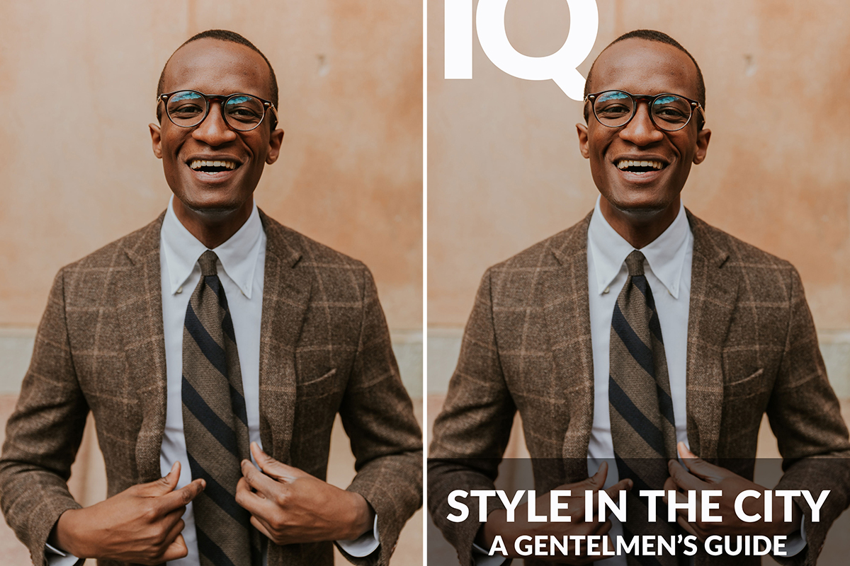
Adding text to a photo is a great way to help communicate more information, and the Type Tool in Photoshop makes it easier than ever to integrate text into your images!
Learn how to use the options within the Type Tool to set font and weights, align your text to different parts of an image, and even have the text interact with elements in a photo using Layer Masks!
This is Day 11 of our 30 Days of Photoshop series. If you enjoyed it, follow along with all 30 episodes as we explore the the magic of Photoshop together!
Continue Watching 30 Days of Photoshop
Enjoying This Free Tutorial?
We publish a new free tutorial every week, each one with sample images and PSDs you can download and follow along with. Sign up and they land straight in your inbox, along with early word on sales, events and subscriber-only offers.
How to Add Type to Your Photos
Adding text to a photo is easy; adding text that looks like it belongs takes a little more care. In this lesson you will tour the type controls in Photoshop, choose fonts and weights that work together, align multiple lines of text so everything is perfectly centered, and use a layer mask to slide a headline behind your subject for a magazine-cover effect.
Create and Format Type
-
Add a Text Layer
Press T for the Horizontal Type Tool (click and hold the icon to see the vertical and mask variants, which you will rarely need). Click on the canvas, type a short title such as a magazine name, and click the checkmark in the Options bar. Every piece of type gets its own layer.
-
Open the Type Controls
In recent versions of Photoshop the Properties panel holds Character, Paragraph and Type Options together. In older versions open the Character and Paragraph panels from the Window menu.
-
Choose a Font and Weight
Pick a font family from the font menu. Creative Cloud subscribers can click More from Adobe Fonts to add thousands more, which sync straight into Photoshop. A family with many weights, from hairline to black, gives you the most flexibility.
-
Set Spacing, Not Stretching
Use Tracking to tighten or loosen the space between letters and Leading for the space between lines. Avoid the vertical and horizontal scale fields; stretched letterforms rarely look good. Faux bold, faux italic, all caps and underline options live here too.
-
Size and Tighten the Title
Drag left or right on the font size icon to scrub the size up until the title is large, then set tracking to a negative value so the letters sit close together. You can also press Ctrl/Cmd + T and scale a type layer like any other.
Put the Title Behind Your Subject
-
Select the Background
Hide the type layer. On a simple background, press W for the Magic Wand and Shift-click a few times around the background until it is all selected without touching the subject.
-
Load the Selection as a Mask
Turn the type layer back on, select it and click Add Layer Mask. The title is now hidden wherever the subject is, so it appears to sit behind them.
-
Unlink the Mask
Click the chain icon between the type thumbnail and its mask. Now you can move or scale the text freely while the mask stays put, and the title always stays behind the subject. Keep enough of the letters visible that the word can still be read.
Add and Align More Text
-
Add a Tagline
Press T, click lower on the canvas and type a tagline. Reduce the size, set the paragraph alignment to Center, and give it positive tracking so it reads as a lighter, more open line.
-
Center It on the Document
Press Ctrl/Cmd + A to select all, switch to the Move Tool (V) and use the alignment buttons in the Options bar. Align horizontal centers, and vertical centers if you want it dead center. Alignment always refers to the active selection.
-
Move Without Drifting
Deselect, then hold Shift while dragging so the text moves only straight up or down and keeps its horizontal alignment. The arrow keys nudge in small steps.
-
Add a Third Line in a Lighter Weight
Type a subtitle beneath the tagline. Instead of choosing a different font, pick a lighter weight of the same family. Mixing weights within one family almost always looks cohesive; mixing two unrelated fonts rarely does.
Make Thin Type Readable
-
Add a Color Bar
Add a Solid Color fill layer beneath the text, press Ctrl/Cmd + I to invert its mask, draw a marquee across the bottom of the image and press Shift + Delete to fill that area of the mask with white. Double-click the swatch and choose a dark tone already present in the photo, such as a deep brown, rather than pure black.
-
Lower the Opacity
Reduce the fill layer’s opacity slightly so the photo shows through while the type stays legible. Bump the subtitle up from hairline to a slightly heavier weight if it is still hard to read.
-
Center Both Lines Inside the Bar
Select both type layers, select all and align their horizontal centers, then use the arrow keys to set the gap between them. Group the two lines with Ctrl/Cmd + G so they behave as one.
-
Align to the Bar Itself
Ctrl/Cmd-click the fill layer’s mask thumbnail to load the bar as a selection (Ctrl/Cmd-clicking any layer or mask turns it into a selection, which is also why the type mask tools are rarely needed). With the text group selected, align vertical and horizontal centers. The text is now perfectly centered in the bar.
Key Takeaways
- Use the Properties or Character panel for font, weight, size, tracking and leading; avoid stretching letters.
- Load a background selection into the type layer’s mask, then unlink the mask, to put text behind a subject.
- Make a selection first, then use the Move Tool’s alignment buttons.
- Pair weights within one font family instead of mixing unrelated fonts.
- A semi-transparent bar in a color pulled from the photo keeps thin type readable.
Related Tutorials
Master Photoshop, Lightroom and Photography
Join PHLEARN PRO for $12.99 a month or $99.99 a year. Cancel anytime, with a 100% money-back guarantee.





