

description
Placing text onto a building, a sign, or any flat surface shot at an angle usually means eyeballing rotation and scale until the perspective looks close enough. The Vanishing Point filter automates that entirely, warping pasted text or a logo to match a defined plane exactly, and this tutorial follows up with Bevel and Emboss, Inner Shadow, and Color Overlay to carve the result into stone, then blurs and weathers it so it does not look freshly pasted on.
Enjoying This Free Tutorial?
We publish a new free tutorial every week, each one with sample images and PSDs you can download and follow along with. Sign up and they land straight in your inbox, along with early word on sales, events and subscriber-only offers.
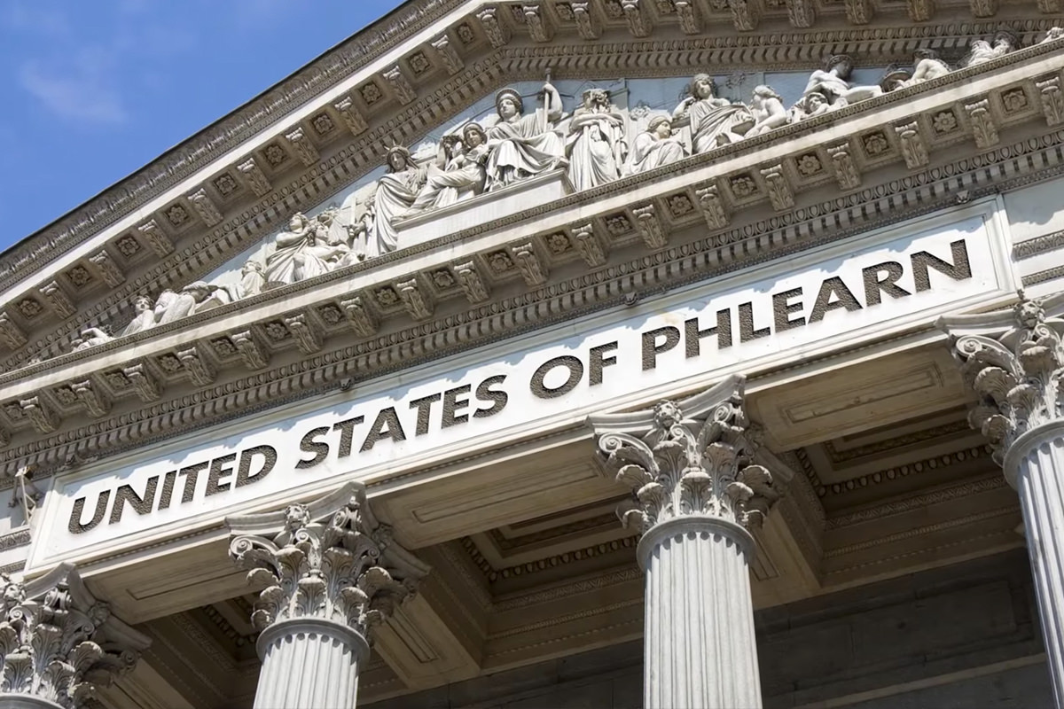
How to Add Text to Anything in Photoshop
Placing text onto a building, a sign, or any flat surface shot at an angle usually means manually eyeballing rotation and scale until the perspective looks close enough. The Vanishing Point filter automates that entirely, warping pasted text or a logo to match a defined plane’s exact perspective, and this tutorial follows up with layer effects that carve the result convincingly into stone.
Adding and Copying Text to the Clipboard
Vanishing Point pastes whatever is currently on the clipboard, so text needs to be turned into a selection and copied before the filter is even opened.
-
Add the Text
Press T for the Type tool and type the text that should appear on the surface.
-
Turn the Text Layer Into a Selection
Hold Cmd/Ctrl and click the text layer’s thumbnail to load it as a selection.
-
Copy the Selection
Press Cmd/Ctrl+C to copy the selection onto the clipboard, then hide the original text layer, make a new blank layer for the result and press Cmd/Ctrl+D to deselect.
Defining a Perspective Plane in Vanishing Point
The Create Plane tool traces the actual perspective of a surface, which is what tells Photoshop how to warp anything pasted into it.
-
Open Vanishing Point
Go to Filter > Vanishing Point.
-
Select the Create Plane Tool
Select the Create Plane tool from the dialog’s toolbar.
-
Click the Corners of the Surface
Click each corner of the flat surface, such as a sign or section of building, to define the plane’s perspective, using Spacebar to scroll around while zoomed in.
Why Copy to the Clipboard Before Opening Vanishing Point
Vanishing Point works by pasting the clipboard’s contents directly into a defined perspective plane, so it has nothing to place if the clipboard is empty when the filter opens. Copying the text or logo first ensures Photoshop has something ready the moment the plane is defined, letting the perspective warp happen in the very next step.
Pasting and Fitting Text Into the Vanishing Point Plane
Once the plane is defined, pasted content automatically warps to match its perspective, needing only a bit of resizing to fit naturally.
-
Paste Into the Plane
Press Cmd/Ctrl+V to paste the copied text directly into the defined plane.
-
Drag It Into Position
Click and drag the pasted content onto the plane, where it automatically snaps into the correct perspective.
-
Scale to Fit
Press Cmd/Ctrl+T, then hold Shift and drag a corner handle to scale the text down until it fits the intended space naturally.
-
Confirm and Exit Vanishing Point
Click OK to apply the pasted, perspective-matched text onto its own new layer.
Carving the Text In With Bevel and Emboss
A Bevel and Emboss layer style gives flat text the illusion of being physically carved or raised on a surface like stone.
-
Open Layer Style
Double-click the text layer to open its Layer Style dialog.
-
Add Bevel and Emboss
Click Bevel and Emboss, choose Inner Bevel as the style, and choose Chisel Hard as the technique.
-
Adjust Depth and Size
Adjust the Depth and Size sliders until the carved texture looks convincing for the surface being used.
Deepening the Effect With an Inner Shadow
An Inner Shadow adds a subtle sense of depth that Bevel and Emboss alone doesn’t fully capture.
-
Add an Inner Shadow
Click Inner Shadow in the Layer Style dialog.
-
Confirm Use Global Light Is Checked
Make sure Use Global Light is checked so the shadow direction stays consistent with any other lighting effects on the layer.
-
Adjust Opacity and Distance
Adjust the shadow’s Opacity and Distance until the text looks like it has real depth into the surface.
Why Always Check Use Global Light
Without Use Global Light checked, each layer effect calculates its own independent light source, which can produce shadows and highlights that point in inconsistent directions across different effects. Keeping it checked ensures every shadow and highlight on the layer shares the same light direction, which is what keeps a combination of effects like Bevel and Emboss and Inner Shadow looking physically coherent together.
Matching Color With a Color Overlay
A Color Overlay tints the carved text to match the actual material color of the surface it’s supposedly carved into.
-
Add a Color Overlay
Click Color Overlay in the Layer Style dialog.
-
Sample a Matching Color
Choose a color that matches the surface’s actual material, such as a brown stone tone rather than a default color.
-
Adjust Overlay Opacity
Adjust the Color Overlay’s opacity until the tint looks natural rather than covering the texture underneath completely.
Softening the Text With a Blurred, Merged Copy
Merging a duplicate of the styled text strips its layer effects into flat pixels, which is necessary before a blur can actually be applied to soften its sharp edges.
-
Duplicate and Merge the Layer
Duplicate the text layer, create a new blank layer, and merge the two together to flatten the layer effects into pixels.
-
Apply a Small Gaussian Blur
Go to Filter > Blur > Gaussian Blur and apply a very small radius, such as 0.7 pixels, so the text edges soften to match the resolution of the rest of the photo.
Why Merge Before Blurring to Strip Layer Effects
A Gaussian Blur applied directly to a layer with active layer styles doesn’t blur the styled result the way it would a normal flattened layer, since the effects are recalculated live rather than baked into pixels. Merging a duplicate onto a blank layer first converts everything, bevel, shadow, and color overlay included, into ordinary pixels that a blur filter can then soften normally.
Adding Weathering With a Motion-Blurred, Masked Layer
A motion-blurred, masked duplicate placed beneath the text simulates water streaking and eroding the surface color over time.
-
Duplicate the Blurred Layer
Duplicate the softened text layer again.
-
Apply Motion Blur Downward
Go to Filter > Blur > Motion Blur, set the angle to roughly 90 degrees, and increase the distance so the effect streaks downward. A small Gaussian Blur on top softens its edges a little more.
-
Add a Black Layer Mask and Paint White Below the Text
Hold Option/Alt and click Add Layer Mask to create a black mask, then paint white just beneath the letters to reveal the streaking effect only there.
-
Position Beneath the Text and Lower Opacity
Move this layer beneath the main text layer so it doesn’t obscure it, and lower its opacity so the weathering looks subtle.
Why This Approach Works
Defining a plane in Vanishing Point before pasting is what allows Photoshop to warp text automatically into the exact perspective of a surface, avoiding the guesswork of manually rotating and scaling text to match an angle. Layering Bevel and Emboss, Inner Shadow, and Color Overlay together, all under Use Global Light, is what turns flat pasted text into something that reads as physically carved into a material. Blurring a merged copy and adding a masked, motion-blurred weathering layer underneath is what keeps the final result from looking too clean and computer-generated for a surface that’s supposed to have some age to it.
Final Thoughts
This same combination, Vanishing Point for perspective and layer effects for material realism, works for putting text or a logo onto any flat surface photographed at an angle, not just a building. Taking the extra time to blur and weather the result is what separates text that looks pasted on from text that looks like it’s actually been there for years.
Quick Reference: Keys, Menus and Settings
- Copy the textT to type; Cmd/Ctrl-click the thumbnail, Cmd/Ctrl + C; new layer, Cmd/Ctrl + D
- Define the planeFilter > Vanishing Point, Create Plane tool on each corner; Space to move around
- Paste and fitCmd/Ctrl + V, drag onto the plane; Cmd/Ctrl + T and Shift-drag to scale
- Carve it inBevel and Emboss: Inner Bevel, Chisel Hard; Inner Shadow with Use Global Light; Color Overlay sampled from the wall
- SoftenCmd/Ctrl + J, new layer, Cmd/Ctrl + E; Filter > Blur > Gaussian Blur, 0.7 pixels
- Weather itFilter > Blur > Motion Blur, about 90 degrees; Alt/Option-click for a black mask, paint white under the letters
No AI, no generative credits.
Text on Any Surface: Common Questions
How do I put text on a wall in perspective in Photoshop?
Copy the text, open Filter > Vanishing Point, draw a plane over the surface with the Create Plane tool, then paste and drag the text onto the plane. It takes on the surface’s perspective automatically.
Why is there nothing to paste in Vanishing Point?
Vanishing Point pastes whatever is on the clipboard. Cmd/Ctrl-click the text layer’s thumbnail to select it and press Cmd/Ctrl + C before you open the filter.
Does this work for a logo or a sign?
Yes. Anything you can copy works, like a logo, and any flat surface shot at an angle works, like a sign. The building is just the example.
How do I draw the plane accurately?
Zoom in and click each corner of the surface with the Create Plane tool, holding the Spacebar to move around. You can drag the corners afterward if one is off.
How do I resize the text inside Vanishing Point?
Press Cmd/Ctrl + T and Shift-drag a corner handle. The text stays in the plane’s perspective as it scales. Click OK and it lands on the active layer.
How do I make text look carved into stone?
Double-click the layer and add Bevel and Emboss with Inner Bevel and Chisel Hard, then an Inner Shadow for depth. Adjust Depth, Size, Opacity and Distance until it looks pushed in.
Why should Use Global Light be checked?
Without it, each effect calculates its own light source and the shadows and highlights won’t match. With it checked, every effect on the layer shares one light direction.
My text looks too sharp. How do I soften it?
Press Cmd/Ctrl + J, add a new blank layer and merge the two with Cmd/Ctrl + E to bake in the effects. Then add a Gaussian Blur of about 0.7 pixels.
How do I make the text look weathered?
Duplicate the blurred layer, add a Motion Blur at about 90 degrees and a black mask with Alt/Option. Paint white just under the letters, move the layer below the text and lower its opacity.
Master Photoshop, Lightroom and Photography
Join PHLEARN PRO for $12.99 a month or $99.99 a year. Cancel anytime, with a 100% money-back guarantee.





