
Download Sample Images
description
The new Create from Image feature in Photoshop is a versatile tool for both designers and image makers. Learn how to use any photo to make custom patterns, detailed vector outlines, and beautiful color palettes. The perfect tool for creating logos, advertisements, and color themes!
Photoshop has hundreds of tools, and there’s always something new to learn and discover. If you’re ready for more, The Beginner’s Guide to Photoshop is a great place to master the foundations of this magical piece of creative software. Learning Photoshop has never been easier!
Enjoying This Free Tutorial?
We publish a new free tutorial every week, each one with sample images and PSDs you can download and follow along with. Sign up and they land straight in your inbox, along with early word on sales, events and subscriber-only offers.

Turn Any Photo Into Patterns, Vectors, and Color Palettes
Adobe used to keep this magic trick on your phone. The Adobe Capture app could take a photo and spit out repeating patterns, vector shapes and color themes automatically — genuinely useful, but stranded on a completely different device from the one you actually design on.
Photoshop 2020 folded all of that functionality straight into the Libraries panel, and then went further. One command, Create from Image, turns any open photo into seamless patterns, scalable vector shapes, extracted color themes and custom gradients — all saved into your Creative Cloud Libraries and synced to every device you sign in on.
In this tutorial we’ll tour every mode of the tool, then put the assets straight to work building a piece of packaging artwork from scratch. If you haven’t updated Photoshop yet, do that first — this one is worth the download.
What Create from Image Actually Does
Point it at a photograph and Photoshop analyzes the image’s shapes, edges and colors, then offers you four different kinds of design asset generated from it:
- Patterns — seamless, tiling repeats built from the photo’s forms, with live scale and rotation control.
- Shapes — true vector artwork traced from the image, scalable to any size without softening.
- Color themes — a palette pulled from the photo’s dominant colors, with each swatch adjustable.
- Gradients — multi-stop gradients sampled from the image, with movable start, mid and end points.
Everything lands in your Creative Cloud Libraries rather than as a flattened layer, which is the part that makes it useful rather than just fun. A saved pattern can be dropped into any document as a live Pattern Fill layer, and a saved shape stays a vector forever.
Opening the Libraries Panel
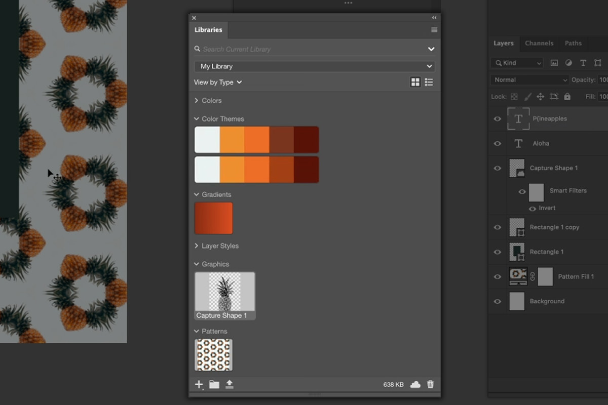
Libraries is where Photoshop keeps the assets you reach for most often — colors, brushes, graphics, character styles — and it’s where Create from Image lives.
-
Open the photo you want to work from
Any image will do, but photos with clear, well-defined subjects and strong color separation give the tool the most to work with. The example here is a single pineapple on a plain background.
-
Go to Window › Libraries
The Libraries panel opens on the right side of your workspace. If you’ve used it before, your existing libraries and assets are already sitting there.
-
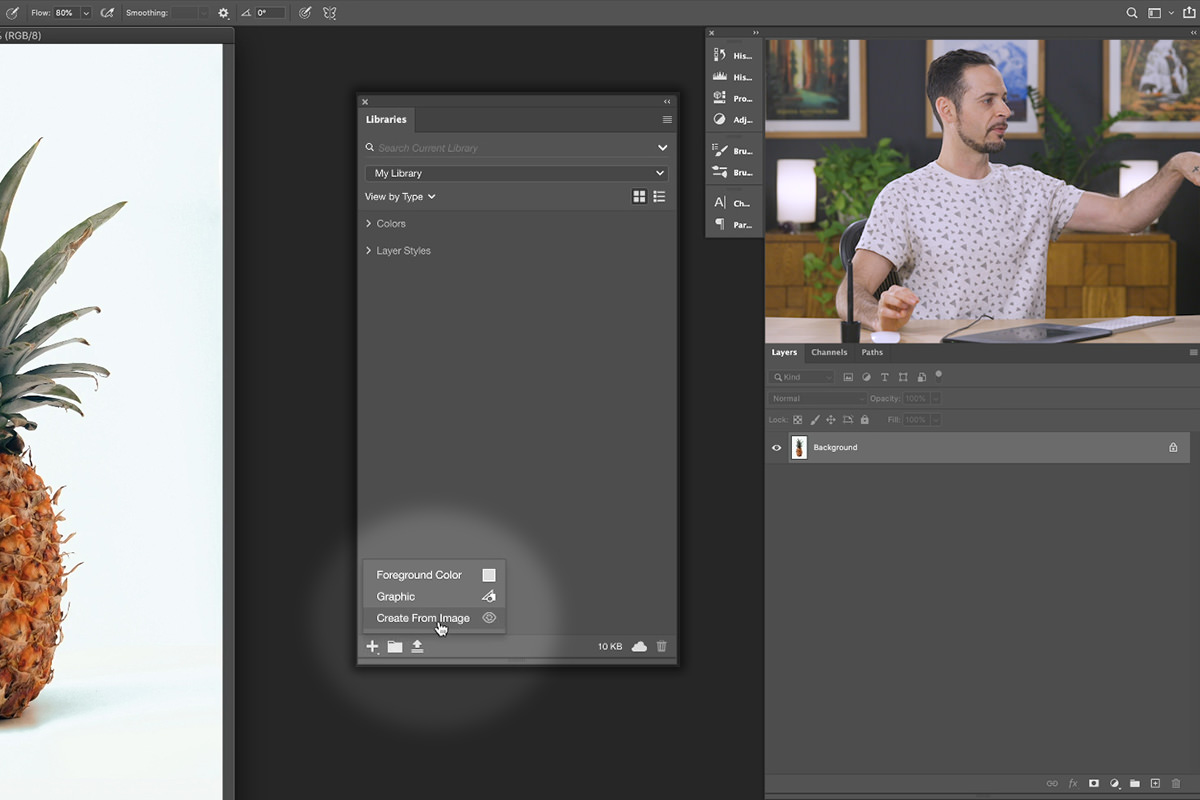
Click the plus icon and choose Create from Image
A new dialog opens showing your photo alongside a live preview of whatever asset it’s about to generate. Drag the corner to make the window larger — you’ll want the room.
If you used the phone app in its heyday and want to see how the two compare, we have a walkthrough of creating patterns in Adobe Capture as well.
Building a Pattern from Your Photo
Patterns is the first tab across the top of the dialog, and it’s the one you’ll probably spend the most time in. Photoshop generates a tiling repeat automatically, then hands you the controls to shape it.
-
Select the Patterns tab
The preview immediately fills with a seamless repeat built from your photo. It’s already tiling correctly — there are no edges to fix by hand.
-
Adjust the scale
Scale controls how large each element of the source image appears in the repeat. Pull it down for a dense, textural look; push it up and individual subjects read clearly as graphic elements.
-
Rotate the repeat
Rotation turns the whole tile. Even a small angle change breaks up the grid-like regularity that makes a pattern look machine-made, so it’s worth nudging rather than leaving at zero.
-
Try the other repeat types
The row of pattern styles across the top switches between different tiling geometries — straight grids, offset rows, mirrored and kaleidoscopic arrangements. The busier ones get genuinely trippy fast, which is either what you want or a good reason to go back to something simple.
-
Save to CC Libraries
Click Save to CC Libraries. The pattern is added to your active library and syncs to every device signed into your Creative Cloud account.
Generating Vector Shapes
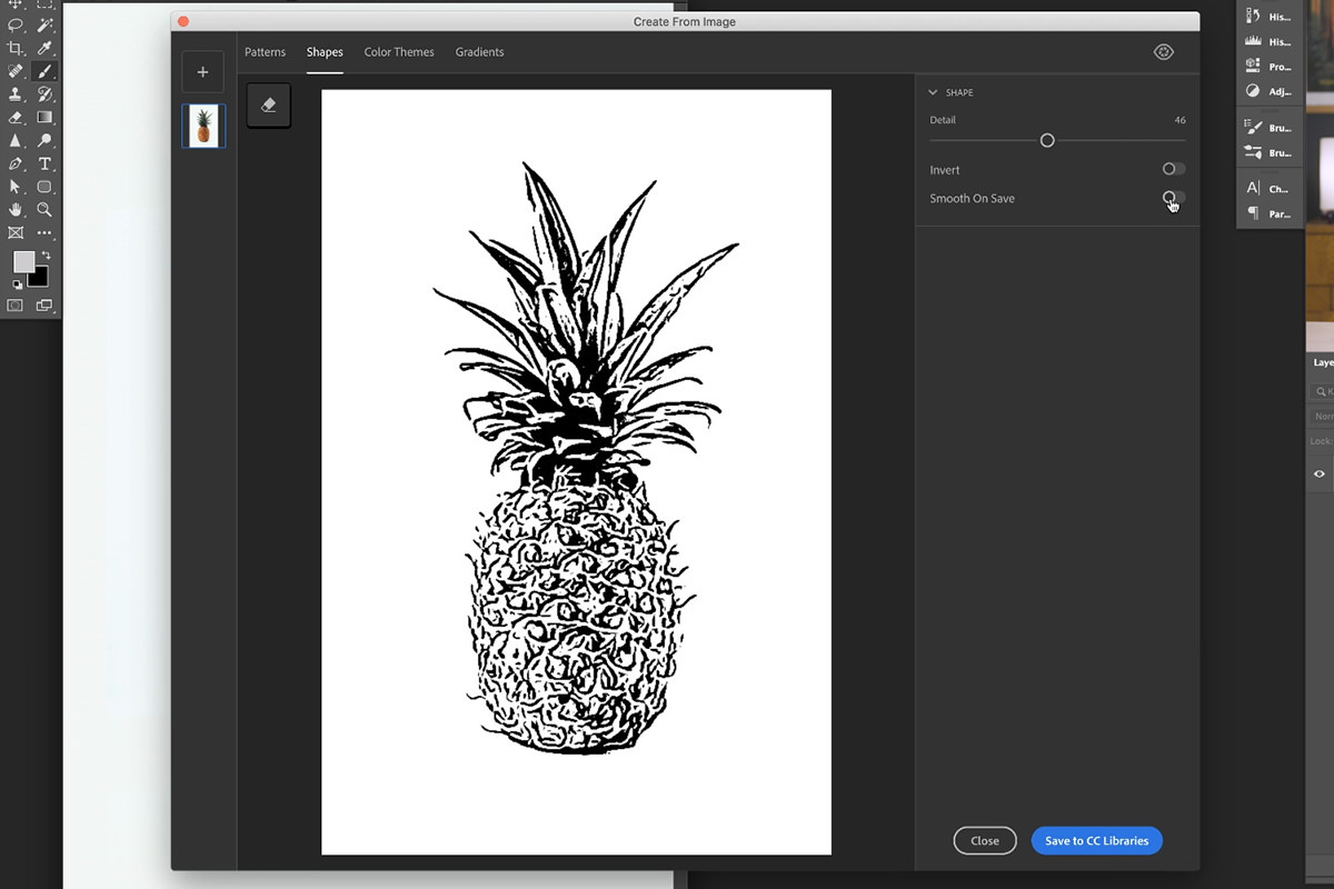
The Shapes tab is the simplest screen in the whole dialog — a single slider — and arguably the most valuable output, because what comes out the other side is real vector artwork.
-
Switch to the Shapes tab
Photoshop traces your image into a flat silhouette. The preview updates instantly.
-
Drag the smoothing slider
Low smoothing keeps fine detail and jagged edges; high smoothing simplifies the trace into clean, confident curves. Where you land depends on whether you want a detailed illustration or a bold logo-style mark.
-
Save it to your library
Because the result is a vector, you can scale it to any size later without losing a pixel of resolution. That is the difference between a shape you can use on a business card and on a billboard.
Once a shape is in your library you can edit it like any other Photoshop vector — the same anchor points, paths and path operations covered in our guide to using the Custom Shape Tool.
Pulling Color Themes and Gradients
The last two tabs are about color rather than form, and both take seconds.
Color themes
Switch to Color Themes and Photoshop samples a palette straight from the photograph. Drag any swatch’s sample point to a different part of the image to swap that color out. It’s the fastest way to build a palette that’s guaranteed to sit comfortably against the imagery you’re designing around, because it literally came from it.
Gradients
The Gradients tab lets you set a start point, a midpoint and an end point on the image, and builds a gradient from the colors underneath them. Move the points around to change the ramp — from a green through to a bright orange, then pull the end point somewhere darker for a deeper finish. You can add or remove stops to make the gradient as simple or as complex as you like. Save each one to your library alongside everything else.
You can also load additional images into the dialog and mix assets across more than one photo, which is worth exploring once the basics feel familiar.
Designing a Packaging Graphic with Your New Assets
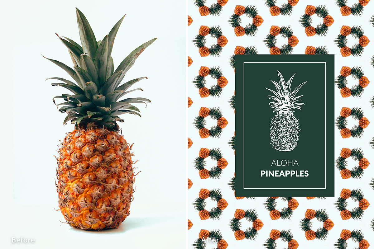
Generating assets is the easy half. Here’s how they come together into an actual finished piece — in this case the front of a package for a fictional brand of pineapples.
-
Create a new document
File › New, set to 2500 x 3000 pixels. A portrait format suits packaging; adjust to whatever your real output needs.
-
Drag your pattern in from Libraries
Click and drag the saved pattern from the Libraries panel onto your canvas. It arrives as a live Pattern Fill layer at full resolution, filling the whole document.
-
Dial in the pattern scale
Double-click the Pattern Fill layer’s thumbnail to reopen its options. Lower the scale to tighten the repeat, or raise it to let individual elements breathe. You can also click and drag directly on the canvas to reposition the pattern inside the fill.
-
Draw a solid background panel
Grab the Rectangle Tool and draw a panel over the pattern. Set its fill by eyedropping a dark green straight out of your source image, and set the stroke to none. This is the surface the rest of the design sits on.
-
Duplicate the panel for a border
Drag the rectangle layer onto the new layer icon. On the copy, remove the fill entirely, add a stroke sampled from the image, then press Ctrl or Cmd + T and hold Shift + Alt or Option to scale it down evenly from the center. Raise the stroke width until the inset border reads clearly.
-
Bring in your vector shape
Drag the saved shape in from Libraries and confirm the placement dialog. Press Ctrl or Cmd + I to invert it if you need it light against a dark panel.
-
Add your type
Press T for the Type Tool and set your text on two separate layers — one word each works well when you want to control their weights independently.
-
Align everything to the panel
Ctrl or Cmd + click the background rectangle’s thumbnail to load it as a selection, then use the Move Tool (V) and the align buttons to center each element vertically and horizontally inside it. Do this for the border, the shape and both text layers.
-
Refine the type
Set the two words to different font weights — a Light for one and something heavier for the other — and sample their color from the background so the whole thing stays inside one palette. Scale them to sit comfortably against the shape.
-
Group and finish
Select the design elements and group them, then scale the group as a unit and re-center it on the canvas. Press F for full screen to see it clean, with no panels in the way.
The Crop Trick That Makes Pattern Fills Worth It
This is the part that justifies keeping the background as a live Pattern Fill layer rather than flattening it into pixels.
Press C for the Crop Tool and drag the crop boundary outward, past the edges of your document. Commit the crop, and the pattern in the background automatically generates into the new space. Extend it sideways, extend it down — the fill keeps producing more pattern to cover whatever area you’ve just created.
For anything with an uncertain final size — packaging that might need a bleed, wrapping paper, a background that has to work in both portrait and landscape — that behavior removes an entire category of rework. A flattened background would have needed cloning or a fresh render; a Pattern Fill layer just fills.
Where People Get Tripped Up
Pushing the scale too far in the dialog
It’s tempting to set the pattern exactly how you want it before saving. Don’t over-invest — the scale and rotation are fully editable later on the Pattern Fill layer, and judging the right scale is much easier at real document size than in a small preview window.
Rasterizing the Pattern Fill layer
The moment you rasterize, you lose both the live scale control and the crop auto-fill behavior above. Leave it as a fill layer for as long as you possibly can.
Forgetting the shapes are vectors
People often place a generated shape, scale it down to fit, and then treat it as fixed. It isn’t — scale it back up whenever you like, edit its paths, change its fill. Rasterizing it out of habit throws away the main reason to use the Shapes tab at all.
Starting from a cluttered photograph
Busy backgrounds produce muddy patterns and unreadable shape traces. A clear subject against a simple background gives the tool the contrast it needs, and takes about ten seconds to shoot or find.
Ignoring the color themes
The palette tab gets skipped because it seems like the least impressive output. It’s actually the one that does the most quiet work — sampling your type and panel colors from it is what makes a design built this fast look deliberate rather than assembled.
More Free Pattern Tutorials to Explore
If generating patterns from your own photos is your thing, these free tutorials go further with the idea:
- How to Make a Repeatable Pattern in Photoshop — building a seamless tile by hand, so you understand what the automatic version is doing.
- How to Make a Pattern from any Object in Photoshop — turning a single isolated object into a repeat.
- Create Patterns That Blend Perfectly in Photoshop — getting a pattern to sit convincingly on an existing surface.
- How to Add Patterns to Clothing in Photoshop — wrapping a pattern around fabric folds and body shape.
- How to Use Step and Repeat in Photoshop — the manual duplication technique behind a lot of pattern work.
Make It Your Own
What makes Create from Image worth building into your workflow isn’t that it produces good-looking assets — it’s that it produces your assets, from your photographs, in a fraction of the time it would take to draw them. The pineapple packaging above went from a single JPEG to a finished graphic in a matter of minutes, and nothing in it came from a stock library.
Shoot something with a clean silhouette, run it through all four tabs, and see what you get back. Custom wrapping paper, textile prints, album artwork, social templates — the source photo is the only thing standing between you and a design system nobody else has.




Enjoying This Free Tutorial? Go Further with PRO.
Unlock Full Sample Files, PSDs, and Hundreds of Masterclasses!

Download full project assets, original PSDs, and RAW images for every lesson
Unlimited access to our complete library of PRO Photoshop & Lightroom courses
Instant 4K Ultra HD streaming on all devices, anytime, anywhere
Full access to our entire library of Photoshop Actions, Presets, and LUTs
Flexible monthly and annual membership plans
Cancel anytime with zero hassle or commitments