Download Sample Images
description
Add beautiful coloring to your photos with Gradient Maps in Photoshop! Learn how to use a Gradient Map to apply different colors to the highlights, midtones, and shadows of an image, and then use Blend If to protect skin tones and dial-in the perfect look. We even include several custom Gradients that you can download and try on your own photos.
Share
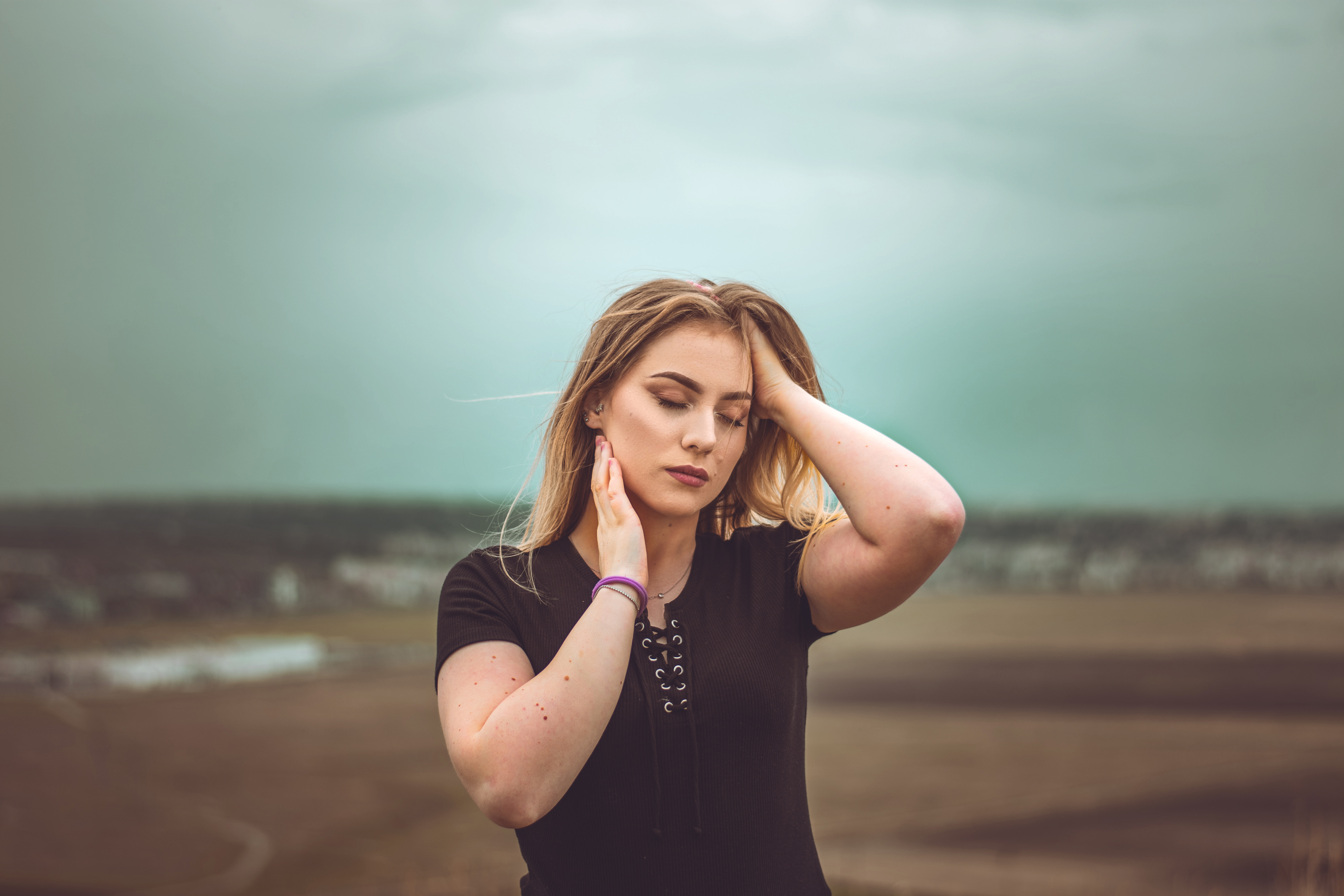
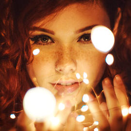
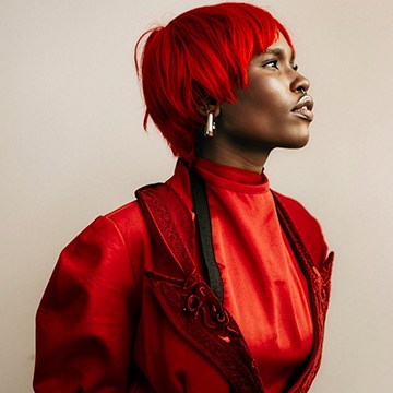
AFTER COLOR GRADE
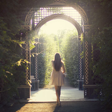
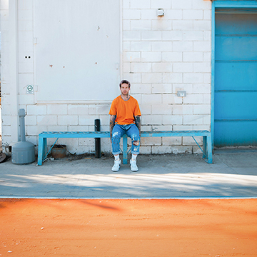
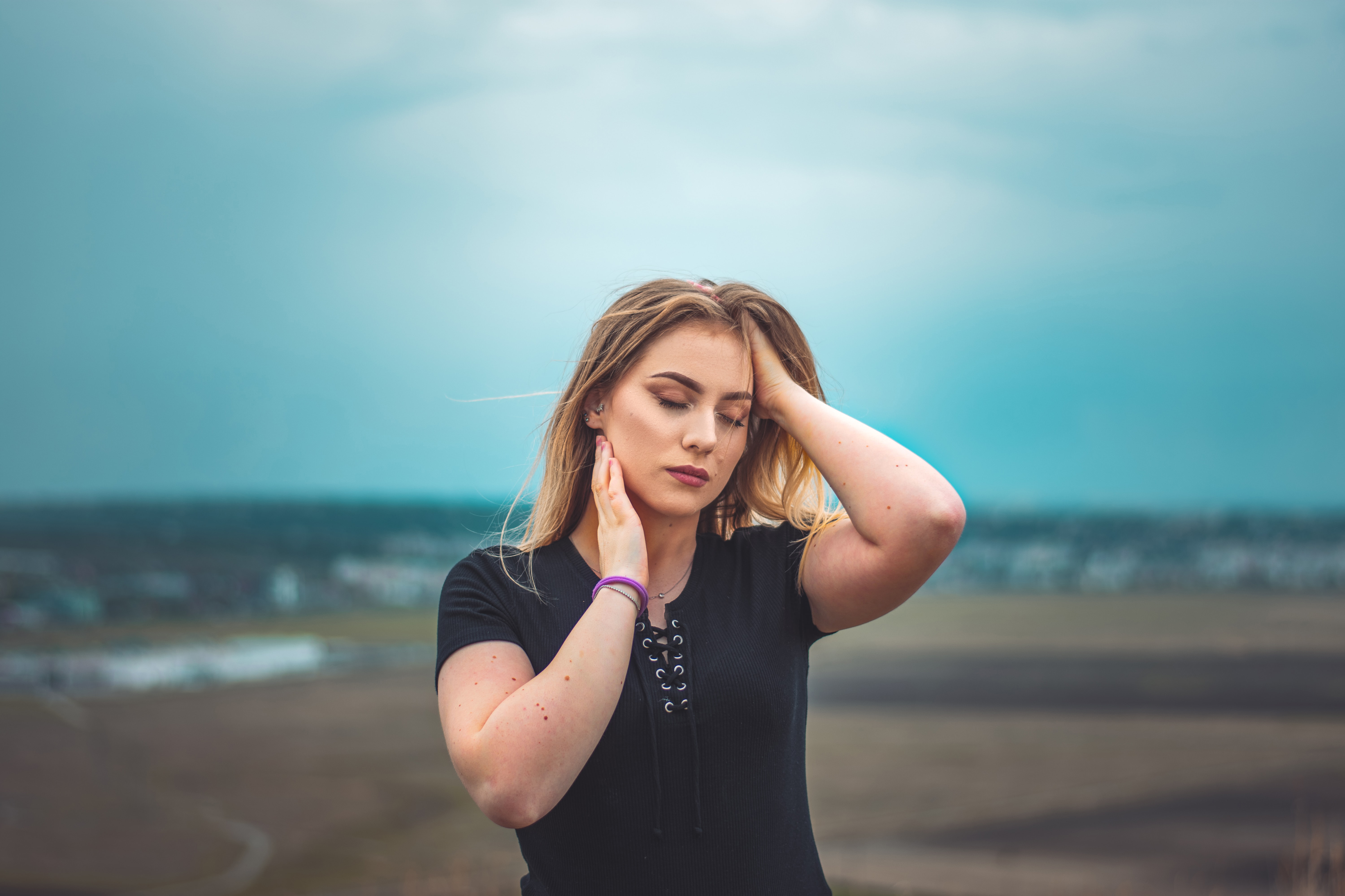
BEFORE
Pro Color Grading Made Easy!
What are Gradient Maps?
Gradient Maps are just one of the many useful Adjustment Layers that Photoshop offers. Adjustment Layers are powerful, not only because they allows us to precisely adjust things like color and exposure, but because they’re also 100% non-destructive. That means we can use as many Adjustment Layers as we want while editing, then adjust, disable, or delete them at any time without damaging the original image.
If you’ve watched PHLEARN before, you’ve probably heard use rave about how great Adjustment Layers like Curves and Levels are. While Curves and Levels are very powerful for both color grading and exposure changes, sometimes there’s an easier and more effective way to get the job done. This is especially true for those moments when you just want to apply professional-grade coloring as fast as possible. This is where Gradient Maps shine!
Gradient Maps allow us to assign the colors of a gradient to the highlights, midtones, and shadows of an image.
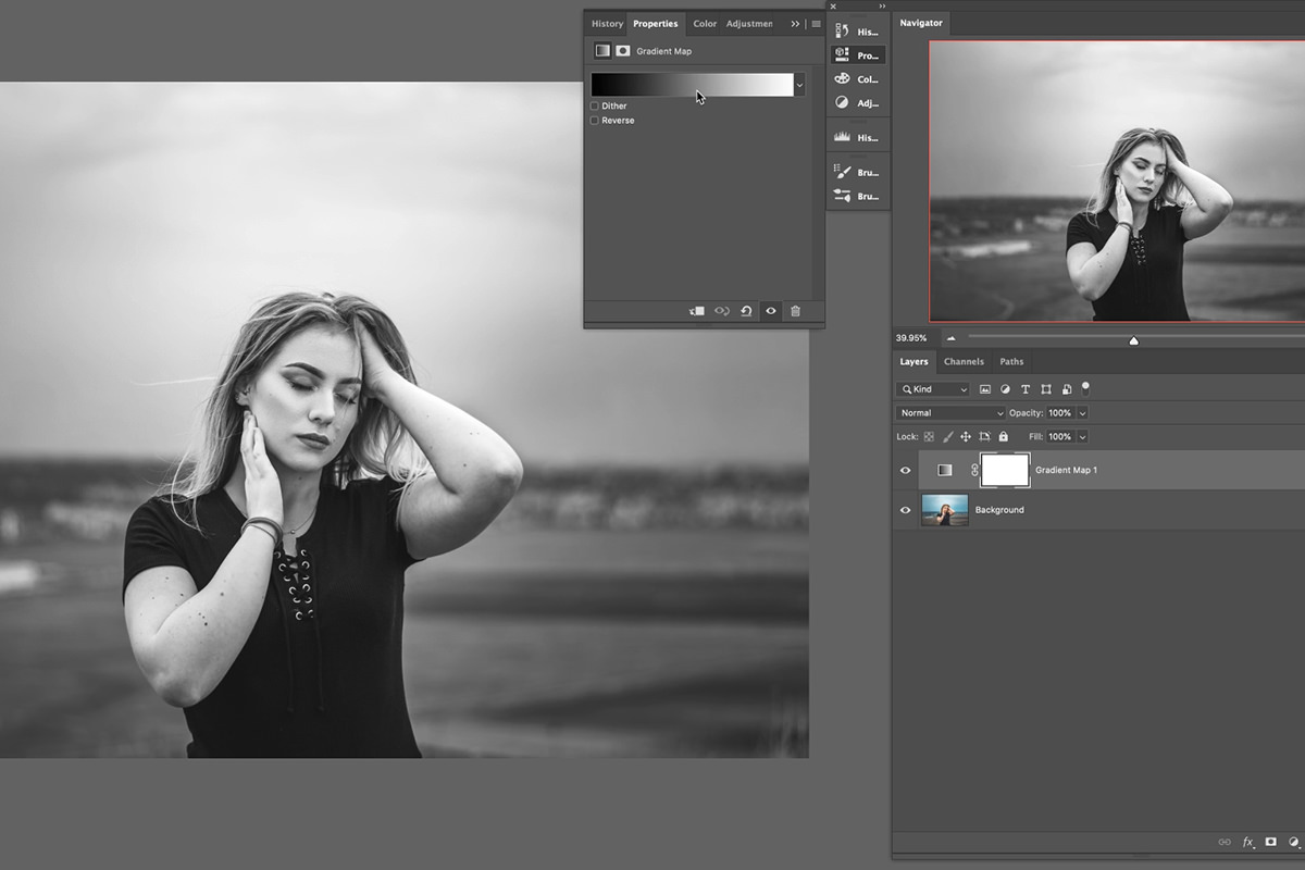
When you first create a Gradient Map Adjustment Layer, you’ll notice that it converts your photo to black and white. Now, you can use Gradient Maps to change an image into black and white (among other tools), but that’s not how we want to use them today. We need some color! Let’s take a look at why the image changed to monochrome and how we can add a splash of color.
How to Use Gradient Maps
The heart of working with Gradient Maps is in the Gradient Editor, which you can open by double-clicking on the gradient bar in the Gradient Map properties window. Looking at the default gradient will explain why our image is now in black and white. A Gradient Map will assign color to the highlights midtones and shadows of a photo. By default, the gradient is set to convert the shadows to black, the highlights to white, and the midtones will be converted to various shades of gray depending on their lightness.
So how do we get color?
The Gradient Editor allows us to do a number of things. We can choose a premade gradient (either one of the many offered with Photoshop or the custom PHLEARN gradients available in the download of this tutorial), we can create our own custom gradient using the tool at the bottom, or we can combine the two options, choosing a premade gradient and then adjusting it to our taste. Let’s take a closer look at how to create and customize gradients.
The Gradient Editor & Color Picker
Select a gradient with some color. We recommend one of our custom PHLEARN gradients since they’re made with portraits in mind, but any will do. Here we’ve selected PH Color Tone 04:
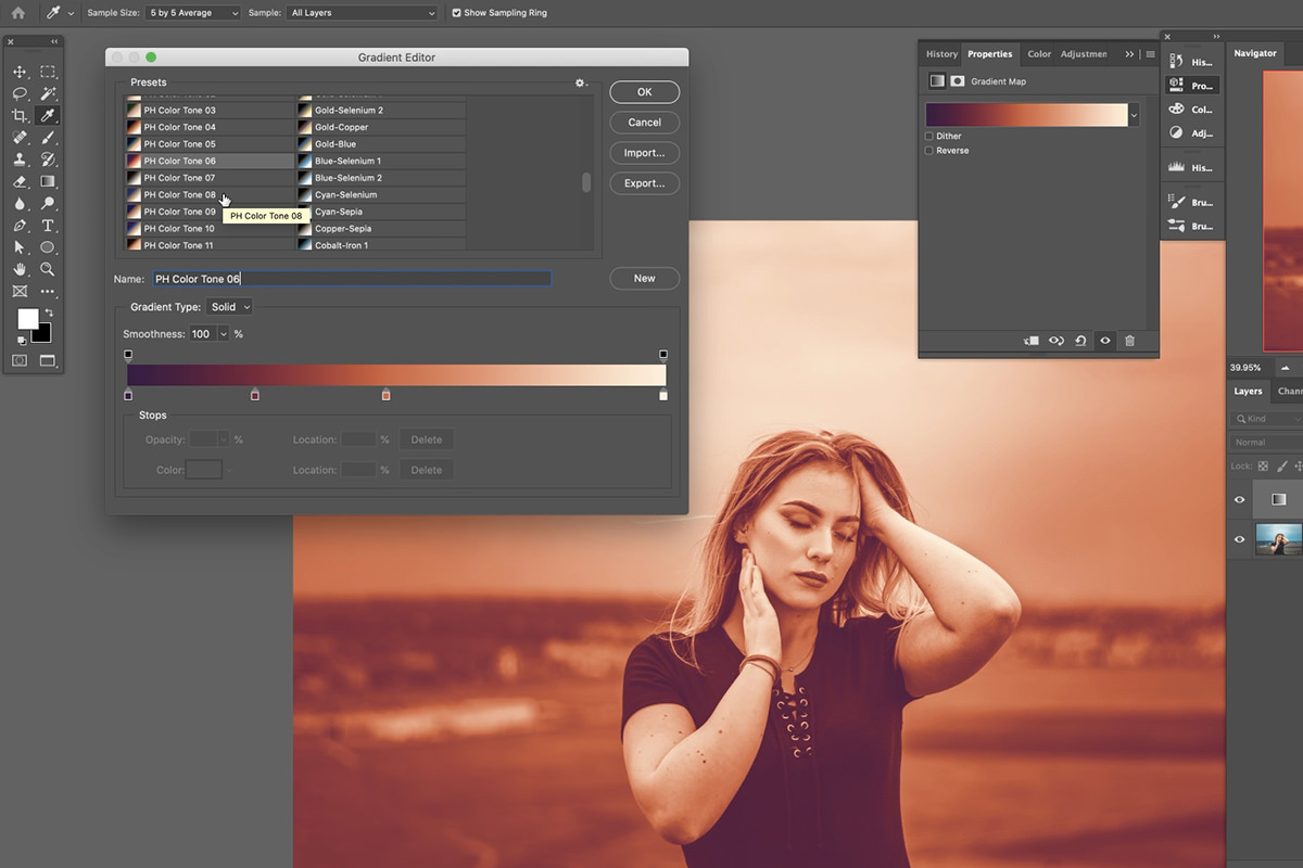
This gradient is applying dark purples into the shadows, rich shades of copper and rust into the midtones, and creamy yellows into the highlights. Notice that there are additional markers along the gradient as well! The magic of gradients is that you can add any number of colors that you want!
Now let’s try making our own gradient.
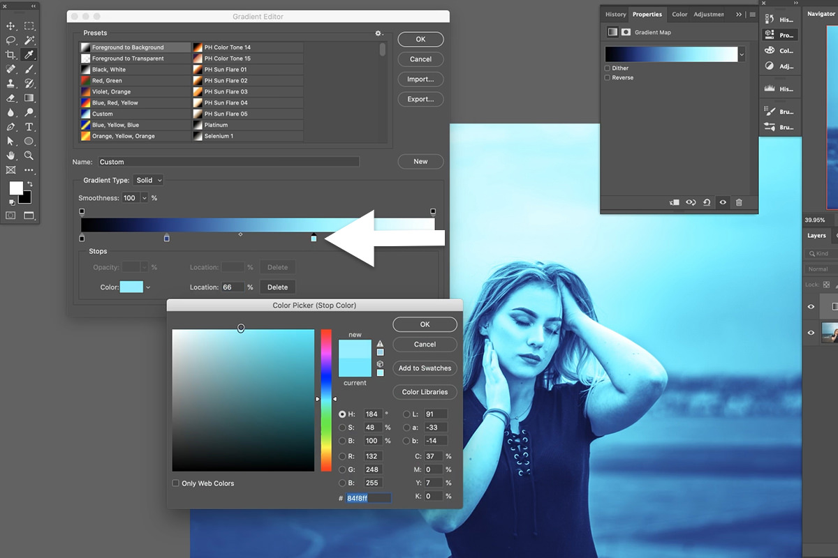
Select one of the default gradients and then click the leftmost marker near the shadows of the gradient bar below. The Color Picker window will open, allowing you to select any color you want to assign to the darks of the image. Choose a dark blue, and then continue adding a couple more colors to the gradient. Keep in mind this important tip: if you want realistic results, colors should progress from darkest to lightest going from left to right along the gradient bar. So if you’re choosing a color for the brightest highlights, keep the color bright (near white). If you’re choosing midtones that are brighter and more near the right side of the bar, choose a lightness that matches.
In our example, we added various shades of blue that get progressively brighter towards the highlights.
So now we know how Gradient Maps work, but the effect is way over the top. You could use this effect if you want an image that’s heavily colored and stylized, but how can we make this more subtle?
Coloring Your Photos
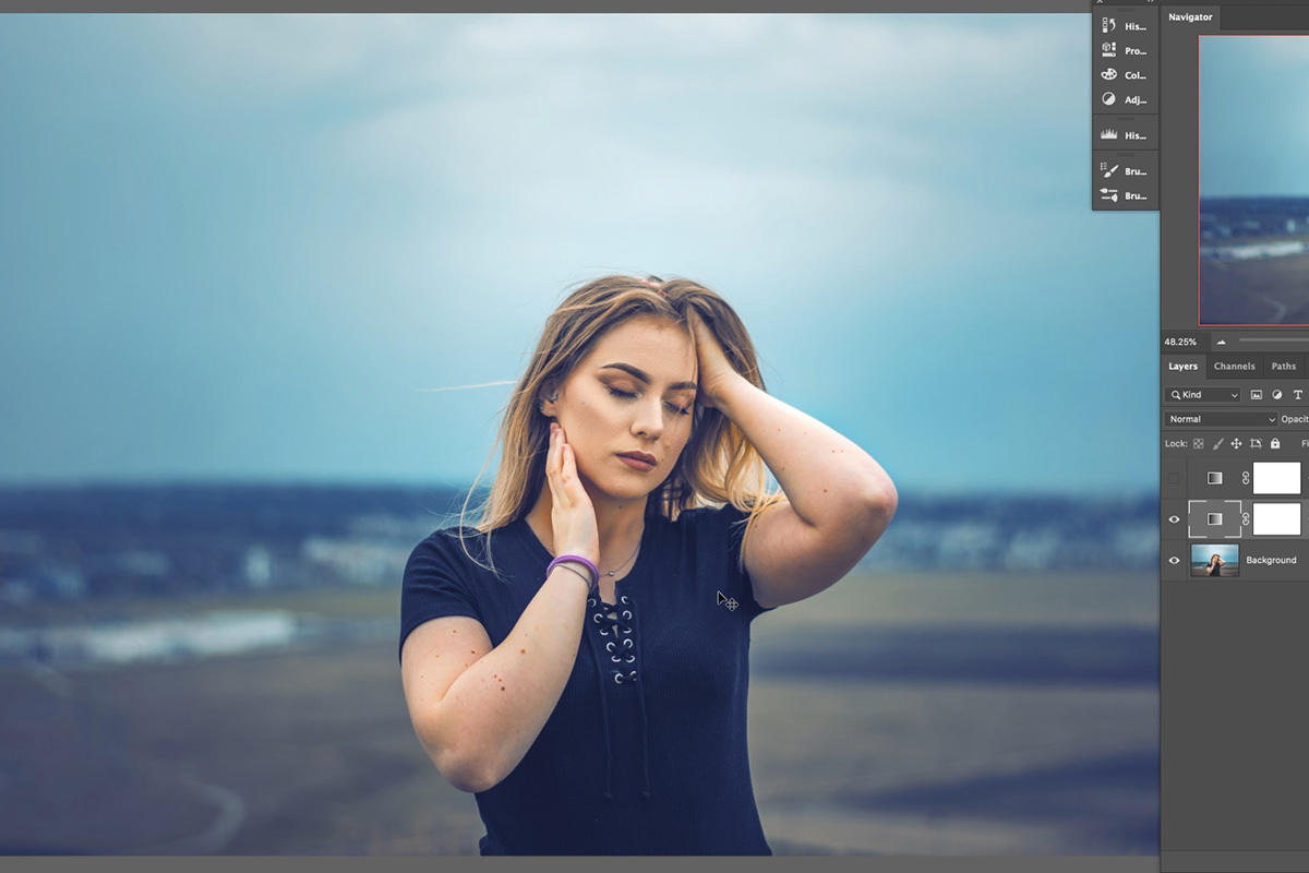
The key to great coloring is preserving the natural tones and character of an image. We don’t want to completely transform a photo, we just want to make some subtle shifts to the colors to help express a particular tone or mood. This is a coastal portrait, so blues and cyans work well at giving it more of a seaside feel. Let’s take a look at a couple of methods to help blend our new Gradient Map into the image.
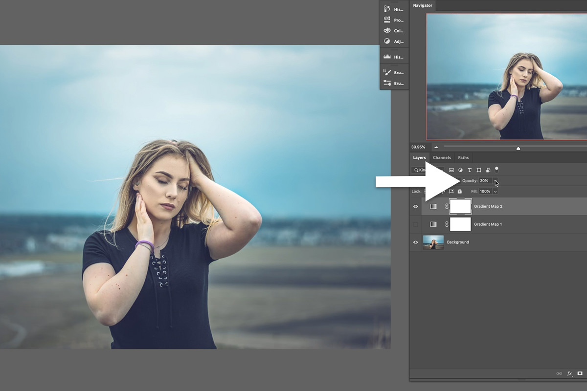
Blending with Opacity
The tried and true method of blending in Photoshop is just simply lowering the opacity. Select the Gradient Map layer, locate the Opacity box above the Layers Panel, and dial it down to your taste.
Easy, right? Well, we’re not done yet. This is great, but another key thing to keep in mind when color toning is protecting and preserving the natural skin tones of any people in the photograph. You certainly can apply coloring to skin, but colors like greens and blues can make skin look unnatural and create an unflattering effect.
Fortunately, Photoshop makes it easy to target skin tones separately so our subjects always look their best!
Blending with Blend If
Blend If is a powerhouse. If this is your first time using it, we recommend checking out this free tutorial that breaks down the basics. Blend If gives us the ability to affect where a Layer appears in any underlying Layers. To access Blend If, click on the Layer Style (fx)) icon below the Layers Panel and select Blending Options. You’ll find the Blend If sliders in the bottom box of the Blending Options dialog.
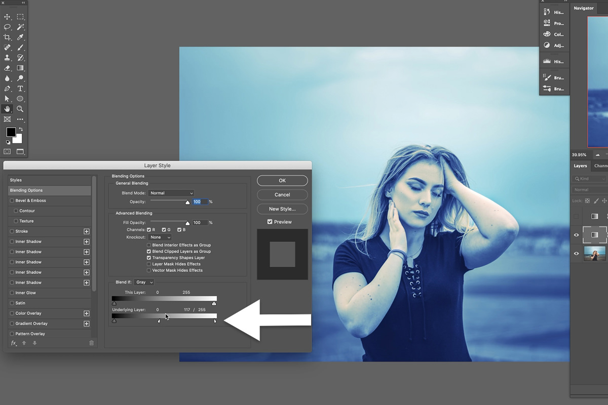
For our purposes today we’ll be focusing on the Underlying Layer slider, which will help us blend the Gradient Map Adjustment Layer into the image below it. By default, Blend If works based off of luminosity levels, allowing us to target and blend the Gradient Map into the highlights or shadows of the image. To use Blend If, hold ALT or OPTN, click on either of the Underlying Layer Sliders, and then drag them along the bar to see the effect. Dragging from right to left will remove the active Layer from the highlights of image below. Left to right will remove the active Layer from the shadows.
So if we didn’t want the Gradient Map to appear in the highlights of photograph, we would split rightmost slider and drag it to the left. This removes the color from the highlights while feathering the effect so that it blends more naturally.
Great! Well, sort of. Again, this is only letting us affect visibility based off of highlight and shadow information–if we need to target skin tones, we’ll need another way.
Protecting Skin Tones
All human skin tones are mixture of reds and oranges. Knowing that, whenever you need to target (or avoid) the skin tones in a photo, you should look to the Red Color Channel for some help. Blend If allows us to select Color Channels for blending using the drop-down box next to the Blend If title.
Click on the drop-down box and select the Red Channel. You’ll notice the colors of the sliders will change to reflect the color channel we’ve selected.
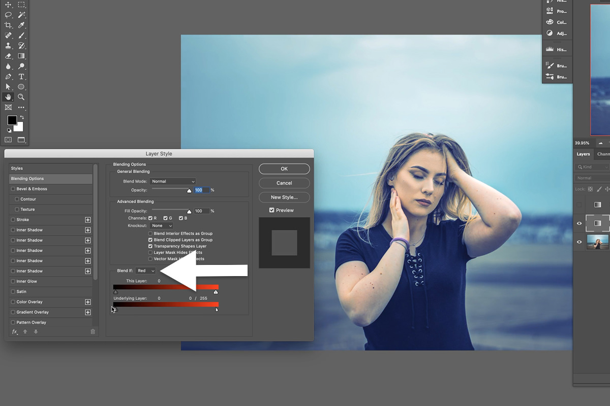
Now hold ALT or OPTN, click on the rightmost slider to split it, and drag it left towards the middle of the bar. This will start to remove the colors from the Gradient Map from the reds in the image. As you adjust the slider, watch the image while paying close attention to the skin tones. You should see them shift from the blues and cyans of our coloring, back to a normal healthy red!
Gradient Maps have all the qualities of a great Photoshop tool. They’re fun and easy to use, allow for a high degree of precision, are non-destructive, and provide a seamless, professional result. We hope this opens up a whole new world of color grading for you and your work!
If you want to learn even more, take the next step with our most popular PRO course on lighting and coloring: Advanced Lighting & Coloring in Photoshop.