
Download Sample Images
Download Assets
Downloads are free with a PHLEARN account.
- Download the sample images and PSDs from every free tutorial on PHLEARN
- New free tutorials published every week
- One free account — sign up once, then download anything
description
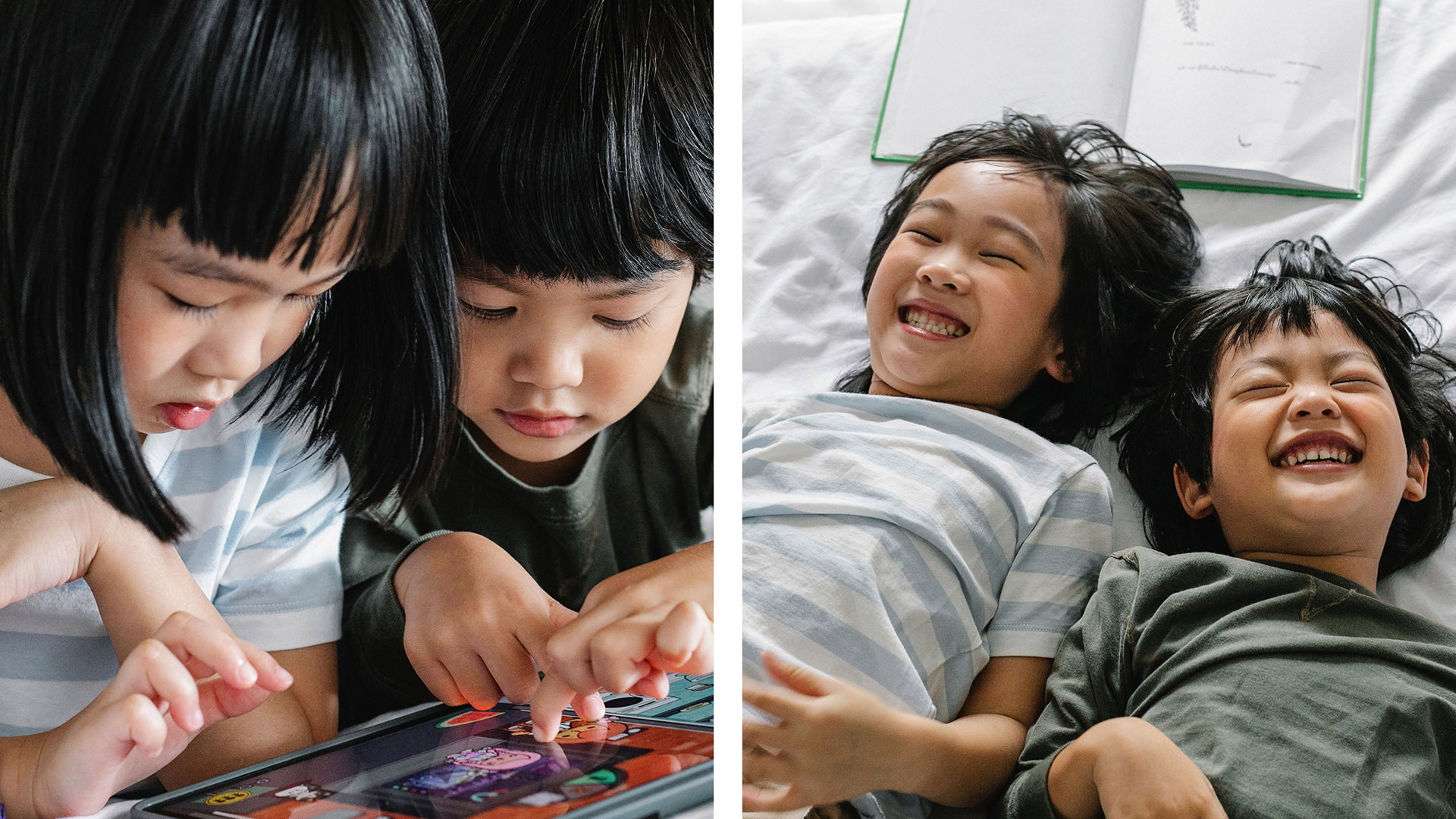
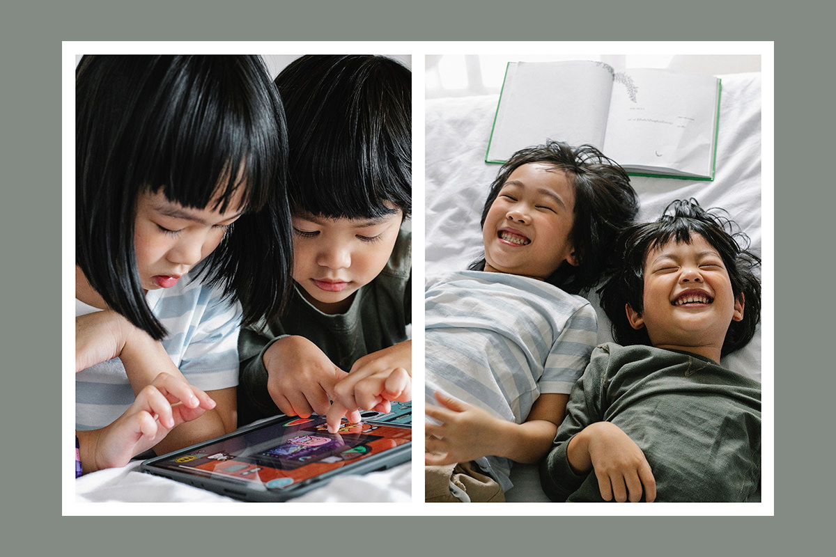
Capturing and editing photos is one thing, but figuring out how to put them together and display them can be a fun project all its own. Learn how to create a quick and easy diptych-style photo collage in Photoshop!
And if you don’t want to go through the process of making a template from scratch, just download the free sample PSD and just add your own images.
Enjoying This Free Tutorial?
We publish a new free tutorial every week, each one with sample images and PSDs you can download and follow along with. Sign up and they land straight in your inbox, along with early word on sales, events and subscriber-only offers.
CREATE AN EASY PHOTO COLLAGE
Two Photographs, One Frame, and a Template You Keep
A diptych is two images presented as a single piece — a format that goes back centuries in painting and works because the pair says something neither photograph manages alone.
Building one in Photoshop takes three steps and about five minutes. More usefully, what you end up with is a reusable template: once the borders and masks exist, swapping in a new pair takes seconds.
Choose Two Photographs That Belong Together
Worth getting right before you open Photoshop, because the format only works when the pairing does.
Look for images that tell one story between them — two frames from the same session, a wide shot and a detail, two moments a few seconds apart. Consistent lighting and color matter, since the two sit inches from each other and any mismatch in white balance or exposure is glaring.
What generally doesn’t work is two unrelated favourites. Without a connection the viewer reads them as two photographs that happen to share a border, and the format adds nothing.
Step One: The Center Divider
-
Bring both images into one document
Move tool, drag from one document tab to the other.
-
Create a new layer and draw a vertical bar
Rectangular Marquee, roughly down the middle. Position doesn’t matter yet.
-
Fill it with white
Edit › Fill › White.
-
Center it exactly
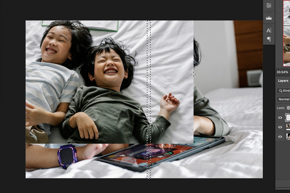
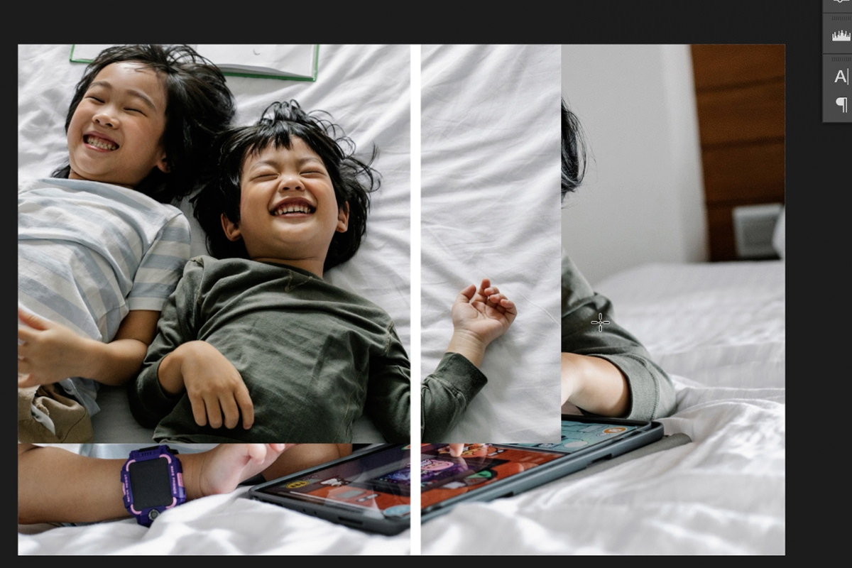
Press Cmd/Ctrl + A to select the whole canvas, take the Move tool, and click Align Horizontal Centers in the options bar. The bar snaps to the exact center of the document.
That alignment trick is the useful part and it works far beyond this: select the whole canvas first and the align buttons align to the document rather than to other layers. No guessing, no rulers, no nudging with arrow keys.
It also means the divider is genuinely centered, which matters here more than almost anywhere — the eye detects an off-center split in a symmetrical layout immediately.
Step Two: The Outer Border
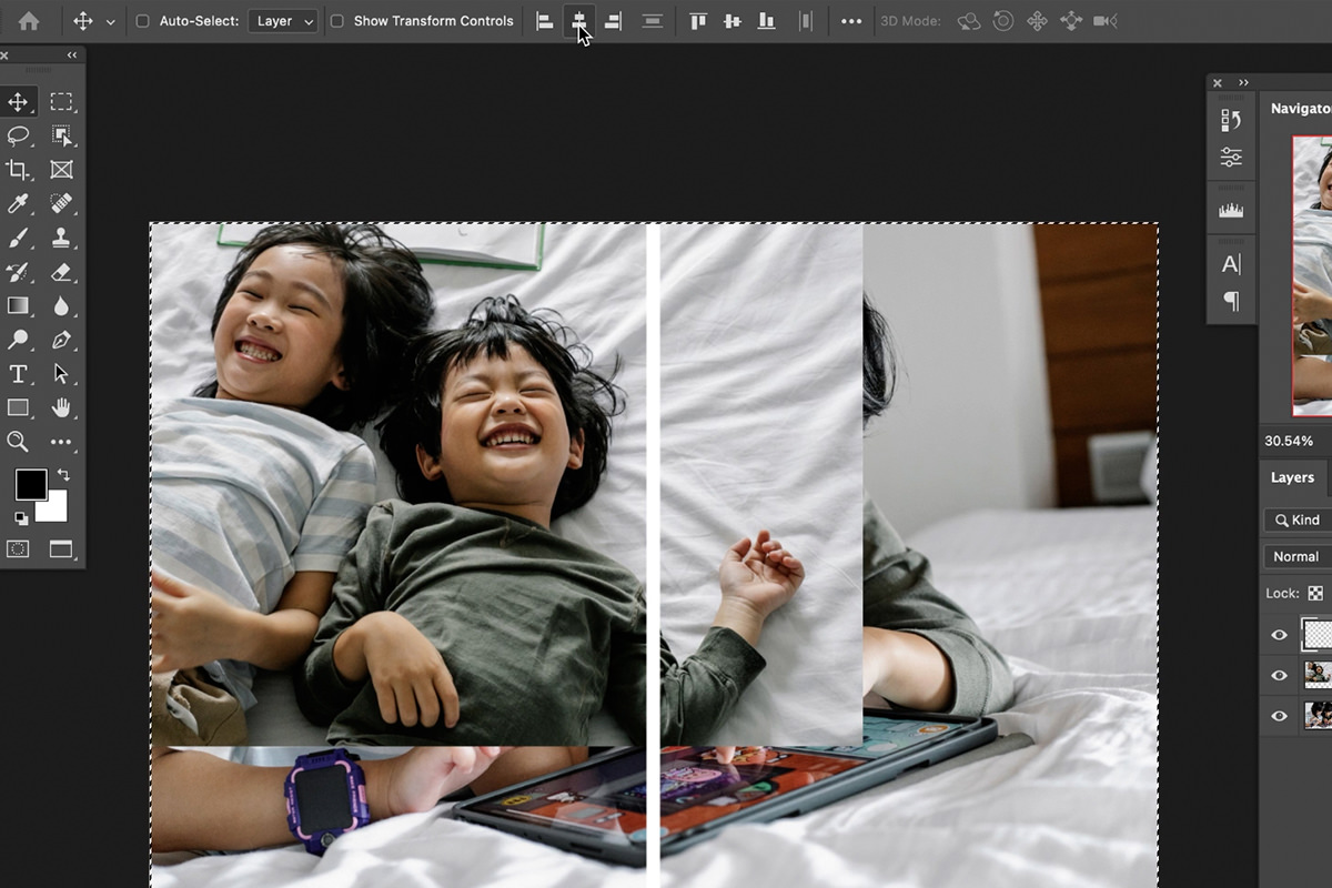
The frame around the outside is made by selecting the inside and inverting.
-
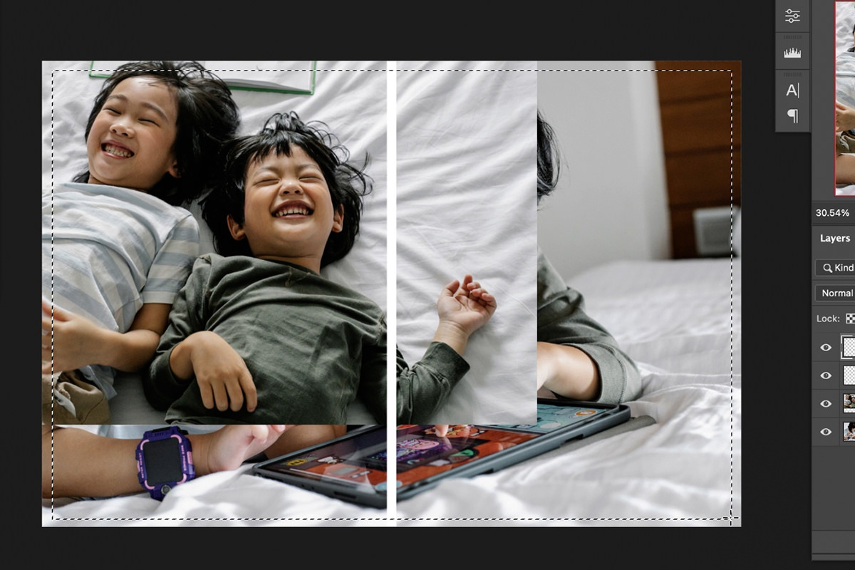
New layer, and marquee the inner area
Draw a rectangle a little inside the document edges. The gap you leave becomes the border width.
-
Select › Inverse
Now everything outside that rectangle is selected — the border itself.
-
Fill with white
Edit › Fill › White.
Selecting the easy shape and inverting is consistently faster than trying to draw a frame directly, and it’s a habit worth having: whenever a shape is awkward to select, select its opposite and invert.
Keep the outer border and the center divider roughly the same width. Unequal gaps look like a mistake rather than a decision.
Step Three: Mask Each Photo Into Its Half
-
Position the first image roughly where you want it
It will overspill into the other half. That’s fine.
-
Marquee its half of the frame
Select the area it should occupy.
-
With that layer selected, click the layer mask icon
The selection becomes a mask and the photo is confined to its half.
-
Unlock the background layer for the second image
Double-click the Background layer to convert it to a normal layer, then move it into the left half and mask it the same way.
Unlink the Mask to Compose Inside the Frame
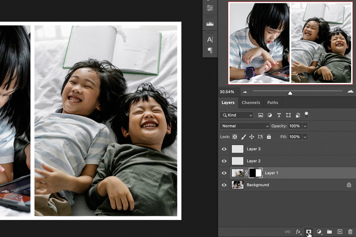
Try to reposition a photo now and its mask travels with it, so the whole panel slides. Not what you want.
Click the small chain link icon between the layer thumbnail and the mask thumbnail. With them unlinked, selecting the image thumbnail lets you move and scale the photograph while the frame stays exactly where it is.
Now you can compose within each panel like cropping through a window — Cmd/Ctrl + T to scale in on a face, Move tool to slide the framing. This is what turns a rigid template into something you actually design in, and the same trick applies anywhere you mask a photo into a shape.
Save It as a Template
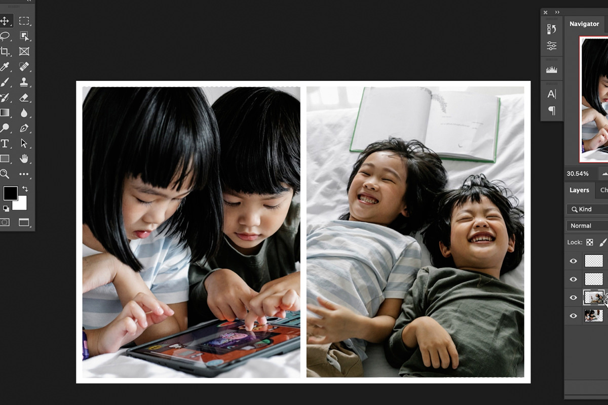
Save the layered PSD before you flatten anything. The divider, the border and both masks are all reusable.
Next time, open it, drag two new photographs in, mask them into the existing halves and compose. A layout that took five minutes to build takes under a minute to reuse — and every diptych you make shares the same proportions, which starts to read as a consistent style rather than a one-off.
The layout isn’t fixed to two vertical panels either. The same three steps produce horizontal splits, three-panel triptychs or a grid — only the shapes you fill and mask change.
Where Diptychs Go Wrong
An off-center divider
Select the whole canvas first, then use the align buttons. Judging it by eye never quite works.
Mismatched borders
The center gap and the outer frame should be the same weight. Unequal spacing reads as an error.
Forgetting to unlink the mask
Move the photo and the panel goes with it. One click on the chain icon.
Pairing unrelated images
Two good photographs that share no story make a worse diptych than two ordinary ones that do.
Inconsistent color between the two
Side by side, a white balance difference is unmissable. Match them before you combine them.
Resizing without a Smart Object
Convert each photo to a Smart Object first and you can scale it repeatedly with no loss of quality.
More Free Photo Editing Tutorials
If this was useful, these go further in the same direction:
- How to Create a Composite in Photoshop — building the layered file first.
- Compositing Highlights, Shadows and Reflections — making an added element sit in the scene.
- How to Use the Select and Mask Workspace — cleaner cut-outs, which compositing depends on.
- How to Create and Use Layer Masks — confining an effect to exactly where it belongs.
- How to Make Realistic Shadows in Photoshop — the shadow that anchors an object.
- How to Use Select Subject in Photoshop — the selection engine behind most cut-outs.
More Free Photoshop Tutorials
- How to Create a Holiday Card in Photoshop — the same masked-frame approach on a full layout.
- How to Use Layer Masks in Photoshop — masks properly explained.
- How to Match Color Between Photos — making a pair agree before you frame them.
- Cut a Person Out for a Thumbnail — masks and borders for graphics.
Let the Pair Do the Work
The technique here is genuinely simple — three fills, two masks and an alignment click. What makes a diptych worth making is the editing decision in front of it: which two frames, placed together, say more than either does alone.
Go back through a recent shoot looking specifically for pairs rather than single best shots. It’s a different way of reading your own work, and it tends to surface images you’d otherwise have passed over.
Related Tutorials
New Free Tutorials View All »




Enjoying This Free Tutorial? Go Further with PRO.
200+ PRO courses. 1,000+ practice files. One membership.

Unlimited access to every PRO course
New PRO courses every month
Layered PSDs and RAW files to follow along
100+ Lightroom Presets, LUTs, Actions and Brushes
Stream in up to 4K, with captions and chapters
Watch on any device: desktop, tablet or phone
4.93 average from 3,900+ reviews · 2M+ students