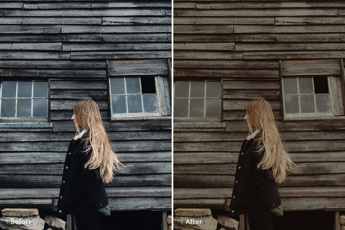

Download Sample Images
description
Maybe you discovered a photo with beautiful coloring that you want to try on your images. Or maybe you’re building a website and want to keep the color and style consistent across every photo. If you’ve been looking for a reliable way to match the color between different images, then this is the tutorial for you!
Learn how to use Photoshop to analyze the light and color information between two images, and then use that information to color grade your photos for a perfect match.
Color toning is one of the most fun and expressive parts of image making. Explore the principles of color theory and how to apply them in Photoshop with How to Master Color & Tone. And if you’re just looking for some coloring inspiration, try perfecting a particular style like Dark & Moody Coloring.
Enjoying This Free Tutorial?
We publish a new free tutorial every week, each one with sample images and PSDs you can download and follow along with. Sign up and they land straight in your inbox, along with early word on sales, events and subscriber-only offers.

Steal Any Photo’s Colour Grade, One Channel at a Time
You find an image online with a colour treatment you love and you want your own photograph to feel the same way. Photoshop has no button for that — and honestly, that’s a good thing, because the manual approach gives you far more control and works on any pair of images rather than just the flattering ones.
The technique comes down to one idea: a colour grade is really a set of decisions about where the highlights, midtones and shadows sit — in each colour channel separately. Read those off your reference, replicate them on your photo with a single Levels adjustment, and the match is done.

Start with a Reference Photo
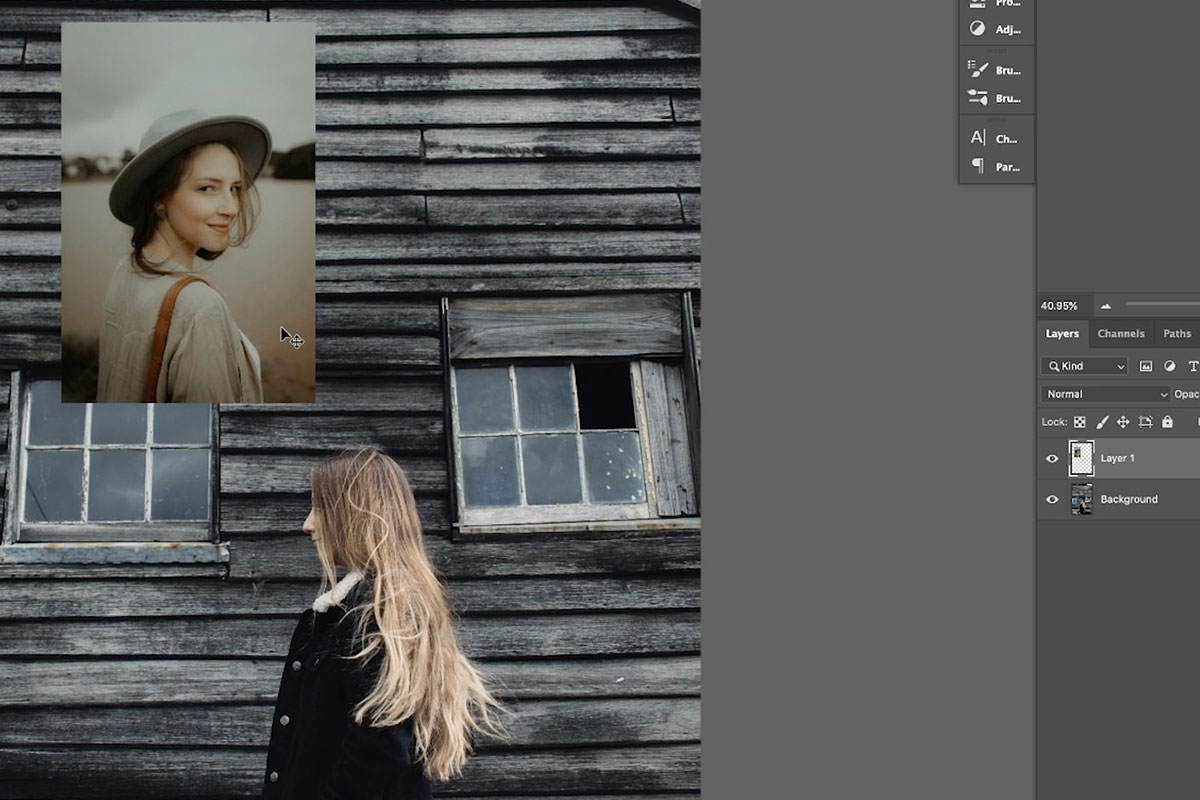
Get both images into one document so you can compare them directly.
-
Drag the reference onto your photo
With both open, grab the Move tool and drag from one document tab to the other. The reference lands as a new layer.
-
Scale it down
Cmd/Ctrl + T, shrink it so it sits in a corner without covering your image, and press Enter. You only need to see it, not work on it.
-
Name the layer
Call it “colour tone” or similar. You’ll be toggling it on and off repeatedly and the layer order matters in a moment.
The First Rule of Colour Matching: Remove the Colour
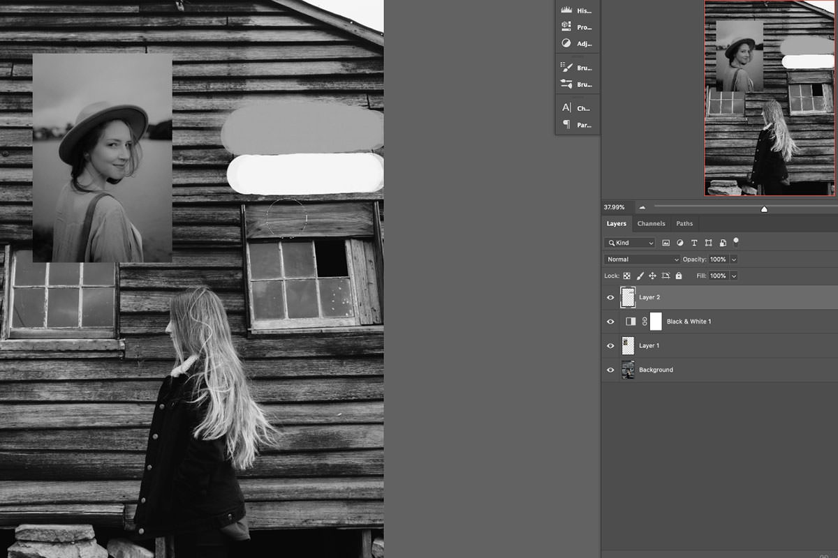
This sounds backwards and it’s the single most useful idea in the whole technique. Add a Black & White adjustment layer above everything.
Colour is distracting. With it stripped away you can see plainly where the two images actually differ in brightness — and brightness is what you have to fix first, because no amount of colour work will make a bright photo sit next to a moody one.
Comparing highlights and shadows
Look at the brightest area of each image — usually the sky. In the example the reference sky reads as a mid grey, while the photo’s sky and the subject’s collar are close to pure white. That’s the diagnosis: the highlights need to come down.
Then compare the darkest areas. In this pair the shadows are already similar, which means the blacks need almost nothing. Knowing what not to touch is half the job.
Sampling with the Brush tool
Eyeballing greys is unreliable. Add a blank layer, press B for the Brush, then hold Alt/Option to eyedropper a value straight from the reference, and again from your photo. Painting the two swatches side by side shows you the real difference rather than the one your eye invents. Delete the layer once you’ve read it.
Next-Level Levels
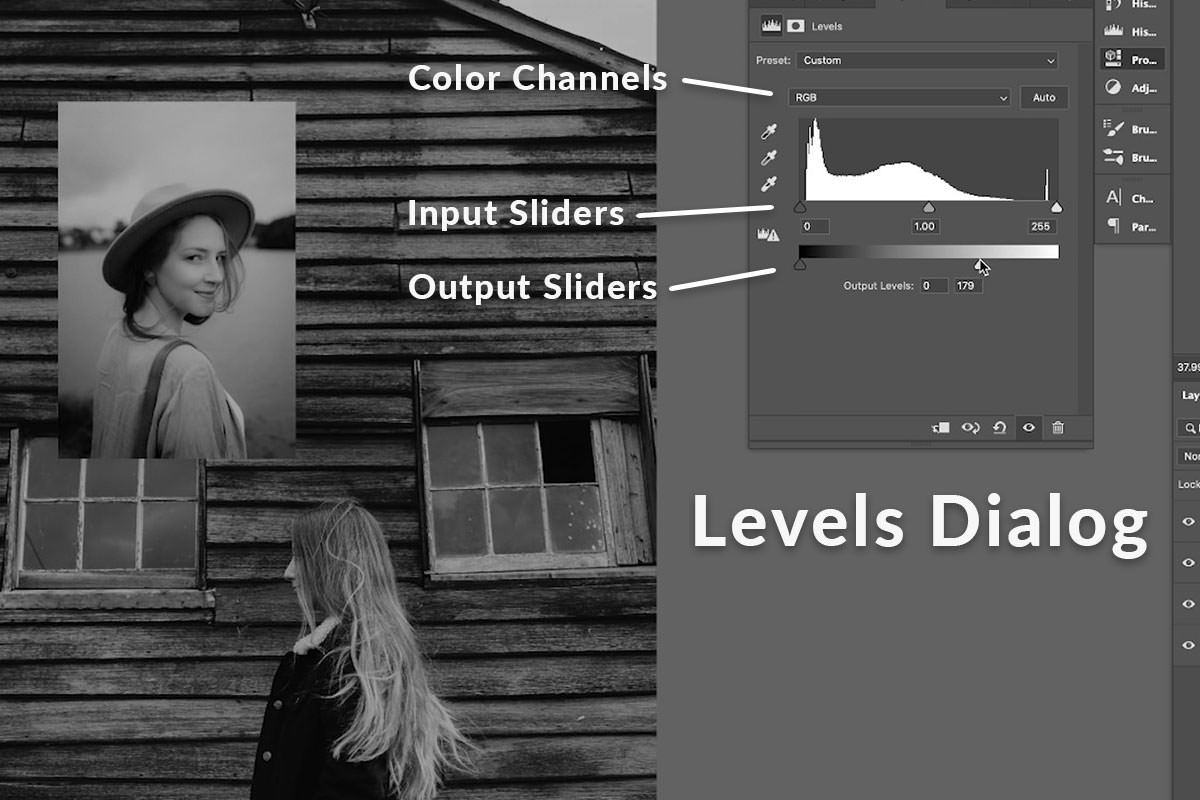
Add a Levels adjustment layer — and put it below your reference layer. That way it affects only your photograph, leaving the reference untouched as a control.
Breaking down the Levels dialog
Levels has two sliders that do different jobs, and the second is the one people skip:
- Input levels (the top slider, under the histogram) sets the black point, midpoint and white point — it expands contrast.
- Output levels (the bottom slider) limits how dark the darks and how bright the brights are allowed to go — it compresses contrast.
Matching a faded or filmic reference is almost always an Output levels job. Pulling the right-hand Output handle inward caps the highlights, which is exactly the “make the brights darker” change the black and white comparison called for.
Matching the lighting first
With the Black & White layer still on, bring the highlights down until the two skies read as the same grey. The midtones will sag as you do — pull the input midpoint left to bring them back up. Toggle the adjustment off and on and the improvement is obvious even before any colour work.
Note roughly where you left the highlight and midtone handles. You’re about to reproduce those same moves in each colour channel.
Dial In the Colour, Channel by Channel
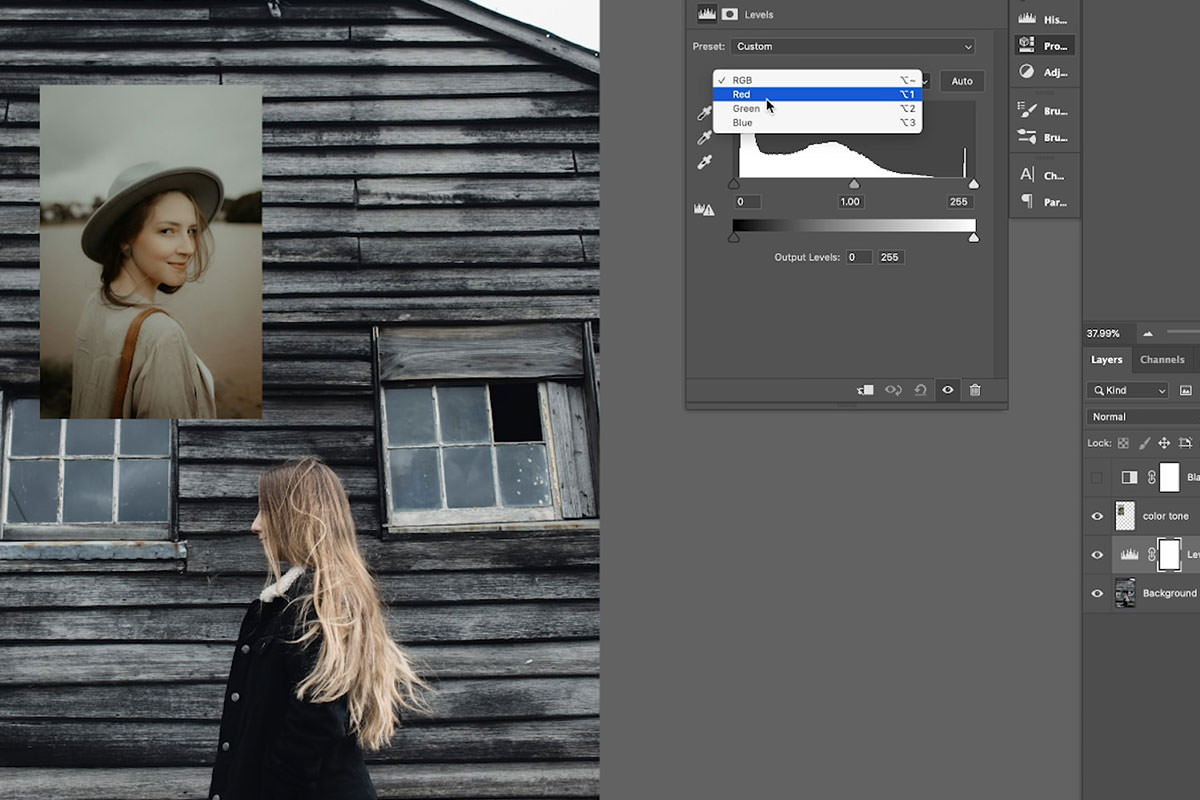
Now turn the Black & White layer off and reset the Levels adjustment back to default. You’re going to make the same two moves again — highlights down, midtones up — but inside the Red, Green and Blue channels individually. That’s what produces colour rather than just brightness.
-
Switch the Levels channel dropdown to Red
At the top of the Properties panel. Every slider now affects only red.
-
Bring the red highlights down
The same Output move you made in black and white, applied to one channel. Less red in the highlights means cooler brights.
-
Repeat on Green, then Blue
It will look wrong partway through — that’s expected. The three channels only balance once all three have moved.
-
Judge blue against yellow
The blue channel is the most sensitive: a nudge right goes blue, a nudge left goes yellow. Small movements.
-
Now lift the midtones per channel
Back through Red, Green and Blue, pulling each input midpoint left. This is where the reference’s warmth or coolness in the mid-range gets reproduced.
-
Cycle round again and fine-tune
Compare the skies directly, then the skin, then the shadows, adjusting whichever channel is furthest off. Two or three passes and it locks in.
If the theory behind adjustment layers is new, How to Master Adjustment Layers in Photoshop is worth reading first, and Adobe’s own Levels adjustment documentation covers every control in the dialog.
A Colour Match Made in Heaven
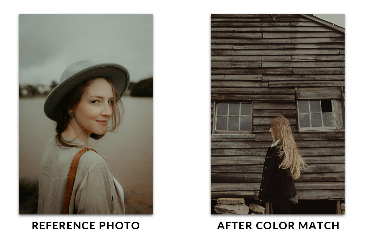
Toggle the Levels layer off and on. The before doesn’t look remotely like the reference; the after looks like the same photographer shot and graded both. Then hide the reference layer and you’re finished.
That’s the real test of a colour match — not whether the numbers agree, but whether the two images could sit next to each other in a portfolio without anything looking out of place.
Why This Beats the Automatic Options
Photoshop does have a Match Color command under Image › Adjustments, and it works occasionally. The reason it isn’t used here is that it makes a single global guess and gives you almost nothing to steer with — three sliders and no channel access. When it lands, it lands; when it doesn’t, there is nowhere to go.
The Levels approach takes a few minutes longer and gives you six independent controls (highlights and midtones across three channels) plus a diagnostic step that tells you what to change before you change it. It also works on any pair of images rather than only on pairs that happen to be similar to begin with.
There’s a broader principle here worth carrying into other work: an automatic tool that can’t be steered is only useful when it happens to be right. Manual techniques that expose their controls stay useful on the difficult cases, which are the ones where you actually need help.
Reading a Histogram While You Work
Levels shows a histogram, and it’s worth glancing at rather than ignoring.
A photograph whose histogram is bunched into the right-hand third is a bright, low-contrast image; one pushed left is dark. When you’re matching a reference, comparing the two histograms tells you at a glance whether you’re being asked to compress the tonal range, expand it, or shift it wholesale.
Two things to watch for as you drag: gaps appearing in the histogram mean you’re stretching the data thin and risking banding in smooth areas like skies, and spikes hard against either end mean you’ve clipped detail to pure black or pure white. Neither is fatal on an 8-bit web image, but both are reasons to make a smaller move.
Making the Match Reusable
Once a match is working, the Levels adjustment layer is a portable object. Drag it from the Layers panel onto another open document and it applies there too — useful when several frames from the same shoot all need pulling toward the same reference.
Because it’s an adjustment layer, its opacity also works as a strength control. If a match feels a fraction too aggressive, dropping the layer to 80% is a faster fix than re-tuning six channel handles, and often looks better than a perfect numerical match.
And should the grade need to apply to only part of the frame — a subject that should stay neutral while the background shifts — the layer already has a mask. Paint black over anything the match shouldn’t touch.
Working in 16-Bit Where You Can
Colour matching pushes tonal data around fairly aggressively, and how much room you have to do that depends on the file’s bit depth.
An 8-bit image has 256 levels per channel. Compress the highlights, lift the midtones and shift three channels independently, and you can genuinely run out of levels — which shows up as banding in skies and smooth gradients. A 16-bit file has thousands of levels per channel and simply absorbs the same moves without complaint.
If you’re matching a raw file, open it into Photoshop at 16 bits per channel and convert down to 8-bit only at export. It costs disk space and nothing else, and it’s the difference between a clean sky and a striped one.
Where Colour Matching Goes Wrong
Starting with colour instead of tone
The most common mistake by far. If the brightness relationship is wrong, no amount of channel work will save it. Black & White first, always.
Putting the Levels layer above the reference
Then it grades both images and you have nothing to compare against. It goes below the reference layer.
Working in RGB instead of individual channels
The composite RGB channel changes brightness, not colour. The grade lives in the separate Red, Green and Blue curves.
Moving the blue channel too far
Blue is the channel your eye is least forgiving about — the swing from natural to obviously tinted is small. Make smaller moves there than you think you need.
Chasing a reference with different light
A golden-hour reference will never fully map onto a flat overcast frame. Match what you can and accept that direction of light isn’t something Levels can fake.
More Free Colour Tutorials
If working with colour is where you want to spend your time, these go further:
- How to Master Adjustment Layers in Photoshop — the whole adjustment layer system, properly.
- Advanced Lighting & Coloring — building light and colour rather than just correcting it.
- Adjustments vs Adjustment Layers — why the non-destructive version is always the right choice.
- How to Color Grade in Photoshop Using Camera Raw — a different route to the same destination.
Read the Light Before the Colour
What makes this technique hold up on any pair of images is that it isn’t really a colour trick — it’s a diagnosis. Strip the colour, see where the tones actually differ, fix that, then reproduce the same corrections per channel.
Try it with a reference that’s nothing like your photo. You’ll find the analysis step tells you within seconds whether the match is achievable, which is worth knowing before you spend twenty minutes on it.




Enjoying This Free Tutorial? Go Further with PRO.
Unlock Full Sample Files, PSDs, and Hundreds of Masterclasses!

Download full project assets, original PSDs, and RAW images for every lesson
Unlimited access to our complete library of PRO Photoshop & Lightroom courses
Instant 4K Ultra HD streaming on all devices, anytime, anywhere
Full access to our entire library of Photoshop Actions, Presets, and LUTs
Flexible monthly and annual membership plans
Cancel anytime with zero hassle or commitments