Photoshop Hall of Famer Bert Monroy Shares “Insider” Secrets of the History of Photo Editing Software
Bert Monroy is a legend in the world of Photoshop. In fact, in 2004, he was inducted into the Photoshop Hall of Fame. He has been absorbed in the world of digital art since MacPaint first arrived on the scene in 1984. Since then, he’s written books, lectured, and taught on all things related to photo creation software tools and visual art. He currently consults to clients including Disney Animation, Pixar, Adobe Systems, and Apple Computers.
Our interview with Bert covers a wide-range of topics, from the evolution of Photoshop as a software tool to how he approaches new creative projects. We hope you enjoy reading about what Bert has witnessed in the visual art industry over his lifetime, and which skills he’s seen remain invaluable throughout his career.
What is it about digital art that drew you in? And what has led you to dedicate so much of your career to developing the medium, as well as educating others in digital art forms?
Bert: Well, I went to the High School of Art and Design. That was my first formal training. I’ve always been an artist. I’ve been drawing since I was two years old, and I’ve always been fascinated with art. Then, I went into advertising, that was my job, and I was an illustrator for many years. And then, back in 1984, I had a small ad agency producing catalogs and my partner said we had to computerize and I said, “Fine, get your computer, but don’t expect me to be there entering data.” They told me there was a new computer coming up that I’d be able to do my layouts on. So, I kind of grudgingly went over to the computer store to see this thing and there was this little thing, “The Macintosh,” just sitting on a table there. So I looked at it, “This is pretty cool.” There were only two things, MacWrite and MacPaint. So, I opened up MacPaint.
I felt this is it, this is the future, this was the medium I’d been looking for because I had tried oils, watercolors, all kinds of stuff, but could never quite get the detail that I wanted. And I felt that this was it even though it was a little 9-inch screen and 72 ppi and black and white, I really felt that this was the future.
I was in that store every day. In fact, I was doing demos for people of MacPaint to sell more Macintoshes. As long as they let me sit there and play, I would pay them back by doing demos for people because I started to master MacPaint, it was such a simple thing. And when my machine came, that was it. I completely gave up the advertising industry, the catalog industry, and started a whole thing around the Mac.
Since the very beginning, even before you had the equipment yourself, you were already in teaching mode, mastering what you could and then passing on what you knew to anybody who would come in and benefit.
Bert: It was just so exciting. It was just so much fun, and yeah, it was great to show people, “Look at this cool thing that moves.” So, I became the art director of the “MacStreet Journal,” which was the
newsletter of the New York Mac users group. And so, we used to have these meetings, set up a graphics SIG, which was a special interest group that dealt with graphics. And I would bring in developers and show them the cool things that I just learned with MacPaint or MacDraw.
What have you witnessed, over the years, in Photoshop’s development? Specifically, were there certain add-ons that you found to be most helpful or impactful on your art and medium?
Bert: Well, they brought me down to Stanford University and put me in this room filled with cameras and a big mirror in front of me, and I knew that mirror was a two-way glass. And I didn’t know who was back there, but they put me in front of a Mac and they wanted to see my impression of what I was seeing. So, I sat down and I opened up Photoshop, it was an early version of three and the first thing I saw was layers. I said, “Wow, layers.” I saw it up in the menu. “Layers, what is this?” I remember the first question I asked was, “How come I can’t select two at the same time?” But it made such a big difference because before, yes, I was doing all kinds of visuals and composites for people, but you know, once you selected something and put it in place and de-selected it, it was there. I wanted to move it a little to the left or to the right or up, but you couldn’t. You’d move it and then you’d have to fill up the hole it left behind. So, the introduction of layers was one big thing that got me.
Version six was another one, which included layers styles. Layers styles took a lot of the grunt work out of doing a drop shadow – there was almost an entire chapter devoted to that in the first book of Photoshop, which I co-wrote. Back then, to create a drop shadow, you had to go in and create an alpha channel and then do a second alpha channel, position it where you wanted the shadow to appear and then subtract one from the other to create a mask that you would then use to make a selection and fill it with black at a certain percentage to get the shadow. Now, with drop shadow being in layer style, you can usually apply it, change it, move it around without actually affecting the art until… you know, you can change it any time. So that was a big thing.
The biggest thing was version seven. They brought me out to look at that, and it was this thing they were working on called the brush engine. When I saw it I said to the guys, “This is the coolest thing I’ve seen since PixelPaint,” and they all started laughing. It turns out that Jerry Harris, one of the two guys that wrote PixelPaint, wrote the brush engine. So you know, I got involved with that, and designing the interface, and some of my brushes that I designed are in the program, in fact, three of them are on the main screen. There’s a dune grass that’s a single blade, and then three little blades of grass, and then a maple leaf. Those are three of mine.
In what ways are you looking forward to Photoshop, or any other software tools that you use frequently use, to improve?
Bert: Adobe came out with a thing called Dimensions many years ago. It was a 3-D program. It was really basic. They took it off the market and they took the technology and folded it into Illustrator. So when they introduced 3-D into Photoshop, I said, “Didn’t you guys learn before?” The program was getting kind of convoluted. Photoshop is complicated enough without adding 3-D.
In fact, the entire 3-D team came here to my studio to talk about the future of it. At first I was against it, but they told me that it was necessary because people who have Photoshop are not going to go out and spend $8,000 on a 3-D program. So, they said introducing some basic stuff was something to help the user. It is development that is necessary in graphics, especially now with virtual reality. So, that’s an exciting new direction for Photoshop.
Shifting away from software tools, what soft skills do you view as indispensable to your work? Specifically, what skill sets did you see crossover from your work as an art director to when you began working in digital art? Are there universally helpful skillsets that have helped you in visual arts?
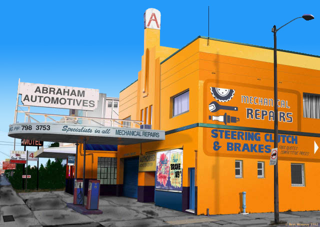
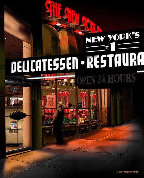
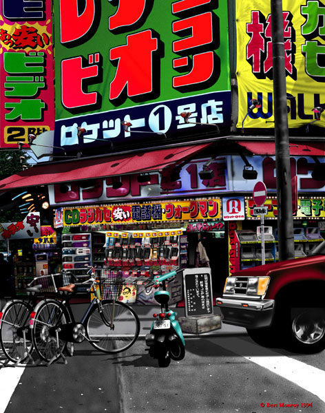
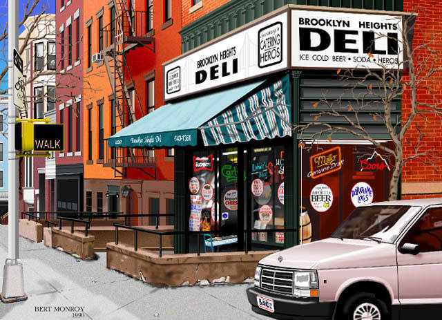
Bert: Well, right there, one word that you said, “visual.” I tell all my students that the most important thing is to see the world with your eyes open. It’s one of the reasons that I do what I do. I grew up in New York City; it’s a city filled with really cool, beautiful buildings and beautiful entrances and nice signs, but nobody looks at them. Everybody walks straight ahead, tunnel vision, going to where they’re going. Nobody ever looks. So, that’s what I do, I paint a place to force somebody to stop and look at it, to take the time to see all the things that make up this wonderful place.
And that’s what I think is most important for any visual artist, is to really hone their attentiveness to look at things. How is a shadow? Well, don’t just draw a shadow, how does a shadow work? How is that shadow gonna be affecting the environment it’s being cast on? How does it affect the colors? It’s really a question of seeing things before you create them. Because if you don’t have the shadow right or the reflection right, even somebody who’s not trained will look at it and say that it looks funny. It’s because, if you deviate from reality without really studying it, then you’re not going get a real image. It’s not going to be credible.
What I think is the most important is that people really take time to look at things and really study how something works.
In addition to paying very close attention, are there other habits that you exercise when beginning a creative project? Do you have any sort of rituals that you implement as you’re developing an idea?
Bert: Well, the thing is to first study what is the objective, what am I trying to say here? If it’s a commercial illustration, how is it going to best show this product? What is going to be the prime color? I was in advertising for many years, so there is a whole psychology on doing something for commercial purposes. The color has to be suggestive, everything has to lead the mind and lead the eye to see something and then convince the mind that it’s something that you want to have.
As far as my paintings, when I study and look at all the angles, I’m trying to see how I can make it better. My newest painting looks absolutely nothing like the photograph that inspired it. I wanted a more dramatic sunset. I wanted the sun just hitting the tops of the buildings so that it’d create these glows on the buildings down the street that would reflect where the sun was.
It’s a question of studying all your angles, working up the perspective and the proportions of things, so I sketch it all out. When I do a painting, what I do is I take the photograph, and various photographs of different details, I take notes because sometimes the camera can’t pick up everything.
And the third thing I do is I actually sketch the scene, because the camera will distort. Especially when you’re doing some kind of a panorama, it will distort. What I do is I take the photograph for the reference, but then I will sketch it the way the eye sees it. So, now I have two things to look at.One that has the detail, which is the photograph, and the other, which is the proportion and perspective of things the way the eye sees it without the distortion of the lens.
How do you react when you feel like your next move isn’t entirely clear?
Bert: Well, one thing is I’ll walk away from this for a little while. I’ll try to do something totally different. What I do is just let my mind go blank and just look at things, and somewhere in there I’m gonna find the answer. And that sometimes takes days, right? But I’ll just look through all kinds of magazines; I’ll look for something that’s gonna spark like a color or some kind of a material or something. And without even expecting it, all of a sudden, there it will be. It’ll be in front of me.
Is there a piece of art you’ve created which you view as having changed your life or how you approach your work?
Bert: Let me see. Yeah, there’s been a lot of those. Hopefully, every one of them does. Well, every painting of mine, there’s a challenge in there. They all present some kind of a challenge, which I then have to figure out, how am I gonna solve this? What combination of filters, or how am I gonna get this effect? So many of my pieces present that kind of a challenge. I would say Times Square was probably the most challenging. Just the size of it, the scope, and the amount of detail in it because it’s 5-feet high by 25-feet wide and took four years. It was the greatest challenge just keeping my interest in it.
Do you have any particular quote or mantra that has served you well throughout your career?
Bert: I tell all my students that the best way to learn is to sit there and play. I tell them, “You can read all the books and watch all the videos, but if you sit there in the face of the dialogue box, the best way to really learn it is to sit there and push the buttons.” I tell them, “You have an entry box, well, put in 5, put in 10, put 100, put it -100, and then hold down the option key.” So I tell them to play because that’s the way I’ve always learned. Since I always get software before it’s released, there is no manual, there are no videos, so I’m forced to push the buttons, and I find so many cool things that aren’t documented by doing that.
You can spend a whole day reading manuals and go online and go to all the chat rooms, but you waste a lot of time doing that. If you just sit there and push the buttons you’ll learn a lot more.
What’s one book that you think any person in a creative field should read?
Bert: The Fountainhead by Ayn Rand, which is about an architect and the things he wanted to accomplish. And I think it’s a good book because it inspires you to look beyond all the critics, status quote, etc. and believe in yourself. So, I would suggest that. I think it was a good book for me because of the fact that, as an artist, it helped to build up my confidence.
You can learn more about Bert’s work at his personal website.

