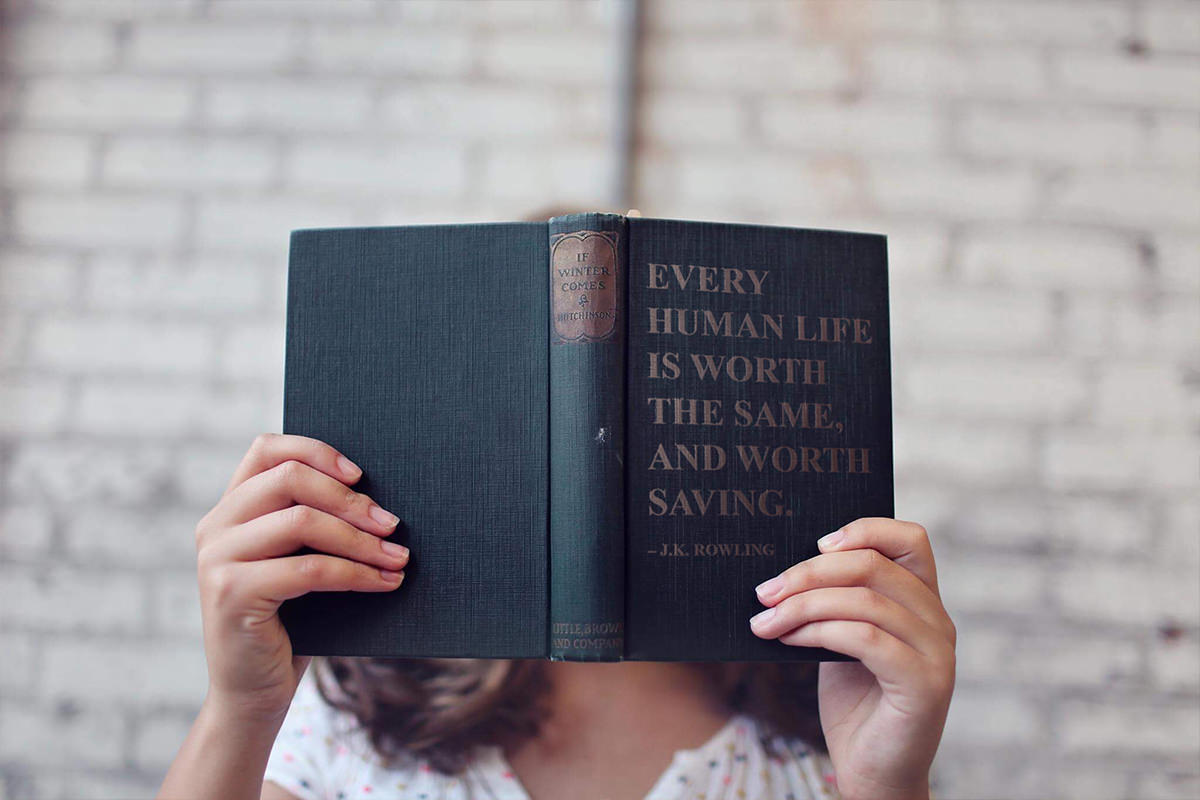


BEFORE
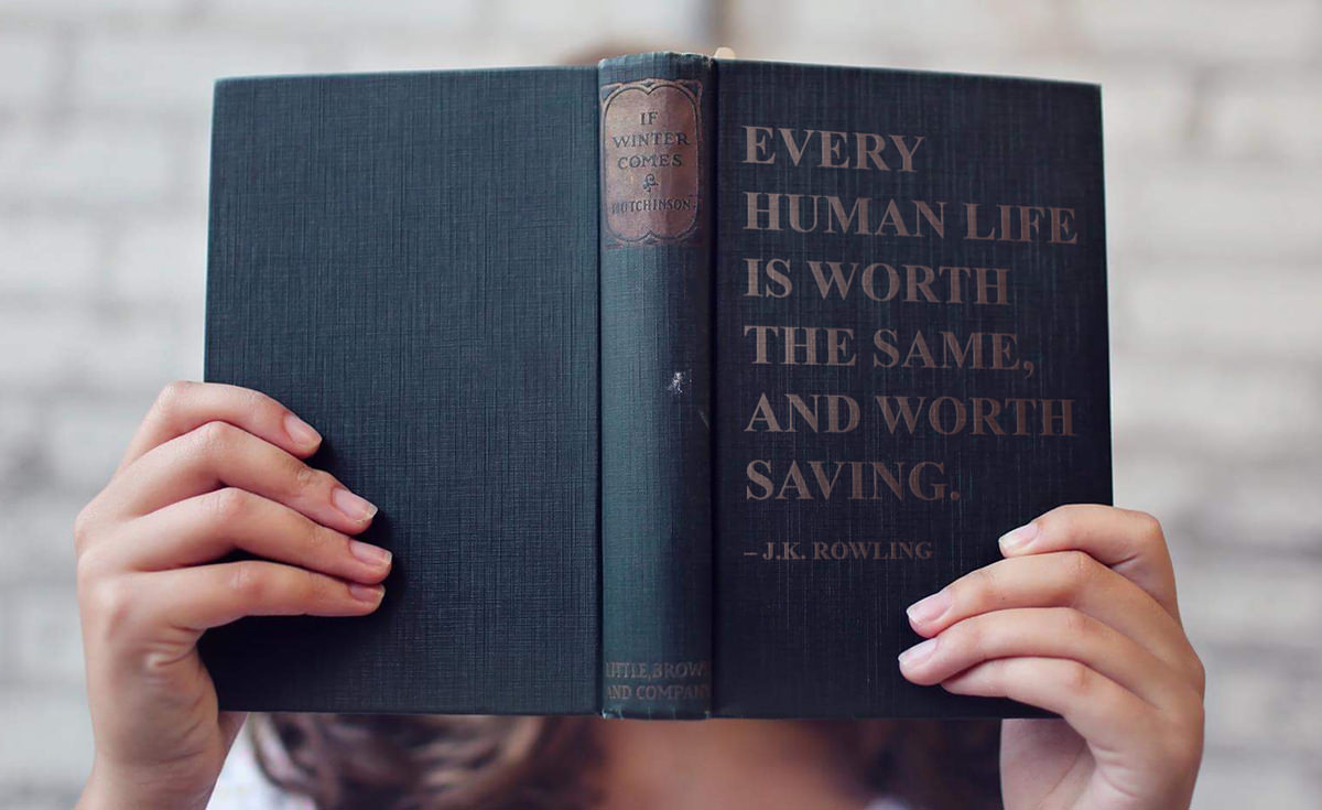
AFTER
Download Sample Images
Click the link below to download the sample images and follow along with this tutorial.
DownloadToday, we show you how to add realistic-looking text to anything in just a few steps!
From matching perspective to revealing and enhancing the texture below the type, you will learn how to make text look like it is part of anything. Even Aaron’s face…
Find your quote
To start, click and drag with your type tool to create a text box on the cover of the book and paste in your quote or title. Open up the Character menu by selecting the Window menu and then Character. Choose a font of your liking (we used Times New Roman to match the old style of the book) and adjust the font size to fit the book.
Add Perspective
To make the text match the perspective of the book, we first need to convert it into a Smart Object. Right Click on your Text Layer and select Convert to Smart Object. If you would like to edit your text after it has already been converted to a Smart Object all you need to do is double click on the box next to the text layer. Now, we can give the text some perspective.
Matching the perspective of the book is easy and will immediately make your text appear more realistic. Simply select your Move tool, and while holding CTRL/CMD, drag the corners until it matches the perspective of the book.
The perspective is looking great, so now it is time to make the edges of the text blend in with the texture of the book underneath.
Displacement Map
We use a Displacement Map to make the text look as though it was pressed right onto the book. A Displacement Map uses the contrast between light and dark in your image to add bumps and texture to the edges of your text.
First, make your text layer invisible by selecting the eye icon next to the layer. Next, we want to increase the contrast of the book to enhance the texture and make the effect work effectively. So on our background layer, create a new Levels Adjustment Layer from the Layers drop down menu. Drag the white slider to the left and the black slider to the right to give our texture more contrast and depth. Now, save this file as a new Photoshop document (the location does not matter). This high-contrast file will be used as our Displacement Map.
Make your Levels Adjustment Layer invisible and your text layer visible, bringing your original image back to normal. To finish applying the Displacement Map, select your text layer and choose Distort then Displace from your Filter drop down menu. The numbers in the Displace dialog box affect how much it will change the edges of your text. We chose a value of 2 in both the Horizontal and Vertical Scale for a subtle effect. Since we are using the same image for our Displacement Map as the one we are editing, we do not need to select any further options. After selecting OK, choose your Displacement .psd file from the menu. Now, because we made our text layer a smart object, we do not need to get it perfect the first time. We can always adjust the displacement layer at any time by double clicking on it.
We will use a Gaussian Blur filter to make our text look a little less sharp and more realistically placed on the book. On the text layer, go to Filter, Blur, and then to Gaussian Blur. We only need a very small blur to achieve this, so bring the Radius down to around 0.2 Pixels.
Match the Lighting
With the first step to realistic-looking text complete, we move on to matching the lighting. In order for the text to appear to be interacting with the light, we need highlights to appear on one side, and shadows to appear on the other. Lucky for us, there is already a perfect example of what the highlights and lowlights look like on the book we are sampling from. Using your Brush Tool, sample the lowlights from the brown patch on the book’s binding. On a new layer, with a very large and soft-edge brush, begin painting on the right side of your book cover, mimicking the shadows of the book. Use a Clipping Mask (by right-clicking on the new layer and going over to Create Clipping Mask) to make sure the paint only shows up on the text below it. On a new layer, repeat the same steps for the highlights on the left side of the cover.
Finishing Touches
We used a Displacement Map to add bumps around the edges of the text to match the book, but we also want the texture of the book to show up within the text itself. To do so, click and drag your background layer to the new layer icon and then move your new background layer to the top of your layer stack. Next, desaturate the layer so we are only affecting the texture. Select Image from the top, Adjustments, and then Desaturate. Create another Clipping Mask on this layer, limiting it to only our text. Select a Soft Light Blending Mode to really bring the texture through. Hold CMD/CTRL and L on your background layer and adjust the light and dark values until it accurately matches the lighting on the book.
Last, but not least, we want to add a little depth using Bevel & Emboss. Right Click on your text layer, go to your Blending Options at the top and select Bevel & Emboss. Bring the size down to zero and your depth to just 1 or 2 – we want to add the slightest bit of depth. Under Shading, you can click and drag within the Angle circle to choose where the light comes from. Select the color swatch box next to Highlight Mode to select a new color for the highlight. To make it more realistic, we want to sample a highlight color from the book’s bind, and then turn the opacity down just a bit. This finishes the last detail we need to add realistic looking text to our book cover!
Now step back and admire your work!
Until next time,
Thanks for Phlearning!