Tutorial Description
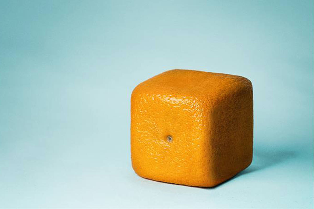
Andri Geroisa did a great job of photographing this orange and Phlearn will tap into dodging and burning to make product photography look perfect in Photoshop. We’re not sure if Andri pulled some Photoshop shenanigans or if it was this shape to begin with, so if he did use Photoshop he did a damn good job. We’re going to take it a step further in Photoshop and make it even more square with some Dodging and Burning techniques and also add some color.
Dodging And Burning, A New Way To Change Shapes
Most people think of Dodging and Burning as a way to make images more contrasty , but it has many other uses. By altering the way Shadows and Highlights fall on the orange, we can make each side appear to be much smoother without even touching the Liquify Tool. Take the dip in the top of the orange for example – by dodging the Shadow and burning the Highlight, it makes the Light look more constant across the entire surface.
Instead of using the dodge and Burn Tools, we’ve created a 50% grey layer set to Soft Light. We can then make parts of our image by using the Brush Tool and alternating between Black and White (Keyboard Shortcut: X). It’s important to use a low Flow around 10% – if you paint heavily you’ll get unnatural looking lines. This method enables you to actually see what your dodging and burning actually looks like, as pictured below.
Liquifying Edges
Now to make the edges more straight, we’re going to do some liquifying on our image. Using a large Brush (400-500px) and a low pressure setting will let us make subtle changes. If you’re getting hard dips in lines from the liquify Tool, your Brush Size is probably too small and your pressure is too high. It’s quite easy to abuse the Liquify Tool, so make sure to use it in a subtle and refined manner.
Adding A Complimentary Color
So let’s say want to make the Background blue in order to compliment the orange. We don’t want the blue to affect the orange in any way. There are a couple ways we can make this happen. One way is to use the Magic Wand Tool to select out the Background, and this does a pretty decent job. We can also use Color Range to make a selection by clicking on the Color of the orange. As long as your selection doesn’t cover the orange, you’ll be able to alter the Color of the Background only.
Make sure to become part of the Phlearn Family on Facebook, conversate with us on Twitter, and #hashtag your Phlearn Inspirations on Instagram. We want to know what the Phlearn community social chatter is about, and who is sharing it.