
Download Assets
This tutorial includes 1 PDF guide. Downloads are free with a PHLEARN account.
- Download the sample files from every free tutorial on PHLEARN
- New free tutorials published every week
- One free account: sign up once, then download anything
Free PDF Guide · 3 Pages
This Tutorial as a Step-by-Step PDF
This guide walks through Layer > New Adjustment Layer > Gradient Map, reading the gradient as shadows, midtones and highlights, Dither and Reverse, moving and recoloring color stops in the Gradient Editor, appending the Color Harmonies and Photographic Toning sets from the gear icon, and lowering opacity to about 10 to 30%. Use it to color tone any portrait.
description
A Gradient Map recolors a photo by its own tonal range, so shadows, midtones and highlights can each take a different color. Aaron builds one from scratch, explains the Dither and Reverse options, drags and recolors individual stops in the Gradient Editor, then appends Photoshop’s Color Harmonies and Photographic Toning sets and dials one back to 10-30% opacity for a natural grade.
Enjoying This Free Tutorial?
We publish a new free tutorial every week, each one with sample images and PSDs you can download and follow along with. Sign up and they land straight in your inbox, along with early word on sales, events and subscriber-only offers.

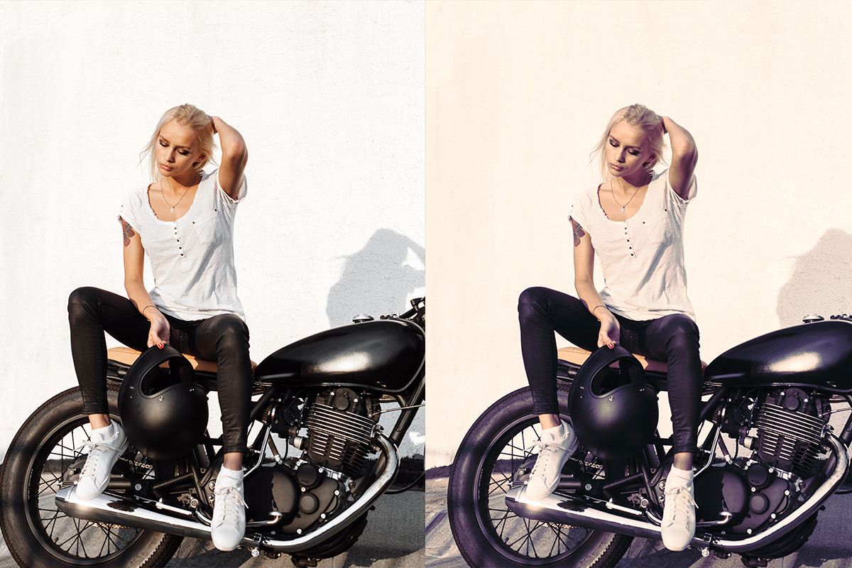
A Gradient Map adjustment layer works a bit like an Instagram filter, but with far more precise control, since it lets shadows, midtones, and highlights each be colored separately based on an image’s own tonal range. This tutorial builds a basic gradient map, edits its colors and midpoints directly, then loads in Photoshop’s built-in preset gradients for more advanced color toning.
Creating a Gradient Map Adjustment Layer
A Gradient Map adjustment layer maps a gradient’s colors across an image’s tonal range, similar to how a histogram spreads shadows, midtones, and highlights from dark to light.
-
Add a Gradient Map Adjustment Layer
Go to Layer > New Adjustment Layer > Gradient Map to add the adjustment.
-
Observe the Default Gradient’s Effect
Notice how the loaded gradient colors the darker areas of the image on one end and the lighter areas on the other.
Understanding the Dither and Reverse Options
Two checkboxes next to the gradient control extra behavior: Dither adds subtle noise to reduce banding, and Reverse flips which end of the gradient applies to shadows versus highlights.
-
Use Dither if Banding Appears
Check the Dither option if the gradient shows visible banding, since it introduces a small amount of noise to smooth the transition.
-
Test the Reverse Option
Check Reverse to see the gradient’s colors flip between shadows and highlights, then uncheck it if the original direction looks better.
Trying Photoshop’s Default Gradient Presets
Clicking through the handful of gradients loaded into Photoshop by default gives a quick sense of the range of looks a gradient map can produce, from simple two-color options to gradients built from three or more colors.
-
Open the Gradient Editor
Double-click the gradient shown in the Properties panel to open the Gradient Editor.
-
Click Through the Default Gradients
Click through the gradients already loaded, noticing options like reds in the shadows and greens in the highlights, or a blue-red-yellow combination.
-
Lower the Layer Opacity
Reduce the gradient map layer’s opacity if the initial effect looks too strong or poster-like.
Why Lowering Opacity Often Improves the Effect
A gradient map applied at full opacity can look overly graphic or poster-like, since it’s replacing the image’s natural color entirely rather than blending with it. Bringing the layer’s opacity down lets the original color show through underneath, which usually produces a more natural, believable color-graded look than the full-strength effect alone.
Editing Individual Gradient Colors and Their Positions
Each color stop along the gradient can be moved, recolored, or added to individually, giving direct control over exactly where each color falls across the shadows, midtones, and highlights.
-
Drag a Color Stop to Reposition It
Click and drag any color stop along the gradient bar to shift where that color falls in the tonal range, such as moving reds closer to the shadows or highlights. Click just below the bar to add a new color stop.
-
Click a Color Stop to Change Its Color
Click a color stop, then click the color swatch below it to open the color picker and choose a different color, such as changing blue to magenta.
-
Adjust Saturation and Darkness as Needed
Fine-tune a chosen color’s saturation or brightness if it looks too intense or doesn’t match the rest of the gradient.
Loading the Color Harmonies Gradient Set
Photoshop includes additional built-in gradient sets beyond the defaults, accessible through the Gradient Editor’s gear icon, including a set of pre-designed color harmonies.
-
Open the Gear Icon Menu
Click the gear icon in the Gradient Editor to see additional gradient set options.
-
Load Color Harmonies
Choose Color Harmonies and click Append to add these gradients to the existing list without replacing the defaults.
-
Click Through the Color Harmony Options
Click through the newly added gradients to preview a variety of complementary color combinations on the image.
Why Append Instead of Replace When Loading New Gradients
Choosing Replace when loading a new gradient set clears out every gradient already in the list, including Photoshop’s original defaults, which then have to be reset separately to get back. Choosing Append instead adds the new set alongside what’s already loaded, keeping every previous option available at the same time.
Loading the Photographic Toning Gradient Set
The Photographic Toning gradient set is built specifically for color-grading photos, offering a wide range of tinted black-and-white and duotone-style looks in one place.
-
Open the Gear Icon Menu Again
Click the gear icon again to access the gradient set list.
-
Load Photographic Toning
Choose Photographic Toning and click Append to add this set of gradients built specifically for photo color toning.
-
Click Through the Toning Options
Preview the range of options, from simple black-and-white variations to sepia tones, cooler blues, and warmer red-leaning tones.
Why Photographic Toning Suits Photos Better Than General Presets
The plain default gradients loaded into Photoshop are general-purpose and not built with photography in mind, which is why they can look graphic or unnatural on a photo straight out of the box. The Photographic Toning set is made for color toning photos, with gradients that run from simple black-and-white variations to sepia, cool and warm tones, which makes it a better starting point than the defaults for this kind of work.
Fine-Tuning a Chosen Preset to Fit the Image
Once a preset gradient looks close to the desired result, small manual adjustments to its individual colors and opacity tailor it precisely to the specific photo.
-
Adjust a Color Stop’s Hue
Change a color stop’s hue slightly, such as from blue to magenta, if the preset needs a small color shift.
-
Desaturate Colors Affecting Skin Tones
Reduce saturation on any color stop that’s affecting skin tones too strongly, to keep them looking natural.
-
Lower the Final Opacity
Bring the gradient map layer’s opacity down to somewhere between 10 and 30% for a subtler, more natural final look.
Why This Approach Works
A gradient map ties color directly to an image’s existing tonal range, which is what lets it recolor shadows, midtones, and highlights independently rather than applying one flat color shift across the whole photo. Loading in Photoshop’s built-in gradient sets, rather than building every color combination from scratch, gives a fast way to explore a wide range of looks before committing to one and fine-tuning it. Lowering the layer’s opacity at the end is what keeps the final result looking like a color-graded photo rather than a flat, poster-like graphic.
Final Thoughts
Because a gradient map recolors based on tonal range rather than picking out specific objects or areas, running an entire photo shoot through the same gradient map keeps every image in the set looking consistently color-graded, which makes it especially useful for branding work. The same basic workflow, adding the adjustment layer, browsing presets, and fine-tuning colors and opacity, applies to any photo that could use a more intentional, unified color tone.
Quick Reference: Menus and Settings
- Add the layerLayer > New Adjustment Layer > Gradient Map
- OptionsDither for banding; Reverse swaps shadow and highlight colors
- Open the editorDouble-click the gradient in the Properties panel
- Edit a colorDrag a color stop to move it; click a stop, then the Color swatch to change it; click below the bar to add one
- Load more gradientsGear icon > Color Harmonies or Photographic Toning > Append
- FinishLayer opacity between 10 and 30%
No AI, no generative credits.

Free Downloads
Take the Guide With You
Get the PDF guide to color toning with a Gradient Map, from editing color stops to loading the Color Harmonies and Photographic Toning sets. Free with a PHLEARN account.
Gradient Maps in Photoshop: Common Questions
What does a Gradient Map do to a photo?
It colors the image by brightness, like a histogram: the left end of the gradient colors the shadows and the right end colors the highlights. Change the gradient and you change the color in each tonal range.
How do I add a Gradient Map?
Go to Layer > New Adjustment Layer > Gradient Map and click OK. It comes in as an adjustment layer with its own layer mask.
What do Dither and Reverse do?
Dither adds a little noise to the gradient, which helps if you see banding. Reverse flips the gradient so the shadow colors go to the highlights and the other way around.
Why does my Gradient Map look like a poster?
At 100% it replaces the photo’s color completely. Lower the layer’s opacity; most of these looks work best between about 10 and 30%.
How do I change the colors in the gradient?
In the Gradient Editor, click a color stop and then the color swatch below to pick a new color. Drag a stop left or right to change which tones it colors, and click below the bar to add a stop.
How do I load more gradients?
Click the gear icon in the Gradient Editor and choose a set such as Color Harmonies or Photographic Toning. Click Append to add them to the list.
Should I click Append or Replace?
Append adds the new set to the gradients you have. Replace removes the current ones and loads only the new set; Reset Gradients in the same menu brings the originals back.
A preset is changing the skin tones too much. What do I do?
Click the color stop that’s hitting the skin and lower its saturation, or lighten it a little. Then bring the layer’s opacity down.
Can I use the same look on a whole photo shoot?
Yes. Because the colors are set by shadows, midtones and highlights, running every image through the same Gradient Map gives the whole set the same colors, which is useful for branding.
Is there a free download?
Yes, with a free PHLEARN account. You get 1 PDF guide to the Gradient Map steps, preset sets and opacity settings from the video.
Master Photoshop, Lightroom and Photography
Join PHLEARN PRO for $12.99 a month or $99.99 a year. Cancel anytime, with a 100% money-back guarantee.





