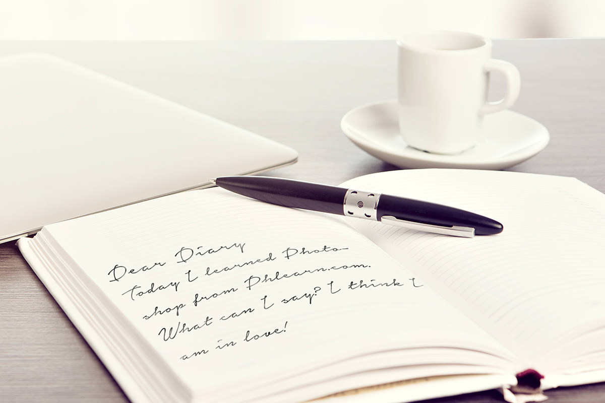

description
Making a font look like actual handwriting on a page, rather than an obviously digital typeface, takes more than just picking a script-style font. This tutorial covers choosing the right photo and font pairing, typing and constraining the text inside a text box, rasterizing it, transforming and warping it to match the page’s perspective and curve, then finishing with a Gaussian blur and a loosely painted layer mask so it reads as genuinely handwritten.
Enjoying This Free Tutorial?
We publish a new free tutorial every week, each one with sample images and PSDs you can download and follow along with. Sign up and they land straight in your inbox, along with early word on sales, events and subscriber-only offers.

Making a font look like actual handwriting on a page, rather than an obviously digital typeface like Arial, takes more than just picking a script-style font. This tutorial covers choosing the right photo and font pairing, typing and constraining the text, transforming and warping it to match the page’s perspective and curve, then finishing with a blur and a layer mask to make it look truly handwritten.
Choosing the Right Photo and Font for Handwritten Text
A photo of an open notebook or diary page, the kind someone might actually write on by hand, is the ideal starting point for this effect.
-
Start With a Photo That Suggests Handwriting
Choose an image like an open diary or notebook, the kind of surface where handwriting would naturally belong.
-
Visit a Free Font Website
Go to DaFont.com, a website offering a large selection of free fonts available for personal use.
-
Filter for the Handwritten Category
Choose the Handwritten theme on the site to browse through fonts designed to look like natural handwriting rather than a standard typeface.
Downloading and Installing a Handwritten Font
Once a font feels right, downloading and installing it makes it available directly inside Photoshop’s font list.
-
Download the Chosen Font
Pick a font that feels like a good fit, such as the Notera font, and download it from the site.
-
Install the Font by Double-Clicking It
Double-click the downloaded font file to install it on the computer, which makes it available inside Photoshop.
Typing the Main Message on a New Type Layer
With the font installed, the Type tool and the Character panel set up the first short line of handwritten text.
-
Click With the Type Tool to Start a Layer
Press T for the Type tool and click directly on the image to create a new type layer.
-
Open the Character Panel and Choose the Font
Go to Window > Character to open the Character panel, then choose the newly installed handwritten font from the font list.
-
Type the Main Line of Text
Type a short line, such as “Dear Diary,” to serve as the main heading text on the page.
-
Adjust the Font Size to Match the Page
Zoom in to check the text against the page and increase the font size, such as to 50 points, until it looks proportionate.
Constraining Longer Body Text to a Text Box
Clicking and dragging with the Type tool, instead of just clicking, creates a bounded text box that automatically wraps longer writing to fit a specific area of the page.
-
Click and Drag to Create a Text Box
With the Type tool active, click and drag to draw a rectangle roughly the size and shape of the page area the writing should fill.
-
Type Longer Text Inside the Box
Type a full sentence or two of body text, letting it automatically wrap within the edges of the drawn text box.
-
Reposition the Text Over the Page
Move the finished text block down into place over the appropriate area of the photographed page.
Why a Text Box Beats Just Clicking to Type
Clicking once with the Type tool creates a single line that keeps expanding sideways no matter how much is typed, which makes it hard to keep longer writing confined to a specific area like a notebook page. Dragging out a text box first constrains the text to that shape from the start, wrapping it automatically so it stays within the boundaries of the page being written on.
Rasterizing the Type Layers Before Transforming
Vector type layers can’t be pushed through the kind of heavy perspective transformation this effect needs, so converting them to a raster layer first is a required step.
-
Select Both Type Layers
Shift-click to select both the heading text layer and the body text layer together.
-
Merge the Layers Into a Raster Layer
Press Cmd/Ctrl+E to merge the selected layers together, converting the vector type into a single raster layer that behaves like a regular image.
Why Rasterizing Text Is Necessary Before Transforming
A vector type layer resists the kind of extreme perspective distortion and warping this effect depends on, limiting how far the text can be pushed to match the page. Merging the type layers into a single raster layer removes that limitation entirely, allowing the text to be freely transformed the same way any photo or graphic layer could be.
Transforming the Text to Fit the Page’s Perspective
Free Transform’s corner-point controls bend the flat text to match the angle and perspective of the actual page underneath it.
-
Open Free Transform
Press Cmd/Ctrl+T to bring up the Free Transform bounding box around the merged text layer.
-
Rotate the Text to Match the Page Angle
Click and rotate the text so its overall angle matches the angle of the page it’s sitting on.
-
Adjust Individual Corner Points
Hold Cmd/Ctrl and click any one of the transform box’s points to move it individually, aligning the text’s edges with the lines and perspective of the page.
Warping the Text to Add Page Curvature
A perspective transform alone leaves the text perfectly flat, so the Warp option adds the subtle curve real handwriting takes on across a curved page.
-
Right-Click and Choose Warp
Right-click the transform box and choose Warp to switch into warp mode.
-
Drag the Corner Handles to Curve the Text
Click and drag the warp grid’s corner handles down to bend the text, matching the natural curve of the page.
-
Confirm the Transformation
Click the checkmark to confirm the warp and compare the flat before against the curved, page-matched after.
Adding a Gaussian Blur for Realism
Because the photographed page itself isn’t perfectly sharp everywhere, leaving the text perfectly crisp makes it read as obviously fake rather than actually written on the page.
-
Open Gaussian Blur
With the text layer selected, go to Filter > Blur > Gaussian Blur.
-
Increase the Radius Slightly
Raise the blur radius just enough to soften the text edges and match the slightly out-of-focus quality visible elsewhere in the photo.
Adding a Layer Mask for Natural Variation
A loosely painted layer mask breaks up the text’s otherwise perfectly even light and dark, giving it the uneven, natural variation real handwriting has.
-
Add a Layer Mask to the Text Layer
Click the layer mask button to add a mask to the merged, transformed text layer.
-
Paint Black With a Large Soft Brush
Choose a large, soft-edged brush and paint black over parts of the text and page, such as areas that might have glare or gloss, to make them less visible, switching to white now and then to keep it random.
-
Paint With a Smaller Brush at Reduced Opacity
Switch to a smaller brush, lower the opacity to around 50%, and brush over individual letters to add finer, more random variation.
-
Paint White to Bring Areas Back
If too much of the text becomes hidden, paint white back over the mask to restore visibility in those areas.
Why Randomness Matters More Than Precision in the Layer Mask
Painting the mask with careful, deliberate strokes would keep the text looking too clean and even, which is exactly the opposite of what real handwriting looks like. Scribbling loosely across the mask instead, without worrying about precision, is what gives the final text the uneven, natural variation that makes it read as genuinely handwritten rather than obviously typed.
Why This Approach Works
Rasterizing the type layers before transforming is what makes the extreme perspective and warp adjustments possible in the first place, since vector text simply can’t be pushed that far. Warping the text after the perspective transform is what adds the subtle curvature that separates a flat, pasted-on look from text that appears to follow the actual surface of the page. Finishing with a loosely painted layer mask, rather than leaving the text perfectly even, is what ultimately sells the illusion, since real handwriting is never uniformly dark or perfectly sharp from letter to letter.
Final Thoughts
None of the individual steps here, typing text, transforming it, or painting a mask, are complicated on their own, but combining all of them is what turns an ordinary font into something that reads as genuine handwriting. The same approach works with any handwritten-style font and any photo with a flat surface to write on, from journal pages to greeting cards to handwritten signs.
Quick Reference: Keys, Menus and Settings
- Get a fontDaFont.com, theme Handwritten; double-click the font file to install
- Type the headingT, click; Window > Character to pick the font; 50 pt
- Text boxT, click and drag a box the shape of the page
- RasterizeShift-click both type layers, Cmd/Ctrl + E
- Fit the pageCmd/Ctrl + T, rotate, Cmd/Ctrl-drag single points; right-click > Warp, drag corners down
- SoftenFilter > Blur > Gaussian Blur, small Radius
- Uneven inkLayer mask, soft brush in black and white, smaller brush at 50% opacity; Alt/Option-click the mask to view it
No AI, no generative credits.
Handwritten Text in Photoshop: Common Questions
Where can I find a handwriting font?
The video uses DaFont.com with the theme set to Handwritten, where many fonts are free for personal use. The one used here is Notera.
How do I get a downloaded font into Photoshop?
Double-click the downloaded font file to install it on your computer. Then pick it in Photoshop’s Window > Character panel.
How do I keep the text inside the page?
With the Type tool, click and drag a box about the shape of the page instead of just clicking. Text typed into the box wraps to the next line at its edges.
Why merge the type layers before transforming?
Type layers are vector and can’t be transformed as far as a regular layer. Shift-click both type layers and press Cmd/Ctrl + E; the merged layer behaves like a photo.
How do I make the text follow the angle of the page?
Press Cmd/Ctrl + T and rotate the text to the page. Then hold Cmd/Ctrl and drag single points of the box so the lines of text follow the lines on the paper.
How do I curve the text to match a bent page?
While transforming, right-click and choose Warp, then drag the corners down so the text bends with the page. Click the checkmark to apply.
Why does my handwriting look fake?
It is sharper than the photo. Go to Filter > Blur > Gaussian Blur and raise the Radius just until the text softens like the rest of the page.
How do I make the ink look uneven like real handwriting?
Add a layer mask and scribble loosely with a large soft brush in black and white. Then use a smaller brush at 50% opacity over single letters; paint white to bring back anything that fades too much.
How can I see what my mask is doing?
Hold Alt/Option and click the layer mask thumbnail to see the mask in black and white. Alt/Option-click again to go back to the image.
Master Photoshop, Lightroom and Photography
Join PHLEARN PRO for $12.99 a month or $99.99 a year. Cancel anytime, with a 100% money-back guarantee.





