

Download Assets
This tutorial includes 2 sample images, 1 sample PSD and 1 PDF guide. Downloads are free with a PHLEARN account.
- Download the sample images and PSDs from every free tutorial on PHLEARN
- New free tutorials published every week
- One free account — sign up once, then download anything
Free PDF Guide · 4 Pages
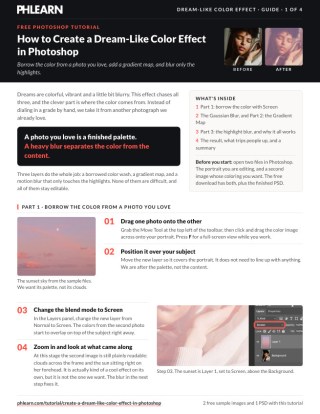
This Tutorial as a Step-by-Step PDF
Walks through borrowing a sunset’s color with the Screen blend mode, a Gaussian Blur on a Smart Object, a Gradient Map from Layer > New Adjustment Layer with Reverse checked at 34%, and a Motion Blur copy at 13 degrees and 119 pixels set to Lighten. Keep it next to your keyboard.
description
A dream-like color effect comes from borrowed color, not sliders.
The colors in a photograph you already love are a finished palette, and this free tutorial shows you how to borrow them. Drop that image over your subject, set it to Screen, then blur it until the shapes disappear and only the color is left.
From there we add a gradient map to push the grade somewhere the original photo could not go on its own, and finish with a motion blur set to Lighten so the softness lands in the highlights and leaves your subject’s face sharp.
Enjoying This Free Tutorial?
We publish a new free tutorial every week, each one with sample images and PSDs you can download and follow along with. Sign up and they land straight in your inbox, along with early word on sales, events and subscriber-only offers.
Image Source
Photography by Ulkar Batista and Anna Shvets, sourced from Pexels.
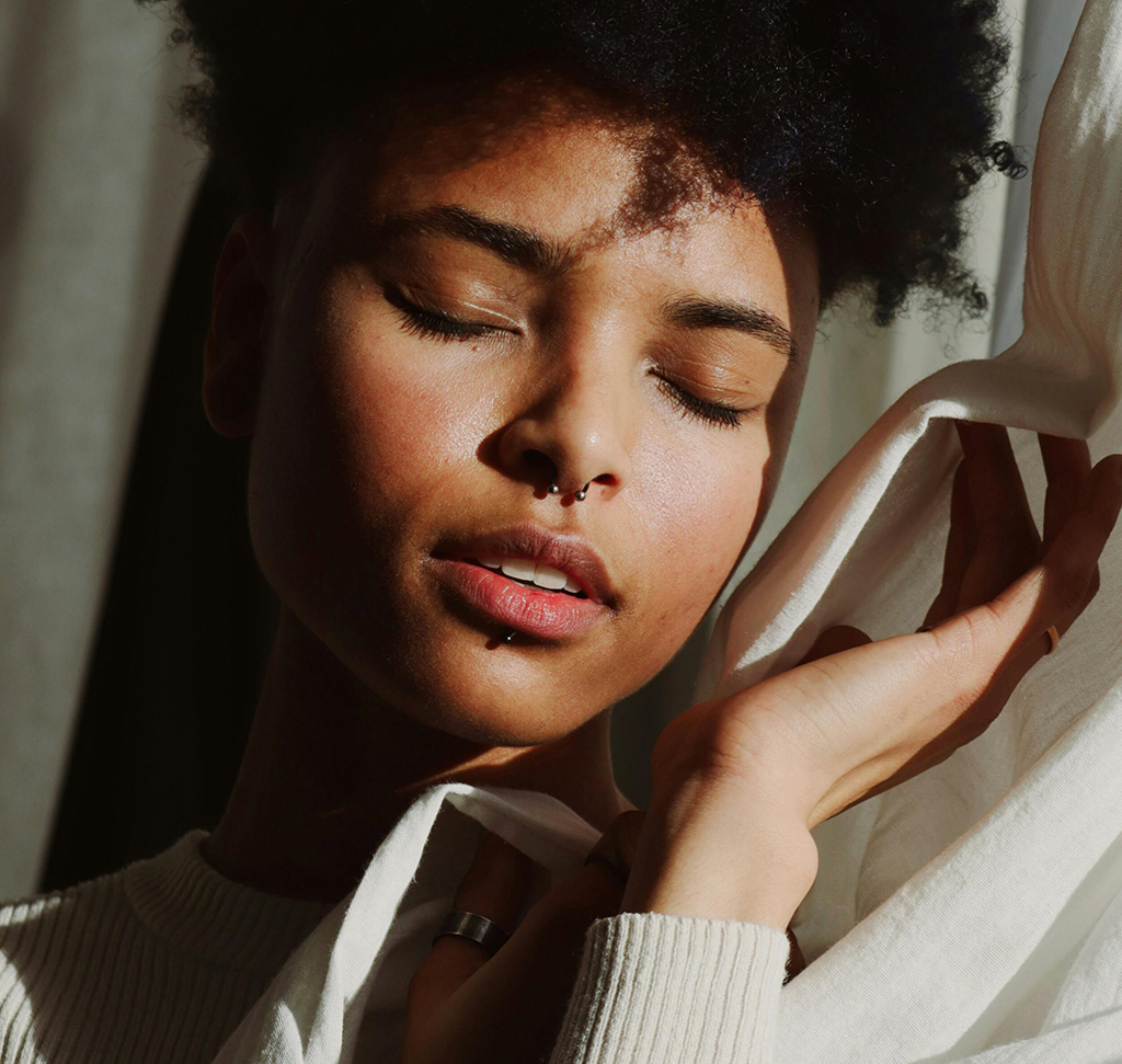
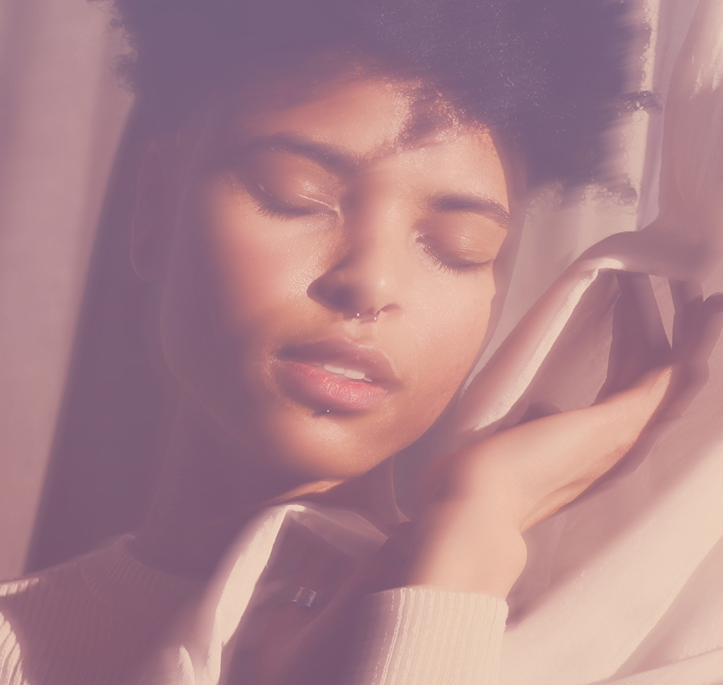
How to Create a Dream-Like Color Effect in Photoshop
Dreams are colorful, vibrant and a little bit blurry. This effect chases all three, and the clever part is where the color comes from: instead of dialing in a grade by hand, you steal it from another photograph you already love.
Three layers do the whole job — a borrowed color wash, a gradient map, and a motion blur that only touches the highlights. None of them are difficult, and all of them stay editable.
Borrow the Color From a Photo You Love
Open two files: the portrait you are editing, and a second image whose coloring you want. A sunset works beautifully here, because the palette is already doing something a portrait rarely does on its own.
-
Open both images in Photoshop
Your subject, and the photo you are taking the color from.
-
Drag one onto the other with the Move Tool
Click and drag from one tab across to the other. Press F for a full-screen view while you work.
-
Position the color layer over your subject
It does not need to line up with anything. You are after the palette, not the content.
Screen Puts the Color on Top
Change the new layer’s blend mode from Normal to Screen and the colors from the second photo wash straight over your subject.

Why You Can Still See the Other Photograph
Zoom in at this stage and the second image is plainly readable — clouds across the background, the sun sitting on your subject’s forehead. That is Screen working exactly as it should: it keeps everything brighter than the layer below, and bright detail includes recognizable shapes.
It is a genuinely interesting look on its own. It is just not the one we want, which is what the next step fixes. If the blend modes are what you want to understand properly, start here or work through every mode in turn.
Blur Away the Detail, Keep the Color
A Gaussian Blur destroys the shapes in the borrowed layer while leaving its color completely intact. Blur it far enough that you cannot make out what the second photograph was, and all that survives is the palette.
Convert to a Smart Object Before the Filter
Right-click the layer and choose Convert to Smart Object before you touch the Filter menu. Do this every time you are about to blur something. It turns a permanent change into a setting you can reopen and retune, and on this effect you will absolutely want to come back and adjust the radius once the other layers exist. Smart Objects in five minutes covers the basics, and the longer walkthrough shows what else they buy you.
-
Set the layer blend mode to Screen
The color washes over your subject immediately.
-
Right-click the layer and Convert to Smart Object
A small badge on the thumbnail confirms it.
-
Go to Filter > Blur > Gaussian Blur
Raise the radius until the clouds and shapes are unreadable but the color is still strong.
-
Lower the layer opacity a little
Back it off until the wash sits under the photograph rather than on top of it.
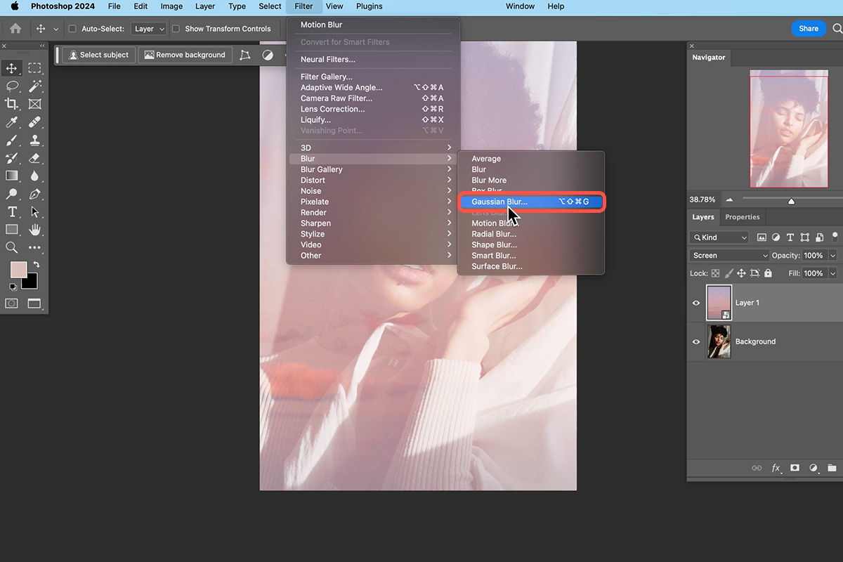
This is the trick worth remembering from the whole tutorial. A photograph you love is already a finished color palette, and a heavy blur is all it takes to separate that palette from its content.
Push It Further With a Gradient Map
A gradient map remaps every tone in the image to a color of your choosing, and it is the fastest way to take a grade somewhere the original photograph could never go on its own.
Switch the borrowed color layer off for a moment so you can see what the gradient map is doing by itself. It is much easier to judge one effect at a time than two stacked on top of each other.
-
Hide the color layer temporarily
Click its eyeball. You will turn it back on shortly.
-
Select the background layer
The adjustment layer will be created directly above whatever is selected.
-
Go to Layer > New Adjustment Layer > Gradient Map
Click OK on the dialog that appears.
-
Pick a gradient in the Properties panel
Open the dropdown and work through the groups. A purple gives this effect its dreamlike cast.
-
Tick Reverse if the image looks inverted
It usually will. Reverse flips which end of the gradient maps to the shadows.
-
Drag the gradient map to the top of the stack and lower its opacity
Around a third is a good starting point — the example sits at 34%.
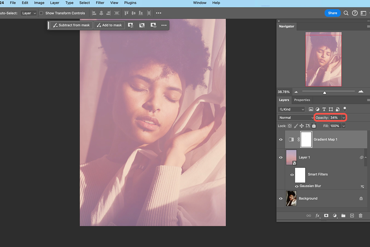
Judge the Two Opacities Together
Both the borrowed color layer and the gradient map are controlling the same thing, so perfecting one before you have set the other is wasted effort. Turn the color layer back on and move the two sliders against each other until the balance is right. That interaction is the whole grade.
Gradient maps repay some study — How to Color Tone Using Gradient Maps and color toning with them both go deeper, and adjustment layers in general explains why this belongs on its own layer.
Blur the Highlights for the Dream Look
The color is done. What is missing is the softness — and rather than blurring the whole photograph, this last layer blurs a copy and then lets only the bright parts of it show through.
-
Duplicate the background layer
Ctrl + J on PC, Cmd + J on Mac. You get a Background copy.
-
Convert the copy to a Smart Object
Same reason as before. Any filter, every time.
-
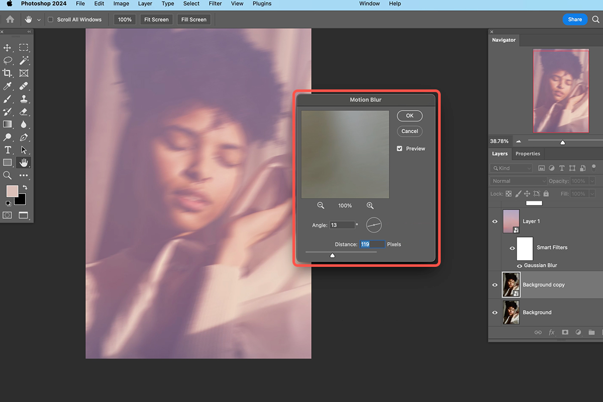
Go to Filter > Blur > Motion Blur
Unlike a Gaussian Blur, this one streaks in a direction.
-
Set the Angle and Distance
A shallow angle streaking up toward the top right reads naturally — the example uses 13 degrees at a distance of 119 pixels. More distance means more streak.
-
Set that layer’s blend mode to Lighten
This is the step that turns a smeared mess into a soft glow.
Lighten Is What Keeps It Subtle
On Lighten, a pixel only shows if it is brighter than what sits beneath it. Because a motion blur smears bright areas outward across darker ones, the blur lands almost entirely in the highlights and leaves your subject’s features alone.
That is why the result reads as a glow rather than as camera shake. Toggle it off and on and the difference is subtle — the face stays sharp, and the light in the hair goes soft. Nudging the blurred layer slightly with the Move Tool shifts where that softness falls. There is more on the filter itself in mastering motion blur and adding motion blur to backgrounds.
Read the Finished Stack
Collapse the layers and the effect is four decisions deep: the original photograph at the bottom, a motion-blurred copy set to Lighten, the borrowed color blurred and set to Screen, and a gradient map over everything.
Each one is doing a separate job, which is exactly why you can tune any of them without dismantling the others.
Why Borrowed Color Beats a Manual Grade
Building a palette from scratch means making dozens of small decisions and hoping they agree with each other. A photograph you already love has none of that problem — its colors were produced by real light falling on a real scene, so they are internally consistent before you start.
Blurring that photograph and dropping it on Screen hands you the whole relationship at once: the warmth, the cast in the shadows, and the way the highlights fall, all in agreement because they came from one moment.
Make the Palette Yours
The real value here is the source image, not the settings. A sunset gives you the warm version; a cold blue evening, a neon sign or a wash of foliage will each send the same three-layer stack somewhere completely different.
Because every step is a smart filter or an adjustment layer, you can swap the borrowed photograph and reuse the whole build. Keep a small folder of images you like the color of and this becomes a thirty-second edit.
Quick Reference: Keys, Menus and Settings
- Bring in the colorMove Tool, drag the sunset onto the portrait; F for full screen
- Overlay itLayer blend mode: Normal > Screen
- Keep only the colorRight-click > Convert to Smart Object, Filter > Blur > Gaussian Blur, then lower Opacity a little
- Gradient mapLayer > New Adjustment Layer > Gradient Map, a purple, Reverse checked, top of the stack at 34%
- Copy the photoCmd/Ctrl + J on the Background, then Convert to Smart Object
- Blur the highlightsFilter > Blur > Motion Blur, Angle 13, Distance 119 pixels; blend mode Lighten
No AI, no generative credits. Every step stays editable.
Free Downloads
Follow Along on the Same Photos
Get the portrait, the sunset photo whose color you borrow, the finished layered PSD and the 4-page PDF guide. Free with a PHLEARN account.
Dream-Like Color Effect: Common Questions
How do I make a dreamy color effect in Photoshop?
Three layers do it: color borrowed from another photo, set to Screen and blurred, a Gradient Map adjustment layer, and a motion-blurred copy of the photo set to Lighten so only the highlights go soft.
How do I use the colors from another photo?
Drag the photo you love onto your image with the Move Tool and change its blend mode from Normal to Screen. Its colors overlay on top of your subject straight away.
Why can I still see the clouds and the sun on my subject?
Screen keeps the bright detail of the second photo, so its shapes come along too. Convert the layer to a Smart Object and add Filter > Blur > Gaussian Blur until you cannot make out the details; the color stays.
Why convert to a Smart Object before blurring?
Any time you use a filter like a Gaussian Blur or Motion Blur, a Smart Object lets you change that blur at any time. Right-click the layer and choose Convert to Smart Object.
How do I add a gradient map?
Click the Background layer, go to Layer > New Adjustment Layer > Gradient Map and click OK. Pick a gradient from the dropdown in the Properties panel; Aaron chooses a purple.
Why does my gradient map look inverted?
Check Reverse in the Properties panel. It flips which end of the gradient maps to the shadows, and the image looks natural again.
How strong should the color layers be?
Drag the gradient map to the top of the stack and lower its Opacity; the example sits at 34%. Then work its opacity and the sunset color layer’s opacity against each other until the coloring is right.
Why set the motion blur layer to Lighten?
On Lighten a pixel only shows if it is brighter than what is beneath it, so the blur lands in the highlights. Your subject stays sharp and the light in the hair goes soft.
What Motion Blur settings are used?
On a duplicated Background (Cmd/Ctrl + J) converted to a Smart Object, Filter > Blur > Motion Blur with the blur going up toward the top right. The example uses an Angle of 13 and a Distance of 119 pixels.
Are the sample files free?
Yes, with a free PHLEARN account. You get 2 sample images, 1 sample PSD and 1 PDF guide: the portrait, the sunset photo you borrow the color from and the finished layer stack.
Master Photoshop, Lightroom and Photography
Join PHLEARN PRO for $12.99 a month or $99.99 a year. Cancel anytime, with a 100% money-back guarantee.





