
Download Sample Images
description
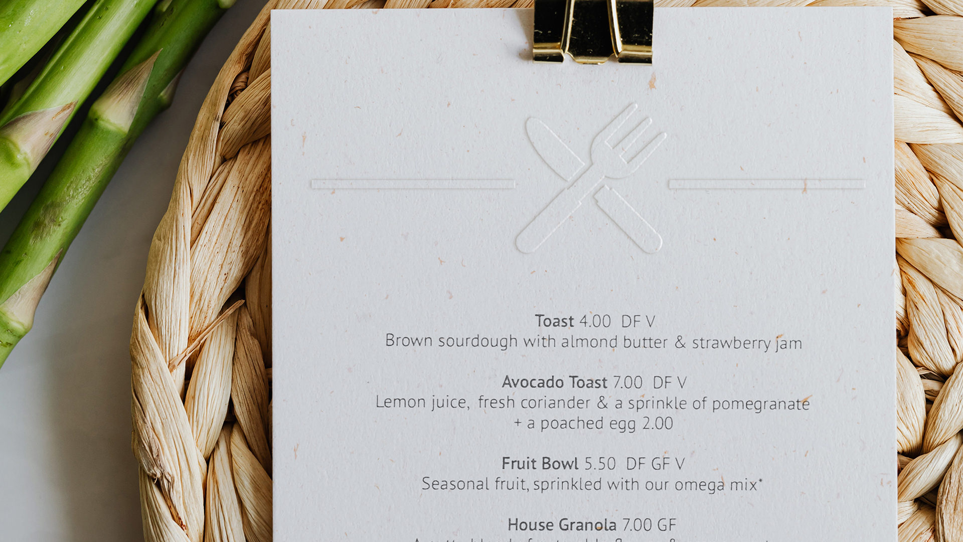
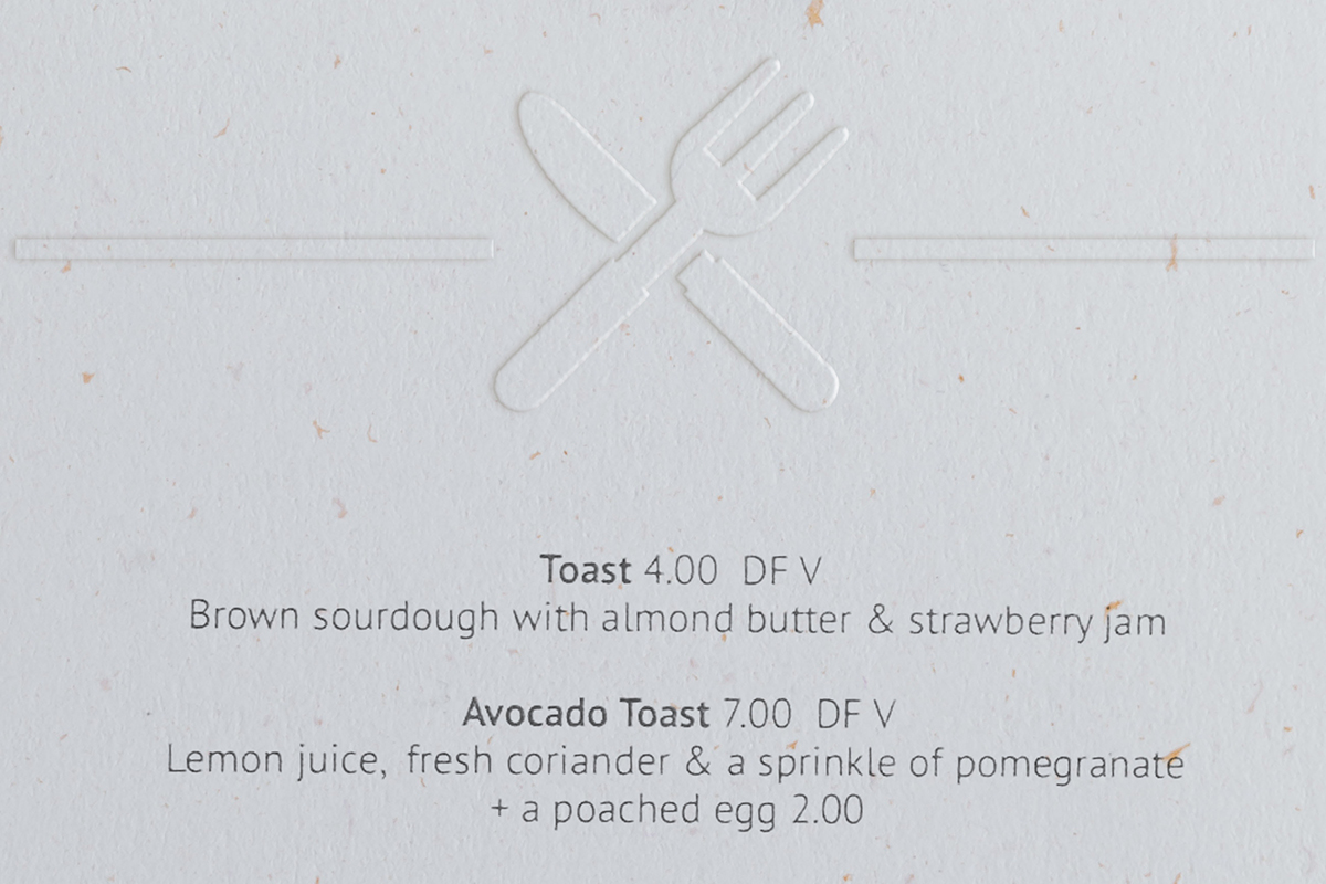
Follow along and learn how to create an embossed effect in Photoshop! Add realistic texture, depth, and dimension to any logo or icon using professional tools and techniques. This effect is perfect for mocking up your designs in real-world environments.
Enjoying This Free Tutorial?
We publish a new free tutorial every week, each one with sample images and PSDs you can download and follow along with. Sign up and they land straight in your inbox, along with early word on sales, events and subscriber-only offers.

CREATE REALISTIC EMBOSSED EFFECTS
BEFORE
Why Most Embossed Mockups Look Fake — and the Three Fixes
Bevel & Emboss has a poor reputation, largely earned in 2003. Used properly it produces convincing print mockups, and the difference between a cheap-looking result and a believable one comes down to three things almost nobody does:
- Distress the edge of the artwork before embossing anything, so it interacts with the paper’s texture.
- Sample the shadow color from the photograph rather than leaving it black.
- Blur the finished effect so its edges match the sharpness of the image it sits in.
We’ll press a logo into a photograph of paper, and everything stays editable throughout.

Get Everything Into One Document
Open your paper photograph and your artwork, then take the Move tool and hold Shift while dragging from one document tab to the other. Shift centers the incoming layer automatically rather than dropping it wherever your cursor happened to be.
Flat vector icons work well here — the Noun Project is a good source for the kind of simple black-on-white marks this technique suits.
Distressing the Edge — the Step Everyone Skips
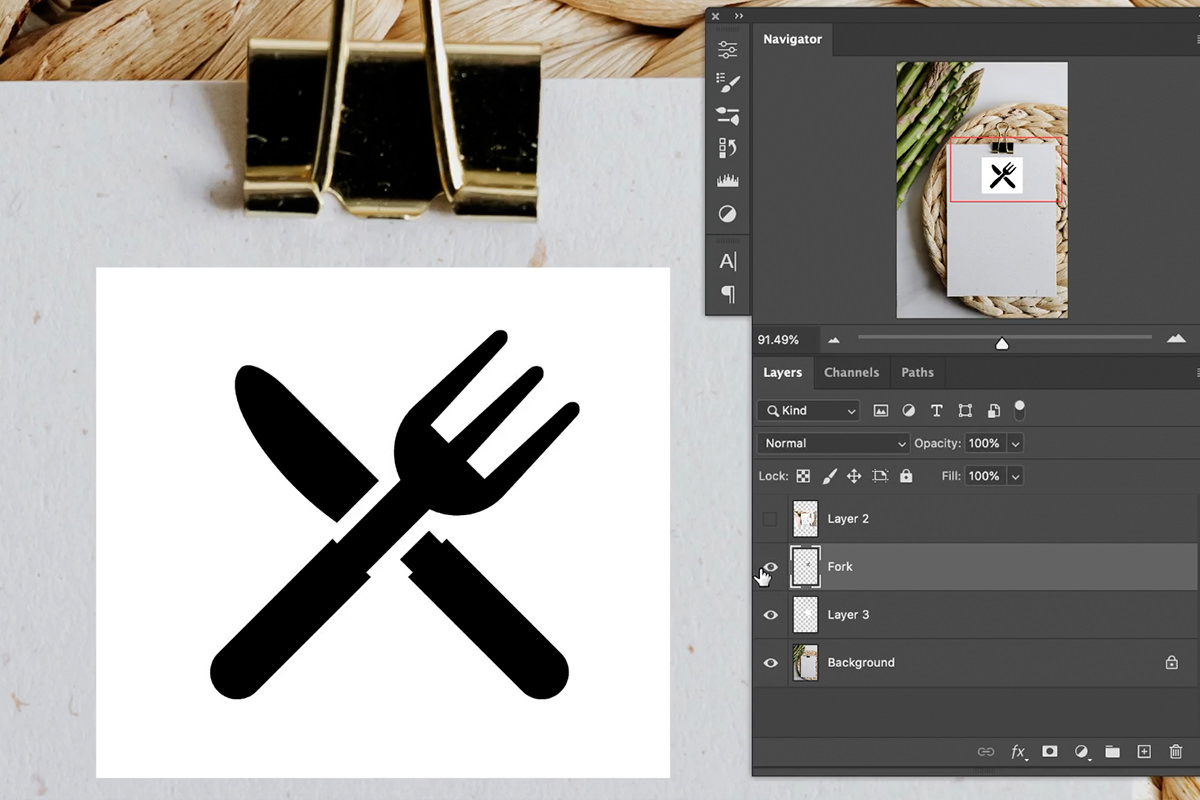
A perfectly smooth vector edge is the first thing that gives an emboss away. Press something into real paper and the edge picks up the paper’s fibers — slightly irregular, never mathematically clean.
It needs a white background to work
The Filter Gallery cannot operate on transparency; it needs light and dark pixels to interact. So:
-
Add a new layer beneath your artwork
Marquee an area around the logo and fill it with white (Edit › Fill › White).
-
Merge the artwork onto it
Shift-click both layers and press Cmd/Ctrl + E. You now have pure black artwork on solid white.
-
Convert to a Smart Object
So the filter stays adjustable — and you will adjust it.
-
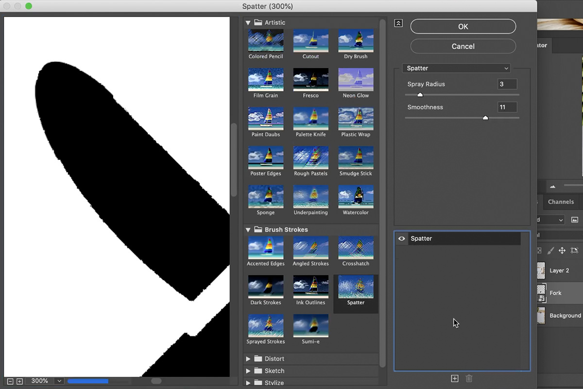
Filter › Filter Gallery › Spatter
Under Brush Strokes. It breaks the outline into small irregularities.
-
Keep Spray Radius low and Smoothness higher
Too much and it reads as stone or concrete rather than paper. You want it barely perceptible — just enough that the edge isn’t machine-perfect.
-
Double-click Filter Gallery in the Layers panel to revise it
Because it’s a Smart Filter, dialling it back later takes seconds.
Separating the Artwork from Its White Background
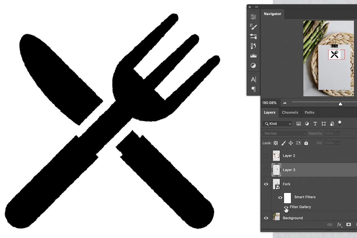
Now the white has done its job and has to go.
Select › Color Range, click the black artwork with the eyedropper, and click OK — everything sharing that color becomes a selection, distressed edge included.
Then hide that layer, create a new empty one, and paint black inside the selection with a brush. Selections are independent of layers, which is what makes this work: you can make a selection based on one layer and fill it on another. The result is your distressed artwork on transparency, with the original still available if you want to revise the filter.
Watch for other dark areas in the frame being caught by Color Range — check the selection before you fill it.
Fill Opacity Zero: the Setting That Makes This Work
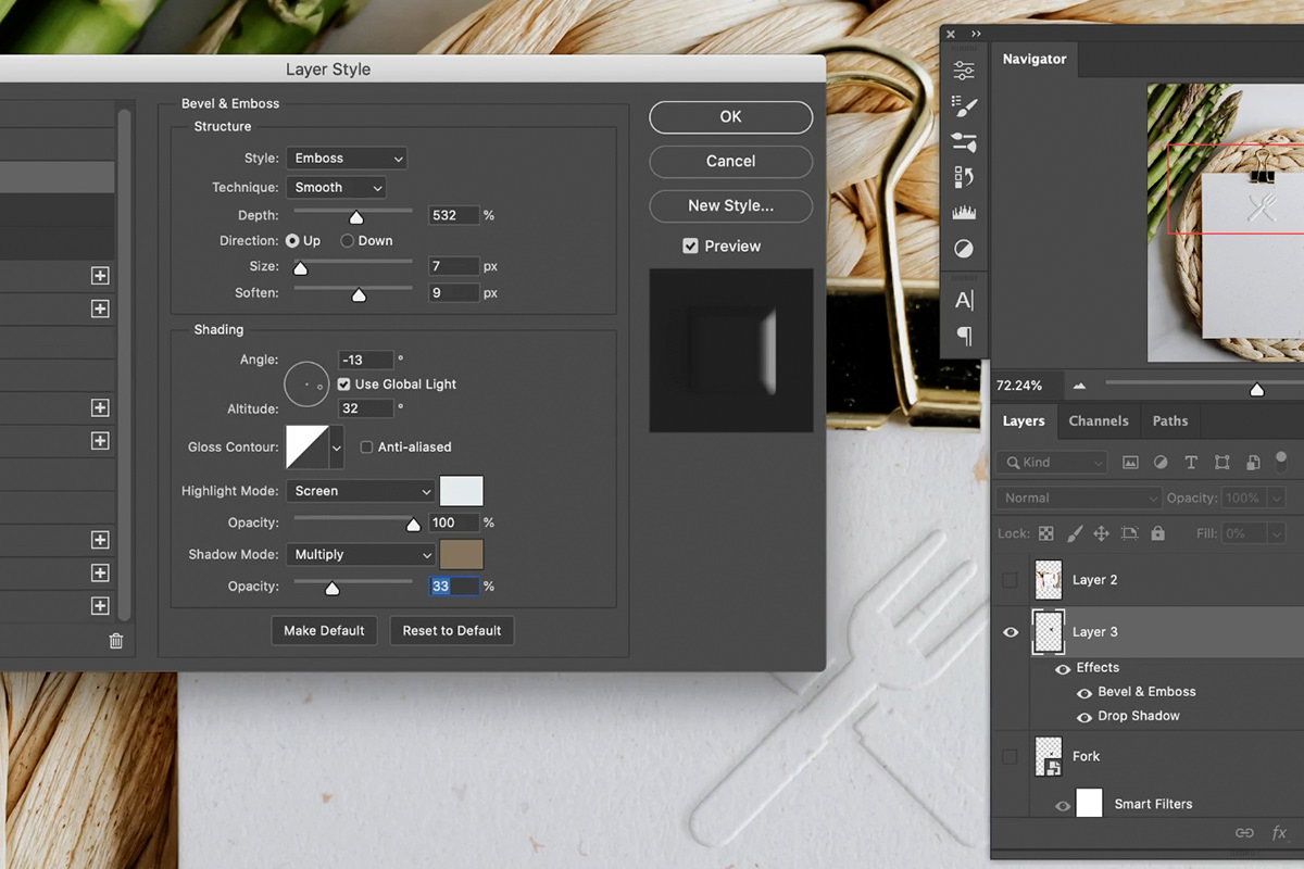
Double-click the artwork layer to open Layer Style, and before anything else, go to Blending Options and drag Fill Opacity to 0.
This is the crucial and non-obvious part. Fill Opacity hides the layer’s own pixels while leaving its layer effects fully visible — unlike Opacity, which fades both. So the black artwork disappears and only the bevel remains, which is exactly right: an emboss is a deformation of the paper, not a black shape sitting on it.
Setting Up Bevel & Emboss
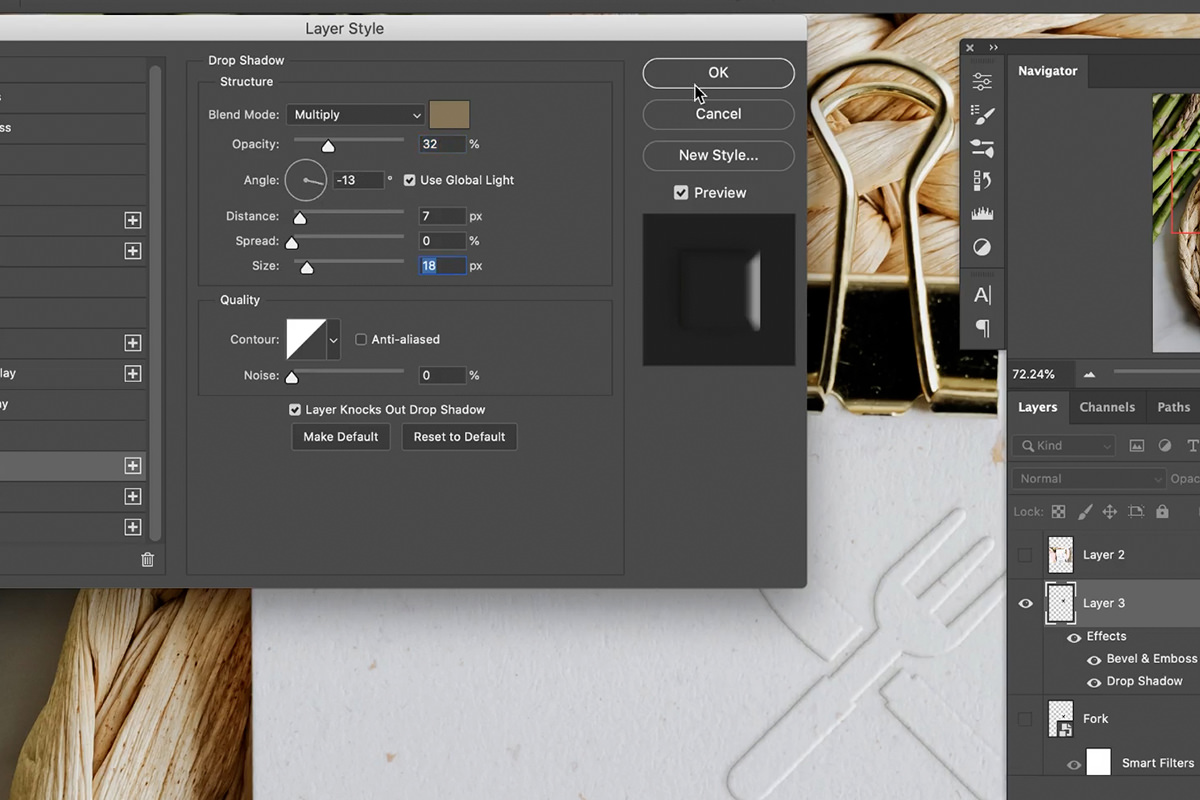
Turn on Bevel & Emboss and work through it in this order.
-
Match the light angle to the photograph
Find a shadow in the paper image and note which direction it falls. If shadows run left, the light is coming from the right — set the angle accordingly. This is the single most important setting; an emboss lit from the wrong side never looks real regardless of everything else.
-
Keep Size low
Paper is thin. A large bevel size reads as molded plastic.
-
Add Soften
A hard bevel edge is the classic tell. Softening blends the effect into the paper surface.
-
Set Depth to taste
How far the artwork appears pressed in or raised out.
-
Sample the shadow color from the image
The shadow color defaults to black, and that’s wrong — look at the actual shadows on the paper and they’re brown, or gray, or whatever color the surrounding light is. Click the shadow swatch and eyedropper a real shadow directly from the photograph. This one change does more for realism than any slider.
-
Set the highlight to white and balance the opacities
Then reduce the shadow opacity until it stops looking heavy.
Adding a Cast Shadow
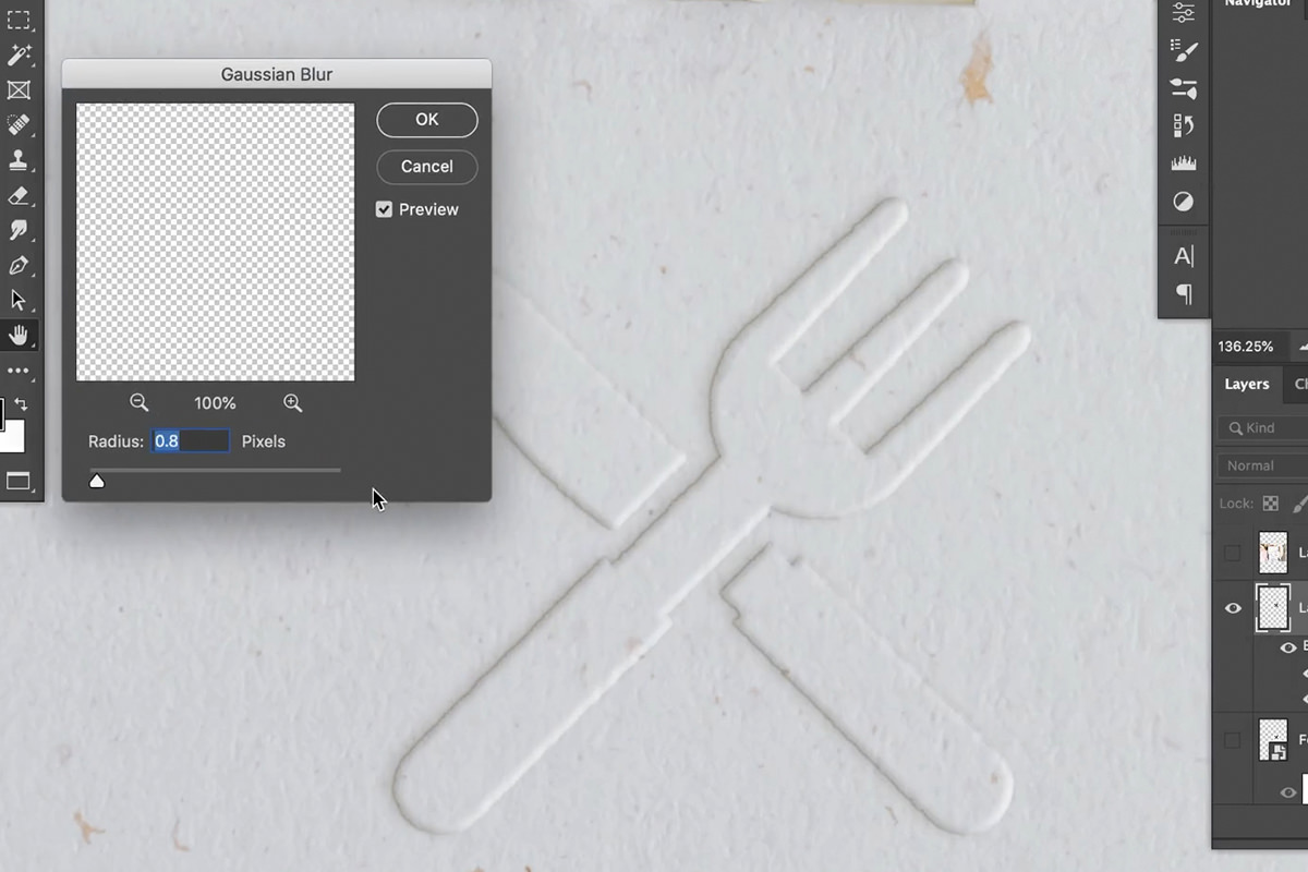
The bevel describes the shape of the indentation. A raised element would also throw a small shadow onto the paper beside it.
Add Drop Shadow, sample its color from the image the same way, and keep Distance, Size and Opacity all low. A heavy drop shadow makes the artwork float above the paper rather than sit in it — subtle is the entire point here.
Blur It to Match the Photograph
Even now the effect will be slightly too crisp, because layer styles render perfectly sharp while the photograph beneath has its own softness from the lens and the paper’s surface.
Apply a small Gaussian Blur — around 1.5 pixels was right here — and nudge it with the arrow keys until the effect’s sharpness matches the image’s. It’s a tiny adjustment that removes the last thing making it look pasted on.
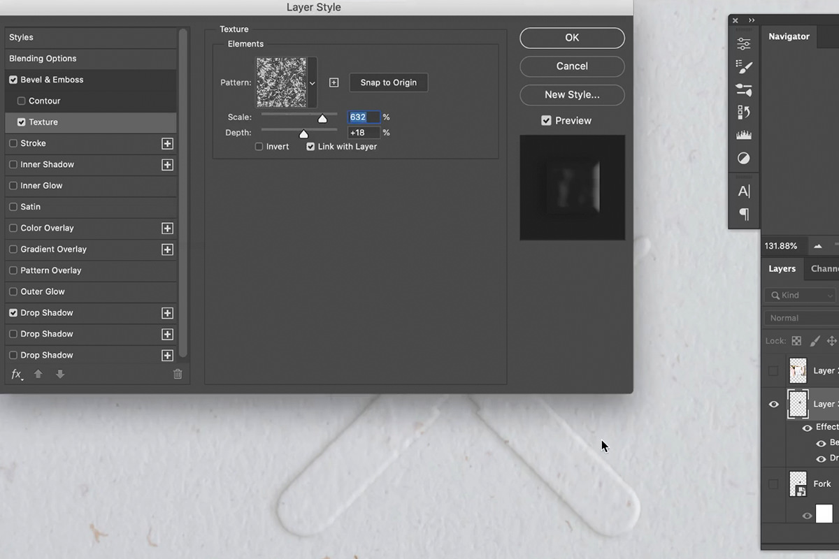
Add a paper texture through the bevel
Reopen Bevel & Emboss and click Texture in the left-hand list. Choose a pattern, then set Scale and Depth so the bevel’s surface picks up a subtle grain matching the paper.
Depth can go negative, flipping the texture in or out. Keep it very low — the goal is a hint of the paper’s surface showing through the emboss, not a visible pattern.
Two Things This Setup Lets You Do
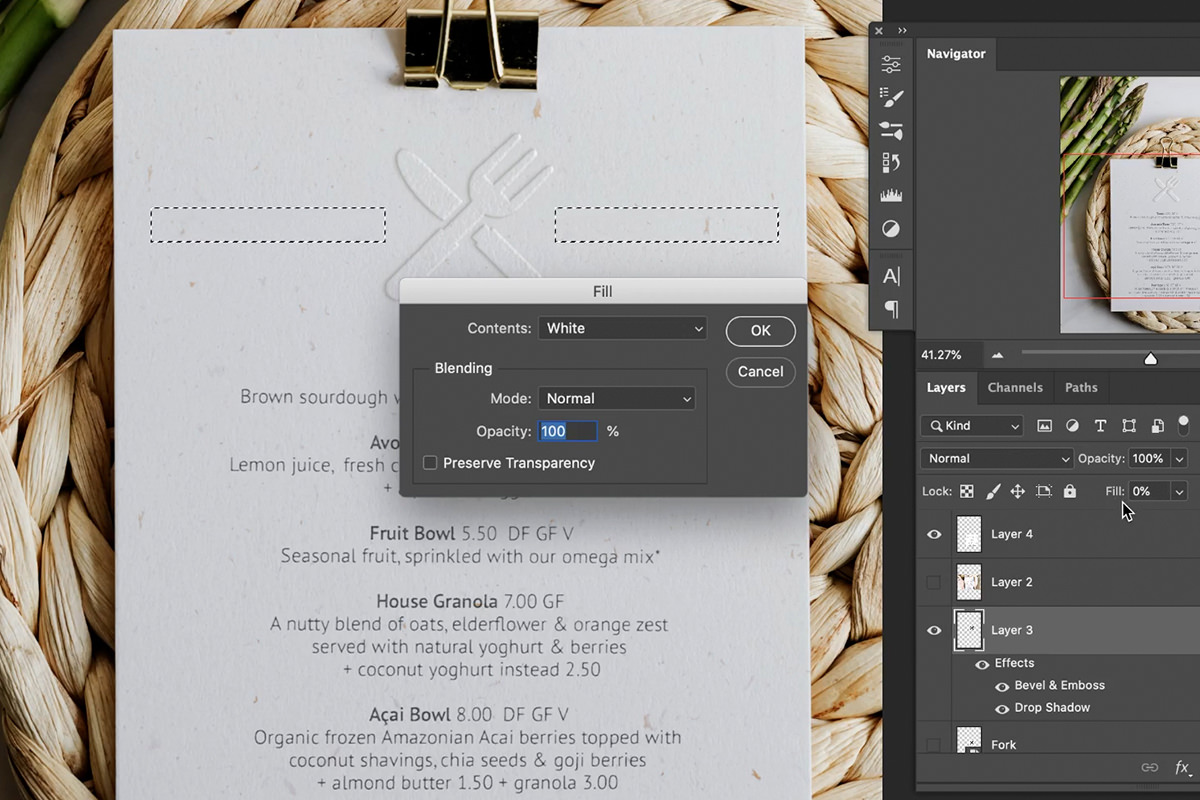
Anything drawn on the layer gets embossed
Because the effect belongs to the layer rather than the artwork, anything you add to that layer picks up the emboss automatically. Marquee a rule and fill it, paint with a brush, add type — each appears embossed instantly. Fill Opacity stays at 0, so you never see the fill itself, only the effect.
That makes this a live design surface rather than a finished result: lay out a whole menu or letterhead directly on the embossed layer and every element matches automatically.
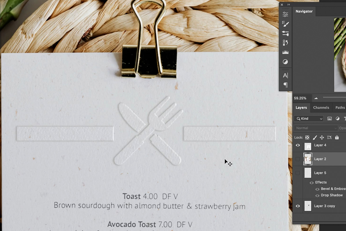
Copy the effect to another layer
Hold Alt/Option and drag the fx icon from one layer onto another and the entire style copies across. Set the new layer’s Fill Opacity to 0 and it’s embossed identically.
Drag without the modifier and you move the effect instead of copying it — the modifier is what makes it a duplicate.
Where Embossed Effects Look Fake
A perfectly smooth edge
Real pressing picks up paper fiber. Distress the outline with Spatter before you emboss.
A black shadow
Sample the shadow color out of the photograph. Black almost never occurs in a real one.
Light coming from the wrong direction
Read the shadows in the image and set the bevel angle to match.
Too much size and depth
Paper is thin. Large values read as plastic or stone.
Forgetting Fill Opacity
Leave it at 100 and the solid artwork sits on top of the effect, ruining it.
An effect sharper than the photograph
Layer styles render perfectly crisp. A 1–2 pixel blur is what integrates them.
More Free Photo Editing Tutorials
If this was useful, these go further in the same direction:
- How to Create a Composite in Photoshop — building the layered file first.
- Compositing Highlights, Shadows and Reflections — making an added element sit in the scene.
- How to Use the Select and Mask Workspace — cleaner cut-outs, which compositing depends on.
- How to Create and Use Layer Masks — confining an effect to exactly where it belongs.
- How to Make Realistic Shadows in Photoshop — the shadow that anchors an object.
- How to Use Select Subject in Photoshop — the selection engine behind most cut-outs.
More Free Photoshop Tutorials
- Layer Effects & Layer Styles in Photoshop — the full layer style system.
- How to Create a Holiday Card in Photoshop — Color Range extraction used the same way.
- How to Place Anything into Perspective — mockups with realistic light and shadow.
- How to Master Adjustment Layers in Photoshop — non-destructive habits throughout.
Realism Is Always the Small Things
Bevel & Emboss on its own looks like a 2003 web button. The same effect with a distressed edge, a sampled shadow color and a pixel and a half of blur looks like a photograph of printed paper.
None of those three takes more than a few seconds, and the pattern generalizes: whenever a Photoshop effect looks artificial, the fix is usually that it’s too perfect, too black, or too sharp for the photograph around it.




Enjoying This Free Tutorial? Go Further with PRO.
Unlock Full Sample Files, PSDs, and Hundreds of Masterclasses!

Download full project assets, original PSDs, and RAW images for every lesson
Unlimited access to our complete library of PRO Photoshop & Lightroom courses
Instant 4K Ultra HD streaming on all devices, anytime, anywhere
Full access to our entire library of Photoshop Actions, Presets, and LUTs
Flexible monthly and annual membership plans
Cancel anytime with zero hassle or commitments