Download Sample Images
description
Create your own logos in Photoshop! Learn how to use type, shapes, and icons to create a simple logo. Then, take elements from that logo, adding some color and gradients to make an alternate version that’s perfect for an icon or social media profile image.
And If you want to learn more, check out our PRO course How to Create Graphics & Logos in Photoshop!
Share
Create Your Own Logos
How to Start a Logo
It seems like everyone needs a logo these days. Fortunately, creating a simple logo can be pretty easy and there are a wide variety of programs that can help you do it–Photoshop included!
Starting with Type
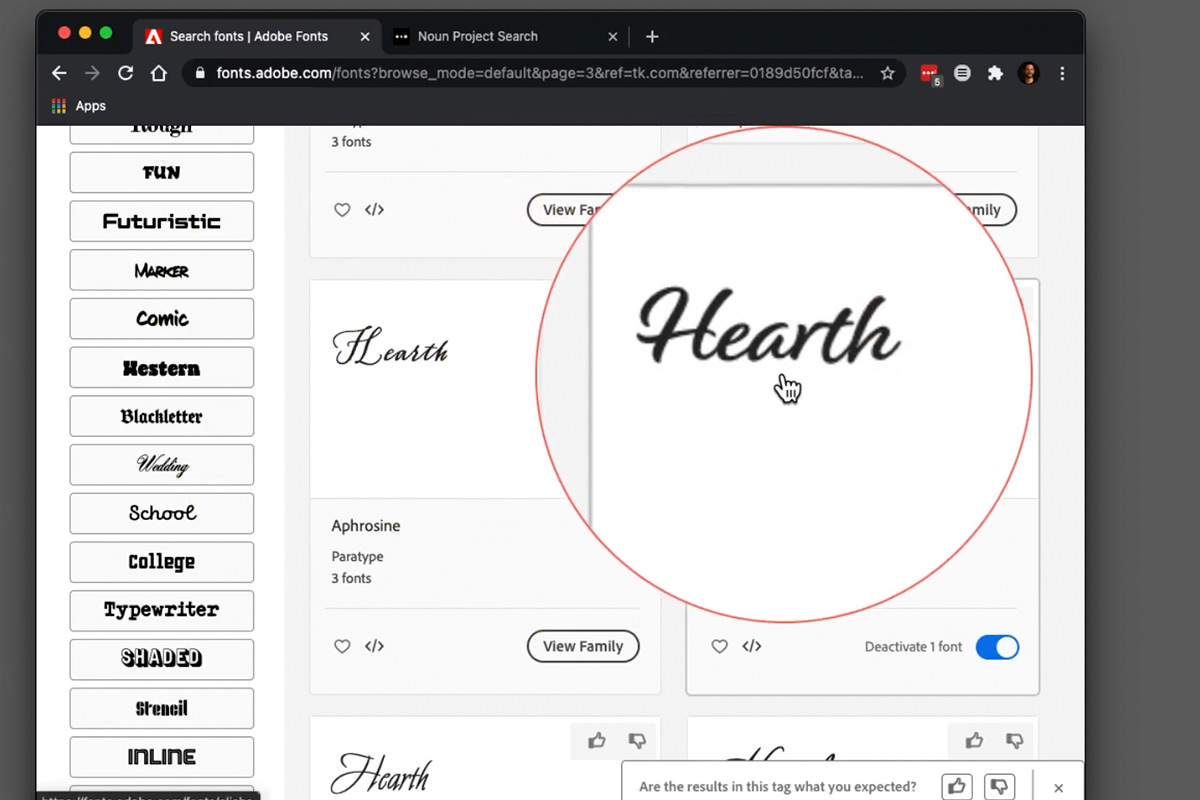
Most logos start out as basic typography, and many logos are only made up of type (called a logotype). If you’re looking for some initial logo inspiration, we recommend using services like Adobe Fonts to find a typeface or specific fonts that represent the brand you have in mind.
For our example, we created an imaginary tea company, so we used Adobe Fonts to find some font families that have a friendly and organic feel. Script-style fonts are perfect for this.
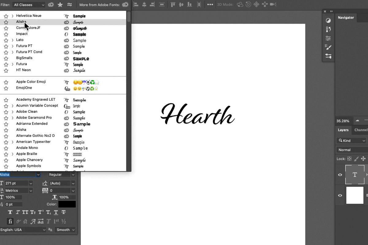
Adobe Fonts makes it particularly easy to add new fonts to Photoshop, since it activates and installs them through your Creative Cloud account.
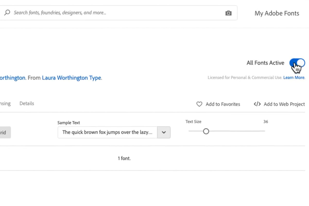
Once you find a typeface or font you like, simply toggle the switch that says ‘Activate’. It will be added to the list of fonts available in all of your Adobe programs.
Adding Icons
When you want a little more than just simple type, adding additional shapes and icons can create more visual interest. (Just make sure that anything you add is relevant to the brand you’re trying to represent!)
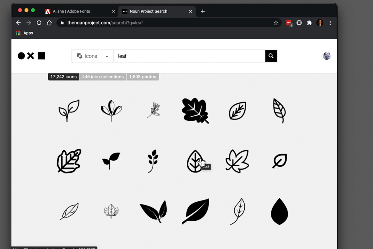
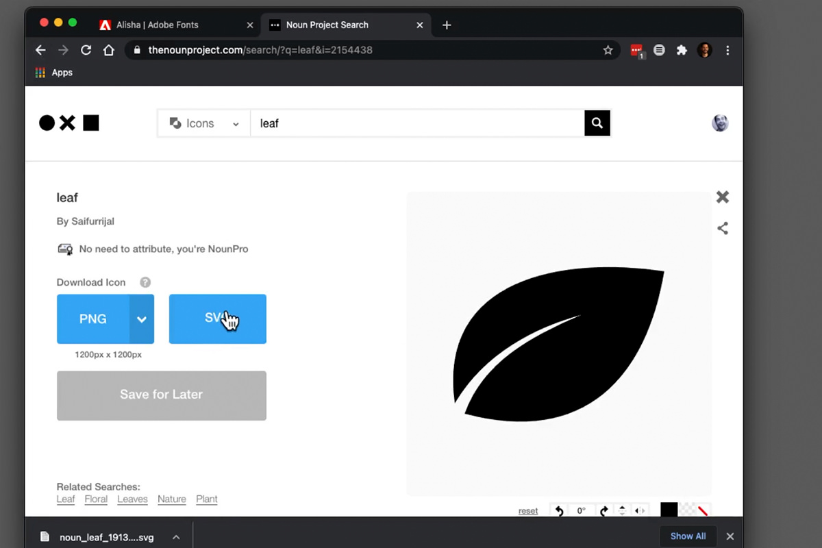
Resources like The Noun Project are another great way to find inspiration for a logo.
For our imaginary tea company, a leaf icon seemed fitting.
We chose to download the icon as an SVG file, which is vector-based. That means we can scale it as large as we want, or as small as we want, without losing any resolution.
This will give us more room to experiment as we try to integrate it in with the type.
Combining Icons & Type
Once you have an icon ready to go, it’s time to work with your design skills! The goal should be to seamlessly combine all the elements of the logo together so that it maintains the feel you want for the brand while still being readable.
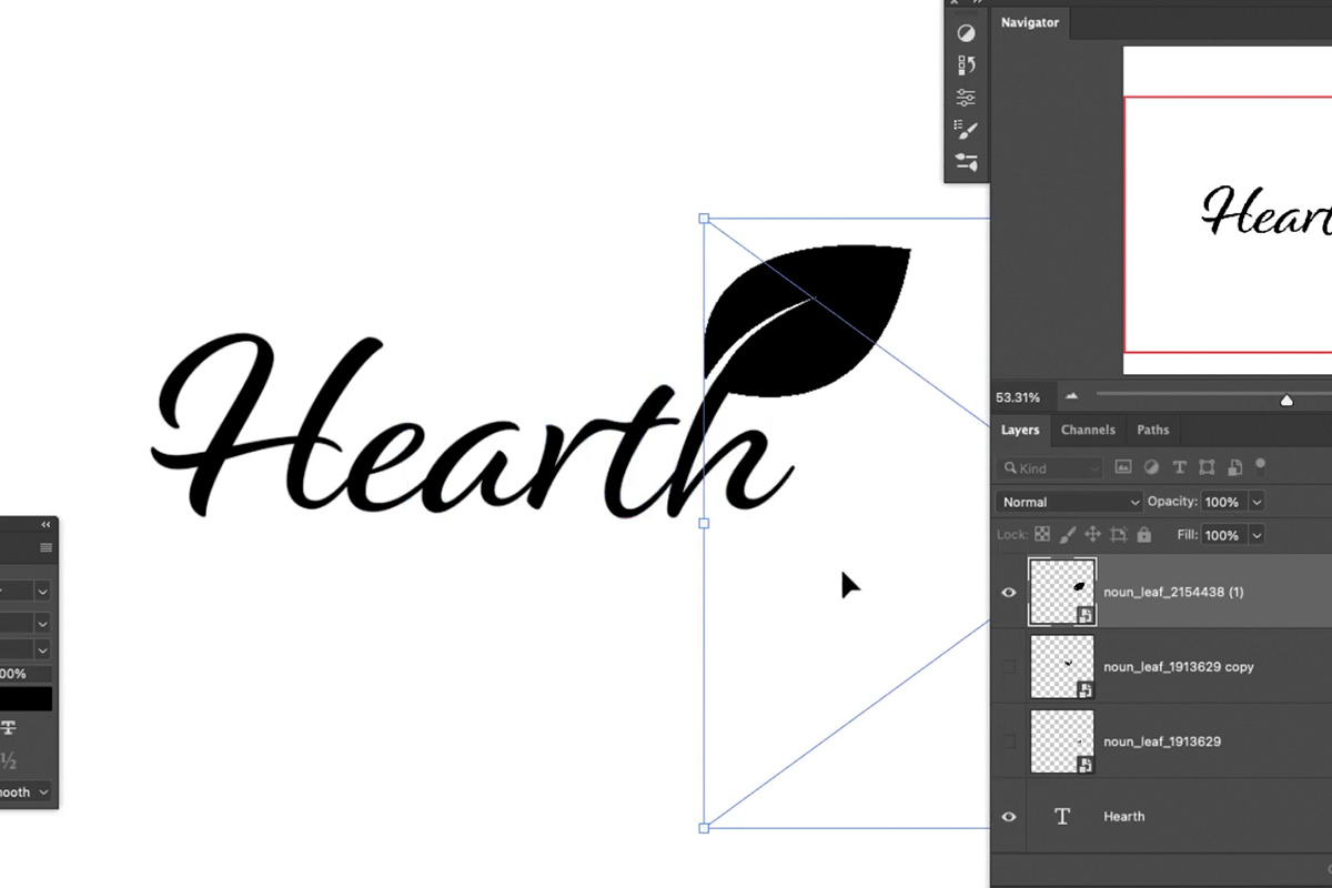
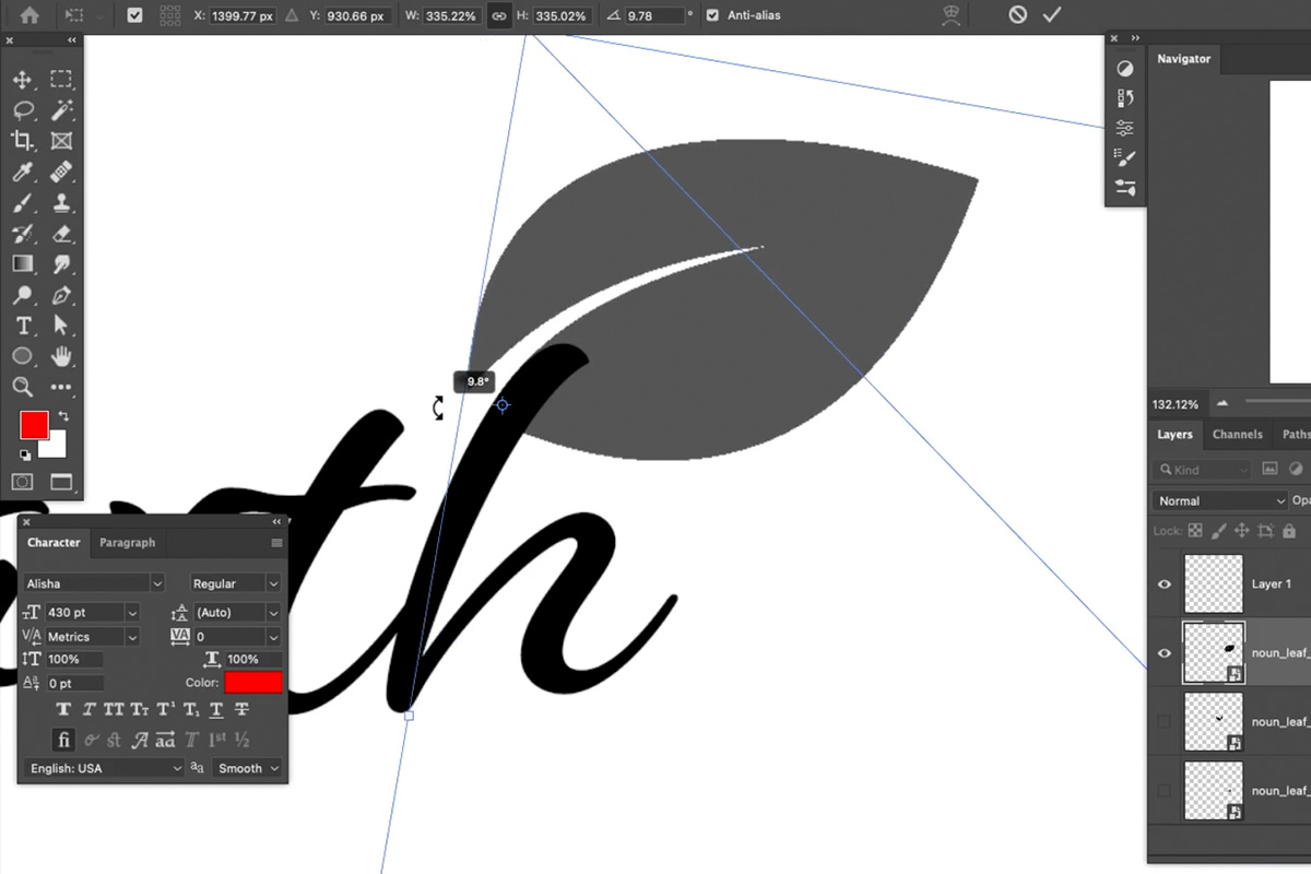
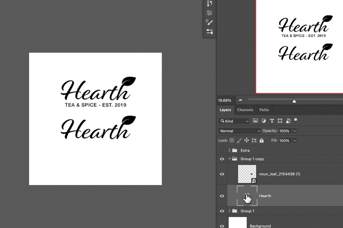
We decided to place the leaf as an extension of the ‘h’ at the end of the company name.
But, it’s usually never as simple as just sticking the icon somewhere along the type. You’ll want it to follow the same curves and form as the type so that it feels like a natural extension.
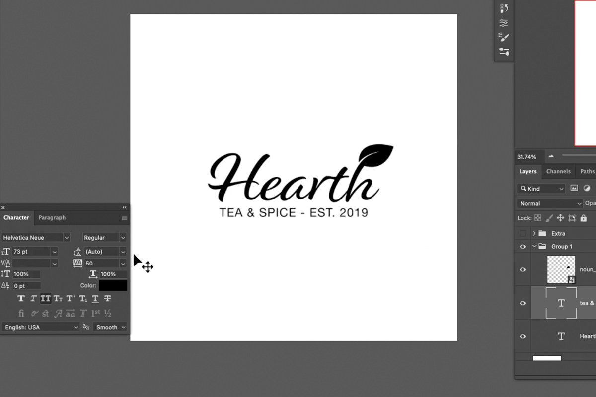
Additionally, sometimes it’s helpful to add additional text underneath the main logo. This can help provide more information about the company or brand.
It’s up to you how much information you want your logo to convey. Just keep in mind that when people read or see your logo from a variety of distances, you want each element to be readable.
Creating Logo Variations
It’s common practice to have several variations on a logo. This will make it easier to display in a wider variety of settings. For instance, the header on your website and the profile picture on your social media accounts might require very different sizes.
For smaller applications, it’s nice to have a much smaller, simpler logo or icon that still represents the brand, and still is closely related to the original logo.
With any variation, it helps to start by duplicating the original. This will give you the same elements to work with without dismantling your original work.
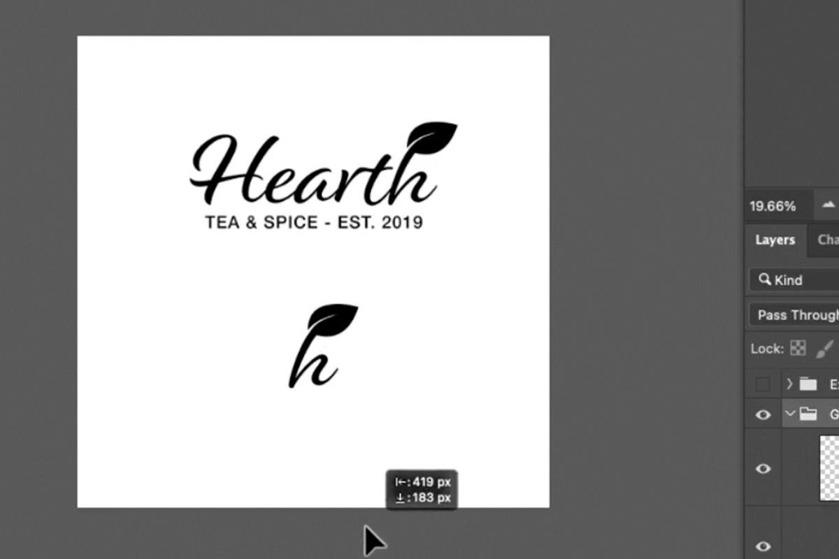
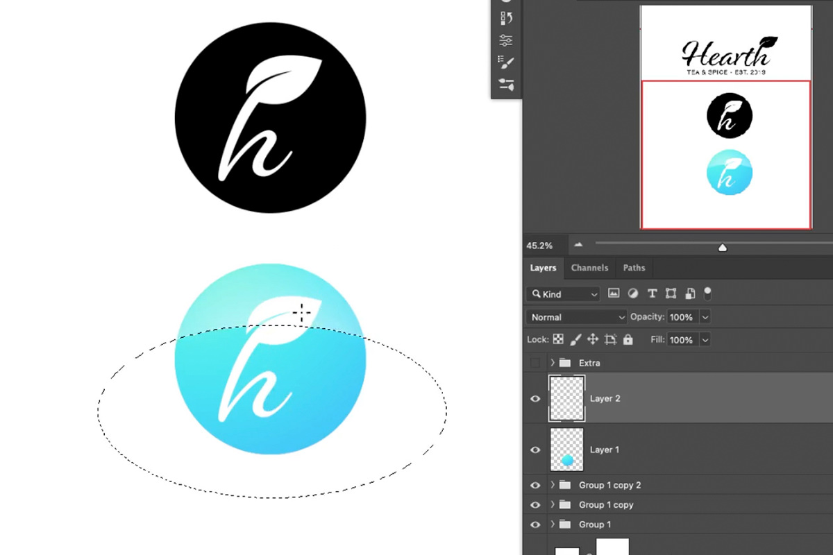
Since the ‘h’ and the leaf are the most iconic parts of the logo we’ve created, we decided to try making that emblem into a small icon. Creating a variation like this is as simple as taking one piece of a larger logo, and then placing it by itself, or on top of a solid-colored shape.
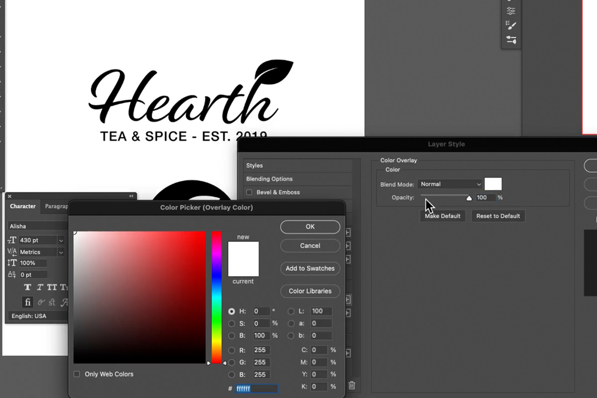
We decided to put it on top of a black circle, changing both the color of the type and the color of the icon to white.
The result was a striking icon that still closely matches up with our original full-text logo. But, you can take this process even further.
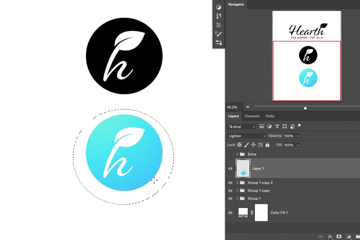
It’s always good practice to have some logo variations that are only in black and white. However, once you’ve created those assets, you’re free to experiment with color, gradients, and textures to create a more detailed design. These are perfect for websites, app icons, profile pictures–any platform where you want to use as many tools as possible to communicate more about your brand.
Since we’re working with a circle theme, we chose to use the Elliptical Marquee Tool to create selections, and then create gradients within those selections.
You can even combine multiple elliptical selections with different gradients to create an eye-catching glass reflection effect!
The goal here should be to use simple tools to experiment, and to create a variety of logos that are all related to each other and related to the brand they’re meant to represent.
And while other programs, like Adobe Illustrator, are ideal for this type of work, if you’re a Photoshop guru, you can still get the job done with impressive results!


