

Download Assets
This tutorial includes 1 sample image, 1 sample PSD and 1 PDF guide. Downloads are free with a PHLEARN account.
- Download the sample images and PSDs from every free tutorial on PHLEARN
- New free tutorials published every week
- One free account — sign up once, then download anything
Free PDF Guide · 4 Pages
This Tutorial as a Step-by-Step PDF
The guide walks through cutting out the letters with Select > Color Range and Select and Mask, pasting each letter in place on its own layer, a double drop shadow, Window > Timeline > Create Frame Animation at 0.5 seconds, the stars, a four-frame rocket, and exporting a GIF and an H.264 video. Keep it next to your keyboard.
description
A short title animation — letters that swap positions, stars that flicker in, a rocket that flies across the frame — is entirely possible in Photoshop with nothing but layer effects and the Frame Animation timeline. Learn how to cut each letter out with Color Range and Select and Mask, give the letters depth with two stacked drop shadows, build the motion by toggling layer visibility frame by frame, and export the result as both a looping GIF and an H.264 video.
Enjoying This Free Tutorial?
We publish a new free tutorial every week, each one with sample images and PSDs you can download and follow along with. Sign up and they land straight in your inbox, along with early word on sales, events and subscriber-only offers.
Image Source
Photo by Ann H via Pexels. Icons by Gregor Cresnar and Mona Sharma via The Noun Project
How to Create a Simple Title Animation in Photoshop
A short animated title card — letters that swap positions, icons that flicker in, a rocket that flies across the frame — is entirely possible in Photoshop using nothing but layer effects and the Frame Animation timeline. This builds an animated “THE END” title card from scratch, from cutting the letters out of a flat graphic to exporting the finished result as both a GIF and a video.
Getting Started: Cutting Out the Letters with Color Range
Before anything can animate, the letters need to exist as their own isolated selection, separate from the background they sit on.
-
Select the Letters with Color Range
Go to Select > Color Range and click the eyedropper on the letters’ color. Push the Fuzziness slider all the way up, then use the plus eyedropper to add any shadow areas that weren’t caught in the first click.
-
Add the Blue Letters to the Selection
Color Range on the yellow misses the blue letters printed on the tiles, so hold Shift and drag the Rectangular Marquee tool over the letter on each tile, adding the letters to the existing selection.
Refining the Edge with Select and Mask
A raw Color Range selection usually needs a bit of cleanup before it’s ready to become a mask.
-
Smooth the Selection Edge
Go to Select > Select and Mask, switch the view to Overlay, and add a small amount of feathering along with a touch of contrast to smooth the transition between the letters and the background.
-
Output to a Layer Mask
Set the output to Layer Mask before confirming, so the cutout becomes fully non-destructive and editable rather than a permanent deletion.
Why a Mask Beats a Direct Deletion Here
Outputting to a layer mask instead of deleting pixels outright means the original, uncut letter shapes are never actually lost — if the Color Range selection needs adjusting later, the mask can simply be repainted rather than requiring the whole selection process to start over from the original flat image.
Separating Each Letter onto Its Own Layer
Because every letter needs to animate independently, each one has to live on a completely separate layer before the animation timeline comes into play.
-
Apply the Mask and Restore the Background
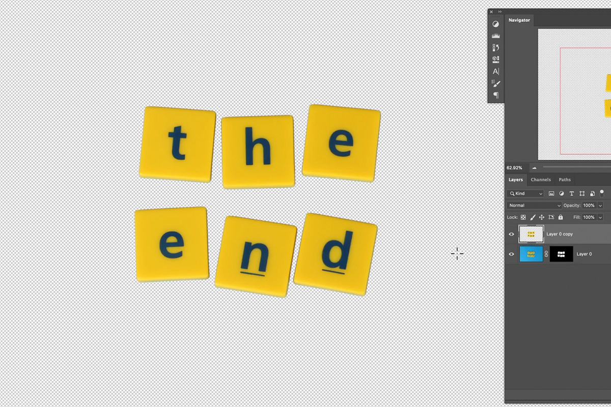
Duplicate the masked layer and apply its layer mask permanently, leaving a layer with just the letters and no mask. Add a solid color fill layer sampled from the original background color underneath, so the scene still reads correctly while the letters are being separated.
-
Cut and Paste in Place, One Letter at a Time
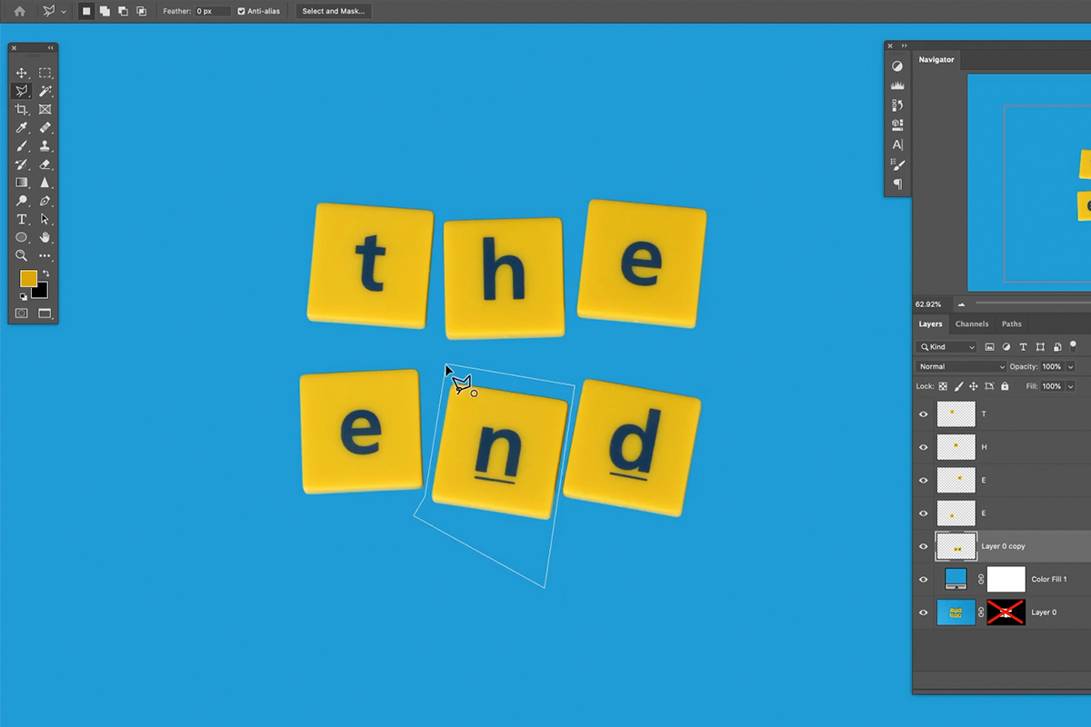
Use the Polygonal Lasso tool to select one letter, cut it with Ctrl/Cmd + X, then paste it back in the exact same position on a new layer with Shift + Ctrl/Cmd + V. Repeat for every letter until each one occupies its own individual layer.
Why Paste in Place Matters
A regular paste can drop content in an unpredictable position relative to the canvas, which would mean manually realigning every single letter afterward. Paste in Place guarantees each letter lands in the exact same spot it was cut from, so the overall word still reads correctly the moment every letter has its own layer.
Adding Dimension with a Two-Layer Drop Shadow
Flat, cut-out letters read as noticeably artificial until they get some shadow back, which is what makes them look like they’re actually sitting above the background rather than pasted flat onto it.
-
Add a Colored Drop Shadow
Double-click a letter layer to open Blending Options and enable Drop Shadow. Rather than plain black, sample a saturated color from the image itself — black or white tends to desaturate the surrounding color, while a sampled color keeps the shadow feeling like it belongs to the same scene.
-
Add a Second, Softer Shadow for Depth
Click the plus icon to duplicate the drop shadow effect, then lower its opacity and adjust its size and distance separately from the first. Two shadows — a tighter one close to the letter and a softer, larger one further out — read as noticeably more three-dimensional than a single shadow alone.
-
Copy the Effect to Every Other Letter
Hold Alt/Option and drag the small “fx” icon from one layer onto another to copy the exact same drop shadow settings, rather than rebuilding them from scratch on every letter.
Setting Up the Frame Animation Timeline
With every letter isolated and shadowed, the animation itself comes together in Photoshop’s Frame Animation timeline — a simpler alternative to the video timeline for this kind of effect.
-
Group and Duplicate the Letters
Group all six letters and name the group THE END 1, then duplicate it with Ctrl/Cmd + J and name the copy THE END 2. You rotate the copies once the timeline is open.
-
Open the Frame Animation Timeline
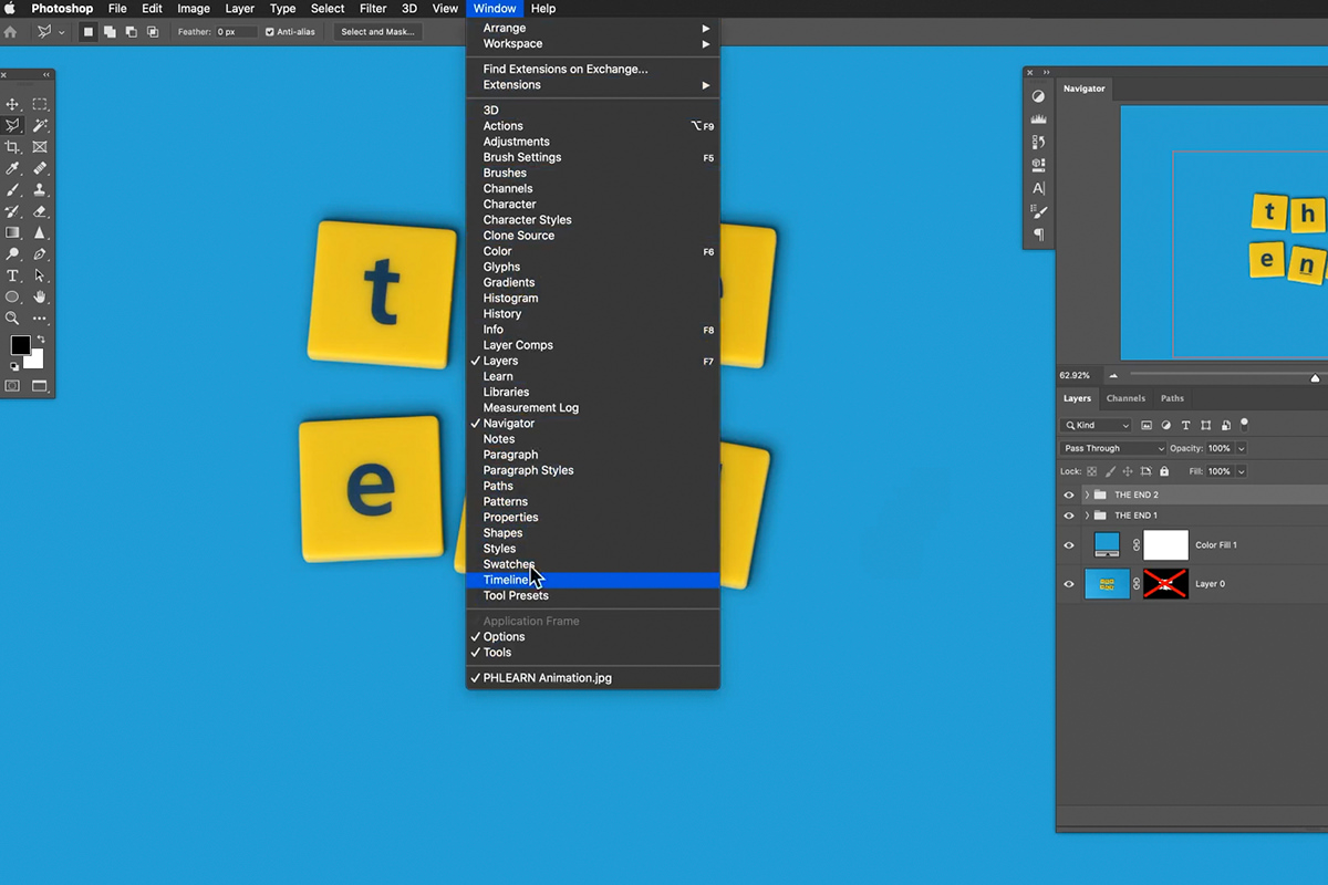
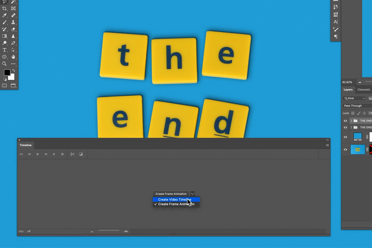
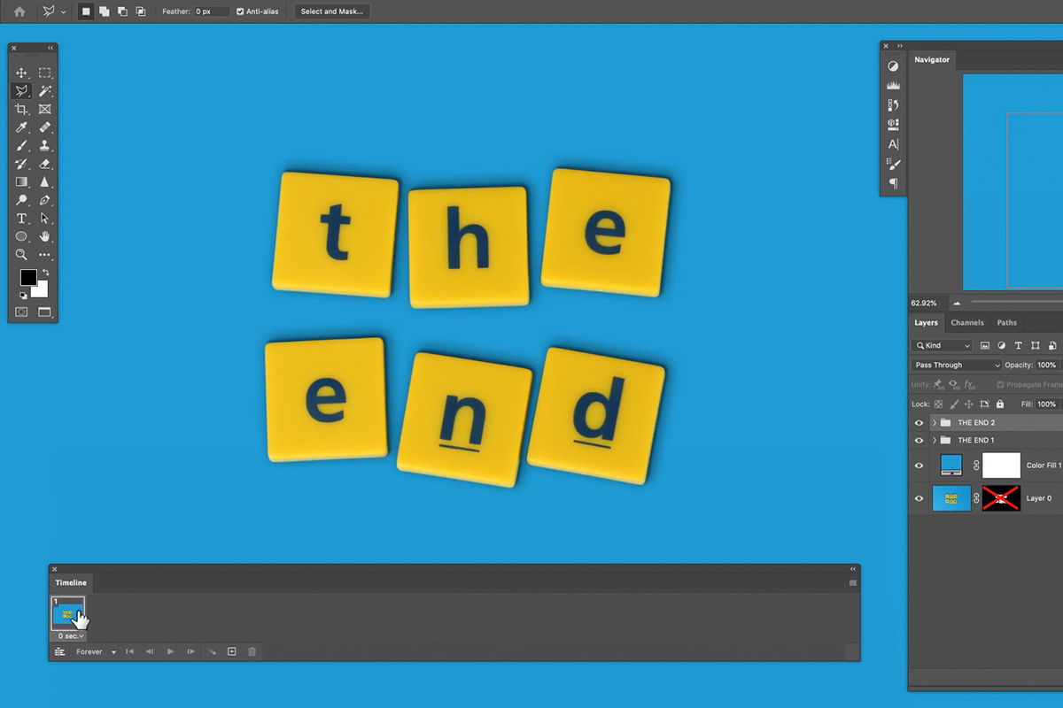
Go to Window > Timeline and choose Create Frame Animation. Each frame in this timeline simply reflects whatever layers are currently visible, so building an animation is mostly a matter of toggling layer visibility per frame. Click the plus icon to add frame 2, then in THE END 2 select each letter, press Ctrl/Cmd + T and rotate it a little, maybe move it a little too, keeping the tiles from overlapping.
Animating the Letters Between Two States
With two distinct letter arrangements grouped and ready, alternating between them across frames is what creates the actual motion.
-
Show One Group per Frame
On the first frame, make only the first letter arrangement visible; click frame 2 and make only the second arrangement visible there instead. Playing the timeline now switches between the two states.
-
Adjust Frame Delay
Select both frames and set their delay — half a second tends to read as snappy without feeling rushed for a short title card animation like this one.
Adding Icons and Recoloring Them with Color Overlay
A couple of simple icon shapes — a rocket and some stars, in this case — add visual interest beyond the animated text alone.
-
Bring in PNG Icons and Recolor Them
Drag in flat PNG icons, then apply a Color Overlay layer effect and sample a color from the existing design to bring them in line with the rest of the graphic.
-
Duplicate and Vary the Icons
Copy the Color Overlay effect to duplicated copies of the same icon with Alt/Option-drag, then resize and rotate each copy slightly so a repeated element, like several stars, doesn’t look like an obvious duplicate.
Animating Icons the Same Way as the Text
Grouping icon variations the same way as the lettering — one group visible per frame — lets stars or other decorative elements animate on the same two-frame cycle as the main title text, keeping the whole design’s motion feeling coordinated rather than mismatched.
Animating an Object Across Multiple Frames
A two-state on/off animation works for the letters and stars, but an object that needs to travel across the scene — like a rocket flying past — needs more distinct positions to read as continuous motion.
-
Duplicate Frames for Additional Positions
Duplicate frames to build out four total positions instead of two: select frame 1, click the plus icon and drag the copy to third place, then duplicate frame 2 and put it on the end. The way this animation is built, you can’t tell one layer to be in one spot on this frame and another spot on the next, so each position gets its own copy of the object. The video timeline could do that, but Aaron finds four copies simpler.
-
Place a Separate Copy at Each Position
Create four copies of the rocket layer, positioning one further along the intended path in each successive frame, so playing through the frames in sequence reads as the rocket flying from one side of the frame to the other.
Exporting as a GIF and as Video
With the animation complete, it can be exported two different ways depending on where it’s headed next.
-
Export as an Animated GIF
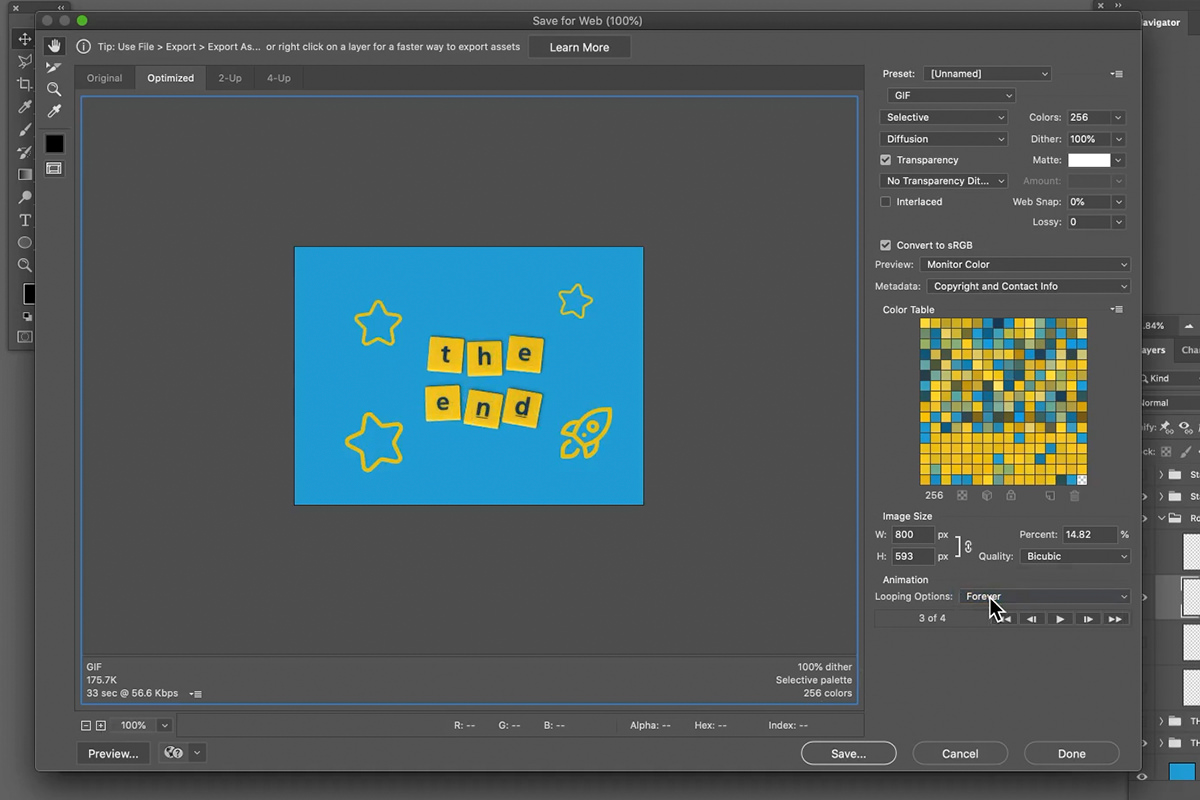
Go to File > Export > Save for Web. Scale the image size way down to keep the file size manageable (Aaron types 800 pixels for the width), set looping to Forever, and use the Preview button to check how the animation actually plays in a browser before saving.
-
Render as a Video File
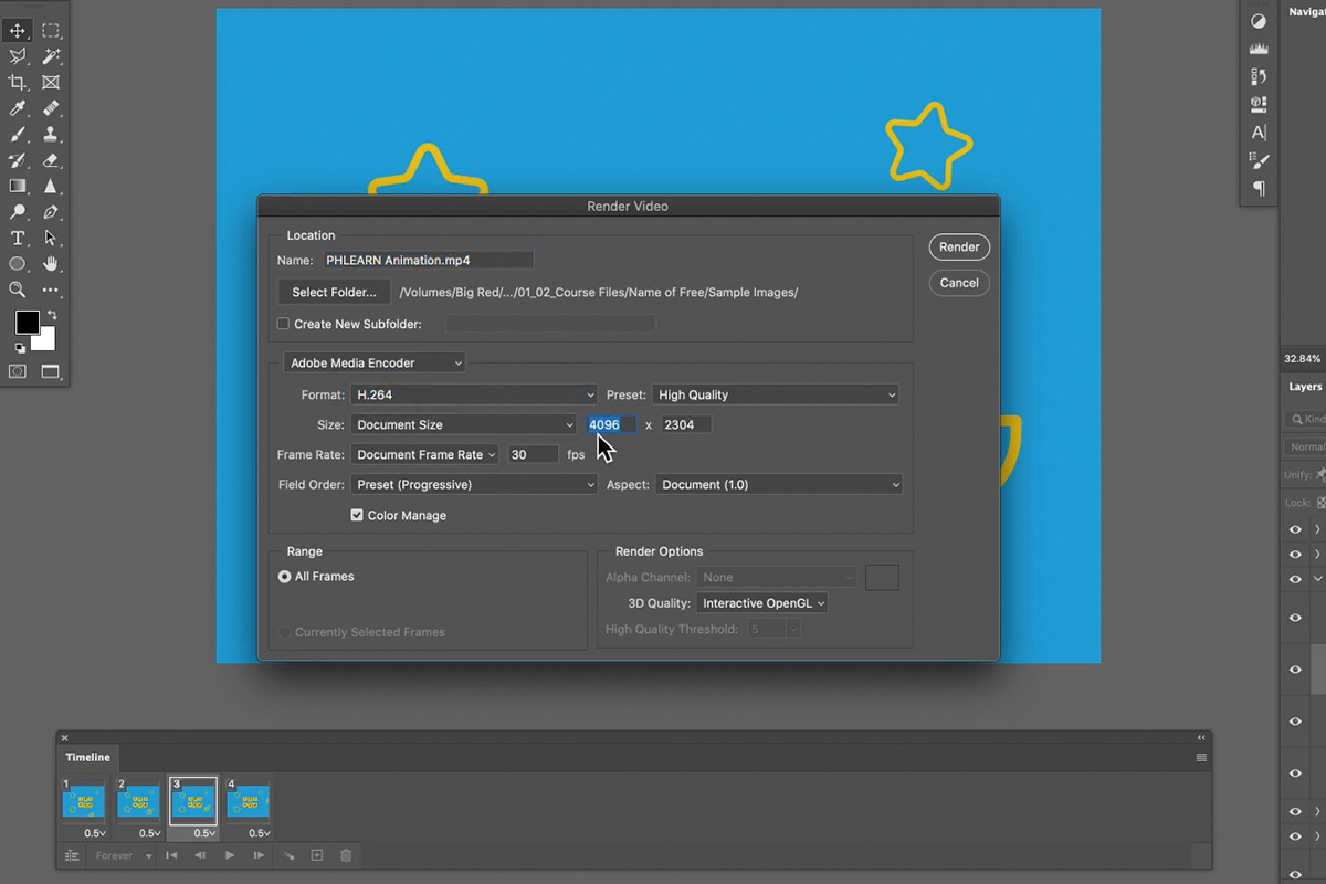
Go to File > Export > Render Video, choose Adobe Media Encoder with an H.264 format, and select a resolution like 1080p before exporting — a better fit than a GIF when the title card needs to drop into a larger video sequence.
Need it longer for video? Shift-click the frames and drag them to the new frame icon: the animation is twice as long and still loops, with no extra work. A GIF loops on its own anyway, so it doesn’t need this.
Why This Approach Works
What makes Frame Animation approachable, even without any prior animation experience, is that it doesn’t ask you to think in terms of keyframes or interpolation at all — each frame is simply a snapshot of whatever layers happen to be visible at that moment. That’s exactly why cutting each letter onto its own layer early on matters so much: without that separation, there would be no way to show one arrangement in frame one and a different arrangement in frame two. The same letter-isolation technique used here to build individual, animatable layers is really just a specialized case of a more general skill covered in How to Change & Remove Backgrounds in Photoshop — separating a subject cleanly from its background is useful well beyond animation work.
Final Thoughts
A short title animation like this one comes together from a handful of individually simple steps — a clean cutout, a couple of drop shadows, and a small number of frames toggled on and off — rather than any single complicated technique. For anyone who wants to push a project like this further, using Photoshop to prepare text and a gradient before bringing the whole thing into After Effects, this two-part series on creating text and a gradient in Photoshop and then using After Effects to add a beautiful animation covers a more advanced animation workflow built on the same underlying idea of preparing separated, animatable layers first.
Quick Reference: Keys, Menus and Settings
- Cut out the lettersSelect > Color Range, Fuzziness all the way up; Shift-drag the Rectangular Marquee to add; Select and Mask, Output To: Layer Mask
- One letter per layerCmd/Ctrl + X, then Shift + Cmd/Ctrl + V to paste in place
- Copy the shadowsAlt/Option-drag the fx icon onto another layer
- Second letter stateCmd/Ctrl + J to duplicate the group, Cmd/Ctrl + T to rotate each letter
- Frame animationWindow > Timeline > Create Frame Animation; plus icon for a new frame; delay 0.5 seconds
- Animated GIFFile > Export > Save for Web, width 800 px, Looping Options: Forever
- VideoFile > Export > Render Video, Adobe Media Encoder, H.264, 1080
No AI, no generative credits.

Free Downloads
Follow Along on the Same Image
Get the yellow letter tiles on blue that Aaron cuts out and animates, the layered PSD, plus the 4-page PDF guide with every step. Free with a PHLEARN account.
Title Animation in Photoshop: Common Questions
Should I use the frame animation or the video timeline?
For a simple title card, the frame animation. Go to Window > Timeline and choose Create Frame Animation. Each frame simply shows whichever layers are visible, so you animate by turning layers on and off.
How do I cut the letters out of the background?
Use Select > Color Range on the yellow with Fuzziness all the way up, and the plus eyedropper for the shaded parts. Shift-drag the Rectangular Marquee over each blue letter to add it, then use Select and Mask with Output To: Layer Mask.
How do I put each letter on its own layer without moving it?
Select a letter with the Polygonal Lasso, cut it with Cmd/Ctrl + X, then press Shift + Cmd/Ctrl + V to paste it in place on a new layer. Repeat for every letter.
Why not use a black drop shadow?
Black and white just desaturate the colors in your image. Click the shadow’s color swatch, sample the blue from the image and drag it down to a darker, saturated blue.
Why add two drop shadows?
Two give more definition than one. Click the plus next to Drop Shadow to duplicate it, keep one small and close where the tile touches the ground, and make the other softer and larger with lower opacity.
How do I copy the shadows to the other letters?
Hold Alt/Option and drag the fx icon onto another letter layer. Drop it right on the layer; if you miss, Photoshop may make a copy of the layer instead, so delete it and try again.
How do I change the speed of the animation?
Shift-click the frames and change the delay under a frame from 0 seconds. Aaron tries 1 second, then shortens it to 0.5.
Why does the rocket need four copies?
The way this animation is built, one layer can’t be in one place on this frame and another place on the next. The video timeline could do that, but four rockets, one shown per frame, is simpler.
How do I save the animation as a GIF?
Go to File > Export > Save for Web, make the width much smaller (Aaron uses 800 pixels), set Looping Options to Forever and click Preview to check it in your browser. For video, use File > Export > Render Video with H.264 at 1080.
Is the sample file free?
Yes, with a free PHLEARN account. You get 1 sample image, 1 sample PSD and 1 PDF guide: the yellow letter tiles on a blue background and a 4-page guide to every step. The rocket and star icons are free from The Noun Project with an account there.
Master Photoshop, Lightroom and Photography
Join PHLEARN PRO for $12.99 a month or $99.99 a year. Cancel anytime, with a 100% money-back guarantee.





