5 Rules to Follow When Analyzing Someone’s Artwork
Art is about communication.
Communicating with words is important and can help to understand, clarify, explain, defend and improve your image making. The more we involve ourselves in making and viewing art, the more we find it’s necessary to talk about the work. How can we know if something hits its mark and others find it interesting?
This is particularly difficult with photographs. We are accustomed to viewing photos as a recording of our lives and it’s difficult to get past the subject and its personal meaning. When we show the image to someone else they can feel helpless in trying to respond to our intended meaning. How do we or they know if it ‘worked’ or did not?
While we tend to favor subject over design/placement, texture, pattern, direction, color, scale, visual depth and contrast of light, color, etc., it’s the artist’s manipulation of these elements that determines if we look at all, how long we look, and what we take away from looking at the work. As artists and viewers, we need to keep in mind that the photographer and designer always has choices. And the exercise and manipulation of those choices are what makes something work or not.
So how do you react when someone asks you, “What do you think?” or “Is it good?” These words can hold a kind or terror when a friend asks you to comment on their art. How do you ‘read’ someone’s photo to give them constructive feedback?
Anyone who works with art long enough understands that words like ‘good’, ‘cool’, ‘interesting’, ‘rad’, ‘confusing’, ‘boring’ and even ‘dynamic’ are meaningless without some supporting information. As an artist and viewer, we need to be aware of the effect of these on our own and others’ reactions. If your friends think your work is cool but you can’t get it published or sold, what can you do?
Comments on technical accomplishments are great but sometimes an accidental slip of the shutter produces the best work. Learn to understand what you want and use those techno chops to achieve it, and in turn help others to achieve their visual goal. We want to support our friends and colleagues but sometimes we need to move beyond our gut reactions.
Reading a photograph or other artwork is a lot like reading a book. What are the qualities that make you want to keep on looking? Can something be good if you don’t like it?
Using ideas of formal analysis can help us to look longer, understand and unpack an artist’s vision, and sometimes provide deeper meaning to you, the viewer.
RULE #1: Withhold Judgement
The most difficult task is to try and avoid conclusions and judgement before you take in all the varied elements. Your gut reaction often means that you are attracted or repulsed by something, but sometimes that is wrapped up in what we call ‘taste’.
Let’s talk about taste. “I know what I like.” Most of us like what we are familiar with. If you grew up eating hamburgers and mac and cheese, then the first time you had a goat cheese pizza you may have been repulsed. Remember that in the sixties, boys with hair below their ears were sent home from school. But tastes change as we experience new things. Punk rockers can become classical musicians (or vice versa)! Art is a great way to broaden your tastes but it can be difficult to resist judgement before we get all the information. And what you loved in the past may seem awful to you now.
Take some time to look and think before you react with praise or criticism – before you use words that pass judgment, for example ‘like’ or ‘great’, or make actions that have the same effect, like shaking your head in confusion and distaste. Your friend or colleague will appreciate your time, believe me! The average time someone spends looking at an image is three to five seconds. That’s it. Whether it’s a sign, a face in a crowd, an advertisement, or a work of art.
The Socratic method of using questions (ask them of yourself and the artist) is a great way to unpack imagery and find more to discuss about even a simple image. This way you can be more sure about WHY you feel the way you do, and your friend/colleague can have some insight into what they are really saying with their work.
RULE #2: Look at the Parts in an Objective Way
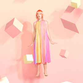
Let’s look at this image first and answer the essential questions.
Photo by sheldon nand on Unsplash
1. What do you see? (simple and objective, remember)
- A vertical (portrait) format with a single brightly dressed person, standing in the foreground, against a neutral colored architectural background.
2. Where is the focus? Why?
- The figure is the focus – bright, big, in the foreground and looking at us, the viewer. She is ‘calling to’ us to look back at her. When there is a face in your image, the direction of the gaze is very important.
3. What about contrast? Is everything the same or are there extreme differences of shape, color, space, etc.?
- The figure has bright flowing organic shapes in warm colors while the background is geometric and cool in color.
- The space is relatively monochromatic (one color) and constructed of geometric shapes, looks like modern materials.
4. Does the viewer’s gaze move in a particular direction?
- The structural lines of the space are diagonal, leading to the right corner, suggesting deeper space with linear perspective.
5. Any similarity of shape, color, direction?
- The vertical figure is echoed by the vertical line in the background.
- The color of the bricks is related to the color of the skirt.
- The pattern of the handbag echoes the pattern of the bricks and the glass blocks.
6. Connotation and denotation (time, place, situation, meaning, symbolism)
- The materials of the building look contemporary, as do the clothes of the figure.
- The scale of the wall and the bricks on the ground denote a contemporary exterior space. The sunglasses support this location.
- The figure is casual in posture, looks as though she has suddenly paused, giving a connotative sense of surprise.
- What does it mean? These elements suggest ‘fashion’ – either ‘seen on the street’ or composed.
7. What about emotions? How does this image make you feel?
- Bright casual colors against stark city materials, a definite visual line to the deep space, a cheerful glance, maybe a wave. Kind of makes you want to create a story, doesn’t it?
It looks like this photo is pretty successful, stands up to the questions and gives us something to talk about and react to without saying ‘good’ or ‘bad’.
RULE #3: Know That the Arrangement of the Parts Directs Your Feelings
Let’s try another.
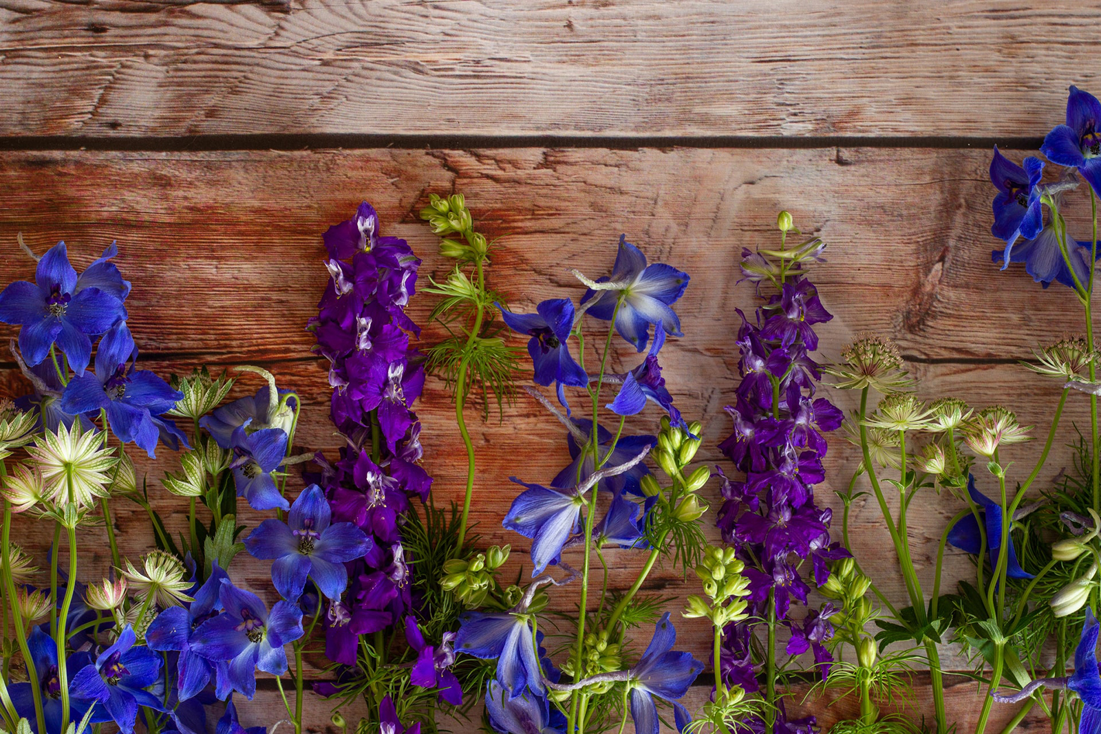
Photo by Micheile Henderson on Unsplash
1. What do you see?
- A horizontal (landscape) composition.
- Strong horizontal lines with a wood texture at the back.
- Organic vertical shapes with small regular colorful shapes (flowers) in front.
2. Where is the focus?
- There appears to be no single focus – the plants/flower shapes command equal attention.
- The space is divided into the top (the wall) and the flowers which form a meandering horizontal edge.
3. How about contrast?
- The strong horizontal of the boards reinforces the horizontal orientation. The bright color of the flowers is in strong contrast to the more neutral wood.
- The repetitive shapes of the flowers form a pattern that we perceive generally and examine specifically to see variation.
4. Does the gaze move in a specific direction?
- The arrangement of the plant’s vertical stems and the repeated shapes of the flowers creates a rhythm. In this case, the colors create the visual path – smooth arc of the blue, vertical purple to lead up and down, soft ‘beats’ of the green/white.
5. What about visual depth? What do we see behind the flowers?
- The space is very shallow, we see nothing beyond the wall of wood. We also see the flowers on a very intimate scale, as though we are close to the ground.
6. Denotation – Where are we? This is mysterious because of what we DON’T see. The rough texture of the wood looks like an exterior wall and the linear arrangement of the flowers seems like they are in a bed or box next to a building outside. But there is no sense of bright light or shadows to suggest sunlight.
Connotation – Flowers are often symbols of beauty, delicacy and growth. The wood contrast suggests human architecture, an outside wall perhaps. The intimate scale suggests a pause to stoop down and look – “take time to smell the flowers.”
7. Emotional effect – ahhhh…
RULE #4: Facts Are Deceiving – Let the Image Talk
Let’s try something abstract.
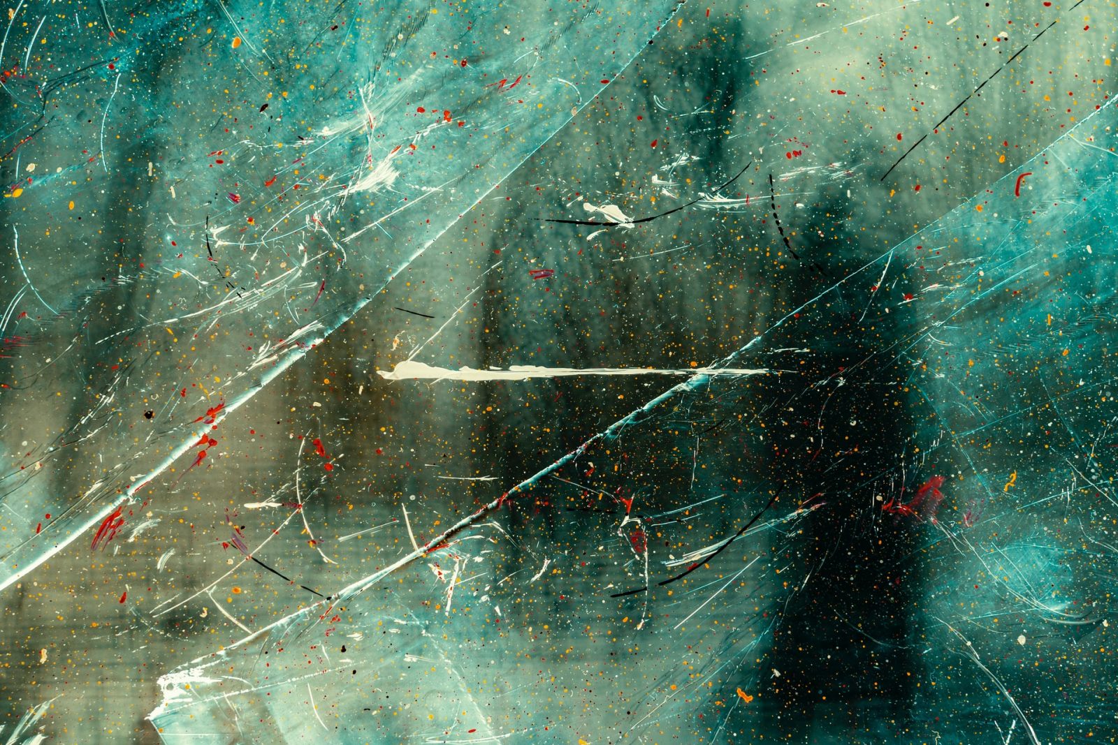
Abstract images can pose more of a problem. How can we talk about something without immediately recognizing the subject?
Let’s be more conversational this time and throw away the list. (Hint: your friend will like this approach better – they’ll understand you are really doing DEEP LOOKING.)
This particular image does not have the direct organization that the first two images have, partly because of the lack of discernible subject matter. At first glance it seems a random layering of marks and shapes. No directly discernible objects, places, actions or story.
In this horizontal composition, strong diagonal marks create visual action that divides the space into three almost equal sections. Strong diagonal division helps to organize space.
While largely monochromatic (one main color), there are much smaller orange and red marks arranged in an almost predictable pattern. (Blue and orange are complementary colors, so they provide dramatic color contrast here.) The contrast of the blue/orange creates a drama that is intensified by the way the marks force our eyes to move throughout the frame.
In addition to the large diagonal white marks, there are smaller marks in the same color, mostly diagonal, but a few irregularly placed and occurring throughout the space. There is one strong horizontal mark in the center. Because of its central placement and contrasting direction, this provides some focus but the busy movement of the small marks pulls the viewer back into the space.
The marks seem to be on a flat surface but the modulation of value (light and dark) suggests that there is a deeper space. There are vertical dark shapes that on close examination suggest tree branches.
Denotation (description/definition) – surface, texture, transparency, movement.
Connotation (suggestive meaning and emotion) – red and orange seems close and pushes the dark vertical shapes back, providing an idea of stabilizing the frantic movement. Can we get philosophical here and suggest that the artist is encouraging us to see beneath the chaotic surface with its jagged marks and shocking color contrast and into a space of stable form and depth?
RULE #5: Let the Author of the Image React
After you’ve gone through your personal analysis of their work, see how the artist reacts. Do they think they were successful in conveying their intent? Did they have an intent to create more than ‘eye candy’? We all have a big sweet tooth for images so this is not bad, but artists should consider what they’ve done, whether they know it or not. This helps to get it “right” more often.
Taking time to talk about an image helps both the artist and the viewer. Staying objective (not so personal) and non-judgmental can help lead to constructive suggestions.
So, to summarize:
- Take your time to answer.
- Avoid judgment words – even if you are the client, give the artist’s work a chance to be analyzed. Images are complicated. Sometimes a longer look changes feelings.
- Take a good look and consider ALL the details:
- What do you see in objective simple terms? (Imagine describing it to someone over the phone in words only.)
- Is there a specific focal point?
- Does your eye move in a specific direction or is there an overall pattern?
- Contrast of size, shape, color, direction, value?
- Can you identify the space? Is it flat or deep?
- Some images and shapes give information – denotation (outside, inside, human, machine) and others activate our sense of connotative meaning – symbols and suggestions.
- What is your emotional response? Was it formed by any or all of the above?
If you can follow these simple guidelines, and TAKE TIME to really look, you will not only have a more complete response to the work (with a lot more to say beyond ‘cool’ or ‘rad’), but you will also let the artist know what elements are working for their intent and which are in conflict.
And you will learn to understand what draws you to keep looking at and creating art as well.