Your New Secret Weapon: A Guide to Complementary Colors in Photography
Complementary colors in photography: an in-depth overview
What are complementary colors? How do color harmonies affect my photography? And what the heck is the difference between additive and subtractive color? If you’ve wonder these things like we have, you’re in the right place. In this guide, we’ll dive into the color wheel and other science behind color theory that will make your photographs POP.
When it comes to photographic technique, we all love to get caught up in the mechanics. What type of lens should I use for sports photography? How do I balance the exposure triangle? And what the heck is an aspect ratio? All mechanical questions with (for the most part) concrete, mechanical answers. But getting those answers doesn’t necessarily mean you will consistently produce great work. Sometimes it pays to step back and work with the one bit of photographic equipment we all got for free: our eyes.
We usually know right away when a color (or color scheme) is or isn’t working. The challenge is learning to identify what is causing it to behave that way. Enter an artist’s best friend: color theory. In this guide we’ll cover some basics of color theory, focusing specifically on one very powerful color combination that many don’t even know about: complementary colors. We’ll talk about what exactly those are, how to find them, and when and how you can use them to take your images up a notch – without spending a dime on new equipment!
Let’s Talk About Color
Have you ever heard two people arguing about whether white is the absence of color or the combination of all colors? Well, both of them were right! Or possibly, they were both wrong. It all depends on which color model they were each trying to describe. When colors mix to form different colors, they generally can do it in one of two ways: with light or with pigment. In one case, you are adding light. In the other, you are taking it away. That’s where the two types of color mixing, additive and subtractive, get their names.
Additive Color
When someone tells you that white is the combination of all colors, they are talking about additive color. This is what you see on your TV, computer, and phone screens. The RGB color model is an additive color model, and if you spend a lot of time in Photoshop you’re probably quite familiar already with those three letters. In this model, the three primary colors are red, green, and blue.
Subtractive Color
In the case of subtractive color, the combination of all colors is black. This is the way you talked about color in your elementary school art classes, when you learned how to mix colors with finger paint. Subtractive color is physical color, and the primary colors you’ll usually see for a subtractive color model are blue, red, and yellow. In printing, the terminology is a little different: cyan, magenta, and yellow. Most printers use dot patterns like the ones below to “mix” different colors. Thanks to some really nifty color science, these combinations cause your eye to perceive a pattern as a certain color, and they use the color model CMY.
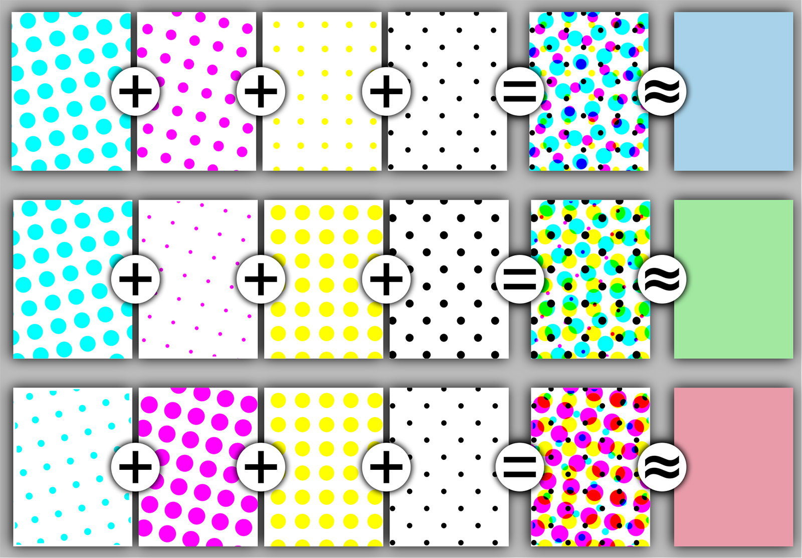
derivative work: Pbroks13 (talk)Halftoningcolor.png: Slippens [Public domain], via Wikimedia Commons
Pro Tip
Did you feel like something was missing when we talked about the CMY color model? Most people are used to seeing it as CMYK. The K refers to black. In printing, it’s more efficient to use a pure black rather than create it by combining all of the colors every time, so it usually has its own toner.
The Color Wheel
Color is probably the most visual concept that exists, so different ways of visualizing color relationships have popped up over time. The one that sticks in most people’s minds is the color wheel, and since the wheel happens to be a great tool for finding complementary colors, it’s what we’ll focus on here.
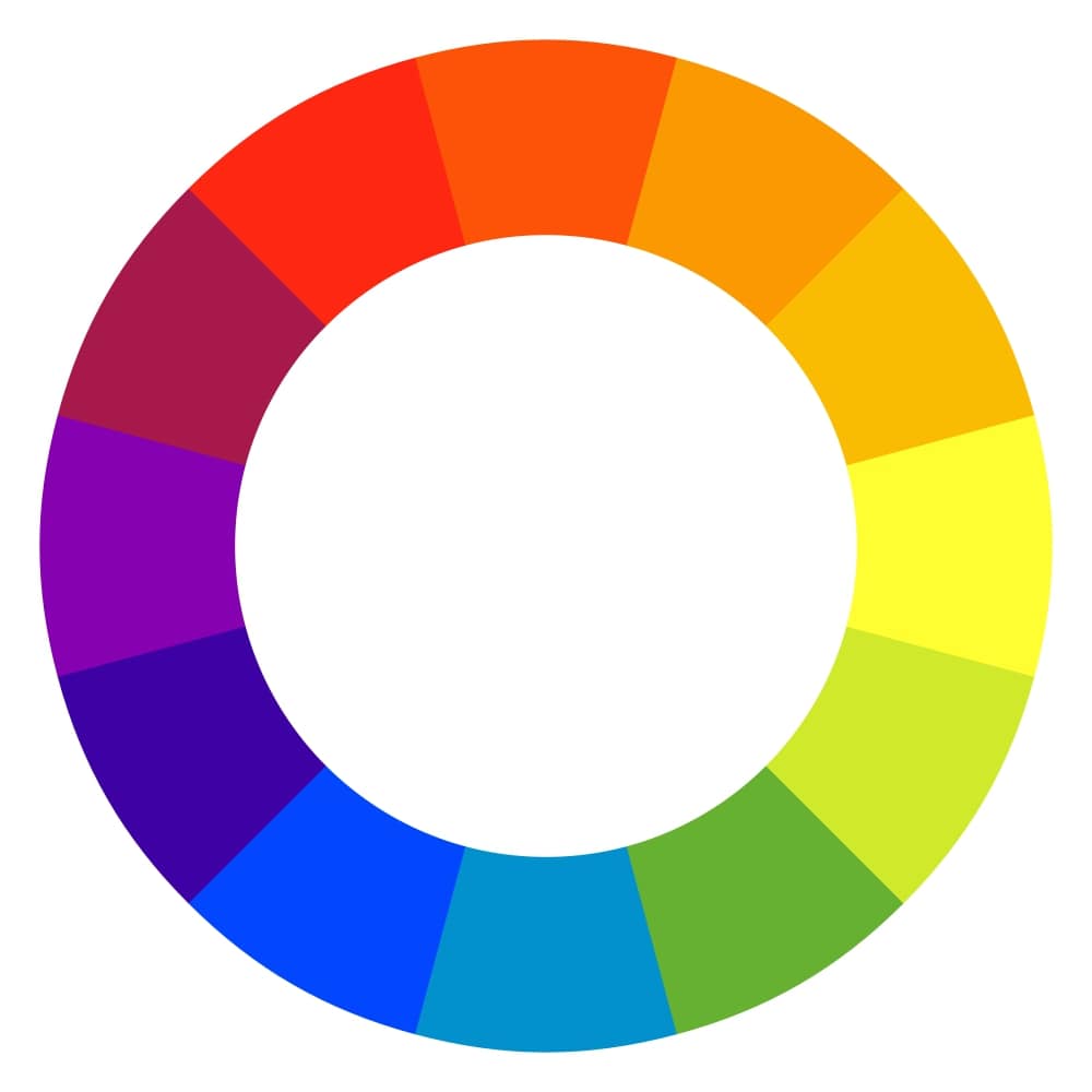
No machine-readable author provided. MarianSigler assumed (based on copyright claims). [Public domain], via Wikimedia Commons
As you can see, the colors are arranged in a circle, and you can see the natural progression from the warm colors to the cool ones and all the way back around. There are three colors on this wheel that you can’t create by mixing other colors. Those three are our primary colors, and since this is a subtractive color wheel, our primary colors are red, blue, and yellow.
When you mix two primary colors, you get a secondary color. In this case, purple (or violet), green, or orange. By mixing a primary color with a secondary one, you get a tertiary color. Because most people start to develop a mild headache at this point in the discussion, the powers that be have made the tertiary colors pretty easy to remember: you just hyphenate the two mixed colors, beginning with the primary one. So by mixing red and orange, you get red-orange. By mixing blue and green, you get blue-green.
This may seem like a digression from the main topic, but in order to understand complementary colors and use them effectively, you need to know what those colors are!
Color Harmonies
Color harmonies are a departure from color mixing, because it’s all about letting colors interact with each other just as they are. You’ve probably shot a brilliant sunset and marvelled at the seamless transition from blindingly bright yellow to deep, serene purple. Or maybe you’ve been drawn to the way the bright red of a rose stands out against the greenery of the rose bush. These scenes and others stand out to you because of the way those colors appear in comparison with one another.
Once you understand color harmonies, you can learn to recognize (and/or seek out) color combinations that work with your vision. Today, we’re focusing on complementary colors and how you can use them to give your photos a little extra pop – or avoid them to minimize tension in your composition.
Pro Tip
We’ll link to a great color wheel resource in just a bit, but you can also buy a physical color wheel at your local craft store to carry in your camera bag. This is really helpful in an unpredictable, high-stress shooting situation like a wedding, where you may want to get detail shots on the fly and need to brainstorm about how and where to set them up.
What Are Complementary Colors?
Think back to the color wheel for a moment. The thing that makes it such a helpful tool is that you can go across it to identify color harmonies. To find a complementary color scheme on your color wheel, simply choose a color, then find the color directly across from it on the circle.
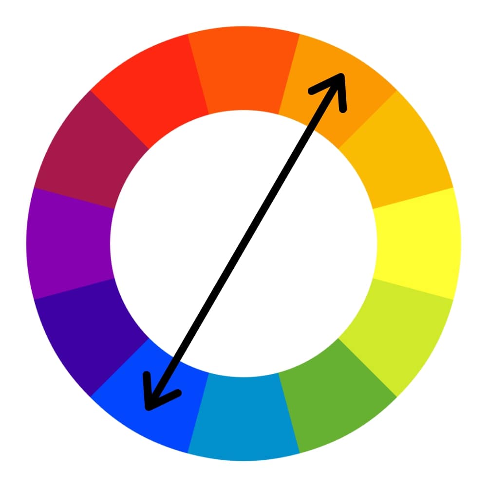
The complementary color schemes you’ll find most recognizable are red/green, blue/orange, and yellow/purple.
Colors have a somewhat ambivalent relationship with their complements. They tend to enhance one another when they’re side by side, but when you mix them, you’ll get a neutral. So they’re good for adding drama and excitement, but they can also overpower your composition very quickly.
You can do a few things to use complementary colors effectively in your photography without letting them steal the show.
- Use one color as an accent color. Don’t worry, you only need a small amount of a complementary color to stand out against its mate.
- Soften one or both colors. By using tints (add white), tones (add grey), or shades (add black), you can get the complementary effect without knocking your viewer out of his chair. Do this in post-processing (more about this later) or look for less overpowering versions of your color while planning your shoot.
- Choose a split-complementary color scheme. To do this, choose your main color, then use it with the two colors directly on either side of its complementary color on the color wheel.
Or, you can just go wild with it! If you’re looking for a way to show chaos, confusion, or strong feeling in your photography, ultra-saturated complementary colors just might be your jam!

Photo by Nikiya Christie on Unsplash
A Note on Selecting Your Complementary Color Scheme
Whether it’s for societal reasons or due to personal experience, certain colors resonate with people in particular ways. This is something to keep in mind as you look for complementary color combinations. Everything from sports teams to religious holidays (Have you ever been to the craft store in December, when it’s red and green from wall to wall?) can utilize complementary colors, so you’ll want to keep that in mind if your particular audience is likely to have a strong reaction to your color combination.
The good news is you can use that kind of color psychology to your advantage if you’re trying to convey multiple ideas in an image. For example, the color blue is used a lot in marketing since it is overwhelmingly perceived as a stable, calm color. The color orange, on the other hand, exudes warmth, excitement, and energy. Using these two complementary colors together brings those two opposing moods together into one, complex image. There’s a lot to play around with there!
Pro Tip
Want a more harmonious-looking color harmony? Try an analogous color scheme! Look for colors that are directly next to one another on the color wheel. These colors will create smooth transitions and will often project a calm, serene quality in your composition.
Complementary Colors in Your Photo Shoot
When you’re planning a shot, think past your technical settings for a minute. What are you trying to convey? Do you want to project a sense of calm? Are you documenting tension? Is there a specific element of your composition that you want to stand out? The colors in your image can help you tell those stories.
If you’re planning ahead for a big shoot, you can use this idea to its full potential by putting together a mood board. Get paint sample cards from your hardware store and play around with color combinations. Find other images that used similar colors and note how those photographers made it work, then brainstorm ways to put your own spin on it.
Always remember that colors are relative. That’s why we pay so much attention to where we put them in relation to one another! Time of day, your camera’s white balance setting, and other lighting considerations will impact the success of your color combinations. Set up a test shoot if color accuracy is especially important to your complementary color combination (this is key if you’re working with brands) and note what time of day and/or what settings on your equipment get the right result. Look over the examples below to see how other photographers have used complementary colors.
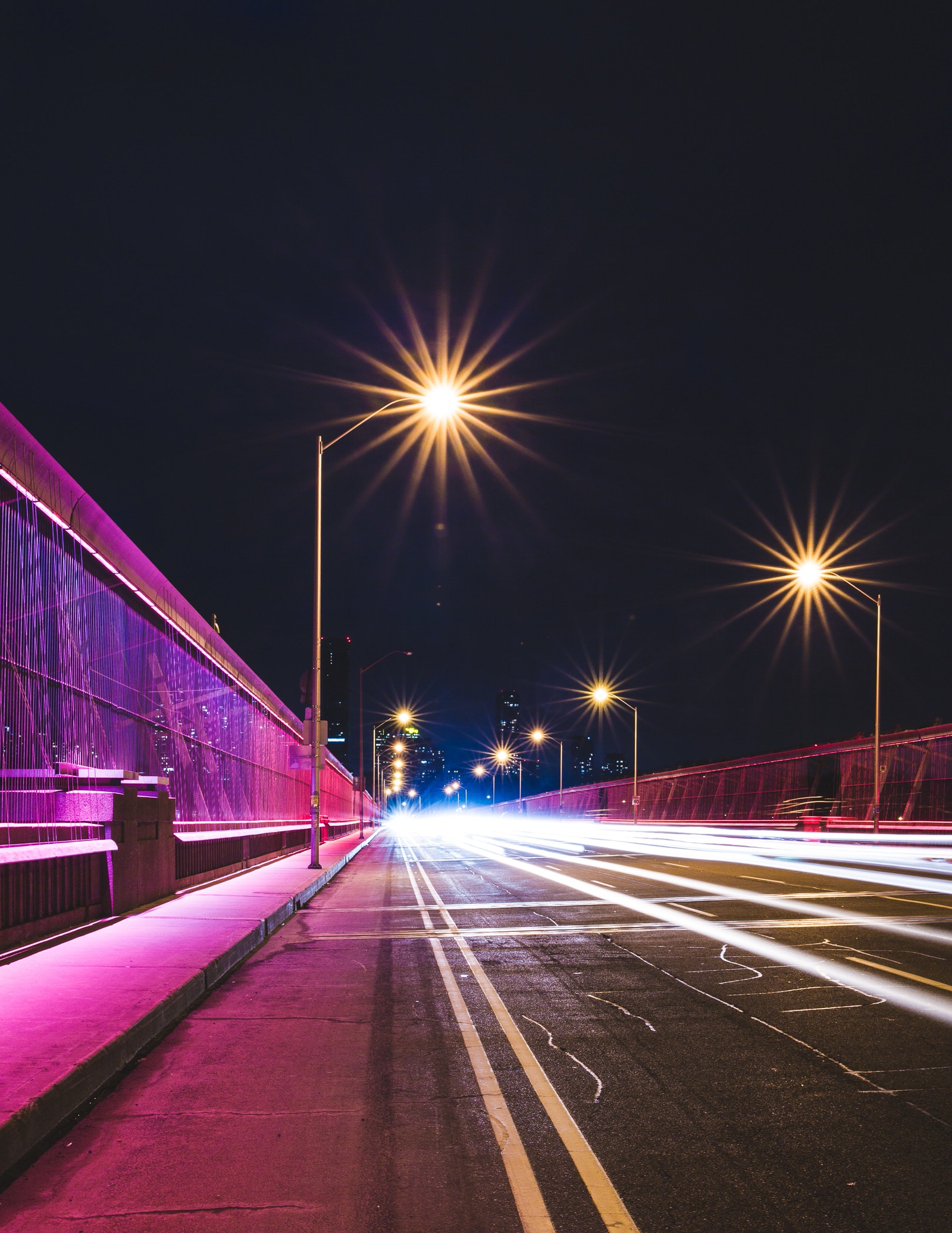
Photo by Filip Mroz on Unsplash
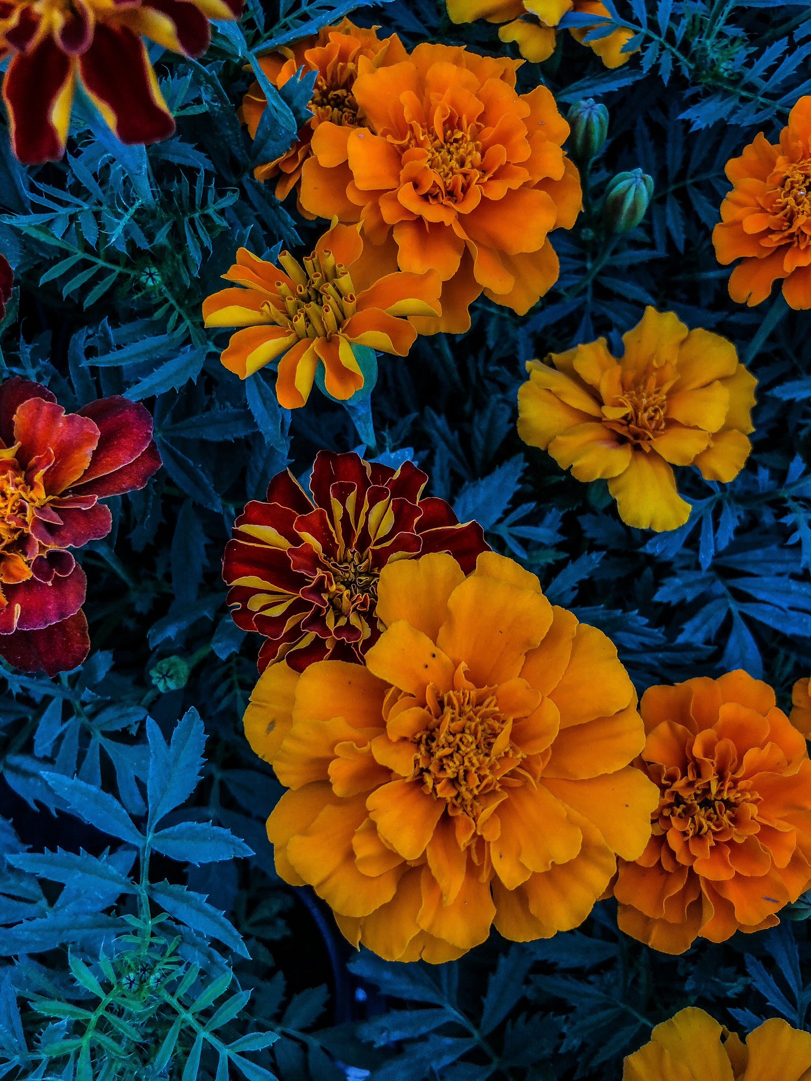
Photo by Elizabeth Jorge on Unsplash

Photo by Food Photographer | Jennifer Pallian on Unsplash
Note that only one of these images uses only complementary colors. You can use a complementary color scheme in conjunction with other colors to tone it down.
Pro Tip
You don’t have to search forever for that one location with the perfect color combination. Take action by selecting props and items in your model’s wardrobe that use your complementary color scheme.
Complementary Colors in Post-Processing
When it comes to color, post-processing is where you’ll have the most flexibility. You probably already managed color to some degree in an editing software like Photoshop, but may not have considered managing your color harmonies along with it.
Design
If you’re planning to use a text overlay on your photo or use design elements to incorporate your image into promotional materials, you might find a color harmony calculator especially helpful. A color harmony calculator can help you find complementary colors based on the exact color as it appears in your image.
Imagine you have an image you want to use in a flyer. You want the text in the flyer to really pop, so you’re looking for the complementary color of the most prominent color in the photo. Here’s how to accomplish that:
- Use the eyedropper tool (I) in Photoshop to select an area of your photo that contains your main color. Open up the color picker and now you’ve got the hex code for that color.
- Now pop over to your color harmony calculator of choice. (We love Canva’s!) Select “complementary” as the harmony you want. Enter the hex code of your main color. The calculator will give you the code for its complement.
- Now you can input that code into the hex code field when you select a text color!
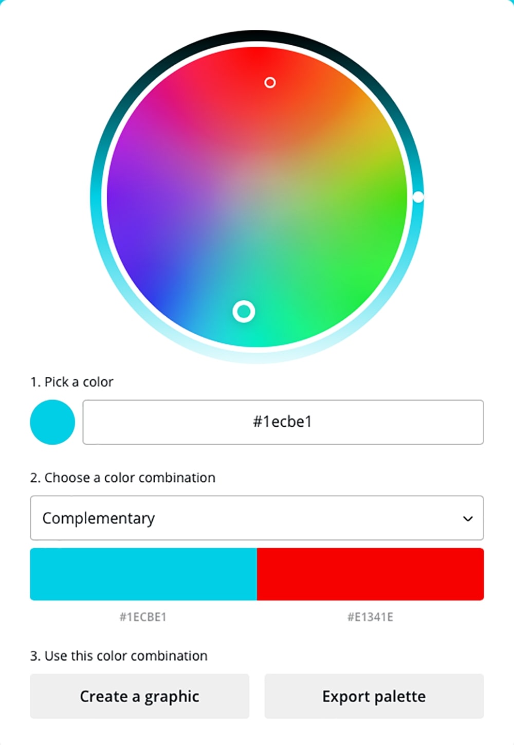
Something to remember about using color theory in post-processing: you are moving from a subtractive color model (the colors you were looking at through your camera lens) to an additive one (the colors you are looking at on your screen). So when you’re using a color harmony calculator to find the complement of a yellow hue, for example, you may get a blue result rather than a purple. Consider this to be a starting point and don’t be afraid to make tweaks to the suggested colors!
Photo Editing
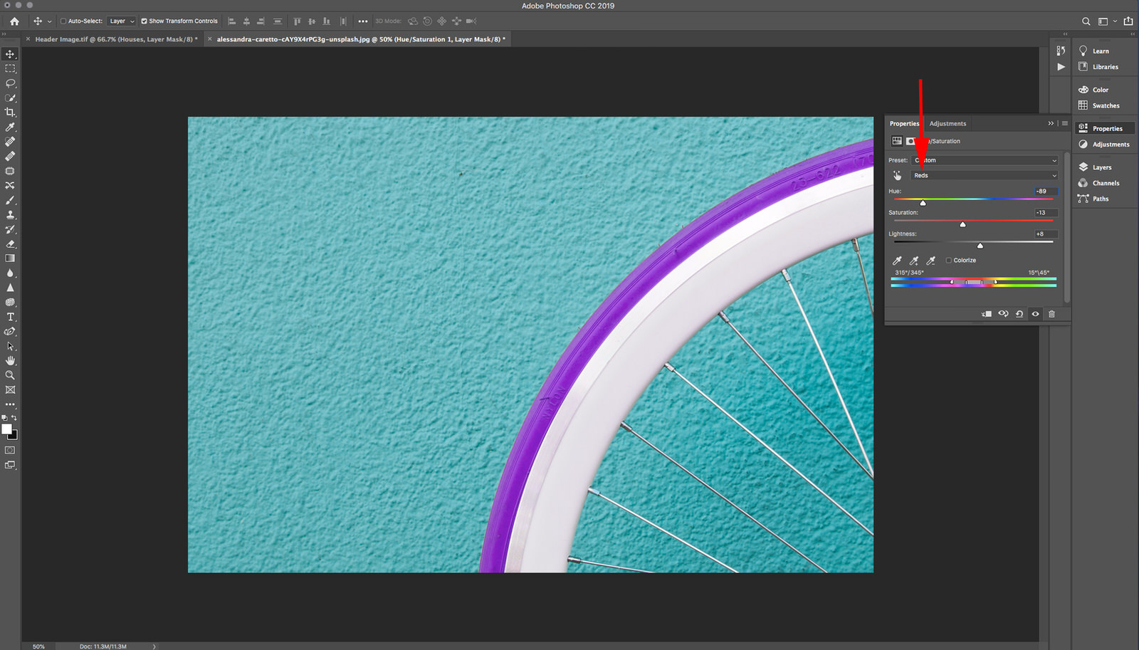
If you simply want to manage the complementary colors in your image, you’ve got plenty of options in Photoshop with a Hue/Saturation adjustment layer.
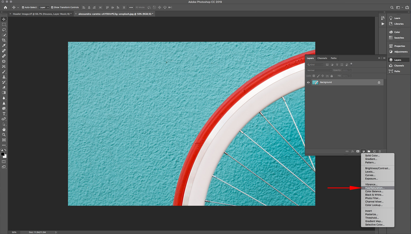
Select your color from the “Master” dropdown menu, then move the Hue slider to change all of the colors in that color range. You can adjust the lightness and saturation of those color ranges in this adjustment layer, as well.
To select part of your image first, based on a particular color, go to Select > Select Color Range. See the video below for a more detailed tutorial:

You can also make some tweaks to your color by “painting” over it with a brush on a new layer. Utilize the opacity and flow settings on your brush as you paint to manage the intensity of the effect, and try different blend modes once you’re done to see what fits your vision.
Keep in mind that complementary colors, when combined, create a neutral. So if one color is popping too much, adding a little bit of that color’s complement might give you more control over it. A Color Balance adjustment layer will give you three sliders that manage the appearance of primary hues in your image. You can use a drop-down menu at the top of the dialogue box to select whether you want your adjustments to impact the shadows, midtones, or highlights in your image.
Pro Tip
Remember: color perception is relative! If you have a color that’s just not cooperating, you can always switch gears and fiddle with the colors around it. Your original color may be perceived differently when adjacent colors have been altered.
Chances are, you have already used color theory in your shooting and not even realized it. Your eyes will have noticed on their own that some colors behave differently when they’re near others, and you probably made some adjustments in the moment to where and how those colors appeared in your image.
The difference is that now you know the “why” and can not only make better decisions when faced with complementary color combinations, you can actually plan for and harness them! Whether you use this information to plan your shoots more efficiently or to stretch your knowledge of techniques to use complementary colors in Photoshop, it’s a powerful new tool that you’ve added to your kit.