Photography Composition Rules: The 25 That Matter, With Examples
The photography composition rules that matter, in five families you can hold in your head, each with an example photo. Plus the 7, 9 and 12 rules people search for, and how to fix a composition in the crop.
Originally published July 5, 2018, by Seth Kravitz. Updated October 14, 2026, by PHLEARN Staff: rewritten as 25 composition rules in five families, with new example photos, the 7, 9 and 12 rules people search for, and how to fix a composition in the crop.
- Rules25, in 5 families
- Works forany camera, including a phone
- Fix lateryes, in the crop
You have taken the photo everyone takes. The subject is in the middle, the horizon cuts the frame in half, and a lamp post grows out of someone’s head. The light was good and the moment was real, and the picture is still flat.
Composition is the part of photography that costs nothing. No lens makes a frame better organised. The photography composition rules below are the ones we keep coming back to in our own tutorials, sorted into five families: where the subject goes, lines, shapes and balance, space and depth, and movement. Learn the families and the 25 rules stop being a list to memorise. They become five questions you ask before you press the shutter.
The rules are not laws. Several of them contradict each other on purpose, and the last one tells you when to ignore the rest. Treat them as ways of seeing a frame. Pick one, use it for a week, then add the next.

The 7, 9 and 12 Rules of Composition People Ask About
Search for photography composition rules and you will find lists of seven, nine and twelve. There is no official set. The lists are different writers’ shortlists, and they overlap almost completely. We counted what the common ones share:
| Appears in nearly every list | Appears in most | Rounds out the longer lists |
|---|---|---|
| Rule of thirds | Depth with foreground, middle and background | Golden ratio and golden spiral |
| Leading lines | Symmetry | Rule of odds |
| Frame within a frame | Negative space | Patterns |
| Simplify, or fill the frame | Rule of space (room to move) | Change your viewpoint |
So the seven are usually the rule of thirds, leading lines, framing, symmetry, depth, negative space and filling the frame. The nine add the golden ratio and the rule of space. The twelve add patterns, the rule of odds and a change of viewpoint. All of them except the rule of odds are among the 25 below (the rule of odds is explained in the questions at the end), with the ones the short lists leave out: horizon placement, implied lines, triangles, juxtaposition, scale and motion. Those are the rules that separate a tidy photo from a good one.
Family 1: Where the Subject Goes
The first decision in any frame is where the most important thing sits. Four photography composition rules cover it, and two of them disagree.
Rule 1: The Rule of Thirds
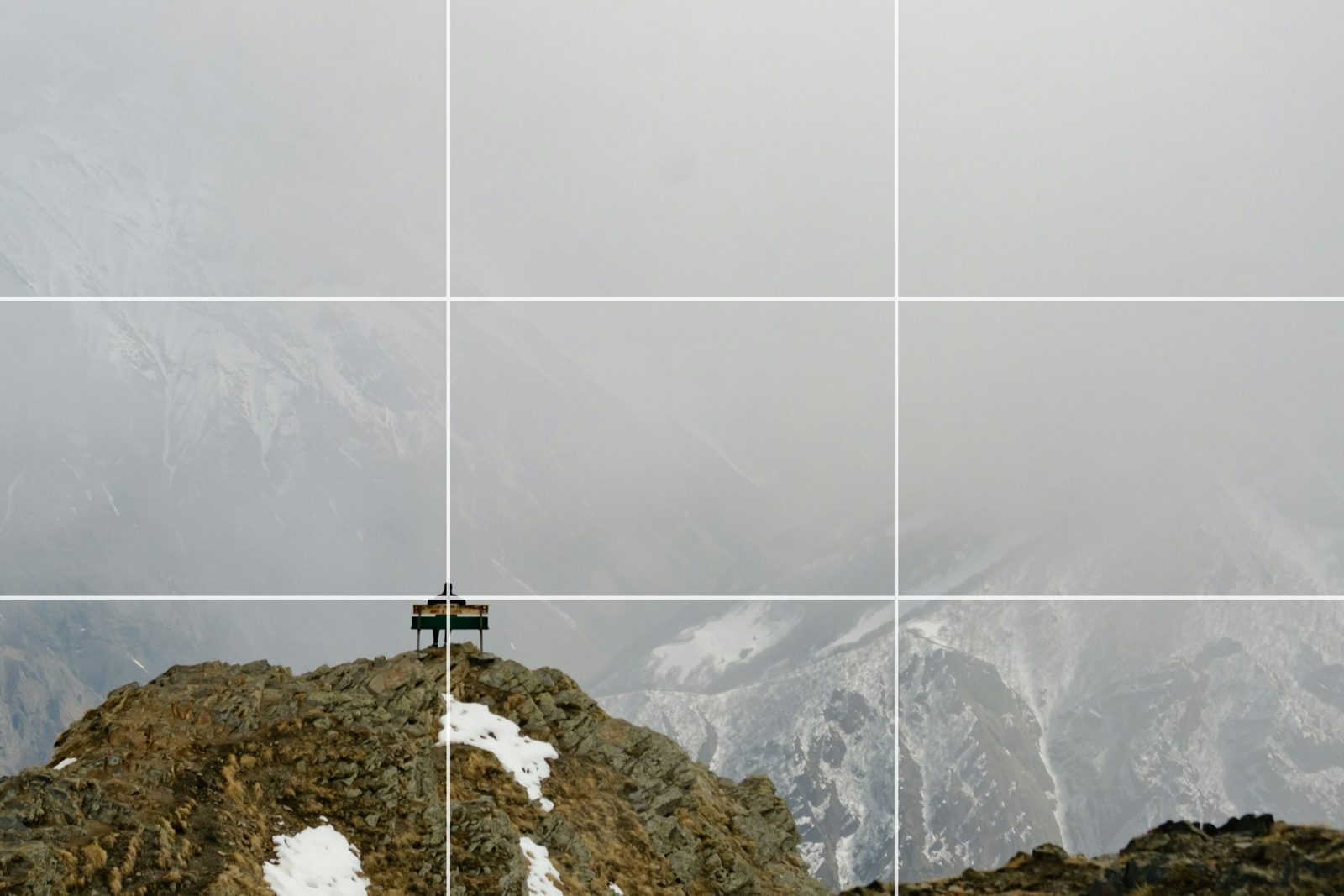
Divide the frame into thirds with two horizontal and two vertical lines. Put the subject on one of the lines, or where two lines cross. The rule is older than photography: the phrase comes from a 1797 book on the picturesque by John Thomas Smith, where it was advice on dividing a scene into unequal parts rather than halves.
It works because it moves the subject off centre without pushing it to the edge, and it leaves the rest of the frame with a job: showing where the subject is, or where it is looking. In a portrait, put the eyes on the top line. In a landscape, put the horizon on the top or the bottom line and decide which deserves two thirds, the land or the sky.
Almost every camera can draw the grid for you. On an iPhone it is Settings > Camera > Grid; most Android camera apps have a grid line setting too. If you want more on this one rule, we have a whole guide to the rule of thirds.
Rule 2: Centre the Subject on Purpose
The middle of the frame is the strongest position there is, which is exactly why a casual centred photo looks static. Centre a subject when the symmetry is the point: a face looking straight into the lens, a doorway, a road running straight away from you, a reflection. Centred works when the subject fills most of the frame, or when there is nothing else in the frame competing with it.
The test is simple. If you centred the subject because that is where the focus point was, move it. If you centred it because the photo is about stillness or symmetry, leave it there.

Rule 3: The Golden Ratio Is Not the Rule of Thirds
The golden ratio is about 1.618 to 1. A frame divided by it has its lines at roughly 38 and 62 percent of the width and height, closer to the centre than the thirds, which sit at 33 and 67 percent. The golden spiral is a curve drawn through a series of golden rectangles, and the eye is meant to follow it in to the subject.
Treat it as a quieter version of the rule of thirds: the subject sits a little nearer the middle, and the picture feels calmer for it. Do not treat it as a secret the masters used. Claims that a given painting or photograph “follows” the golden ratio are usually a grid laid over the picture after the fact. Lightroom Classic and Photoshop both draw a golden ratio and a golden spiral overlay in the Crop tool (Rule 24 covers how), so you can try both grids on the same photo and see which one you believe. Our guide to the golden ratio for photographers goes into the maths.
Rule 4: Put the Horizon High or Low, Never Halfway by Accident
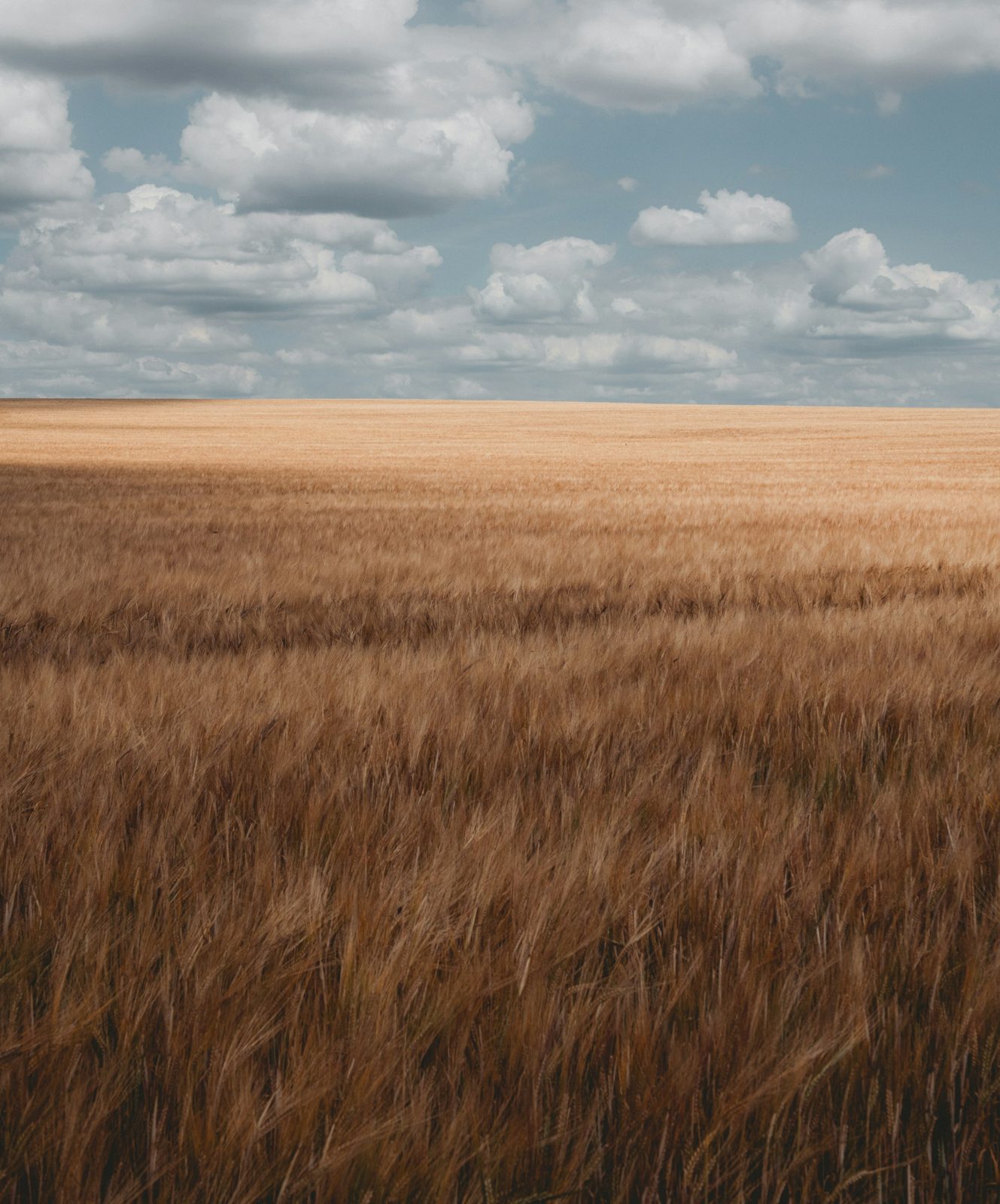
A horizon across the middle splits a photo into two pictures that fight. Decide which half the photo is about. A low horizon, near the bottom third, gives the sky the frame: weather, light, the smallness of whatever stands on the land. A high horizon, near the top third, gives the frame to the foreground: a beach, a field, the texture of the ground you are standing on.
The horizon also has to be level. A tilt of a degree or two reads as a mistake, not a choice. Lightroom’s Crop tool has a Straighten tool for this, and Photoshop’s Crop tool has one in the options bar. If you want a tilt, make it big enough that nobody mistakes it.

Family 2: Lines
The eye follows lines without being asked. Five composition rules put that to work.
Rule 5: Leading Lines
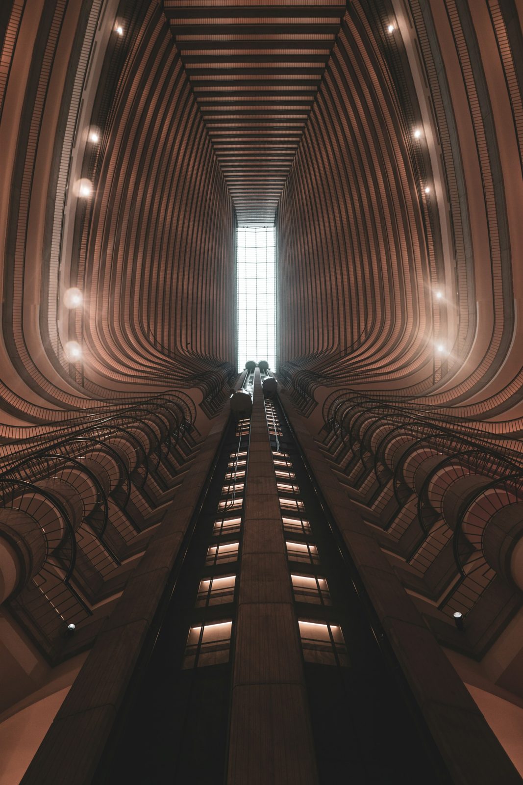
A road, a fence, a shoreline, a row of lights: anything that runs through the frame carries the eye along it. Point it at the subject. A leading line that leads nowhere, or leads out of the frame, pulls the viewer out with it.
The strongest leading lines start near a corner of the frame and run into the picture. Getting lower often helps, because a low camera stretches the lines on the ground. If your line ends at the subject, you have done the viewer’s work for them. For fifteen more examples, and diagrams of the six kinds of leading line, see our guide to leading lines in photography.
Rule 6: Diagonals
A horizontal line rests. A vertical line stands. A diagonal moves. Change your angle, or tilt the camera decisively, to turn a staircase or a street into a diagonal, or find one in the scene: a hillside, a shadow, an arm. Many viewers read a line rising from the bottom left to the top right as climbing, and the other way as falling. Both are useful, as long as you know which one you have.
Rule 7: Curves
A curve does what a diagonal does, slower. A river, a path, a coastline, the line of a shoulder: the eye wanders along it rather than shooting to the end. The classic shape is the S-curve, a line that bends one way and then the other on its way through the frame. Curves suit landscapes, architecture and anything you want to feel calm. Pair a curve with one hard straight line somewhere in the frame and both get stronger.



Rule 8: Implied Lines
Not every line is drawn. A person’s gaze is a line. A pointing arm is a line. Two people facing each other draw a line between them. Viewers follow these the way they follow a road, which is why a portrait where the subject looks out of the frame makes you want to know what is out there, and a portrait where they look toward the empty side of the frame feels complete.
Use the gaze deliberately. Have the subject look across the frame, into the space you left, and the frame holds together. Have them look out of the frame at nothing, and the photo feels like half a story.
Rule 9: Triangles
Three points of interest make a triangle, and the eye travels round it without leaving the frame. The points can be three people, a head and two hands, a mountain peak and two trees. A triangle with its base at the bottom feels stable. A triangle balanced on a point feels tense. Group portraits are mostly triangle management: get the heads at three different heights and the group stops looking like a line-up.


Family 3: Shapes and Balance
Lines move the eye. Shapes hold it. Five photography composition rules cover how a frame balances.
Rule 10: Symmetry
Symmetry is the one case where centring is the rule rather than the exception. A building, a reflection, a face: put the axis of symmetry down the middle of the frame and square the camera up so the two halves really match. The hard part is the squaring. Stand on the centre line, level the camera, and check the edges of the frame, because a symmetry that is off by a little looks worse than no symmetry at all.
Rule 11: Patterns, and Breaking Them
Repetition is restful: windows on a facade, boats in a harbour, a crowd of matching umbrellas. Fill the frame with the pattern and the photo becomes about the rhythm. Then look for the break. One plain umbrella among striped ones, one open window, one person facing the other way. The break becomes the subject, and the pattern becomes the background that makes it obvious.
Rule 12: Balance and Visual Weight
Every element in a frame has weight. Big, dark, bright, saturated, sharp and human things weigh more than small, soft, grey and empty ones. A frame with all the weight on one side tips. You can balance it formally, with equal weight on both sides, or informally, with a large quiet area balancing a small loud one. A small bright figure in a corner can hold its own against a whole dark hillside. This is why negative space (Rule 15) works: emptiness has weight too.



Rule 13: Frame Within a Frame
Shoot through something. A doorway, an arch, a window, a gap in the trees, the space between two people. The inner frame tells the viewer where to look, adds a layer of depth, and often hides a messy edge. The frame does not have to be complete: two sides of a doorway are enough. Keep the inner frame darker or simpler than the subject, so it stays a frame and does not become the subject.
Rule 14: Juxtaposition
Put two unlike things next to each other and the photo is about the comparison: old and new, large and small, natural and built, still and moving. Juxtaposition needs both halves to be obvious. If the viewer has to search for the second thing, the joke is lost. It also needs the two things to be close in the frame, or linked by a line or a colour, so the eye moves between them.


Family 4: Space and Depth
A photo is flat. These six photography composition rules make it feel like it is not, and decide how much of the frame the subject gets.
Rule 15: Negative Space
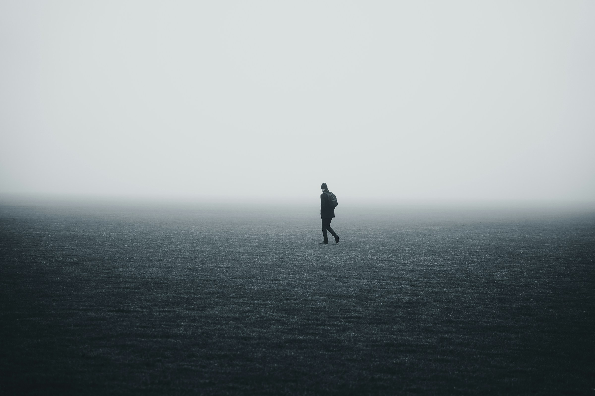
Negative space is the empty part of the frame: sky, wall, water, fog. It is not wasted space. It gives the subject room, it tells the viewer the subject is alone or small or calm, and it is where the eye rests between looks. The most common mistake is giving the subject too little of it, because the photographer was afraid of “empty”. Try a frame that is 80 percent nothing. It is harder than it sounds, and it is one of the fastest ways to make a photo look considered.
Rule 16: Fill the Frame
The opposite rule, and just as useful. Get close, or zoom in, until the subject touches the edges and the background is gone. “If your pictures aren’t good enough, you aren’t close enough” is the line attributed to Robert Capa, and it is still the most useful piece of advice a beginner gets. Filling the frame removes every distraction at once, and it forces the viewer to look at texture, expression and detail they would otherwise miss. For portraits, it is fine to crop into the forehead. It is not fine to crop at the chin.


Rule 17: Layers: Foreground, Middle Ground, Background
Depth comes from having something at three distances. A rock in the foreground, a lake in the middle, mountains behind. A person at the table, the room behind them, the window behind that. Each layer should be distinct in tone or focus, or they merge into one flat plane. The quickest way to add a foreground is to lower the camera until something close enters the bottom of the frame. Overlapping layers show depth better than layers that sit side by side.
Rule 18: Show Scale
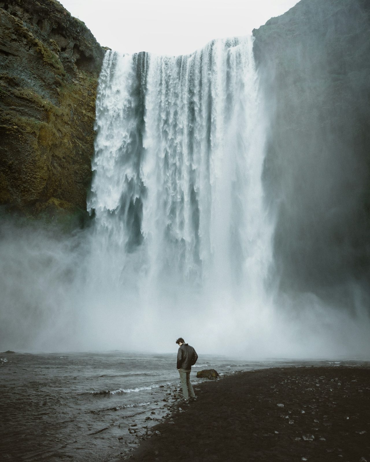
A landscape has no size until something of known size is in it. A person, a boat, a house, a car: the viewer knows how big those are, so the mountain behind them becomes huge. Keep the figure small. The smaller it is, the bigger the landscape, as long as the figure still reads as a figure. Put it on a line or a crossing point from Rule 1, and give it something to do or somewhere to look.
Rule 19: Simplify the Background
Most composition problems are background problems. A pole behind a head, a bright patch behind a dark subject, a stranger walking through. Before you shoot, look past the subject at what is behind it. Then move: a step to the side changes the background completely, while the subject barely changes. A wide aperture blurs the background, a plain wall or an open sky removes it, and shooting down from above or up from below replaces it with ground or sky.


Rule 20: Let the Background Tell the Story
Sometimes the background is the point. A chef in their kitchen, a climber on the wall, a child in a classroom. Here the rule flips: keep the background visible enough to explain the subject, but a little darker, softer or less busy than the subject, so the viewer knows who the photo is about. The trick is depth of field. Stop down enough that the room reads, but not so much that every object in it is as sharp as the person.
Family 5: Movement and Moment
Still photographs can hold motion. The last five photography composition rules are about time: where things are going, and where you are standing.
Rule 21: Leave Room to Move
A subject moving across the frame needs space in front of it. A runner about to leave the edge of the frame feels cramped; the same runner with two thirds of the frame ahead of them feels fast. Film-makers call it lead room, and the same idea applies to a gaze: leave space on the side the subject looks toward. Put the subject on the third behind them and let them move into the empty two thirds.
Rule 22: Show the Motion
Freeze it or blur it, but choose. A fast shutter freezes a splash or a jump at the top of its arc. A slow one lets the subject blur while the world stays sharp, or, if you pan the camera with the subject, keeps the subject sharp while the background streaks. For panning, a shutter speed somewhere around 1/30 to 1/60 of a second is a starting point for a cyclist; follow the subject smoothly, press during the pan, and expect to throw most of the frames away. The keepers are worth it.


Rule 23: Change Your Viewpoint
Most photos are taken from eye level, standing, from where the photographer happened to be. Kneel and the foreground grows. Lie down and a child or a dog is suddenly at your level, and the sky becomes the background. Climb a few steps and a crowd becomes a pattern. Walk round the subject and the light, the lines and the background all change. The rule is only this: before you press the shutter, ask whether this is the only place you could have stood.
Rule 24: Compose Again in the Crop
Composition does not end at the shutter. The crop is where you remove the edge you did not see, straighten the horizon, move the subject onto a third, or change the whole shape of the picture. We do a lot of our composing here, and every one of the photography composition rules above can be applied there.
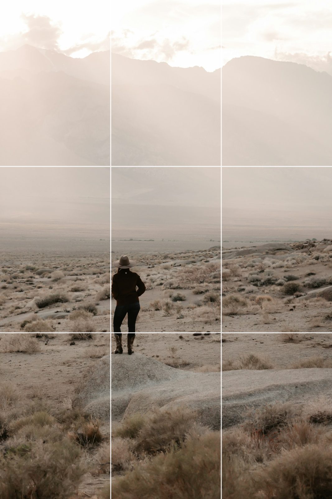
Lightroom Classic draws the grids for you. In the Develop module, pick the Crop tool, then go to Tools > Crop Guide Overlay and choose Grid, Thirds, Fifths, Diagonal, Center, Triangle, Golden Ratio, Golden Spiral or Aspect Ratios. Press O to step through the overlays and Shift + O to flip the orientation of the triangle and spiral ones.
Photoshop’s Crop tool has the same idea: the overlay menu in the options bar offers Rule of Thirds, Grid, Diagonal, Triangle, Golden Ratio and Golden Spiral, and the same two keys step through them. In Photoshop, turn off Delete Cropped Pixels in the options bar so you can come back and change the crop at any time; Lightroom Classic’s crop never deletes pixels.


If the frame is too tight to re-compose, Photoshop can extend it. Generative Expand fills the new canvas with matching sky, grass or wall, and it is the tool we use when a horizon needs straightening and there is nothing left at the corners. Day 13 of 30 Days of Photoshop covers the crop, the straighten and the expand together. Our guide to aspect ratios covers which shape to choose.
Rule 25: Break the Rules, One at a Time
Every one of the photography composition rules above has a famous photo that ignores it. Horizons through the middle, subjects cut off at the edge, tilted frames, a lamp post growing out of a head that turns out to be the whole point. The difference between a broken rule and a mistake is that you can say which rule you broke and why.
So break them, but one at a time. Centre a subject and leave the horizon through the middle because the scene is a perfect mirror. Cut a face at the edge because the photo is about what the person is looking at. When you can name the rule you are breaking, you are composing. When you cannot, you are hoping.
Five Composition Mistakes That Ruin Otherwise Good Photos
Most photos that miss break one of the photography composition rules above without meaning to, in one of these five ways. All five are fixable before the shot, and three of them are fixable in the crop.
The horizon through the middle, by accident. The sky and the land get equal billing and neither wins. Tilt the camera up or down until one of them has two thirds.
Something growing out of the subject’s head. A pole, a tree, a door frame. Look past the subject before you shoot, then take one step to the side.
Cutting a person at a joint. A crop that ends at the knees, wrists, ankles or neck looks like an amputation. Crop between joints, mid-thigh or mid-torso. In a tight portrait, cutting into the top of the head is fine; cutting at the chin is not.
Busy edges. The eye goes to the edge of a frame to check what is there. A bright blob, half a car or a stray hand in the corner pulls it out of the picture. Check all four edges before you press the shutter, and crop them away afterwards if you missed one.
Too much in the frame. When everything is included, nothing is the subject. Decide what the photo is about, then remove everything that is not that: move closer, change the angle, or wait for the stranger to walk out.
Common Questions About Composition Rules
What are the 7 rules of composition in photography? There is no official seven, but the lists that use the number almost always include the rule of thirds, leading lines, frame within a frame, symmetry, depth, negative space and filling the frame. All seven are in this guide (Rules 1, 5, 13, 10, 17, 15 and 16).
What are the 9 and 12 photography composition rules? The nine-rule lists add the golden ratio and the rule of space (room to move). The twelve-rule lists add patterns, the rule of odds and a change of viewpoint. The rule of odds says an odd number of subjects, three or five, is easier to arrange than an even number, because one can sit in the middle with the others on either side, and the eye does not pair them off.
What is the most important photography composition rule? Simplify. Almost every other rule is a way of deciding what to leave out. If you only remember one thing, remember to look at the background and the edges before you press the shutter.
Is the golden ratio the same as the rule of thirds? No. The rule of thirds divides the frame into equal thirds, with lines at 33 and 67 percent. The golden ratio puts the lines at about 38 and 62 percent, closer to the centre. The two grids give similar results, and the golden ratio version is a little calmer. Try both in the Crop tool and keep the one that suits the photo.
Can you fix photography composition after the shot? Often, yes. The crop fixes a horizon, a wrong third, a busy edge and a wrong shape. It cannot add what the camera did not record, unless you use Generative Expand to extend the canvas, and it cannot change the viewpoint. Shoot a little wider than you need, and the crop becomes a second chance.
Do the photography composition rules apply to phone photos? All of them. Composition is about where you stand and what you include, not about the camera. Turn on the grid in your camera app and the rule of thirds is drawn for you on every shot.
Photography Composition Rules: The Short Version
- Rule of thirds
- Centre on purpose
- Golden ratio, not the thirds
- Horizon high or low
- Leading lines
- Diagonals
- Curves
- Implied lines
- Triangles
- Symmetry
- Patterns, and the break
- Balance and visual weight
- Frame within a frame
- Juxtaposition
- Negative space
- Fill the frame
- Foreground, middle, background
- Show scale
- Simplify the background
- Let the background tell the story
- Room to move
- Show the motion
- Change your viewpoint
- Compose again in the crop
- Break the rules, one at a time
That is every photography composition rule worth carrying with you, in five families. Take one family of photography composition rules out for a week. Shoot only lines, or only space and depth, and look at the results with the grid overlays in the Crop tool. By the fifth week the rules will have become the questions you ask without thinking. To see the crop and re-compose steps on real photos, 30 Days of Photoshop is free.
In this article
- The 7, 9 and 12 Rules of Composition People Ask About
- Family 1: Where the Subject Goes
- 1. The Rule of Thirds
- 2. Centre the Subject on Purpose
- 3. The Golden Ratio Is Not the Rule of Thirds
- 4. Put the Horizon High or Low, Never Halfway by Accident
- Family 2: Lines
- 5. Leading Lines
- 6. Diagonals
- 7. Curves
- 8. Implied Lines
- 9. Triangles
- Family 3: Shapes and Balance
- 10. Symmetry
- 11. Patterns, and Breaking Them
- 12. Balance and Visual Weight
- 13. Frame Within a Frame
- 14. Juxtaposition
- Family 4: Space and Depth
- 15. Negative Space
- 16. Fill the Frame
- 17. Layers: Foreground, Middle Ground, Background
- 18. Show Scale
- 19. Simplify the Background
- 20. Let the Background Tell the Story
- Family 5: Movement and Moment
- 21. Leave Room to Move
- 22. Show the Motion
- 23. Change Your Viewpoint
- 24. Compose Again in the Crop
- 25. Break the Rules, One at a Time
- Five Composition Mistakes That Ruin Otherwise Good Photos
- Common Questions About Composition Rules
- Photography Composition Rules: The Short Version
Free with PHLEARN