Photoshop Color Working Spaces and What They Can Do for You
Color can be a Photoshop user’s best friend or their worst enemy. When you get that perfect edit, it’s a euphoric feeling that can only be deflated by the frustration of seeing your save file inexplicably desaturated, bearing a mysterious color cast, or looking just plain “off”. A few different things can cause this to happen, and without a firm understanding of post-processing color management you may feel at a loss. Fortunately, there’s an easy starting point for gaining basic knowledge of the right color settings for your files, and we’re ready to walk you through it!
Color spaces may seem complex at first, but they are one of the most powerful color management tools in a photo editor’s arsenal. When setting up a workflow, this little pocket of Photoshop is a great place to start, since it can affect the appearance of your image from the moment you open your file. Finding the correct color management setup for the work you do will give you a good start to every project, so let’s get started with a basic overview of working spaces and what they can do for you.
Color Modes
Before we dive into working spaces, it’s important to take a refresher on the different color modes (sometimes called color models). The two major color modes we’ll talk about today are RGB and CMYK. These color modes serve different purposes and it’s necessary to know which one will yield the desired result depending on the project you are undertaking.
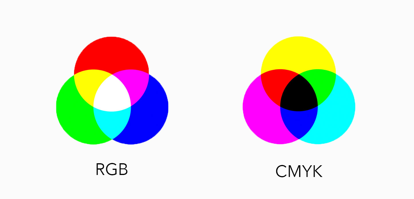
RGB and CMYK color modes work in different ways to produce the color you see in your images.
RGB Color Mode
The first thing to remember is that light is additive, while pigments are subtractive. When you view your images on a screen, that screen is producing colors in the form of light. RGB color mode combines the primary colors of light (red, green, and blue) in different combinations to produce the colors you need. It is best used for viewing on a screen. If you fill each pixel with the most saturated version of all three colors, you will get white. Sounds counterintuitive, right?
Most people have been taught from their first elementary art class that the combination of all colors is black (or black-ish), and that’s certainly true when you’re mixing paint. Your computer screen is not a Crayola product, though. Your computer screen emits light, and light and pigment behave very differently, which is why it is in situations involving light where RGB (forgive a pun) shines.
Some printing services are optimized for RGB files, and that’s fine. You will probably get satisfactory results for run-of-the-mill prints with an RGB file. The colors may not be 100 percent true, but generally you’re not going to send an RGB picture of a cow to a professional printing lab and receive a blue cow back (unless the animal was, in fact, blue to start with). Especially so if you opt in for the color management option that most pro printers offer, and pro labs often have recommended settings for optimal results listed on their websites.
For magazines and other printed media, however, RGB may not always cut it. Such publications may have more specific submission requirements. That’s because, when printing an image, the ink (or pigment, as we called it earlier) is producing colors that work in a completely different way from what you’ve been seeing in your editing software. In these cases, you can sometimes request a customized color profile that is specific to their printing process.
CMYK Color Mode
This is where CMY comes in. CMY, unlike RGB, is subtractive. You’ll commonly see this as CMYK, as the mixture of colors will not always produce a reliable black without the addition of black (or K) itself. You’ll notice that I’m talking about adding colors to create black in this instance, because unlike RGB color, CMYK color is very much like your Crayola paint set. Cyan, magenta, yellow, and black inks are layered or mixed to create the desired color.
It makes sense that this would be the mode of choice for printed media, since we’re talking about how the pigments used to print your images will behave. The challenge here is that you are editing these soon-to-be printed images on a screen.
Whether you’re editing for online display or tweaking an image soon to go to print, each screen has its own opinions about how a specific color should appear. Backlight, contrast settings, and other nit-picky calibration factors can affect your experience on a given device. To compound this, the output of a device’s screen can alter over time, so your settings from five years ago may be showing you something different today unless you’ve been diligent with your calibration.

Grayscale
Though we’re focusing on color today, an honorable mention goes to grayscale. This one is pretty self-explanatory, but not everyone understands why it exists. Ideally, setting each color in your mode at the same number should produce a neutral color (read: a gray). So why can’t I just choose a gray looking color from my color picker and call it a day? You certainly can, but those colors aren’t always reliable depending on your screen. You might end up with a neutral-looking gray on your computer that translates into more of a warm gray on other devices or when you print. Colors are greedy, and any chance a color has to steal the show, it will take!
Grayscale gives those colors a reality check so you have gray and black. Not green-gray, not blue- or yellow-gray, just gray. It’s especially useful in printing because those C, M, and Y cartridges are not cheap. When you print an image or document in grayscale, you are using your black cartridge, rather than making your colors work double-time to produce your grays and blacks.
Color Working Spaces
So how do we edit an image on one device so that it will show up the way we want it to on other devices? We use working spaces! Working spaces are generalized color spaces that are best for editing your images and are intended to preserve the appearance of your image across many different types of devices.

Color spaces are often confused with color modes and color profiles, and for good reason. They sound similar and they work together. They are not the same, though, and although the difference between them is sometimes challenging to understand when you first encounter the concept, it’s good information to get a handle on if you plan to spend a lot of time in Photoshop. When you have an RGB image, each pixel is assigned a number for each of those colors (red, green, and blue.) Those numbers are important, but your monitor needs even more information to understand them.
Imagine you are following a recipe. You know that you need two tablespoons, three cups, and half a teaspoon to complete this recipe. This is crucial information and you’re glad to have it, but you still can’t follow the directions without knowing what ingredients to put into your tablespoons, cups, and teaspoon. Color spaces are those ingredients!
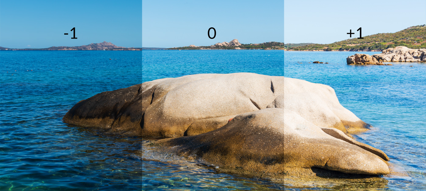
Don’t ignore your working spaces! They can seriously impact the appearance of your image.
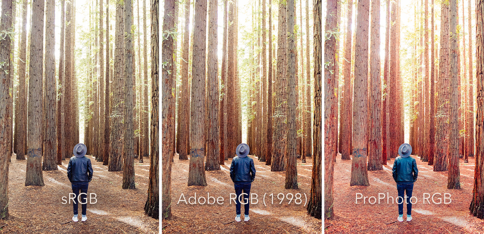
sRGB Working Space
sRGB is easy to discount, since it dates back to CRT monitors from the mid to late nineties and offers the smallest color gamut of the three we will discuss. The power of sRGB is in its universality. Despite its age and limitations, support for sRGB is pretty standard and you can be relatively certain the colors you manage with sRGB will be recognized by most browsers. Because of this, your average web viewer has a better chance of seeing what you intend for them to see, and since most of your viewers will be seeing your work for the first time from behind a screen of some kind, this is a big plus.
On the other hand, sRGB may not be doing complete justice to your original captures. Your DSLR, for example, will almost definitely capture a wider color gamut than exists for sRGB, which means you could be removing information from your images right off the bat.
Think of it in terms of file types. A RAW file contains information that you don’t necessarily see, but that you can access and use if you know how. Once you save your image as a JPG, you’re saying goodbye to all that extra information (theoretically, that is. Since you are a good photographer, you are keeping a save file of each file type!) Using sRGB as your working space over a wider gamut space is the same concept. It’s up to you to decide whether the work you are doing will require that extra information.
Adobe RGB (1998) Color Space
Adobe RGB (1998) is a safe middle ground between the challenges of seriously wide-gamut color spaces and the commonly used but relatively spartan sRGB. It gives you the ability to preserve more color information (though still probably not all) from your DSLR or scanner, which is always a good thing, and as monitors become more advanced, photographers are seeing more and more of the colors from Adobe RGB (1998)’s gamut on their screens.
However, non-photographers or well-meaning amateur photoshoppers who eschew color management may not plan for your use of Adobe RGB (1998) and their settings may produce disappointing results once the file is out of your own hands.
ProPhoto RGB Color Space
A behemoth compared to sRGB, ProPhoto RGB comes with its own set of idiosyncrasies. Though it’s a favorite of many high-level professionals, its wider color gamut includes colors that monitors can’t yet process and even some that the human eye can’t see. In a sense, you could be going in blind if you don’t know for sure how to manage this working space.
In addition to that, because the colors in the ProPhoto gamut are spread more widely, you’re more likely to experience banding when you are working with an 8-bit file so stick with 16 bits when using this working space. Exemplary results are achievable in this working space, but not only in this working space. Hobbyists and enthusiasts may prefer to start with sRGB, as it is currently the default RGB working space in Photoshop.

Because ProPhoto RGB has such a wide color gamut, 8 bits per channel doesn’t allow enough “checkpoints” between color shifts and can result in banding where there should have been smooth, seamless transitions.
The three working spaces we’ve outlined here are by no means the only ones you will see in your Color Settings menu. There are a veritable jumble of spaces available to you, some with merit while others are simply outdated, and not all photographers will agree on which ones fall into which category. You may find that some trial and error will help you find what meets your needs best, so remember to edit non-destructively so that you can learn from the trials without having to live with your errors.
What Is an ICC Profile?
If you open a file from someone else in Photoshop, you may find that it already has an embedded profile. It may seem like the obvious choice to automatically switch it to your working space, but in actuality it’s a general rule of thumb not to mess with embedded profiles unless you have a specific reason to do so.
Usually, these embedded profiles are ICC profiles, and there’s a reason they’re there. While our working spaces are “device independent”, an ICC profile is tailored to the device it came from. It’s designed to correct the known faults and tendencies of that device. If you remove the color profile when you open it (or tell Photoshop to do so automatically), you are exposing those flaws and the image quality may change.
To summarize, your working space is most needed for files that don’t already have a color space or profile assigned. When exporting your file at the end of your workflow, you can always convert your image to a different color space if your output destination requires it. But when editing a file that will be returned to the person who sent it to you, they will probably see the best version of your work if your honor their settings.
What About CMYK Color Spaces?
They certainly exist, as you can see in the Color Settings dialogue box above, but you’ll notice that the working spaces covered here are all RGB based. Unless you are going to be heavily involved in the actual printing, altering Photoshop’s default CMYK working space, U.S. Web Coated (SWOP) v2, may not even be necessary for you. You may prefer to work in RGB for the bulk of your work. In this case, converting to CMYK at the end of your workflow (save this separately from your RBG version!) could be the way to go. Since preferences and equipment vary widely for printers, it’s best to refer to the publication you are submitting to or the lab you are hiring to see which settings will yield the best end result.
To check or alter your color management setup in Photoshop, go to Edit > Color Settings. There you can choose to preserve the embedded profiles of your inbound images and designate a working space, among other things. You can also decide when you would like Photoshop to notify you that there is a profile mismatch or a missing profile, although if you are confident in your settings those notifications may only slow down your workflow.
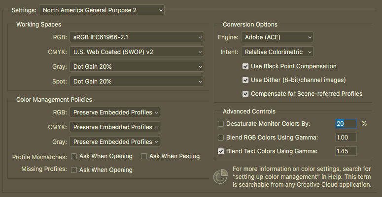
Edit > Color Settings will allow you to make any changes to your current setup that you feel are necessary.
Now that you’ve got a decent understanding of color management, you will be able to use working spaces to protect your color preferences across devices. This will be key particularly if you alternate between editing setups. With your new color confidence you can now go on to tackle other Photoshop techniques that may have felt too complex for you before!