How to Composite Text & Graphics into Photos
-
Add to
favorites
-
DifficultyMedium
-
Length1.5 hours
-
Videos5
-
Software
Description
Learn how to composite graphics and text into photos to create stunning advertisements, marketing images, social media graphics, and more. Download and follow along with each example and start creating beautiful images today!
THIS COURSE INCLUDES
- 8 Sample Images
- 4 Sample PSDs
Share
Course Downloads
Create Stunning Compositions
AFTER
BEFORE
AFTER
BEFORE
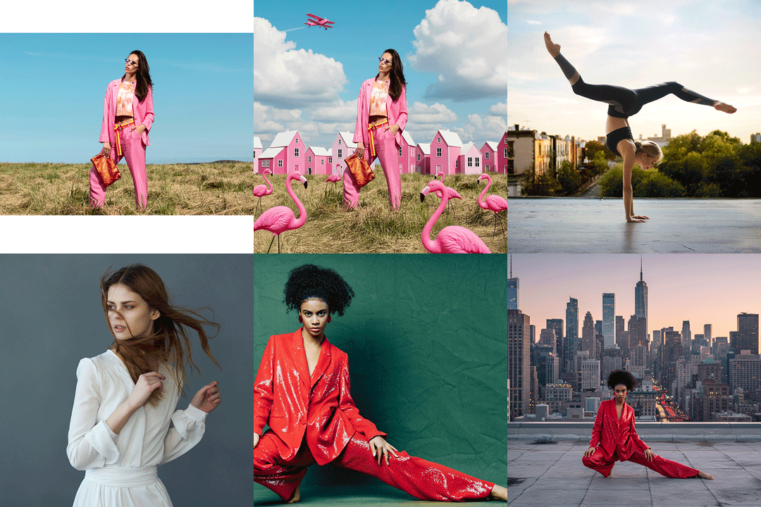
Place Graphics Between the Subject and Background
Learn to cut out a person from their background and create beautiful graphics behind them for an integrated composition. Learn to use layer effects such as drop shadow, stroke, and color overlay to enhance the graphics and integrate them into photos.
Great for Print, Advertising, and Social Media
Graphics and text can provide additional information about a brand or company, but they can provide more impact when presented with a great photo. Learn to integrate everything for endless applications.
Follow Along
Follow along with the included sample images and composite text and graphics into the included photos. Learn how to identify and find existing graphics on stock image websites like Adobe Stock and alter them if needed to fit your own brand.
AFTER
BEFORE
Infographics, Marketing & More
Learn to choose images and graphics that will fit well together and integrate them into a single composition. Even a simple composite will look more professional then text simply overlayed on a photo.
Clean, Elegant Compositions
Create variations of graphics and composite them into photos for maximum effect. Learn to re-arrange and re-create graphics so they better suite your photos.
AFTER
BEFORE
Enhanced Layer Effects
Along with traditional layer effects like Stroke and Drop Shadow, learn to create more advanced layer effects. We show you how to create a beautiful blurred effect with the background, making text and graphics easier to read. A nice change over a traditional white background!
Automatic Selections!
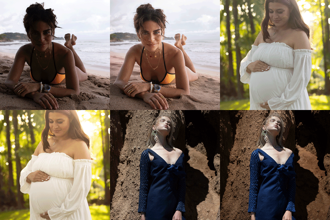
Learn to cut out your subject using new tools like “Select Subject” to quickly cut the subject out of the background and create a stunning composition in seconds. Refine and improve layer masks if needed for professional results.

Aaron Nace
PHLEARN Founder – Class Instructor
Aaron Nace is a photographer, Photoshop artist and founder of PHLEARN. He is the #1 Photoshop instructor in the world with millions of YouTube subscribers.
Reviews
New & Popular Tutorials
Training Site in
the World
Tutorials!
Ratings
and Counting
Subscribers







Wow, I really enjoyed reading this article.Whatever the hobbies you have or what you like to do, to beat the competition you have to know how to capture emotions or put in what you do to get people to come to your products. Thank you for all the information.
Lock transparency! Who’d ever thought? Always learn something…and usually several things.
I loved this tutorial , real interesting, it was sparking idea’s the whole way through.
Hi Aaron! Thanks for the tutorials! I hope we can get back to the advanced tutorials like colour grading and colour corrections. New AI tools.
Great Tutorial. Learned a few new tricks, refreshed some others. Always fun to hear Aaron explain things
Loved this tutorial! Lots of techniques that are useable in many different images. The pace was good and the images and examples great.
Dude….. Amazing stuff as usual. 10 stars
I didn’t expect this subject was going to have a lot of new information for me but I was wrong – again. I’m glad I found your tutorials, they’ve turned out to be a total game changer. Thank you!
This tutorial really caught my eye as soon as I saw the announcement email as I have to create a lot of images incorporating text and graphics for my work. It can be a real struggle to get the text/images to play nicely together sometimes, especially if the background is busy or parts of the subject are where I wanna place my text. I’ve always loved the effect of cutting out the subject and overlaying it on top of the banner/graphics etc but I’d never tried it before as I thought it would be too difficult. The lessons in this tutorial show some really effective solutions to make your text stand out on busy backgrounds while still making your subject the centre of attention. I loved how each lesson used variations of the same basic technique to provide the repetition required to lock it into memory so I can actually remember how to do it later on. I also loved the way that Aaron critiqued his own work as he went along, and he wasn’t afraid to say when he didn’t like the look of something. He then proceeded to tell us why and demonstrated various ways to correct it. I’ve come away from this tutorial armed with some really cool techniques that are going to up my game when it comes to working with text and graphics on images. I (almost) can’t wait to start work on Monday so I can start putting it into practice 😀