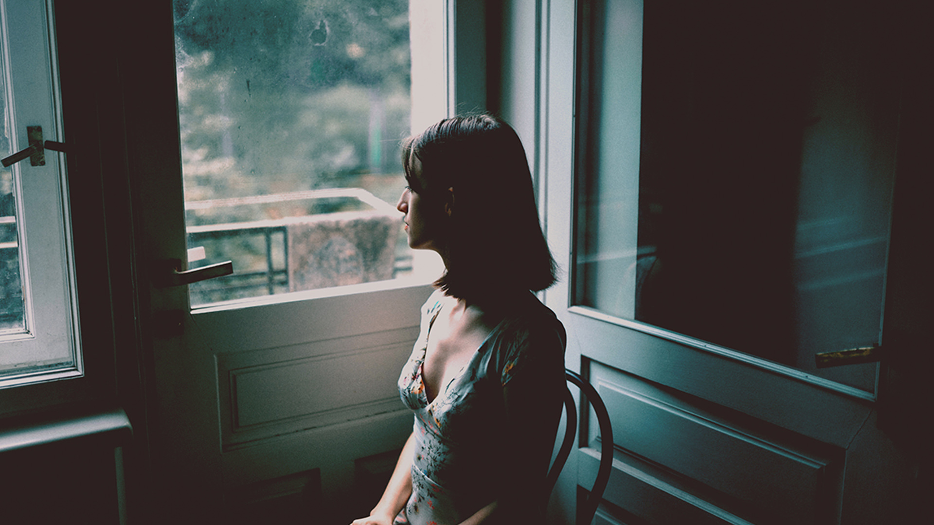

Download Sample Images
Download Assets
This tutorial includes 2 sample images, 1 sample PSD and 1 PDF guide. Downloads are free with a PHLEARN account.
- Free sample files with every tutorial on PHLEARN
- New tutorials published every week
- Unlimited downloads with your free PHLEARN account
Free PDF Guide · 3 Pages
This Tutorial as a Step-by-Step PDF
The 3-page guide walks through the grade: Layer > New Adjustment Layer > Curves, the bottom-left point up and to the right and the top-right point in and down, the same two points in the Red, Green and Blue channels, a corrective pass, and dragging the layer onto another photo. Keep it next to your keyboard.
description
Going for that dark and dramatic look? Then follow along and learn how to create moody and mysterious coloring in Photoshop. And best of all, it can be done using just a single Curves Adjustment Layer!
If you enjoyed this short tutorial and want to take a deeper dive into dark and moody looks (or just color grading in general), check out our PRO course Dark & Moody Coloring in Photoshop! Or if you’d rather lighten the mood, we also have courses on Bright & Airy Coloring and Film & Vintage Coloring.
Enjoying This Free Tutorial?
We publish a new free tutorial every week, each one with sample images and PSDs you can download and follow along with. Sign up and they land straight in your inbox, along with early word on sales, events and subscriber-only offers.
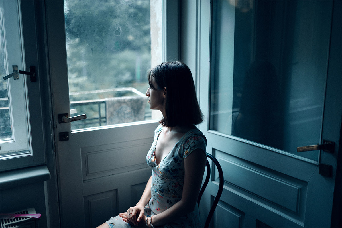
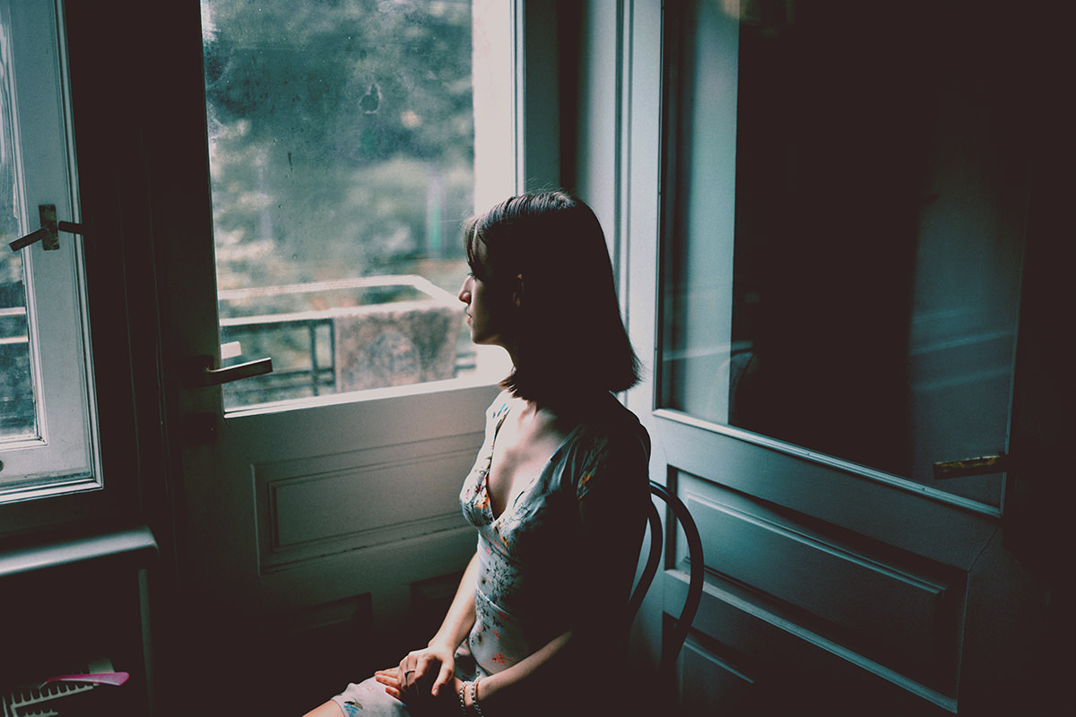
CREATE DARK & MOODY LOOKS
Dark and Moody Is Two Curve Handles, and One Decision Before Them
The dark, muted, slightly faded look that dominates a certain corner of Instagram is easier to produce than it appears. The entire grade is one Curves adjustment layer — and specifically, it’s the two small handles at the ends of the curve that most people never touch.
The harder part isn’t the technique at all. It’s knowing which photographs this works on, because applied to the wrong image it does nothing, or worse.
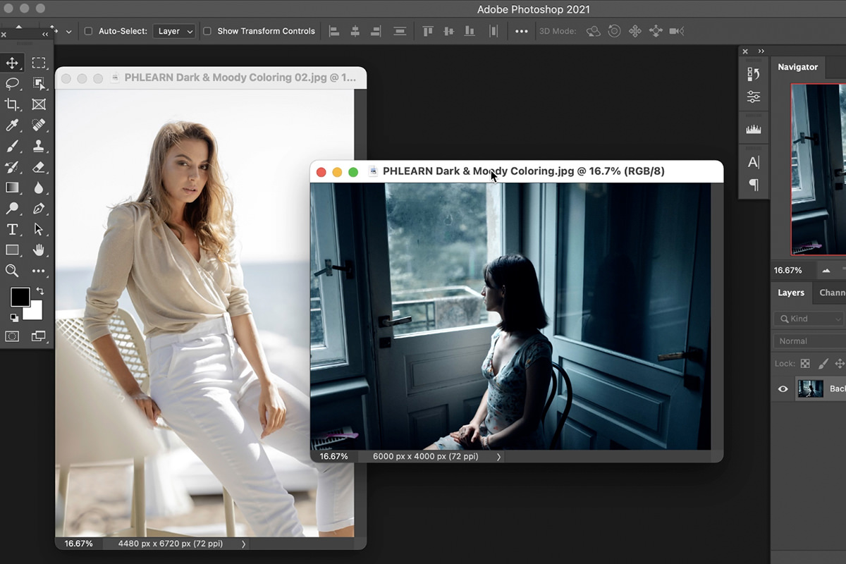
Choose the Right Photograph First
Compare two images. One is a bright sunny day, light clothing, open and cheerful. The other is darker in its actual light levels and in its subject matter — someone looking out of a window on what looks like a rainy day.
Only the second one will take this grade, and for two separate reasons.
It needs the tones
This grade works by compressing the extremes of the tonal range toward each other. That requires an image that has extremes to compress — real shadows and real highlights. A bright, open photograph with very few dark pixels gives the curve almost nothing to act on in the shadows, so all it does is crush the highlights and leave the image looking flat rather than moody.
It needs the mood
Color grading amplifies what’s already in a photograph; it doesn’t create meaning that isn’t there. A somber grade on cheerful subject matter reads as a mistake, because the color and the content are saying different things.
Decide what a photograph is about, then choose a grade that agrees with it. That order — mood first, color second — is the actual lesson here, and it applies to every grade you’ll ever build.
The Two Handles That Do Everything
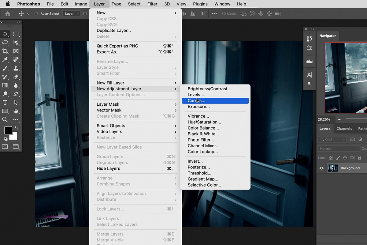
Add a Curves adjustment layer: Layer › New Adjustment Layer › Curves.
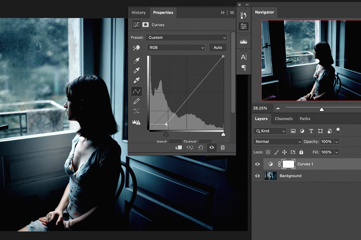
Most people drag points in the middle of the diagonal line. The dark-and-moody look comes from somewhere else: the small square handles at the bottom-left and top-right corners.
- Drag the bottom-left handle up and to the right and your blacks stop being black. They lift to a dark gray — the faded, filmic shadow that defines this whole aesthetic.
- Drag the top-right handle in and down and your whites stop being white. The brightest points dim to a soft off-white.
Together they compress the tonal range from both ends. Under most circumstances that’s the opposite of what you’d want — it’s a deliberate reduction of contrast. Here it’s precisely the point: the muted, low-contrast, slightly hazy feel comes from denying the image pure black and pure white.
Now Do It Again in Each Color Channel
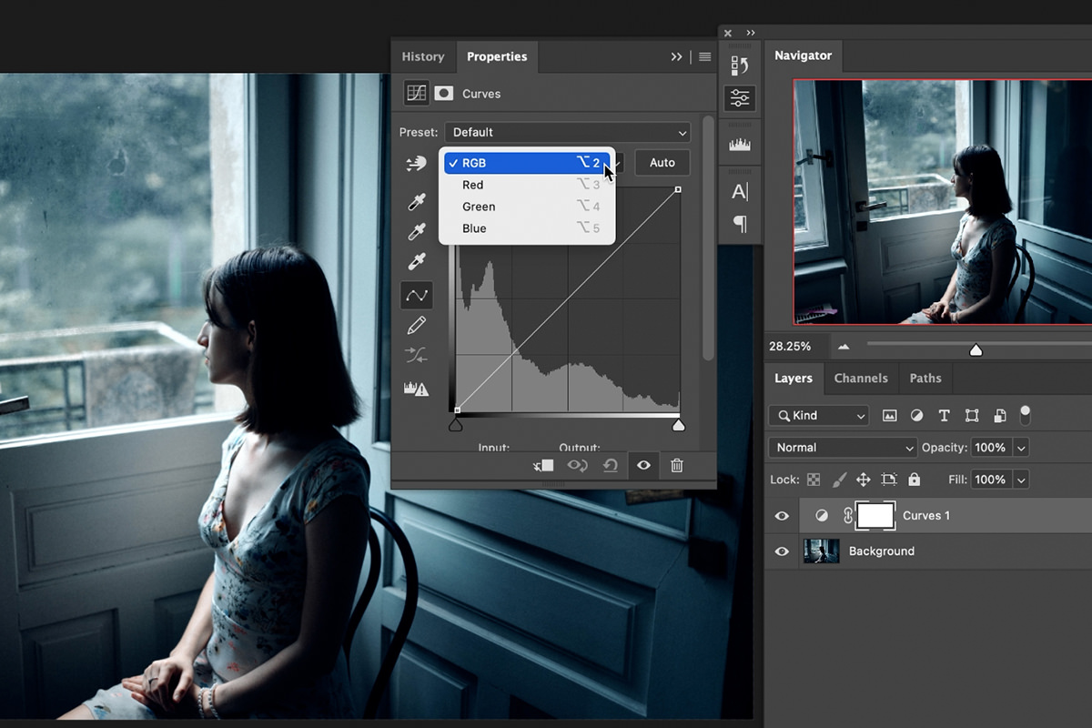
The composite RGB curve changes brightness. Switch the channel dropdown to Red, Green or Blue and the same two corner handles now control color in your shadows and highlights independently.
Which direction does what:
- Red channel — up adds red, down adds cyan.
- Green channel — up adds green, down adds magenta.
- Blue channel — up adds blue, down adds yellow.
Each channel’s pairs are opposites, which is why moving one handle can only ever push you along one axis. Understanding that turns the whole thing from guesswork into three deliberate decisions.
-
Work the Red channel
Lift the bottom-left handle to put red into the shadows, or drop it for cyan. Warm shadows feel nostalgic; cyan shadows feel cold and cinematic.
-
Work the Green channel
Small movements. Green is the channel your eye is most sensitive to, and a heavy hand here shows up immediately in skin tones.
-
Work the Blue channel
Moving a point down adds yellow and moving it up adds blue. Aaron goes yellow, for a warm version of dark and moody; going blue cools it instead.
-
Go back round and correct
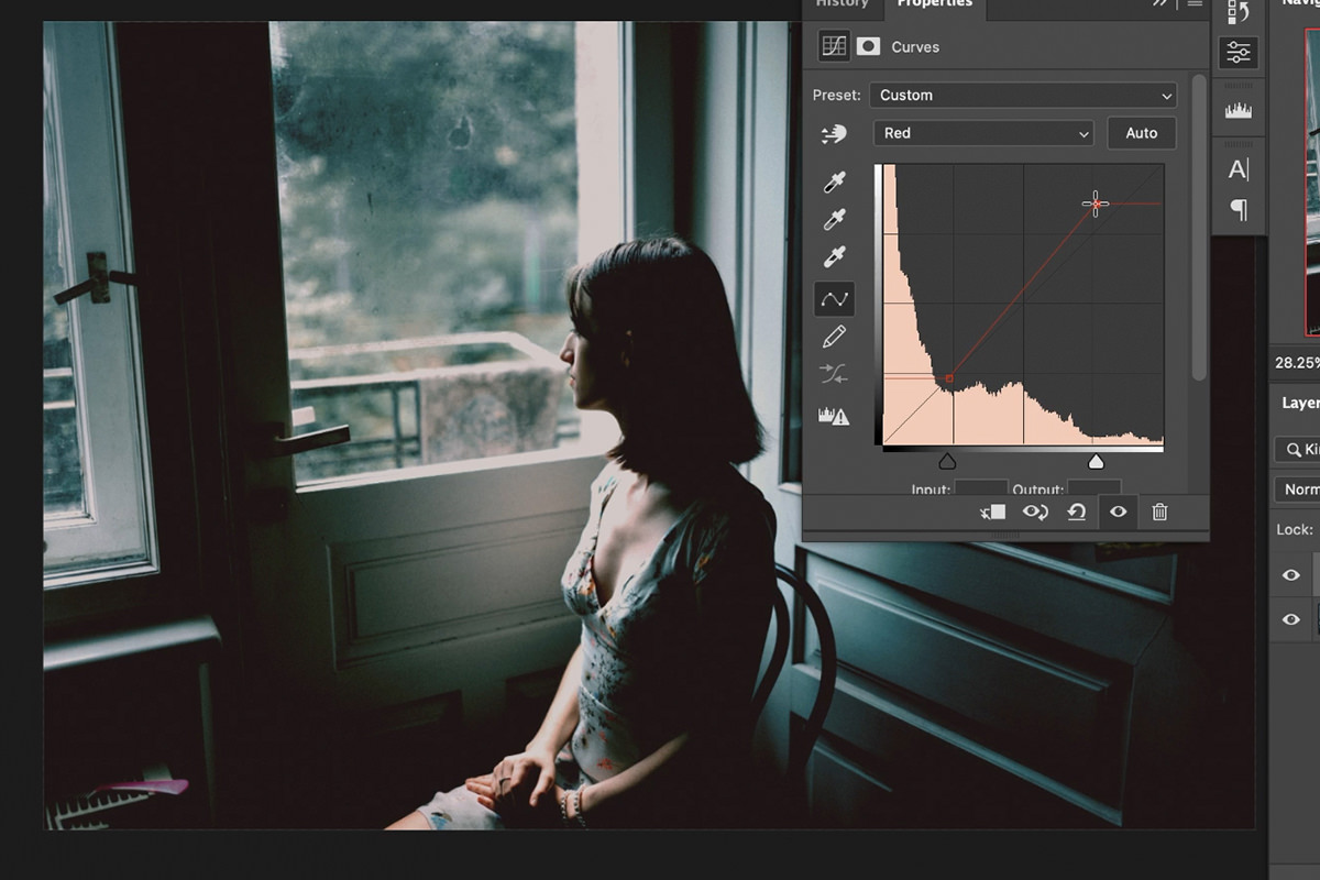
The channels interact — adding warmth in one place often pushes green somewhere else. Expect to go back and correct. When Aaron’s version came out a little too green, he pulled the Green channel down just a little, then pushed a bit more red into the shadows and a little more into the highlights.
This is where the grade becomes yours. The tonal compression makes it moody; the channel work decides whether that mood is warm and nostalgic or cold and severe. Both are valid, and it’s a two-minute difference.
Reuse It on Other Images
Once you have a Curves layer you like, it’s portable. Drag the adjustment layer from the Layers panel directly onto another open document and it arrives with every channel setting intact.
You can also save it as a Curves preset from the panel menu, or export a whole stack of adjustments as a LUT if you want to use the same look in other applications.
And Watch It Fail on the Wrong Image
Drag that same Curves layer onto the bright, sunny photograph and the difference is instructive. The highlight compression does something — the brights dull down — but the shadow lift has almost nothing to work with, because there were barely any dark pixels to begin with.
The result isn’t moody. It’s just flat: a cheerful photograph with its contrast removed and no atmosphere gained in exchange.
That’s worth seeing rather than being told, because it makes the principle concrete. A grade is not a filter that improves any photograph — it’s an amplifier for something the image already has. If the tones and the mood aren’t there, no curve will put them there.
Where Dark and Moody Goes Wrong
Applying it to bright, open images
No shadows to lift means no atmosphere to gain. You just lose contrast.
Dragging the middle of the curve instead of the corners
Midpoint adjustments change brightness. The look lives entirely in the two end handles.
Lifting the blacks too far
A little lift is filmic. A lot is washed out and looks like a mistake rather than a choice.
Heavy-handed green
Green is the channel skin tones notice first. Move it least.
Grading before deciding the mood
Color amplifies subject matter, it doesn’t override it. Work out what the photograph is saying, then support it.
Expecting one grade to suit a whole shoot
Frames with different light will need the curve adjusted. Copy it across as a starting point, then tune each one.
Let the Photograph Choose the Grade
Two handles and three channels is the whole technique, and you could learn it in five minutes. The part worth practicing is the judgment in front of it — looking at an image and asking what it’s already saying before deciding what color would help it say that more clearly.
Try building this grade on a photograph you know is right for it, then deliberately drag it onto one that isn’t. Watching it fail teaches more than watching it succeed.
Quick Reference: Keys, Menus and Settings
- Add the Curves layerLayer > New Adjustment Layer > Curves
- Crunch the tonesRGB: bottom-left point up and to the right; top-right point in and down
- Color the endsChannel menu: Red, Green, Blue; move the same two end points
- Which wayRed up or cyan down; green up or magenta down; blue up or yellow down
- Dial it inDouble-click the Curves layer; toggle its visibility to compare; Cmd/Ctrl + Z to undo
- Reuse the gradeDrag the Curves layer onto another open document
No AI, no generative credits.

Free Downloads
Follow Along on the Same Photos
Get both sample photos (the window-lit portrait and the bright sunny one), the layered PSD and the 3-page PDF guide to the Curves grade. Free with a PHLEARN account.
Dark and Moody Color Grading: Common Questions
How do I get the dark and moody look in Photoshop?
With one Curves adjustment layer: Layer > New Adjustment Layer > Curves. Move only the two end points: the bottom-left point up and to the right, and the top-right point in and down.
Why move the corner points instead of the middle of the curve?
The end points crunch the darks and lights together. Lifting the bottom-left point stops the darks going all the way to black, and pulling the top-right point down makes the lightest points a little darker. Points in the middle mostly change brightness.
Which photos work for a dark and moody grade?
Ones that are already darker in their light and more somber in subject, like the portrait looking out of a window on a rainy-looking day. Decide on the mood of the photo first, then color it to match.
How do I add color to the shadows and highlights?
Use the channel menu at the top of the Curves panel to switch to Red, Green or Blue, and move the same two end points. In a color channel they add color instead of only changing brightness.
Which way does each color channel push the color?
Red: up adds red, down adds cyan. Green: up adds green, down adds magenta. Blue: up adds blue, down adds yellow.
Does dark and moody have to be cool and blue?
No. You can have it in whatever color scheme you want, warm or cool. Aaron goes yellow in the Blue channel for a warm version.
What if my grade looks too green?
Go back to the Green channel and pull the point down just a little. Aaron then added a bit more red to the shadows and the highlights in the Red channel.
Can I change the grade after I make it?
Yes. Double-click the Curves adjustment layer and go to any channel to keep dialing it in, and turn the layer off and on to compare. If a change does not help, undo with Cmd/Ctrl + Z.
How do I use the same grade on another photo?
Click the Curves layer and drag it onto another open document; it copies the settings in every channel. On the bright, sunny sample it mostly crunches the lights and flattens the image, so expect to adjust it per photo.
Are the sample files free?
Yes, with a free PHLEARN account. You get 2 sample images, 1 sample PSD and 1 PDF guide: the window-lit portrait, the bright sunny photo and the 3-page step-by-step guide.
Master Photoshop, Lightroom and Photography
Join PHLEARN PRO for $12.99 a month or $99.99 a year. Cancel anytime, with a 100% money-back guarantee.





