

Download Assets
This tutorial includes 2 sample images and 1 PDF guide. Downloads are free with a PHLEARN account.
- Download the sample images and PSDs from every free tutorial on PHLEARN
- New free tutorials published every week
- One free account — sign up once, then download anything
Free PDF Guide · 2 Pages
This Tutorial as a Step-by-Step PDF
The 2-page guide builds the composite and matches its color: Shift-click the layer mask, Shift-drag the background in with the Move Tool, duplicate the subject with Ctrl/Command+J, then Image > Adjustments > Match Color with the same document and Layer 1 as the source, Luminance, Color Intensity, Neutralize and Fade 20. Keep it next to your keyboard.
description
A warm subject dropped onto a cool background is one of the fastest ways to break a composite, and Photoshop can fix most of it automatically. This tutorial covers the Match Color tool: duplicating the subject layer first because the adjustment is destructive, choosing a source document and layer, and then using Luminance, Color Intensity, Neutralize and Fade to pull an accurate match back to something believable.
Enjoying This Free Tutorial?
We publish a new free tutorial every week, each one with sample images and PSDs you can download and follow along with. Sign up and they land straight in your inbox, along with early word on sales, events and subscriber-only offers.

How to Match Colors Automatically in Photoshop
Every time a subject gets composited onto a new background, there’s a real risk that the color temperatures won’t match — a cool blue background paired with a warm-toned subject is an especially common mismatch. Photoshop has a built-in tool that handles this color matching automatically, and this walkthrough covers how to use it effectively, along with the settings that make the difference between a technically correct match and one that actually looks believable.
Start with Your Subject Already Cut Out
This technique assumes the compositing groundwork is already done: a subject cut out onto its own layer with a layer mask. For help with that step specifically, How to Change & Remove Backgrounds in Photoshop covers the cutout process in detail. With the subject isolated (hold Shift and click the layer mask to turn it on if it is disabled), take the Move tool (V), hold Shift and drag the background image onto the subject’s document, and move that layer below the subject. Press F for full screen, then scale the background up a little with Free Transform (Ctrl/Cmd+T).
Spot the Color Mismatch
Once the composite is roughly assembled, the color mismatch usually becomes obvious right away — a background carrying a lot of blue paired against warm, orange-leaning tones in the subject is a classic example. That mismatch is exactly what throws off an otherwise well-composited image, since human vision is extremely sensitive to inconsistent lighting and color temperature between a subject and its surroundings.
Protect Your Original Layer First
Before applying any automatic color matching, it’s important to know that this specific tool makes a permanent, destructive change to whatever layer it’s applied to, and it can’t be used on a Smart Object either. Duplicate the subject’s layer first with Ctrl/Cmd+J, and apply the color match only to the duplicate, keeping the original, unmatched layer available as a backup in case the result needs to be revisited or redone later.
Open the Match Color Tool
With the duplicated subject layer selected, go to Image > Adjustments > Match Color.
Choosing a Source Document and Layer
The dialog asks for a Source: since the background is already loaded into the same document, choose that same document as the source, then select the specific layer holding the background as the layer to pull color information from. Photoshop then analyzes that layer’s color and applies a matching adjustment to the active subject layer.
Matching Across Two Separate Documents
The source document doesn’t have to be the same file the subject already lives in — Match Color can pull its reference color from any other open document as well, which is useful whenever the background hasn’t been merged into the composite file yet or lives in a separate project altogether.
Fine-Tune Luminance and Color Intensity
Once the initial match is applied, several sliders let it be fine-tuned further. Luminance adjusts overall brightness and darkness, while Color Intensity works similarly to a saturation control, strengthening or softening how pronounced the color shift feels.
Why Fade and Neutralize Matter Most
Fade and Neutralize are the two settings that matter most for realism. A raw color match can technically be correct while still looking too extreme or artificial — overly blue, for instance, even though the math behind the match is accurate. Neutralize calms that intensity down, while Fade blends the matched result back toward the subject’s original coloring by a chosen percentage. Every image is a little different, so find the place along the slider that works for your composite; for this image, typing in a Fade of 20 worked well.
Compare Before and After
Comparing the subject before and after the match makes the improvement immediately clear: warm tones that clashed against a cool background now sit comfortably within that same color world, without looking as though the subject was pasted in from an entirely different scene. Click OK to apply it. To finish the layout, the background gets stretched up a little more with Free Transform, which hides a bit of the road. This entire process, from opening the Match Color dialog to landing on final slider values, typically takes only a couple of minutes once the underlying cutout and background placement are already in place.
Know When Manual Adjustment Is Still Needed
Because this is an automatic tool, it performs the underlying color analysis and matching math without human judgment involved, which means it works extremely well on some images and less convincingly on others.
Layering In Manual Adjustments When Needed
Whenever the automatic result doesn’t fully land, don’t hesitate to do more color adjustments on your own, with Curves or Color Balance for example, on top of what Match Color already provides, since the automatic tool is meant as a strong starting point rather than a guaranteed final answer for every composite.
Why This Technique Works
Match Color works by analyzing the statistical color distribution of a chosen source layer, its overall color balance, brightness range, and intensity, and then remapping the target layer’s colors to follow that same distribution. That’s a fundamentally different approach from manually eyeballing a Curves or Color Balance adjustment, since it’s built entirely around real measured data pulled directly from the actual background being composited against, rather than a photographer’s visual guess at what “matching” should look like. The Fade and Neutralize controls exist because a purely mathematical color match can overshoot what looks natural to the human eye, so those two sliders exist specifically to pull an accurate-but-extreme result back toward something that reads as genuinely believable.
Final Thoughts
Matching colors between a subject and a new background is one of the fastest ways to make or break the believability of a composite, and Photoshop’s Match Color tool solves the bulk of that problem automatically in just a couple of minutes. Keeping a duplicate of the original, unmatched layer as a safety net costs nothing and means the color match can always be revisited or redone later, and treating the automatic result as a strong starting point rather than a finished answer keeps every composite looking as realistic as it can.
Quick Reference: Keys, Menus and Settings
- Turn on the maskShift-click the layer mask
- Bring in the backgroundV, Shift-drag onto the subject image, move the layer below the subject
- Full screen and scaleF, then Cmd/Ctrl + T
- Back up the subjectCmd/Ctrl + J, then click the copy you will change
- Match the colorImage > Adjustments > Match Color; Source: this document, Layer: the background (Layer 1)
- Make it believableLuminance a little brighter, Color Intensity to taste, Neutralize on, Fade 20 for this image
No AI, no generative credits.
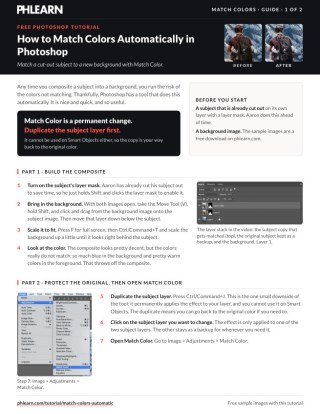
Free Downloads
Follow Along on the Same Photos
Get the subject photo and the blue-toned background to composite, plus the 2-page PDF guide to matching their color with Match Color. Free with a PHLEARN account.
Match Color in Photoshop: Common Questions
Where is Match Color in Photoshop?
Go to Image > Adjustments > Match Color. Click the subject layer you want to change before you open it.
Why duplicate the subject layer first?
Match Color is a permanent change, and it cannot be used on a Smart Object. Press Cmd/Ctrl + J and apply it to one copy, so the other keeps the original color as a backup.
What should I choose as the Source and Layer?
If the background is already in the same document, choose that document as the Source and the background layer (Layer 1 in the video) as the Layer. Photoshop pulls the colors from that layer and applies them to the subject.
Can I match colors from a different document?
Yes. The Source menu lists all your open documents, so you can match color from one document to a completely different one.
What do Luminance and Color Intensity do?
Luminance sets the bright and dark levels; in the video it goes a little brighter. Color Intensity is basically like saturation.
The colors match, but my subject looks too blue. What now?
Check Neutralize, which calms the match down a little, then use Fade to fade out the effect. Fade and Neutralize are what make the match look realistic.
What Fade value should I use?
Every image is a little different, so find the place along the slider that works for yours. For the image in the video, typing in 20 worked well.
How do I bring the background into the subject’s document?
With both images open, take the Move tool (V), hold Shift and drag from the background image onto the subject image. Move that layer below the subject and scale it with Cmd/Ctrl + T.
What if the automatic match doesn’t look right?
It is an automatic tool, so it works really well sometimes and not as well other times. Do more color adjustments on your own on top of it, with Curves or Color Balance for example.
Are the sample files free?
Yes, with a free PHLEARN account. You get 2 sample images and 1 PDF guide: the subject and the background to composite, and a 2-page walkthrough of Match Color.
Master Photoshop, Lightroom and Photography
Join PHLEARN PRO for $12.99 a month or $99.99 a year. Cancel anytime, with a 100% money-back guarantee.





