

Frequency Separation Action & Sample Images
Download Assets
This tutorial includes a free Frequency Separation action, sample images, a sample video and a PDF guide. Downloads are free with a PHLEARN account.
- Free sample files with every tutorial on PHLEARN
- New tutorials published every week
- Unlimited downloads with your free PHLEARN account
Free PDF Guide · 4 Pages
This Tutorial as a Step-by-Step PDF
This guide walks through frequency separation: loading the PHLEARN action in Window > Actions, choosing the 8bit or 16bit version, blurring with Gaussian Blur until skin detail is gone, then fixing texture on the HF layer with the Clone Stamp set to Current Layer and color on LF. Use it on your own portraits.
description
Smooth out imperfections and keep details intact with Frequency Separation! This powerful Photoshop tool allows you to separate the colors and textures of an image, making it easy to touch up skin, hair, and more.
Enjoying This Free Tutorial?
We publish a new free tutorial every week, each one with sample images and PSDs you can download and follow along with. Sign up and they land straight in your inbox, along with early word on sales, events and subscriber-only offers.
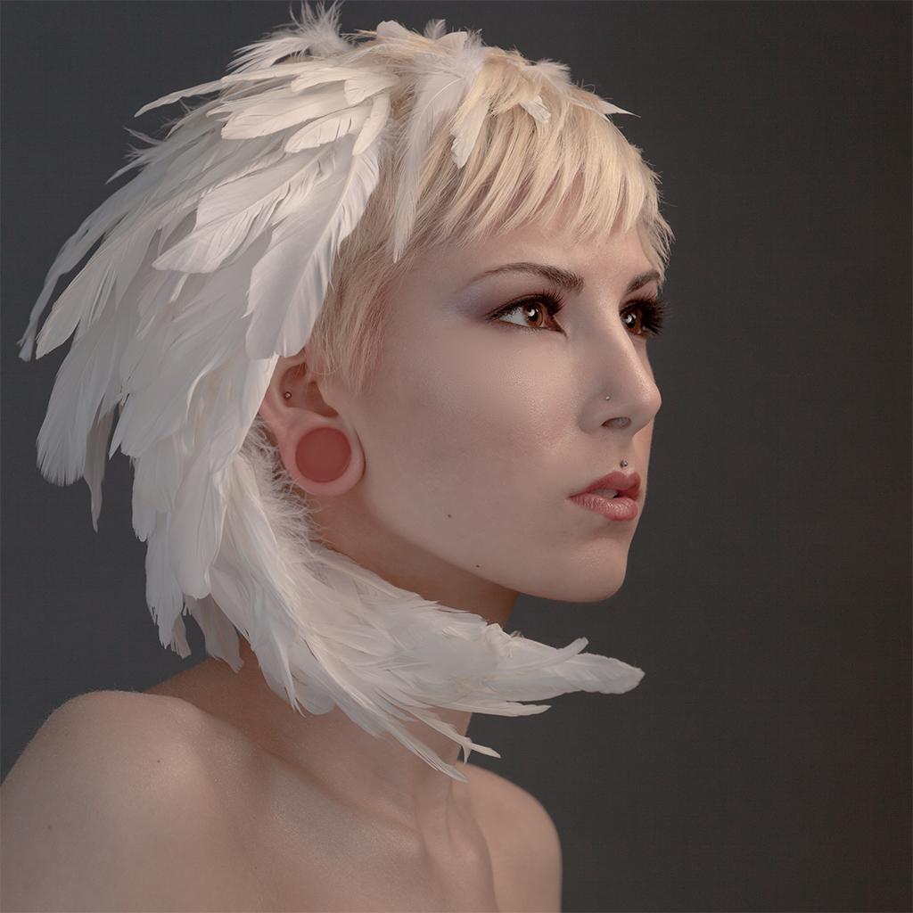
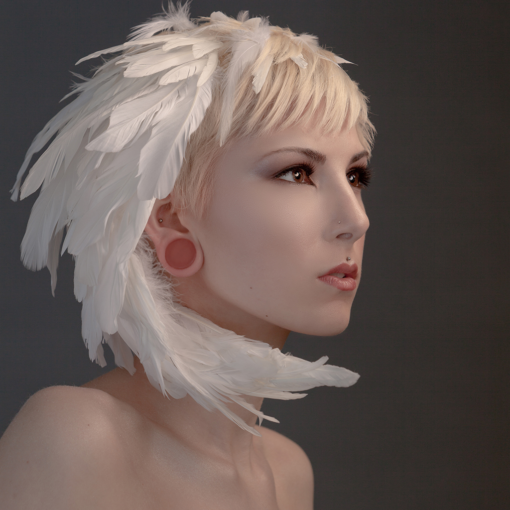
How to Use Frequency Separation in Photoshop
Skin retouching has one central problem. Everything that makes skin look wrong — blotchy color, uneven tone, patches that are too red or too dark — lives at a large scale. Everything that makes skin look real — pores, fine lines, the texture that tells your eye you are looking at a person — lives at a small scale. Blur away the first and you destroy the second, which is why over-retouched skin looks like plastic.
Frequency separation splits those two things onto separate layers so you can fix one without touching the other. It is the technique behind most professional skin work, and once the setup makes sense it is genuinely straightforward.
What It Actually Does
The setup produces two layers from one photograph.
The low frequency layer holds color and tone — the broad shifts of light and shade across a face, with all fine detail blurred out of it. The high frequency layer holds texture — pores, hairs, fine lines — with all color information removed, which is why it looks like flat gray with speckles.
Stack them with the right blend mode and they reconstruct the original image exactly. Nothing is lost in the split. But now you can smooth a blotchy cheek on the color layer and the pores sitting on the texture layer above are completely unaffected.
Setting It Up
-
Duplicate the background layer twice
Press Ctrl or Cmd + J twice. Name the lower copy Color and the upper copy Texture.
-
Hide the upper Texture layer for now
Click its eye icon off so you can see what you are doing on the layer below.
-
Apply Gaussian Blur to the Color layer
Filter, then Blur, then Gaussian Blur. Raise the radius until skin texture has just disappeared but the structure of the face is still recognisable. Note the exact number you used.
-
Turn the Texture layer back on and select it
This is the layer you will run Apply Image on.
-
Go to Image, then Apply Image
Set Layer to your blurred Color layer, then use the settings below.
-
Set the Texture layer’s blend mode to Linear Light
The image should now look exactly as it did before you started.
-
Group both layers
Shift-click them and press Ctrl or Cmd + G. This gives you one place to control the overall strength later.
Choosing the blur radius
This is the only judgement call in the setup, and it decides what counts as texture and what counts as tone.
Too low and skin texture stays in the color layer, so smoothing it will damage detail — exactly what you were trying to avoid. Too high and genuine tonal variation gets pushed up into the texture layer, where it will be awkward to work with.
The target is the point where pores and fine lines have just vanished but the shape of the face — the nose, the eye sockets, the jaw — is still clearly readable. On a typical portrait that is often somewhere between 4 and 10 pixels, but it depends entirely on your resolution. A larger file needs a larger radius for the same visual result.
Apply Image settings depend on bit depth
This is where most people get stuck, because the correct settings are different for 8-bit and 16-bit files and using the wrong ones produces an obviously broken result.
For an 8-bit image: Blending set to Subtract, Scale 2, Offset 128.
For a 16-bit image: Blending set to Add, Scale 2, Offset 0, and tick Invert.
Check your bit depth under Image, then Mode before you start. If the image turns solid gray or goes strange after Apply Image, this is almost always why.
Reading the Two Layers
Before retouching, look at each layer on its own.
Hide the Texture layer and the Color layer looks like a soft, blurred version of the portrait — all the tonal information, none of the detail. Every blotch, red patch and uneven area is still clearly visible here, which tells you those problems are tonal, not textural.
Now look at the Texture layer alone. Flat mid-gray with the fine detail of the skin sitting in it — pores, stray hairs, the edges of features. No color at all.
Understanding which layer holds which problem is the entire skill. Everything after this is just choosing correctly.
Retouching the Color Layer
Work here for anything to do with tone: blotchiness, redness around the nose, a patch of shadow under the eyes that is too heavy, uneven skin color across a cheek or forehead.
-
Select the Lasso Tool and set a generous feather
Somewhere around 25 to 35 pixels on a normal-sized portrait. A hard-edged selection will leave a visible boundary.
-
Draw around one problem area
Work in small zones rather than selecting a whole face at once.
-
Apply Gaussian Blur to that selection
Raise the radius until the color inside evens out and matches the tone around it.
-
Repeat, area by area
Each area gets its own selection and its own blur amount. That variation is what keeps the result looking natural.
The remarkable part is watching the texture stay completely intact while you do this. You can smooth a cheek aggressively and every pore remains, because the pores are not on this layer at all.
Retouching the Texture Layer
Work here for anything physical: a blemish, a stray hair, a distracting line, a patch of rough texture.
Use the Clone Stamp, and check one setting in the options bar — Sample must be set to Current Layer. Leave it on the default and the tool samples the composite, which defeats the whole point of the separation.
Then sample clean skin texture near the problem area and paint over it. Because there is no color on this layer, you never have to worry about matching tone — you are only replacing texture with texture, which is why cloning here is so much more forgiving than cloning on a flat image.
Sample from an area with similar texture density. Cloning forehead texture onto a cheek tends to show.
Controlling the Strength
If the retouch looks too aggressive when you step back, do not undo it. Lower the opacity of the group containing both layers.
Because the group reconstructs the whole image, reducing its opacity blends your retouched version back toward the original by whatever proportion you choose. Dropping to 70 or 80 percent is a common finishing move and instantly restores realizm to work that went slightly too far.
Common Mistakes
Working on the wrong layer
Trying to clone out a blemish on the color layer smears tone and leaves the texture of the blemish in place. Trying to fix blotchy color on the texture layer does nothing useful. If a fix is not working, check which layer you are on first.
Not feathering the lasso
Hard-edged selections on the color layer leave visible patches. The feather is what makes the correction invisible.
Smoothing everything
Frequency separation makes it very easy to smooth an entire face, and the result is lifeless. Fix specific problems. Leave the tonal variation that gives a face its shape.
Forgetting Current Layer on the Clone Stamp
Worth repeating because it is the single most common setup error after the bit-depth issue.
More Free Retouching Tutorials
Frequency separation is one tool in a portrait workflow, not the whole of it. These cover the rest:
- How to Retouch a Portrait in Photoshop — the complete workflow this belongs inside.
- Advanced Skin Retouching in Photoshop — where to take skin work once the split is set up.
- Eliminate Dark Circles and Brighten Eyes — a targeted fix that suits the color layer.
- How to Remove Redness from Skin in Photoshop — correcting tone without touching texture.
- How to Create and Use Layer Masks in Photoshop — confining a retouch to exactly where it belongs.
When Not to Use It
Frequency separation is a corrective technique, not a finishing one. It excels at evening out problem areas and removing blemishes, and it is the wrong tool for shaping light on a face — that is dodge and burn work, done separately and usually afterward.
For a portrait needing only a few blemishes removed, the Healing Brush on a duplicate layer is faster and perfectly adequate. Reach for frequency separation when the skin has real tonal problems that need addressing without sacrificing texture, which is precisely the case where nothing else works as well.
Related Tutorials
Master Photoshop, Lightroom and Photography
Join PHLEARN PRO for $12.99 a month or $99.99 a year. Cancel anytime, with a 100% money-back guarantee.





