

Download Assets
This tutorial includes 1 sample image, 1 sample PSD and 1 PDF guide. Downloads are free with a PHLEARN account.
- Download the sample images and PSDs from every free tutorial on PHLEARN
- New free tutorials published every week
- One free account — sign up once, then download anything
Free PDF Guide · 4 Pages
This Tutorial as a Step-by-Step PDF
The guide walks through selecting the moped with the Object Selection tool, a Hue/Saturation layer set to Yellows, painting reference swatches, refining Hue and Saturation, cleaning the mask, sampling the text color from the photo, a two-part dark green drop shadow and Layer > Layer Style > Scale Effects at 80%. Keep it next to your keyboard.
description
Color match objects in Photoshop with a Hue/Saturation layer driven by your own selection, and the recolor stays editable for as long as you want it.
Colors that work together make a photo feel intentional. This tutorial shows how to color match an object to another element in the same photo, shifting a yellow moped toward the pink of nearby flowers using the Object Selection tool, a Hue/Saturation adjustment layer, and painted reference swatches to dial in an exact match. Then carry the same logic into added text and build a realistic two-layer drop shadow sampled from colors already in the image.
Enjoying This Free Tutorial?
We publish a new free tutorial every week, each one with sample images and PSDs you can download and follow along with. Sign up and they land straight in your inbox, along with early word on sales, events and subscriber-only offers.
Image Source
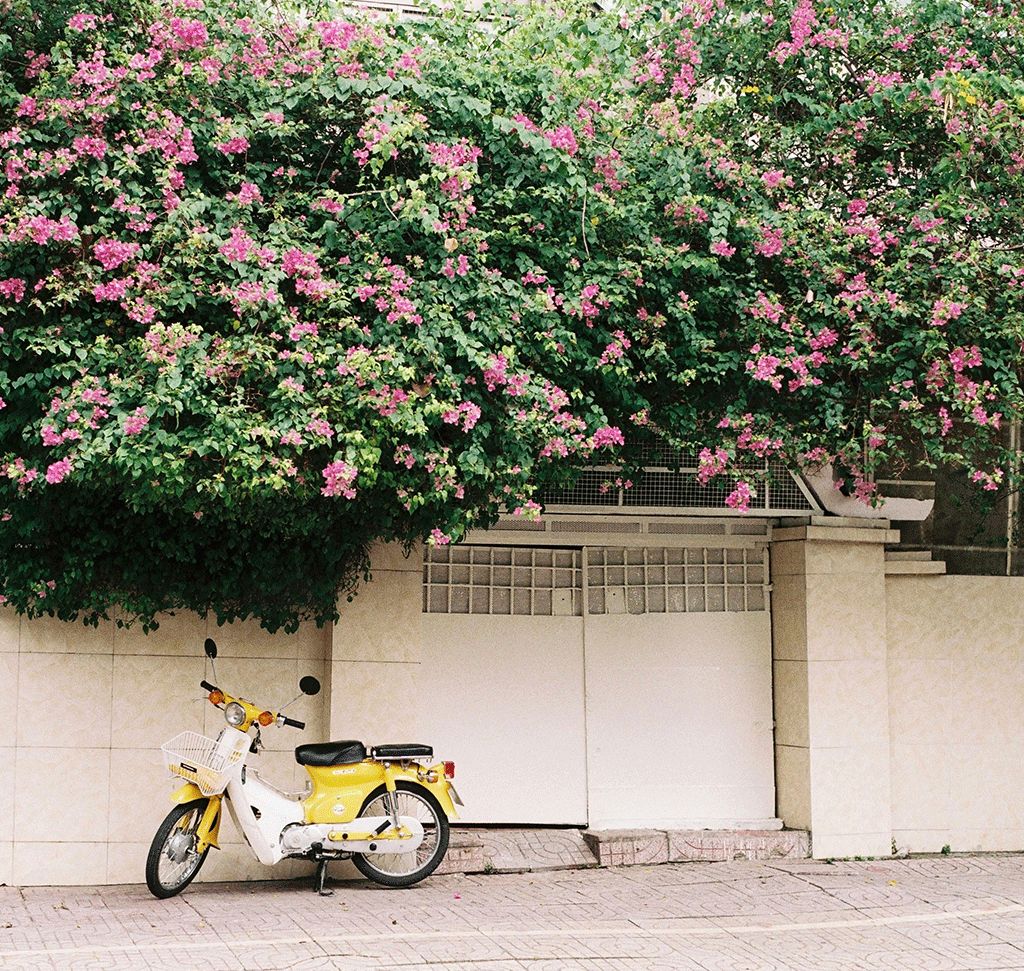
Photo by Butfirstcaphesuada via Pexels

How to Color Match Objects in Photoshop
When colors within a photo work together, the whole image reads as more intentional and cohesive — a yellow object next to pink flowers feels disconnected, while the same object shifted toward that pink family suddenly feels like it belongs. This technique covers how to color match an object to another element in the same photo, then carrying that same color logic into added text and a realistic drop shadow.
Getting Started: Selecting the Object to Recolor
The starting example recolors a yellow moped so it matches the pink flowers elsewhere in the same photo.
-
Select the Object Selection Tool
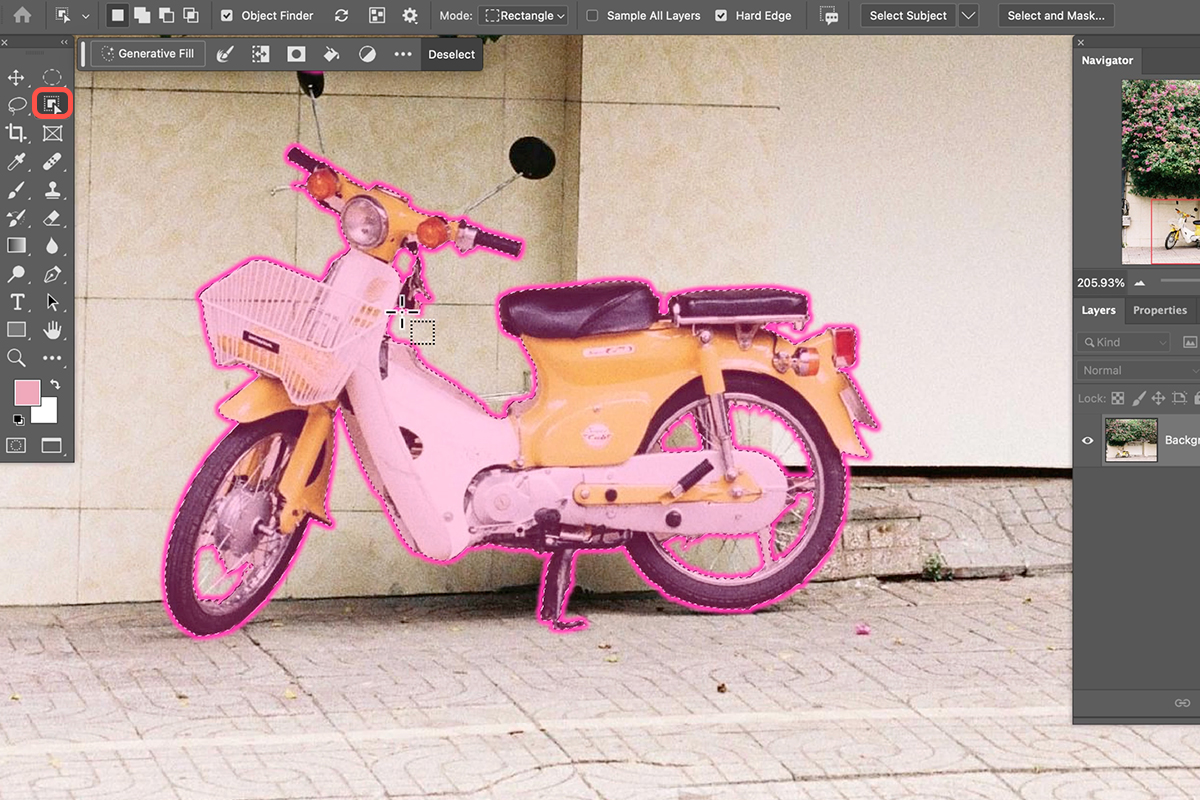
Press W for the Object Selection tool, nested with the Quick Selection tool and Magic Wand.
-
Click the Object to Select It
Hover over the object — in this case, the moped — and click to turn it into an active selection.
Loading Your Selection into a Hue/Saturation Layer
-
Add a Hue/Saturation Adjustment Layer
With the selection active, go to Layer > New Adjustment Layer > Hue/Saturation and click OK.
Why the Selection Loads Directly into the Mask
Creating an adjustment layer while a selection is active automatically loads that selection into the new layer’s mask, so the adjustment is instantly limited to just the selected object — visible only on the moped, black everywhere else — without any extra masking step.
Targeting the Right Colors
-
Switch from Master to the Target Color
In the Properties panel, change the dropdown from Master to the specific color range you want to affect, such as Yellows, so unrelated colors like a tail light stay untouched.
-
Sample the Exact Color with the Eyedropper
Use the eyedropper in the panel to click directly on the color you want to change, locking in the precise range.
-
Shift Hue to Change the Object’s Color
Click and drag the Hue slider to shift the object toward the target color family.
An initial hue shift often lands close to the target color but not quite matching it, which is hard to judge accurately when the reference color is tiny or far away in the frame.
-
Create a New Reference Layer
Add a new layer, press B for the Brush tool, hold Alt (Option on Mac) to sample colors from the target area (like the flowers), and paint a few swatches of those colors right next to the object you’re recoloring.
Why Sample a Reference Rather Than Guess
Comparing a hue shift against tiny, distant flowers in the photo makes small color mismatches hard to see accurately. Painting large, easy-to-judge swatches of those same colors directly beside the object being recolored turns a subtle comparison into an obvious one, making it much easier to dial in a precise color match.
Refining the Match with Hue, Saturation, and Lightness
-
Reopen the Hue/Saturation Properties
Click back on the Hue/Saturation adjustment layer and return to the same color range (Yellows) you were editing before.
-
Fine-Tune Hue Against the Reference
Compare the object’s color directly against your painted swatches and adjust the Hue slider until they align closely.
-
Adjust Saturation to Match
Bring the Saturation slider down (or up) until the object’s intensity matches the reference colors — a mismatched saturation is one of the most common reasons a color match still looks slightly off.
Cleaning Up the Mask
-
Subtract from the Mask on Missed Areas
Click the adjustment layer’s mask, then use the Subtract from Mask brush (or manually paint black) over any small areas the initial object selection missed, like a headlight or tail light that shouldn’t be recolored.
-
Adjust Lightness for a Final Touch
Return to the Hue/Saturation properties and nudge the Lightness slider slightly if the match still needs a small final adjustment.
-
Delete the Reference Layer
Once the match looks right, delete the painted swatch reference layer, since it was only needed for comparison.
Color Matching Text to the Image
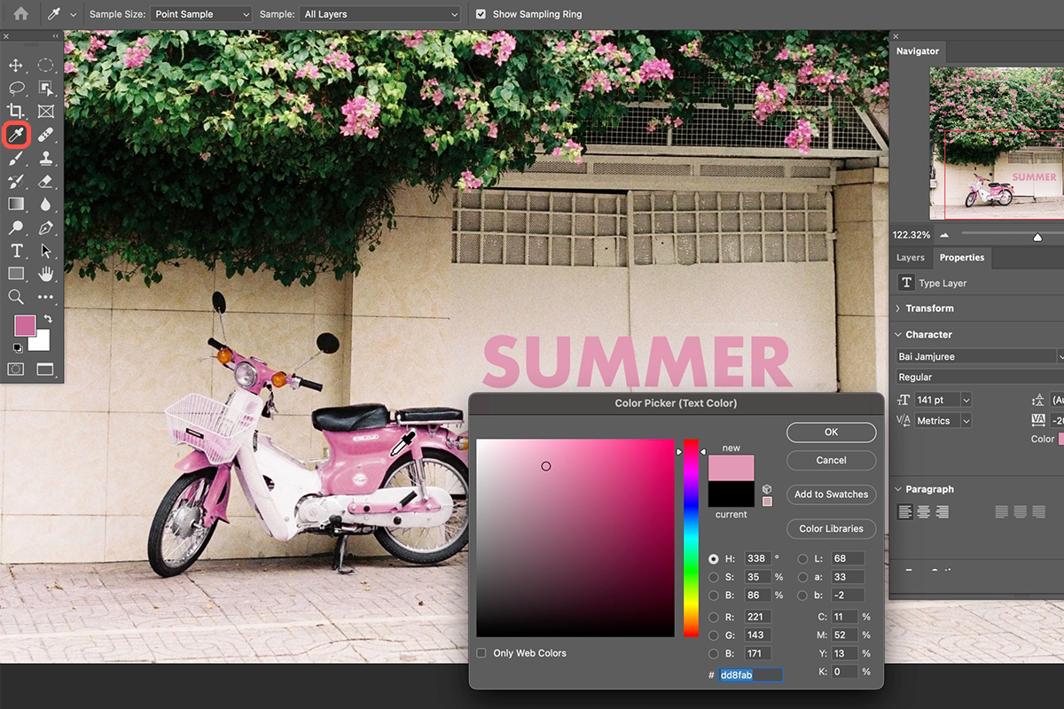
The same color-matching logic extends naturally to any text or graphic elements added on top of the photo, keeping the whole composition visually unified.
-
Add Text with the Type Tool
Press T for the Type tool and add your text.
-
Sample the Text Color from the Image
In the Properties panel, click the color swatch, then use the eyedropper to sample a color directly from the photo, such as the now-recolored object.
-
Duplicate and Edit a Second Line
Press Ctrl + J (Cmd + J) to duplicate the text layer, then double-click to edit it into a second line.
-
Left-Align the Text Layers
Shift-click both text layers, select the Move tool, and use the left-align option to line them up cleanly.
-
Group the Text Layers
Shift-click both text layers and press Ctrl + G (Cmd + G) to group them, then position the group within the composition.
Building a Realistic Drop Shadow
Color-matched text often still needs help standing out against a busy background, and a well-built drop shadow does that far more convincingly than a plain black one.
-
Add a Drop Shadow Layer Style
Select a text layer, go to Layer > Layer Style > Drop Shadow.
-
Set Blend Mode and Sample a Dark Color
With Blend Mode set to Multiply, click the shadow’s color swatch and sample a dark color directly from the photo, such as a deep green from foliage, rather than using plain black.
-
Set the Distance for a Close Shadow
Bring the Distance slider in close so the first shadow sits tight against the text.
-
Duplicate the Shadow for a Softer Second Layer
Click the plus icon next to Drop Shadow to add a second shadow, increase its Distance, lower its Opacity substantially, and increase its Size so it fades out more broadly.
Why Avoid Black for Drop Shadows
A pure black drop shadow tends to flatten an image sitting on top of a photo, since black is rarely a color that actually exists in the scene’s real shadow tones. Sampling a dark color that’s already present in the photo, and layering two shadows — one tight and dark, one broader and more subtle — produces a shadow that reads as a natural part of the photo rather than a generic effect stamped on top of it.

Copying and Scaling Layer Effects
Once a drop shadow looks right on one text layer, it doesn’t need to be rebuilt manually on every other layer that needs the same treatment.
-
Copy Layer Effects with Alt/Option-Drag
Hold Alt (Option on Mac) and click-drag the FX icon from one layer onto another to copy its entire layer effects, including both drop shadows, in one motion.
-
Scale All Effects at Once
If the copied effect looks too large or small on the new layer, go to Layer > Layer Style > Scale Effects and drag the slider (try around 80–85%) to resize every effect proportionally at the same time, rather than adjusting each shadow’s settings individually.
Common Mistakes to Avoid
Trying to judge a color match against a tiny, distant reference in the photo instead of painting a large comparison swatch nearby is the most common way a match ends up slightly off without anyone noticing why. Reaching for plain black on a drop shadow is another common shortcut that flattens an otherwise well-composited image, and manually rebuilding the same drop shadow settings on every new layer instead of copying and scaling the layer effects wastes time and risks inconsistency between layers.
Why This Approach Works
What ties this whole process together, from the moped to the text to the drop shadow, is a single consistent principle: every color decision gets pulled from colors that already exist somewhere in the photo, rather than chosen arbitrarily. Loading a selection directly into a Hue/Saturation mask keeps a color shift confined to exactly the object intended, and painting a large reference swatch turns a hard-to-judge, distant color comparison into an easy, side-by-side one.
Sampling text color and drop shadow color directly from the image, instead of defaulting to black or an arbitrary hue, is what makes every added element feel like it was born from the same photo rather than pasted on top of it. And building two drop shadows at different distances and opacities, rather than a single flat one, mimics how real shadows actually look — a tight, dark contact shadow and a softer, broader ambient one working together.
Final Thoughts
Learning to color match is a small habit that pays off disproportionately in how finished and intentional a composite or design looks. Once you’re comfortable pulling colors directly from your own image — for an object’s recolor, for text, and for a drop shadow — you’ll find it becomes second nature to reach for the eyedropper before reaching for a default color, and the visual cohesion that results is often the difference between an image that looks assembled and one that looks designed.
Quick Reference: Keys, Menus and Settings
- Select the objectW for the Object Selection tool, then click the object
- Recolor itLayer > New Adjustment Layer > Hue/Saturation; Master to Yellows, eyedropper on the paint, drag Hue
- Reference swatchesNew layer, B, Alt/Option-click the target color and paint beside the object
- Clean the maskClick the mask, Subtract from mask; [ and ] size the brush
- TextT; Cmd/Ctrl + J duplicates, Cmd/Ctrl + G groups
- Drop shadowLayer > Layer Style > Drop Shadow: Multiply, dark color from the photo; plus icon for a farther, softer second one
- Copy and scaleAlt/Option-drag the fx icon; Layer > Layer Style > Scale Effects, 80%
No generative AI. Every color is sampled from the photo itself.

Free Downloads
Follow Along on the Same Photo
Get the moped photo, the finished PSD with the recolor, the text and the two-part drop shadow, and the 4-page PDF guide. Free with a PHLEARN account.
Color Matching Objects: Common Questions
How do I change the color of just one object?
Press W for the Object Selection tool and click the object. With the selection active, go to Layer > New Adjustment Layer > Hue/Saturation. The selection loads into the layer mask, so the change only shows on that object.
Why switch Hue/Saturation from Master to Yellows?
Master changes every color inside the mask. Choosing Yellows, then clicking the yellow paint with the panel’s eyedropper, limits the change to that paint so the tail light and other colors stay as they are.
The new color is close but not quite right. How do I match it?
Make a new layer, press B for the Brush, Alt/Option-click the target color and paint big swatches right beside the object. Comparing against those is far easier than against tiny flowers across the frame. Delete the layer when you are done.
The hue matches but it still looks off. What am I missing?
Usually Saturation. The new color is often too saturated or not saturated enough, so work Hue and Saturation together. In the video a touch more Lightness made the match even better.
Some small details changed color too. How do I fix them?
Click the layer mask and choose Subtract from mask, which gives you the Brush with black. Use the [ and ] keys to size it and paint over the spots, like the orange headlights and tail light.
How do I color match text to a photo?
Select the text layer, click Color in the Properties panel and, with the picker open, click in the image to sample. The video samples the pink straight from the recolored bike.
Why not use a black drop shadow?
Black makes an image over a photo look flat. In Layer > Layer Style > Drop Shadow, keep Blend Mode on Multiply, click the color box and sample a dark color from the photo, here a dark green from the plants.
How do I make a drop shadow look more natural?
Use at least two. Set the first with a small Distance so it sits close. Click the plus icon beside Drop Shadow to duplicate it, then raise Distance, lower Opacity quite a bit and raise Size so it fades.
How do I copy a layer style to another layer and resize it?
Hold Alt/Option and drag the fx icon onto the other layer. If the shadows are too big there, go to Layer > Layer Style > Scale Effects. The video settles on 80%, which keeps the ratio between both shadows.
Are the sample files free?
Yes, with a free PHLEARN account. You get 1 sample image, 1 sample PSD and 1 PDF guide: the moped photo, the finished color-matched file and a 4-page step-by-step guide.
Master Photoshop, Lightroom and Photography
Join PHLEARN PRO for $12.99 a month or $99.99 a year. Cancel anytime, with a 100% money-back guarantee.





