

Download Assets
This tutorial includes 2 sample images, 2 sample PSDs and 1 PDF guide. Downloads are free with a PHLEARN account.
- Download the sample images and PSDs from every free tutorial on PHLEARN
- New free tutorials published every week
- One free account — sign up once, then download anything
Free PDF Guide · 5 Pages
This Tutorial as a Step-by-Step PDF
Walks through building a Label Template from a white shape, Color Overlay and the align buttons, File > Place Linked, Warp and Split Warp Vertically, a Select > Subject mask, Multiply and Screen copies of the photo tuned with Levels, then Gaussian Blur and Add Noise as Smart Filters. Keep it next to your keyboard.
description
Learn how to create packaging design mockups in Photoshop by building a product label and compositing it onto a product photo. Build the label’s shape from the product photo, design it with stock graphics, shapes, Color Overlay, and a clean type hierarchy, then place it as a linked Smart Object so every edit updates automatically. Warp the label around the product, mask it to the surface, and bring back real shadows and highlights with Multiply and Screen layers.
Enjoying This Free Tutorial?
We publish a new free tutorial every week, each one with sample images and PSDs you can download and follow along with. Sign up and they land straight in your inbox, along with early word on sales, events and subscriber-only offers.
Image Source
Icons: Flourish and Flower via The Noun Project
Photos: Graphic Background and Product Mockup via Pexels
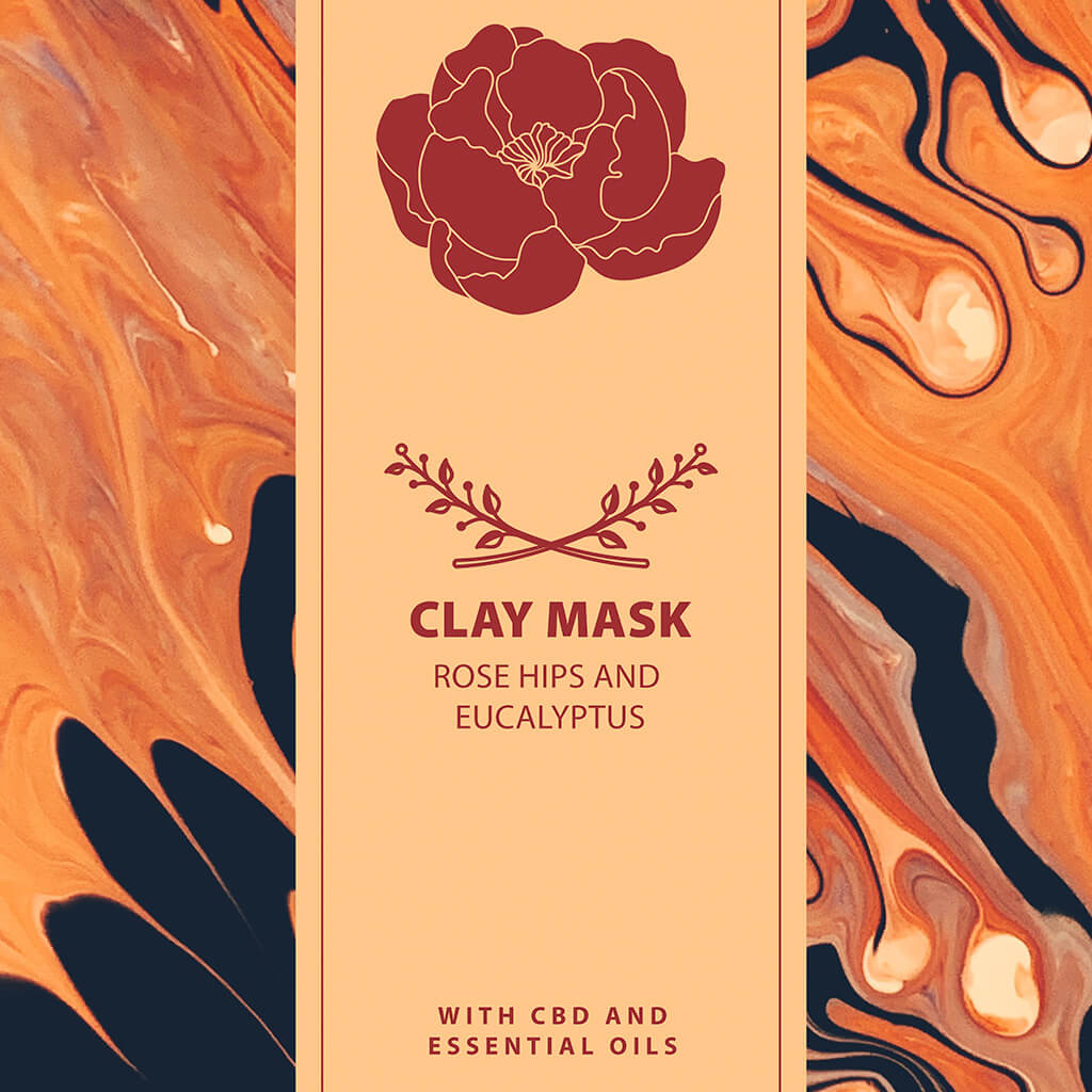
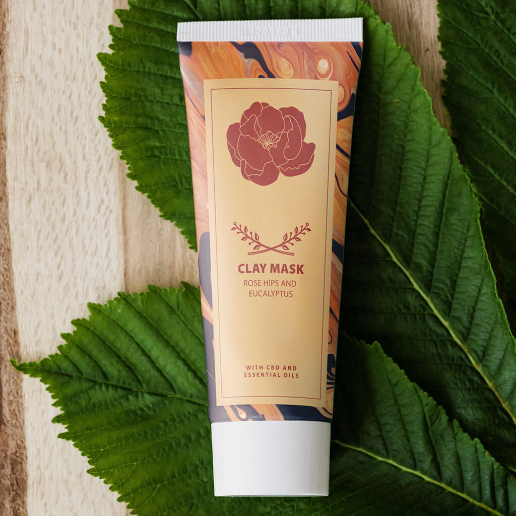
How to Create a Product Label and Composite It into a Mockup in Photoshop
Designing a product label and dropping it onto a photo of the actual product are usually treated as two separate jobs, but linking them together means every edit to the label — a moved logo, a new headline, a color swap — updates automatically everywhere that label has been placed. This tutorial builds a label from scratch and composites it onto a product photo using a linked Smart Object, so the whole workflow stays fully editable.
Building the Label’s Shape to Match the Product
Start on the product photo itself with the Marquee tool (M), roughly drawing a shape about the size of where the label will sit, then fill it with white (Shift+Delete opens the Fill dialog). Right-click that shape’s layer and choose Duplicate Layer, sending it to a brand-new document — that new document becomes the actual label file, so scaling the shape up with Free Transform (Cmd/Ctrl+T) and cropping around it gives a properly sized, high-resolution canvas to design on.
Designing the Label with Stock Graphics, Shapes, and Color Overlay
With the label canvas ready, bring in stock photos and icon graphics to build the design — the Rectangle tool (U) can add simple color blocks, sampled directly from an image with the eyedropper in the color picker. Icon graphics that come in black can be recolored non-destructively through the Layer Style dialog’s Color Overlay option, sampling any color from elsewhere in the design with the eyedropper that appears while hovering over the canvas.
Fixing the Eyedropper When It Samples the Wrong Layer
If the eyedropper keeps grabbing color from a layer above the one intended, switch the Eyedropper tool’s Sample setting to “All Layers” — this fixes the sampling everywhere the eyedropper is used, including inside dialogs like Color Overlay, not just with the tool itself.
Aligning Elements Precisely with the Move Tool’s Align Options
Selecting the whole canvas (Cmd/Ctrl+A) and then using the Move tool’s alignment buttons — center vertically, center horizontally, and so on — snaps any selected layer precisely into place relative to that selection, which is a fast, reliable way to keep a design’s elements lined up instead of eyeballing position by hand.
Building Up the Type Hierarchy for a Brand Look
Starting with a single text layer and duplicating it repeatedly (Cmd/Ctrl+J) makes it easy to build a full type hierarchy — a brand name, a product name, and a smaller descriptive line — each with its own size, weight, and letter spacing pulled from the same base style. Grouping related elements, like a logo mark with its brand name, keeps the layer stack organized and makes repositioning the whole unit later much simpler.
Placing the Label as a Linked Smart Object on the Product
Save the finished label as its own PSD, then on the product photo go to File > Place Linked and select that label file. This places the label as a linked Smart Object that stays connected to its source file — resizing and positioning it into place on the product with Free Transform sets up the base composite.
Why a Linked Smart Object Beats a Flattened Screenshot
Pasting a flattened screenshot of a label onto a product photo means redoing the whole composite from scratch every time a client wants the logo moved or the color changed. A linked Smart Object avoids that entirely — editing and saving the original label file updates every document it’s linked into automatically, which matters even more once the same label needs to appear across several different product mockups.
Warping the Label to Wrap Around the Product’s Curve
With the label’s Smart Object selected, Free Transform followed by right-click > Warp (making sure the warp mode is set to Custom) allows the flat label to be reshaped to follow a curved surface — an Arch warp can suggest the overall curve of a rounded package, refined further with a custom drag of the warp grid.
Split Warp Vertically: A Newer Photoshop Feature
Right-clicking during a warp and choosing Split Warp Vertically adds a vertical dividing line that lets pixels on one side of it be pushed and pulled independently of the other side — doing this near both edges of the label makes it look convincingly compressed as it wraps around the product’s rounded sides, an effect that isn’t available in older Photoshop versions without this feature.
Masking the Label to Just the Product’s Body
A warped label is still visible everywhere until it’s masked to just the product’s surface. Select > Subject provides a fast rough starting mask, refined with the Pen tool or Lasso tool around trickier areas like a curved cap or lid where the label genuinely shouldn’t appear. Painting black directly on the mask with the Brush tool (holding Shift between two clicks draws a clean straight line) can clean up any remaining hard edges, and a light pass with the Smudge tool over the mask itself softens edges that look too crisp to be real.
Adding Real Shadows and Highlights from the Original Product Photo
A perfectly flat label composited onto a product photo reads as obviously fake, because it ignores the product’s real shadows and highlights. Duplicating the original background layer, setting its blend mode to Multiply, and clipping it to the label layer brings the product’s natural shadow detail back over the design. Duplicating that again with a Screen blend mode instead brings the highlights back the same way.
Using Levels Instead of Opacity to Control a Screen Blend
Lowering a Screen-blended layer’s opacity dims the highlights but doesn’t sharpen their definition. A Levels adjustment (Cmd/Ctrl+L) that darkens the layer’s dark point instead keeps the true highlight areas bright while making everything else in that layer disappear into the Screen blend — often layered twice, once broadly and once more aggressively for a sharp, focused highlight along one edge.
Finishing with Color, Blur, and Noise to Match the Original Photo’s Look
A final pass of realism comes from small imperfections: painting a touch of warm color on a new layer set to Soft Light softens highlight areas that would otherwise read as pure, unnaturally white. Since the label sits on a Smart Object, Filter > Blur > Gaussian Blur and Filter > Noise > Add Noise both apply as fully editable Smart Filters, softening the label’s crisp edges and adding a touch of grain so its sharpness matches the photographic quality of the rest of the image — even a slight blur on the layer mask itself helps the transition read more naturally.
Why the Linked Smart Object Workflow Works
Placing a label as a linked Smart Object rather than a flattened image means the design and the composite are never really separate files — they’re two views onto the same source. Warping, masking, and adding shadow and highlight layers all happen on top of that link without ever breaking it, so a design change made once in the label file ripples out to every mockup it appears in. That’s what makes this workflow genuinely reusable across a whole line of products instead of a one-off trick for a single image.
Final Thoughts
A convincing product mockup comes down to two separate skills working together: designing a clean, well-aligned label, and then integrating it onto the product with real warp, shadow, and highlight detail pulled from the photo itself. Building the connection with a linked Smart Object is what turns that into an iterative, genuinely editable workflow rather than a composite that has to be rebuilt from scratch every time something changes. Several of the icon graphics used on this label came from the Noun Project, including this flourish icon.
Quick Reference: Keys, Menus and Settings
- Label templateM marquee, Shift + Delete fill white; right-click > Duplicate Layer, Document: New
- Recolor iconsDouble-click the layer > Color Overlay; Eyedropper tool Sample: All Layers
- Align and typeCmd/Ctrl + A, then the Move tool align buttons; Cmd/Ctrl + J duplicates a line, Cmd/Ctrl + G groups
- Link the labelFile > Place Linked; Cmd/Ctrl + S in the label file updates the mockup
- Wrap itCmd/Ctrl + T, right-click > Warp (Custom) > Split Warp Vertically; Cmd/Ctrl + H hides the grid
- Mask itSelect > Subject, add a layer mask; P for the Pen around the cap, fill black
- Light and finishClipped photo copies on Multiply and Screen, Cmd/Ctrl + L for Levels; Filter > Blur > Gaussian Blur, Filter > Noise > Add Noise

Free Downloads
Follow Along on the Same Files
Get the 2 sample images, the Label Template PSD, the linked package mockup PSD and the 5-page PDF guide. Free with a PHLEARN account.
Packaging Mockups in Photoshop: Common Questions
How do I make a mockup update when I change the label?
Save the label as its own PSD, then on the product photo go to File > Place Linked and pick that file. Every time you save the label with Cmd/Ctrl + S, the mockup updates with the warp, mask, shadows and highlights still in place.
How do I start a label with the right proportions?
On the product photo, press M and drag a marquee about the size of the label, then fill it with white using Shift + Delete. Right-click the layer, choose Duplicate Layer and set Document to New, then scale it up with Cmd/Ctrl + T.
How do I change the color of black icons?
Double-click the icon layer to open Layer Style and click Color Overlay. Click the color swatch, then hover over the document and eyedrop any color in your design.
Why does the eyedropper pick the wrong color?
It can sample layers sitting above the one you want. Select the Eyedropper tool and set Sample to All Layers; that setting also applies inside the color picker and Color Overlay.
How do I center text and graphics on a label?
Press Cmd/Ctrl + A to select the document, then use the align buttons in the Move tool’s options bar. To center something between two elements, draw a smaller marquee between them and align to that instead.
How do I wrap a flat label around a curved product?
Press Cmd/Ctrl + T, right-click and choose Warp, and check the warp menu says Custom. Right-click again, choose Split Warp Vertically near each edge, and drag the pixels outside each line inward so the label curves.
Why don’t I have Split Warp?
Split Warp is a newer Photoshop feature, so older versions like CS6 don’t have it. Use a traditional Warp or Liquify instead.
Why does my label look pasted on?
It ignores the product’s real light. Duplicate the Background layer above the label, set it to Multiply and choose Create Clipping Mask for the shadows. A second copy on Screen, with its darks darkened in Levels (Cmd/Ctrl + L), brings back the highlights.
How do I make the label match the photo’s softness?
On the label layer, add a very subtle Filter > Blur > Gaussian Blur and a tiny bit of Filter > Noise > Add Noise. On a Smart Object both are Smart Filters you can switch off; a little blur on the layer mask helps too.
Are the sample files free?
Yes, with a free PHLEARN account. You get 2 sample images, 2 sample PSDs and 1 PDF guide: the PSDs are the Label Template and the finished package mockup, and the guide is 5 pages.
Master Photoshop, Lightroom and Photography
Join PHLEARN PRO for $12.99 a month or $99.99 a year. Cancel anytime, with a 100% money-back guarantee.





