How to Make a Photography Website and Landing Pages That Sell
In today’s internet fueled economy, most photographers understand that they need a web presence and that the best way for them to represent themselves online is through a website. However, most photographers don’t fully understand the role that their website should play in their business, or what they should feature on it.
While many website themes geared towards the photography industry put the focus on featuring the portfolio, having a website with a portfolio and a contact page is simply not enough to get you hired. As we discussed in previous articles, photography is a big investment for most clients. Whether you sell high-quality albums, a piece of retouching software, or Lightroom presets that can speed up workflow, once your product crosses a certain price threshold it moves from an impulse buy into something that requires more nurturing: between seven and 13 marketing touch points! While some of these touch points can come from your social media efforts, your website will need to be doing a lot of the heavy lifting!
So, we’re going to look at the role of your website in your photography business, as well as what it needs to convert visitors into leads or booking inquiries. We are also going to demystify landing pages and discuss the role they play in your website ecosystem and overall digital marketing strategy.
The Role of Your Photography Website
Your website acts as a proxy for you and your business in the online sphere, giving customers an idea of what working with you is like. It also acts as a marketing machine, helping customers find your photography work or studio online and decide whether your services or style are the right fit for them or not. Let’s take a look at the roles your website should be fulfilling:
- Help you get found in search results – Your website should be optimized for search engines in order to be found online.
- Build trust with your potential clients – It’s not enough to be found online if the visitors don’t feel as though you will be able to meet their needs. You need to understand who your ideal client is and what their psychological needs are so that your website and its content makes them feel comfortable and gains their trust.
- Educate potential clients – One way to build trust with visitors is to help educate them, because it lets them know that you recognize their challenges and can provide solutions. For example, a family looking for wardrobe ideas for an upcoming portrait might learn a lot from a blog post on your site discussing how to get the best results from a portrait session.
- Inform potential clients – Your website can also inform visitors about how you can solve problems. Let’s say that in the same blog post for family wardrobe ideas, you discuss how you’ve honed your skills to capture both posed and lifestyle photos so that families get images that speak to their unique culture. This content might make parents realize you are able to solve their problem of kids not sitting still for a portrait, and that you can capture the uniqueness of their family without that being a worry.
- Nurture potential clients – A visitor might come back multiple times before they are ready to purchase or book. You will want to create calls to action throughout your website to encourage someone to sign up for your email newsletter, where you can send them valuable content that is relevant to their stage in the customer journey.
- Convert visitors into leads – The ultimate goal of your website is, of course, to get visitors to convert into leads who either sign up for your newsletter or email you via your contact form. Your website will need to be designed with this ultimate goal in mind, guiding visitors towards the next step in the path towards conversion.
With all of this in mind, you will need to design the content and experience of your website to tell the story of your photography business and to curate the journey through your website as that story is being told. Here’s another example: If you’re teaching other photographers how to use their camera and lighting equipment through video tutorials, you’re also helping others translate their creativity through the tools of photography. So the content on your website will be about using camera equipment, but also about tapping into one’s creativity. Articles about one’s creativity can have calls to action to sign up for free video courses on learning about your camera settings. Those free courses could then be upsold into larger workshops and online courses.
Think about your business in the vein of what you offer and why. Your personal story is probably tied up in that why.
Telling a Story with Your Website
Now that you have thought about the “why” of your photography business, you want to tell this story on your website. Unfortunately, many photographers confuse the focus of the story they tell on their website. What you need to understand is that the story isn’t just about you. More than anything, it’s about your client, their needs, challenges, concerns and the solutions that you can provide them. You are there to solve their problems and alleviate their concerns, and your story is going to be the key driver in letting your visitors know that you see them, recognize what their concerns are and are qualified to help.
Your About Page is a fantastic place to start. Take a look at the following examples of relatable and effective About Pages:
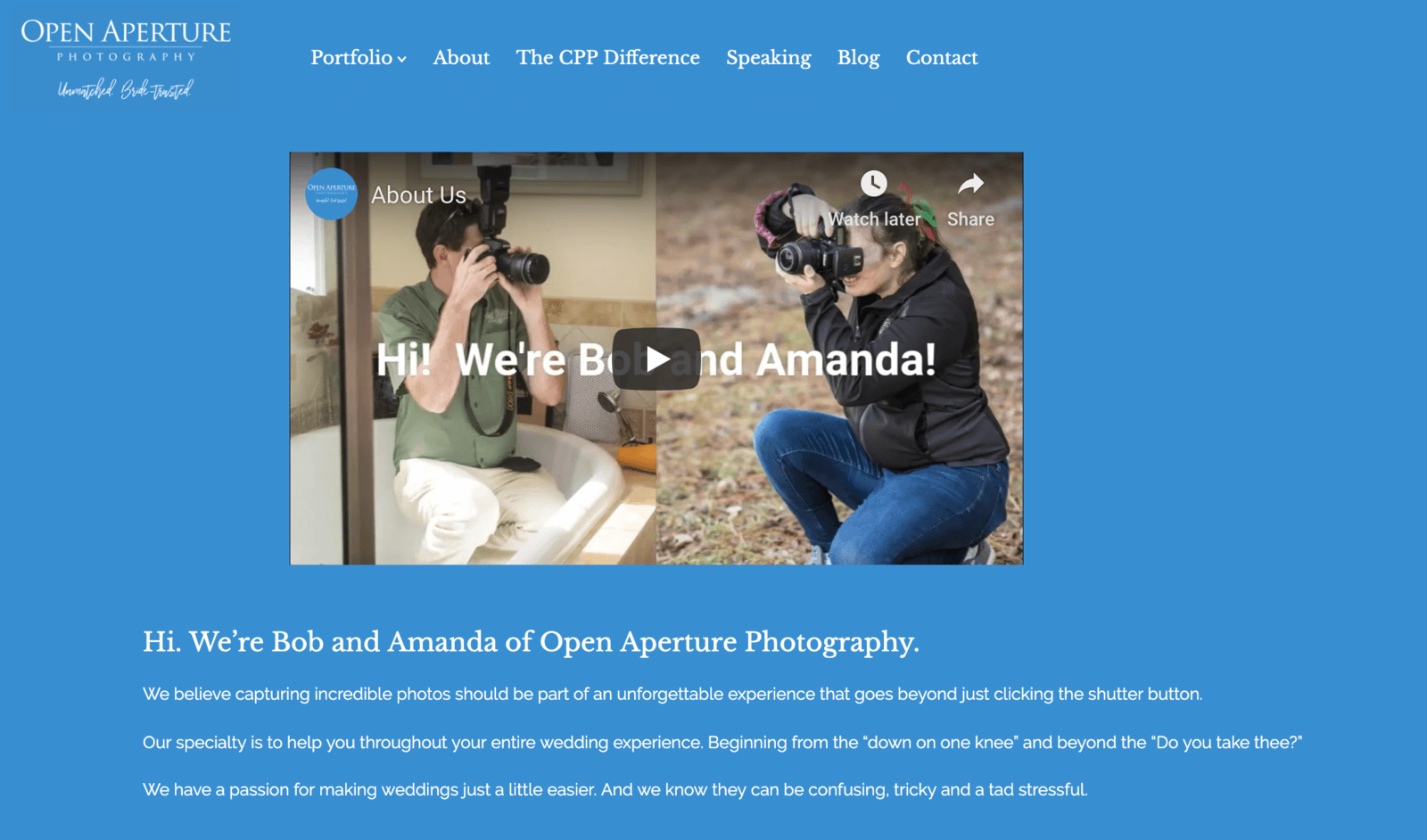
Open Aperture Photography has an amazing About Page. In it, they explain to brides and grooms that they understand exactly what their needs are in regards to wedding coverage, and they understand the common worries that brides and grooms deal with in the planning stages. They also use video to help tell their story and introduce prospective clients to their business.
One of the best parts of their About Page is where they say, “So, imagine waking up…”:
The storytelling in this paragraph is fantastic, hits those psychological underpinnings of the fears couples have when planning weddings, and lets them know that Bob and Amanda have enough experience to make sure that the photography will be smooth when couples hire Open Aperture Photography. Notice how client-specific the language is. Bob and Amanda aren’t talking about themselves so much as they are talking about what their clients can get and expect from them. It could be argued that the only thing missing from this About Page is a contact form!
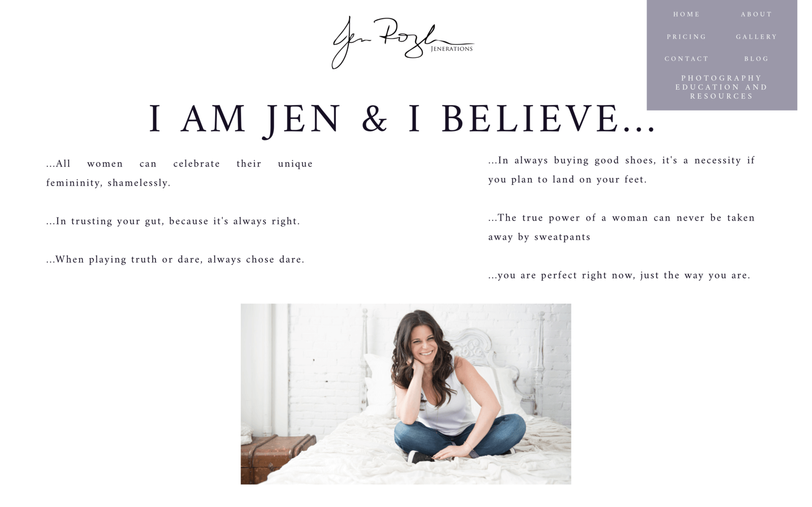
Jen Rozenbaum’s About Page is deceptively simple. Although she is detailing her beliefs, she is establishing herself as someone who is loving and accepting and can hold space for her prospective clients who might feel vulnerable about a boudoir session:
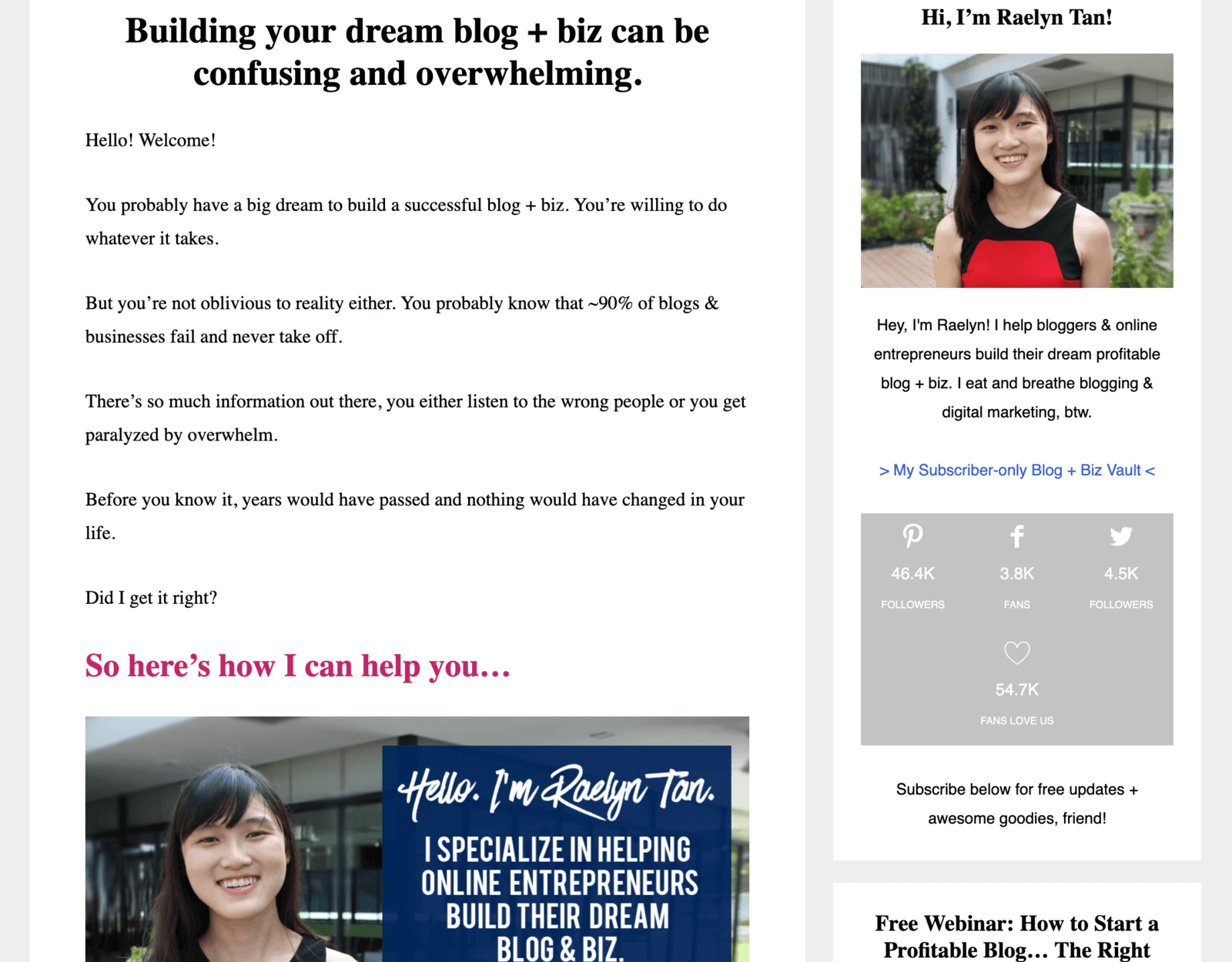
Though not photography specific, Raelyn Tan has a very long About Page, and a great post on how to write one, but above the fold (top of page) she is also speaking directly to her ideal client about what their needs are and how her business can help. This is a great example to refer to if you’re offering business consulting or coaching for other photographers:
So when writing your About Page, focus on the following:
- Make it clear who you are serving. If your business is geared towards commercial photographers who need a high-end retouching service, then include images and text that call that out. If your business is selling Photoshop actions and Lightroom presets designed specifically to create the light, airy look that is popular for newborn photographers, then don’t fill your site with images that aren’t relevant.
- Highlight what their problems are. Using the above example, if you’ve designed a specific Photoshop workflow to retouch the skin discoloration that some newborns have, then write your copy so that visitors understand that you relate to the issues that they have in post.
- Introduce your business and how you are able to solve those problems. This is where your story can come in. Write copy along the lines of, “When I was [insert situation that is relevant to where your ideal client is now], I struggled with [insert relevant problem]. Then I discovered/created/fell in love with [your product or service as the solution].”
In our example of the newborn photographer selling actions and presets, they might say: “When I first started my newborn photography business, I spent hours in editing trying to correct skin tones and get those creamy highlights that are so popular. Despite the fact that I started my business to give me more flexibility and time with my family, I found myself missing meals and bedtimes! That’s when I knew something had to change. So I created the Newborn Photography Workflow to help speed up your post-processing time, and achieve consistent edits and snuggle-soft skin tones!”
- Establish your credibility as an expert, but be personal. The above example not only lets prospects know that you’ve been in their shoes and have found a solution, but it makes you relatable. Someone who has done marathon editing sessions and missed important time with their family can completely relate to this story, and will be moved by the prospect of a solution that can help.
- Offer a call to action to get them to subscribe to your newsletter or purchase your product. Depending on your price point, you might want to direct someone to a buy button. In the preset example, if you have a $20 introductory product, someone might be willing to buy on impulse. But if you have an entire class or academy on newborn photography and retouching, you might need someone to sign up for a special offer like a video or a newsletter series that gives a sample of what they will learn.
The content around your photography website, especially on your blog, will also help you to tell the story of your expertise and knowledge and should be written with these things in mind. As we discussed in our content creation article, the content on your site should supply a demand. This is why delving into who your ideal customer is and what their needs are is so important!
Curating the Journey on Your Website
Your website is your online home, and although you will not be physically present to guide visitors to all the rooms/pages you hope they will see, you can design elements of your site in such a way to act as your proxy. If you’ve been working on your SEO efforts, then someone might find your site in a Google search, or one of your blog posts might rank well for a certain topic. If you’ve been spending time on building a strong social media strategy, then someone might find your site through a post on Facebook or a link in your Instagram profile. From that perspective, almost any page on your website could end up being the first impression for your photography work.
The question is where do we want visitors to go? You might be thinking, “I want people to go straight to my contact form and book a session with me!” But as we discussed when we thought about customer journeys, it can take time for someone to be ready to convert to a lead. Oftentimes, we need to nurture someone from the awareness stage, through their customer journey before they are ready to book.
So think about each page on your website and ask yourself what it is that you would like your ideal client to see and know, and in what order. For example, if someone enters your site via a blog post, do you want them to know more about you and your photography and what it’s like to work with you? Or do you want them to see more of your work? List out the pages on your website. Ask yourself what order someone should see those pages in. For example, if someone comes to your homepage first, what is the next logical page for them to go to based on your business?
Let’s think about what this looks like in the real world: If you’re selling a plugin or retouching service, your visitor probably wants to see this product in action. Direct them to a page that shows examples next. Next, they probably want to see if you offer a free trial or sample downloads. Put this offer on your Purchase page so that you can capture prospects and buyers in the same journey.
As you list your website pages, think about the call to action (CTA) you can place on each page to help the visitor know where to go next. Each of your blog posts can also have a CTA on them. For example, I had a lot of success getting newsletter sign-ups from my blog simply by embedding a Mailchimp form at the bottom of my blog posts. These blog posts were written to be valuable content for my ideal client, and my CTA was simply a promise of more of the same delivered to their inbox:
Once they signed up, they would receive an email nurture sequence with relevant information that eventually encouraged them to book with me. Overall, the goal of your website tour is either to get the visitor to sign up for your mailing list or to lead them to your contact or booking form. By curating the experience on your site, your prospective client has had an opportunity to get to know you better and appreciate your unique offering. Creating a curated tour for your website can help keep users on your site longer and also help cull price-shoppers who go straight to your booking form looking for the lowest price.
What Your Photography Website Needs
Now that we have discussed the role of your website and how to use it to tell a story and curate a journey for your ideal client, let’s take a quick look at what your website needs:
- A clear vision of who your ideal client is.
- A homepage that shows off your best work to appeal to that ideal client.
- Your template should also have an easy way to get back to your homepage. Most web users have been trained to click a link on a logo to get to the homepage, so make sure yours is clickable.
- An about page that is client-focused and helps build trust.
- Service pages or galleries that show off your best work.
- A contact page that includes an address, a phone number (good for local SEO) and a contact form.
- Quality content geared towards educating your ideal client.
- Calls to action throughout the site to encourage movement through the customer journey towards conversion.
- Social media links in the footer of your site and the ability to share your content on social media.
- Simple navigation and clean aesthetic that is mobile responsive.
- If possible, keep the number of menu items to five or six to keep navigation uncluttered.
Image by tswedensky from PixabayUsing Landing Pages
If you’ve been learning about how to market your photography business, you’ve probably heard the term landing page thrown around a bit. However, many photographers struggle to understand the difference between a landing page and a web page.
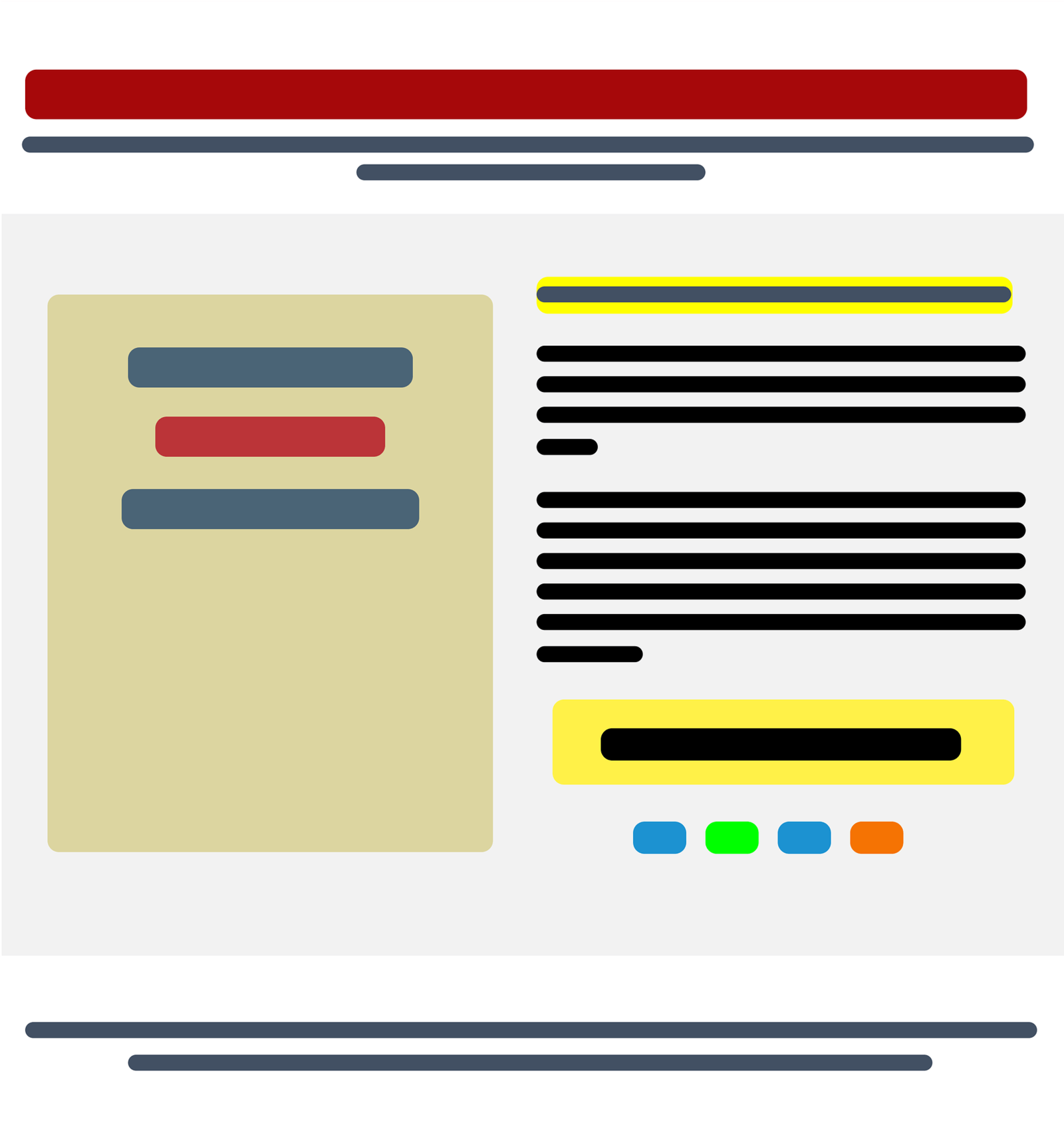
Simply put, a landing page is a type of web page that is free of distractions and encourages the visitor to focus on a single goal. So a good landing page will not have a top or bottom navigation, or a blog sidebar. Usually, the goal of a landing page is to get the visitor to fill out a form in order to sign up for an offer. Some photographers use landing pages to get visitors to watch a video and then fill out a form for more information.
Personally, I use a landing page when I want to get visitors to sign up for my online classes or purchase one of my digital products like an eBook. Another photographer that I know offers an eBook to prospective clients about how to look great in front of the camera. Friends that run a business teaching photographers the ins and outs of successful wedding photography businesses use a multitude of landing pages to get their audience to sign up for webinars that they’re hosting or to join a membership site that they run.
Why Use a Landing Page?
When visitors are coming to your website, they are there to be introduced to you, your business or services, and to decide if your solution fits their needs. For example, if you offer culling, editing and retouching for wedding portraits, then a visitor needs to know if your style fits theirs or if you can match their style. If you sell actions and presets, visitors need to know what version of Photoshop and Lightroom your products are compatible with. The tour that you curate will be designed to help answer those questions.
Still, even when you have curated a tour and calls to action throughout the website, there are many options and places for visitors to go. So if you have a marketing or advertising strategy that is focused on a single goal – let’s say getting people to sign up for your lead magnet – you want to make sure visitors aren’t distracted.
This is where a landing page comes in. Because landing pages are designed to focus entirely on one conversion goal, their design limits other distractions and the options to click through to other parts of your website. Usually, this conversion goal is a contact or signup form, although sometimes the conversion goal could be to purchase a product. If you sell Lightroom presets, your landing page might be a sales page to get visitors to purchase. Anything that takes the visitor’s focus away from completing the goal on the page is eliminated, whether it is design elements or content.
According to HubSpot, the essential components of an effective landing page are:
- A main headline and a supporting headline – This tells visitors what they will be getting from the page and why they need it. For example: Adobe Lightroom presets that will cut your workflow time in half!
- A unique selling proposition – This is what makes your offer distinct and, hopefully, better. What makes your presets better than everything else out there? Are they designed for a specific type of work? Has your retouching graced the pages of Vogue? Let clients know!
- The benefits of your offering – How will your prospect’s life improve as a direct result of your offering? Are you saving them time, money or worry in their editing process? Are you giving them prints and albums that help them treasure their wedding, their family or themselves?
- Images or video showing context – Even if what you are offering is free, no one wants to give away their email address without seeing a preview of what they will be getting. This is why before and after images are so powerful for plugins, presets or retouching services. Behind the scenes videos are great for photographers offering client sessions. If you’re teaching online classes, walkthrough videos of what people will be learning and how gives them an idea of your teaching style.
- Social proof – Testimonials on how your offer was worthwhile for others like your prospect helps with converting prospects into leads. Remember the example testimonial we saw for the Newborn Photography Workflow? You’ll want to curate testimonials that speak to the exact issues your clients are facing.
- A reinforcement statement – This echoes your main headline and could be a second heading further down the page that uses different wording to say the same thing. So using our previous example, you might reinforce your headline by saying something along the lines of, “Get our complete workflow and watch your editing time get cut in half.”
- A closing argument – This is the final opportunity for you to reinforce your unique selling proposition and the benefits that a prospect will receive when signing up for your offer. Our workflow closing argument will hit those psychological underpinnings by saying something along the lines of, “You didn’t get into this business to be chained to your computer! When you use the Newborn Photography Workflow you free up time for the things that are most important to you: your family and celebrating the new family members of your clients.” Once you have reminded visitors of the benefits they will receive, you can also call out the features of the product.
- A call to action – This is either the form where your prospects sign up or the button where they click to buy. Make sure that it stands out. If you’re using a form, test the number of fields. Usually the fewer fields, the higher the conversion rate of the form.
MailerLite, an email software provider, has some great examples of photography landing pages. And if you’re interested in an in-depth critique of photography-specific landing pages, Wishpond has an excellent review on their blog with pros and cons for each example.
When Would You Use a Landing Page?
There are a number of reasons you might want to send traffic to a landing page instead of your overall website. Let’s take the example of the eBook describing how to look good on camera: you don’t just want to offer this as an ungated download on your website. (When we say “gated” we mean that someone has to enter an email address to access the content. “Ungated” means that they could just click on a link and start a download.)
Instead, you want to create a landing page that addresses all of the reasons that might hold someone back from getting in front of the camera. Here, you are speaking to the psychological need of the client and letting them know you see them and are able to offer a solution. For each reason someone might be afraid to be photographed, your landing page will tease a solution. So if someone is uncomfortable with their weight on camera, your landing page will tell them that your eBook will teach them slimming poses. If someone feels like their smile looks fake on camera, your landing page will say that your eBook will teach them techniques to find genuine expressions for the camera.
The benefit of using a landing page for this eBook is that it will be designed with that single goal and no other distractions, which can help convert visitors into subscribers.
Reasons to use a landing page:
- Offer a lead magnet in exchange for an email
- Encourage sign-ups for an event
- Give subscribers access to a special coupon
- Get visitors to enter a sweepstake in exchange for their email
- Sign up for more information on a digital product, or to purchase a digital product
Whenever I run advertising campaigns, I always use a landing page. In fact, if I am taking over an advertising client from another agency, one of the first things that I do in an audit is make sure that the campaigns are using appropriate landing pages. It’s often not advisable when running a Google Ads, Facebook or Instagram Ads campaign to be sending traffic to your homepage because this is likely not the most relevant page on your site. Additionally, your website is full of distractions. When running paid ads, design a campaign that closely links the copy and content of your ad and landing page together for best results.
How to Create a Landing Page
There are many companies out there that offer easy drag & drop landing page templates. In some cases, email providers such as Mailchimp, MailerLite and ConvertKit offer built-in landing page templates or simple forms as a part of their email services. These services are great places to start if you’re beginning to explore using landing pages in your marketing.
If you are running a more complex marketing campaign or are selling a product, companies like Leadpages, Instapage, Wishpond and Unbounce offer a diverse range of templates to choose from. However, you don’t have to create landing pages that live off of your main website domain. Website service providers such as Squarespace and Wix can also be used to fashion landing pages from scratch, but you will need to know how to adjust the code or template to remove distractions such as the top and bottom page navigation. I’ve used Squarespace for some of my landing pages and have found it difficult to adjust the code, so if you’re looking for a drag & drop solution then I would start with something like Leadpages or Instapage.
To Summarize
When you’re at a consultation, a networking event or an expo, potential clients get to interact with you in person and experience your business in a more three-dimensional way. On the internet, prospects don’t get to meet you in the same way. Instead, your website represents you, your brand, your personality and your products or services in the online world. So your website needs to be able to do many of the things you might otherwise do in person: educate, nurture and convert ideal prospects into customers. While you might have a conversation with someone in person about the story of your business and whether it’s the right fit for them, your website needs to do this online.
Landing pages, by contrast, focus visitors on a single conversion goal. They are still telling an important story and help visitors understand whether a specific offer is right for them, but they are free of distraction. Their purpose is to get prospects to sign up for a special offer or lead magnet. This could be that demo of your software, or an eBook about how to dress or pose for the camera, or a sample of your work. Remember: if you’re already using an email marketing service for your newsletter, you probably have access to landing page templates that you can use in your lead generation and advertising strategies.
Test these services out first before upgrading to a more expensive landing page-specific service. You may find that a simple landing page works perfectly well for the offer that you want visitors to sign up for. However, as your marketing strategy evolves and becomes more complex, the templates and support from companies such as Leadpages, Instapage, Wishpond and Unbounce can be invaluable.
By telling your story, and how it relates to what keeps your client up at night, you can nurture prospects through your booking or sales pipeline. Tell stories about how your presets changed photographer’s workflow or testimonials about how your fine art photos helped a customer connect to their feelings or the landscape. Take time to write content that educates your prospects on how to use your product, or how to prepare for a session, or how to design their spaces to highlight the art they are investing in.
With the right mix of relevant website content – and landing pages to help encourage prospects to move into your nurturing sequence – you will find that your digital strategy begins to come together, bringing a consistent pipeline of quality leads to your photography business!

