Download Sample Images
description
Compositing is the art and craft of combining elements from different photos into a single image. The goal is to create the illusion that everything was photographed in the same scene. Sometimes we do it to solve common problems, like replacing a washed out sky in a landscape photo with one that’s full of clouds, color, and detail. And sometimes we do it to bring our imaginations to life, creating impossible scenes of fantasy and wonder.
But before we can start to explore the world of compositing, we need to master some of the basics. In order to make it look like the people, places, and objects from different photos were all photographed together, the color and lighting need to match. So join us as we show you how to create photorealistic composite images in Photoshop by matching light and color!
This is Day 28 of our 30 Days of Photoshop series. If you enjoyed it, follow along with all 30 episodes as we explore the magic of Photoshop together!
Watch Next
30 Days of Photoshop

Sign up to receive email updates to keep you going, sample images to follow along, and a printable calendar to keep track of your progress!
Share

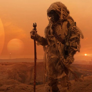
MATCH LIGHT & COLOR
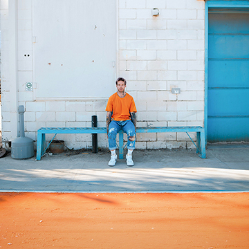
BEFORE
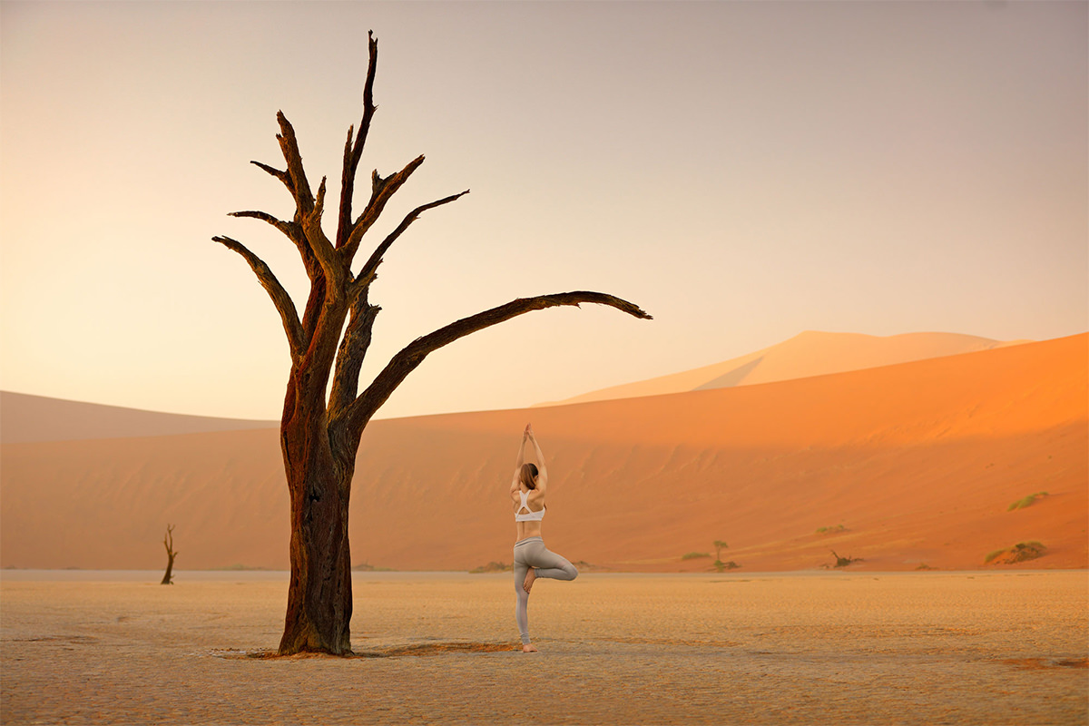
Seamless Composite Images
What are Check Layers?
There are countless tools in Photoshop that can help us create composite images. From selection tools, to Adjustment Layers, to Blending Modes. But there are only a few that can help us see things more clearly. We use Check Layers to help guide our eyes as we dial-in the correct light and color levels. But you won’t find ‘Check Layers’ listed anywhere in Photoshop. Compositors use the term Check Layers to describe and categorize a handful of Adjustment Layers that help us check our work.
The two types of Check Layers we’ll be working with today are the Black & White Adjustment Layer, and a Solid Color Fill Layer set to the Saturation Blending Mode.
Starting in Black & White
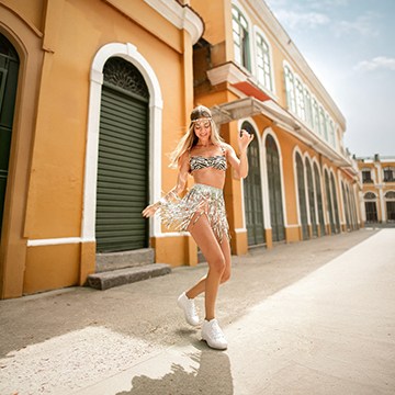
In our example, we’re placing our subject into a new scene and environment. One thing to keep in mind when making composites like this is to use your background as the guide for adjusting the light and color. It’s very difficult, and usually impossible, to make the lighting look different in a background that was photographed outside in bright, natural light. It’s much easier to try and take a cut out subject and then match them to the background lighting.
So once the subject is in place in the scene, where do we start? Begin by creating a Black & White Adjustment Layer over the top of every element in the Layers Panel. This will remove color from the equation, making it much easier for our eyes to gauge the differences in light levels from Layer to Layer. Keep in mind that this Black & White Adjustment is not meant to be permanent–once we use other tools to match the lighting of our subject to our background, we can disable or delete it.
Now that we can see the light levels easier, and can see that our subject is a little too light compared to the background, we can use a Levels (or Curves) Adjustment Layer, clipped to the subject, to dial-in the light levels we need to match the environment.
Solid Color Fill & Saturation
With our light levels matched, we can move on to color. First, make sure the Black & White Adjustment Layer is disabled. Then create a Solid Color Fill Layer over top of everything in the Layers Panel, and set it to a color of your choice, just as long as it’s a saturated color (aim for the top right side of the color picker). Now the entire image should be covered up by the color you chose. Next set the Blending Mode of the Solid Color Fill Layer to Saturation. Since we chose a saturated color, this Blending Mode will blend the color into the image while raising the relative saturation of everything underneath it. Now we can more easily identify areas of color in our subject that don’t quite match the background.
Create a Color Balance Adjustment Layer and then clip it to the subject Layer. You can use Color Balance to adjust the appearance of specific color channels in each of the highlights, midtones, and channels. So if there is too much blue showing up on our subject, we can push those areas more toward red to better match the environment.