Tutorial Description
A student on a Death Valley photography workshop I recently taught groused, “My problem is that when I take a picture of a sand dune, it looks like a sand dune. It doesn’t look like art.”
It’s a common complaint in photography, and the road that lies between shooting snapshots and shooting fine art is a long and winding one. Part of the Distance can be covered by understanding the classical tenets of photography: composition is critical, perspectives are paramount, technique is terribly important, and lighting is literally everything. In other words, with a great composition, fascinating perspective, excellent technique, and beautiful lighting, you can create a wonderful fine art photograph. But there is another element that you can bring to the table to take your wonderful photo and make it magic. Yup, Photoshop.
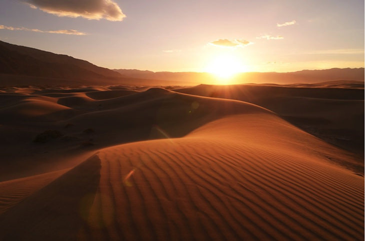
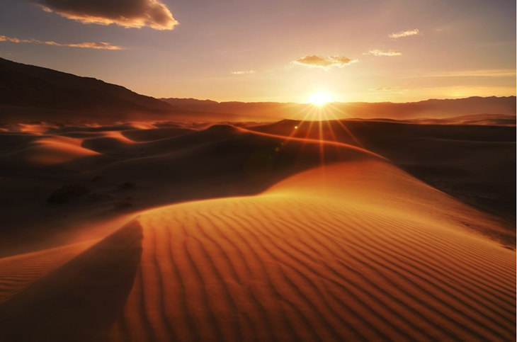
When I snapped this photo in Death Valley’s Mesquite Sand Dunes, I was reasonably happy with it. I thought the composition was compelling, the back-lit sand dunes contained endless sensual curves and interesting tonal Contrasts, and the sand blowing across the dunes added some subtle, but powerful interest to the photo.

My original shot, straight out of camera
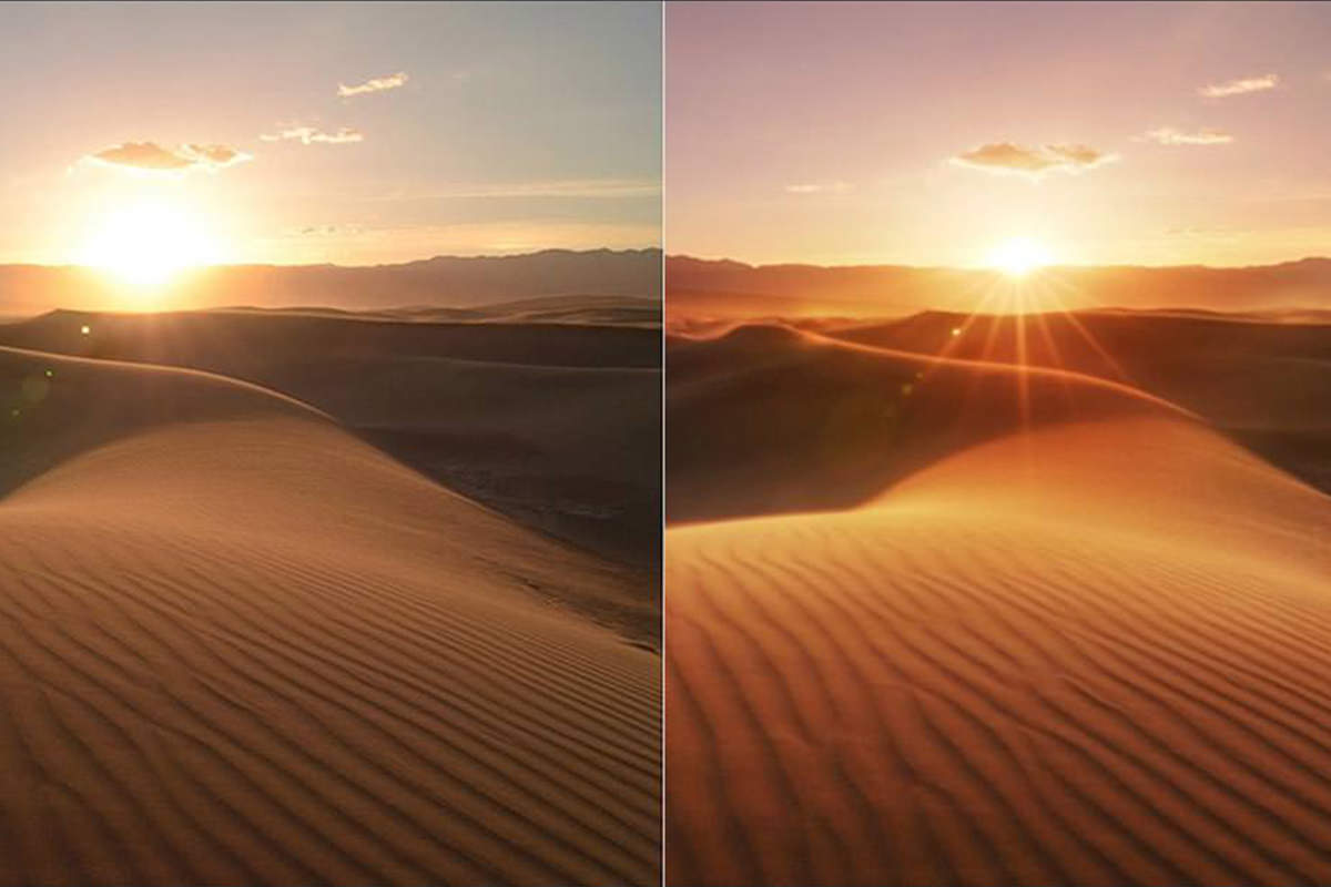
What I didn’t like about the image was the way the sun was simply a bright blotch in the sky, and also how it threw some annoying flare across the image. But I was shooting on a tripod so I knew I could fix each of these issues individually by shooting some additional photos. Since flare is caused by bright light shining directly into the lens, the easiest way to fix it is to block the bright light. Using advanced, patent-pending, sun-blocking technology (i.e. my thumb), I did exactly that, and voila: flare gone. Next, I stopped my aperture down to f/22 to Darken the sun, as well as create a spiffy sunburst effect.

Two additional shots to remove flare (left) and make the sun more interesting (right)
Problems solved, but now I was left with another one: I had three separate photos. How was I going to combine them into one final image? Enter Photoshop. I had my three shots, I just needed to work them over with some post-processing shiatsu.
Any time I do image editing I ask myself, what’s the final vision, and what elements am I trying to enhance? For this shot I wanted to emphasize the warm tones in the sand, create more atmosphere in the image, and add a touch of fantasy with my Colors. With that vision in place I brought my original shot into my RAW processor. To enhance the warm tones I cranked the Color temp up to 9090 K, and I also added a slight magenta tint to the image. Magenta isn’t a Color that is often seen in naturally-occurring phenomena, so I knew that adding a dash here would lend itself to the fantasy feel of the photo. I also juiced up the contrast to make the Light on the dunes pop a but more.
Original shot after RAW conversion
Next I opened my non-flare image in the raw convertor and gave it the exact same settings as the baseline, which left me with a nearly identical shot, plus a thumb, but minus any flare.
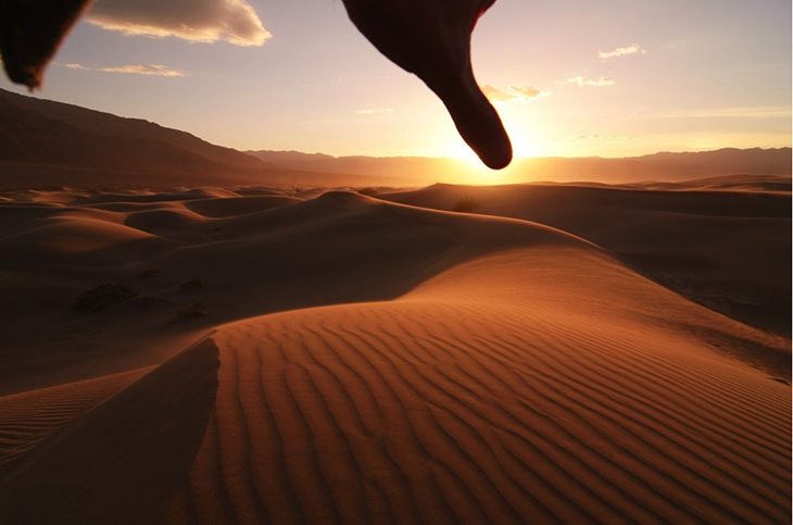
Got a problem? Just stick your thumb in there!
It was then a simple matter to layer this shot on top of my original shot, then add a layer mask to mask out the flare.
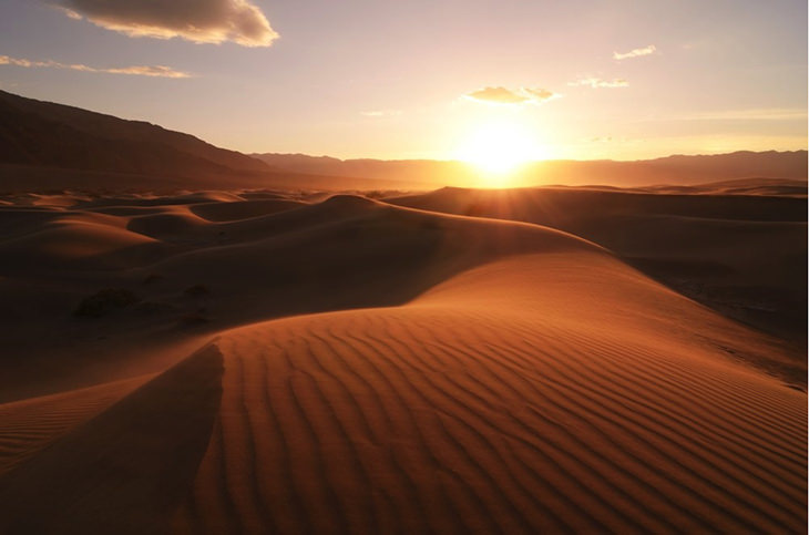
Poof: that flare is history!
If you look closely and kinda squint you might notice that there are some slight variances between the original shot and the non-flare shot. And that’s because of minute Differences between the lighting and amount of sand blowing from Frame to Frame. The result is that the parts of the image where I masked out the flare are very slightly darker and more cyan than the surrounding areas. To fix that I added a curves adjustment layer, clipped it to the non-flare layer, and ever-so-slightly brightened it and added a whiff of red. By clipping the curves layer to my non-flare layer I made sure that the adjustment would be applied only to that layer. In order to do that you can right-click on the curves layer and select “Create Clipping Mask” from the pop-up menu, or you can hold Alt / Option and click in the space between the two layers.
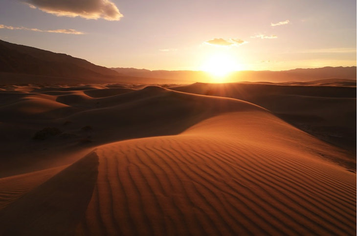
Hasta la vista, flary
With the flare problem sorted I needed to address that big, ugly sun. First I tried darkening the sky with a downward curves adjustment masked to effect just the sky.
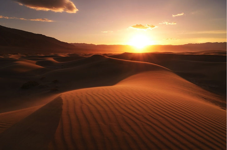
Ooh yeah, rich and sexy, like a sugar daddy should be
But while this did make the sky richer and sexier, it didn’t do anything to fix the blown highlights of the sun itself. So taking my sunburst image through raw processing to add the same color temp and tint, I layered it on top of my working image.
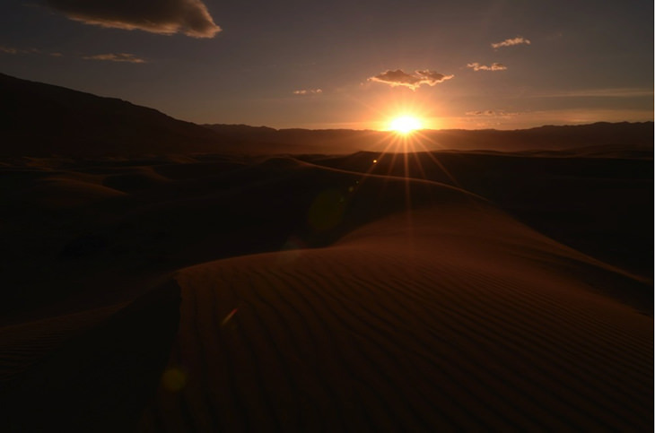
Text-align: right;”>This shot was taken at F/22 just as the sun hit the horizon in order to create a sunburst
Now I needed a clever way to mask this image so that the sunburst showed through but nothing else did. There are a million ways to approach this task in Photoshop, but I’m a big proponent of KISS: Keep It Simple, Stupid. I like to add the Stupid part for self-deprecating Motivation. Anyway, what could be simpler than a Layer Mask? I added one to the sunburst layer then used a circular gradient to mask out everything but the darker sun. This got me roughly there, but it also led to an unpleasant side- effect, and I’m not talking about nausea. Because the sky in my sunburst image is darker then the sky in the Underlying Layer, the mask left me with a weird, shadowy halo.

Gradient mask good, ugly sun halo bad
But it turns out there’s a really easy way to fix this with the curves Tool. A little-realized fact about the curves Tool is that it brightens tones without clipping them. Because Curves always makes a smooth, uh, Curve between your Adjustment points and your image’s white and black points, whenever you brighten an image your highlights get brighter without actually becoming white (conversely you can Darken an image without clipping your Shadows). Of course you can push your adjustment too far so that the smoothness of your curve “breaks” and boom, you get clipped highlights. But since you can add as
many adjustment points as you like to a curves layer you can tell Photoshop exactly which tones you want to brighten and which tones you want to preserve. In this case I wanted to brighten my midtones but preserve the brightest highlights. So I created a new curves layer, clipped it to my sunburst layer and started adjusting. I added a control point to brighten the Midtones and Highlights, another to maintain some Contrast in the shadows, and a third to make sure the brightest highlights didn’t get blown out.
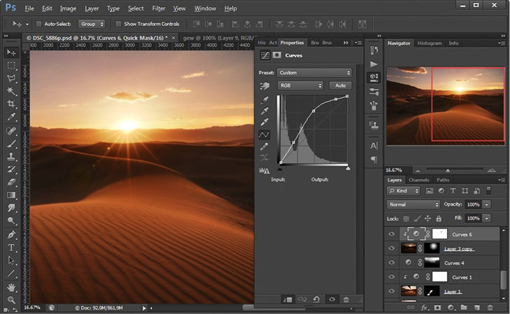
Adding a curves adjustment layer allows you to brighten the sunburst to help it blend in with out losing detail
Even though the sunburst is now considerably brighter than it originally was, because I used that curves adjustment and told Photoshop to preserve the bright Highlights, all the details of the sunburst are still visible, just more subtly so.

Before blending in the sunburst (left), and after blending with the curves adjustment layer (right)
With the blending complete and the tonal range looking good, it was time to add some more atmosphere to this shot. In particular I wanted to make the sand dunes appear to be glowing, and I wanted the sun to look like it was shining through a rich haze. I have two favorite techniques for accomplishing these tasks.
To make the dunes glow, I first needed to duplicate all the visible layers into a single layer on top of my layers. This is called Stamp Visible, and the Keyboard Shortcut is Ctrl + Alt + Shift + E on a PC, or
Cmd + Option + Shift + E on a Mac. By running the Stamp Visible command I created a New Layer that is essentially a Composite of all the layers underneath it. Next I added a Gaussian Blur to the layer, via Filter ? Blur ? Gaussian Blur. The exact amount of blur will vary from image to image based on the Size of the image and how much glow you want to add. In this case I used 9.2 pixels for the blur radius.
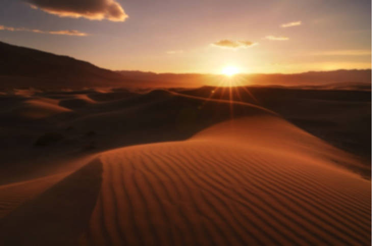
Hooray, a fuzzy image!
The next step is my favorite part because it’s what makes the dunes look like they’re aglow with their own light. I added a Curves Adjustment Layer, clipped it to the blurred layer, and cranked the midtones way up. Now the light parts of the dunes look like they’re absolutely on fire.
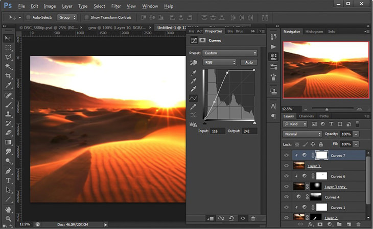
Style=”text-align: right;”>The dunes are glowing, but the sky is toast
But as you can see, that drastic curves adjustment blew out my highlights and brightened the Shadows way too much. Enter our old friend, the layer mask. Making sure the blurred layer was selected in the layers palette, and holding Alt / Option, I clicked on the Add Layer Mask button at the bottom of the layers palette. This created a black Layer Mask, completely hiding the blurred layer, and because it was clipped, the bright Curves adjustment as well. Then using a soft Brush and an opacity of around 15% I painted white on the mask on the light parts of the dunes.
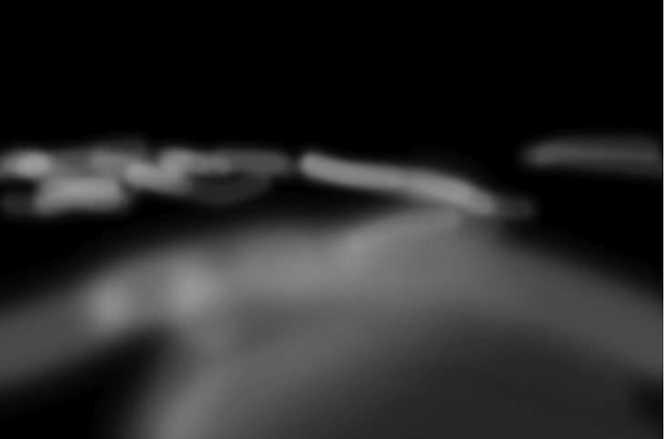
The mask of the blurred layer
This confined the glow to only the light parts of the dunes, where the blur and the extreme curves adjustment made them look as though they themselves were luminous.
Add 1 tsp curves, a dash of blur, and apply selectively for glowing goodness. Serves 12
At this point I realized I wanted the dunes in the back left to be a bit brighter. More specifically, I wanted the Light parts of those dunes to be brighter. So I added yet another Curves Adjustment Layer and yanked the tonal Curve up.
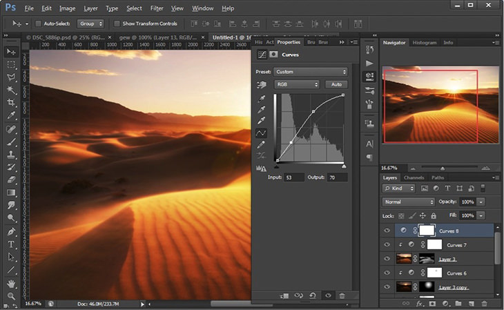
Background dunes are now brighter, but so is everything else. We need to apply this adjustment selectively.
But that curves Adjustment was applied across the entire image, and I only wanted it applied selectively to the light parts of those Background dunes. So I hit Ctrl / Cmd + I to Invert the curves layer mask and make it black, knowing I could paint back in the adjustment where I wanted it. Any time I want to make a selective adjustment my mind immediately thinks, how do I make an appropriate selection? In this case, because the Color Difference between the Light and dark parts of the dunes is quite pronounced I figured Channels would be a good place to make my selection.
In the Channels palette I clicked through the Red, Blue, and Green channels to see which gave me the most contrast in those dunes. In this case, the Red Channel had the most contrast by far, though it still wasn’t enough contrast to make a clean selection, so I duplicated the Red Channel by dragging it down to the Create New Channel button at the bottom of the Channels palette.
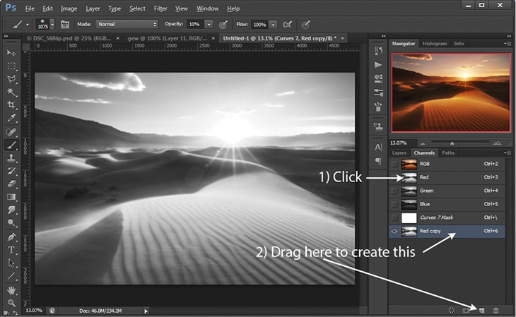
Creating a duplicate of the red channel
A cool thing about working with a channel is that you can make many of the same Brightness or contrast adjustments to it as you would to any layer. I hit Ctrl / Cmd + L to bring up a Levels adjustment for my Red copy channel. Then, by dragging the white and black points in I greatly increased the contrast of the Red copy channel, making a clear division between the Lights and darks of those background dunes.
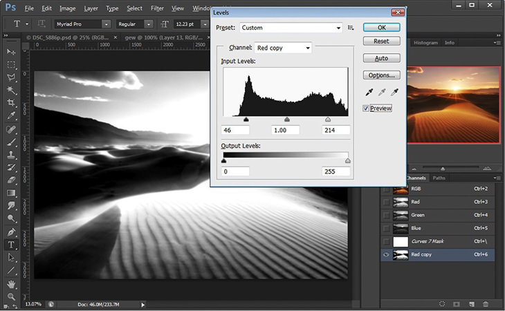
Use Levels to adjust the Contrast in your channel copies
At this point you’re probably wondering what the heck I’m doing, or how on earth this relates to making those Background dunes brighter. But here is where this weird channels stuff all pays off. You can create a selection from any channel simply by Ctrl / Cmd clicking on it or clicking the Load Channel As Selection button at the bottom of the palette. That’s really important, so I’ll say it again in BOLD. You can create a selection from any channel simply by Ctrl / Cmd clicking on it or clicking the Load Channel As Selection button at the bottom of the palette. It works like this: anything in the Channel that’s black is selected 0%, anything that’s white is selected 100%, and all the Midtones in between are selected proportionately to their Brightness. This is amazingly powerful stuff, because look how intricate those light and dark areas are in our Red copy Channel. By turning that into a selection we can use it as a mask for any adjustments we want to make. Cowabunga!
Next I loaded the Red copy channel as a selection by Ctrl / Cmd clicking on it and was ready to go back to my layers. But before I did I needed to return to viewing all the RGB Channels, so I single clicked on the the RGB channel at the top of the Channels palette before going back to my layers palette.
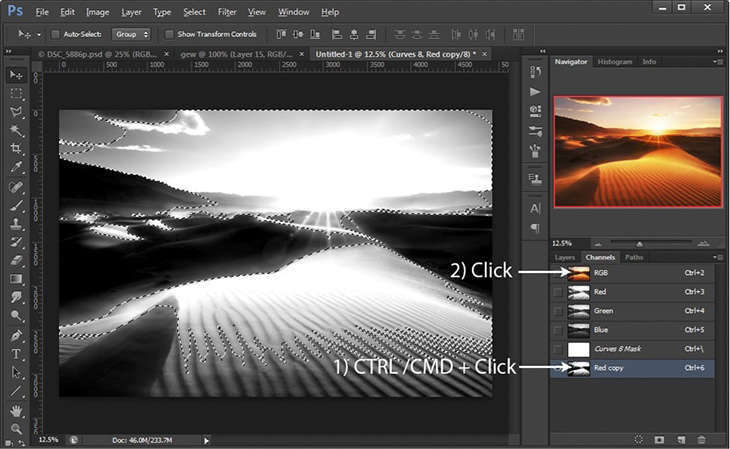
The Red copy channel is now loaded as an amazingly intricate selection
Back in the layers palette I clicked on the black mask for my curves adjustment layer and using a white, soft, low-Opacity Brush I brushed in my selection where I wanted it. You can see how the Channel selection method creates an amazingly detailed mask.
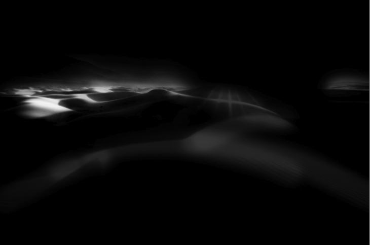
The mask for our Background dunes curves layer
The result of all this Channels selecting madness? A highly controlled splash of brightness exactly where I wanted it.
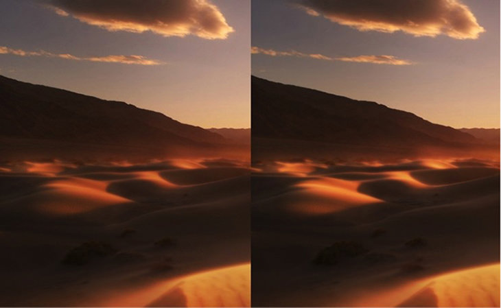
Before the selective curves Adjustments (left) and after (right)
That’s a nice touch, and I’m almost done with the image, but remember that I said I also wanted the sun to look like it was shining through haze? This is a great effect to add an atmospheric, fantasy quality to your images, and it’s relatively easy to do. I created a New Layer, filled it with 50% gray, and set the blending mode to Soft Light. Then sampling some bright rosy and golden tones from within the image I used my Brush Tool (soft, large, 20% Opacity) and painted in some big splotches right on top of where the sun is.
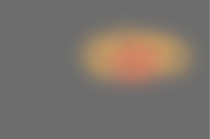
Style=”text-align: right;”>This is what we call Photoshop, UFO-style
In a Soft Light layer, anything that’s brighter than middle gray will Lighten the Underlying Layers, anything that’s darker will darken the Underlying Layers, and anything that’s 50% gray will have no effect. So what’s happening in this case is that those golden-rosy splotches are brightening the underlying layers and adding a hint of Color as well. It’s a subtle but powerful effect that can be used to add amazing atmosphere to your images. Note that it works best when it’s used with bright light sources (e.g. the sun) shining directly at the camera like in this image.

After adding the Soft Light layer, the sun has a nice bit of glow. Before (left) and after (right)
Finally, there’s one last adjustment I want to make to the image. To really lock in that magic feeling I wanted to add a little more magenta to the sky. I did this simply via a Color Balance layer, then used the Gradient Tool to mask out everything but the sky.
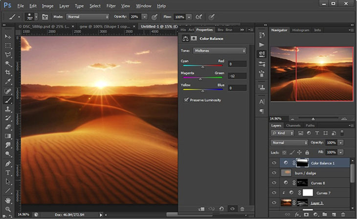
Text-align: right;”>Add a sniff of magenta for a more fantasy feel
That was the final adjustment and here’s the resulting image.
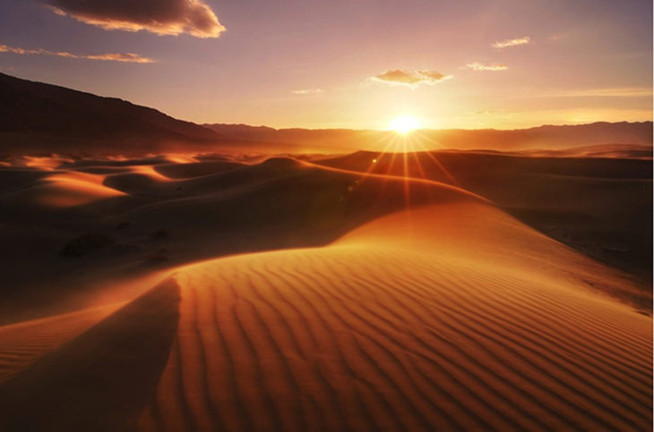
Presto, we done!
Now let’s take another look back at the initial image to see just how far we’ve come.
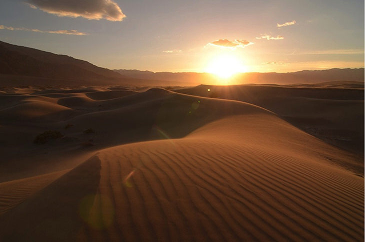
Back to square one, noooooooooo!!!
It’s a striking Difference, and one that shows just how much oomph you can inject into your photos with some selective Adjustments, some blending, and some blurring. Now go have some fun processing!
