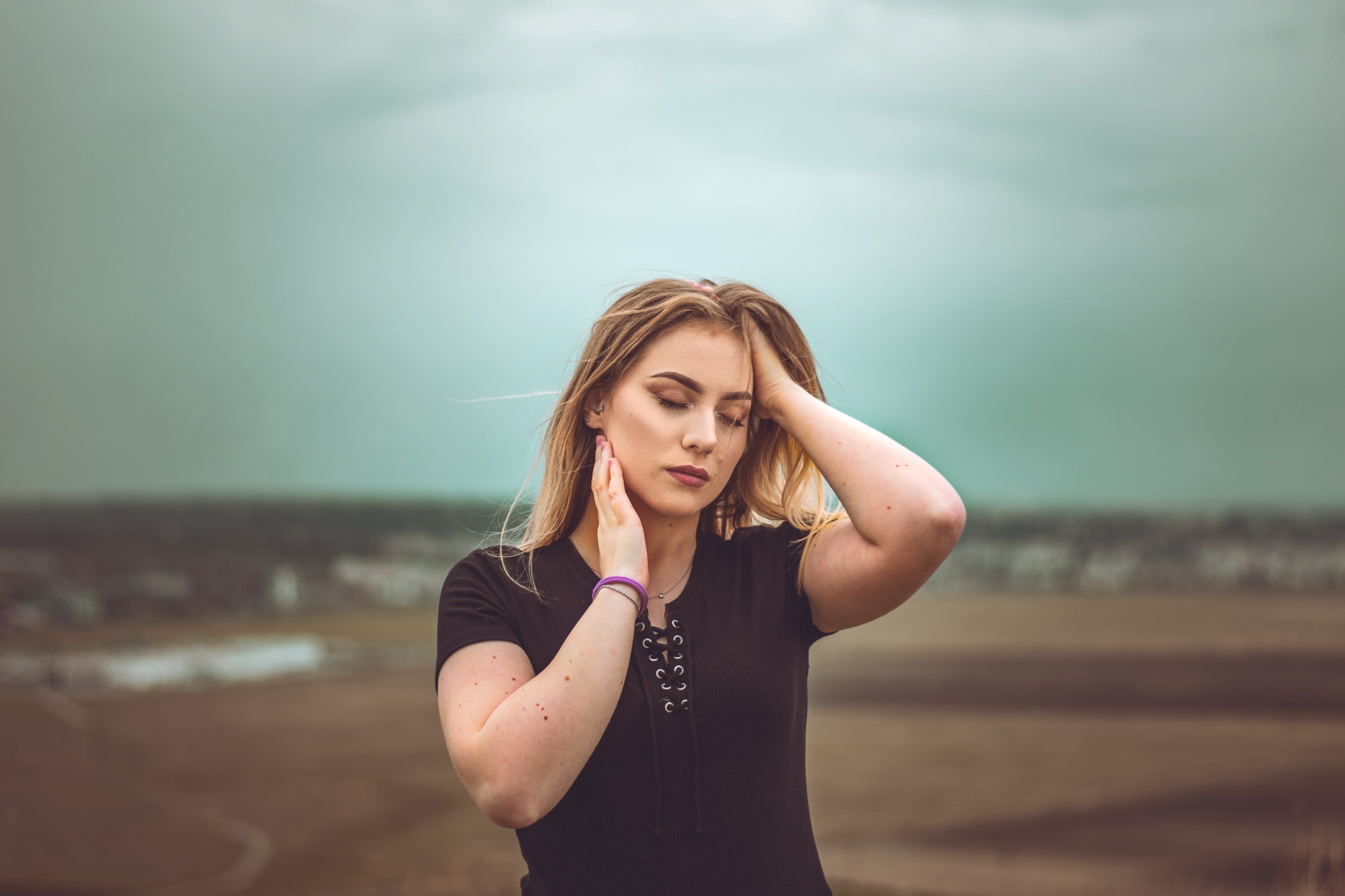

Download Sample Images
Download Assets
This tutorial includes 1 sample image, 1 GRD gradient file and 1 PDF guide. Downloads are free with a PHLEARN account.
- Free sample files with every tutorial on PHLEARN
- New tutorials published every week
- Unlimited downloads with your free PHLEARN account
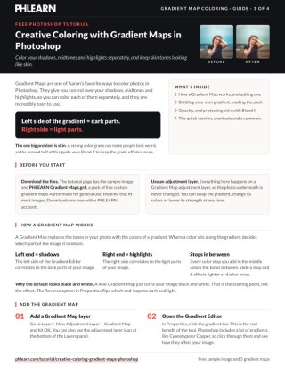
Free PDF Guide · 4 Pages
This Tutorial as a Step-by-Step PDF
The guide covers Layer > New Adjustment Layer > Gradient Map, why the left of the Gradient Editor maps the darks and the right the lights, adding and sliding color stops, importing the pack of five PHLEARN gradient maps, setting opacity with V and a number, and protecting skin with Blend If set to Red and a split slider. Keep it next to your keyboard.
description
Add beautiful coloring to your photos with Gradient Maps in Photoshop! Learn how to use a Gradient Map to apply different colors to the highlights, midtones, and shadows of an image, and then use Blend If to protect skin tones and dial-in the perfect look. We even include several custom Gradients that you can download and try on your own photos.
Enjoying This Free Tutorial?
We publish a new free tutorial every week, each one with sample images and PSDs you can download and follow along with. Sign up and they land straight in your inbox, along with early word on sales, events and subscriber-only offers.
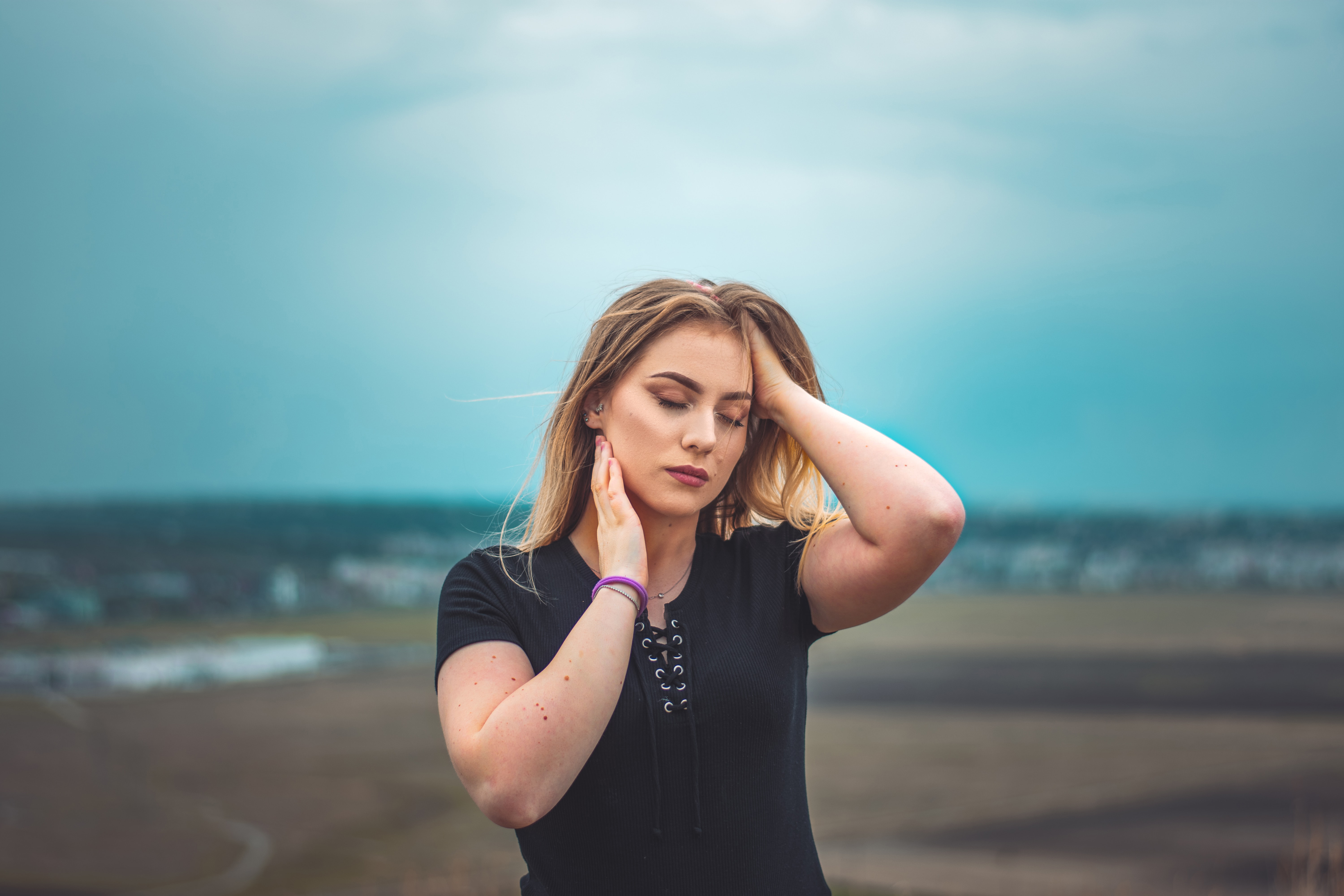
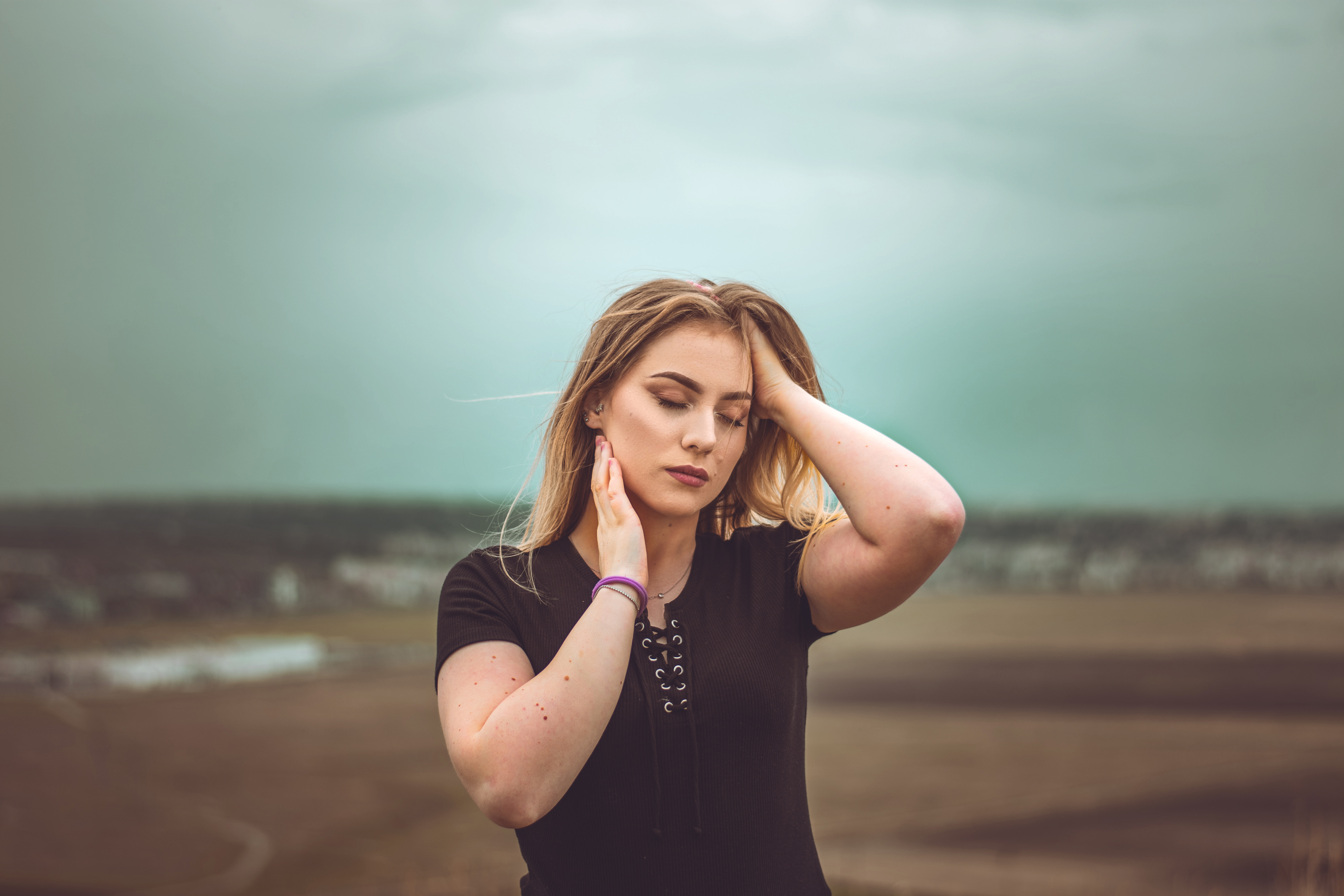
Color Your Shadows, Midtones and Highlights Separately
Most color grading tools push the whole image in one direction. A gradient map doesn’t — it lets you assign a different color to the dark parts, the middle parts and the bright parts of a photograph independently. That’s why it produces the split-toned, cinematic looks that a simple color balance never quite reaches.
It’s also fast. Once you understand the one idea behind it, a full color grade is about four clicks. The catch is skin: push a gradient map hard on a portrait and your subject goes blue. We’ll fix that too, with a technique that protects skin tones automatically.
What a Gradient Map Actually Does
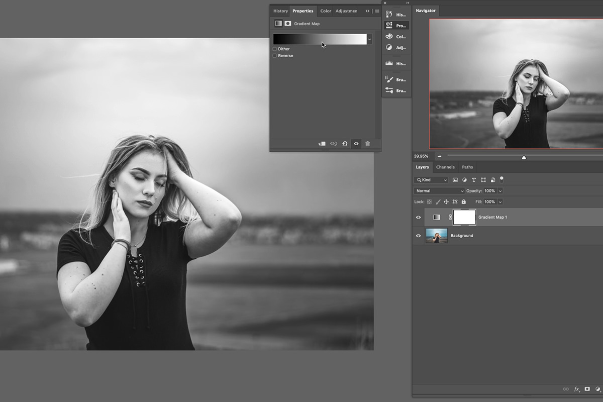
A gradient map reads the brightness of every pixel and replaces it with the color sitting at that position along a gradient you define.
That’s the whole concept. The darkest pixels take the color at the far left of your gradient, the brightest take the color at the far right, and everything in between is mapped proportionally. Set the gradient from black to white and nothing changes. Set it from deep blue to warm cream and you’ve built a color grade.
Because it works off luminance, it respects the existing light in the photograph — which is why the results look graded rather than painted on.
Adding Your First Gradient Map
Go to Layer › New Adjustment Layer › Gradient Map, or use the adjustment layer icon at the bottom of the Layers panel.
Your image immediately turns black and white. That’s correct — Photoshop’s default gradient runs black to white, so every pixel is mapped to its own brightness. Nothing to worry about; you’re about to replace it.
Photoshop ships with presets worth clicking through — Cyanotype and the metallic ones are genuinely useful starting points. But the real value is in building your own. If adjustment layers are new to you, How to Master Adjustment Layers in Photoshop covers why these are always the right way to work.
Inside the Gradient Editor
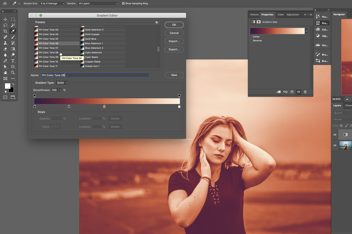
Click the gradient strip in the Properties panel to open the editor. This is where the grade is built.
Left is shadows, right is highlights
Fix this in your head and everything else follows. The left end of the strip maps your darkest pixels; the right end maps your brightest.
Choose “Foreground to Background” and the image may look like a negative — that just means the dark end is mapped to a light color. Drag the black stop to the far left and the white stop to the far right and it snaps back to looking natural.
Adding and moving color stops
Click anywhere along the bottom of the strip to add a stop. Double-click a stop to change its color. Drag it left or right to control which tonal range it affects.
Position is as important as color. Drag a stop right and it starts influencing the brighter parts of the image; drag it left and it moves down into the shadows. Since most photographs have far more midtones than extremes, small movements near the center make the biggest visible difference.
Choosing colors that actually work
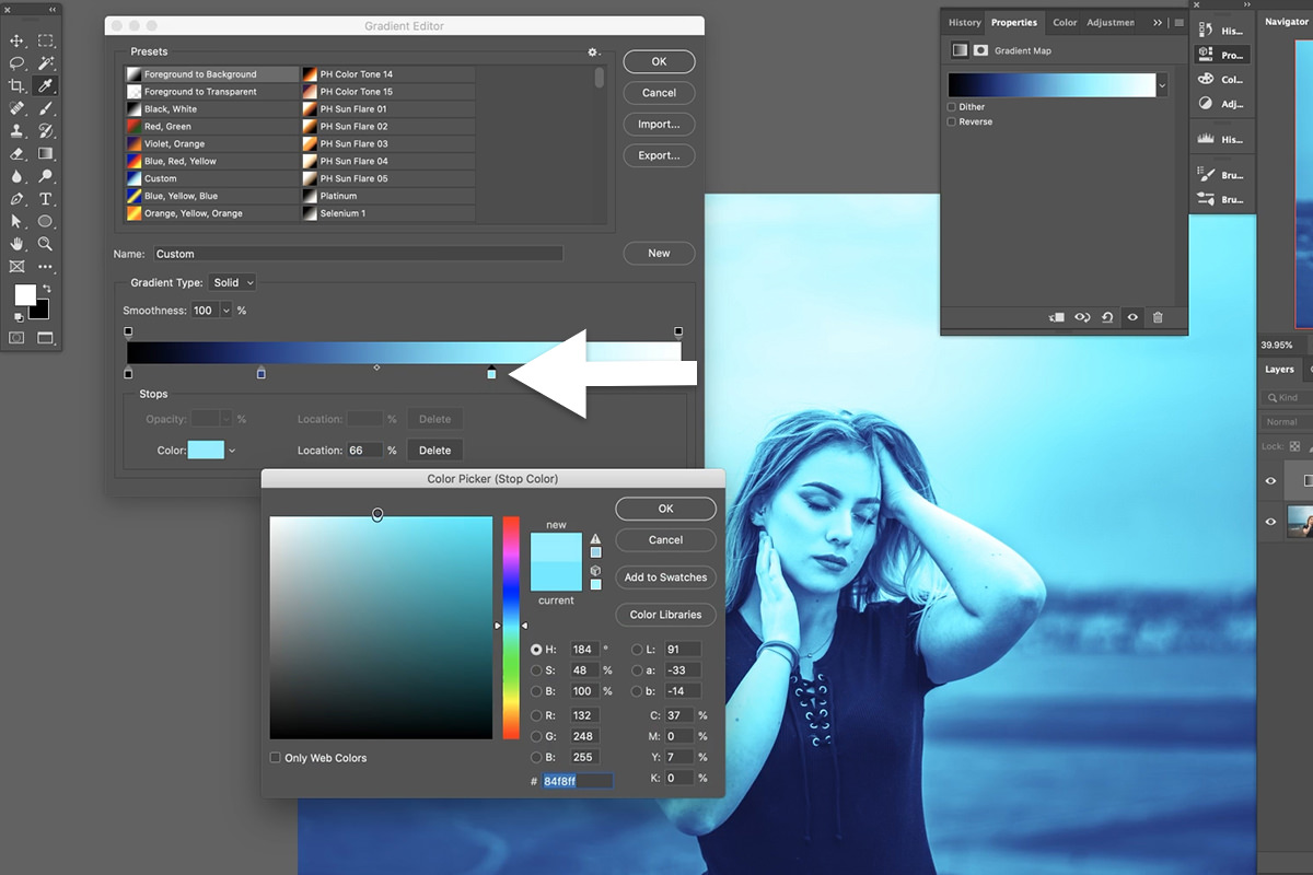
The first attempt almost always looks terrible, and that’s fine — every stop stays editable, so nothing needs restarting.
In the color picker, right is more saturated and left is less; up is brighter and down is darker. The single most common fix is moving left. Saturated colors that look decisive in the picker read as garish once mapped across an entire photograph. Desaturated, slightly darker colors produce grades that look intentional.
When you have something you like, click New in the editor to save it as a named preset.
Loading a Gradient Map Pack
Gradient presets are shareable .grd files, and this tutorial comes with five of ours — use the download link on this page.
Add a Gradient Map, click the gradient bar to open the Gradient Editor, then click the Import button and choose the .grd file. The new gradients append to the bottom of the list, ready to click through. Loading a pack and cycling it against your own image is the fastest way to develop a sense of which color relationships work.
Dialing It Back with Opacity
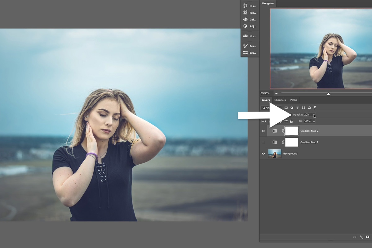
A gradient map at full strength is almost always too much. That’s not a fault — it’s a starting point you’re expected to reduce.
How far down is a judgment call; on the first image in the video, 20% looks natural and lets the grade sit in with the skin tones. And there’s a much better way to get there than dragging the opacity slider: press V for the Move tool, then a number key. 1 is 10%, 5 is 50%, 0 is 100% — and typing two digits quickly, like 33, gives 33%.
It sounds trivial. It isn’t: you keep your eyes on the photograph instead of on a slider in the corner, which is exactly when you can actually judge the effect. This works on any layer, not just gradient maps.
Blend If: The Skin Tone Problem
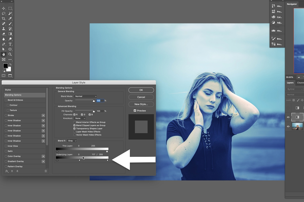
Lowering opacity weakens the grade everywhere. Sometimes you want it strong across the frame and absent on your subject’s face. That’s a job for Blend If.
Double-click the gradient map layer to open Layer Style; Blend If sits at the bottom. Its two sliders decide where this layer is allowed to be visible — a mask you never have to paint. There’s a dedicated free tutorial on Blend If if you want the full picture.
What the two sliders do
This Layer hides parts of the gradient map based on its own values. Underlying Layer — the more useful one — hides it based on the photograph beneath. Drag the black handle right and the layer disappears from the dark areas of your photo; drag the white handle left and it disappears from the bright areas.
Split the handle or it will look terrible
Dragged as-is, the cut-off is abrupt and the edges look torn. Hold Alt or Option and drag one half of the handle away from the other and the transition becomes a gradual ramp instead of a hard line. This step is not optional — it’s the difference between a professional result and an obvious one.
Protecting Skin with the Red Channel
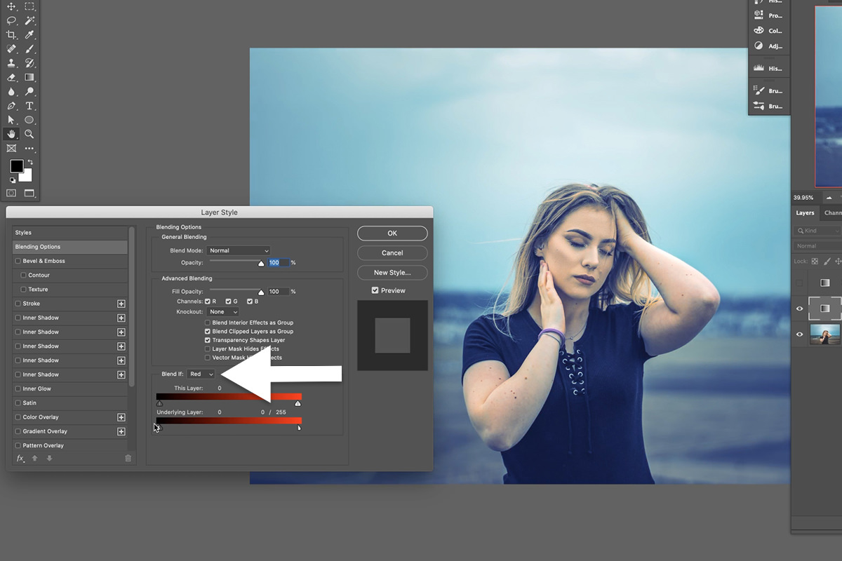
Blending on the default Gray channel works on brightness, which doesn’t help — skin isn’t reliably brighter or darker than its surroundings. Skin is distinguished by its color.
So change the Blend If dropdown from Gray to Red. Skin is essentially orange, and RGB gives you only Red, Green or Blue — Red is by far the closest.
-
Double-click the gradient map layer
Opens Layer Style.
-
Set Blend If to Red
Both sliders now read the red channel of the underlying photograph.
-
Drag the Underlying Layer white handle to the left
The grade begins vanishing from the reddest parts of the image — which is the skin.
-
Alt or Option-drag to split the handle
Softens the falloff so the protection is invisible.
-
Push until skin looks right
You want a trace of the grade left on skin. Removing it completely makes the subject look pasted onto the scene.
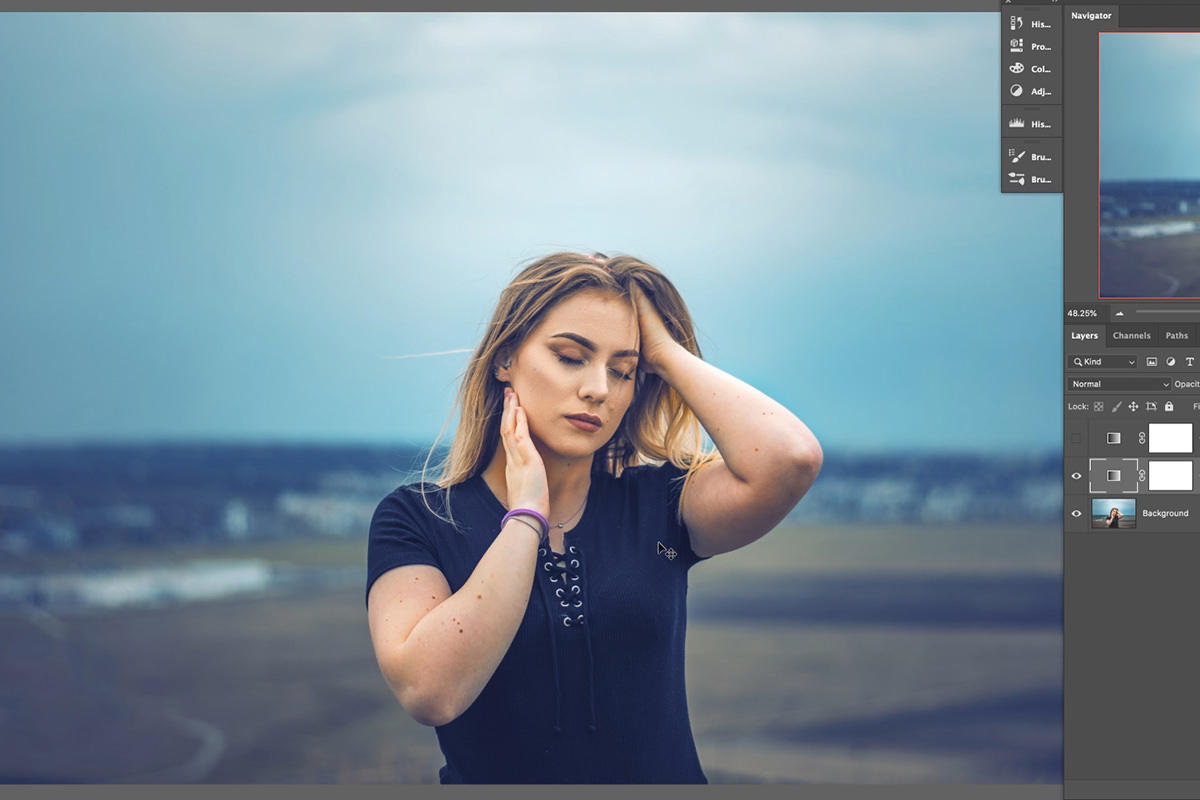
One caveat worth expecting: anything else red in the frame is protected too — a sunset sky, a red jacket. Usually that’s harmless, occasionally you’ll need to back off.
The Whole Thing, Start to Finish
Once it’s familiar, a complete grade takes under a minute:
-
Add a Gradient Map adjustment layer
Layer › New Adjustment Layer › Gradient Map, or the adjustment layer icon at the bottom of the Layers panel.
-
Click a preset gradient
Yours or one from a loaded pack. Don’t fuss over it — you can swap it at any point.
-
Double-click the layer, set Blend If to Red
Alt or Option-drag the Underlying Layer white handle to protect skin.
-
Press V, then a number, to set opacity
Press 1 through 0 until it looks natural.
And you can stack them. Keep several Gradient Map layers on at different opacities and play with the color combinations. When you’re done, group them all together and save.
Where Gradient Maps Go Wrong
Leaving the layer at 100%
The single biggest giveaway. Most of the time these coloring effects look a lot better dialed down.
Picking colors that are too saturated
What looks rich in the color picker looks lurid mapped across a whole photo. Move left in the picker, further than feels right.
Not splitting the Blend If handles
An unsplit handle produces hard, obvious edges. Alt or Option-drag, every time.
Blending on Gray instead of Red for skin
Gray targets brightness, and skin isn’t defined by brightness. Red is the channel that finds it.
Building the gradient before looking at the photo
Where you place the stops depends on where that image’s tones actually sit. Watch the picture, not the strip.
Build a Set You Reuse
What makes gradient maps worth learning properly is that the work compounds. Every grade you like can be saved as a preset, and after a few months you have a personal set of looks that apply in one click and are recognizably yours.
Start by loading the pack from this tutorial, running each one against a portrait with Blend If set to Red, and noting which two you keep coming back to. Those are the beginning of your own set.
Quick Reference: Keys, Menus and Settings
- Add a gradient mapLayer > New Adjustment Layer > Gradient Map, or the adjustment layer icon in the Layers panel
- Read the gradientProperties: click the gradient bar; left end = shadows, right end = highlights
- Add a colorClick under the bar for a stop, Color to pick it, drag to place it; New saves the preset
- Load the packGradient Editor > Import > the .grd file from the download
- Set opacityV, then 1 to 0: 2 is 20%, 3 3 is 33%
- Protect skinDouble-click the layer > Blend If: Red; Alt/Option-drag the Underlying Layer white slider left
No AI, no generative credits.
Free Downloads
Follow Along on the Same Photo
Get the sample image, the GRD file with five PHLEARN gradient maps and the 4-page PDF guide to coloring with gradient maps and Blend If. Free with a PHLEARN account.
Gradient Maps in Photoshop: Common Questions
What does a gradient map do in Photoshop?
It replaces the tones in your photo with the colors of a gradient. The left end of the gradient colors the dark parts of the image and the right end colors the light parts, so you can color shadows, midtones and highlights separately.
How do I add a gradient map?
Go to Layer > New Adjustment Layer > Gradient Map and click OK, or use the adjustment layer icon at the bottom of the Layers panel. A new gradient map turns the image black and white; that is the starting point.
Why does my photo look like a negative?
The dark parts are being mapped to white and the light parts to black. In the Gradient Editor, drag the black stop all the way to the left and the white stop to the right, and the image looks natural again.
How do I add a color to the gradient?
Click under the gradient bar to add a stop, then click Color and pick one. Slide the stop right to color more of the light parts or left to move it into the darks. Name the gradient and click New to save it.
My gradient map looks garish. How do I fix it?
Click the stop, click Color and change it; nothing needs restarting. In the Color Picker, right is more saturated and left is less, so a color that looks too strong usually needs to move left.
How do I load a .grd gradient pack?
Add a Gradient Map, click the gradient bar to open the Gradient Editor, click Import and choose the .grd file. The new gradients are added at the bottom of the presets list.
What is the quickest way to lower a gradient map’s opacity?
Press V for the Move Tool, then a number: 1 is 10%, 5 is 50%, and typing 3 3 quickly gives 33%. You keep your eyes on the photo instead of the slider; Aaron uses 20% on the first image.
How do I keep a gradient map off skin tones?
Double-click the Gradient Map layer, set Blend If to Red, then hold Alt/Option and drag the Underlying Layer white slider to the left. The split slider fades the grade out of the reds, which is where the skin is.
Why use the Red channel in Blend If instead of Gray?
Gray only works on light and dark levels. Skin is technically orange, and RGB has no orange channel, so Red is the closest. Other reds, like a red sky, get protected too.
Are the sample files free?
Yes, with a free PHLEARN account. You get 1 sample image, 1 GRD gradient file and 1 PDF guide: the photo from the video, a pack of five PHLEARN gradient maps and the 4-page guide.
Master Photoshop, Lightroom and Photography
Join PHLEARN PRO for $12.99 a month or $99.99 a year. Cancel anytime, with a 100% money-back guarantee.





