How to Choose Between Color and Black & White (and Why It Even Matters)
To saturate or desaturate? That is the question for a lot of digital photographers right now and it’s really no wonder why. It’s a choice that seems almost arbitrary when changing your mind is as easy as finding the right slider.
Many portrait photographers put the choice in their clients’ hands, providing them with both versions of each image. And why not, when the primary objective is to create something that your client will enjoy and come back to for years to come? But when it comes to building a brand for yourself, submitting to competitions, or making a statement with your art, the choice between color and non-color could be the difference between accomplishing your goals and falling short of them.
On the surface, it seems like the most basic artistic decision you will make: Will I use color or not? But its impact can be deep when used correctly, and to make an informed choice you will need at least a superficial understanding of art and photographic history, color theory, and the way people think. Don’t let this intimidate you! No one expects you to deliberate for hours over each photo.
In this guide we will break down aspects of saturated (and desaturated) photography into manageable information that you can weigh easily in your head the next time you’re working in your favorite image editor. You may never look at color the same way again!
“…there’s a time for [desaturation] and a time for color, all depending on the story one tries to tell. In the digital darkroom, I try to be intentional about asking myself whether the colour adds to something to my story or detracts from it. If it’s simply a distraction or a crutch for a mediocre composition or subject, then I have no problem stripping it away. On the other hand, if it does contribute something, I’ll retain it.”
– Paul Zizka
Before We Get Started, Let’s Talk Vocabulary
Black and white photography is almost never only made of black and white. You will see many shades of grey in a black and white image, which is why these images are more aptly labeled (and less wordy to describe) as “achromatic.” Achromatic just means “without color.” This is different from monochromatic images, which we’ll discuss later on, although the words are sometimes used interchangeably.
Art History and Color Photography
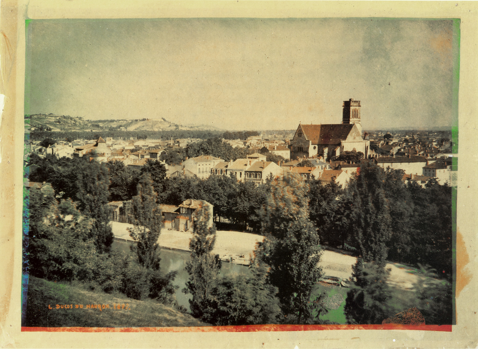
Early color photography wasn’t nearly as true to life as what we see today, and for a long time it was a giant pain to produce. This is really saying something since, compared to today’s standards, producing any type of photography was a giant pain for a long time. Even as color photography became more mainstream, it took a lot of artistic photographers a while to overcome their skepticism. This is not particularly surprising. When you’ve spent a lifetime training your eye to see a certain way, it’s easy to feel threatened by the idea of your entire industry turning on its head.
But there were those who were excited by the possibilities. Ansel Adams, the world-renowned black and white photographer, called color photography a “beguiling medium” and worked in it for his advertising work as well as in consulting for Kodak and Polaroid. Though he and others expressed some disdain for newer photographers working artistically in color, it’s clear he was intrigued by its potential.
Let’s Go Back a Little Further
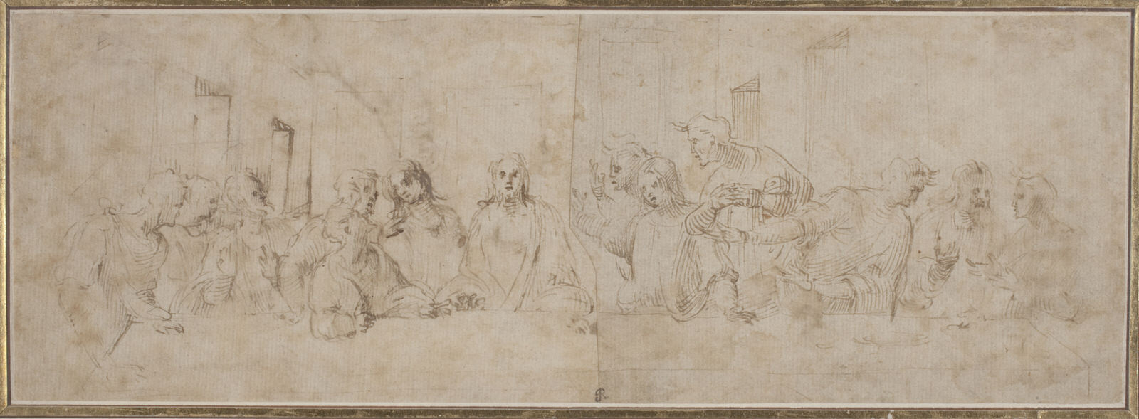
All the push and pull between the two processes is surprising in a way. If we forget photography altogether for a moment and go back even further, we see that there’s a precedent for using black and white media as a learning tool. The “old masters” of painting and sculpture, as we call them now, began their education with drawing, usually with charcoal or a similar medium. These drawings were either black and white or monochromatic. Graduating to painting and wider color work was an achievement; they had gained the ability to process value, contrast, and composition and could now apply what they learned to color.
Even in current day college-level art studios, color is oftentimes introduced later in artistic curriculum than certain aspects of design, such as line, symmetry, and form. Learners of traditional darkroom processes will almost certainly use a black and white process before moving on to the complexities of color printing.
In digital photography, color is fair game from the beginning simply because it’s as accessible in this medium as black and white. It all comes in the same box when you buy your camera… there are no additional materials required. Savvy educators, however, will teach achromatic and full color composition hand in hand. The truth is that the two techniques are like peas and carrots; when you’re struggling to find the right level of contrast in a color image, the easiest way to find the balance you’re looking for is to temporarily desaturate the image and manipulate it without the distraction of color.
Conversely, certain values in black and white imagery can be brought forward or regressed through the use of color filters or luminance settings in post-processing. David Muench even describes his color work as black and white images with a layer of color on top. This is true for all color images, really, if you think of black and white as pure value.
Color Theory and Photography
Quite in opposition to the concept of these techniques complementing one another, color and black and white both tend to be taken for granted when the difference between them is only a keyboard shortcut away. It becomes a question of who wore it best, and if you ask why one was chosen over the other the answer much of the time will be “I liked it better this way.”
While it’s okay to “like” one look over the other, it’s important to be able to articulate why it’s speaking to you. When we ask the question “Which is better?” we’re not so much referring to the colors (or lack of them) as how they will impact the concept and/or composition we’re trying to achieve. Unfortunately, composition often takes a back seat to concept.
When we’re trying to speak through our art, it seems obvious that the best way to do that is to show what we’re thinking of in a very literal way. But it’s important to remember that you are already seeing what you want to see in your images. Your eyes are drawn to the things you find important, especially when you made the image yourself and you already know where to look.
Your viewers don’t have that leg up, and that’s where composition becomes so vital to their experience of your work. Because while the choice between saturation and desaturation can enhance a strong concept, it usually needs an equally strong composition to draw your viewer’s attention to it.
“One very important difference between color and monochromatic photography is this: in black and white you suggest; in color you state. Much can be implied by suggestion, but statement demands certainty… absolute certainty.”
– Paul Outerbridge
What we’re establishing here is that the decision of whether or not to use color without an understanding of your goal composition leads to a simplistic use of it – and not in a good way. For example, black and white are the crowd favorites for sophistication, introspection, and an overall classic feel, but they don’t automatically equal “good” art, as far as that can be defined. In fact, it could be argued that some modern photographers tend to rely on black and white as a prop; a facade that masks uncertainty in their vision and ultimately, inferior work. Likewise, bright color is sometimes used to mask a muddy composition. It goes both ways.
Color in all its complexity is intimidating to some, so rather than fumble around with color calibration or nudge stubborn color casts out of their work, they remove color from the equation completely.
But color need not be intimidating. Even for photographers who choose not to utilize it, a basic understanding of how colors relate to one another will help them process what they see during shooting. It’s also indispensable knowledge in post-processing. If we know how to manipulate color, we know how to recreate what we’re seeing in our minds. That’s the very definition of artistic vision!
What Do I Need to Know to Use Color (Or Not) Effectively?
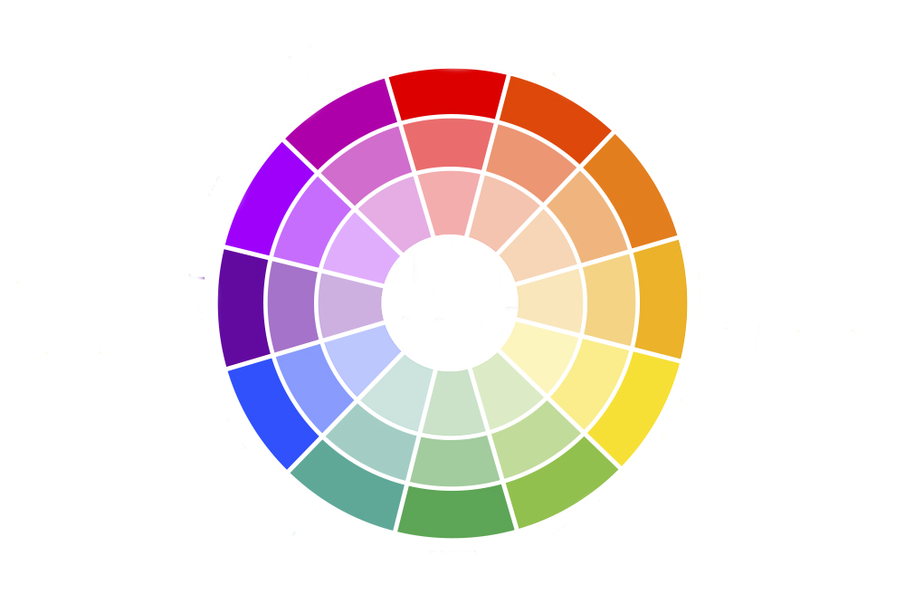
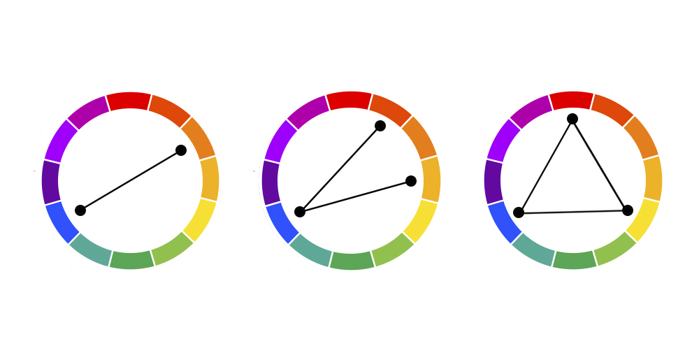
The friendliest way to approach color is with a tool most people will already recognize: the color wheel. This handy prop has all the familiar hues we know and love, organized to show the relationships between them. For example, you can find the opposite of a color by looking directly across from it on the color wheel. These are called complementary colors (the first example in the graphic above) and they make one another stand out or compete with each other, depending on how you use them.
You can also find a truckload of other color schemes based on where hues sit in relation to one another. On certain versions of the color wheel, you can see shades (which you get by adding black to a hue), tints (which you get by adding white), or tones (which you get by adding grey). This may all seem like TMI when we’re talking about pressing a shutter button, but the ability to analyze a color situation on the go will revolutionize the way your see the world.
But wait, that’s not all! Color use is about more than the way hues relate to each other; it’s also about how they relate to people. Colors are filled with emotion and memory, both yours and that of your audience. This can be a powerful tool if your personal experiences are what you want to bring to your work. However, it’s important to be hypervigilant that you are using color with intention. While there’s no way you can possibly account for everyone’s history and preferences, it’s good to be aware of them.
“The way I have always looked at it is the world is in color. And there’s nothing we can do about that.”
– William Eggleston
From the technical side of things, color photography sometimes requires you to relinquish a certain amount of control. Although you can take steps to keep your colors as consistent across devices as possible, online work is going to be viewed through the lens of a myriad of brands and calibrations.
Let’s not even get started on social media image compression here. Even when printing, you may not always have control over how your images are reproduced, lit, and displayed. This is on top of the many personal biases you and your audience bring to the table. Consistency is undoubtedly key, but there’s a case for seeing this as a blessing rather than a curse. When you embrace the fact that you can’t create one specific image that will look exactly identical everywhere it appears, a lot of opportunity for creativity opens up.
This isn’t at all to say that black and white is the easy way out. Adding interest to a scene without the fireworks of saturation can be quite the artistic challenge, and it can lay bare compositional weaknesses that might have gone unnoticed otherwise. Despite the almost unlimited access to color that exists in photography today, there are still photographers who prefer their work without it.
In what may seem contradictory to our earlier discussion of Ansel Adams, one of his former assistants, Alan Ross, makes the valid point that there’s a certain pressure to maintain realism when using color. While it’s possible (and not unheard of) to use color in unorthodox ways for a surrealistic effect or just for the fun of it, your audience will have to work a little harder to wrap their heads around it.
That’s not a problem if your color is your concept, but if you have other complex voices already in your work, it can get chaotic fast. Considering the average museum goer is estimated to spend between 15 and 30 seconds on a work of art before moving on (and considering your Instagram followers may be swiping considerably faster even than that), simplicity has its advantages.
“Black and white are the colors of photography. To me, they symbolize the alternatives of hope and despair to which mankind is forever subjected.”
– Robert Frank in Photographers on Photography: A Critical Anthology
The most indispensable tool in a black and white toolkit is contrast. Make it pop, keep it flat, or mix and match throughout your image – just don’t ever neglect it. Because we tend to perceive value differently when color is involved, removing color from an image gives us license to tinker with contrast in a way that might not work when we’re also contending with saturation and color harmonies.
Going back for a second to color and emotion, let’s remember that black and white photography tends to be more dispassionate if objectivity is something you want in your image. You can worry less that your feelings about the wallpaper in your first home are affecting your use of the color blue for example, and the same goes for others who see your work. Just don’t underestimate the power of nostalgia. Even for those of us born long after color photography became normalized, something about a desaturated image evokes an unaccountable feeling of it.
What About Selective Color and Alternative Color Methods?
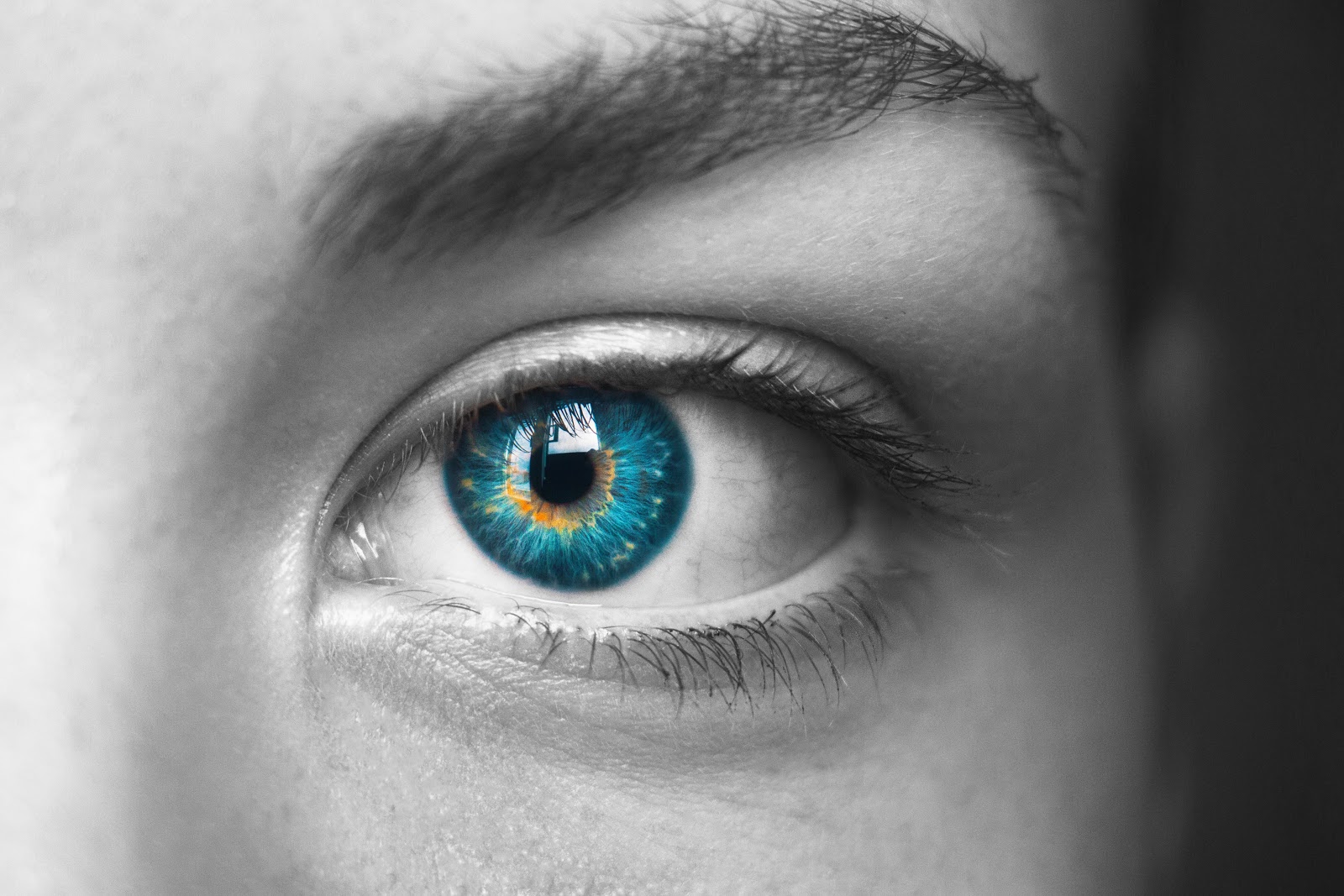
Up to this point, we’ve talked mostly of an either/or end product, but what about cases where the final image is a combination of color and black and white? Selective color, the use of color only in specific areas of a black and white image, is both shamefully overused and surprisingly effective when used thoughtfully. It can be a perfect marriage of the two techniques or it can be their bastard.
You’re at risk of beating your audience over the head with your point if you take it the obvious route, but there’s a lot available in terms of choosing the level of saturation, color relationships within your selections, and the way those pops of color are composed within the image.
There’s also the matter of monochrome imagery, where the tints, shades, and tones of a single hue are used exclusively throughout a photo. Basically, a black and white image of that specific color. It’s hard to say if monochrome should be considered a subset of full color or of black and white photography, but it unquestionably combines their challenges. Like black and white photography, a monochrome work is left to draw the viewer’s eye using primarily composition and value while still navigating the questions color photography always raises: Which colors work with this concept? How do I use saturation as part of this composition?
Color Psychology and Photography
While color theory is a big deal in this discussion, we can’t really talk about whether it’s better or worse than non-color without touching on the psychology of it. Commercial photographers already know that color choice can impact how a viewer feels about the product as heavily as the marketing language. That’s why brands can be so fierce about using “their” colors, down to a specific pantone, for continuity across their promotional materials.
Take the food industry, for example: fast food restaurants in particular lean heavily toward the warm end of the spectrum, relying on saturated reds, oranges, and yellows because they can simulate feelings of hunger, urgency, or need. Though blue is stereotypically associated with calm or even sadness, it’s also often used to project non-threatening masculinity in marketing, while greens generally evoke feelings of balance and oneness with nature.
Whether these are due to social implications or a natural response is a different conversation (though we can probably all agree that it’s a little bit of both). It’s proof though, that color can add layers to your work when you use it wisely.
It’s a tool to be used with caution, since color carries certain cultural and social associations that can speak louder than your meaning. It’s not just on a global or regional scale, either. As we discussed earlier, everyone has their own individual experiences that they are drawing on when they observe your work, and you can’t account for every single viewer’s history in every photograph you make. Embrace these associations if you like or try to set them aside in favor of impartiality, but always be thoughtful when you are considering them.
“For me, color isn’t just about color, light isn’t just about light, space isn’t just about space, form isn’t just about form. I’m intrigued with the emotional and sensory tenor of these elements.”
– Alex Webb
So Which Is “Best?”
If you take away anything from this article, let it be that there is no winner between color and desaturation. It’s about which one works best for each image or body of work. The decision process is different for every photographer, since the criteria and preferences of each individual artist are unique, and not all photographers will agree with each other’s final decision every time. That’s just part of the fun!
When we’re talking about commissioned work, the question becomes almost inconsequential. The answer is whichever will make your client happy, and that’s perfectly okay. If your client gives you free reign, all the better, but when we’re thinking about portrait photography or decorative art, it’s essential (though difficult) to remember that your personal preferences are secondary to those of the person who hired you. However, a thorough grasp of how colors work and the ways they speak to us will help you fulfill your clients’ vision in ways they may not even hope for.
In short, your target concept and composition should really answer the question for you. When you are deciding which to use, you are determining which will convey your meaning most effectively. This means you need to know what it is you are trying to say with your work. If you don’t know, you can’t make a solid choice between the two techniques (or successfully use them together).
If this seems like a lot of deliberation, remember that simplicity has a beauty of its own. It would be counterproductive to soul-search every single image that comes out of your camera for the right level of saturation, and your concept doesn’t have to hit viewers over the head! Whatever you choose, thoughtful use of color (or lack thereof) in your photography will take it up a notch, and that’s what we’re really going for here.
