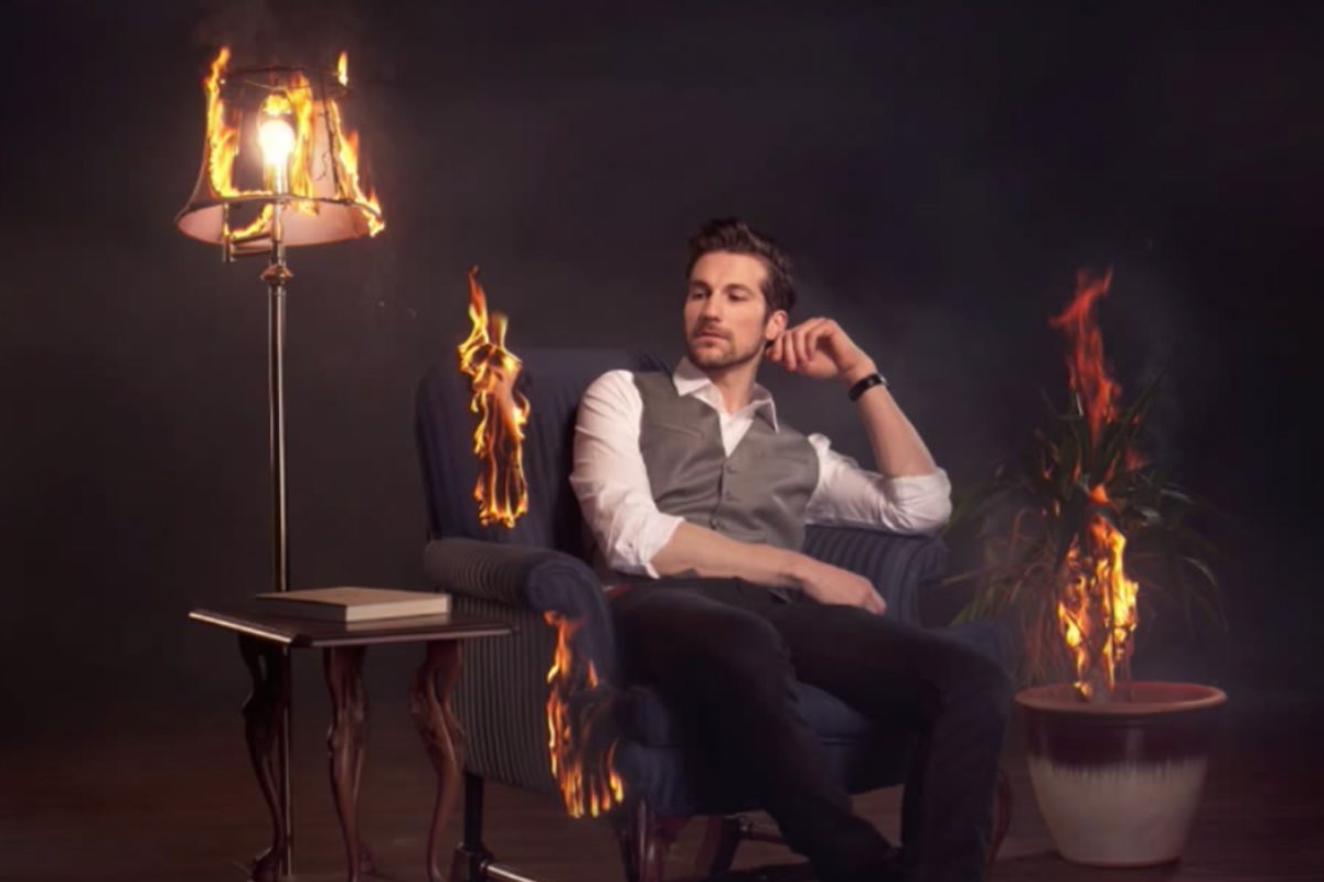

description
Curves can carry almost an entire edit on its own. This free tutorial follows a fire-themed composite from flat to finished using little else: fire elements blended in with Lighten mode and matched for brightness, shadows lifted and distractions darkened with individually masked Curves layers, a practical light bulb relit in post, midtones flattened for a painterly feel, and a final split tone pushing blue into the shadows while the highlights stay warm.
Enjoying This Free Tutorial?
We publish a new free tutorial every week, each one with sample images and PSDs you can download and follow along with. Sign up and they land straight in your inbox, along with early word on sales, events and subscriber-only offers.

Styling an Image With Curves in Photoshop
A composite can have every piece placed correctly and still feel flat and disconnected until color and tone pull it together. This tutorial, led by guest photographer Rob Woodcox, breaks down how a single fire-themed composite gets its finished look almost entirely through Curves — blending in fire elements, lightening and darkening specific areas, relighting a practical light source, and finishing with a painterly, color-toned grade.
Adding Fire Elements With Lighten Blend Mode and Matching Curves
Individual pieces of fire, shot separately for safety, need both a blending mode and a brightness adjustment to sit convincingly in the scene.
-
Bring In Each Fire Element as Its Own Layer
Place each separately photographed piece of fire as its own layer, positioned where it belongs in the composite.
-
Set a Flame Layer to Lighten
For a flame that should blend naturally against a dark background, change its blending mode from Normal to Lighten, so only the parts of the layer brighter than what’s beneath it remain visible.
-
Add a Curves Layer to Match Brightness Across Fire Elements
Add a Curves adjustment layer to brighten one piece of fire, comparing it against the others by eye until every flame reads with similar intensity.
Why the Lighten Blend Mode Works for Fire on a Dark Background
Lighten mode only shows the parts of a layer that are brighter than the layer underneath, which is exactly the behavior of flame naturally standing out against a dark, smoky background. This removes the need to hand-mask around every irregular flame edge, since the blend mode itself only lets the genuinely bright parts of the fire show through.
Lightening Shadows With a Masked Curves Layer
Recovering detail in a specific dark area, like a subject’s legs, uses a Curves layer targeted with the eyedropper and a painted mask.
-
Add a Curves Layer and Sample the Dark Area
Add a Curves adjustment layer, select the on-image sampling tool, and click the dark area that needs lightening to see exactly where it falls on the curve.
-
Lift That Point on the Curve
Click a point low on the curve near where the sampled value landed and drag it upward to brighten that specific tonal range.
-
Invert the Mask and Paint the Effect Back In
Press Cmd/Ctrl+I to invert the mask to black, hiding the adjustment, then paint with white to selectively reveal the brightening only where it’s needed.
-
Lower Opacity Where the Effect Is Too Strong
If the brightening looks too strong on part of the image, such as nearby flames, lower the layer’s opacity or paint at a reduced flow in that specific area.
Darkening a Distracting Area With a Soft Brush Mask
A patch of smoke or another small area that draws too much attention gets toned down the same way, just in the opposite direction.
-
Add a Darkening Curves Layer
Add a Curves adjustment layer and drag the curve down until the distracting area blends in better with the rest of the scene.
-
Mask It In With a Soft-Edged Brush
Invert the mask, then paint the darkening in with a soft, feathered brush rather than a hard-edged one.
Why a Soft Brush Avoids an Obvious Painted Circle
Painting an adjustment into a mask with a hard-edged brush leaves a visible circular boundary where the effect abruptly starts and stops. Softening the brush’s edge lets the adjustment fade in gradually instead, which is what keeps a painted-in darkening or lightening pass from looking like an obvious digital patch.
Relighting a Light Bulb With Two Curves Layers
A light bulb that had to stay off during a fire shoot, for safety, gets convincingly turned back on entirely in post.
-
Add a Curves Layer to Brighten the Bulb and Its Glow
Add a Curves adjustment layer, brighten the curve, and mask it in around the bulb with a soft brush so a natural-looking glow spreads outward from it.
-
Add a Second, Tighter Curves Layer for the Bulb Itself
Add a second Curves adjustment layer, using a smaller brush to mask a tighter, more concentrated bright area directly on the bulb, layered on top of the wider glow.
Building a Painterly Look by Flattening Midtones
A subtler, more compressed tonal range across the image is what gives many composites their soft, painted quality.
-
Add a Curves Layer and Pull Down the Darks
Add a Curves adjustment layer and drag the darkest point on the curve down slightly for a richer black.
-
Pull Down the Midlights
Click a point roughly halfway between the midtones and highlights and drag it down as well, flattening that tonal range.
Why Flattening Tones With Curves Creates a Painted Look
Real paint has a naturally limited range of distinct tones compared to a photograph, which is part of what gives painted images their softer, less clinical look. Compressing a specific range on the Curves chart, rather than leaving every tone spread out to its full extent, recreates some of that same limited-range quality directly in a photo.
Adding a Vignette With Selective Darkening Curves Layers
Multiple separate darkening layers, rather than one global vignette, pull focus toward the subject while protecting his face from getting too dark.
-
Add a Curves Layer to Darken the Edges and Smoke
Add a Curves adjustment layer, darken it, and mask it into the smoke and edges of the frame that are pulling too much attention.
-
Add Further Curves Layers for Other Distracting Spots
Repeat with additional Curves layers wherever another specific area still stands out too much, since a single layer often can’t cover every spot evenly.
-
Mask Out the Subject’s Face
On the later overall darkening layer’s mask, paint black over the subject’s face so it stays bright even as the rest of the scene darkens around him.
Desaturating Slightly With a Low-Opacity Black and White Layer
A subtle, unconventional use of the Black and White adjustment adds a slightly vintage, less oversaturated quality to skin and color throughout the image.
-
Add a Black and White Adjustment Layer
Add a Black and White adjustment layer above the rest of the edit.
-
Lower Its Opacity Significantly
Reduce the layer’s opacity well below 100%, letting just a portion of the desaturating effect blend through rather than fully converting the image.
Color Toning Shadows and Highlights by Channel
A final Curves layer pushes specific colors into specific tonal ranges, using the direct relationship between each channel and its opposite color.
-
Add a Curves Layer and Select the Blue Channel
Add a Curves adjustment layer, switch from RGB to the Blue channel, and pull the shadows up slightly to introduce a subtle blue into the darks.
-
Keep Highlights and Midtones Warm
Pull the blue channel back down slightly in the midtones and highlights, keeping those areas warmer rather than uniformly cool.
Why Each Color Channel Has a Direct Opposite
In Photoshop’s Curves, red’s opposite is cyan, green’s opposite is magenta, and blue’s opposite is yellow, so pulling any channel down pushes the image toward its opposite color instead. Understanding this relationship, rather than adjusting channels by trial and error, is what makes it possible to deliberately push blue into the shadows while keeping the highlights warm — exactly the kind of split-toning look used to finish this image.
Why This Approach Works
Nearly every effect in this composite, from blending the fire to the final split-toned grade, comes from the same single tool used differently each time: a masked Curves layer targeted at one specific area or tonal range. Sampling a value directly on the curve before adjusting it takes the guesswork out of knowing exactly which point to move, and masking every adjustment individually, rather than applying broad global changes, is what keeps something like the subject’s face protected while everything around him darkens and desaturates. Understanding how each color channel relates to its opposite turns color grading from trial and error into something deliberate and repeatable.
Final Thoughts
Every distinct look in this image — the painterly flattened tones, the warm-highlight-cool-shadow split, the subtle vintage desaturation — comes from stacking simple, individually masked Curves layers rather than one complicated global adjustment. Getting comfortable sampling values directly on the curve and understanding each channel’s opposite color is worth the practice, since it turns Curves into the single most versatile tool for finishing any composite or photograph.
Quick Reference: Keys, Menus and Settings
- Blend a flameBlend mode Lighten; a Curves layer to match brightness
- Find the toneOn-image tool in the Curves panel, click the area, drag that point
- Mask it inCmd/Ctrl + I to hide, paint white with a soft brush
- Painterly tonesCurves: darks down a little, midlights down
- Soft desaturationBlack and White adjustment layer at low opacity
- Blue shadowsCurves > Blue: shadows up, midtones and highlights back to straight
- Channel oppositesRed and cyan, green and magenta, blue and yellow
No AI, no generative credits.
Styling With Curves: Common Questions
Who teaches this tutorial?
Guest photographer Rob Woodcox, during his takeover week at PHLEARN. He walks through the edit of his fire shoot, mostly the color and toning.
How do I blend fire into a dark background?
Set the flame layer’s blend mode to Lighten. Only the parts brighter than the layer beneath show, so the flame sits against the dark smoke without a careful cutout.
How do I make separate fire shots match?
Add a Curves layer to the weaker flame and brighten it by eye until it pops like the others. Rob shot one fire at a time for safety, so each piece needed matching.
How do I find a tone on the Curves graph?
Pick the on-image tool in the Curves panel and click the area in the photo. It shows where that tone sits on the curve; drag a point there to lift or lower it.
How do I apply Curves to only one area?
Press Cmd/Ctrl + I to turn the Curves mask black, which hides the adjustment. Then paint white with a soft brush where you want it.
How do I turn a light bulb on in Photoshop?
Use two Curves layers. One brightens the bulb with a wider glow around the lamp; a second, masked with a smaller brush, makes the center glow.
How does Curves give a painterly look?
Pull the darks down a little and the midlights, halfway between midtones and highlights, down too. Flattening those tones gives the soft look of paint.
Why add a Black and White layer to a color image?
At a low opacity it slightly desaturates the photo. It looks a bit more vintage and calms over-the-top reds in skin.
How do I add blue to the shadows only?
In a Curves layer, choose the Blue channel and pull the shadows up. Bring the midtones and highlights back to the straight line to keep them warm. To remove a point, drag it off the graph.
From the Magazine View all
Stories, interviews and guides for photographers, new every week.
 EditingLightCraft vs Lightroom: I Edited the Same RAW Files in BothThe free clone on the same RAW files: what matches, what breaks and who should switch.
 InspirationRare Historical Photos: 13 of the Rarest Pictures Ever TakenFrom the earliest surviving picture of a person to the last passenger pigeon: who took each one and why it survives.
 EditingArtCraft: Photoshop Cloned by AI in Two Weeks. Is It Legal?ArtCraft cloned Photoshop and Lightroom with AI and gave them away. Any good? Legal? Safe?
Master Photoshop, Lightroom and Photography
Join PHLEARN PRO for $12.99 a month, or $99.99 a year (save 36%). Cancel anytime, with a 100% money-back guarantee.