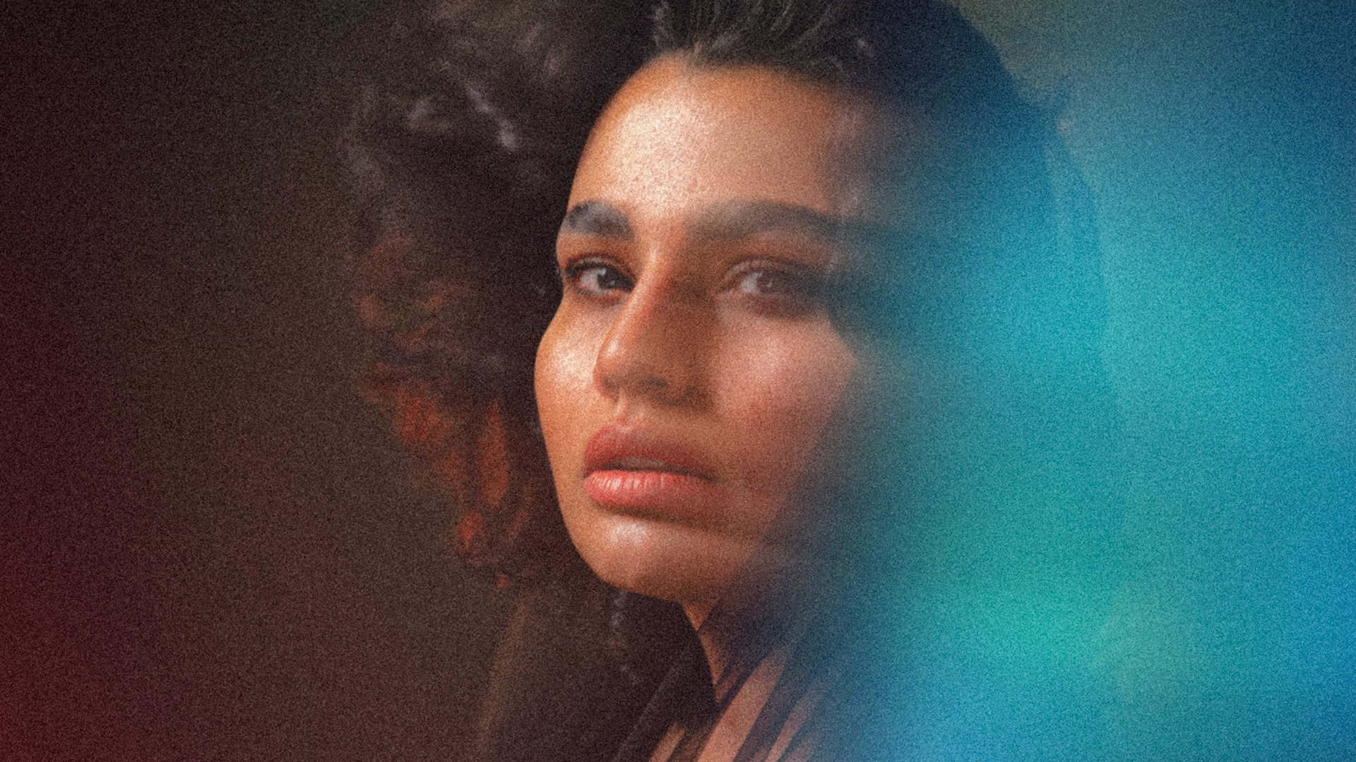

Download Assets
This tutorial includes 8 sample images, 1 sample PSD and 1 PDF guide. Downloads are free with a PHLEARN account.
- Download the sample images and PSDs from every free tutorial on PHLEARN
- New free tutorials published every week
- One free account — sign up once, then download anything
Free PDF Guide · 4 Pages
This Tutorial as a Step-by-Step PDF
Every step from the video in order: Path Blur on a copy set to Lighten, Foreground to Transparent gradients in Color Dodge, the textures in Screen with Levels to kill the gray, Hue/Saturation for color, and the Camera Raw grain, vignette and radial gradient. Keep it next to your keyboard.
description
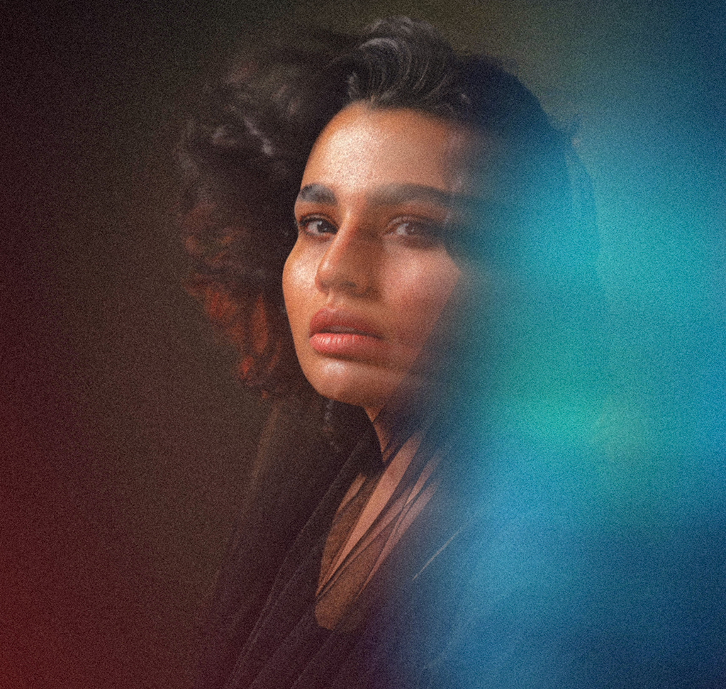
The aura effect wraps a portrait in colored light — the look you see on album covers and festival posters, where the subject appears to be generating the atmosphere rather than standing in it. Preset packs promise it in one click and all produce the same picture.
Built properly it is three independent passes of light stacked on one another: an arched Path Blur set to Lighten for motion, gradient glows on Color Dodge for color, and aura textures on Screen for shape. Because each pass is separate, you can dial any one of them back without losing the other two — which is what makes the effect yours rather than the preset’s.
Enjoying This Free Tutorial?
We publish a new free tutorial every week, each one with sample images and PSDs you can download and follow along with. Sign up and they land straight in your inbox, along with early word on sales, events and subscriber-only offers.
Image Source

The Aura Effect in Photoshop Is Three Layers of Light, Not a Filter
It shows up on album covers and festival posters — a portrait wrapped in colored light, part motion and part glow, the subject looking like they’re generating the atmosphere rather than standing in it. There are preset packs that promise it in one click, and they all produce the same picture.
Built properly, the aura effect in Photoshop is three separate passes of light stacked on top of each other: a motion blur that gives movement, gradient glows that give color, and textures that give shape. Each one is a blend mode and a handful of decisions, and because they’re independent you can dial any of them back without losing the others.
The Three Passes and What Each One Does
Motion Comes From a Path Blur, Not a Filter Preset
An arched Path Blur set to Lighten smears the bright parts of the frame around the subject. It reads as energy because it follows a curve rather than a straight axis.
Color Comes From Gradients on Color Dodge
A foreground-to-transparent gradient on Color Dodge doesn’t sit on top of the image, it intensifies the light already there. That’s why it looks like a glow rather than a colored overlay.
Detail Comes From Textures on Screen
Screen mode drops the black background of an aura texture and keeps only the light. This is what turns a soft wash into something with filaments and structure.
Blur the Background for Movement
-
Duplicate the Main Layer
Cmd/Ctrl + J. Everything that follows happens above the original, so you always have the untouched photo to fall back to.
-
Run Path Blur With an Arched Path
Filter > Blur Gallery > Path Blur. Draw a curve rather than a straight line — that curve is what makes the movement look like it’s circling the subject. Raise Speed and Taper, and uncheck Centered Blur so the motion runs one way instead of smearing symmetrically.
-
Set the Blend Mode to Lighten
Lighten keeps only the pixels brighter than what’s underneath, so the blur adds streaks of light around your subject without softening their face. This one setting is what makes the pass integrate rather than sit on top.

Add the Gradient Glows
-
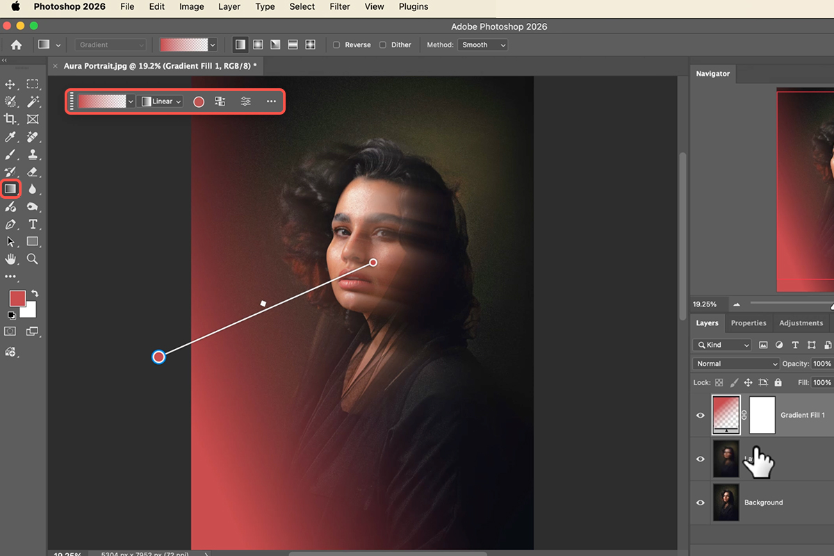
Set the Gradient Tool to Foreground to Transparent
Keyboard shortcut G. Foreground-to-transparent is essential — a solid gradient would flood the frame, while this one fades to nothing and lets you build the glow in passes.
-
Draw a Bold Color Across the Frame
Linear or radial, both work. Pick a saturated color — a strong red or magenta — because Color Dodge is about to intensify whatever you choose, and a timid color disappears entirely.
-
Change the Blend Mode to Color Dodge
The gradient stops being a colored film and becomes light. Color Dodge brightens what’s already bright, which is why the glow naturally gathers around highlights and edges rather than sitting flatly over the whole picture.
-
Reverse It or Drag the Handles to Move the Light
Click the reverse icon to flip which end is bright, or drag the gradient handles to change where the light appears to come from. Add a second gradient in another color if you want the aura to shift across the frame.
Bring In the Aura Textures
-
Drag a Texture In and Transform It
Cmd/Ctrl + T to rotate and scale. Position it so the brightest part of the texture falls where you want the aura to be strongest — usually just off the subject’s shoulder or above the head, not centerd on the face.
-
Set the Blend Mode to Screen
The texture’s black background vanishes and only the light survives. This is the standard move for anything shot on black — light leaks, bokeh overlays, smoke, sparks.
-
Clean the Edges With Levels
Cmd/Ctrl + L, then drag the black input slider right. Screen never quite kills a not-quite-black background; this pushes the dark values to true black so the rectangular edge of the texture disappears.
-
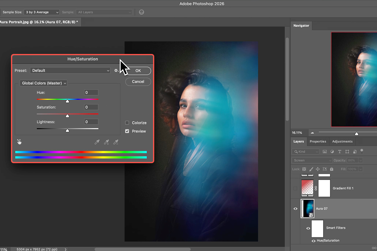
Recolor With Hue/Saturation
Cmd/Ctrl + U. The texture arrived in whatever color it was made in; this makes it agree with your gradients. Matching the texture to one of your two gradient colors usually looks more deliberate than introducing a third.
Tie Everything Together
-
Build a Composite Layer With Apply Image
Image > Apply Image flattens everything visible into one new layer while leaving the originals intact underneath. You need a single layer for the finishing pass, and this gets you one without committing to anything.
-
Convert to a Smart Object and Open Camera Raw Filter
As a Smart Object, the Camera Raw settings stay editable. Double-click to reopen and adjust at any point.
-
Add Grain From the Effects Tab
The most important step in the whole finish. Your blur, gradients and textures were all generated at different levels of smoothness; a common grain across the composite makes them read as one photograph rather than three effects.
-
Finish With a Vignette or a Radial Mask
Darken the frame edges, or use a radial mask to brighten and warm the center. Either way you’re pointing the eye back at the subject, who can otherwise get lost in everything you just added.
The Mistakes That Give It Away
Too Many Colors
Two related colors look intentional. Four look like a lens flare pack. Restraint is what separates this from the version everybody has seen.
Covering the Face
The aura is the setting, not the subject. If the glow is competing with your subject’s eyes, move it or mask it back.
Skipping the Grain
Easy to skip because each element looks fine on its own. The composite is where the mismatch in texture shows, and grain is what resolves it.
Leaving a Visible Texture Edge
A faint rectangle in the corner undoes the whole illusion. Check the frame edges at 100% before you call it done, and use Levels if you find one.
Why Stacking Beats a Preset
Any one of these three passes on its own looks like an effect. All three together look like light, because that’s roughly how light actually behaves — it moves, it colors, and it has structure. Building them separately is what lets you tune the balance to the specific photograph in front of you.
The blend modes are the transferable part. Lighten for adding movement, Color Dodge for glows, Screen for anything shot on black — those three cover an enormous amount of ground well beyond this particular look.
Build One on Your Own Portrait
Duplicate the layer, run an arched Path Blur on Lighten, draw a bold gradient on Color Dodge, drop in a texture on Screen and clean it with Levels, then composite with Apply Image and finish with grain and a vignette. Download the eight free sample images — the portrait and the aura textures — and build the version from the video first, then rebuild it on a portrait of your own where you get to choose the colors. For compositing, color and light in depth, our PRO Photoshop Learning Path is where to go next.
Quick Reference: Keys, Menus and Settings
- Blur the subjectCmd/Ctrl + J, Filter > Blur Gallery > Path Blur: arc the path, raise Speed and Taper, untick Centered Blur; blend mode Lighten, lower Opacity
- Aura with a gradientG, Basics > Foreground to Transparent, pick a color, drag; blend mode Color Dodge; Reverse flips it
- Radial versionShift-drag for a new gradient, click the Radial icon, Reverse for color on the outside
- Aura with a textureDrag one of the 7 textures in, rotate (hold Shift), scale, Enter; blend mode Screen
- Hide the texture’s dark areasCmd/Ctrl + L, drag the black point right
- Change its colorCmd/Ctrl + U, move Hue
- FinishNew layer, Image > Apply Image, Filter > Convert for Smart Filters, Camera Raw Filter: Grain, Vignette, Radial Gradient with Exposure up, warmer, Highlights protected
Mac first, then Windows where they differ.

Free Downloads
Follow Along on the Same Files
Get the portrait, all seven aura textures, the layered PSD and the PDF guide. Free with a PHLEARN account.
Aura Effect: Common Questions
Which photos work best for an aura effect?
A portrait on a dark background. Both ways of adding the aura (Color Dodge gradients and Screen-mode textures) only add light, so they show up far better against dark.
Why blur the subject first?
For a sense of motion. Duplicate the layer, run Path Blur with an arced path, more speed and taper and Centered Blur off, then set the blurred copy to Lighten and lower its opacity so it sits over the sharp original.
How does the gradient version work?
Press G, choose Foreground to Transparent from Basics, pick a color and drag across the photo, then set the gradient layer to Color Dodge. Reverse flips the direction, and switching to Radial with Reverse on puts the color around the edges with a clear center.
How does the texture version work?
Drag one of the seven aura textures in, rotate and scale it, press Enter and set it to Screen. Screen keeps the light parts and drops the dark ones. It’s Aaron’s favorite of the two methods, and you can stack several textures.
I can still see the texture’s dark edges. Why?
Screen never fully hides mid-gray. Press Cmd/Ctrl+L for Levels on the texture and drag the black point to the right; the darks go to black and vanish.
Can I change the aura’s color?
Yes. Cmd/Ctrl+U on the texture layer and move the Hue slider; for a gradient, click its color swatch and pick a new color. Both update live.
What’s the Camera Raw finish?
Apply Image onto a new layer, convert it for Smart Filters, then in the Camera Raw Filter add grain to tie the layers together, a vignette, and a radial gradient mask with a little more exposure and warmth on the face, highlights protected.
Does this use AI or credits?
No. Blend modes, gradients, Levels and a Camera Raw finish.
Are the sample files free?
Yes, with a free PHLEARN account. You get the portrait, all seven aura textures, the layered PSD and the PDF guide.
Master Photoshop, Lightroom and Photography
Join PHLEARN PRO for $12.99 a month or $99.99 a year. Cancel anytime, with a 100% money-back guarantee.





