

Download Assets
This tutorial includes 2 sample images, 1 sample PSD and 1 PDF guide. Downloads are free with a PHLEARN account.
- Download the sample images and PSDs from every free tutorial on PHLEARN
- New free tutorials published every week
- One free account — sign up once, then download anything
Free PDF Guide · 4 Pages
This Tutorial as a Step-by-Step PDF
Every step from the video in order: the wider crop, the black silhouette, the radial gradient, Path Blur with taper and centered blur off, the gradient map and its editor, and the darker stop for the subject. Keep it next to your keyboard.
description
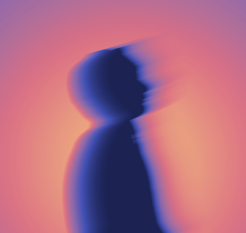
This motion blur effect is everywhere in music videos and album art — a figure dissolving into streaks of teal and orange, half shape and half light. It reads as expensive, and most people assume it comes out of a plugin or a preset pack.
It doesn’t. This is four ordinary tools stacked in the right order: a silhouette, a radial gradient, Path Blur and a Gradient Map. Building it by hand rather than running a filter is the whole point — every stage stays adjustable, so the result is yours rather than the preset’s.
Enjoying This Free Tutorial?
We publish a new free tutorial every week, each one with sample images and PSDs you can download and follow along with. Sign up and they land straight in your inbox, along with early word on sales, events and subscriber-only offers.
Image Source

Build a Glow Motion Blur Effect in Photoshop From a Silhouette Up
The look is everywhere in music videos and album art — a figure dissolving into streaks of teal and orange, half-shape and half-light. It reads as expensive, and most people assume it comes out of a plugin or a preset pack.
It doesn’t. This motion blur effect in Photoshop is four ordinary tools stacked in the right order: a silhouette, a radial gradient, Path Blur, and a Gradient Map. Building it by hand rather than running a filter is the whole point — every stage stays adjustable, so the result is yours rather than the preset’s.
The Logic Behind the Look
You Build It in Greyscale First
Color comes last. Everything before the Gradient Map is black, white and grey, because the Gradient Map reads brightness values and assigns color to them. Get the tonal shape right and the color almost handles itself.
The Silhouette Is Doing the Composition
Flattening your subject to solid black strips out skin tone, clothing detail and everything else competing for attention. What’s left is a shape — which is the only thing this motion blur effect needs from the original photo.
Nothing Here Is Destructive
Smart Objects, adjustment layers and a repositionable gradient mean you can change the direction of the motion or the entire color palette twenty minutes later without rebuilding anything.
Set Up the Canvas and the Silhouette
-
Extend the Canvas With the Crop Tool
Keyboard shortcut C. Hold Alt/Option while dragging a handle to expand from the center. The blur needs somewhere to travel, so give it room now rather than discovering the streaks are clipped later.
-
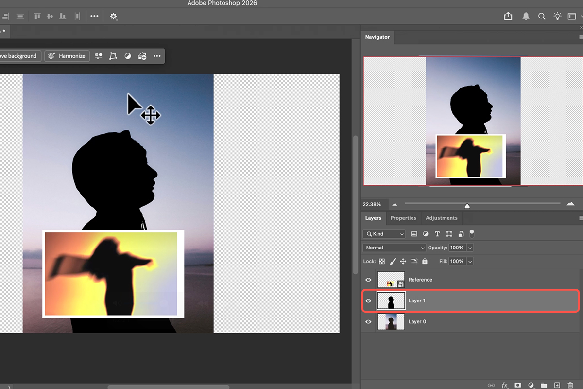
Isolate the Subject and Put Them on Their Own Layer
Click Select Subject, then move the selection to a new layer. The selection doesn’t have to be immaculate — you’re about to fill it with solid black, which forgives a lot of edge error.
-
Fill the Subject With Black and Hide the Original Background
You now have a clean silhouette on an empty canvas. This is the point where the photo stops being a photograph and starts being a design.
Build the Light Behind the Subject
-
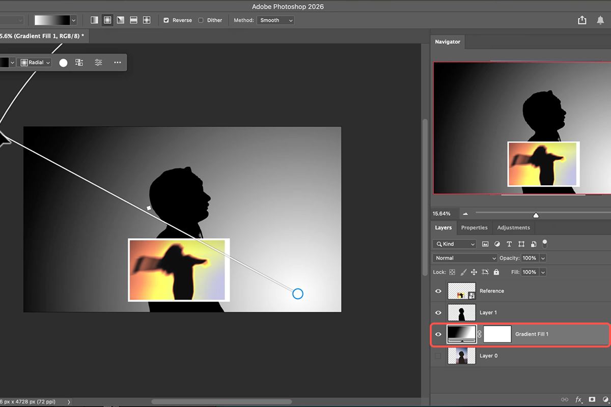
Switch to the Gradient Tool and Pick a Radial Black-to-White Preset
Keyboard shortcut G. Radial, not linear — you want a source of light, not a horizon.
-
Draw the Gradient Behind the Subject
Wherever you place the bright center is where the color will eventually be most intense. Off-center and slightly behind the figure usually beats dead center. Because you drew it by hand, you can move or rescale it at any point to shift where the light lands.
Add the Motion
-
Convert the Subject Layer to a Smart Object
Do this before touching the Blur Gallery. It’s what lets you reopen and re-draw the blur path later instead of undoing back to here.
-
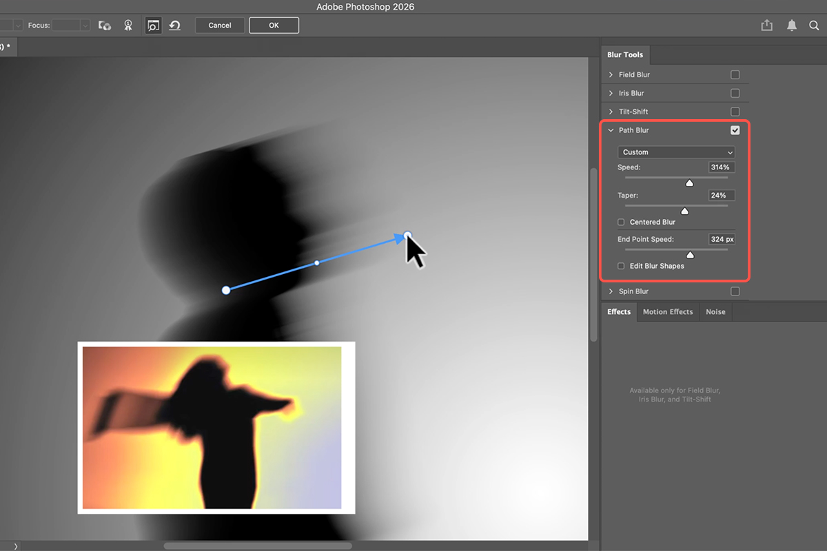
Open the Blur Gallery and Choose Path Blur
Draw a path in the direction you want the movement to run. Path Blur follows the line you draw rather than smearing in one fixed axis, which is why it produces motion that curves with a body instead of through it.
-
Uncheck Centered Blur, Then Set Speed and Taper
Centered Blur off is what makes the movement one-directional — the difference between something in motion and something merely out of focus. Speed sets how far the streaks travel; Taper fades them out at the end so they dissolve into the background rather than stopping at a hard edge.
Map the Color
-
Add a Gradient Map From the Adjustments Panel
The greyscale image becomes color in one step. The Gradient Map assigns one color to your shadows and another to your highlights, and interpolates everything between — which is exactly why the tonal work came first.
-
Reverse It, or Pick Your Own Colors
Click Reverse to flip which end of the gradient lands on the shadows — often the fastest route to a better version. Double-click the gradient itself to choose your own stops: teal to orange, deep purple to gold, whatever the piece wants. This is the step where the image stops looking like a tutorial result and starts looking like yours.
Where This Usually Goes Wrong
Cropping Too Tight at the Start
The most common failure, and the most annoying to fix, because the blur is already built by the time you notice the streaks hitting the frame edge. Extend the canvas generously in step one.
Leaving Centered Blur On
It smears the subject symmetrically, which reads as camera shake rather than movement. One checkbox, most of the difference.
Skipping the Smart Object
Applying Path Blur to a normal layer bakes it in. When you decide the motion should run the other way — and you will — you’ll be starting over.
Accepting the First Gradient Map
The default presets are a starting point, not an answer. Reverse it, then open it and move the stops. Two minutes here is what separates this from every other version of the motion blur effect online.
Why Building It By Hand Matters
There are one-click actions that produce something in this neighbourhood, and they all produce the same image for everybody who runs them. The reason to assemble it from a silhouette, a gradient, a blur path and a color map is that each of those four is a decision, and four decisions is enough to make a picture that only you would have made.
It’s also transferable. Path Blur with Taper is useful far outside this motion blur effect, and once you understand that a Gradient Map colors by brightness, color grading in general stops being guesswork.
Build One Tonight
Extend the canvas, cut out your subject and fill them black, draw a radial gradient behind them, convert to a Smart Object, run Path Blur with Centered Blur off, and finish with a Gradient Map. Download the two free sample images and build the version from the video first — then run the same nine steps on a silhouette of your own, where the shape is one you chose. For color grading, compositing and effects work in depth, our PRO Photoshop Learning Path is where to go next.
Quick Reference: Keys, Menus and Settings
- Wider canvasC, Fill: Transparent, Option/Alt-drag a side handle, Enter
- SilhouetteSelect Subject, new layer, fill with black, deselect; hide the original
- Light behind the subjectG, Basics > Foreground to Transparent (black to white), Radial, drag; move the layer below the subject
- MotionFilter > Convert for Smart Filters, then Filter > Blur Gallery > Path Blur: raise Speed and Taper, untick Centered Blur, drag the points
- ColorWindow > Adjustments > Gradient Map; click the gradient to open the editor and pick a preset; Reverse if the light end is wrong
- Darker subjectIn the gradient editor, add a stop near the left and make it darker
- Change it laterDouble-click Blur Gallery under the Smart Object; move the gradient layer with G
Mac first, then Windows where they differ.
Free Downloads
Follow Along on the Same Photos
Get both sample images (the portrait and the reference), the layered PSD with the gradient map, and the PDF guide. Free with a PHLEARN account.
Glow Motion Effect: Common Questions
What is this effect?
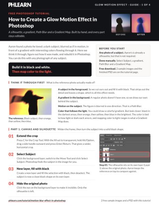
A black silhouette with a streak of motion, on a glowing gradient that shifts from orange through yellow to blue. Aaron found a reference photo he liked and reverse-engineered it: a silhouette, a radial gradient, a Path Blur and a gradient map.
How do I make the silhouette?
Click Select Subject, make a new layer, fill the selection with black and deselect. It works with any subject, not just the backlit one in the video.
Why build it in black and white first?
Because the color comes last, from a gradient map. The map assigns colors by brightness, so a black subject, a black-to-white radial gradient and gray blur edges are all it needs. You can change every color afterwards without touching the layers.
Which blur makes the motion?
Path Blur in the Blur Gallery, on the subject converted to a Smart Object. Raise Speed, raise Taper so the streak fades out, and untick Centered Blur so it blurs in one direction only. Drag the control points to steer it.
What does the gradient map do?
It maps the dark values to one end of a gradient and the light values to the other. Click the gradient in the Properties panel to open the editor and pick any preset; click Reverse if the bright end lands on the wrong side. Drag the radial gradient layer around and the colors move with it.
My subject isn’t black anymore. How do I get that back?
In the gradient editor, add a color stop near the left end and make it darker. The darkest values (the subject) then map to that stop.
Can I change the blur or colors later?
Yes. Double-click Blur Gallery under the Smart Object to re-edit the blur, double-click the gradient map to pick another gradient or edit the colors, and press G to move the radial gradient.
Does this use AI or credits?
Select Subject uses AI to find the person, but nothing spends generative credits. The rest is a gradient, a blur and an adjustment layer.
Are the sample files free?
Yes, with a free PHLEARN account. You get both sample images, the layered PSD and the PDF guide.
Master Photoshop, Lightroom and Photography
Join PHLEARN PRO for $12.99 a month or $99.99 a year. Cancel anytime, with a 100% money-back guarantee.





