
description
Recreating a video game title screen involves more type work than photo editing, from building a custom logo out of separate text layers to roughing up its edge with a filter. This tutorial covers recropping a soldier photo to make room for text, building and centering a multi-part custom title, texturing it with clipping masks and Levels, and finishing with the Spatter filter for a gritty, authentic edge.
Enjoying This Free Tutorial?
We publish a new free tutorial every week, each one with sample images and PSDs you can download and follow along with. Sign up and they land straight in your inbox, along with early word on sales, events and subscriber-only offers.
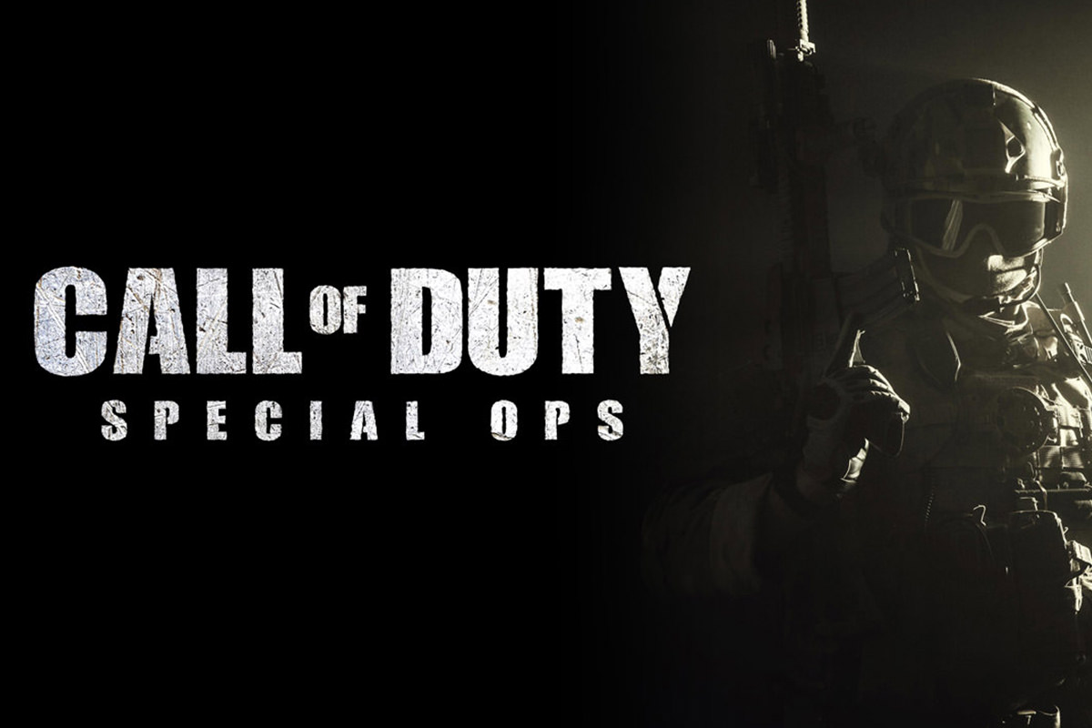
Recreating a video game title screen involves more type work than photo editing, from building a custom logo out of separate text layers to roughing up its edge with a filter. This tutorial covers recropping a soldier photo to make room for text, building and centering a multi-part custom title, texturing it with clipping masks, and finishing with the Spatter filter for a gritty, authentic edge.
Cropping to Make Room for Text
Recropping the photo so text sits over a plain, dark area rather than the subject’s detail keeps the title readable and clean.
-
Combine the Source Images
Hold Shift and drag the soldier photo and texture images into the same document, grouping the textures together for now.
-
Select the Crop Tool
Press C for the Crop tool.
-
Leave Delete Cropped Pixels Unchecked
Make sure Delete Cropped Pixels is unchecked so pixels outside the crop remain recoverable.
-
Recrop to Favor an Empty Area
Adjust the crop boundaries so a plain, dark area of the photo, rather than the subject’s face or gear, sits where the title text will go.
Filling the Background With a Solid Color Layer
A Solid Color adjustment layer set to black fills in any new empty space the crop reveals, and automatically extends if the crop changes again later.
-
Add a Solid Color Adjustment Layer
Add a Solid Color adjustment layer and set it to black.
-
Move It Beneath the Subject
Drag the solid color layer below the subject layer in the stacking order.
Why a Solid Color Fill Layer Beats a Regular Filled Layer
A regular layer filled with black only covers the exact area painted at the time, leaving new transparent space exposed if the canvas or crop changes afterward. A Solid Color adjustment layer automatically fills the entire canvas at all times, so expanding the crop later never reveals an unfilled gap that needs to be patched manually.
Blending the Edge With a Gradient Mask
A linear gradient painted onto the subject’s layer mask fades the transition between the photo and the solid black background so no hard edge is visible.
-
Add a Layer Mask to the Subject
Click the layer mask button on the subject layer.
-
Select the Linear Gradient Tool
Press G for the Gradient tool and choose the linear gradient option with Foreground to Transparent and black as the foreground color.
-
Drag the Gradient Across the Seam
Hold Shift and drag from one side to the other across the visible seam to fade it smoothly.
Setting Up the Custom Title Type
A downloaded custom font, applied through the Character panel, gives the title its distinctive game-style look from the very first word.
-
Find and Install a Matching Font
Search for a font matching the game’s style and install it from a free font site.
-
Add the First Word of Text
Press T for the Type tool, click on the canvas, and type the first word of the title.
-
Apply the Custom Font and Color
Open Window > Character, select the custom font, and set the text color to white.
-
Set Tracking and Size
Set Tracking back to zero for standard letter spacing, then increase the font size to fill the available space.
Sizing and Spacing Each Line of Text
Duplicating the first text layer for each additional word keeps every part of the title editable and independently sized.
-
Duplicate the Layer for Each Word
Press Cmd/Ctrl+J to duplicate the text layer for each additional word in the title, renaming and retyping each copy.
-
Resize Smaller Words
Reduce the size of a shorter connecting word, such as “of,” so it reads clearly between two larger words.
-
Nudge Layers With the Arrow Keys
Hold Shift while dragging, or use the arrow keys, to reposition each word while keeping it aligned horizontally or vertically.
-
Widen the Tracking on a Subtitle
Duplicate a text layer for a subtitle and increase its Tracking value significantly, such as to 400 or 500, for a wide, spaced-out look.
Centering the Grouped Title Text
Grouping the main title’s layers together lets a subtitle be centered against the whole group at once, rather than against just one individual word.
-
Group the Main Title Layers
Select the main title’s layers and press Cmd/Ctrl+G to group them together.
-
Select the Group and the Subtitle Together
Hold Cmd/Ctrl and click both the title group and the subtitle layer to select them together.
-
Apply Center Align
Select the Move tool and click the horizontal center align option to center the subtitle against the entire title group.
Clipping Textures Onto the Type
A clipping mask lets a texture layer show through only where the title’s group is visible, without needing any manual selections or layer masks.
-
Bring a Texture Above the Title Group
Move a scratched metal texture layer directly above the grouped title text.
-
Create a Clipping Mask
Right-click the texture layer and choose Create Clipping Mask so it only shows up where the title group is visible.
-
Reposition and Scale the Texture
Move and scale the clipped texture to control exactly which part of it shows through the type.
-
Add a Second Texture the Same Way
Repeat the process with a second texture layer for additional grit and variation.
Why Clipping Masks Work Better Than Manual Layer Masks Here
Manually masking a texture to match complex, multi-word text would mean tracing every letter’s exact shape by hand, and redoing that work anytime the text changed. A clipping mask instead reads its visibility directly from whatever’s on the layer or group below it, so the texture automatically follows the title’s exact shape even if the text is edited afterward.
Increasing Contrast With Levels on the Texture
A Levels adjustment applied directly to each texture layer pushes its highlights and shadows further apart, giving the type a more gritty, scratched look.
-
Open Levels on a Texture Layer
Select a clipped texture layer and press Cmd/Ctrl+L.
-
Widen the White and Black Points
Move the white point input slider left and the black point input slider right to increase contrast.
-
Repeat for the Second Texture
Apply a similar Levels adjustment to the second texture layer for a consistent, gritty look.
Roughening the Edge With the Spatter Filter
A stamp-visible layer captures everything in the document at once, which the Spatter filter then uses to rough up the type’s edge, masked so the effect only shows on the logo.
-
Create a Stamp Visible Layer
Press Shift+Option/Alt+Cmd/Ctrl+E to create a new layer that’s a flattened copy of everything visible in the document.
-
Open the Filter Gallery
Go to Filter > Filter Gallery, then choose Spatter under Brush Strokes.
-
Adjust Spray Radius and Smoothness
Adjust the Spray Radius and Smoothness sliders until the edge looks appropriately rough without becoming illegible.
-
Mask the Effect to Just the Logo
Add a layer mask, use the Marquee tool to select just the title area, and mask out the filter’s effect everywhere else in the photo.
Why a Stamp Visible Layer Is Needed for This Filter
The Spatter filter needs actual pixel content to work with, so it can’t be applied to a blank new layer or directly to a group. Creating a stamp visible layer flattens everything currently seen in the document onto one layer, giving the filter real image data to distort while leaving every original layer beneath it untouched.
Why This Approach Works
Splitting the title into separate layers for each word keeps every part independently sized and positioned, which is essential when a logo mixes drastically different scales and letter spacing. Clipping masks let the texture and type stay perfectly in sync no matter how the text changes, without ever needing to redraw a manual selection. Applying the Spatter filter to a stamp visible layer, then masking its effect to just the logo, roughens the type’s edge without touching the photo of the subject underneath it.
Final Thoughts
Between the custom font, the clipped textures, and the Spatter filter’s rough edge, this workflow turns plain text into something that looks like an authentic game title. The same combination of layered type, clipping masks, and a texture filter works for building a logo in any style, not just a military game’s, once the underlying technique is understood.
Quick Reference: Keys, Menus and Settings
- RecropC, Delete Cropped Pixels unchecked
- Fill and fadeSolid Color layer (black) below the photo; layer mask, G, Linear, Foreground to Transparent
- TypeT, Window > Character: white, Tracking 0; Cmd/Ctrl + J for each word
- SubtitleTracking 400 to 500, size 40; group the title with Cmd/Ctrl + G, Move tool center align
- TextureRight-click > Create Clipping Mask; Cmd/Ctrl + L for contrast
- Stamp visibleShift + Alt/Option + Cmd/Ctrl + E
- Rough edgeFilter > Filter Gallery > Brush Strokes > Spatter; Spray Radius and Smoothness; mask to the logo
No AI, no generative credits.
Video Game Title Screens: Common Questions
Where do I get a font that matches the game?
Aaron searched Google for a Call of Duty font and found a free one on DaFont. Install it, press T, then pick it in Window > Character and set the color to white.
Why use a Solid Color layer for the black background?
A Solid Color fill layer always fills the whole canvas, so if you pull the crop out again later the new space is filled automatically. A regular layer filled with black would leave a gap.
How do I hide the line between the photo and the black?
Add a layer mask to the photo, press G and choose a Linear, Foreground to Transparent gradient with black, then Shift-drag across the edge. A temporary Levels layer makes the line easier to see.
Why put each word on its own layer?
So each part can be a different size. Press Cmd/Ctrl + J to duplicate the first word, retype it, and make the small “of” smaller than the words around it.
How do I get the wide-spaced subtitle?
Raise Tracking in the Character panel; the video tries 400 and settles near 500, with the size dropped to 40. Tracking adds space between the letters without stretching them.
How do I center the subtitle under the whole title?
Select the title layers and press Cmd/Ctrl + G to group them. Cmd/Ctrl-click the group and the subtitle, choose the Move tool and click the horizontal center align button.
Can I clip a texture to a group of text?
Yes. Put the texture layer directly above the group, right-click it and choose Create Clipping Mask. The texture shows only inside the letters, and you can move either one on its own.
How do I make the texture look grittier?
Select the texture layer, press Cmd/Ctrl + L for Levels and pull the white point and black point sliders in toward the middle.
Why do I need a stamp visible layer for the Spatter filter?
The filter can’t run on a blank layer. Press Shift + Alt/Option + Cmd/Ctrl + E to make a merged copy, apply Filter > Filter Gallery > Brush Strokes > Spatter, then mask it to the logo with a Marquee selection.
From the Magazine View all
Stories, interviews and guides for photographers, new every week.
 EditingLightCraft vs Lightroom: I Edited the Same RAW Files in BothThe free clone on the same RAW files: what matches, what breaks and who should switch.
 InspirationRare Historical Photos: 13 of the Rarest Pictures Ever TakenFrom the earliest surviving picture of a person to the last passenger pigeon: who took each one and why it survives.
 EditingArtCraft: Photoshop Cloned by AI in Two Weeks. Is It Legal?ArtCraft cloned Photoshop and Lightroom with AI and gave them away. Any good? Legal? Safe?
Master Photoshop, Lightroom and Photography
Join PHLEARN PRO for $12.99 a month, or $99.99 a year (save 36%). Cancel anytime, with a 100% money-back guarantee.