
Download Assets
This tutorial includes 1 sample image, 1 sample PSD and 1 PDF guide. Downloads are free with a PHLEARN account.
- Download the sample images and PSDs from every free tutorial on PHLEARN
- New free tutorials published every week
- One free account — sign up once, then download anything
Free PDF Guide · 3 Pages
This Tutorial as a Step-by-Step PDF
Every step from the video in order: a Vibrance layer at +100, a second one with Saturation at +100 to compare skin, the Hue/Saturation layer with the eyedropper that targets one color, shifting the greens and the suit, and stacking Vibrance with Hue/Saturation. Keep it next to your keyboard.
description
Vibrance protects the colors that are already strong. Saturation does not. That is the whole difference. Discover when to choose each tool for stunning color enhancements. We’ll show you how Vibrance protects skin tones for natural-looking portraits, while Saturation boosts all colors. Plus, learn to fine-tune specific hues with Hue/Saturation adjustment layers.
Enjoying This Free Tutorial?
We publish a new free tutorial every week, each one with sample images and PSDs you can download and follow along with. Sign up and they land straight in your inbox, along with early word on sales, events and subscriber-only offers.
Image Source
Vibrance vs Saturation in Photoshop: What the Difference Actually Is
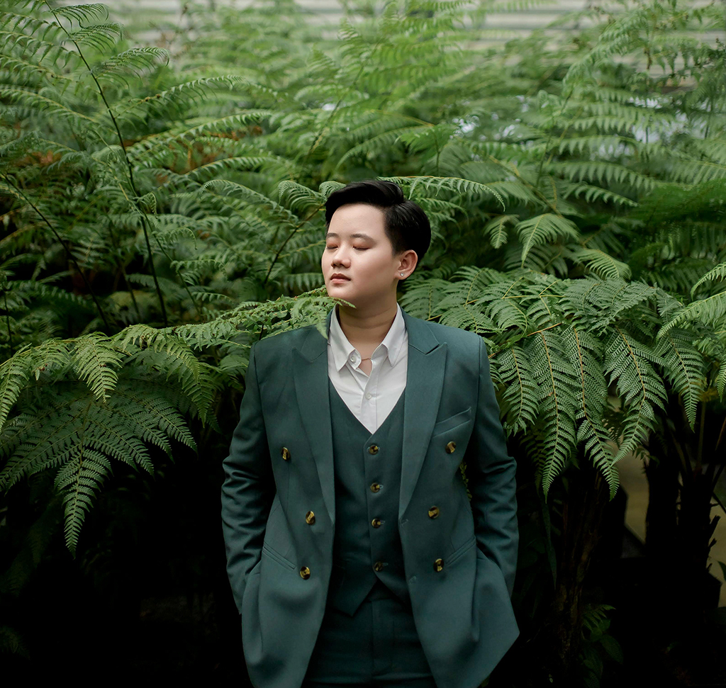
Both controls add color. The difference is how they decide which colors to affect, and that single distinction determines which one belongs on a photograph of a person.
Saturation increases every color in the image by the same amount, regardless of how saturated it already is. Vibrance increases the muted colors more than the already-saturated ones, and specifically protects skin tones.
That is the whole thing. Everything below is what follows from it.
See It on the Same Image
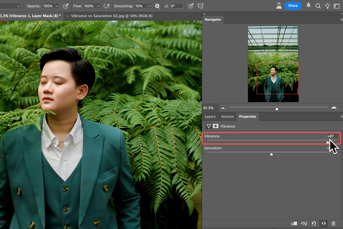
Take a portrait with a colorful background and add Layer ? New Adjustment Layer ? Vibrance. The panel contains both a Vibrance slider and a Saturation slider, so you can compare them without leaving it.
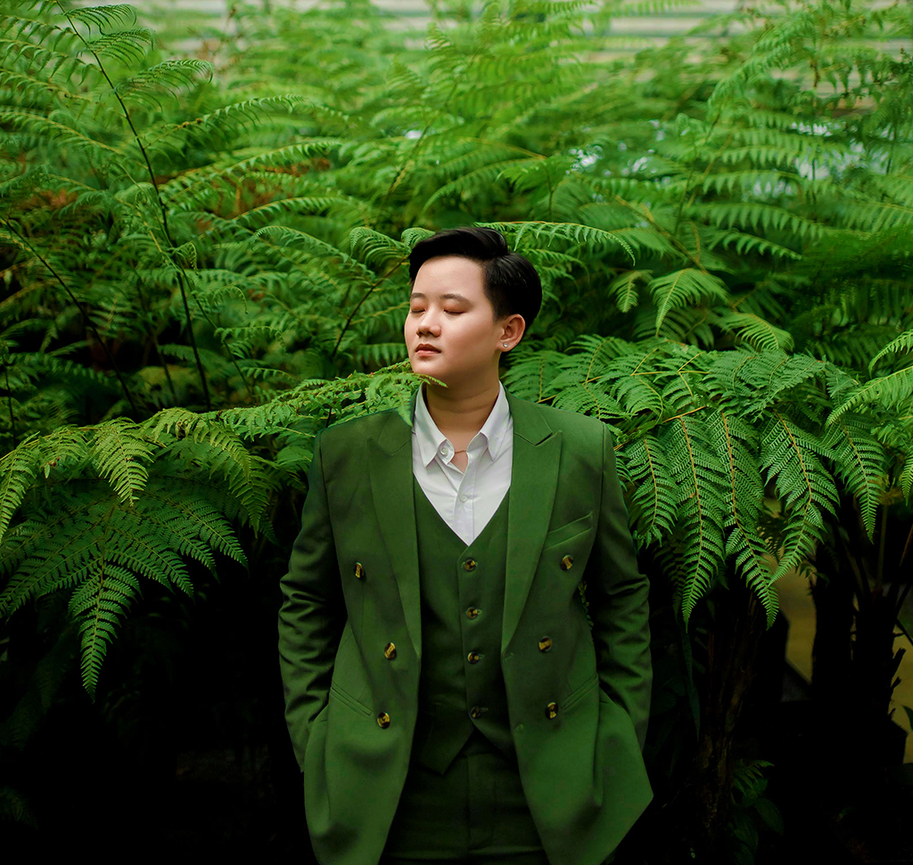
Vibrance at Full
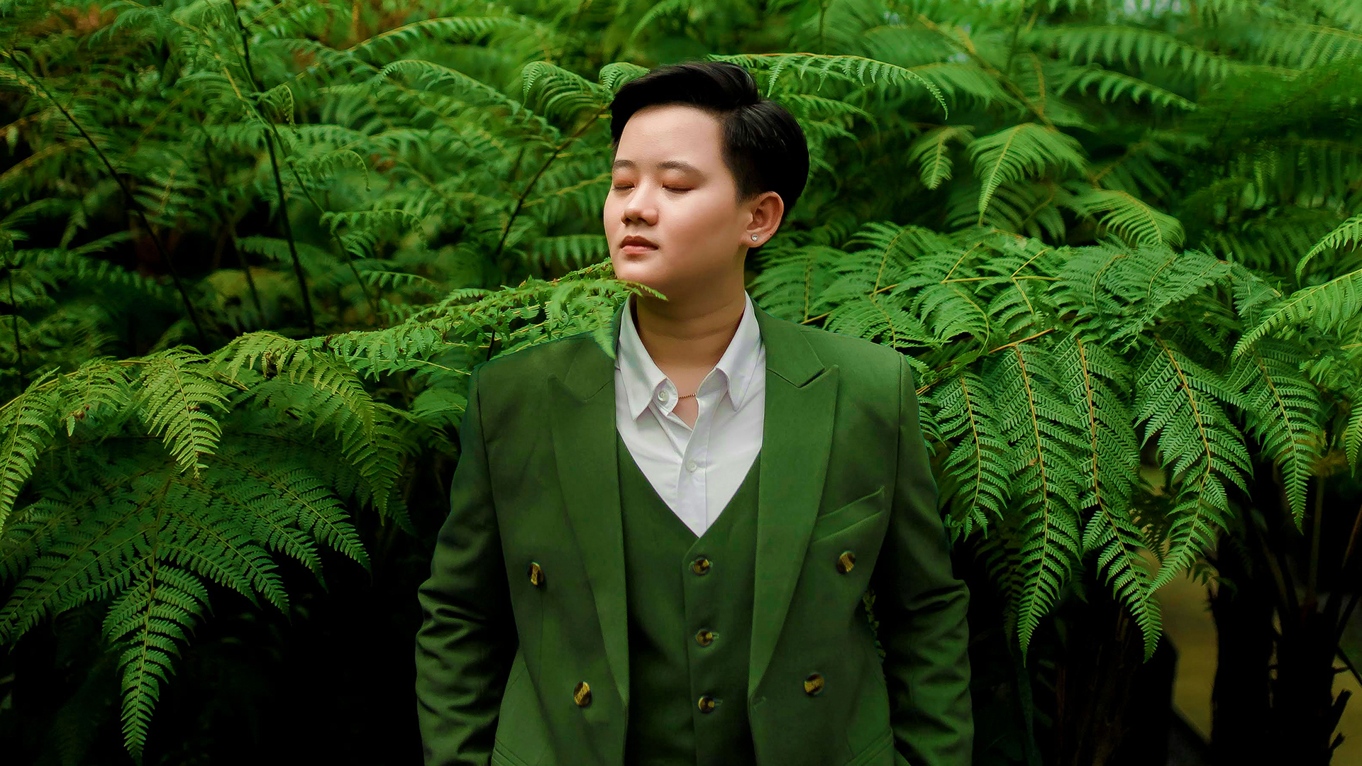
Drag Vibrance all the way right. Greens in the foliage deepen considerably, clothing gains color, and the overall image looks richer — but the face still looks like a person.
Vibrance found the areas that were undersaturated and lifted those, while leaving the colors near skin tone largely alone.
Saturation at Full
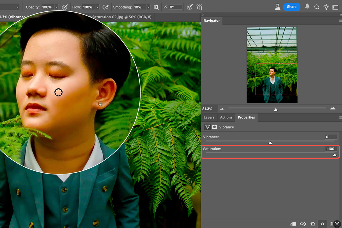
Reset, and drag Saturation to 100 instead. The background gets colorful in much the same way — and the face turns orange.
Saturation has no concept of skin. It applied the same increase everywhere, and since skin already carries strong red and orange, pushing it further takes it somewhere no person has ever looked.
This is why an image can look oversaturated even when the background looks good. The face is what gives it away.
Which to Use
People in the frame: use Vibrance. The skin protection is the entire point, and it is doing work you would otherwise have to do by hand with masks.
No people: either works. On landscapes, products, or architecture there are no skin tones to protect, so Saturation is a legitimate choice and gives a more uniform lift.
Even then Vibrance is often the better default, because it lifts flat colors more than strong ones — which tends to even out an image rather than exaggerating whatever was already loudest.
Hue/Saturation: Targeting One Color
Both sliders above are global. When you want to change one color and leave the rest, you need Layer ? New Adjustment Layer ? Hue/Saturation.
Its master Saturation slider does the same job as the one in Vibrance. The value is in the dropdown above it, which restricts the adjustment to a color range — Reds, Yellows, Greens, Cyans, Blues, Magentas.
Use the Eyedropper, Not Just the Dropdown
The preset ranges are approximate. The eyedropper is what makes this precise.
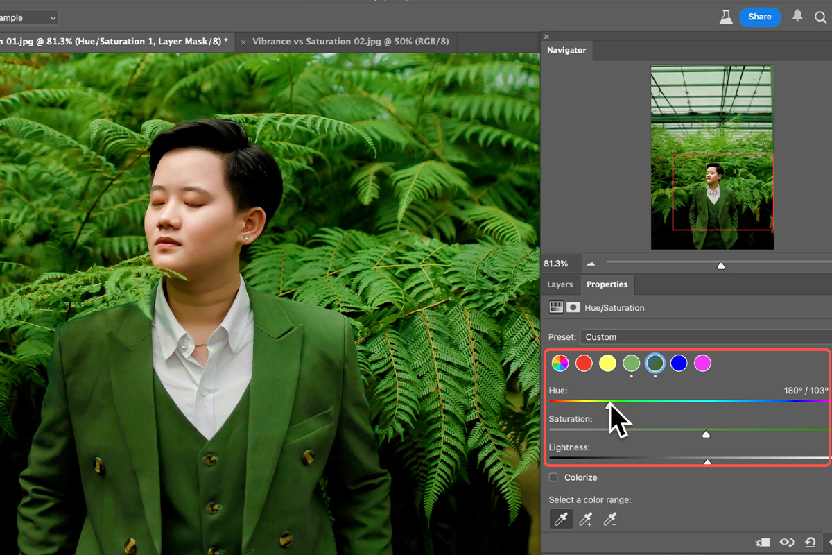
Pick any color range from the dropdown, then take the eyedropper and click the actual color in your image. Photoshop redefines the range around what you clicked — so the selection matches the specific green of your foliage rather than a generic green.
Because of this, which range you start from barely matters. Click a green in the photo and it becomes greens; click the subject’s teal jacket and it becomes that teal. The eyedropper overrides the starting point.
A small marker appears beside ranges you have adjusted, so you can see at a glance what has been touched.
Hue as Well as Saturation
Within a targeted range you also get Hue, which shifts the color itself. Nudging greens toward yellow and orange turns summer foliage autumnal. Shifting a garment’s hue slightly toward the background colors ties a composition together.
Small movements. Large hue shifts read as obviously manipulated, particularly on anything a viewer knows the real color of.
Why This Protects Skin Too
Targeting a range means everything outside it is untouched. Adjust the foliage and the jacket, and skin tones are mathematically excluded rather than merely spared — you can push those colors much harder than a global control would ever allow.
Use Them Together
The two are not alternatives. The reliable workflow uses both, in order.
-
Vibrance first, as a global lift
Add a Vibrance adjustment layer and raise it until the image has life. Skin tones stay safe, so you can be fairly generous.
-
Hue/Saturation second, for specific colors
Add a Hue/Saturation layer, use the eyedropper to target the colors you want to push, and adjust their saturation and hue individually.
-
Toggle to check
Turn each layer off and on. Your eye adapts to color within seconds, so comparing against the original is the only reliable check.
Vibrance does the broad work safely; Hue/Saturation does the precise work where you want it. Together they get further than either alone, and neither touches a pixel destructively.
In Short
Saturation treats all colors equally and will wreck skin. Vibrance favors muted colors and protects skin, which makes it the correct default for anything with a person in it. Hue/Saturation with the eyedropper is how you adjust one color without disturbing the others.
Vibrance for the whole image, Hue/Saturation for the parts that need more.
Quick Reference: Keys, Menus and Settings
- VibranceLayer > New Adjustment Layer > Vibrance; Vibrance slider up (skin stays natural)
- SaturationSame layer, Saturation slider; everything including skin goes up
- Target one colorLayer > New Adjustment Layer > Hue/Saturation; pick any color swatch, then the eyedropper and click the color in the photo
- ThenSaturation, Hue or Vibrance for that color only; a dot marks each color you’ve adjusted
- Aaron’s comboVibrance up overall, then Hue/Saturation to fine-tune greens and clothing
- CompareThe eye icon on each layer
No AI, no generative credits.

Free Downloads
Follow Along on the Same Photo
Get the portrait from the video, the PSD with the three adjustment layers to compare, and the PDF guide. Free with a PHLEARN account.
Vibrance vs Saturation: Common Questions
What’s the difference between vibrance and saturation?
Both add color. Saturation pushes every color equally, skin included. Vibrance protects skin tones while boosting the rest, so a portrait at +100 vibrance still looks like a person.
Which one should I use?
Vibrance when there are people in the photo. Saturation when there aren’t, or when you want to push specific colors and don’t mind the rest moving.
Why does the Vibrance layer have both sliders?
So you can mix them. The video makes two Vibrance layers, one with each slider at +100, and toggles them to show the difference on the face.
How do I saturate just one color?
Hue/Saturation adjustment layer. Pick any color swatch, click the eyedropper and then click the color in the photo; the swatch switches to whatever you clicked. Now Saturation, Hue and Vibrance affect only that color.
Can I change the color, not just its strength?
Yes. With the color targeted, drag Hue. The video shifts the suit toward the greens in the background without touching the skin.
What’s the recommended setup?
A Vibrance layer for the overall lift, then a Hue/Saturation layer to tune individual colors. Skin stays right, and everything else gets dialed in.
Why does my Hue/Saturation panel look different?
It was redesigned in 2025 with color swatches and an eyedropper. Older versions use a dropdown of color ranges; the idea is the same.
Are the sample files free?
Yes, with a free PHLEARN account. You get the portrait, the PSD with all three layers and the PDF guide.
Master Photoshop, Lightroom and Photography
Join PHLEARN PRO for $12.99 a month or $99.99 a year. Cancel anytime, with a 100% money-back guarantee.





