
Download Assets
Download Assets
This tutorial includes 1 sample image and 1 sample PSD. Downloads are free with a PHLEARN account.
- Download the sample images and PSDs from every free tutorial on PHLEARN
- New free tutorials published every week
- One free account — sign up once, then download anything
Watch the Full Series
30 Days of Photoshop · 2025 EditionOur most-watched series, updated for 2025 — watch all 30 free
description
Adjustment layers are how you edit light and color in Photoshop without editing the photograph. Each one holds an instruction rather than pixels, carries its own layer mask, and can be re-opened, re-tuned, faded or deleted years later.
Day 5 goes through all of them — what each adjustment actually does, which ones overlap, which handful covers most real work, and how to mask them so a change lands on one part of the frame instead of the whole thing.
This is Day 5 of 30 Days of Photoshop, 2025 Edition — our most-watched series, rebuilt from the ground up for today’s tools.
Continue Watching 30 Days of Photoshop
JOIN 30 DAYS OF PHOTOSHOP (FOR FREE!)
Ready to jump in? Sign up and we’ll email you a printable calendar and daily class schedule so you can get started right away!
Image Source
Adjustment Layers Edit Light and Color Without Touching the Photo
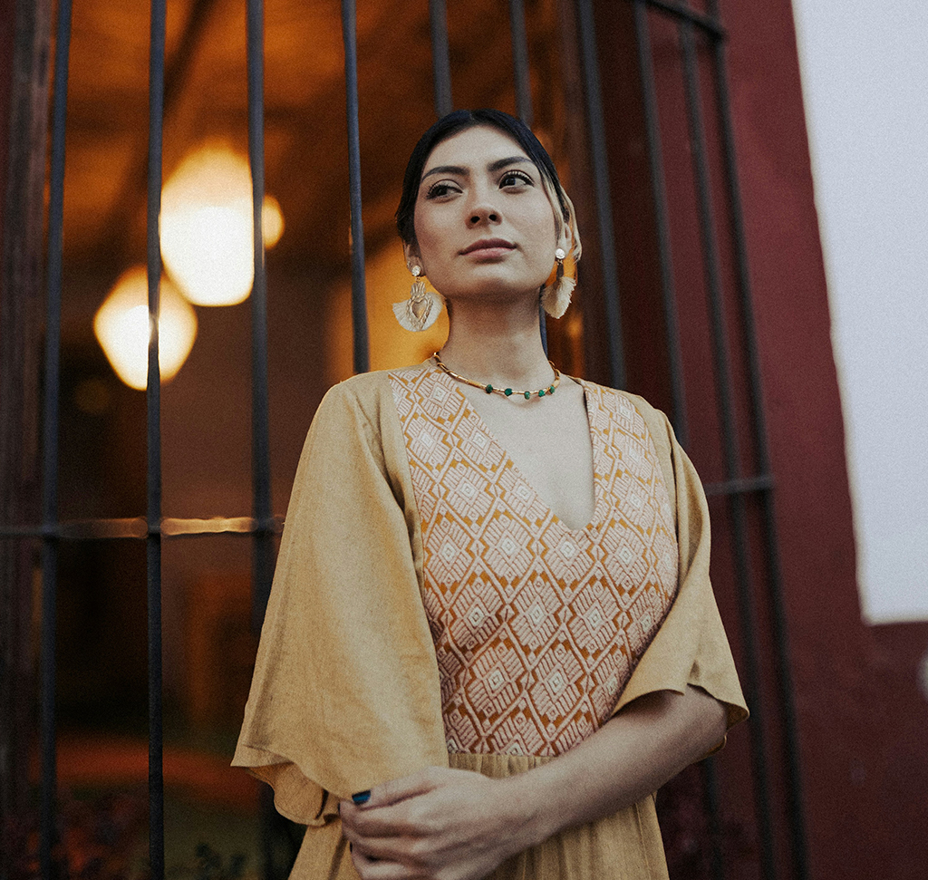
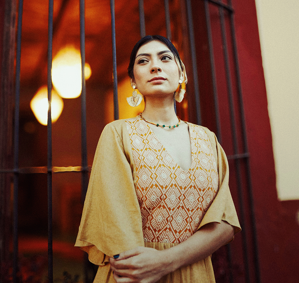
An adjustment layer edits light and color without touching the photograph. It stores an instruction, not pixels, which means you can reopen it, retune it, fade it, mask it or delete it at any point — today, or in ten years when you reopen the PSD.
There are seventeen of them. A working photographer uses about five. This is the guided tour: what each one does, which ones do the same job as each other, and which handful is worth actually learning.
Three Ways to Add One, and the One Worth Using
You can go to Layer > New Adjustment Layer, or click the half-filled circle at the bottom of the Layers panel. Both work and both give you the same list.
The third route is the Adjustments panel (Window > Adjustments), which shows every adjustment as an icon you can click straight away. Pair it with Window > Properties, because an adjustment layer is useless without the Properties panel — that is where all its controls live.

Set the Workspace Up First
-
Dock the Adjustments Panel on the Right
Drag it against the right-hand dock until a blue bar appears, then let go.
-
Dock Properties Underneath It
Same gesture, lower down. Now Adjustments, Properties and Layers are all visible at once.
-
Save It as a Workspace
Window > Workspace > New Workspace. You will be in this layout constantly, and it is the arrangement most of this series assumes.
Anatomy of an Adjustment Layer
Two Thumbnails, One Properties Panel
Every adjustment layer arrives with a layer mask already attached. Click the left thumbnail and Properties shows the adjustment’s controls; click the right one and Properties switches to mask controls instead. The white outline tells you which is active. Almost every “why is nothing happening” moment with adjustment layers is this.
The Icons Along the Bottom of Properties
Left to right: clip to layer below (the adjustment stops affecting the whole stack and affects only the single layer beneath it — the layer indents and gains a down arrow), press-and-hold preview (a temporary before/after you hold rather than toggle), reset (all sliders back to default without deleting the layer), visibility, and delete.
Masking: Black Hides, White Shows
A new mask is entirely white, so the adjustment applies to the whole frame. Paint black onto it and the adjustment disappears there. That is the entire rule, and it holds for every mask in Photoshop.
To fade an adjustment outward from your subject, click the mask thumbnail, take the Gradient tool with the black to white preset set to radial, and drag from the center out. If you get the inverse of what you wanted, tick Reverse in the options bar rather than starting again — this catches everyone the first time.
To wipe a mask and start over, select it and use Edit > Fill > White. Brushes, gradients and selections all write to masks; none of them is more correct than the others.
The Tonal Adjustments
Brightness/Contrast is exactly what it says: two sliders and an Auto button. Nothing wrong with it, and it is the fastest way to make a subject read properly.
Levels
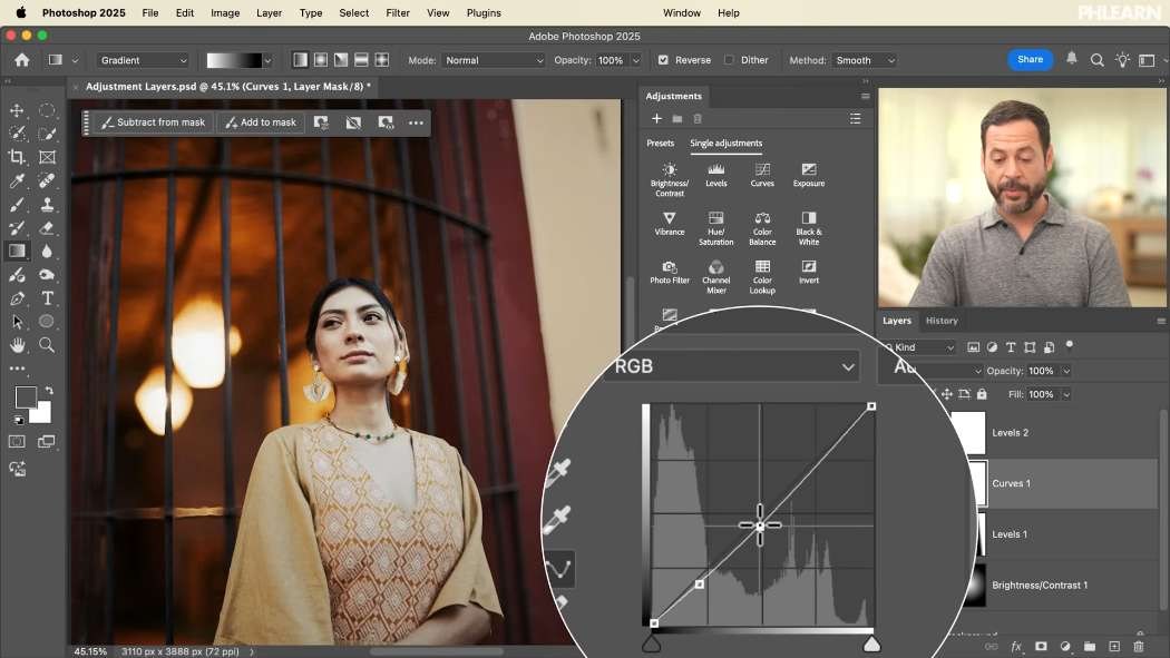
Five control points and far more power than it looks. The black point and white point on the input slider crush everything beyond them to pure black or white. The midpoint between them is the one you will move most often — it lightens or darkens the midtones without clipping either end.
The second slider underneath is the output range, and it is worth knowing: pull its left handle right and your darkest pixel becomes gray instead of black, which is how faded, filmic looks are built. The dropdown reading RGB switches to individual red, green and blue channels, and that is where levels turns into a color-toning tool — less red in the highlights and more in the shadows, greens against magentas, blues against yellows.
Curves
The most common question about these two is what the difference is, and the honest answer is: not much. Moving the curve’s endpoint inward does the same thing as moving the levels black point. Lifting the bottom of the curve does the same thing as the output slider. Curves has the same per-channel dropdown.
The real difference is how many points you get. Levels gives you five, fixed. Curves lets you add as many as you like, so you can darken shadows, lift midtones and pull highlights back down in one adjustment. Levels is easier to learn; curves goes further. Most people do 90% of their work in one or the other.
Exposure offers exposure, offset and gamma. Offset moves the black point and gamma moves the midtones, so it overlaps heavily with both of the above — the math underneath is different, the result is similar. If levels already makes sense to you, you can safely ignore this one.
The Color Adjustments
Vibrance
Two sliders that are not the same. Saturation pushes every color equally, which is what turns skin orange. Vibrance pushes the least-saturated colors hardest and deliberately protects skin tones. On anything with a person in it, reach for vibrance first.
Hue/Saturation
Rotates color around the wheel. On its own it recolors the entire image, which is rarely what you want — it comes into its own masked. Mask it down to a single practical light in the frame and you can change that light’s color without touching anything else.
Color Balance
The most intuitive color tool in the list, because you can see the color you are adding. Pick shadows, midtones or highlights, then push each of the three sliders toward the color you want. Warmth into the midtones, a little blue in the shadows — that is a whole grade. Keep it subtle; it goes wrong quickly.
Selective Color
The precision instrument. Choose one color family — reds, say — and then set exactly how much cyan, magenta, yellow and black goes into it, leaving every other color alone. Slow, fiddly, and the right answer when a single color in the frame is fighting you.

The Look and Grade Adjustments
Black & White
More than a desaturate. Auto analyzes the colors and produces a considered conversion, the presets emulate traditional colored filters (a red filter, an infrared look), and the Tint checkbox lets you push the result toward any single color. Drop the layer opacity and you get a partial desaturation — the old newsprint look in one move.
Photo Filter
An underrated starting point. Pick from the built-in warming and cooling filters or choose any color yourself, then set the density. Keep the density low and it flatters almost any photograph. This is the one to reach for early on when a picture feels slightly cold and you cannot say why.
Color Lookup
Presets, in the form of LUTs. Photoshop ships with a set under Load 3D LUT, PHLEARN PRO includes hundreds more, and you can build your own. Lower the opacity to dial any of them back.
Gradient Map
The best color-toning tool in the panel, and the one people misjudge. It maps a gradient onto your image’s tonal range: darkest pixels take the left end of the gradient, brightest take the right. If the result looks inverted, click Reverse — that is almost always the fix.
At 100% opacity it is a graphic effect. Between roughly 10 and 20% it is a color grade, and a surprisingly sophisticated one. Cycle through the built-in gradient sets with the opacity already down and you will find combinations you would never have chosen deliberately.
The Ones You Will Rarely Need
Channel Mixer remixes how the red, green and blue channels combine. Enormously powerful, deeply unintuitive, and mostly used for artistic effects rather than photo editing. Invert has no options at all. Posterize reduces the image to a set number of tonal levels and Threshold forces every pixel to pure black or pure white — both belong to graphics work more than photography. None of them are wasted; they are just not part of a normal edit.
Group the Stack, Then Fade the Group
Shift-click every adjustment layer and press Ctrl/Cmd + G to group them. Name the group something like “Adjustments”.
Now the group’s own opacity slider fades the entire edit at once. Built something you like but slightly too strong? Take the group to 70% rather than revisiting nine layers individually. It is the simplest way to pull a whole grade back, and it only works because none of it was ever baked in.
Which Ones to Actually Learn
Start with levels or curves for tone, vibrance for color, color balance for warmth, and a gradient map at low opacity for grading. Those four will carry the majority of your editing. Everything else is there for the day you need it.
Download the sample file and build the stack yourself, then mask one of the adjustments with a radial gradient so it lands only on your subject. That combination — an adjustment plus a mask — is most of what photo retouching actually is.
Day 4 introduced layers and the masks these sit on. Tomorrow, Day 6 is entirely about layer masks — the other half of everything above.
Quick Reference: Keys, Menus and Settings
- Open the panelsWindow > Adjustments and Window > Properties; or Layer > New Adjustment Layer
- Properties iconsClip to layer below, press-and-hold preview, reset, visibility, delete
- Fade from the subjectClick the mask, G, Black to White, Radial; tick Reverse if it’s backwards
- Clear a maskEdit > Fill > White
- Tone by channelLevels or Curves: change the RGB dropdown to Red, Green or Blue
- Gradient map gradeReverse if inverted, layer opacity about 10 to 20%
- Fade everythingShift-click the layers, Cmd/Ctrl + G, lower the group opacity
No AI, no generative credits.
Free Downloads
Follow Along on the Same Photo
Get the sample photo and the layered PSD with the full stack of adjustment layers, grouped and masked, so you can switch each one off. Free with a PHLEARN account.
Adjustment Layers: Common Questions
What is an adjustment layer in Photoshop?
A layer that edits light and color without touching the photo’s pixels. You can reopen it, change its settings, mask it, lower its opacity or delete it at any time, even years later in the saved PSD.
Where do I find adjustment layers?
Layer > New Adjustment Layer, the half-filled circle at the bottom of the Layers panel, or the Adjustments panel under Window > Adjustments. Open Window > Properties too, because that’s where the controls live.
Why does Properties show mask settings instead of my sliders?
The mask thumbnail is selected. Click the left thumbnail, the adjustment itself, and Properties shows its controls again. The white outline tells you which one is active.
How do I make an adjustment affect only one layer?
Click the clip icon, the first one at the bottom of the Properties panel. The adjustment indents with a down arrow and affects only the layer directly below it.
My radial gradient mask came out backwards. How do I fix it?
Tick Reverse in the Gradient tool’s options bar and drag again. On a mask, black hides the adjustment and white shows it.
What’s the difference between Levels and Curves?
Very little. Both move the black point, white point and midtones and both work per color channel. Levels has five fixed points; Curves lets you add as many points as you want.
Should I use Vibrance or Saturation?
On photos of people, start with Vibrance. It adds color while protecting skin tones; Saturation boosts every color and can push skin too far.
Why does my gradient map look inverted or way too strong?
Click Reverse if the dark and light ends look swapped. Then lower the layer opacity to around 10 to 20% and it becomes a subtle color grade.
How do I tone down my whole edit at once?
Shift-click all the adjustment layers and press Cmd/Ctrl + G to group them. Lower the group’s opacity to fade every adjustment together.
Are the sample files free?
Yes, with a free PHLEARN account. You get 1 sample image and 1 sample PSD: the photo and the layered file with the full stack of adjustment layers, grouped and masked.
Master Photoshop, Lightroom and Photography
Join PHLEARN PRO for $12.99 a month or $99.99 a year. Cancel anytime, with a 100% money-back guarantee.





