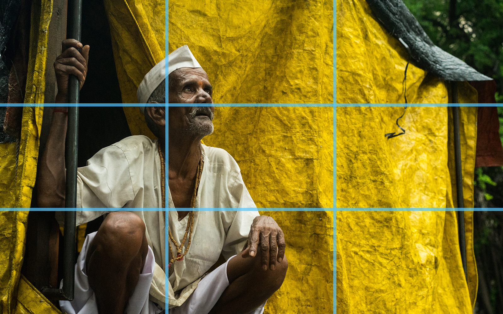
Add Something New to Your Photography with Juxtaposition
“One of these things is not like the others.”
…and that’s why you’re still looking at the same photo instead of moving on in less than a minute. Even famous works of art are lucky to get more than a few seconds in a museum setting and thanks to the staggering amount of images posted daily to Instagram alone, photos on the web aren’t faring much better.
That’s why photographers use handy compositional tricks that snatch up a viewer’s attention before their image falls victim to “the scroll”. If you find that you’re drawn to an image by the appearance of unlike objects or concepts in close proximity, congratulations! You’ve discovered at least one of those compositional tricks: juxtaposition.
Juxta– What Now?
It’s a clunky sort of word, but hang in there. It actually makes perfect sense that those letters don’t look or sound like they belong together, because that’s what juxtaposition is all about. It puts two (or more) elements that don’t typically “go together”, together.
In art (and therefore, photography) juxtaposition can be a compositional or conceptual element. You may have even used juxtaposition in your work already without realizing what you were doing had a name. Maybe you’ve put two very different things in close proximity to experiment, add drama and tension, or just prove a point. You probably noticed that this had a powerful effect on your image. (If none of this sounds familiar to you, keep reading. We’ll show you how it’s done.)
When and Why Would You Use Juxtaposition in Photography?
Juxtaposition can serve several different purposes:
To Add Humor
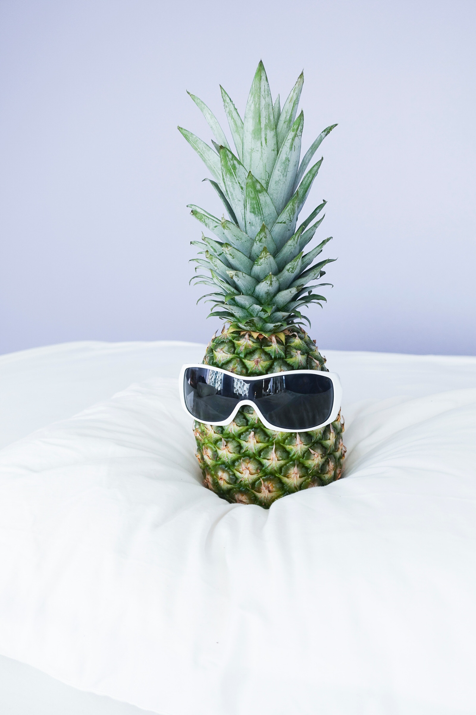
Photo by Elena Cordery on Unsplash
Unexpected things can be funny, like this pineapple wearing sunglasses. Fruit and fashion accessories don’t normally go together at all, so it’s a fun little surprise to see one wearing the other.
To Show Scale
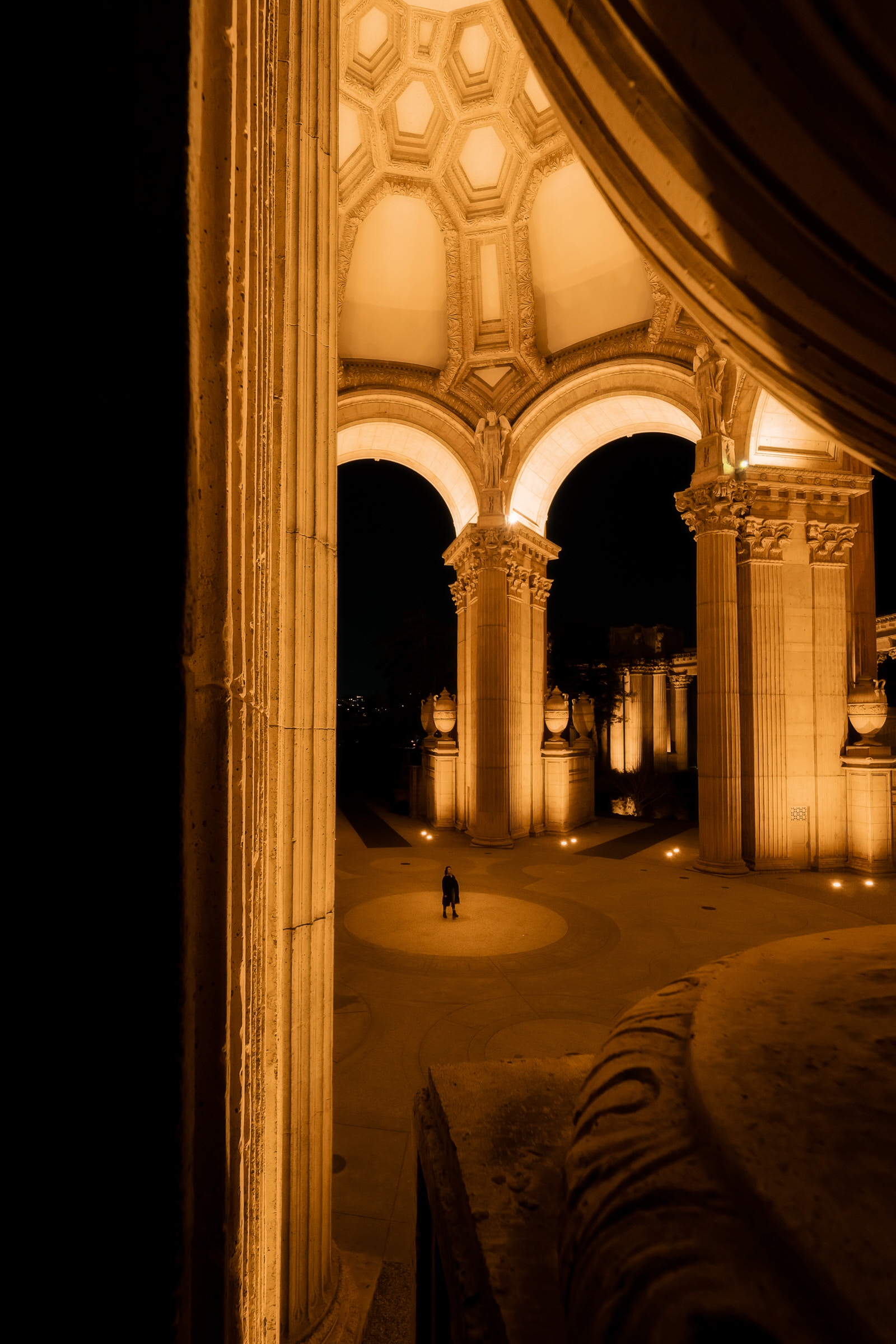
Photo by Elena Cordery on Unsplash
See how tiny this person looks in comparison to the surroundings? If they weren’t in the image, you wouldn’t get a true sense of how massive that structure is.
To Highlight Disparities
Photo by Nick van den Berg on Unsplash
The best way to make an injustice seem real is by putting the haves and the have-nots side by side. A Lamborghini never looks more Lamborghini-ish than when it’s idling next to an old Ford Pinto.
To Grab the Viewer’s Attention
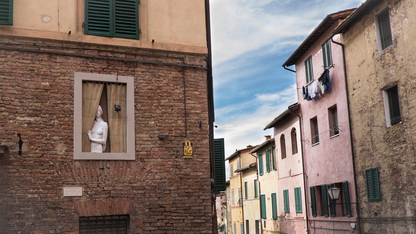
Photo by Alev Takil on Unsplash
This is a picturesque little town, but it’s not what you would call unique. The unexpected statue peeking from behind a curtain, however, stands out against all the other, ordinary windows. That keeps you looking at the image when you might normally have thought, “That’s nice,” and moved on.
Learn from a Pro:
One of the best-known celebrity portraits taken by Annie Leibovitz is this one of John Lennon, nude and wrapped in a vulnerable position around a stiff and passive-looking Yoko Ono. The stark differences between their clothes (or lack thereof) and demeanors speak volumes about the different roles people can play in a relationship.
What Can Be Juxtaposed?
The fun thing about using juxtaposition in your work is how limitless it really is. You can juxtapose many different artistic elements, including (but not limited to) the ones below:
Color
If you’ve read our guide to complementary colors, you know the power of color theory in photography. Juxtaposition allows you to harness this power in new ways:
- Put complementary colors in close proximity to convey tension or just add a little excitement
- Juxtapose warm colors against cool ones
- Guide your viewer’s attention with selective color (juxtapose one saturated area against the rest of the image in black and white)
Accent colors work in a similar way, by putting something a little different next to like colors, and often this type of juxtaposition can actually achieve a certain harmony.
Text
The eye tends to gravitate toward text in an image, so use that to your advantage. Go out and shoot some street photography. Look for text that doesn’t match the surroundings, or maybe a font that doesn’t mesh with the message it’s supposed to be conveying. Graffiti is always fun to play around with! Forgotten construction signs (you’d be surprised how often that happens) or outdated advertisements are other things you can be on the lookout for.
Concept
If your goal is to convey an idea, feeling, or way of thinking, you’re working with a concept. Juxtaposition can be used in this capacity to bring awareness to a problem or highlight an injustice, maybe by putting opulence in close proximity to poverty.
You can also convey friction by using contrasting ideas in the same composition. This can also show cooperation and peace if those ideas are composed so that they do not clash against one another visually. To capture such complex ideas, you may wish to utilize symbols of your respective ideas. Some possible examples:
- A protest sign leaning against a government building
- An expensive sports car parked outside a condemned structure
- Two people from different cultures sitting down to a meal together
Value
Value in this sense refers to the darks and lights in a photo. By placing shadows against spotlights or using different levels of contrast throughout an image, you can juxtapose different values. You already know that contrast adds drama, but if you tend to use it consistently throughout an image, you could try only making one or a few elements really pop against other, lower-contrast ones.
Size and Quantity
Remember the example from earlier of the tiny person standing in the giant structure? Size and quantity are easy to juxtapose, especially with the right angle. A single person drinking coffee on a luxury balcony and looking down at a crowded street conveys peace in the middle of chaos. An empty grocery basket next to fully stocked shelves could talk about the silent hunger epidemic.
Forced perspective can also utilize juxtaposition to add a different view of everyday items or bring whimsy into a dry concept. (The image below is a personal favorite.)
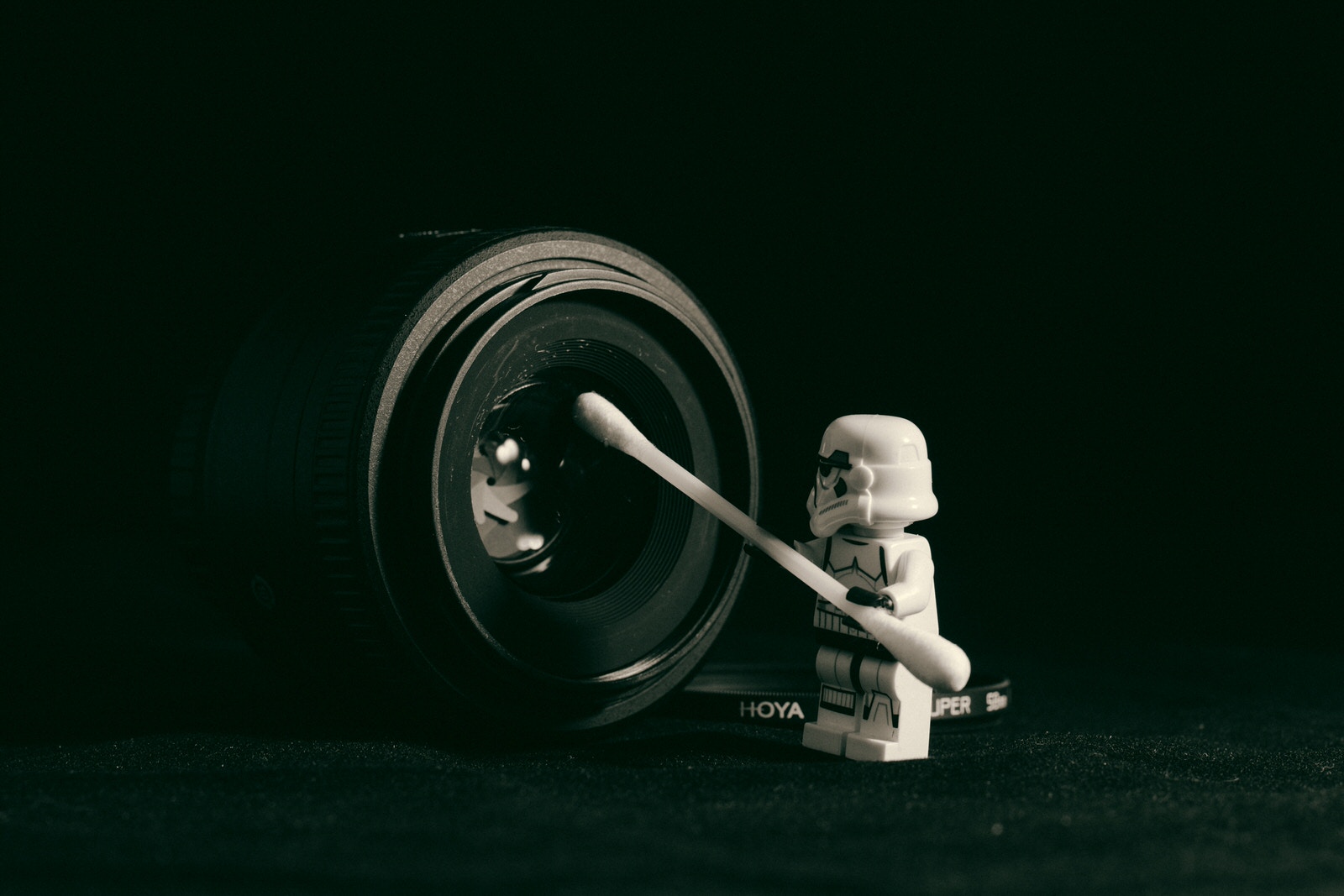
Photo by James Pond on Unsplash
Shapes, Textures, and Patterns
Shapes are everywhere in architecture and interior design, so buildings, homes, and cities have a lot of potential for this type of juxtaposition. Chicago’s Cloud Gate (also known as “The Bean”) may be an overused example, but it demonstrates clearly how different shapes can create a captivating composition when used together. It’s a striking sculpture in its own right, but it stands out more than anything because of the straight lines and mostly rectangular structures that surround it.
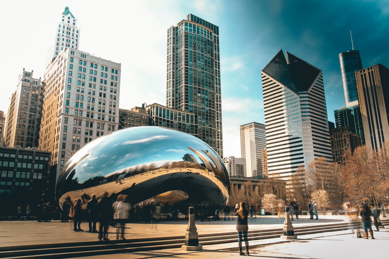
Photo by Sawyer Bengtson on Unsplash
Patterns can clash or work together to direct attention in an image. Whichever effect you’re going for, there’s no denying that different patterns in the same photo are a prime example of juxtaposition.
Textures can be found in fabrics, buildings, and nature to name just a few things. An image of smooth little fingers wrapped around a great-grandmother’s wrinkled hand uses texture to explore deeper concepts than just the way skin looks. It calls the aging process to mind, as well as generational differences and the passage of time in general.
Mixed Media
To take it a step further with texture, you can experiment by combining different artistic mediums with your photography. Painting on top of your prints adds unexpected dimension, for example. Or, you can try mounting your photography in an unexpected way, juxtaposing it with a sculptural element.
Learn from a Pro:
Max Ernst juxtaposed conflicting ideas with collages (like this one) made from cut out photographs. The resulting images spoke indirectly of his trauma after serving in World War I.
Juxtaposing Creatively
Though you can do a lot with juxtaposition in-camera with a single shot, there are other ways to put unlike elements together in your photography:
As Part of a Larger Work
You don’t have to squeeze juxtaposition into a single image to get your point across. It makes a powerful statement in series work, as well. Whether you’re using it across adjacent works that have been hung gallery style or as single compositions formatted as diptychs (or triptychs), there’s a lot of room to play with the idea.
In Post-Processing, Through Masking and Brushes
Using color and value to juxtapose is simple in both Photoshop and Lightroom if you know what to do. Here we’ll walk you through the most straightforward method for both platforms.
As you go, you may want to try out different effects before settling on one. Fortunately, both Lightroom and Photoshop have a snapshot feature. Each time you try a new version, take a snapshot before making any additional changes. The advantage of this over clicking back through your history is that a snapshot temporarily saves all of your layers and changes. That way, you can go quickly from snapshot to snapshot and see which version you prefer.
In Photoshop:
Select an adjustment layer and make your changes. To adjust value, use a Levels, Curves, or Brightness/Contrast adjustment layer. To adjust color, use a Hue/Saturation, Vibrance, or Color Balance adjustment layer.
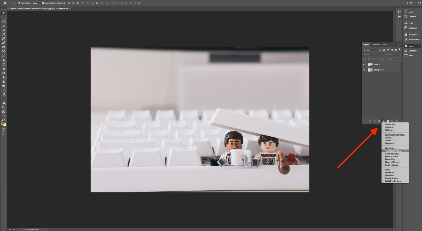
Look for the half-filled-in circle at the bottom of your Layers menu or go to Layer > New Adjustment Layer. (And yes, that’s another witty LEGO shot by James Pond on Unsplash.)
When you select your adjustment layer, there will automatically be a mask applied to that layer. It will be completely white, since you haven’t masked anything in the image yet. Invert the mask (Command + I) to make it black. That means the effect you just created will be invisible for the entire image. Then, use the Brush tool (B) to paint the adjustment back on only where you want it. Make sure your color picker is set to white to do this; painting black onto a black mask does nothing.
To take a snapshot in Photoshop:
Go to your History panel and click the little camera icon at the bottom. A new snapshot will appear at the top of History, beneath the snapshot of your image when it was originally opened.
To Get a Similar Effect in Lightroom:
Use an adjustment brush to paint an effect directly on the image. Create the effect with the relevant sliders (such as Brightness or Saturation). You can alter the size, feathering, flow, and density of the brush to get the right effect or play with Auto Mask to get a more targeted selection.
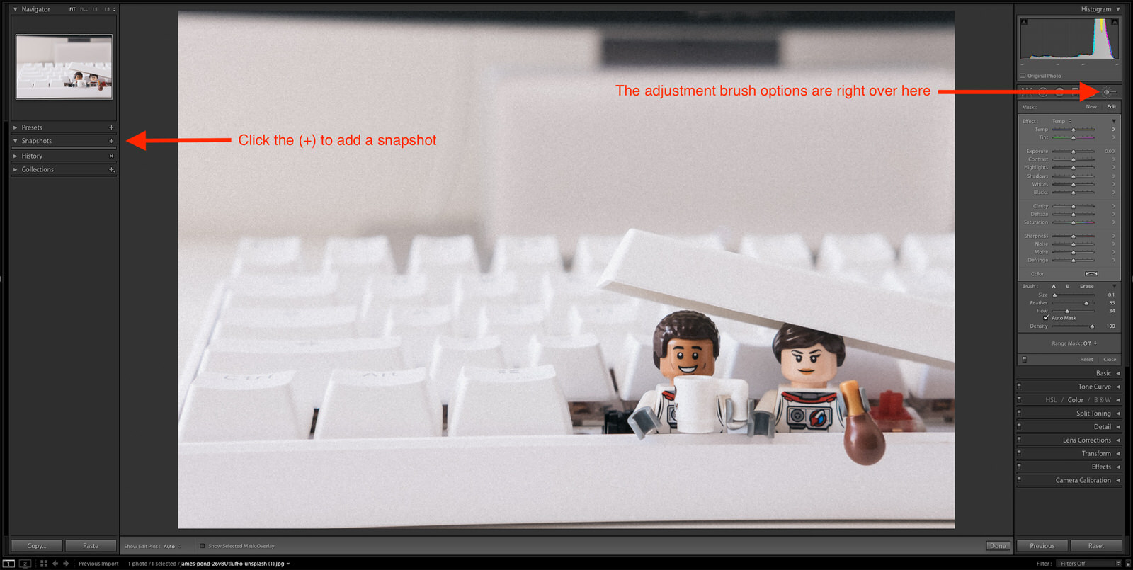
To take a snapshot in Lightroom:
On the left side of the Develop module, find Snapshots (beneath Presets). Click the plus button next to Snapshots to create and name your snapshot. You can also use the keyboard shortcut Command/Control + N.
In Post-Processing, Through Compositing
Sometimes you have an idea that just isn’t going to happen in real life, like this banana lemon hybrid… thing.
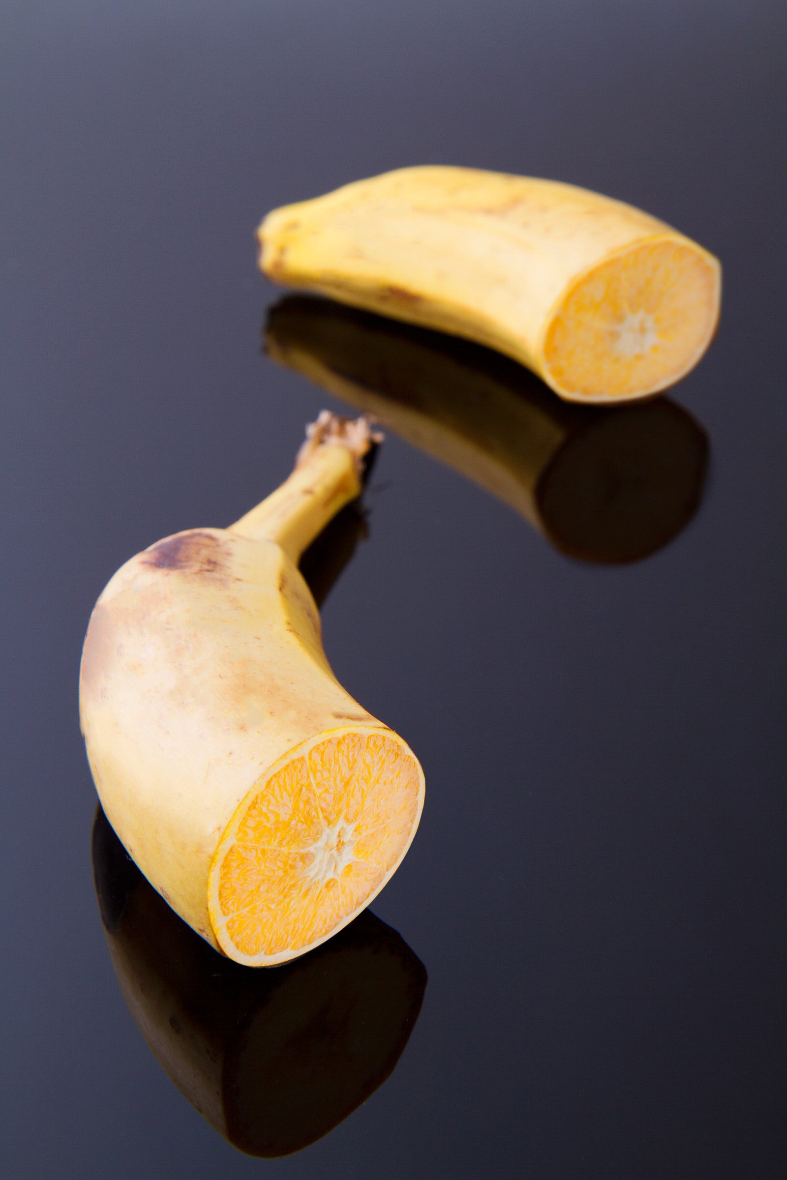
By Nati Torjman on Pexels
In that case, you can learn to composite the elements from that image together in Photoshop. In the beginning, you may just stick with placing different images in one file and masking around them. As you gain confidence, you’ll start getting into more complex techniques, and a world of juxtapositional possibilities will open up to you.
As you learn, follow these basic tips for realistic compositing:
- Start small – Compositing can be time-intensive and complex. Give yourself a few starter challenges (add a book to a bookshelf, for example) to get comfortable with the techniques first.
- Work on layers, lots of layers – Get very friendly with Shift + Command/Control + N. The more layers you have, the more easily you can go back and change things. Create groups (Command/Control + G) to keep them all organized.
- Match the lighting – If the sun’s shining in a different direction on your subject than on everything else in the photo, it’s a dead giveaway that your subject wasn’t originally there.
- Know your focal lengths – A wide-angle shot is going to stretch differently than a telephoto one. You want to plan for that when you’re shooting, be able to visually match up focal lengths when you’re working with stock images, or learn how to warp elements convincingly in post-processing.
- Watch your angles and perspective – This one is tricky to plan for, but you can make minor adjustments with the many options to transform (Command/Control + T) layers and layer groups.
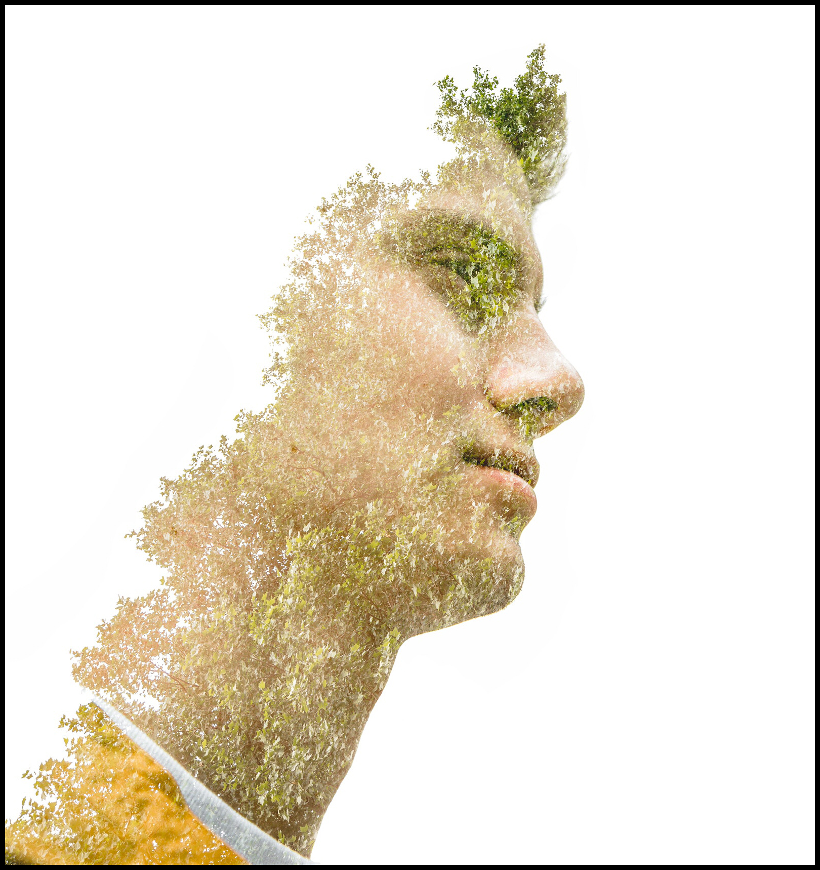
This double exposure juxtaposes tree leaves with a young man’s face. Check out our tutorial to learn more about creating multiple exposures in Photoshop.
Photo by Matt Antonioli on Unsplash
Photo by Matt Antonioli on Unsplash
Multiple exposure in post-processing is a compositing technique that allows you to juxtapose with a little more subtlety – that is, if you want it. With this method, you’re layering unlike elements through one another rather than on top or below. Depending on the level of opacity you choose, this can simply add a touch of texture or create complete chaos. Your call!
Learn from a Pro:
In Robert Doisneau’s portrait of Pablo Picasso, Les Pains de Picasso, hand-shaped loaves of bread sit where Picasso’s actual hands would rest. His serious expression, juxtaposed with those giant, loaf-y fingers, makes for a humorous and iconic shot.
Juxtaposition is a quick and easy way to make a big change in your photo. It’s a versatile compositional element that can be used just about any way you can imagine. Whether you’re looking to inject a bit of humor into a dry concept or highlight a humanitarian concern with a pithy comparison, now you’ve got the tools to do it.