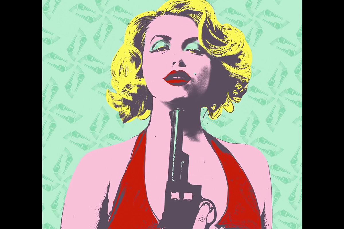

description
Part one of this free two-part pop art project builds the black-and-white silhouette everything else depends on. Working from a specific screen-printed reference, the portrait is duplicated, desaturated, and pushed with Levels into several separate layers, each masked to one area of the image and blended with Multiply. The Filter Gallery’s Stamp filter, stacked with a second effect, then adds the rough, high-contrast texture of a real screen print.
Enjoying This Free Tutorial?
We publish a new free tutorial every week, each one with sample images and PSDs you can download and follow along with. Sign up and they land straight in your inbox, along with early word on sales, events and subscriber-only offers.

Creating Pop Art Using Photoshop
Turning a straight portrait into a screen-printed pop art piece starts with building a convincing black-and-white silhouette, long before any color enters the picture. This first part of a two-part series builds that silhouette using stacked, desaturated Multiply layers, Levels adjustments, and the Filter Gallery’s Stamp filter to recreate the texture of a real screen print.
Working From a Specific Reference Image
Recreating a well-known style starts with studying a specific, real example rather than guessing at the look from memory.
-
Choose a Specific Reference to Study
Pick a well-known example of the style you’re recreating, such as one of the famous screen-printed celebrity portraits of the 1960s, and study it closely before starting.
-
Research How the Original Was Made
Look into the actual technique behind the reference, in this case photographs turned into screens and then screen-printed, so the Photoshop process can aim to recreate that same texture.
Why Working From a Specific Reference Improves the Result
Recreating a specific, well-documented piece rather than a vague general style gives a much clearer target to aim for and a way to judge whether the result is actually working. Studying how references like this were technically made, not just how they look, is what makes it possible to reverse-engineer a similar process in a completely different program.
Bringing the Reference Image Into the Document
Working with the reference directly inside the same document, rather than comparing two separate windows, makes it easier to match the look as you go.
-
Drag the Reference Into the Working Document
Use the Move tool to click and drag the reference image directly into the same document as the photo you’re editing.
-
Resize the Reference for Easy Comparison
Press Cmd/Ctrl+T to shrink the reference image down and position it off to the side for easy comparison while you work.
Building the Base Silhouette Layer
The foundation of the effect starts as a simple desaturated duplicate, aimed only at capturing the darkest shadow areas.
-
Duplicate the Background Layer
Press Cmd/Ctrl+J to duplicate the background layer.
-
Desaturate the Duplicate
Press Shift+Cmd/Ctrl+U to remove all color from the duplicated layer.
-
Adjust Levels to Isolate Shadow Detail
Press Cmd/Ctrl+L to open Levels, and raise the black and white points until the layer shows mainly the areas that should read as shadow.
-
Mask the Layer to Just the Relevant Shading
Add a layer mask and paint black over any areas that aren’t relevant to the shading you’re targeting, keeping only the specific shadow detail you care about, like the shading on the face.
Stacking Multiple Black-and-White Layers in Multiply Mode
Rather than building one perfect layer, the silhouette comes together from several separate black-and-white layers, each targeting a different area, blended together with Multiply.
-
Create a Solid White Base Layer
Add a plain white layer beneath the stack of black-and-white layers to blend against.
-
Set Each New Layer to Multiply
Change each new black-and-white layer’s blending mode from Normal to Multiply so it darkens the layers beneath it rather than replacing them.
-
Adjust Levels Differently for Each Layer
Use Cmd/Ctrl+L on each new layer to push its blacks and whites to a different balance, since each one is responsible for a different level of darkness in a different area.
-
Mask Each Layer to Its Own Specific Area
Add a layer mask to each new layer and paint black or white so it only affects the specific area it was built for, such as the dress, the hair, or an eye.
Why Multiple Targeted Layers Work Better Than One Global Adjustment
Different parts of a portrait, like a face, a dress, and hair, need very different amounts of darkness and detail to read correctly as a silhouette. Building several separate layers, each tuned and masked for one specific area, allows every part of the image to get exactly the treatment it needs rather than forcing one setting to work everywhere at once.
Adding Screen-Print Texture With the Filter Gallery
The Filter Gallery’s Stamp filter, layered with other filters, recreates the rough, high-contrast texture of a real screen print.
-
Open the Filter Gallery and Apply Stamp
Go to Filter > Filter Gallery and apply the Stamp filter, pressing D first to reset the foreground and background colors to black and white.
-
Adjust Smoothness and Light/Dark Balance
Use the Smoothness and Light/Dark Balance sliders within the Stamp filter to control how much detail and contrast comes through.
-
Stack a Second Filter on Top
Add a second filter effect, such as Angled Strokes, on top of the Stamp filter within the same Filter Gallery dialog to further change the amount of visible detail.
Why Stacking Filters Inside the Filter Gallery Matters
The Filter Gallery allows more than one filter effect to be layered on top of each other in a single dialog, and toggling a second filter like Angled Strokes on and off noticeably changes how much detail the Stamp filter underneath ends up revealing. That layering is what makes it possible to fine-tune the amount of screen-print-style texture on each individual masked area rather than settling for one fixed look.
Knowing When to Stop Adding Layers
With enough layered detail built up, judging the result against the reference image is what determines whether more layers are actually needed.
-
Compare Regularly Against the Reference
Toggle layers on and off while comparing the result to the reference image to judge whether more detail is genuinely needed in a given area.
-
Add Layers Only Where Comparison Shows a Gap
Continue creating new duplicated, filtered, masked layers only for areas where the comparison reveals a clear gap, such as under an eye or along an arm.
Why This Approach Works
Building the silhouette from several separately masked, separately leveled Multiply layers, rather than one global adjustment, is what makes it possible to give every part of a portrait exactly the amount of darkness and detail it needs. Layering multiple Filter Gallery effects on top of each other, instead of settling for a single filter’s default look, is what gets the texture close to a real screen print rather than an obviously digital effect. Working from a specific, well-researched reference throughout keeps every decision anchored to a real target instead of guesswork.
Final Thoughts
This silhouette stage is the unglamorous but essential foundation the whole pop art effect depends on, since without a convincing black-and-white base, no amount of coloring later will make the final image read as pop art. Even setting aside the specific reference image, the underlying habit of stacking multiple targeted, masked adjustment layers instead of reaching for one global fix is worth carrying into completely different kinds of edits. Part two of this series picks up from here to add color and build out the background.
Quick Reference: Keys, Menus and Settings
- Bring in the referenceMove tool drag into the document, then Cmd/Ctrl + T to shrink it
- Copy and desaturateCmd/Ctrl + J, then Shift + Cmd/Ctrl + U
- Isolate the shadowsCmd/Ctrl + L: raise the blacks and the whites
- Blend the layersBlend mode Normal to Multiply, over a plain white layer
- Show one area onlyAlt/Option-click the layer mask icon for a black mask, paint white
- Screen-print textureD, then Filter > Filter Gallery > Stamp (Smoothness, Light/Dark Balance), Angled Strokes on top
Pop Art in Photoshop: Common Questions
Why build a black-and-white version before adding color?
The dark outline is what makes the image read as a screen print. Part 1 builds that silhouette from stacked black-and-white layers; Part 2 paints flat color underneath it.
Should I keep the reference image open while I work?
Yes. Drag it into your document with the Move tool, press Cmd/Ctrl + T and shrink it off to one side, so you can compare as you go. Aaron works from Andy Warhol’s Marilyn Monroe prints.
How do I start the silhouette layer?
Press Cmd/Ctrl + J to copy the background layer and Shift + Cmd/Ctrl + U to remove its color. Then press Cmd/Ctrl + L and push the black and white points until the layer mostly shows the shadows.
Why set the layers to Multiply?
Multiply lets each black-and-white layer only darken what is below it, so several layers build up together over a plain white layer instead of covering each other.
Why use several layers instead of one?
The face, dress, hair and eyes each need a different amount of darkness and detail. Each layer gets its own Levels setting and a mask so it only shows in its own area.
How do I make a layer show in just one area?
Hold Alt/Option and click the layer mask icon to add a black mask that hides the whole layer, then paint white where you want it. Press Cmd/Ctrl + I on a mask to flip it.
Why is the Stamp filter red and white?
Stamp uses your foreground and background colors. Press D for the default black and white before you go to Filter > Filter Gallery.
Can I use more than one filter in the Filter Gallery?
Yes. Add a second effect, like Angled Strokes, on top of Stamp. A longer Stroke Length lets less detail through, so toggle it on and off to compare.
From the Magazine View all
Stories, interviews and guides for photographers, new every week.
 EditingLightCraft vs Lightroom: I Edited the Same RAW Files in BothThe free clone on the same RAW files: what matches, what breaks and who should switch.
 InspirationRare Historical Photos: 13 of the Rarest Pictures Ever TakenFrom the earliest surviving picture of a person to the last passenger pigeon: who took each one and why it survives.
 EditingArtCraft: Photoshop Cloned by AI in Two Weeks. Is It Legal?ArtCraft cloned Photoshop and Lightroom with AI and gave them away. Any good? Legal? Safe?
Master Photoshop, Lightroom and Photography
Join PHLEARN PRO for $12.99 a month, or $99.99 a year (save 36%). Cancel anytime, with a 100% money-back guarantee.