Download Assets
description
Learn how to turn any color into a gradient in Photoshop! This tutorial guides you through selecting objects, applying custom gradients, and adjusting blend modes for vibrant results.
Go PRO:
Explore more about color with our PRO tutorial Advanced Color Grading in Lightroom & Adobe Camera RAW . You’ll learn how to perfect your hues, highlight your subjects, and craft unique visual styles.
Image Source
- Tochukwu Ekeh
Images sourced from Pexels.
Share

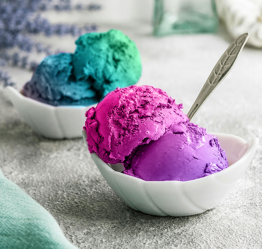
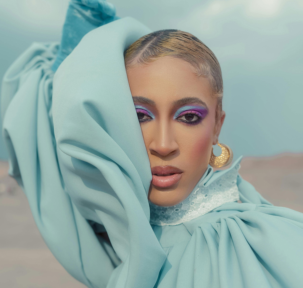
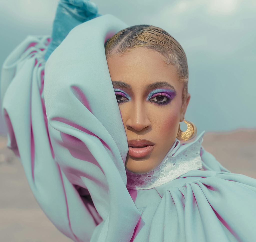
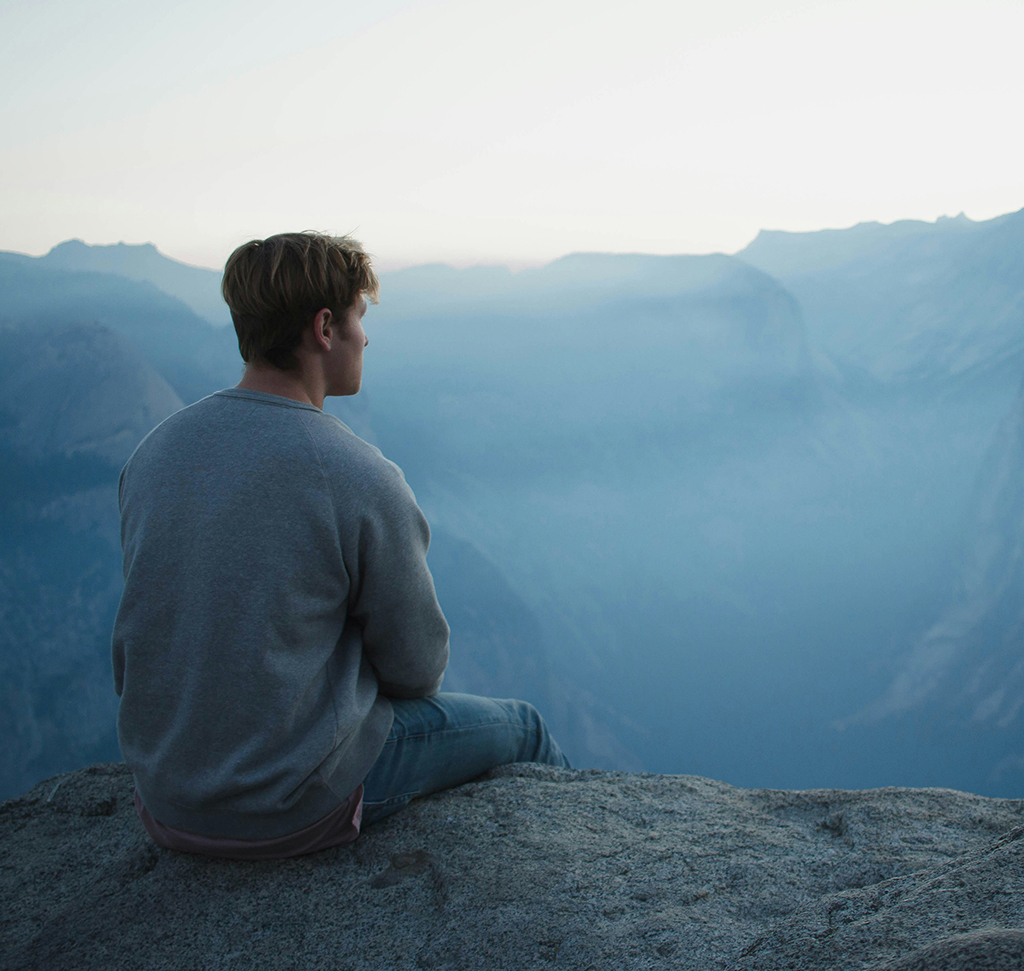
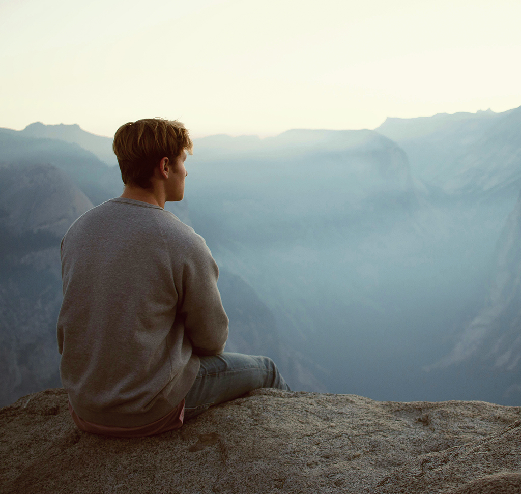
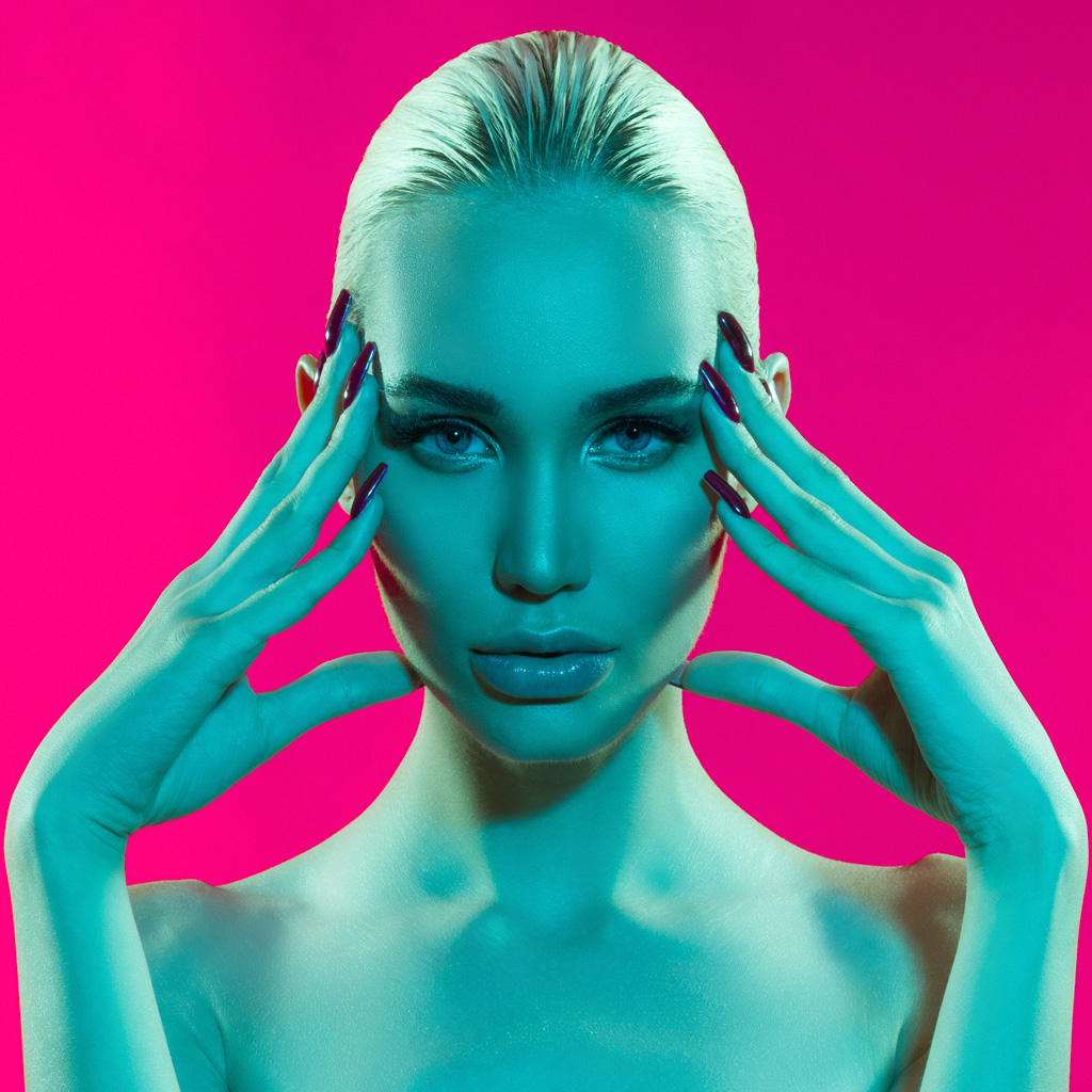
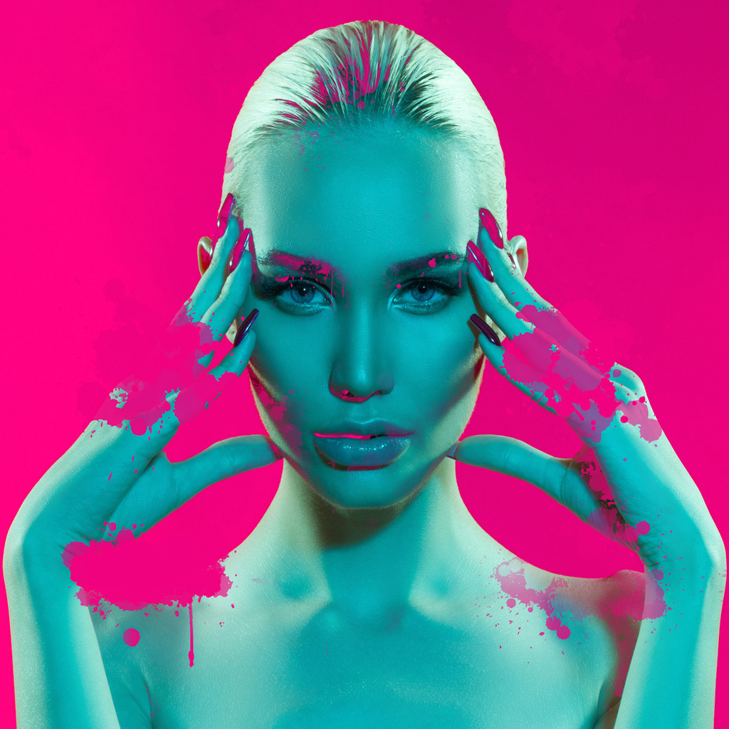
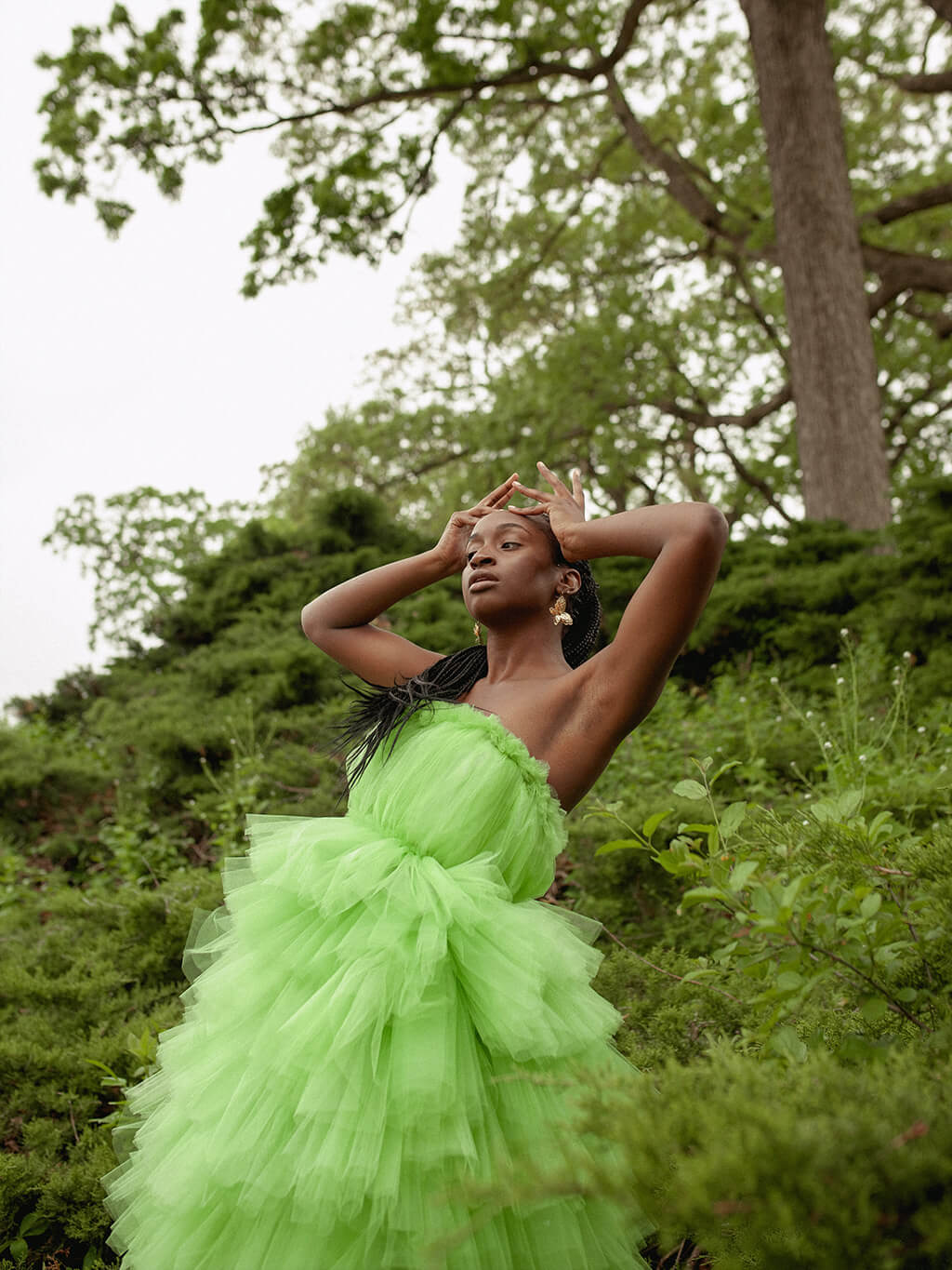
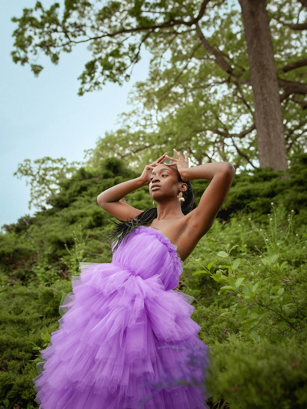
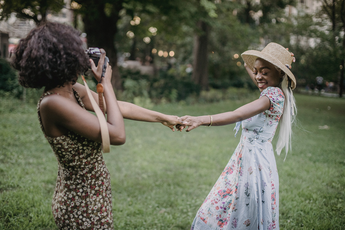
AFTER
BEFORE
Your Vision, Gradient Perfect.
This guide will show you how to transform any color into a beautiful, customizable gradient in Photoshop. Learning this technique opens up a world of creative possibilities, allowing you to add depth and visual interest to your images, whether you’re enhancing an object or creating striking backgrounds. It’s a fun and easy way to add a professional touch to your Photoshop projects.
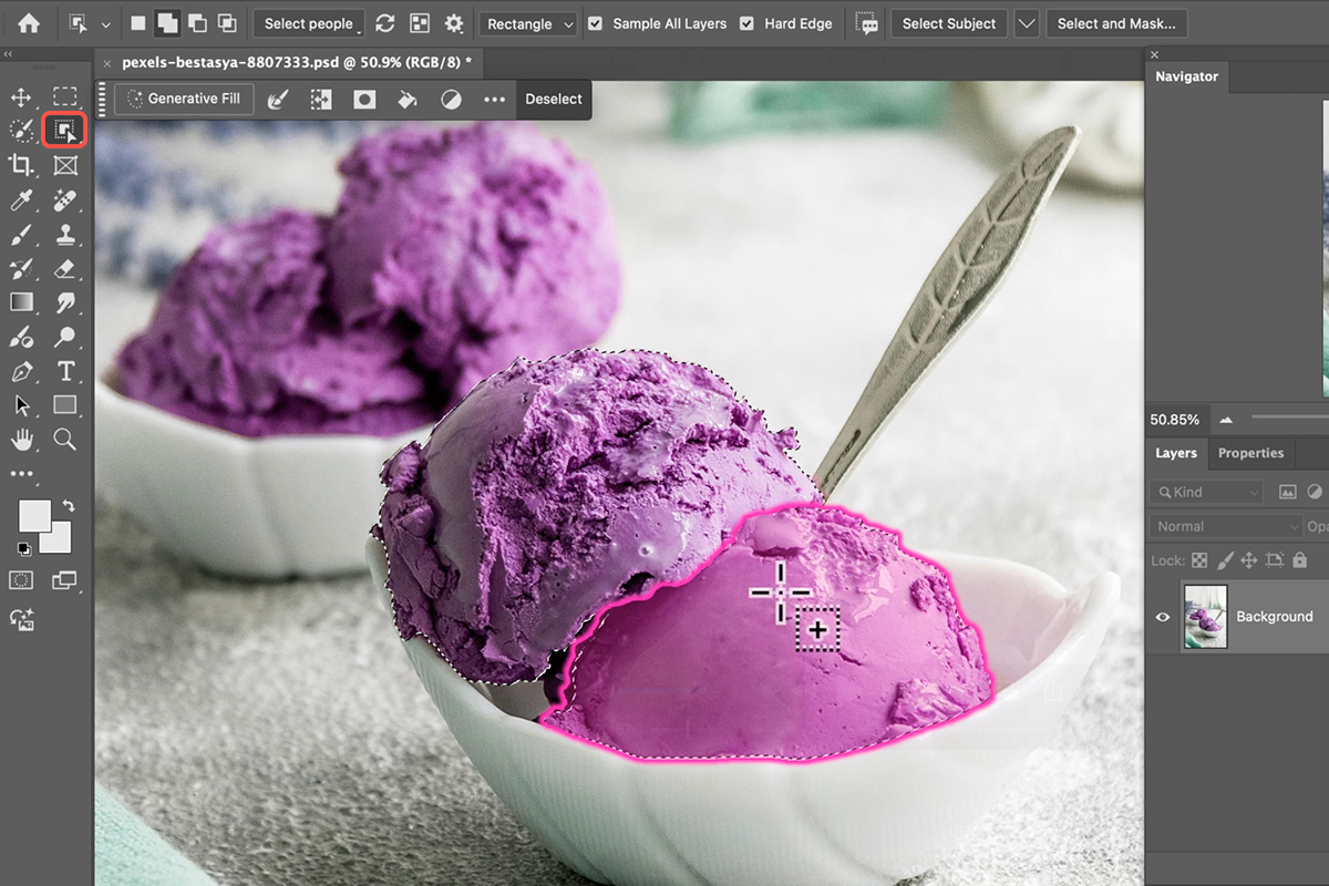
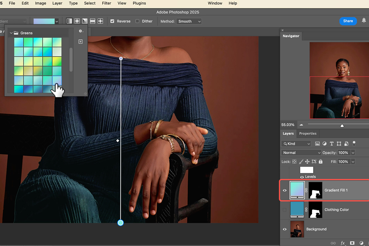
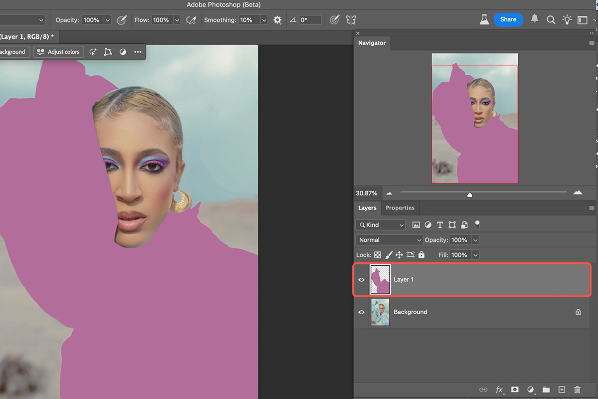
Object Selection First
1. Begin by selecting the object you wish to gradientize. Use the Object Selection tool (Keyboard Shortcut “W”). Simply hover over the object and click to create an initial selection. If the selection isn’t perfect, hold Shift and click on additional areas to add to the selection.
2. For more precise adjustments, switch to the Selection Brush tool (Keyboard Shortcut “L” and then select the Selection Brush from the toolbar) to paint in any missed areas. Ensure your entire desired object is perfectly selected before moving on.
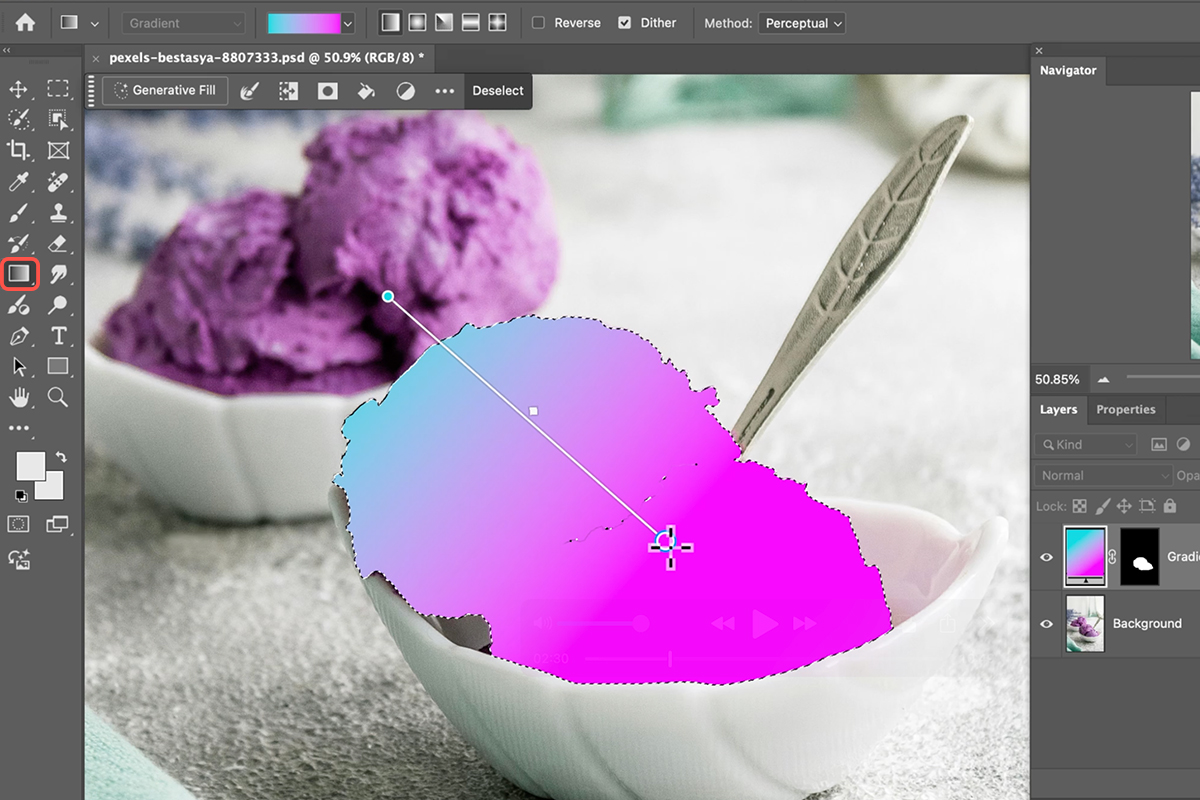
Apply The Gradient
3. With your object selected, it’s time to apply the gradient. Access the Gradient tool (Keyboard Shortcut “G”). In the top bar, select “New Gradient” for more control over your colors.
4. Click on the color dropdown to explore various pre-set gradient options, such as purples or sun-like effects. You can also choose different gradient shapes like linear or radial.
5. Once you’ve chosen your gradient, click and drag across your selected object in the direction you want the gradient to appear.
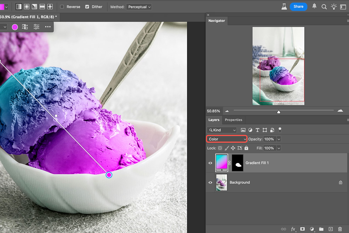
Adjust Blend Mode
The next crucial step is to adjust the blend mode of your new gradient layer.
6. Locate the layer blend mode in the Layers panel, which is typically set to “Normal” by default. Click on this setting and change it to “Color”. This blend mode will apply the gradient’s colors while preserving the underlying details of your original object. For a slightly less vibrant effect, you can also experiment with the “Hue” blend mode.
Fine-Tune Your Gradient
Once the blend mode is set, the fun truly begins! You can easily move the gradient on your layer to change its positioning. Even better, you can customize the gradient’s colors by clicking on the individual color stops on the gradient bar. This will bring up your contextual taskbar where you can select new colors from the color picker or choose from different gradient presets. Experiment with different colors and positions to achieve your desired aesthetic, creating unique and eye-catching effects.
Download Assets
description
Learn how to use Photoshop’s color channels for two powerful tasks. Master cutting out objects with soft edges, like clouds or hair, by leveraging image contrast within channels. Plus, discover a unique method to create artistic color effects that are impossible with standard adjustments.
Go PRO:
New to Photoshop? Explore our PRO tutorial Photoshop Fundamentals: Aaron’s Top 10 Essential Tools & Techniques . Discover mind-blowing tricks for selecting, removing, retouching images, and more!
Image Source
- Sergey Vinogradov
- Keven Ohlew
Images sourced from Pexels.
Share

AFTER
BEFORE
Color Channels Made Easy
Understanding Photoshop’s Color Channels is crucial for unlocking advanced image editing. While seemingly complex, channels offer unparalleled precision for cutting out objects with intricate, soft edges like hair or clouds, and also provide a unique avenue for creating stunning, artistic color effects that are otherwise impossible to achieve.
Identify Best Channel
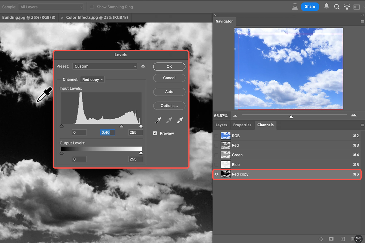
1. Open your Channels panel by going to Window > Channels. Here, you’ll see your image broken down into its Red, Green, and Blue color information, plus the combined RGB channel.
2. Toggle through the individual Red, Green, and Blue channels to identify the one that exhibits the highest contrast between the object you want to select and its background. For example, a blue sky will appear lightest in the Blue channel and darkest in the Red channel.
3. Once you’ve identified the channel with the best contrast, duplicate it by dragging it to the “New Channel” icon at the bottom of the Channels panel.
4. Enhance its contrast by using Levels (Keyboard Shortcut Ctrl/Cmd + L), pushing the darks darker and the lights lighter.
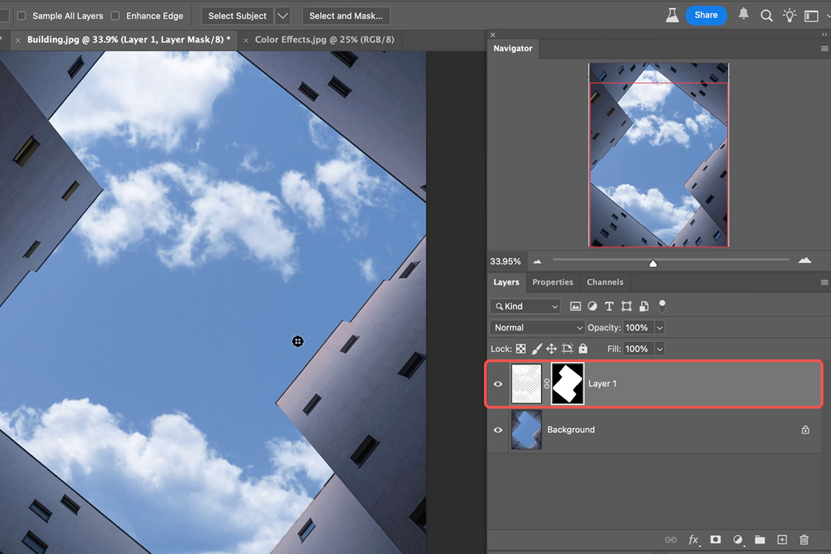
5. To turn this high-contrast channel into a selection, hold Ctrl/Cmd and click on the channel’s thumbnail, or click the “Load channel as selection” icon at the bottom. This will select the light areas of the channel.
Integrate Your Cutout
6. With your selection active, go back to your Layers panel.
7. Create a new layer, fill the selection with white (or the appropriate color for your object), and deselect (Keyboard Shortcut Ctrl/Cmd + D). You now have a perfectly cut-out object with transparent edges.
8. Drag this layer to another document and use Ctrl/Cmd + T to transform its size and position. If integrating into a new background, you might apply a layer mask to the new background and then unlink the layer and mask (by clicking the chain icon between them) to allow independent movement of your cutout for precise placement.
Explore Color Art
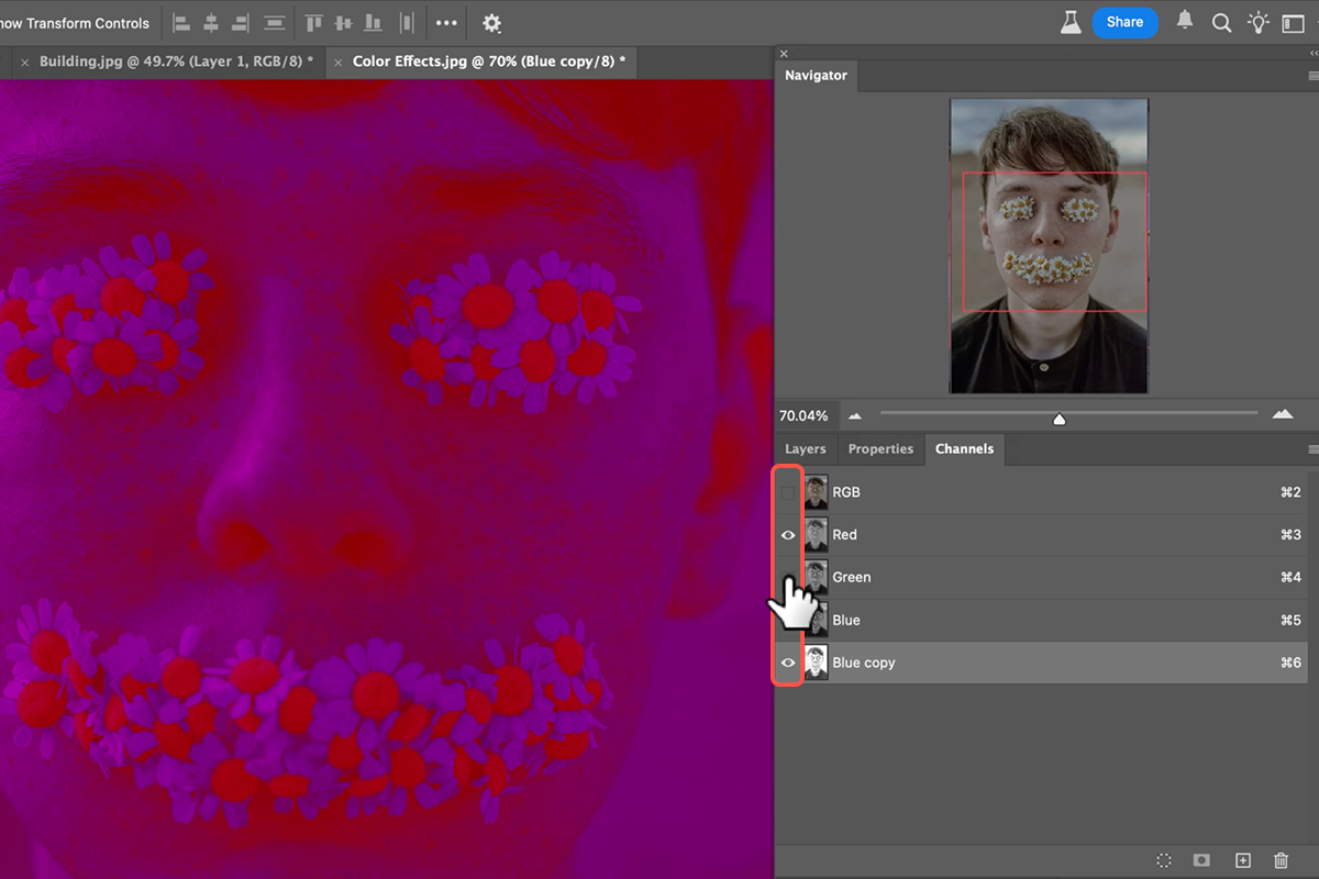
Channels aren’t just for selections; they’re a playground for creative color.
1. With your image active, go to the Channels panel. Duplicate a channel (e.g., the Blue channel), and then apply Levels (Ctrl/Cmd + L) to this duplicated channel, experimenting with the sliders.
2. Now, here’s the fun part: start toggling the visibility of the RGB and individual color channels (including your duplicated ones) on and off. You’ll discover unique, abstract color effects that morph with each combination.
Keep in mind that exporting these specific visual effects directly can be tricky; but a common workaround is to use screenshots and Photomerge.
Download Assets
description
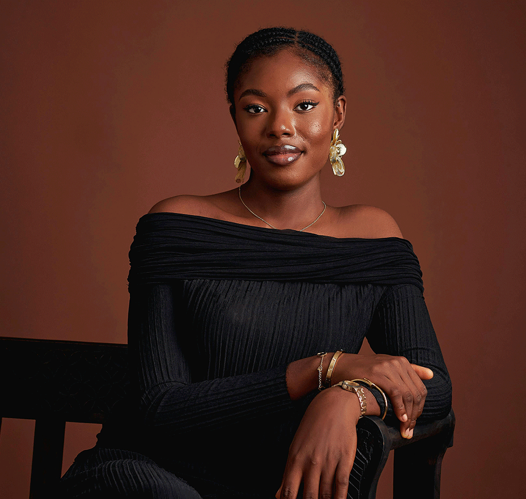
Learn how to effortlessly transform black clothing and objects into any color in Photoshop! Discover a unique method for recoloring by extracting the original highlights and shadows, then seamlessly blending them with a new solid color or even gradients. Perfect for giving your images a fresh, vibrant look!
Go PRO:
Explore more about color with our PRO tutorial Advanced Color Grading in Lightroom & Adobe Camera RAW . You’ll learn how to perfect your hues, highlight your subjects, and craft unique visual styles.
Image Source
- Tochukwu Ekeh
Images sourced from Pexels.
Share
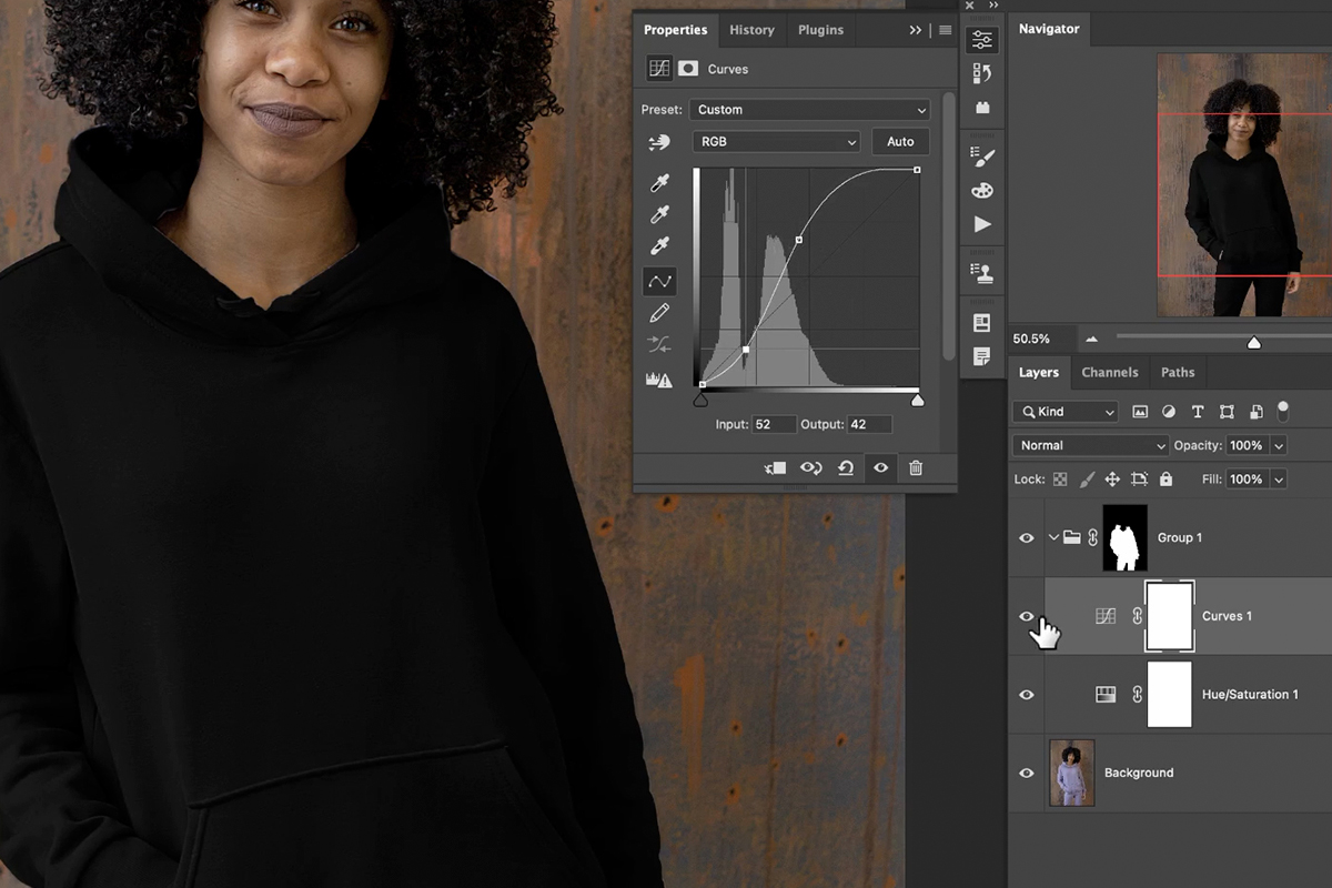
Recolor Black, The Easy Way
It can be tricky to change the color of black clothing or objects in Photoshop because black doesn’t contain the color information that tools like Hue/Saturation need. In this tutorial we’ll show you an ingenious method that makes transforming black to any other vibrant color as easy as ever, giving you complete control over your image’s aesthetic.
Getting Started
1. Open the image you want to edit in Photoshop.
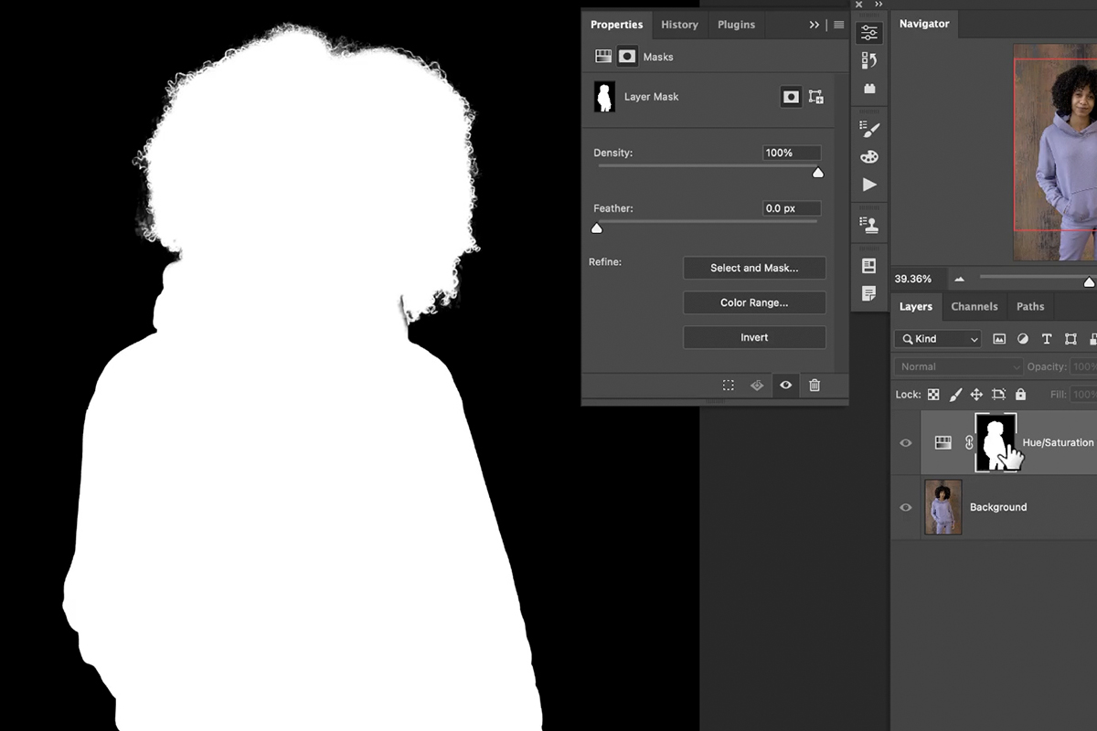
2. select the black clothing or object you want to recolor. Use the Object Selection Tool (keyboard shortcut “W”) and leverage its “Select People” feature to quickly isolate the clothing.
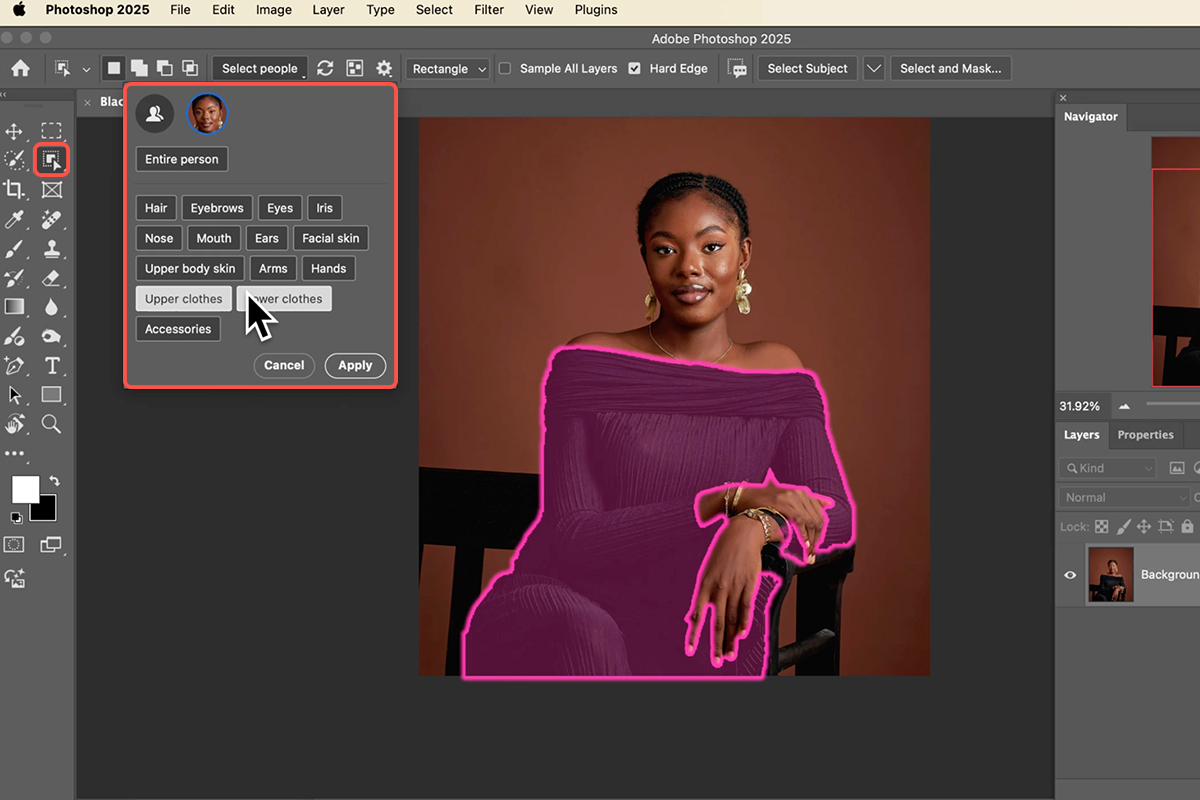
3. After the initial selection, fine-tune the mask on the solid color fill layer using the Brush Tool (keyboard Shortcut “B”) to ensure only the desired area is selected.
4. With your selection active, create a Solid Color Fill Layer. Go to Layer > New Fill Layer > Solid Color. Choose your desired color.
Don’t worry about perfection now, as you can easily change it later! This layer will serve as the base for your new color, and the selection will automatically become its layer mask.
Isolate Texture Details
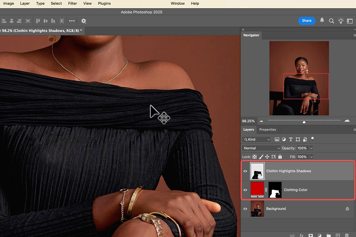
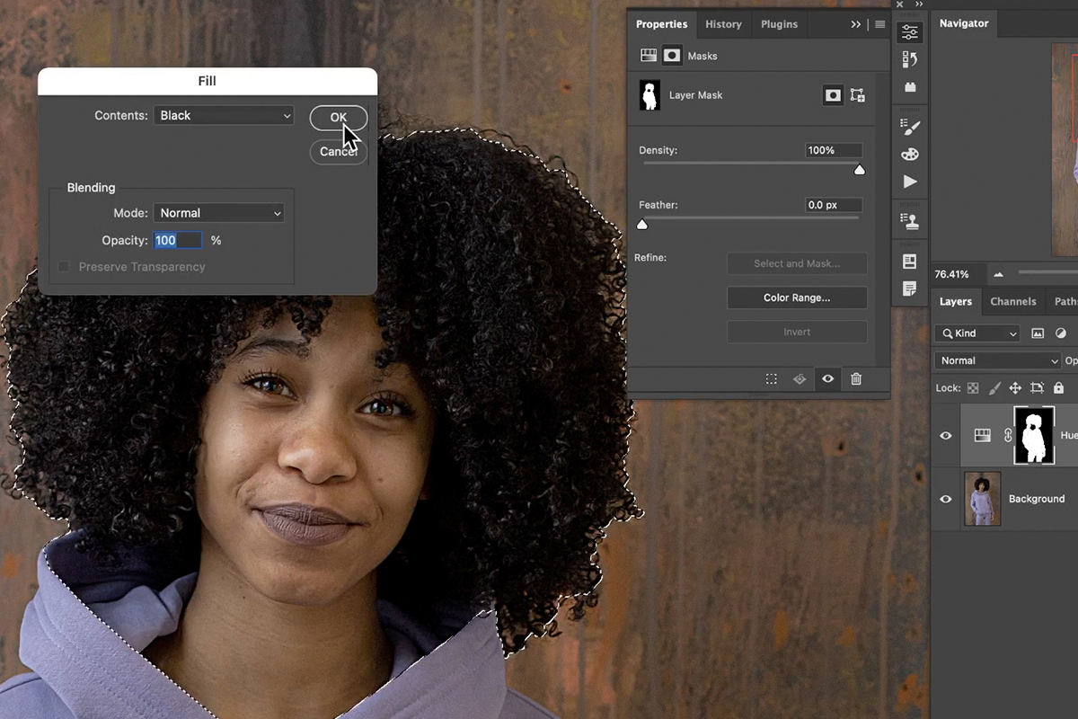
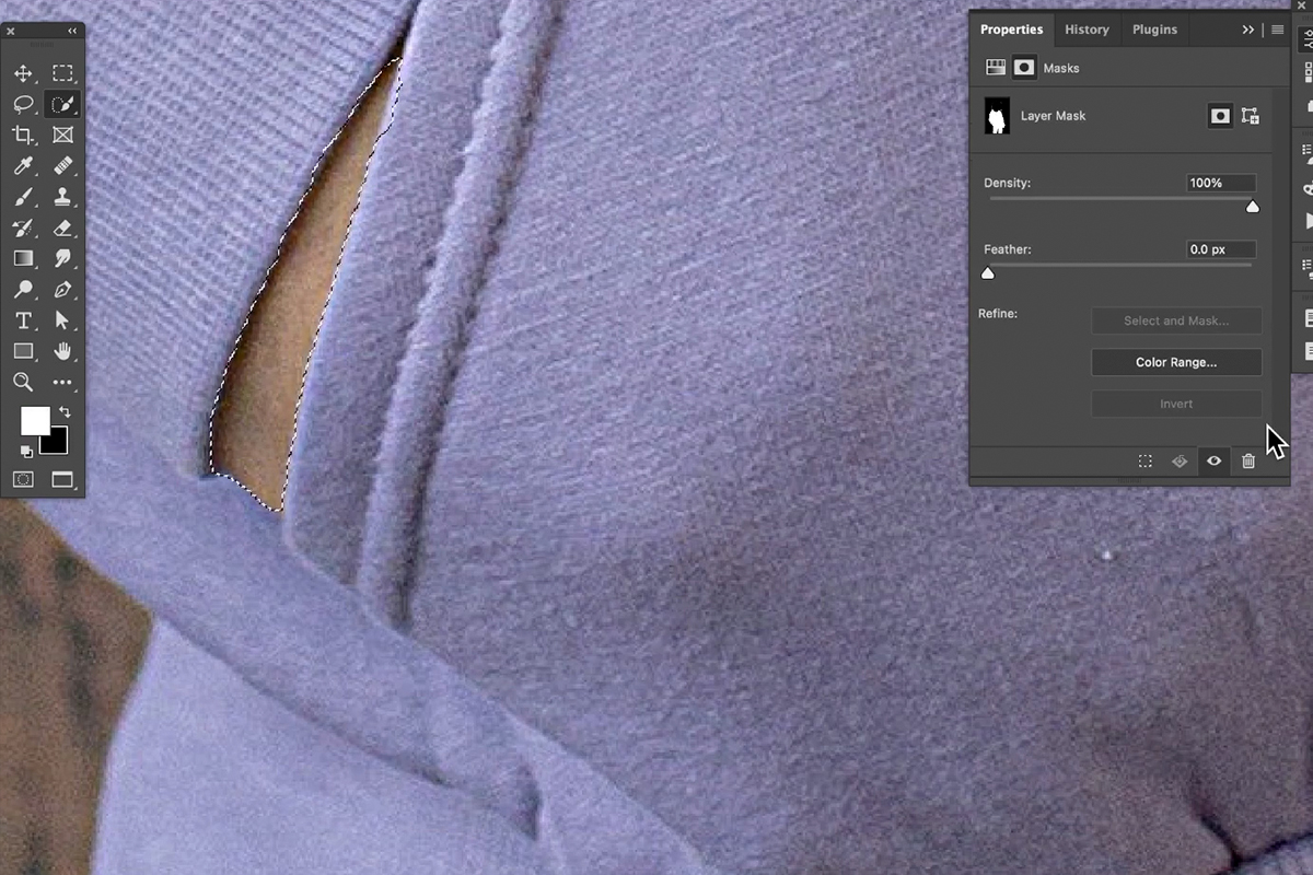
5. Next, extract the highlights and shadows from the original black clothing. Hold Ctrl/Cmd and click on the layer mask of your new color fill layer to reactivate the selection.
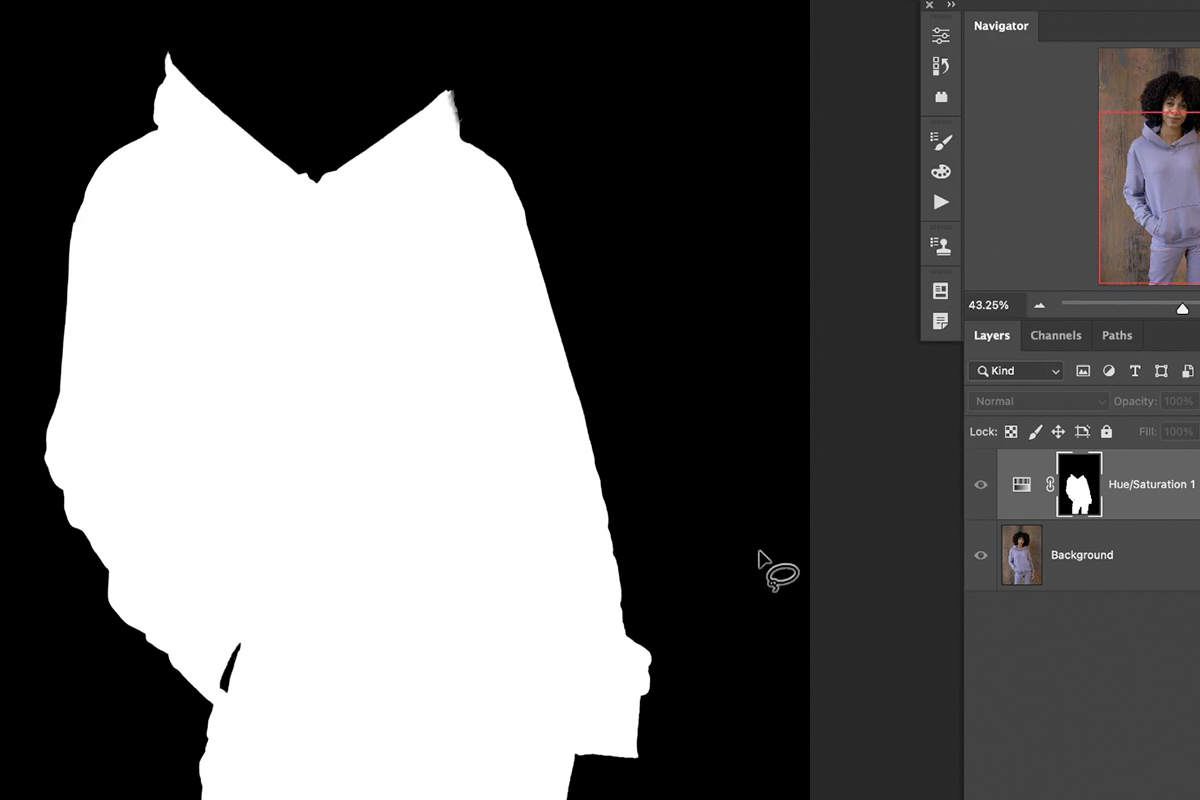
6. Then, with your background layer selected, press Ctrl/Cmd + J to duplicate only the selected clothing onto a new layer.
7. Rename this new layer something descriptive like “clothing highlights and shadows” and ensure it’s positioned above your solid color fill layer.
Blend and Refine
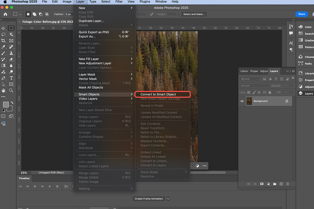
8. Convert your “clothing highlights and shadows” layer into a Smart Object (Layer > Smart Objects > Convert to Smart Object). This allows for non-destructive edits.
9. Change its blend mode to Multiply.
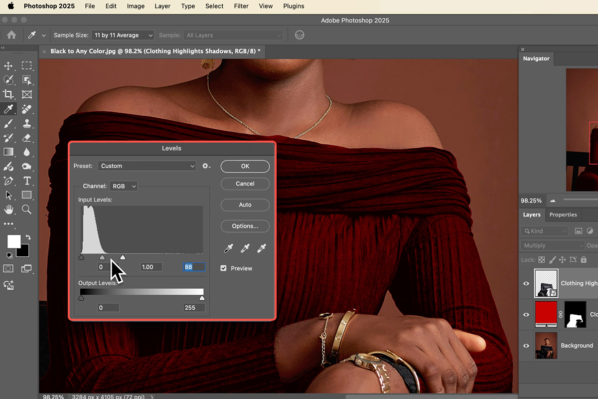
10. Apply a Levels adjustment (Ctrl/Cmd + L) to this Smart Object.
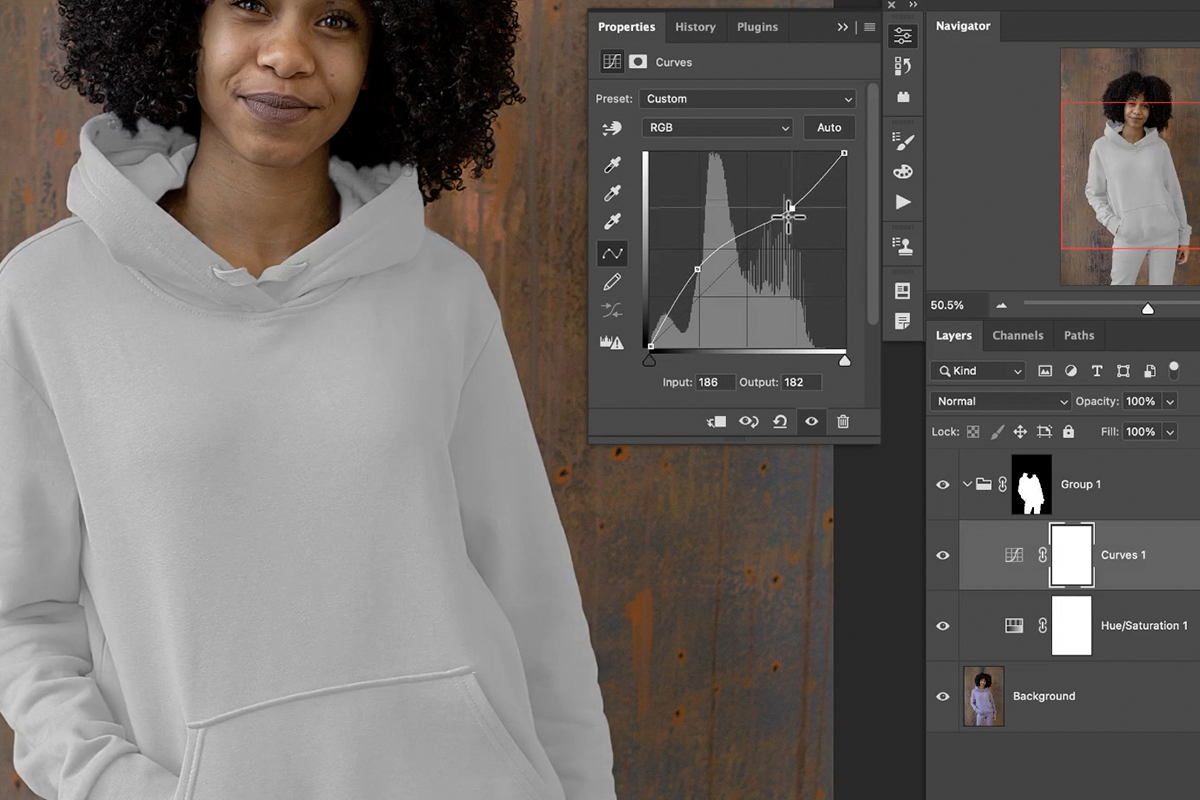
By adjusting the white, black, and midtone sliders, you can precisely control how the original highlights and shadows blend with your new color, making the transformation seamless and realistic. You can double-click on the color fill layer’s swatch to change the hue at any time.
Bonus Gradient Effects
For an even more dynamic look, you can apply a gradient instead of a solid color. To do so, simply create a new Gradient Fill Layer (or switch your Solid Color Fill Layer to a Gradient Fill Layer). Then, hold Alt/Option and click and drag the layer mask from your “clothing color” layer to the new gradient layer. This will copy the mask, allowing the gradient to beautifully fill the shape of the clothing.
This powerful technique ensures your recolored black objects retain all their original texture and depth, making the changes appear natural and professional. Experiment with different colors and gradients to achieve stunning results every time!
Download Assets
description
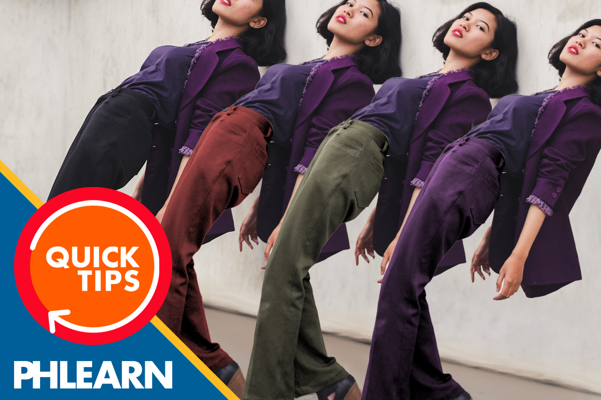
Learn how to color coordinate images in Photoshop! This tutorial shows how to select clothing, sample a desired color, and apply it using a hue blend mode. You’ll also discover the power of “Blend If” to create a stunning two-toned effect, allowing different colors to appear in the highlights and shadows for a cohesive and vibrant look.
Go PRO:
Explore more about color with our PRO tutorial Advanced Color Grading in Lightroom & Adobe Camera RAW . You’ll learn how to perfect your hues, highlight your subjects, and craft unique visual styles.
Share
AFTER
BEFORE
Color Your World
Color coordinating images in Photoshop can dramatically enhance your photos’ visual appeal, making them look professionally cohesive and harmonized. We’ll teach you a fun and effective technique to borrow colors from one part of your image and seamlessly apply them to another. Let’s get started!
Select Your Subject
1. First, open your image in Photoshop.
2. Grab the Object Selection tool from the toolbar. You can simply click and drag to select your subject’s clothing. Alternatively, you can use the Select Subject tool.
3. Once selected, refine your selection by holding Alt or Option to subtract areas you don’t want to color (like skin or accessories). For more precise control, use the Selection Brush tool and hold Alt or Option to paint away unwanted sections.

Apply New Color
4. With your selection active, it’s time to sample the desired color. Press B for the Brush tool, then hold Alt/Option to activate the Eyedropper tool.
5. Click on the color you want to use (e.g., the purple eyeliner).
6. Next, create a New Layer.
7. Go to Edit > Fill, and select Foreground Color (which will be your sampled color). Hit OK.
8. Now, deselect by pressing Ctrl/Command + D. Your selected area will now be filled with the new color. No worries, if it doesn’t look quite right yet!
Refine with Blending
9. To seamlessly integrate the new color, change the layer’s Blend Mode. Locate the Blend Mode dropdown (usually set to “Normal”) and change it to Hue. This will apply the new color while preserving the original saturation and highlights/shadows for a more realistic look. If you desire a more uniform vibrancy, you can try “Color” mode, but “Hue” often yields better results.
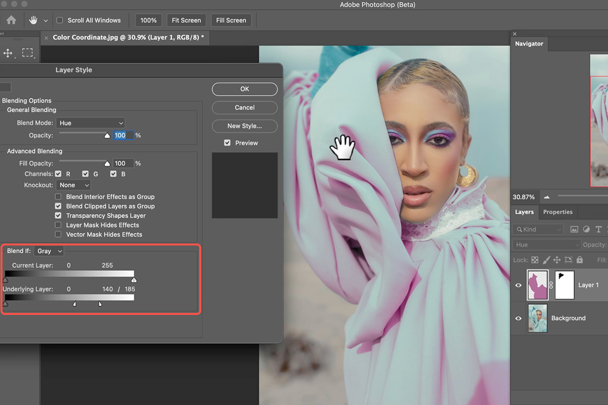
10. For an advanced touch, double-click in the gray area next to your layer to open Layer Style.
11. Use the Blend If sliders under “Underlying Layer” to fade between the original and new colors, creating a two-toned effect. Hold Alt/Option while dragging a slider to split it, providing a smoother, feathered transition. This allows you to selectively apply the new color to highlights or shadows for dynamic visual effects.
You’re all set! We hope this guide helps you confidently color coordinate your images in Photoshop. Remember, you can always experiment with different colors and “Blend If” settings to discover unique and beautiful effects.
Download Assets
description
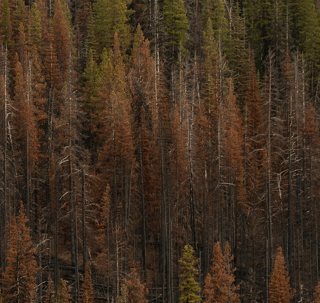
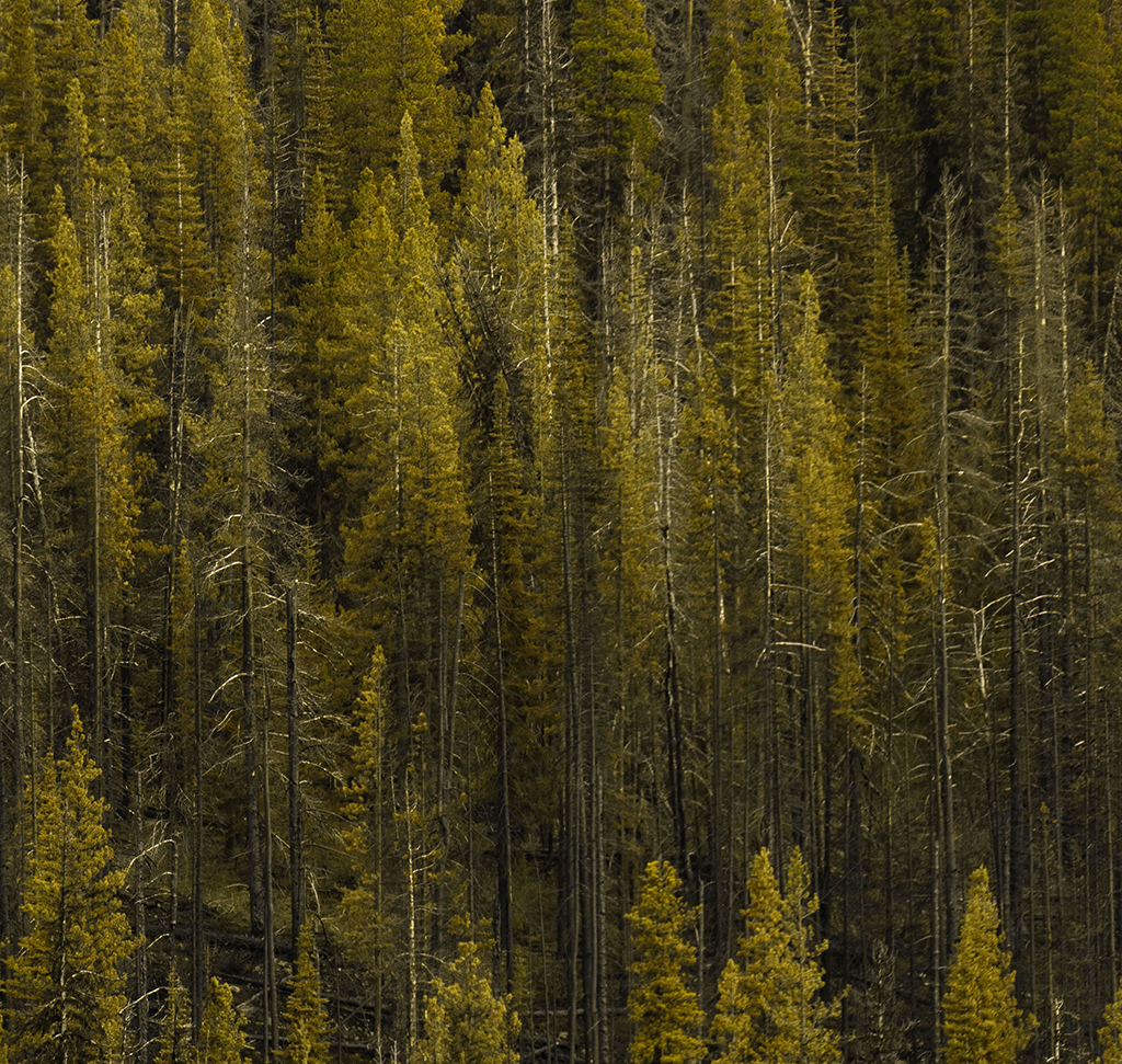
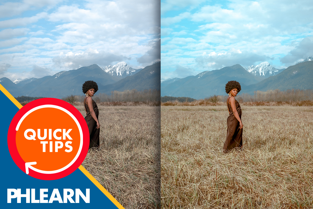
Learn how to revive dull trees in your photos using Photoshop’s Camera Raw filter. This tutorial will show you how to easily select and adjust hues, saturation, and luminance to transform lifeless foliage into vibrant, natural-looking greenery.
Go PRO:
Want to take things to the next level? Explore our PRO tutorial Advanced Landscape Editing in Photoshop & Adobe Camera RAW . Learn precise adjustments, advanced sky replacement, color grading, and more!.
Image Source
- Matt Richmond
Images sourced from Pexels.
Share
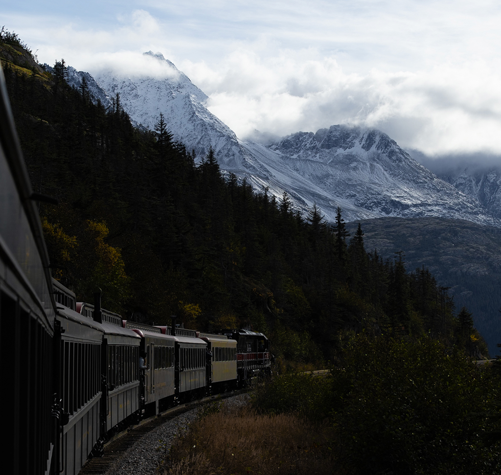
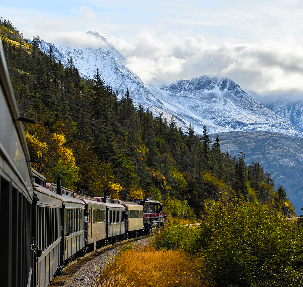
AFTER
BEFORE
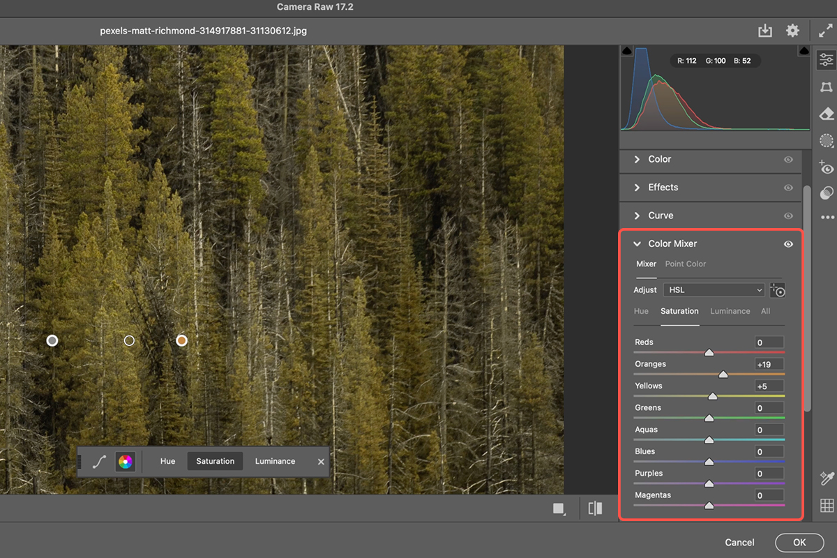
Revive Dull Foliage
Often, natural elements in our images can appear washed out or nearing the end of their season, even if the rest of the photo is perfect. Learning to selectively enhance these greens can dramatically improve the overall vibrancy and realism of your nature shots, and even photos with people where trees are in the background, making your images truly pop. This easy technique is the perfect solution. Let’s jump into Photoshop!
Getting Started
1. Open your image in Photoshop.
2. To ensure you can always go back and make changes without damaging your original image, convert your background layer to a Smart Object. To do this, go to Layer > Smart Objects > Convert to Smart Object (you can also right click on the layer and select “Convert to Smart Object”). This allows you to apply “Smart Filters” which are non-destructive and fully editable.
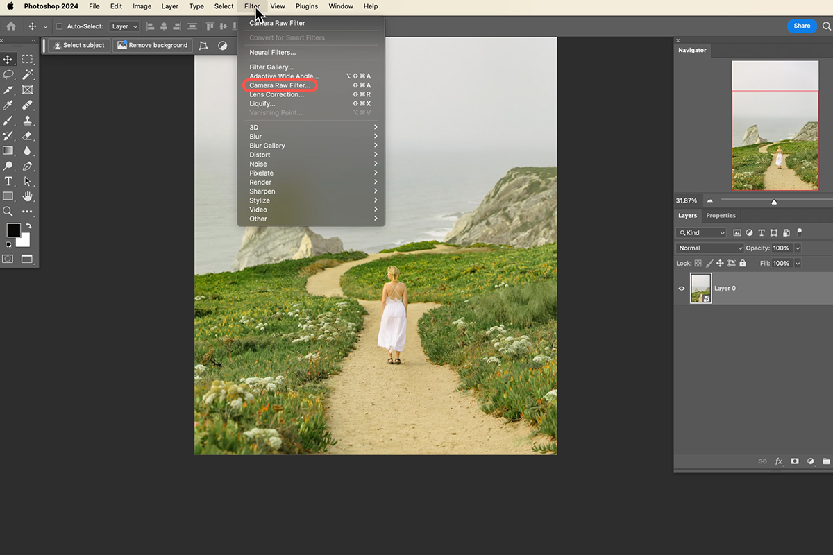
3. Next, you’ll apply the Camera Raw Filter, a fantastic tool for color adjustments. Go to Filter > Camera Raw Filter.
Making Adjustments
4. Once in the Camera Raw dialog box, navigate to the Color Mixer panel on the right-hand side.
5. Within the Color Mixer, select the eyedropper icon. This tool allows you to directly click on the colors you want to adjust in your image. You’ll have three options: Hue, Saturation, and Luminance.
Hue: Click on the dull green areas of your trees and drag to the right to shift the yellow tones towards green, bringing out a more vibrant, healthy color.
Saturation: With the eyedropper still active, click on the trees again and drag to the right to intensify the color, making the greens look more alive.
Luminance: Finally, click on the trees and drag to the right to brighten the green tones, adding more light and making them appear fresher.
Refine and Finalize
6. After making your adjustments in the Camera Raw Filter, click OK.
Because you converted your layer to a Smart Object, the Camera Raw Filter will appear as a “Smart Filter” in your Layers panel. You can toggle this filter on and off by clicking the eye icon next to it, allowing you to see your before and after.
If you wish to make further tweaks, simply double-click on “Camera Raw Filter” in the Layers panel to re-enter the dialog box and refine your settings. This non-destructive workflow ensures flexibility and control over your edits.
Description
Transform your photos with advanced color grading in Lightroom and Adobe Camera RAW! Learn to perfect your hues, highlight your subjects, and craft unique visual styles. Plus, discover how to create reusable presets and explore different looks with snapshots. Download the included RAW files so you can follow along!
THIS COURSE INCLUDES
- 8 Sample Images (RAW)
- 1 Sample PSD
Share
Table of Contents
-
01 - Color Correction vs Color Toning38:54m
-
02 - Basic Edits18:00m
-
03 - Cinematic Color Grading14:25m
-
04 - Enhancing Your Subject19:22m
Course Downloads
Color Your Vision


AFTER
BEFORE
The Power of Colors
Enhancing colors in photos transcends mere adjustments; it’s about evoking emotions and rekindling memories. Cameras, despite their sophistication, sometimes miss the magic our eyes perceive. This tutorial will guide you in enhancing those colors, vividly bringing your unforgettable moments back to life.
Exploring LR & ACR
Learn to leverage the power of Lightroom Classic and Adobe Camera RAW. We’ll explore both interfaces, showing you how their similar tools make achieving perfect color correction surprisingly straightforward and incredibly effective. Understanding the unique strengths of each platform’s color controls, we’ll help you tackle any color challenge and bring your vision to life with precision.
Color Correction
Color correction is the essential first step in image editing. In this tutorial, we’ll show you how to banish unwanted color shifts, and make tones look more accurate and and truly reflect the scene you captured. Plus, you’ll learn how to boost specific colors for amazing contrast and depth.


AFTER
BEFORE
Advanced Masking
Discover Lightroom’s advanced masking tools! We’ll show you how to make intricate selections with ease using AI-powered features like “Select Subject” and “Select Sky”. You’ll learn to target specific areas for flawless color correction and creative enhancements.
Refining Masks
This tutorial isn’t just about selecting; it’s about wielding absolute control! Discover the exhilarating power of adding to your selections for ultimate coverage, subtracting unwanted details with laser-like precision, and flipping your focus instantly by inverting masks.
Tailored Edits
Learn how to precisely introduce distinct colors into your shadows and highlights, creating captivating visual contrasts. In this tutorial, we’ll explore the color grading panel and demystify how its intuitive controls allow you to subtly or dramatically alter the mood and atmosphere of your images. Imagine rich, warm tones in your highlights dancing against cool, deep shadows, a cinematic effect at your fingertips!
Elevate Your Images

Bring Color to Life
Learn simple yet powerful techniques to boost vibrancy, enhance saturation, and make your photos truly pop with rich, captivating hues that grab attention and tell a more compelling visual story.


AFTER
BEFORE
Beyond Color
Color is just the beginning in this tutorial! We’ll guide you through refining your composition, so your beautifully graded image is truly perfect and distraction-free.
You’ll learn to seamlessly eliminate distractions like unwanted stickers, menus, wires, and even reflections, ensuring a polished and professional starting point for your color work.
Non-Destructive Editing
True to the PHLEARN way, this tutorial embraces non-destructive editing from start to finish! Every color tweak, mask application, and artistic effect we demonstrate adheres to this core principle. Your original photos will remain untouched, granting you the freedom to experiment, refine, and even undo any edit, ensuring a flexible and worry-free creative journey.
From Beginner to PRO
This tutorial features 8 sample images, carefully structured to help you confidently grasp each color correction and toning technique as we progress. Whether you’re building your foundation from the beginning or challenging yourself with more complex techniques, these examples offer a clear path to developing your skills.

Snapshots & Presets
Explore all your creative options with presets and snapshots! You’ll learn how to create your own reusable presets for consistent color grading across multiple images, saving you valuable time. We’ll even show you how to generate snapshots, enabling you to experiment with diverse looks and easily compare different edits, perfect for showcasing variations to clients and refining your artistic vision.
RAW Files Included
Unlike compressed JPEGs, working with RAW files gives you more control over your edits. That’s why all the images included are RAW files! You’ll experience the maximum flexibility to adjust exposure, color, and details without sacrificing quality, mirroring the professional workflow and ensuring you achieve the best possible learning outcome from every step.
Color Grading Learning Path
Master the art of color grading with our comprehensive 30-hour Coloring Learning Path, designed for both beginners and professionals. From color fundamentals to advanced techniques, you’ll learn to create stunning visuals with a perfect blend of color and style.

Aaron Nace
PHLEARN Founder – Class Instructor
Aaron Nace is a photographer, Photoshop artist and founder of PHLEARN. He is the #1 Photoshop instructor in the world with millions of YouTube subscribers.

Irene Marí
Fashion Photographer
A big thanks to Marí for providing us with four RAW images to use in this tutorial! Irene Marí is a self-taught photographer and retoucher. She learned makeup to enhance her images, diving into bold, vibrant color. She began with expressive self-portraits—still a favorite practice—and later ventured into photographing other models, bringing the same creative flair and technical precision to every frame.
View more of Marí’s work.
Reviews
How to Change Any Color into a Gradient in Photoshop
-

-
Add to
favorites
-
DifficultyAdvanced
-
Length1.75 hours
-
Videos6
-
Software
Description
Create surreal portraits with Photoshop! In this tutorial we’ll show you how to blend, color correct, and transform stock photos into stunning art. Discover advanced masking and layering techniques, that will revolutionize your compositing workflow. As a bonus, you’ll learn how to animate your creations with AI for dynamic videos.
THIS COURSE INCLUDES
- 21 Sample Images
- 5 Sample PSDs
Share
Course Downloads
Dive Into Surreal Compositing

Art of The Unreal
Surreal compositing thrives on abstract integration. It’s about blending diverse elements like stars, lights, and florals to create a unique piece of art. It’s a journey of experimentation, where iterative exploration of different tools and techniques will help you gain the confidence to bring your most imaginative ideas to life. In this tutorial we’ll show you exactly how to master these techniques, step-by-step, from initial concept to final, breathtaking result.
Working with Stock Images
Crafting composites using stock images requires careful selection. We know that identifying harmonious elements can be quite challenging. That’s why we don’t just show you what to do, but how we think. We’ll unveil our entire thought process, guiding you through the selection, blending, and transformation of stock images, ensuring you master the art of surreal compositing from start to finish!
The Power of Smart Objects
Using Smart Objects is an ideal way to approach compositing. Converting a layer into a Smart Object allows you to make changes to that layer – such as scaling, warping, and applying filters – without affecting the original image. We’ll explore how to maximize the benefits of Smart Objects for seamless, non-destructive editing in your surreal compositions.


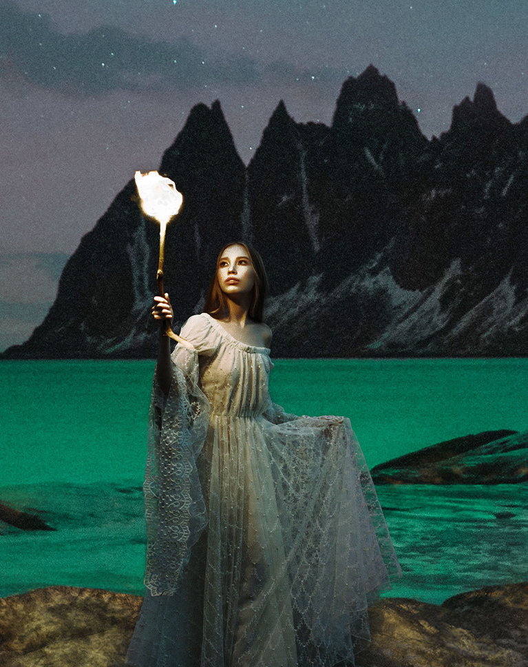
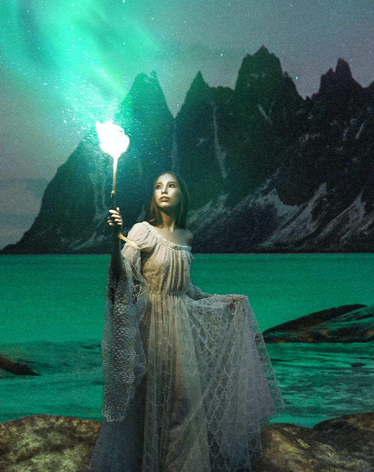
AFTER
BEFORE
Organizing Your Assets
Navigate the complexities of compositing with confidence! This tutorial unveils expert strategies for organizing layers, groups, and adjustments, empowering you to streamline your workflow. Discover how to build projects that are not only efficient but also effortlessly adaptable for future creative explorations.
Creating Depth
To craft truly immersive visuals, depth is key. In this tutorial you’ll discover the secrets of layering foreground, midground, and background elements. We’ll show you how to manipulate light, color, and atmosphere to construct believable, photorealistic environments that draw the viewer in.
Matching Light & Color
The biggest challenge of using stock images for a composite is transforming a collection of separate photos into a unified, visually compelling narrative. Learn how to use advanced Photoshop tools like Levels and Color Balance to seamlessly match light and color between any number of images.
Building Visual Worlds

Dream It, Blend It
Building a dreamlike scene in Photoshop? That’s impressive. But doing it with only free photos? That’s next level! We’ll teach you our top tips to perfectly mix different images to create a perfect and seamless piece of artwork.

Color Theory Basics
Discover the power of color and how it shapes your images. We’ll break down how colors work together to create eye-catching results. You’ll move beyond simply adjusting sliders and gain a deep understanding of how to strategically use color to guide the viewer’s focus, drawing their eye to key elements within your composition. We’ll explore techniques for manipulating color to evoke specific feelings, create visual depth, and add a professional polish that will make your images stand out.
Adding Blur Effects
Imagine turning a busy, distracting background into a soft, dreamy backdrop, making your subject truly stand out. In this tutorial, you’ll learn how to use blur effects, not just as a simple tool, but as a way to control focus and create depth in your images.
Layer Styles & Color Twists
Learn how to use Layer Styles and Color Channels to add amazing visual twists to your images. We’ll show you how to subtly change the color parts of your pictures, giving them a unique look. You’ll learn simple ways to make your images stand out with professional-level effects, adding depth and interest without needing complex techniques.

Using Blending Modes
Explore artistic options and learn how quickly you can accomplish them with a simple Blending Mode change! In this tutorial we’ll show you how to combine images using modes like Screen, Multiply, and Overlay. These modes change how layers interact, letting you easily brighten, darken, or add contrast. You’ll see how to create unique effects and improve your images with just a few clicks.
Creating Moving Images
To finalize this tutorial, we’ll show you how to easily animate your finished images using AI. Watch as we turn still artwork into dynamic videos with just a few clicks. You’ll learn how simple it is to add movement and bring your creative vision to life, adding a modern and engaging layer to your final pieces.
Compositing Learning Path
Join us as we unlock the secrets of advanced compositing with our Magical Compositing Learning Path. From mastering light and color with stock images to exploring mind-bending creations by guest artists, and even discovering some of our most classic composites, this learning path empowers you to bring your wildest visions to life.
Aaron Nace
PHLEARN Founder – Class Instructor
Aaron Nace is a photographer, Photoshop artist and founder of PHLEARN. He is the #1 Photoshop instructor in the world with millions of YouTube subscribers.
View More Classes by Aaron Nace
Special thanks to Pars Sahin, Pawel Czerwinski, Vitaliy Shevchenko, Wolfgang Hasselmann, Jason Leung, Rustam Burkhanov, Serhii Tyaglovsky, Sheng Hu, Tonmoy Iftekhar, Troy Olson, Anton Khmelnitsky, Dan Meyers, Eugene Golovesov, Jack Dong, Mahyar Yeganeh, Milad Fakurian, Allec Gomes, Jay Soundo, NASA Hubble Space Telescope, Robert Clark, and Susan Wilkinson.
Images for this PRO course were sourced from Unsplash .
Reviews
-
I def need to use this subscription more.
-
More please! Great creative ideas.
-
Had lots of fun with this – great course! I found my file size increased super quick, and one of the images had to be re-saved as PSB. I assume it’s maybe because of the number of smart objects and the fact I scaled some of them up really huge to get the effect I wanted? I used a couple of images of my wonderful wife, here’s my effort!
Download Assets
description
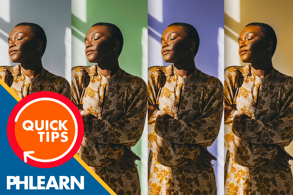
Craft artistic moods with Lightroom’s advanced color grading techniques! Today’s class will show how to manipulate shadows, midtones, and highlights, creating unique vibes in your images. We’ll explore profiles and even show you how to create presets, so you can consistently apply your favorite styles to any image.
Follow along with all 30 episodes as we explore the the magic of Lightroom together!
Watch Next
JOIN 30 DAYS OF LIGHTROOM (FOR FREE!)
Ready to jump in? Sign up and we’ll email you a printable calendar and daily class schedule so you can get started right away!
Image Source
- Gabriel Garcia
Images sourced from Pexels.
Share

AFTER
BEFORE
Color Your Mood
Day 9 of 30 Days of Lightroom! Today, we’re diving into the creative world of advanced color grading, where you’ll learn to add artistic color to shadows, midtones, and highlights, transforming your photos with unique moods and styles.
Exploring Color Grading
1. Begin by opening your image in the Develop module and navigating to the “Color Grading” panel.
2. Experiment with built-in profiles from the “Profile Browser” to see quick color grading effects.
3. To start your own color grading, use the “Midtones,” “Shadows,” and “Highlights” wheels. Drag the central control point to adjust hue and saturation, and use the brightness slider for luminance.
Fine-Tuning Color
4. For precise control, push the central slider to the outer edge, then adjust the hue slider to select your desired color.
5. Refine the saturation and brightness to achieve the perfect balance.
6. Use the “Blending” and “Balance” sliders to control how colors interact across shadows, midtones, and highlights. Remember to use the “eye” icon to view before and after comparisons.
Creating & Using Presets
7. Once you’ve achieved your desired color grading, create a preset by clicking the “+” icon in the “Presets” panel.
8. Name your preset and select “Check None,” then check only “Color Grading” to ensure it only affects color.
9. Apply your preset to other images for consistent styling. You can also export presets to share or sell, and import presets from other creators.
With that, Day 9 ends! Tomorrow, we’ll move onto AI tools and show you how to remove objects and distractions.
Download Assets
description
Ever felt your photos lacked that “pop”? Let’s fix that!Day 8 brings us Lightroom’s color basics, where we’ll explore tweaking white balance and playing with hues. We’ll show you how to make your images truly sing, adding that special touch that makes them feel alive. This tutorial includes a downloadable RAW file!.
Follow along with all 30 episodes as we explore the the magic of Lightroom together!
Watch Next
JOIN 30 DAYS OF LIGHTROOM (FOR FREE!)
Ready to jump in? Sign up and we’ll email you a printable calendar and daily class schedule so you can get started right away!
Image Source
Share
AFTER
BEFORE
Perfect Color Edits
Today, we’ll delve into the fundamentals of color editing, empowering you to achieve perfect color balance and vibrancy in your photos. We’ll explore tools like white balance and the color mixer to fine-tune individual hues and saturations.
Basic Color Adjustments
Begin by opening your image in the Develop module and applying the “Auto” settings. This will provide a solid foundation by adjusting highlights, shadows, and overall exposure. Next, reset the vibrance and saturation sliders to zero. This allows for precise, individual color adjustments using the color mixer.
Color Mixer
Navigate to the color mixer panel. Here, you can adjust hue, saturation, and luminance for specific colors. Use the targeted adjustment tool to click and drag directly on the image, modifying colors intuitively. This method provides finer control than simply adjusting sliders. Experiment with enhancing yellows, greens, and blues to bring out the natural vibrancy of your scene.
Point Color & Calibration
For even more precise color control, explore the point color tool. Select specific colors using the eyedropper and adjust their hue, saturation, and luminance. Additionally, the calibration panel allows for subtle adjustments to red, green, and blue primaries, offering another layer of color refinement.
And just like that we finished Day 8 of our series! Tomorrow, we’ll focus on more advanced coloring techniques to help give images a specific mood.
Download Assets
description
Learn how to apply graphics to your images and use colors to create a more impactful and engaging final product.
Go PRO:
New to Photoshop and not sure where to begin? Explore our latest PRO tutorial Photoshop Fundamentals: Aaron’s Top 10 Essential Tools & Techniques . Discover mind-blowing tricks for selecting, removing, retouching, and more!.
Share


AFTER
BEFORE
Enhance Your Images
Imagine seamlessly blending graphics into your photos, extracting text to use in your designs, or even making text appear to be part of the underlying image texture. This guide makes the process easy and accessible, even for beginners!
Transferring Graphics
1. Choose the graphic you want to move.
2. Use the Move Tool (Keyboard Shortcut “V”) to click and drag the graphic onto the target image.
3. If the graphic has a white background, change its layer blend mode to Multiply. If some white background persists, you can open Levels (Keyboard Shortcut “Ctrl/Cmd + L”), and use the white eyedropper to click on the remaining white area or adjust the white point slider to remove it completely.
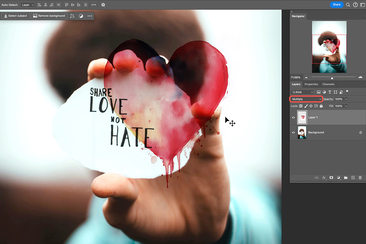
Extracting and Coloring Text
4. Make the graphic layer invisible temporarily.
5. Select the background layer. Go to Select > Color Range.
6. Adjust the fuzziness slider in the Color Range dialog to select the text. Light areas in the preview are selected.
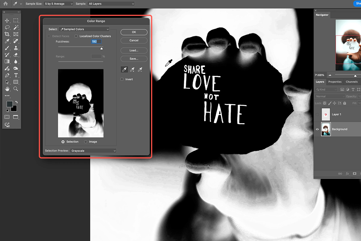
7. Create a new layer for the extracted text.
8. Use the Brush Tool (Keyboard Shortcut “B”) with white color and 100% opacity and flow to paint over the selected text on the new layer.
9. Use the Move Tool (Keyboard Shortcut “V”) to reposition the extracted text as needed.
10. Double-click the text layer to open Layer Style. Apply a Color Overlay and choose the desired color.
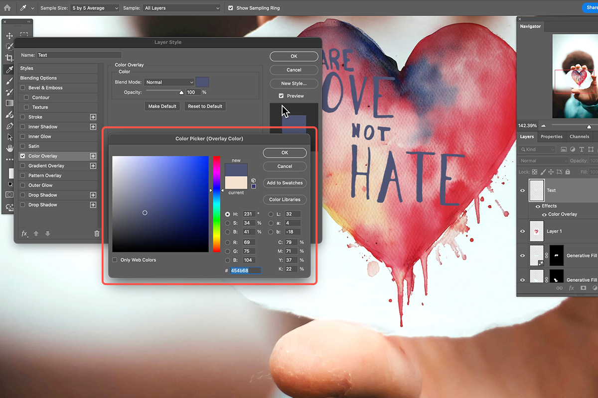
Advanced Techniques
For a more realistic effect, use a layer mask instead of simply painting the text white.
11. Ctrl/Cmd-click the text layer to select its contents.
12. Select the layer containing the graphic you want to affect.
13. Hold Alt/Option and click the Layer Mask icon on the graphic layer. This creates an inverted mask, making the graphic invisible where the text was selected.
You can unlink the graphic and its mask to move them independently. This technique is particularly useful for creating composite images where you want the text to appear as part of the underlying texture.
Download Assets
description
Learn to master color toning in Photoshop! Discover how to use the Camera Raw Filter to add warmth, coolness, or drama to your images. Create stunning presets and achieve professional-level results without ever leaving Photoshop.
Go PRO:
Discover the world of coloring with our in-depth PRO Coloring Learning Path. From color fundamentals to advanced techniques, you’ll learn to create stunning visuals with a perfect blend of color and style.
Image Source
Share
AFTER
BEFORE
Color Correct in ACR
Learn how to achieve stunning color tones using the powerful Camera Raw Filter hidden within Photoshop. This guide will walk you through the process step-by-step, no editing experience needed!
Preparing Your Image
To ensure maximum flexibility and control over your color adjustments, follow these steps:
1. Convert to Smart Object: Navigate to Layer > Smart Objects > Convert to Smart Object. This allows you to edit the filter non-destructively.
2. Open Camera Raw Filter: Go to Filter > Camera Raw Filter. This opens the interface where you’ll make your color adjustments.
Color Grading with Three-Way Sliders
Under the Color Grading tab, you’ll find sliders for Highlights, Midtones, and Shadows. These sliders allow you to precisely adjust the color of each tonal range in your image.
3. Click and drag the center of a slider to choose the desired hue for your highlights, midtones, or shadows.
4. Adjust saturation by manipulating the inner point of the slider, while the outer point controls the hue, to achieve the ideal balance of color intensity.
5. Use the bottom slider to fine-tune the brightness or darkness of the selected tonal range.
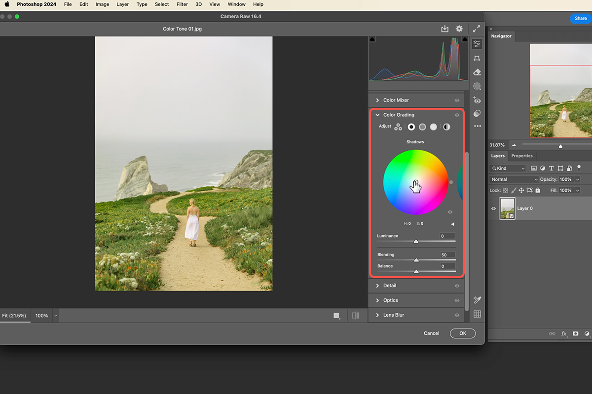
Fine-Tune Blending and Balance
To further refine your color adjustments, use the Blending and Balance sliders.
The Blending slider controls how smoothly the shadow and highlight colors transition into each other. You can use it to create a more gradual or abrupt blend.
The balance slider shifts the overall temperature of the image towards warmer or cooler tones. Experiment with different settings to achieve your desired look.
Create and Explore Built-In Presets
To preserve your custom color adjustments for future use, double-click the Camera Raw Filter to access the settings at any time. You can then save your edit as a preset by clicking the three dots (…) and selecting Create Preset.
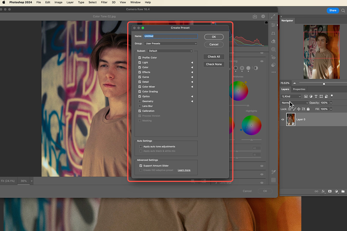
In addition to creating your own presets, the Camera Raw Filter comes with a variety of built-in color grading options. Explore these presets to find a starting point that suits your image. You can further customize the strength of these presets using the opacity slider.
Download Assets
description
Want to turn your photos into soft, dreamy masterpieces? In this tutorial, we’ll show you a Photoshop technique that uses layers, filters, and a touch of color magic to create an ethereal look for your images.
Go PRO:
Master the art of stunning special effects with our exclusive Special Effects Learning Path.
Artist Credit
- Ulkar Batista
- Anna Shvets
Images sourced from Pexels.
Share
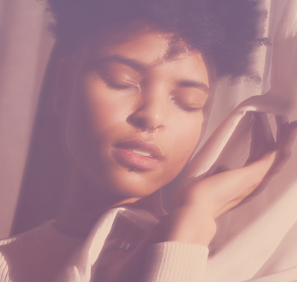
AFTER
BEFORE
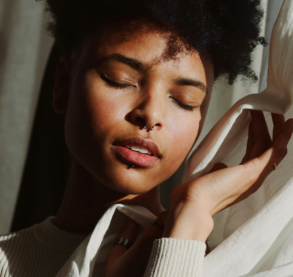
Soft Focus. Ethereal Glow.
Creating a dreamy effect for your photos is now easier than ever! By combining clever techniques with a sprinkle of creativity, you can unlock a world of artistic possibilities and add a touch of magic to your images. Follow the steps below to achieve stunning results.
Borrowing Colors
1. Let’s start by selecting two images: your main photograph and another image with colors you like.
2. Use the Move Tool (Keyboard Shortcut “V”) to drag the color image on top of your main photo.
3. Change the blend mode of the color image layer to “Screen” to transfer its colors to your subject.

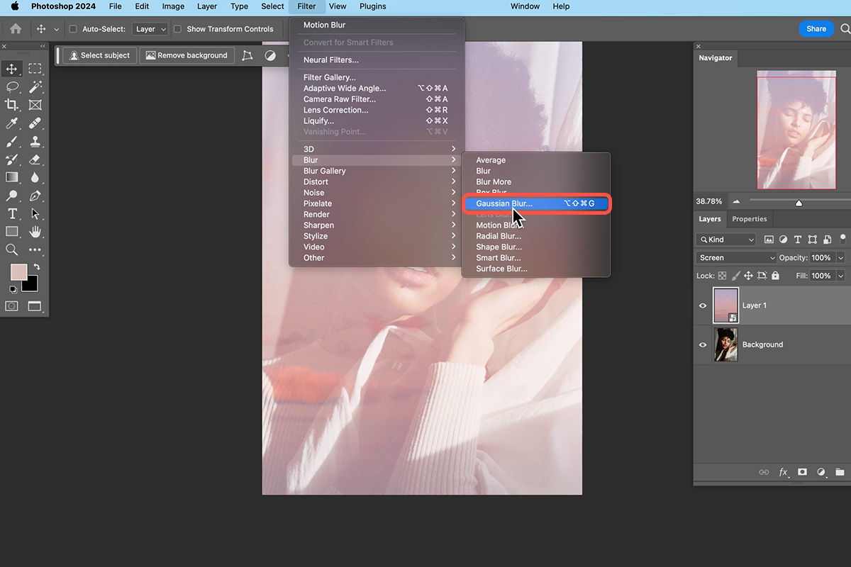
Blurring for Softness
4. To create a dreamy blur, convert the color image layer into a Smart Object. Simply, right-click on the color image layer in the Layers panel and select “Convert to Smart Object” from the context menu.
5. Apply a Gaussian Blur filter. This softens the details in the color image while keeping the color information intact.
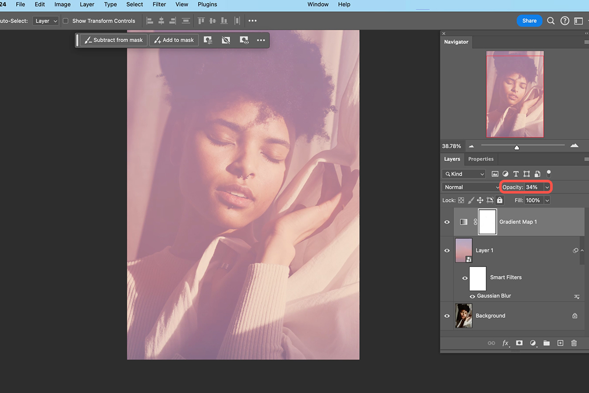
6. Adjust the opacity of the blurred color layer to control the intensity of the effect.
Gradient Map for Mood
7. For further color manipulation, add a Gradient Map adjustment layer.
8. Choose a gradient that complements your desired mood. Remember to check the “Reverse” box if the gradient appears inverted.
9. Adjust the opacity of the Gradient Map layer to blend it seamlessly with the rest of the image.
Adding Dreamy Blur
10. To create a subtle blur effect that emphasizes highlights, duplicate your background layer.
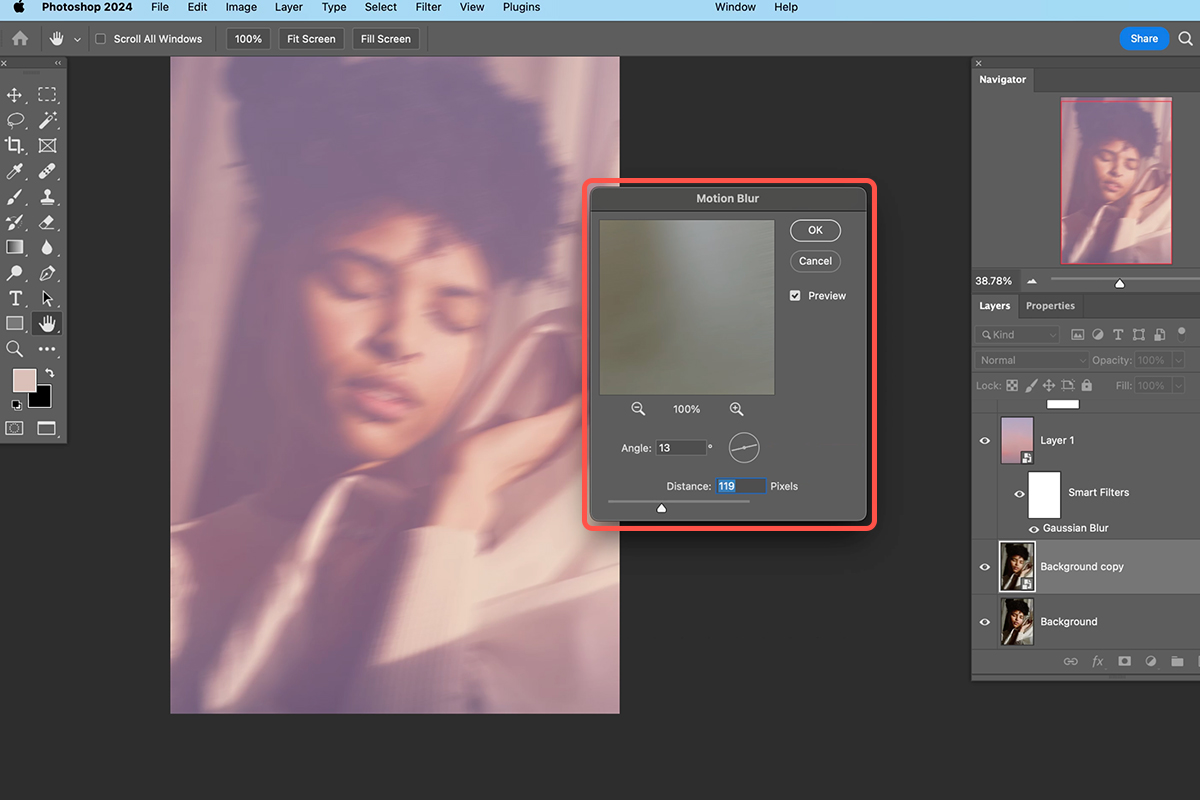
11. Convert this copy into a Smart Object and apply a Motion Blur filter.
12. Set the direction and strength of the blur to your liking.
13. Change the blend mode of the blurred layer to “Lighten” for a soft, hazy effect. You can further refine the effect by adjusting the layer’s position.
Final Touches
Minimize all your layers to see the final result. You should have a dreamy image with soft colors, a subtle blur effect, and a touch of mystery. This technique offers a unique way to transform your photos and create an otherworldly atmosphere. Don’t hesitate to experiment with different color palettes and blur settings to achieve your desired dreamlike effect.
Download Assets
description
Learn how to transform the colors of your photos in Photoshop with the Neural Filters’ Color Transfer feature! In this tutorial we’ll show you how to apply colors from a preset or even your own image, and fine-tune the effect for a perfect look.
Go PRO:
Recreate the style of any photograph using the color tools in both Lightroom and Photoshop with our exclusive PRO tutorial How to Match Color in Lightroom & Photoshop.
Artist Credit
Share
AFTER
BEFORE
Perfect Color Match
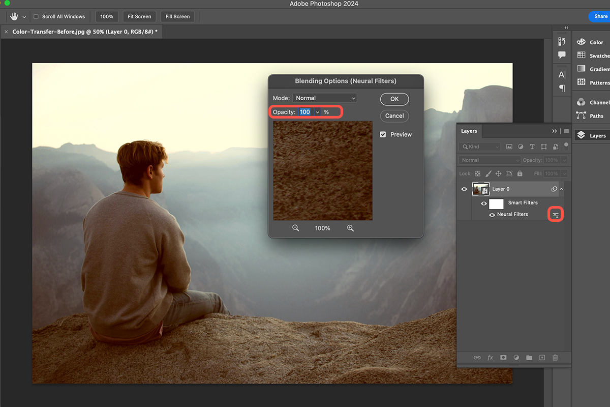
Have you ever wanted to give your photos a color makeover inspired by another image? If so, then Photoshop’s Neural Filters have a powerful tool called “Color Transfer” that can help you achieve that look.
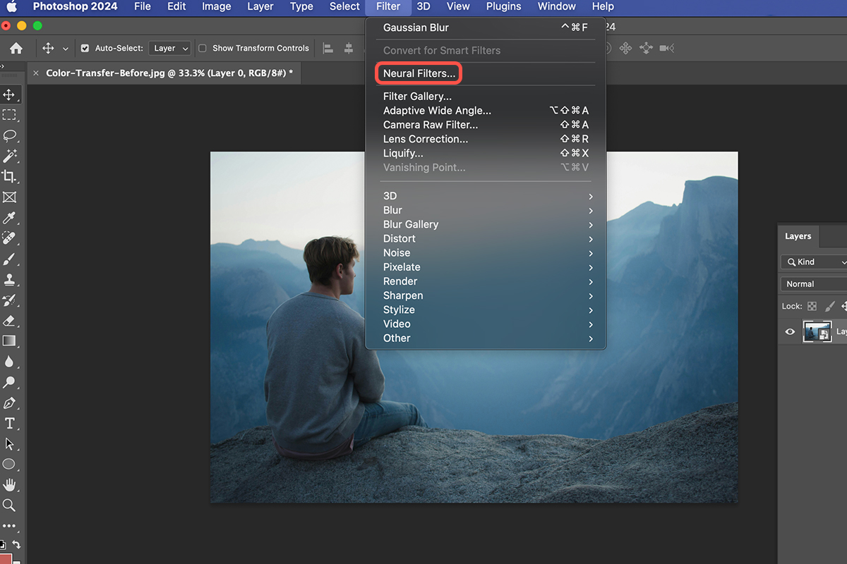
Access Neural Filters
1. Open the photo you want to adjust the colors of in Photoshop.
2. Convert the background layer to a Smart Object using the quick menu option: right-click the background layer in the Layers panel and choose “Convert to Smart Object” from the menu. This step allows for non-destructive editing with the Neural Filter.
3. Go to Filter > Neural Filters.
4. In the Neural Filters window, select “Color Transfer”.
Choose a Reference Image
5. Click on the “Custom” tab.
6. Select the image you want to use as a color reference by browsing your computer.
7. Click “Use This Image” to apply the reference colors.

Adjusting Color Strength
To fine-tune the intensity of the color transfer effect, you can adjust its opacity. Double-click the small sliders next to the “Neural Filters” label on the Layers panel. This reveals the blending options for the filter. Locate the “Opacity” slider and drag it left to decrease the effect’s strength, creating a more subtle color shift.
Explore Blending Modes
For even more creative control, you can experiment with different blend modes to achieve unique color effects. To access these options, double-click the small sliders next to the “Neural Filters” label on the Layers panel. This will reveal the blending options for the filter. The “Normal” blend mode is the default, but you can try others like “Screen” for a more vibrant effect. Play around with different options to see how they alter the final look!
Download Assets
description
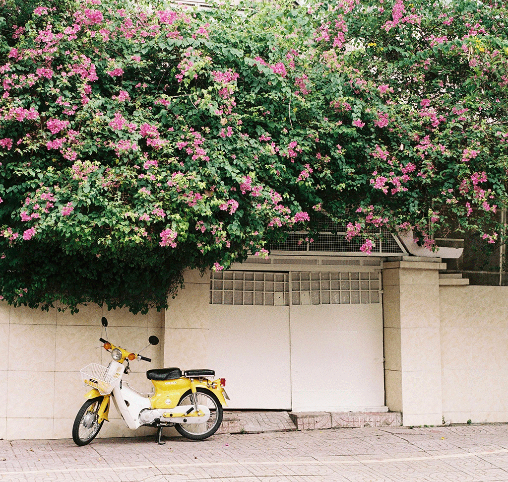
Learn how to color match objects in your photos using Photoshop! This tutorial will guide you through the process of selecting an object, adjusting its hue and saturation, and adding color reference swatches to achieve a perfect match.
You’ll also learn how to clean up the selection and fine-tune the color balance. Then, we’ll add text and color-match it to the image, creating a cohesive design.
Go PRO:
Learn how to match the color between photos in both Lightroom and Photoshop with our in-depth PRO tutorial How to Match Color in Lightroom & Photoshop.
Artist Credit
- Butfirstcaphesuada
Images sourced from Pexels.
Share
MATCH COLORS LIKE A PRO
Perfect Color Match
Imagine transforming an image by making its colors sing in perfect harmony. That’s the magic of color matching in Photoshop! Follow the steps below to unify the various elements in your images, and direct the viewer’s eye within the photo.
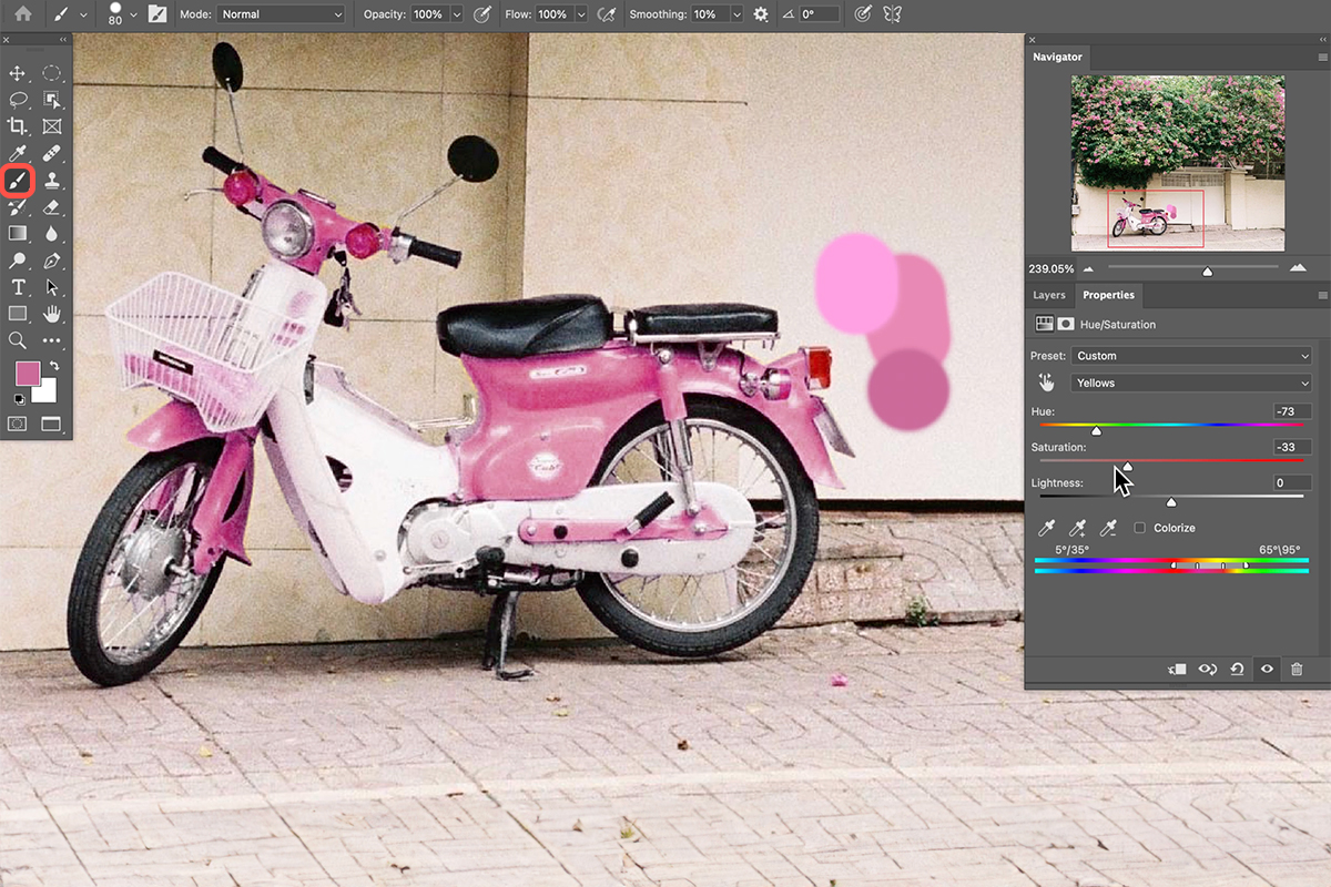
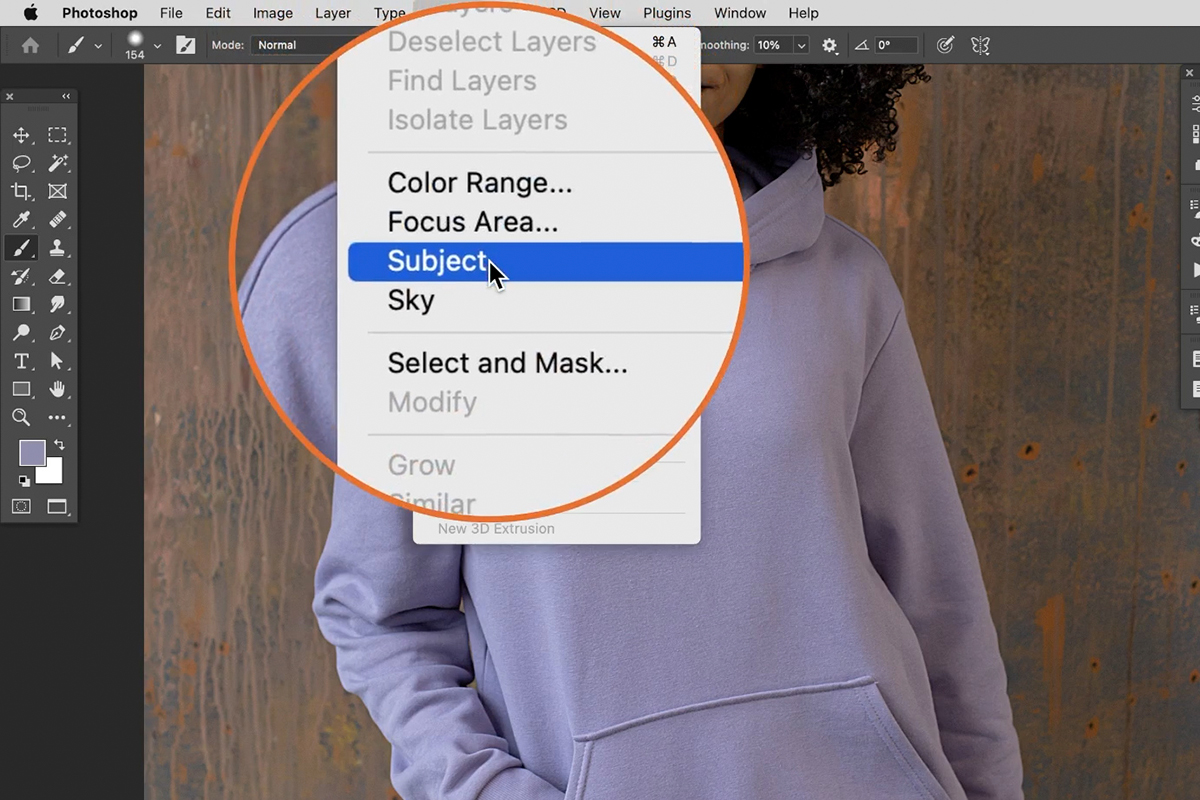
Selecting the Object to Recolor
1. Open your photo in Photoshop.
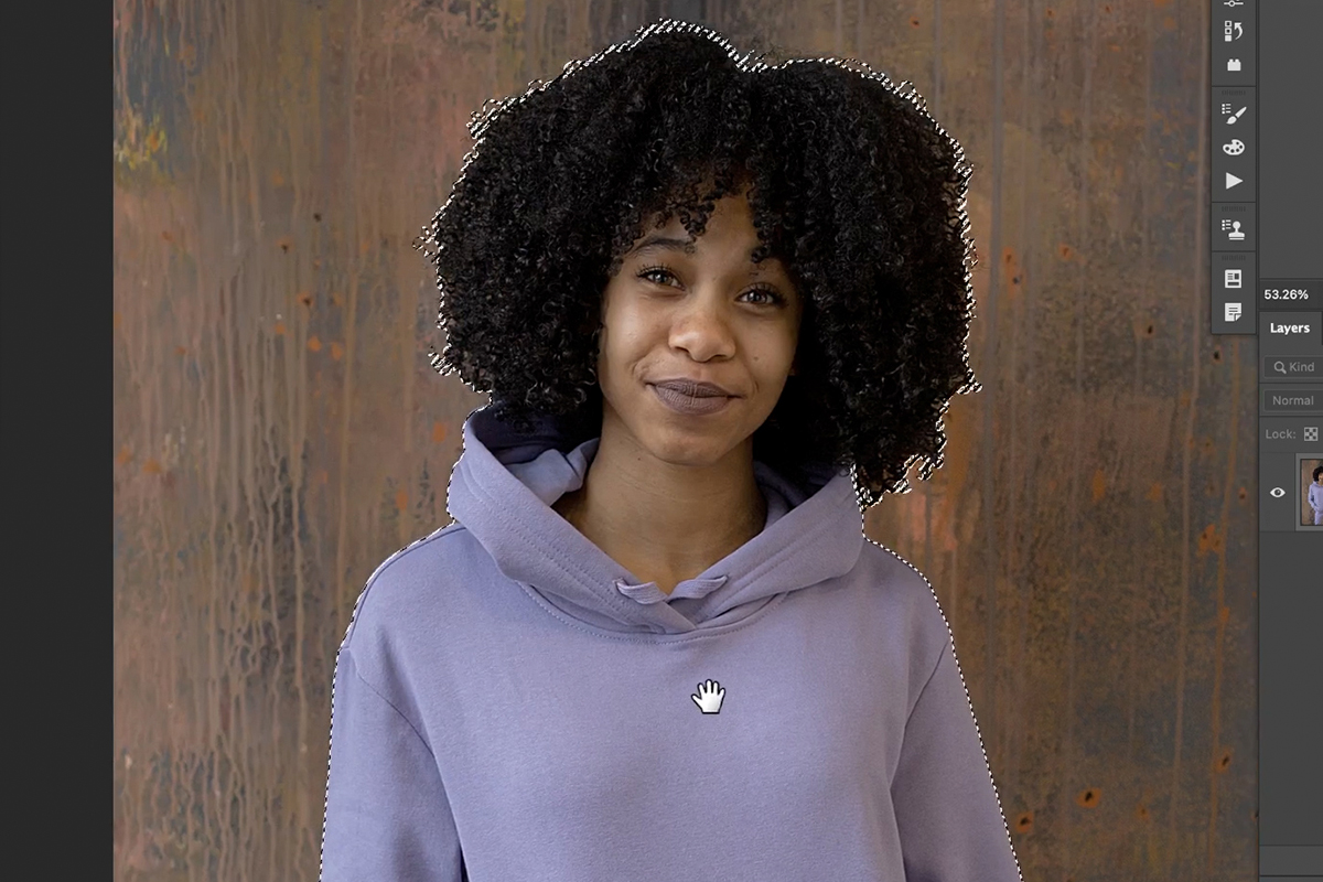
2. Choose the Object Selection Tool (keyboard shortcut W). Hover over the image with the tool to see objects automatically highlight.
3. Click on the object you want to recolor.

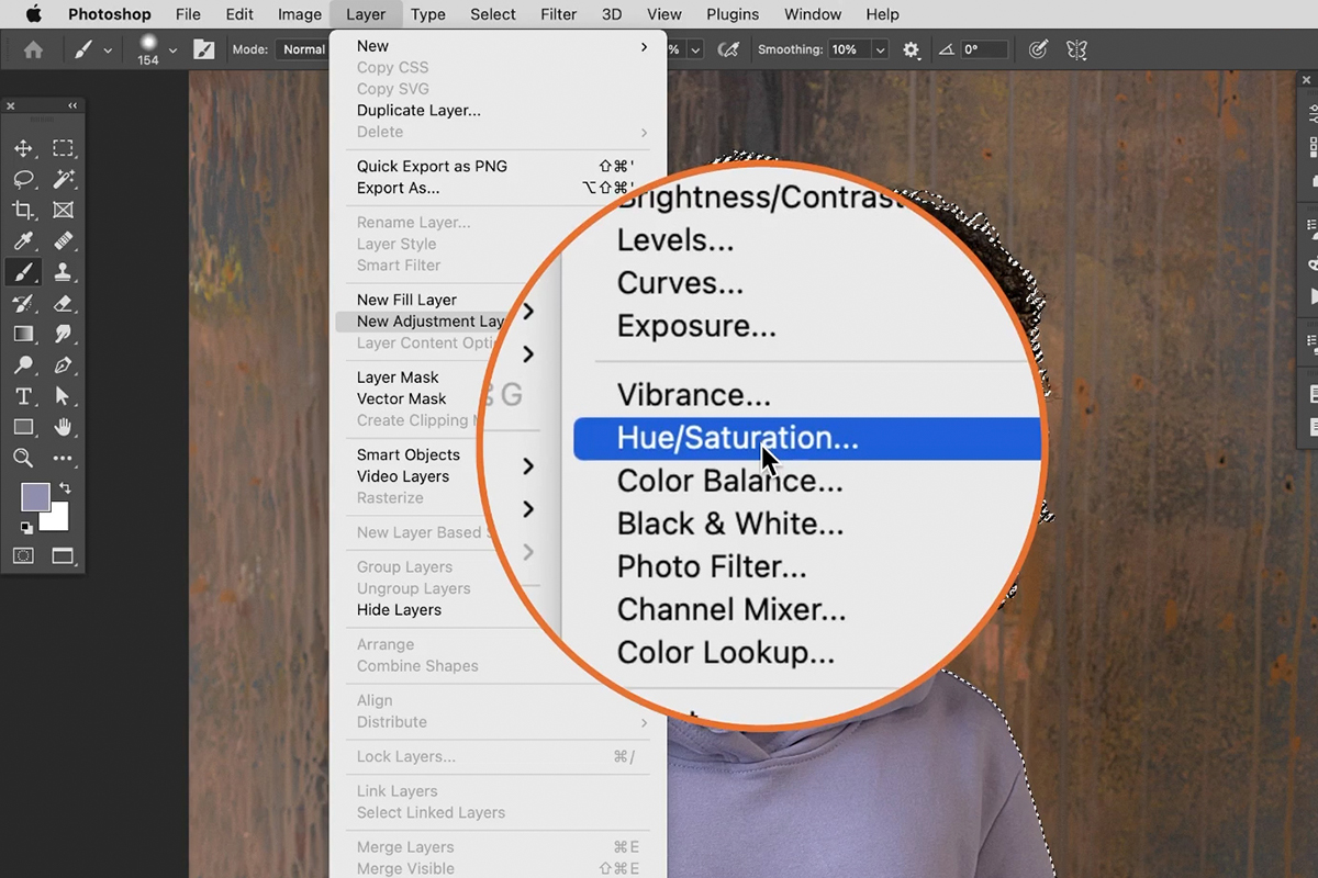
Find the Right Color
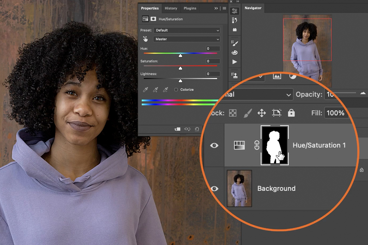
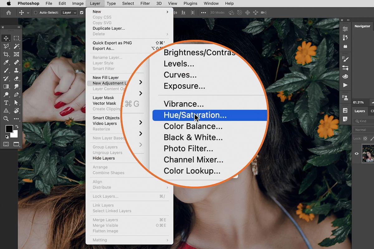
4. Go to Layers > New Adjustment Layer > Hue/Saturation.
This creates a new layer that will only affect the selected object because of the selection made in step 3.
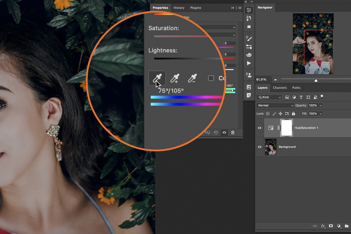
5. Click on the Eyedropper tool in the Properties window.
6. Select the color you want to match the object to (in this case, the pink flowers).
7. Drag the Hue slider until the object’s color closely matches the flowers.
8. Create a new layer (keyboard shortcut B).
9. Use the Eyedropper tool to sample a few colors from the flowers you want to match.
10. Paint these colors on the new layer next to the moped.
11. Use this as a reference point for further adjustments.
Perfecting the Match
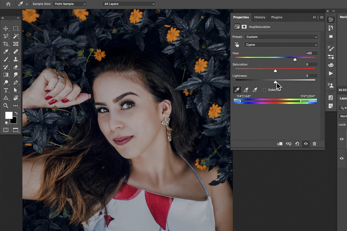
12. Go back to the Hue/Saturation adjustment layer.
13. Use the eyedropper tool again to select the color you want to match on the reference layer (the pink color blocks).
14. Fine-tune the Hue and Saturation sliders to achieve the desired color match.
The Object Selection Tool might leave some stray color changes (like the orange taillight). No worries! Click on the layer mask of the Hue/Saturation adjustment layer. This lets you act like a digital painter, using a black brush to erase any unwanted color adjustments. Now your object’s color transformation will be flawless!.
Adding Text
The additional steps below are optional, but they offer a chance to add some artistic flair to your photo. Want to incorporate a title or caption? Follow these steps to make your text sing in harmony with the rest of the image.
1. Use the Text tool (keyboard shortcut T) to add text to your image.
2. Use the Eyedropper tool to sample a color from the moped to match the text color.
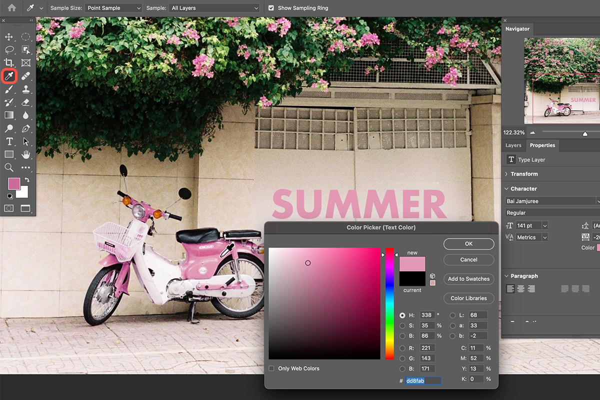
Creating a Drop Shadow
3. Use the Layer Style menu to add a drop shadow to the text.
4. Sample a dark green color from the plants in the photo for the drop shadow color (instead of black) to maintain color harmony.
5. You can use two drop shadows, one closer and one further away, to create more depth.
You’re all set! You’ve successfully used Photoshop’s magic to transform your photo’s color palette. By matching an object to another element, you’ve created a sense of visual harmony and elevated the overall aesthetic. Remember, this technique isn’t just about making edits; it’s about unlocking the power of color to tell a story and evoke emotions in your viewers. So, go forth and experiment! Explore different color combinations and see how they can breathe new life into your photos, transforming them from ordinary snapshots to captivating masterpieces.
Download Assets
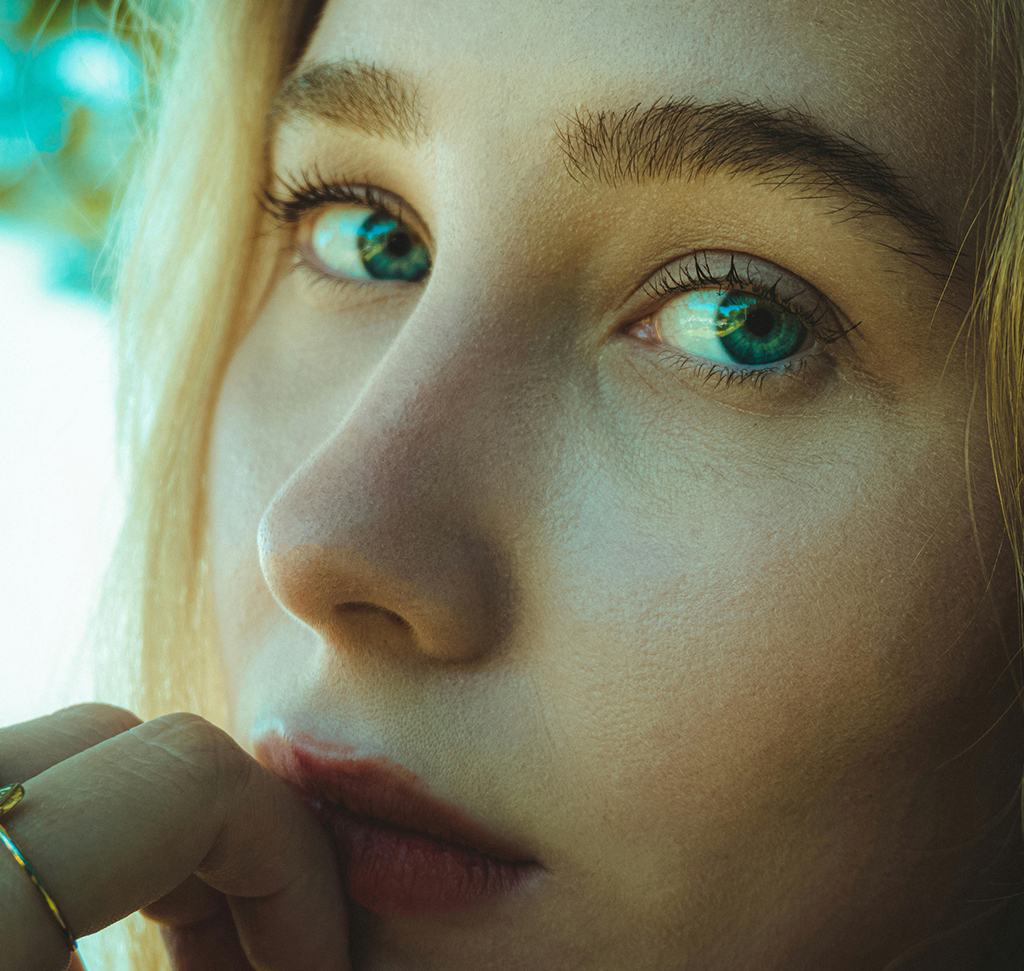
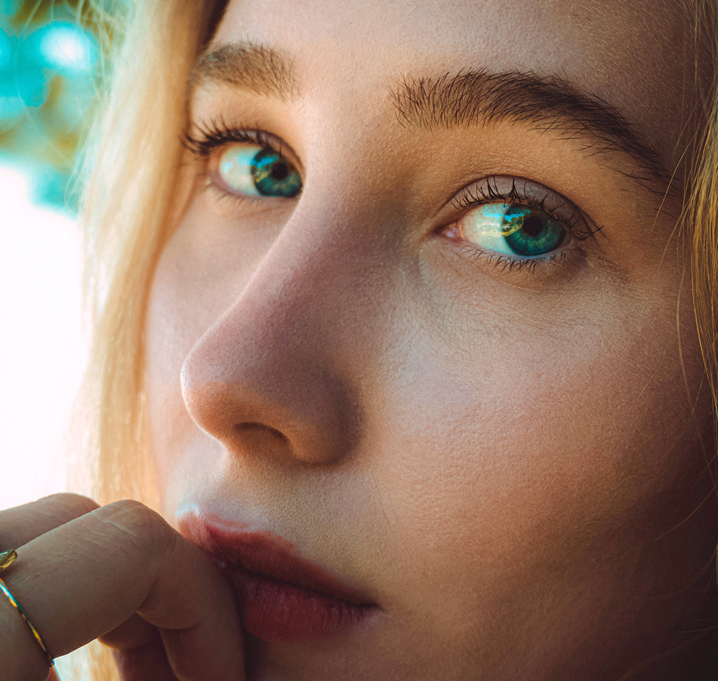
description
Learn how to fix color casts in portrait photos using Photoshop! In this tutorial we’ll show you how to use Color Balance adjustment layers to achieve natural-looking skin tones in your portraits in a few easy steps.
Go PRO:
Take your portraits to the next level with our in-depth PRO tutorial The Beginner’s Guide to Portrait Retouching Using AI & Traditional Tools.
Artist Credit
- Athena
- Umutcan
- Onur Bahadir
- Collis
Images sourced from Pexels.
Share
AFTER
BEFORE
Balanced Colors, Every Time!
In this tutorial we’ll walk you through using Color Balance Adjustment Layers in Photoshop to enhance your portrait images by creating natural-looking skin tones.
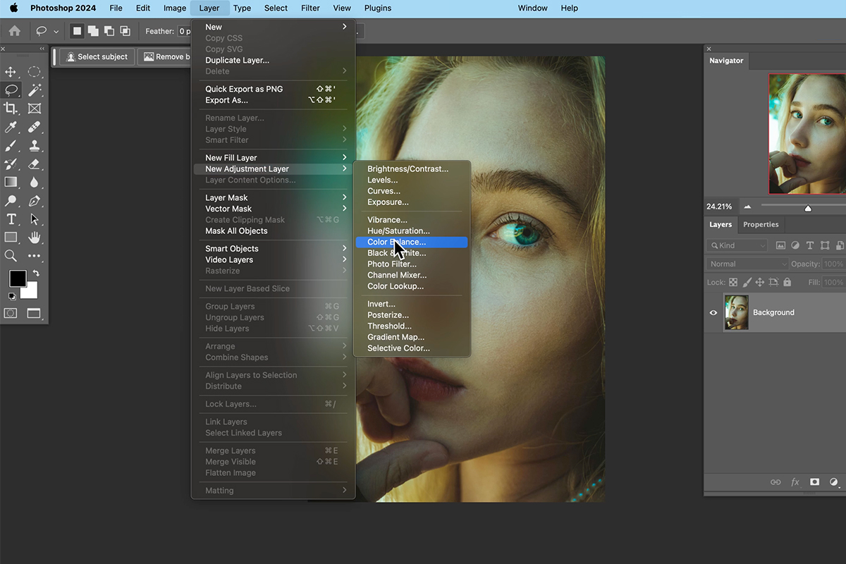
Adding a Color Balance Adjustment Layer
1. Open your portrait photo in Photoshop.
2. Zoom in on your subject’s face for better precision while adjusting colors.
3. In the Layers panel, click the “Create a new adjustment layer” icon.
4. Select “Color Balance” from the menu. This creates a new adjustment layer specifically for color balancing.
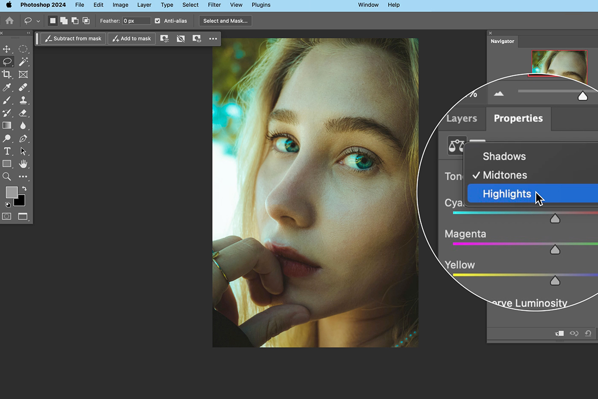
Making Adjustments for Natural Skin Tones
Throughout this process, focus on your subject’s skin tone on the image, not the specific slider values.
5. In the “Properties” panel, locate the sliders under “Highlights.”
6. Click on a slider and drag it left or right while observing the impact on your subject’s skin.
7. Aim for natural-looking skin tones. Avoid going too far in either direction, which can create unnatural colors.
Repeat these steps for Midtones and Shadows if needed. Always pay close attention to how color casts affect the shadows on your subject’s face. Aim for a neutral and natural look.
To assess the effectiveness of your edits, the Layers panel provides a handy trick. Click the eyeball icon next to the Color Balance Adjustment Layer. This lets you toggle its visibility on and off, allowing you to easily compare the adjusted version with the original image.
Using Levels Adjustment Layers
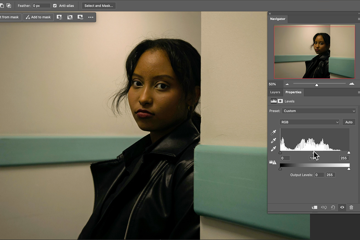
Sometimes your image might require additional adjustments beyond Color Balance. In these cases, Levels Adjustment Layers can be a helpful next step. They provide precise control over the overall brightness and contrast of your image. Think of Levels as a histogram that shows the distribution of light and shadows in your photo. By moving the sliders, you can target specific areas:
Brighten shadows: Move the black input level to the left to recover detail in dark areas.
Darken highlights: Move the white input level to the right to reduce blown-out highlights.
Adjust midtone contrast: Move the middle gray slider to control the overall image contrast.
Additional Tips
With practice, using Color Balance Adjustment Layers will become second nature, allowing you to consistently achieve natural-looking skin tones in every portrait.
Embrace Experimentation: Remember, color correction is subjective. Feel free to experiment with the sliders to achieve the look you prefer, while keeping natural skin tones in mind.
Temperature Control: You can create a warmer or cooler image by adjusting the sliders accordingly.
Correct Lighting First: If the image has a strong color cast throughout, consider using Levels Adjustment Layers before Color Balance to address the overall lighting first.
Fight Color Fatigue: Take breaks while editing to avoid color fatigue, which can affect your judgment of the colors you see on screen.
Revisit and Refine: The Color Balance Adjustment Layer is always editable. You can revisit it later and make further adjustments if needed.
How to Change Any Color into a Gradient in Photoshop
-
-
Add to
favorites
-
DifficultyAdvanced
-
Length3.25 hours
-
Videos8
-
Software
Description
Get ready to dive into the fascinating world of compositing! Discover the art of seamlessly blending a person into a brand new background. Unveil some awesome techniques such as shadow blending and color matching that will take your final creation to a whole new level of realism.
THIS COURSE INCLUDES
- 7 Sample Images
- 1 Sample PSD
- 1 Photoshop Brush
Share
Table of Contents
-
01 - Compositing Essentials Unveiled17:15m
-
02 - Mastering Subject Integration24:21m
-
03 - Crafting the Perfect Reflection29:16m
-
04 - Refining Layers20:12m
-
05 - Captivating Light Effects39:49m
-
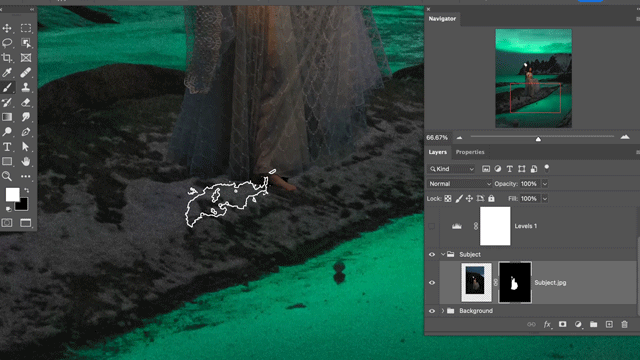
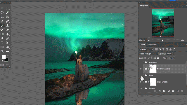
06 - Magical Northern Lights22:52m
-
07 - Adding the Final Touches32:10m
Course Downloads
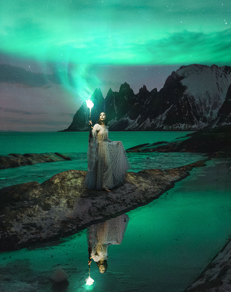
Compositing Magic Unleashed
INTO ONE BEAUTIFUL SCENE
COMBINE SEVEN IMAGES
Advanced Compositing in Photoshop
Compositing is what we do best, and we’re here to help you unlock the full potential of this technique to create extraordinary visuals. Discover the art of seamlessly blending multiple images into a surreal and captivating composition using Photoshop.
Expand your Skillset
Master essential tools like Levels, Clipping Masks, Smart Objects, and Custom Photoshop Brushes to develop a seamless workflow for combining multiple images. Gain precise control over the elements you’re compositing and elevate your images to the next level.
Use Stock Images
Don’t let the complexity of compositing hinder your progress, especially when it comes to finding the right images for your creation. Our tutorial includes all the necessary images, saving you valuable time and effort.

FINAL COMPOSITE
ORIGINAL BACKGROUND
Complete PSD File
We don’t just show you how to create this stunning image, we include our own completed PSD file for you to explore and reverse-engineer. See how a pro organizes and structures a project to be able to work quickly and non-destructively.
Photoshop Brush
Using brushes in Photoshop is essential for adding artistic touches, creating unique effects, and enhancing your digital artwork. This course includes our custom Photoshop Brush for you to use and keep forever!
Compositing Learning Path
To comfortably navigate through this course, it’s necessary to have some familiarity with Photoshop and experience in compositing. If you’re new to compositing, we recommend exploring our Compositing Learning Path—a curated selection of our top-notch compositing courses that will guide you from beginner to expert. Follow this link to access the Compositing Learning Path.
Put Your Imagination to Work
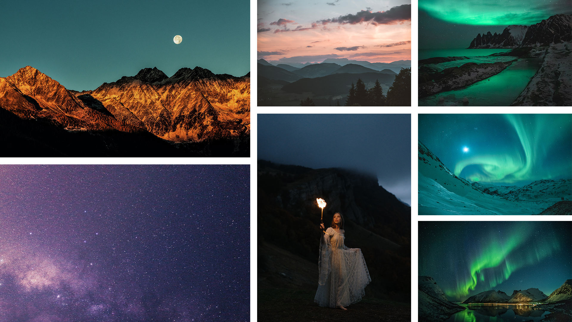
Seven Photos, One Masterpiece
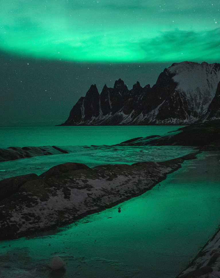
Join us in creating an awe-inspiring scene by blending seven stunning free stock images into a seamless and visually striking composite!
AFTER
BEFORE
Perfect Color Match
Craft a convincing composite image by flawlessly matching colors. Dive into the world of adjusting colors separately for shadows, mid-tones, and highlights to achieve an authentic and vibrant color blend that brings your composition to life.
The Power of Artificial Intelligence
With AI-powered tools, you can now achieve precise and accurate selections with just a few clicks, saving you valuable time and effort. Say goodbye to tedious manual selection techniques and embrace the convenience of AI for seamless subject extraction in Photoshop.
Sky Replacement
Learn how to easily swap out the sky in your images with a different sky from another photograph. Discover techniques and tools that enable you to smoothly integrate a new sky, effortlessly transforming the mood and atmosphere of your photos.
CREATE TEXTURES LIKE A PRO
BLEND IMAGES SEAMLESSLY
Texture Integration
Creating textures plays a vital role when blending multiple images in Photoshop. Textures add depth, realism, and cohesion to the final composite, helping to seamlessly integrate various elements.
Efficient Workflow
With almost 15 years of experience under his belt, Aaron Nace has mastered a smooth and efficient compositing workflow. Get ready to learn how to work smart, solve creative challenges, and make the most of various tools to nail your compositing projects.
Mastering Photo Compositing
Once you finish this course, try one of our other advanced compositing courses like Advanced Compositing with Stock Photos and Advanced Compositing with Stock Photos 2!
Aaron Nace
PHLEARN Founder – Class Instructor
Aaron Nace is a photographer, Photoshop artist and founder of PHLEARN. He is the #1 Photoshop instructor in the world with millions of YouTube subscribers.
View More Classes by Aaron Nace
Special thanks to Eberhard Grossgasteiger, Joshimer Biñas, Stephan Seeber, Tobias Bjørkli, and Zayceva Tatiana. Images for this PRO course were sourced from Pexels.
Reviews
-
This was amazing and also so much fun 🙂
-
Yet another tremendous and detailed tutorial Aaron and a beautiful piece of art! I love the attention to detail in your compositing tutorials and how fairly random images come together to make something unique and special. The only thing that I wonder about is the reflection. It’s really well done but to my eyes it’s not totally believable because it appears too bright relative to the subject. What do you think? Thanks again!
-
I really enjoyed this tutorial, and I got a tremendous amount out of it. I don’t do much in the way of compositing yet, but in this tutorial I was introduced to numerous Photoshop techniques that I can use in all my photo work.
-
As always you have given us some wonderful techniques Aaron. Having gone over the individual tools many times, I find these composite exercises a very satisfying way of putting it all together.
-
.. Love learning new things on photoshop with phlearn .Aaron make the class so fun and the project so inspiring. Really enjoying this one .thank you Aaron .Bx
description
Learn how create a unique artistic effect by combining a portrait with splatter effects in Photoshop. Using channels for precise selections, we select darker areas of the image and fill them with color. Position splatter effects over the subject and use layer masks to fine-tune the outcome. Experiment with layer styles and blending modes to achieve captivating results. This versatile technique adds depth and dimension to digital art, graphic design, and photography projects.
Share
AFTER
BEFORE
Create Vibrant Portraits
Learn how to create a unique artistic effect by combining a portrait with splatter effects in Photoshop. This technique adds depth to the image and produces an impressive outcome that cannot be achieved with simple blend modes.
1. Preparing the image and splatter effect:
Start by selecting a suitable portrait and a high-quality splatter effect. Adobe Stock is a great resource for finding appropriate splatter effects. Download the effect and import it into Photoshop.
2. Understanding blending modes:
The blending mode is essential when working with multiple layers in Photoshop. While the ‘multiply’ blending mode can provide interesting results, it may not produce the desired colors or opacity. To achieve a more controlled effect, we’ll use the ‘normal’ blending mode.
3. Utilizing channels for selections:
Channels are powerful tools for making precise selections in Photoshop. They enable you to select specific areas based on the intensity of color information in the image. To work with channels, open the Channels panel by going to Window > Channels.
4. Selecting the appropriate channel:
The goal is to select the channel that contains the most information. In our case, the green channel provides the best result. To create a selection based on the green channel, either hold control/command and click on the thumbnail or use the selection icon.
5. Creating a new layer:
Return to the Layers panel and create a new layer. The selection made using the green channel selects the lighter areas of the image. Invert the selection by going to Select & Inverse to select the darker areas instead.
6. Filling the selection with color:
Create another new layer, and then go to Edit > Fill. Choose ‘color’ for the Contents, and use the color picker’s eyedropper tool to pick the desired color from the background.
7. Utilizing the splatter effect:
The filled selection now has transparency built into it, which adds depth to the image. Make the subject visible again, and position the splatter effects over them. Duplicate the splatter layer as needed to create multiple effects. Use a layer mask to selectively hide or reveal parts of the splatter effect, ensuring that it doesn’t obscure essential features of the subject.
8. Refining the effect:
To further enhance the final result, you can experiment with layer styles such as ‘inner glow’ or ‘drop shadow.’ Additionally, you can adjust the hue, saturation, and brightness of the splatter effect using adjustment layers. Finally, consider experimenting with different blending modes to achieve a variety of interesting results.
This technique is versatile and can be applied to various projects, including digital art, graphic design, and photography.
Download Assets
description
Learn to create a warm beautiful atmosphere in your images in Lightroom Desktop. Learn to adjust color and light as well as add masking to light areas to enhance the look and beauty of your photos!
Artist Credit
Special Thanks to the following artist for uploading their images and making them available for free for everyone to use.
Share
AFTER
BEFORE
Download Assets
description
Learn to use Lightroom’s new powerful AI Selection tools like Select Subject to select and isolate colors for more power and control. In this tutorial, we start by selecting the subject and then isolating only her dress – so we can change the color from green to purple and create contrasting colors with the environment.
We also add blue to the sky and bring more attention to the subject with a natural vignette. All of these tips are easy to do and can make a big difference in your images!
Artist Credit
Special Thanks to the following artist for uploading their images and making them available for free for everyone to use.
Share
AFTER
BEFORE
Download Assets
description
Learn how to easily change the background color of any image in Photoshop.
Artist Credit
Photo by Charles Wundengba on Pexels
Share
MAKE DETAILED SELECTIONS OF HAIR
BEFORE

Download Sample Images
description
Learn how to use Gradient Maps in Photoshop to change the color of any object to match a specific color value! Perfect for changing the colors in a photo to match the colors of a company’s logos and branding.
Ready to learn more Photoshop? Check out The Beginner’s Guide to Photoshop and our comprehensive series of courses in our Photoshop Learning Path.
Share
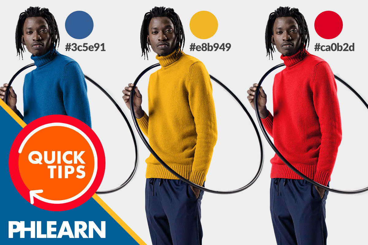
CHANGE ANY COLOR TO A SPECIFIC COLOR
Download Sample Images
description
Learn how to use the Color Grading Tool in Lightroom Classic to apply a professional color grade to an image, and then apply that same coloring to an entire series of images.
Artist Credit
Images sourced from Pexels.
Share
APPLY PROFESSIONAL COLOR GRADE
BEFORE
Pro Color Grading in a Few Clicks
The New Color Grading in Lightroom Classic
Released in 2020, the relatively new Color Grading Tool promises to make the process of color grading quicker and easier without losing the control we need for a professional result.
Follow along as we explore the Color Grading Tool in Lightroom Classic, and use it to color grade an entire collection of images in just a few minutes.
Breaking Down the Color Grading Tool
Import the collection of images provided with the link above, or feel free to use a collection of your own.
Once the images are loaded into Lightroom, open the Develop module, and then open the Color Grading tab.
We’ve talked about color and lightness, but what about saturation? If you want to adjust the saturation of a range, hold SHIFT as you move the cursor within a color wheel.
Once opened, the Color Grading Tool gives us a handful of ways that we can target and adjust the colors in an image.
We can choose to make targeted adjustments, focusing specifically on the highlights, midtones, or shadows in the image.
We can make global adjustments, which will affect the entire photo as a whole. This option is faster, but we sacrifice a lot of control. If you’ve got the time, we recommend sticking with the other adjustment options.
Lastly, there’s the 3-Way adjustment option which allows us to make color adjustments across the highlights, midtones, and shadows with control of each. This is our preferred method, so let’s take a closer look at what it can do.
Notice the 3 color controls for the midtones, shadows, and highlights. These allow you to adjust both the color and the lightness for each range.
While you’re experimenting with color options, you can hold ALT or OPTN to toggle reset options for any one of the color wheels, or for the entire Color Grading Tool. This is great, as it allows you to test out a variety of coloring while being able to quickly undo a change at any point.
If you want a little more control as you move your cursor around a color wheel, holding ALT or OPTN as you drag will decrease the sensitivity of the cursor, allowing you to make finer adjustments.
Coloring a Collection with Sync Settings
If you’re working with a series of similar images from a photoshop, you may want to apply a similar look to every photograph.
The Sync Settings feature in Lightroom makes this process quick and easy.
Back in the Library module, select the image that you’ve color graded.
Then, hit CTRL or CMD + A to select all of the other images that you’ve imported.
Near the bottom right of the screen, click on the Sync Settings button. The Sync Settings dialog will open.
This dialog allows us to choose which adjustments that we want to copy from our main image to every other image that we’ve selected.
Click the Check None button to start from scratch.
Since we only used the Color Grading Tool to make our adjustments, we only need to check the box for Color Grading from the list.
Click Synchronize, and Lightroom will copy those exact adjustments from the Color Grading Tool to every other image selected.
Best of all, you can click on any image, open the Develop module, and then make more adjustments using the Color Grading Tool to give each image a more customized look.
Download Sample Image
Download Sample PSD
Click here to download the complete sample PSD file (304 MB).
description
Follow along as we show you how to realistically change the color of clothing in Photoshop. Learn how to use Layer Masks, Hue/Saturation Adjustment Layers, and Curves Adjustment Layers to change clothing to any color–even black or white.
Share
CHANGE THE COLOR OF CLOTHING–EVEN TO BLACK AND WHITE!
BEFORE
Change the Color of Clothing & Products
The Basics of Changing Colors in Photoshop
Being able to realistically change the color of something in Photoshop is an essential skill, especially when working with images of clothing, fashion, or products. Fortunately, the tools and techniques you’ll need to work with color are easy to use and master.
Using basic selections, Layer Masks, and Hue/Saturation and Curves Adjustment Layers, you’ll be able to change the color of anything in a matter of minutes.
Making a Selection
Like many other Photoshop techniques, the color change workflow starts with a selection. Selections allow us to do a number of things, like target a specific area or object in a photo that we want to edit.
Since we’re trying to change the color of the subject’s clothing, we need to make a selection of the clothing so that we can change the color without affecting anything else in the image.
There are a ton of ways to make selections in Photoshop–some are quick and easy, and others require a little more time and attention. Since the image we’re working with has a relatively simple background, we’re going to focus on the quicker, automated tools to get the job done.
Keep in mind that selections (and Layer Masks) are things that evolve and change throughout an edit. As you’ll see later, an original selection might need to be refined later in the editing process as we notice areas that the quick selection tools might have missed.
To create a quick, initial selection, open the Select menu and choose the Subject option. Photoshop will try to automatically identify and create a selection around the main subject in the photo.
With this particular image, Select Subject does a nice job of accurately identifying the subject and selecting them. Since we’re only trying to edit the clothing, we’ll eventually need to remove the subject’s face, skin, and hair from the selection, but that will be easier once we’ve converted the selection into a Layer Mask.
Creating a Layer Mask from a Selection
Now that we have an active selection, it’s easy to turn it into a Layer Mask. Since we’re focusing on color change, the main tool we’ll be using is a Hue/Saturation Adjustment Layer. Whenever you have an active selection while creating a new Adjustment Layer, Photoshop automatically loads that selection as the Layer Mask of the Adjustment Layer.
With the selection active, simply create a new Hue/Saturation Adjustment Layer above the image in the Layers Panel. Photoshop will apply the selection to the Layer Mask.
We’re just about ready to start adjusting the color of the clothing, but first we need to remove the subject’s face, skin, and hair from the Layer Mask so that they’re not affected by the Hue/Saturation Adjustment Layer.
Refining the Layer Mask
Layer Masks are very easy to edit and refine over time. The most important thing to remember is that a Layer Mask simply defines where its associated Layer will be visible. White means that that part of the Layer will be visible (in this case, the subject), and black means that that part of the Layer will be invisible (in this case, the background).
Since we want to isolate the clothing, only the clothing should appear in white on the Layer Mask.
Try using the Quick Selection Tool to select the subject’s face and hair. Once you have an active selection, click on the Layer Mask of the Hue/Saturation Adjustment Layer, and then fill the selection with black by opening the Edit menu and clicking on the Fill option.
Repeat this process for any other areas of the subject’s skin and hair.
Once you’re done, only the clothing should be visible in white on the Layer Mask.
Changing the Color
Now that the clothing is separated from the rest of the image, we’re ready to adjust the color! In many cases, a single Hue/Saturation Adjustment Layer will do the trick, but occasionally an additional Curves Adjustment Layer can help bring back detail in the highlights and shadows (most useful when changing the color to black or white). Since it’s handy to have a Curves Adjustment available, let’s set the project up so that we can use both.
We’re going to need the same Layer Mask for both the Hue/Saturation Adjustment Layer and for the Curves Adjustment Layer.
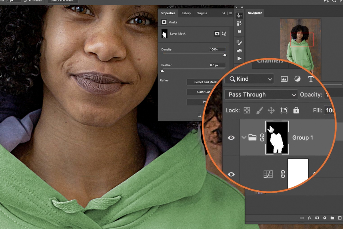
The easiest way to do this, and stay organized, is to put the Hue/Saturation Adjustment Layer into a Group by selecting it and then hitting CTRL or CMD + G.
Then click and drag the Layer Mask we created up to the Group. Now everything we place into this Group will be defined by the Layer Mask of the Group.
Create a Curves Adjustment Layer and place it into the Group with the Hue/Saturation Adjustment Layer.
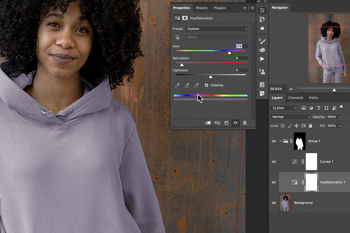
Working with Hue/Saturation Adjustment Layers
To change the color of the clothing, double-click on the Hue/Saturation Adjustment Layer to open the dialog.
Make sure to check the Colorize box just below the three main sliders. Then adjust the sliders to change the color of the clothing!
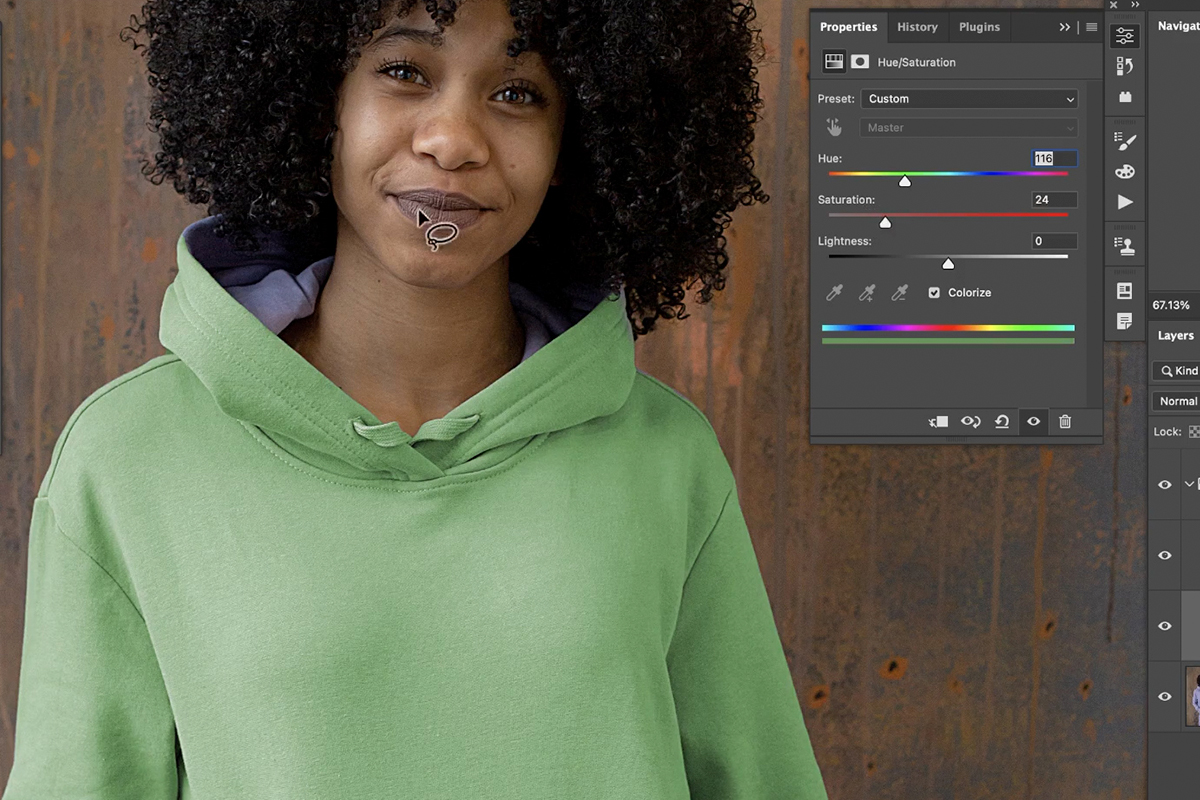
While changing the color, you may notice other areas you might have missed while creating the selection and Layer Mask. You can use a variety of selection tools, or just the Brush Tool set to black or white, to further refine the Layer Mask.
Changing the Color to Black or White
Our initial color change turned the clothing from lavender to green, which was pretty easy. But what if we wanted to change the clothing to black or white?
Changing the color of something to black or white can be tricky as it’s easy to lose important details in texture or in the highlight and shadow information.
That’s where the Curves Adjustment Layer can help. For example, let’s try changing the color to black.
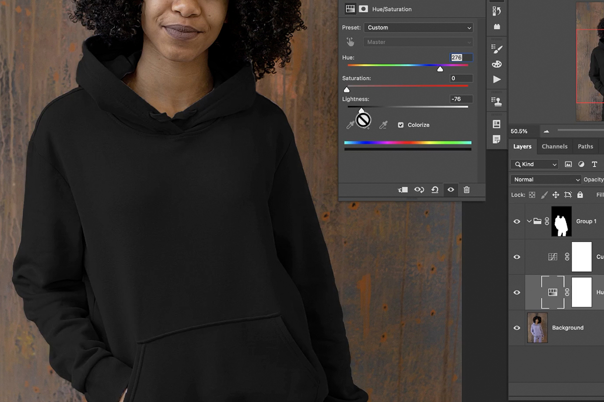
Drag the Saturation slider all the way to the left. Then, drag the Lightness slider in the Hue/Saturation Adjustment Layer dialog to near black. Don’t drag it all the way to the left, as you will lose almost all of the detail you’ll need to make it look realistic.
Then, double-click on the Curves Adjustment Layer dialog. Make the darks a little bit darker, and the highlights a little bit brighter. This will help to recover some of the original highlight and shadow information, creating a much more realistic effect.
You can follow the same steps if you want to change the color to white. The only difference being that you want to reverse the Curves adjustments, instead making the highlights a little bit darker and the shadows a bit brighter.

Download Sample Images
description
Learn how to add a bright and beautiful color grade to your photos with the Camera RAW filter in Photoshop!
Ready to learn more Photoshop? Check out The Beginner’s Guide to Photoshop and our comprehensive series of courses in our Photoshop Learning Path.
Share
BEAUTIFUL COLOR IN JUST A FEW MINUTES
Download Sample Images
description
Learn how to use Levels and Hue/Saturation Adjustments to turn black into any color in Photoshop!
Ready to learn more Photoshop? Check out The Beginner’s Guide to Photoshop and our comprehensive series of courses in our Photoshop Learning Path.
Share
TURN BLACK INTO ANY COLOR
Download Sample Images
description
Learn how to quickly change the color of almost any background in Photoshop!
Ready to learn more Photoshop? Check out The Beginner’s Guide to Photoshop and our comprehensive series of courses in our Photoshop Learning Path.
Share
QUICKLY CHANGE THE COLOR OF A BACKGROUND
Download Sample Image & PSD
description
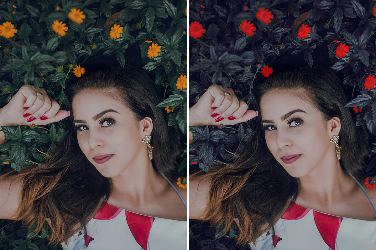
Follow along as we change the color of plants and flowers in Photoshop! Learn how to use Hue/Saturation Adjustment Layers, Layer Masks, Groups, and more.
Share
BEFORE
Change the Color of Plants & Flowers
Change the Color of Anything in Photoshop
Photoshop makes it fairly easy to select particular colors, or even objects, in a photograph and make change to the hue, saturation or brightness.
And changing the colors of plants and flowers is a great way to add more visual interest to an image or just to create an eye-catching effect.
Let’s see what we can do with the plant and flowers in this photo to make the image a littler darker and more dramatic.
Changing Colors with Hue/Saturation
We have some great courses on the power of Adjustment Layers in Photoshop and, if you want to master these useful tools, the Hue/Saturation Adjustment Layer is a great place to start.
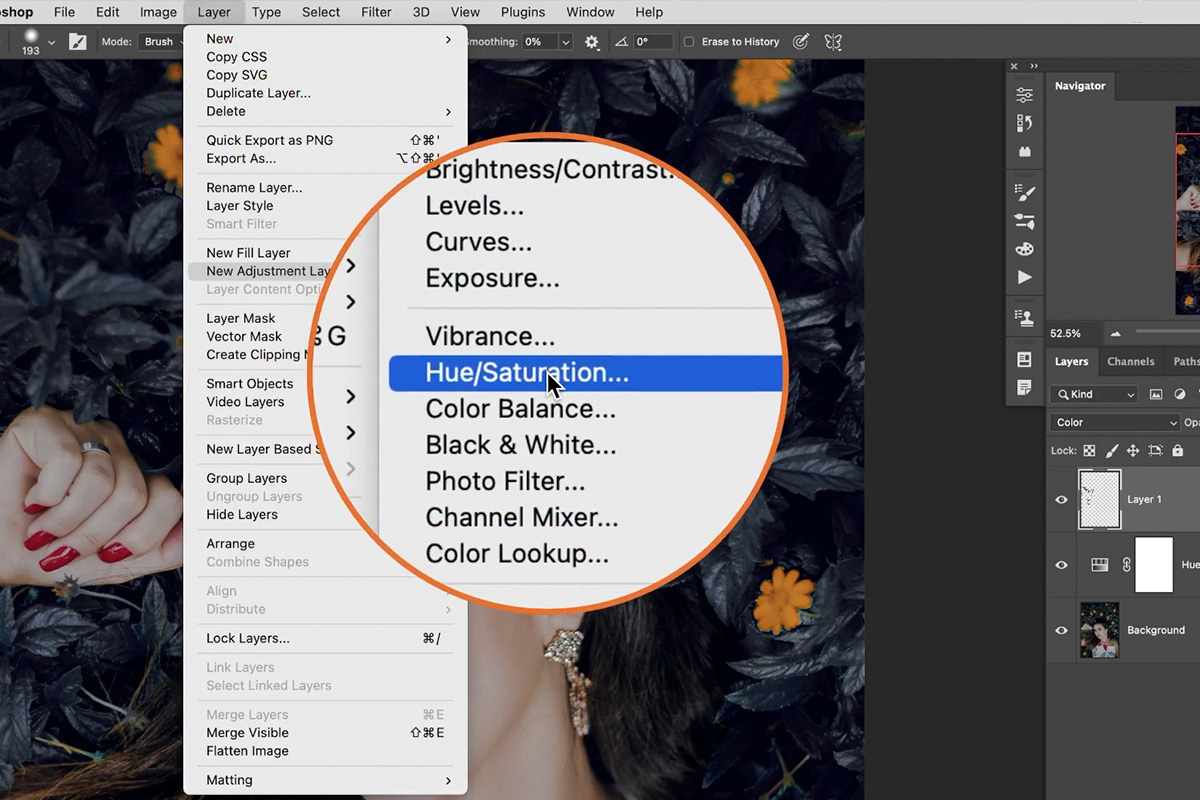
You can add Adjustment Layers to the Layer Stack vie the Layer menu at the top of the screen. Hover over New Adjustment Layer and a list will appear with all of the available options.
Since we want to focus on changing the colors in our image, create a Hue/Saturation Adjustment Layer. Once selected, the Hue/Saturation Adjustment dialog will appear. This dialog provides a number of options to both select and change any color in a photo.
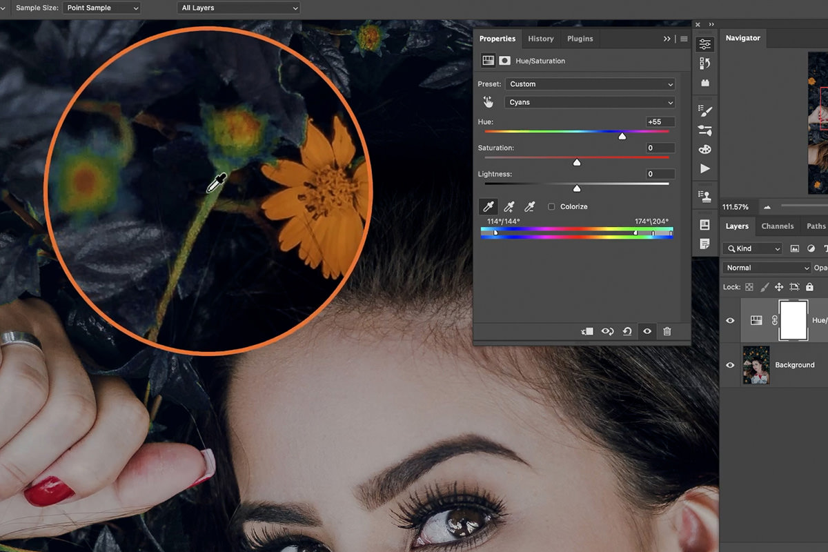
Let’s begin by changing the colors of leaves. The easiest way to do this is by selecting the greens in the image. Click on the drop-down box that’s currently set to Master, and then change it to Greens.
Then, for even more precision, you can use the eyedropper tools to select the specific hues of green that you want to adjust.
Once the colors you want to adjust have been selected, move the Hue, Saturation, and Lightness sliders to the left and right to see how those changes affect the image.
We chose to change the green leaves to be more of a dark blue/purple color.
We’ll move on to change the color of the flowers in a moment, but first we need to take care of some spots that the Hue/Saturation Adjustment Layer missed.
Refining Hue/Saturation Adjustments
While the selection tools within the Hue/Saturation Adjustments are very helpful, they won’t always provide a perfect result.
Zooming in, notice that some small areas, like flower stems, were missed by our original selections.
Fortunately, this is a pretty simple fix and we have a few options as to how we approach it.
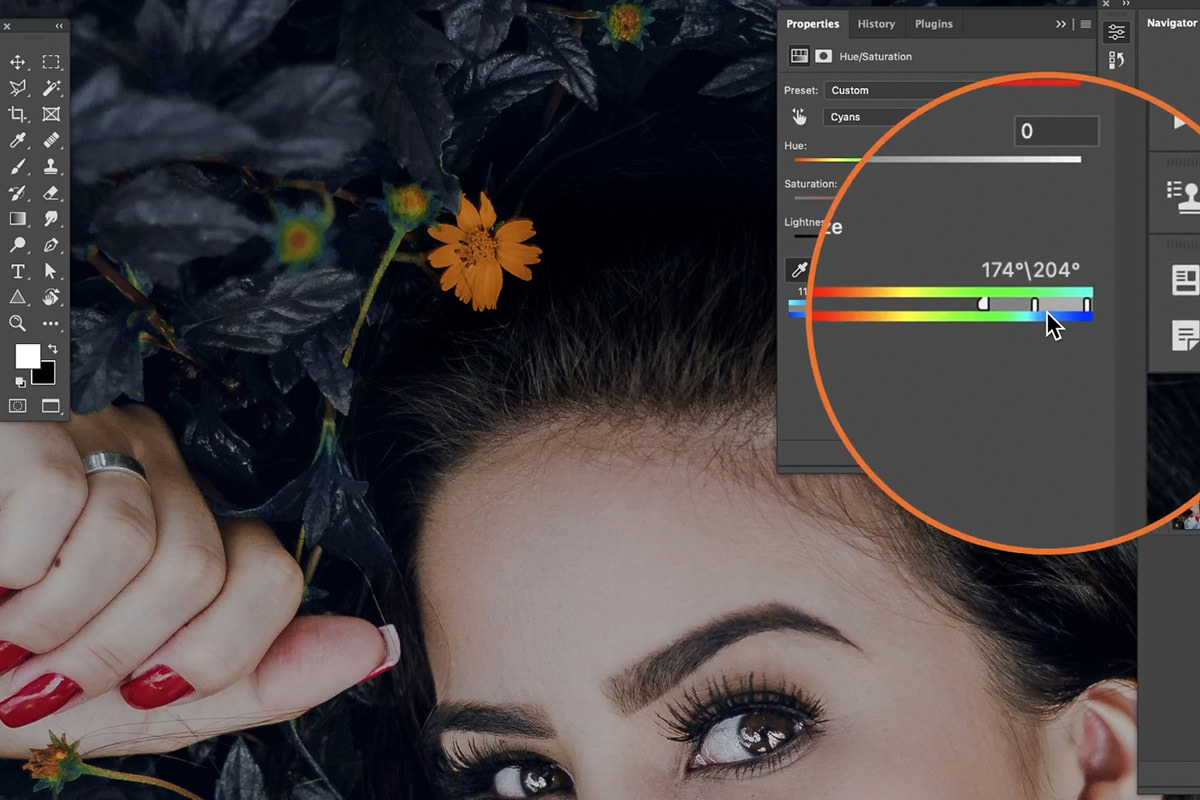
One method is to simply double-click on Hue/Saturation Adjustment Layer to open the settings window, and then adjust the feathering of the effect using the slider at the bottom of the panel.
By increasing the feathering, the Adjustment will expand out to affect a wider range of hues.
While this can sometimes solve the problem, it didn’t do very much for us in this particular example.
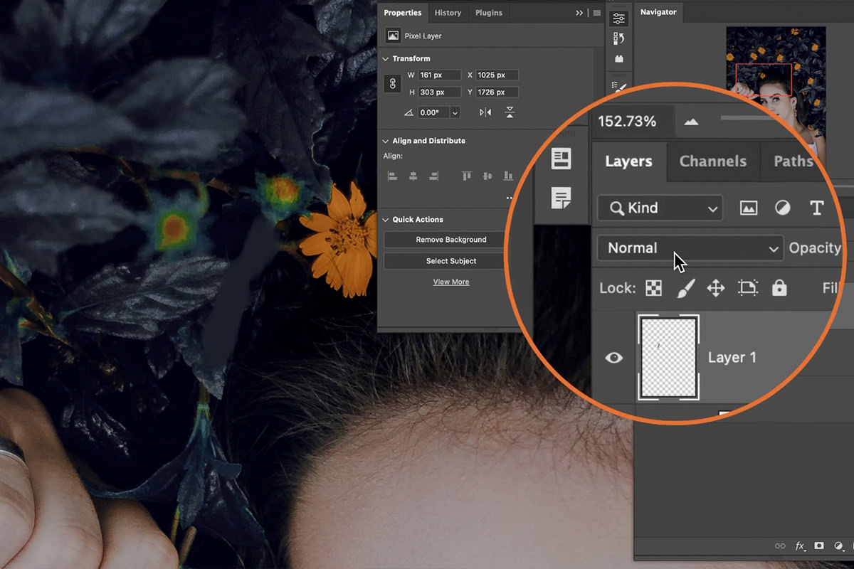
Another more manual approach is to create a new Layer, select the Brush Tool, Sample a color from the surrounding area (hold ALT or OPTN and click on any color to sample it), and then paint over the spot that we want to change to the sampled color.
Select the Layer that you painted on, locate the Blending Mode options at the top of the Layer Panel, and change the Blending Mode to Color.
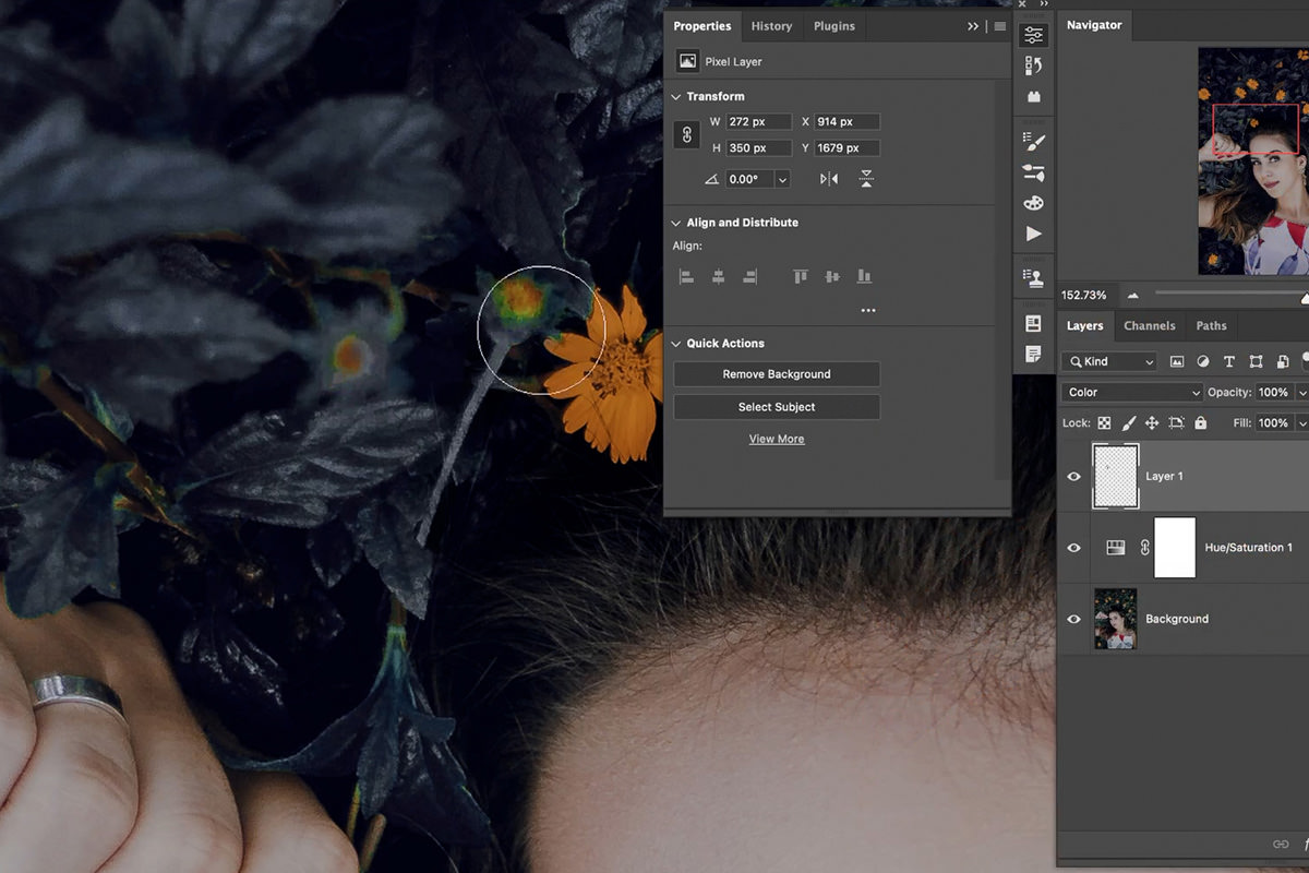
Notice that Photoshop used the color of where we painted to change the color of the photo information below it.
We’re done with the leaves, now let’s try and change the color of the flowers to complete our new look!
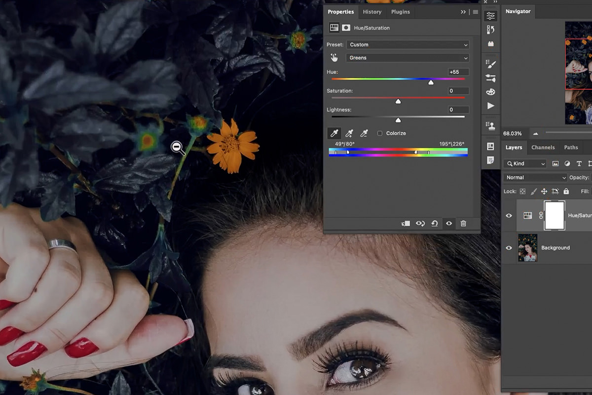
Changing Multiple Colors
Since we’re changing the color of multiple objects in the image, we’re going to need multiple Hue/Saturation Adjustment Layers to finish the job.
Using the same process as when we started, created a new Hue/Saturation Adjustment Layer on top of the Layer Stack.
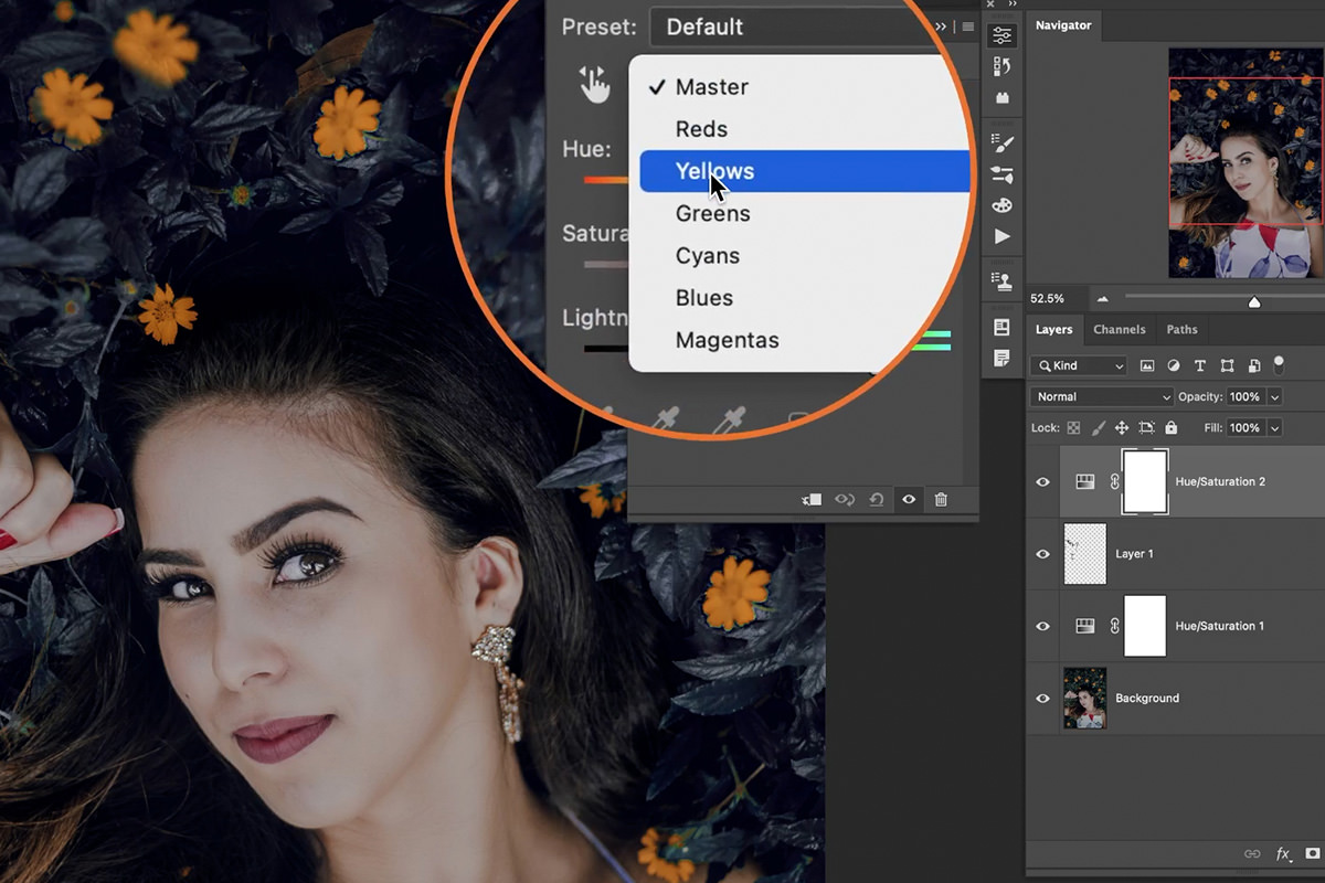
Since our goal is to change the color of the flowers, choose Yellows from the drop-down box in the Hue/Saturation dialog.
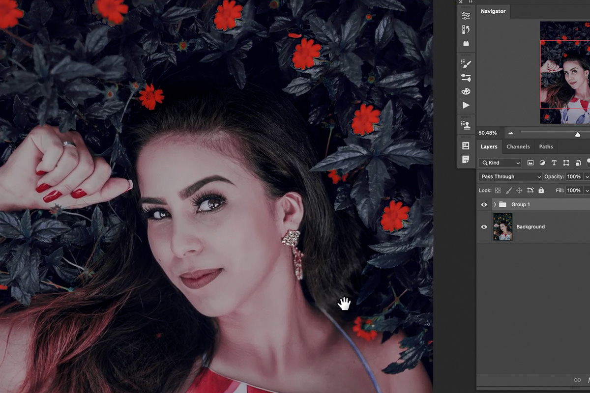
We chose to go with a pretty saturated red to make the image a little more dramatic. But there’s an issue.
Notice that the new adjustment affected the skin tone of the subject. This is a pretty common issue when working with images of people. Any time you adjust reds, oranges, or yellows–any warm color tones–you’re going to end up changing the skin tones of any people in your photo.
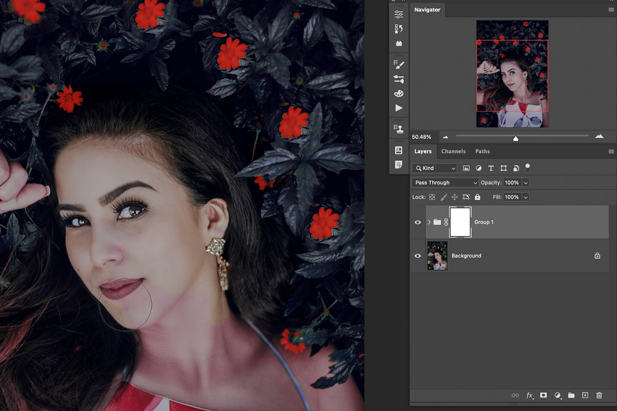
As long as you know to look out for this issue, it’s another easy fix.
Simply Group all of the Hue/Saturation Adjustments together by selection all of them and hitting CTRL or CMD + G. Add a Layer Mask to the Group and, using a soft, round brush, use the Brush Tool to paint with black on Layer Mask over the subject and their skin.
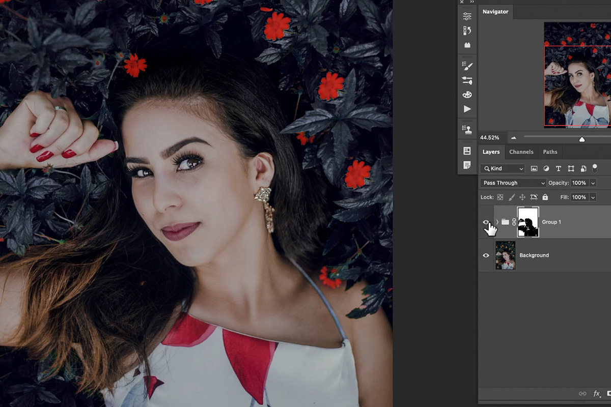
This will remove any color changes from affecting the colors in the subject’s skin, hair, and clothing.
You should end up with plants and flowers appearing in the colors that you chose, and a subject that looks perfectly natural.
Download Sample Images
DOWNLOAD PSD
Download the PSD (54 MB).
description
Learn some easy Photoshop techniques to change the color of clothing and fabric to match any background!
Share
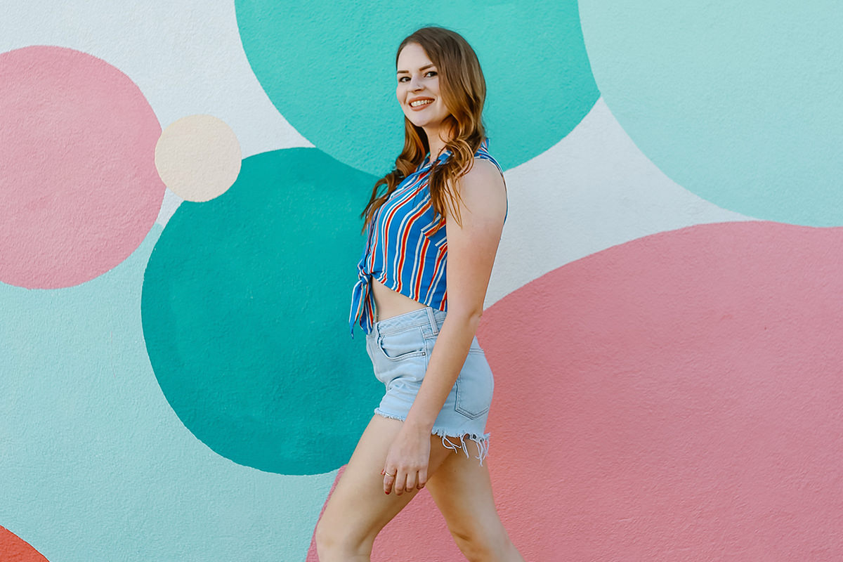
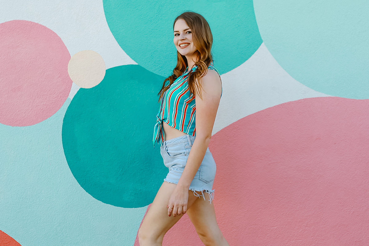
MATCH CLOTHING COLOR TO ANY BACKGROUND
BEFORE
Change the Color of Clothing
Changing Colors in Photoshop
Creating a more cohesive color palette in an image can make for a more pleasing and impactful photograph. Take, for example, a photo of colorful clothing in front of an equally colorful background.
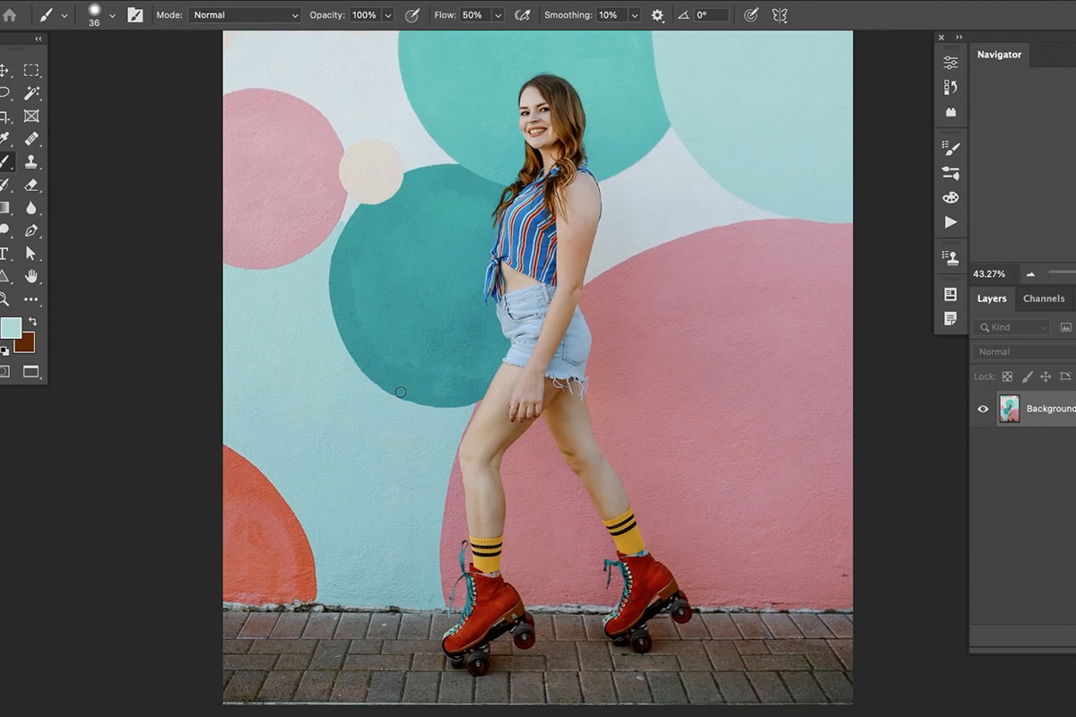
The colors are what make this image pop, but what if we could take it a step further and match the color of the subject’s clothing to more closely match the mural in the background? Let’s give it as try!
Hue/Saturation Adjustment Layers
We often talk about the power of Adjustment Layers in Photoshop. And when you want to change the color of anything, there’s no better tool than the Hue/Saturation Adjustment Layer.
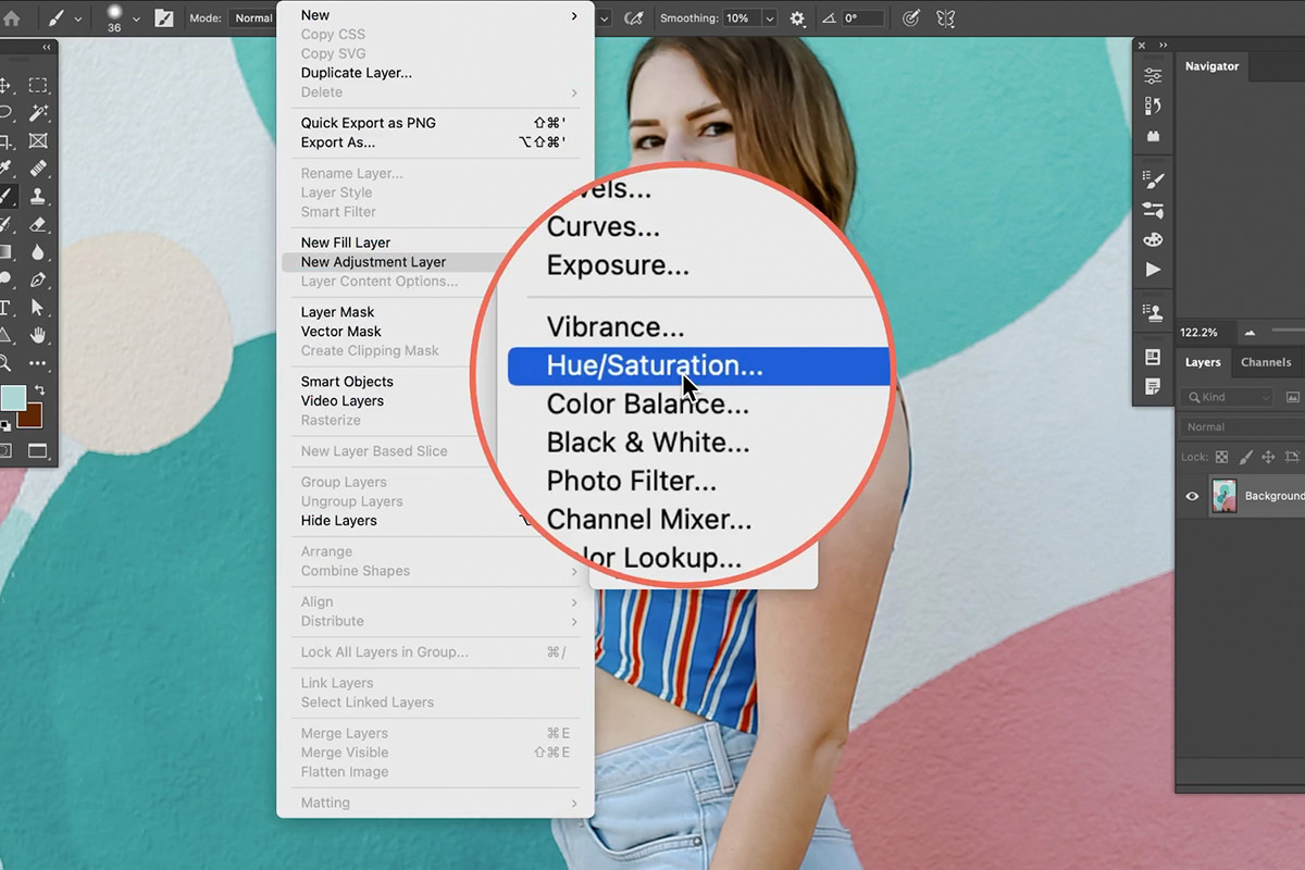
Create a Hue/Saturation Adjustment Layer above the background image. Notice that there are a variety of tools that allow us to define color ranges that we want to affect.
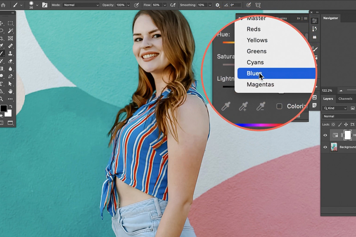
In this particular example, we want to change the color of the subject’s shirt to more of teal color to match the circles in the background.
Using the top drop-down box, we can select Blues to try and target the blue colors in the shirt.
Once you’ve finished defining the Layer Mask, you’re done! You’ve successfully changed the color of the clothing so that it better matches the background.
But we’re not quite done. Let’s take a look at another technique that uses the Brush Tool to remove some bright colors that might be a little too distracting.
Color Change with the Brush Tool
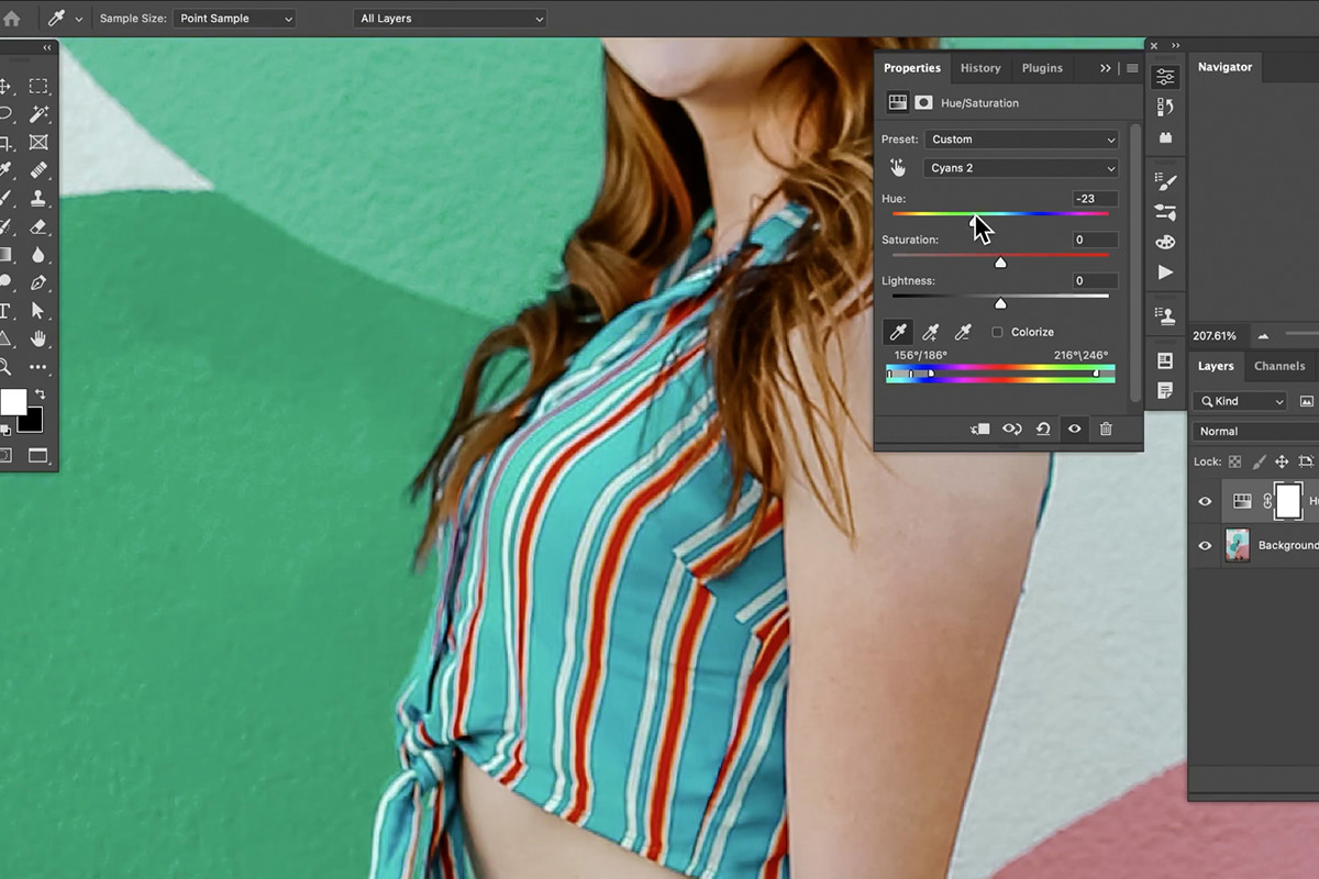
Now when we move the Hue Slider, the blues in the subject’s clothing change. But you’ll also notice that the background colors change as well. Don’t worry too much about this, as we can use a Layer Mask to prevent the Hue/Saturation Adjustment Layer from affecting areas that we don’t want it to.
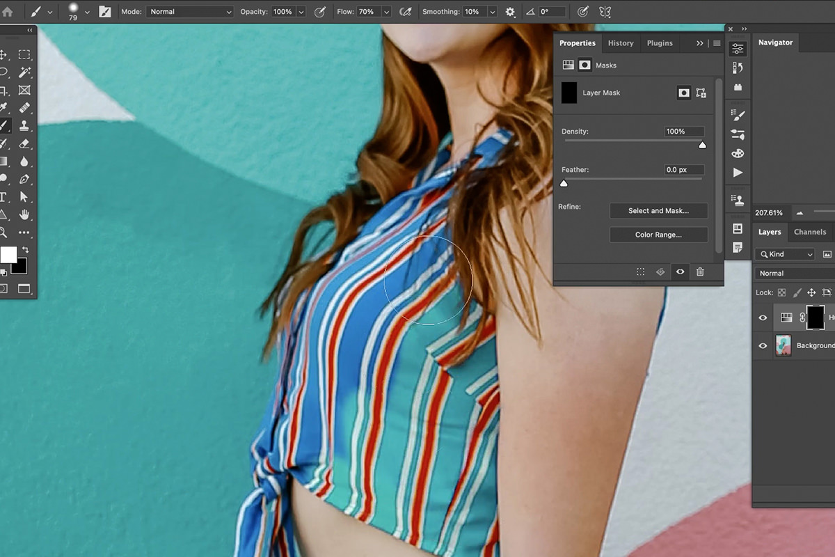
Fill the Layer Mask of the Hue/Saturation Adjustment Layer with black, and then use the Brush Tool to paint white on the Layer Mask where you want the color change to appear–in our case, the subject’s shirt.
The Brush Tool & Blending Modes
You can also change the color of almost anything in a photo by simply painting with the Brush Tool and using Blending Modes to affect the color.
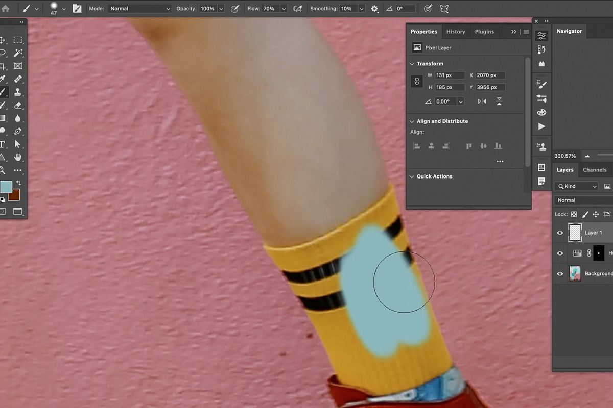
Sample a teal color from the background and, on a new Layer, paint over a small area of the subject’s bright yellow socks. We’ve got the color we want, but not the effect–it clearly looks like we just painted over the fabric.
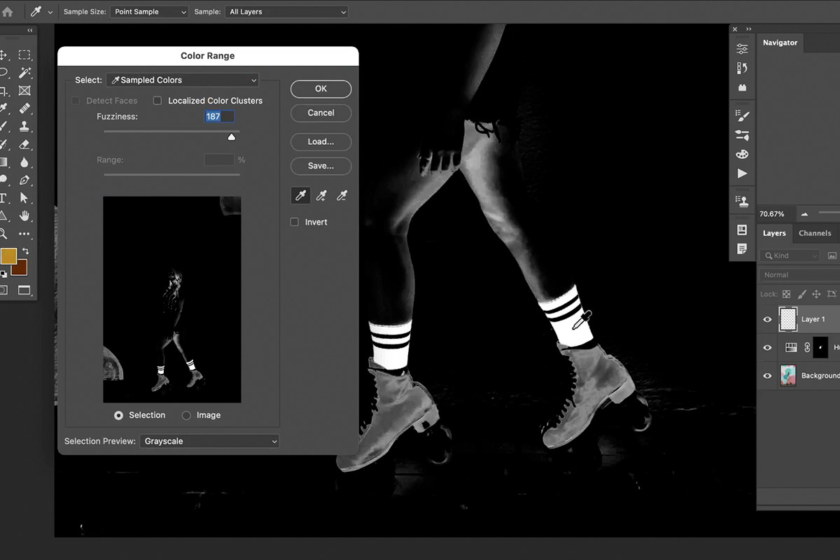
To refine the effect, we’ll first need to make a fairly accurate selection of the areas we want to affect. Since we’re targeting the only bright yellow objects in the image, Select Color Range is the perfect tool for the job.
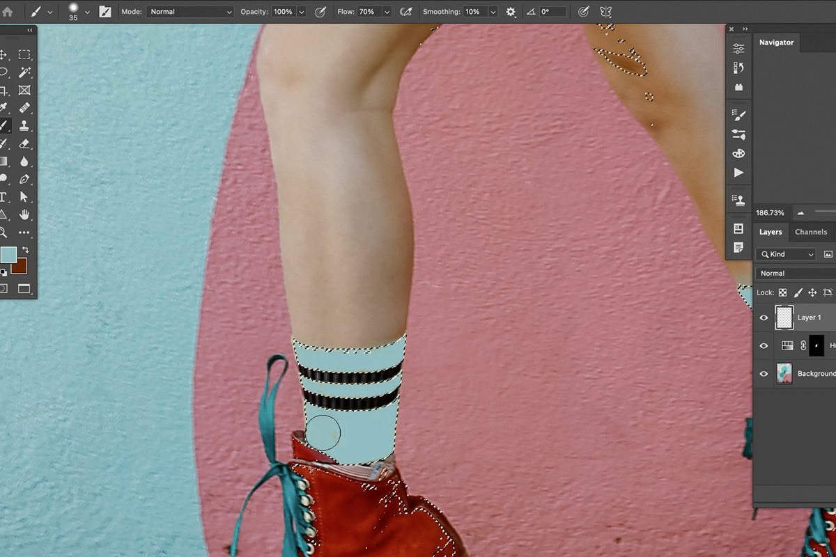
Once you’ve got a selection of the yellow socks, go back to painting over them with that sampled teal color.
Change the Blending Mode of that painted Layer to Color, and you’re good to go!
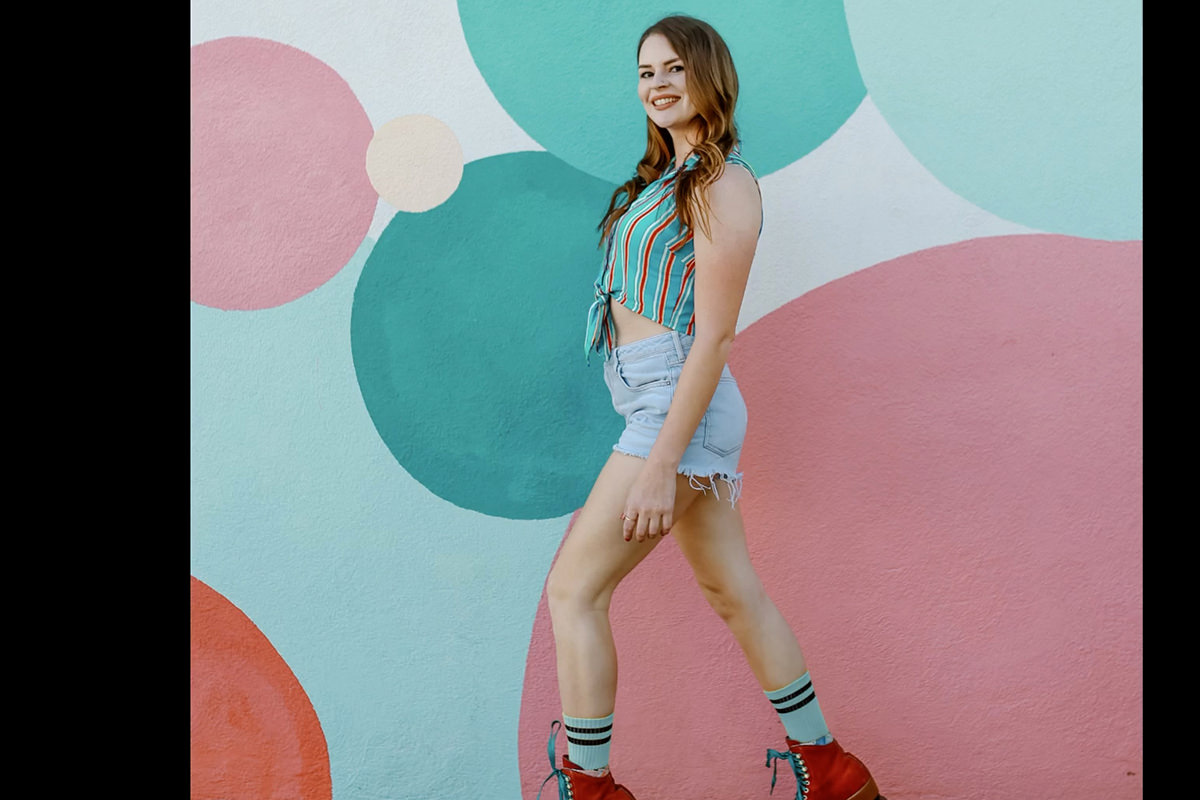
You should be left with clothing that more closely matches the background, and a more cohesive color palette overall!
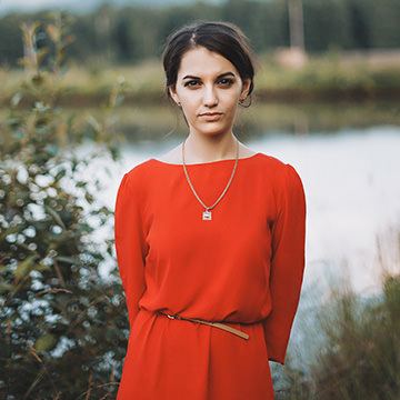
Download Sample Images
description
Learn how to color correct any photo in just a few easy clicks using Curves in Photoshop!
Ready to learn more Photoshop? Check out The Beginner’s Guide to Photoshop and our comprehensive series of courses in our Photoshop Learning Path.
Share

INSTANT COLOR CORRECTION
Hi Aaron, I’ve been following your courses since 2020, and they’re now as much a part of my routine as a good cuppa. Your boundless enthusiasm, energy, and passion for teaching keep me tuning in—far healthier than bingeing biscuits, I reckon! Thanks for all the hard graft. Please keep it up and don’t let your sparkle go off for a tea break—you’re a cracking teacher. Doug.
Fantastic tutorial! Very powerful tools and techniques, taught by Aaron with his usual outstanding work flow. Congratulations!
Peter again … didn’t finish my comment … because of color blindness, do you have or would you make an updated tutorial on creatinfg black & white images?? Thanks Peter Prentice
Hi Peter! Our team has reached out to you via email with a link to our Black and White PRO!
I really enjoyed this tutorial … a great opportunity to use some basic skills that I hadn’t thought of very much and then individually fix multiple issures … not “fix” … “improve” is a better term! The color grading was a little harder because I am partly red green colorblind so I don’t always see much difference.
I’m really finding color grading helpful with my underwater photos. Thank you AAron.
Thank you Aaron, I had a great time and learned a lot by following you with your pictures.
Great lessons. Very good presentation