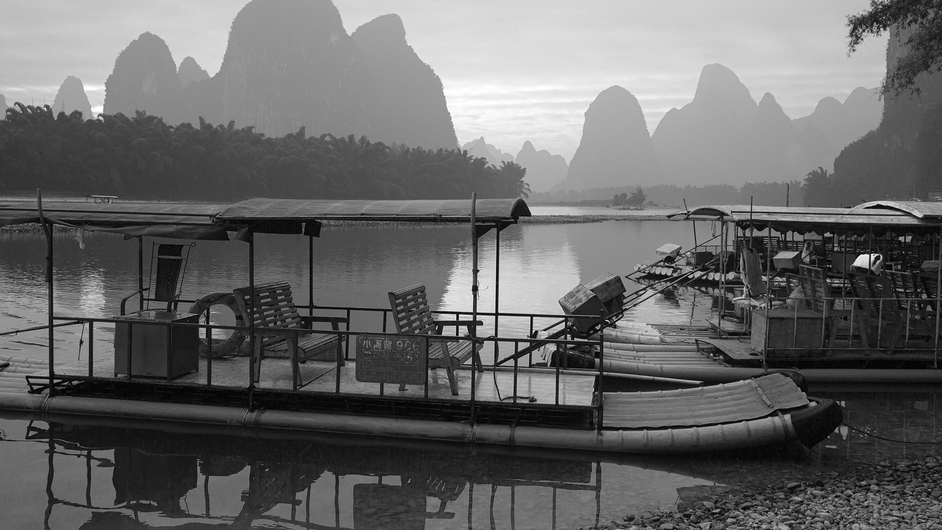

Download Assets
Download Assets
This tutorial includes 1 sample RAW file. Downloads are free with a PHLEARN account.
- Free sample files with every tutorial on PHLEARN
- New tutorials published every week
- Unlimited downloads with your free PHLEARN account
Watch the Full Series
description
Black and white is not Saturation dragged to zero. It flattens every color to whatever brightness it happened to have, and the result is usually gray and lifeless.
On Day 19 of 30 Days of Lightroom Classic we use the Black and White Mix to decide how each original color renders as tone, then add a subtle sepia with color grading.
This is Day 19 of our 30 Days of Lightroom Classic series. Follow along with all 30 episodes as we explore the magic of Lightroom together!
Continue Watching 30 Days of Lightroom Classic
JOIN 30 DAYS OF LIGHTROOM (FOR FREE!)
Ready to jump in? Sign up and we’ll email you a printable calendar and daily class schedule so you can get started right away!
Image Source

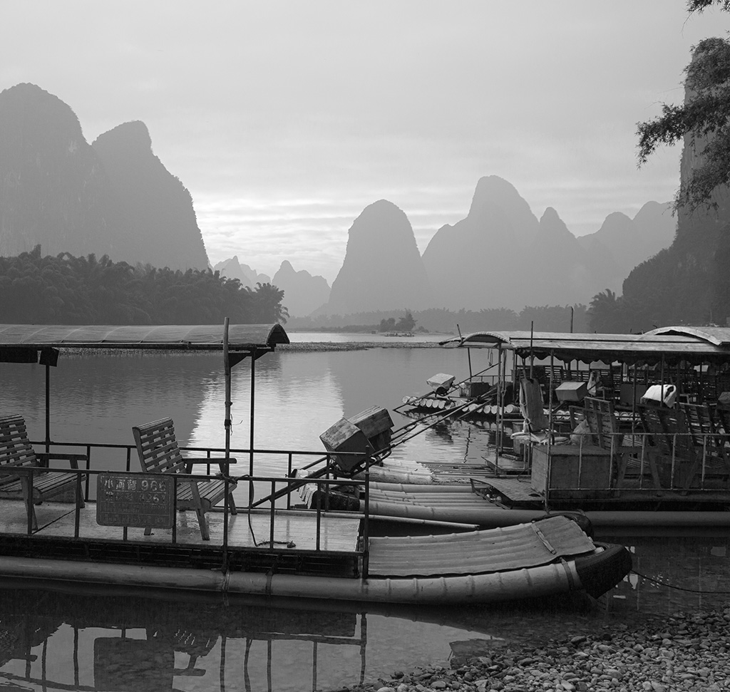
Black and White Starts With the Colors You Had
Dragging Saturation to zero is not a black and white conversion. It flattens every color to whatever brightness it happened to have, and the usual result is a gray, lifeless image with no separation between things that were obviously different in color.
A proper conversion decides how bright each original color becomes. A red door and a green wall can be identical shades of gray or strongly contrasting ones, and that choice is yours. Day 19 covers the panel that gives you it, and finishes with a subtle sepia tone.
Converting Properly
At the top of the Basic panel, beside Auto, is a Black & White treatment button. Click it.
This does something different from removing saturation. It switches the file to a monochrome interpretation and unlocks a new panel in the right-hand column — B&W, containing the Black and White Mix.
The Black and White Mix
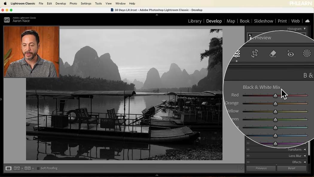
Eight sliders — red, orange, yellow, green, aqua, blue, purple, magenta. Each one controls how bright anything that was that color becomes in the monochrome image.
Drag the red slider right and everything that was red turns pale. Drag it left and it goes near black. The color information is still in the file; you are deciding how to translate it into tone.
This is where black and white contrast comes from. Two areas that were different colors but similar brightness will merge into the same gray unless you separate them here — and separating them is the whole craft.
Start with Auto, then go slider by slider
The Auto button in this panel gives a reasonable starting mix. It is genuinely useful as a point to react to, but it is not the finish. Working through each slider by hand, watching what moves, is where the image is actually made — lifting oranges alone can transform the contrast of a photograph.
The targeted adjustment tool

The small icon in the corner of the panel works exactly as it does in the Color Mixer: click it, then drag up or down directly on the image.
One thing to understand about it. It responds to the color that area used to be, not to the region you clicked. Drag on a piece of metal and you are moving whatever color that metal originally was — everywhere in the frame. That is a feature rather than a limitation, but it explains why other parts of the picture move with it.
Everything Else Still Works
The conversion does not lock anything. Go back to the Basic panel afterwards and Exposure, Contrast, Highlights and Shadows all behave normally.
Contrast is worth experimenting with in both directions. High contrast is the obvious choice for monochrome, and a lower-contrast, flatter treatment can look considerably more sophisticated on the right image.
Texture and Clarity also deserve a mention here. With color gone, texture is doing much more of the work of holding attention, and black and white tolerates more of both than a color image would.
Masking works normally too — a mask that lifts a subject, a gradient that holds back a sky, all unaffected by the conversion.
Adding a Tone Back
Here is the part that seems contradictory and is not: having removed the color, you can put a little back deliberately.

The Color Grading panel still applies to a monochrome file, and tinting the tonal ranges is how sepia and split-toned prints have always been made. The method for each wheel:
-
Drag the centre point to the outer edge
Full saturation, so the hue is unmistakable.
-
Rotate the outer ring through the whole circle
Stop where it looks right. Warm yellows and oranges in the highlights give the classic aged look.
-
Pull the saturation back down hard
Until it is barely there. A tone should be felt, not identified.
Warm highlights with cooler shadows is the combination that reads as a print rather than a filter. The sliders beneath each wheel adjust brightness for that range, so you can add contrast at the same time.
Double-click any control to reset it — useful when a wheel has gone somewhere you cannot get back from.
The eyeball at the top of the Color Grading panel toggles the whole tone, letting you compare pure monochrome against the tinted version. Both are legitimate; it is a taste decision.
Where This Usually Goes Wrong
Using Saturation at ?100 instead of the B&W treatment. You lose the entire Black and White Mix, which is the only reason to convert in Lightroom rather than shoot monochrome.
Accepting the Auto mix. It is a starting point. The interesting decisions are in the sliders.
Forgetting that colors you cannot see still matter. If two areas look identically gray, they were similar in brightness — find their original colors and separate them.
Over-toning. Sepia at anything above “barely perceptible” looks like a phone filter.
Assuming every photo suits monochrome. Images that depend on color relationships lose their subject entirely. Black and white suits texture, shape, light and contrast.
Take It From Here
Black and white is underrated, largely because most people arrive at it by deleting the color rather than translating it. Spend two minutes in the Black and White Mix and a flat gray conversion becomes a photograph with real separation and depth — and the color data is always still there if you change your mind.
Tomorrow we look at keeping several versions of the same edit at once: virtual copies in Lightroom Classic.
Quick Reference: Keys, Menus and Settings
- ConvertDevelop > Basic panel > Black & White
- Set the tonesB&W panel > Black and White Mix: Auto to start, then drag each color slider
- Drag on the photoClick the targeted adjustment icon, then drag up or down on the image
- RefineBasic panel: Exposure and Contrast; Texture and Clarity up a little
- Add a toneColor Grading: center point to the edge, rotate the outer control, pull back in; double-click to reset
- CompareEye icon on Color Grading; \ for the full before and after
The color data stays in the file, so you can go back to color at any time.

Free Downloads
Follow Along on the Same RAW File
Get the RAW file from the tutorial, full of distinct colors for the Black and White Mix to pull apart before you add a subtle tone. Free with a PHLEARN account.
Black and White in Lightroom: Common Questions
How do I convert a photo to black and white in Lightroom Classic?
In the Develop module, click Black & White at the top of the Basic panel. A new B&W panel opens with the Black and White Mix.
Why not just drag Saturation all the way down?
That flattens every color to the gray it happens to be and leaves you without the Black and White Mix. The Black & White treatment lets you decide how bright each original color becomes.
What does the Black and White Mix do?
Each slider controls how light or dark anything that was that color becomes. Drag the red slider and everything that was red in the original gets lighter or darker.
Should I use Auto in the Black and White Mix?
It is a good place to start, but go through each slider yourself. In the tutorial, bringing up the oranges adds a lot of contrast.
Why does dragging on one spot change other parts of the photo?
The targeted adjustment tool works on the color that area was originally, not on the spot you clicked. Everything else in the photo that was that color moves too.
Can I still adjust exposure and contrast after converting?
Yes. The Basic panel works as usual, and a little less contrast can look great. A touch of Texture and Clarity helps black and white photos too, and masks still work.
How do I add a sepia tone to a black and white photo?
Open Color Grading, drag a wheel’s center point to the edge, rotate the outer control around the wheel to find the color, then pull the center point back in. A warm yellow in the highlights gives an aged look.
How do I reset a color grading wheel?
Double-click the control on the wheel and it goes back to neutral.
How do I compare the toned and untoned versions?
Click the eye icon at the top of the Color Grading panel to switch the tone off and on. Press the backslash key for the before and after of the whole edit.
Is the sample file free?
Yes, with a free PHLEARN account. You get 1 sample RAW file: the colorful photo converted in the tutorial.
Master Photoshop, Lightroom and Photography
Join PHLEARN PRO for $12.99 a month or $99.99 a year. Cancel anytime, with a 100% money-back guarantee.





