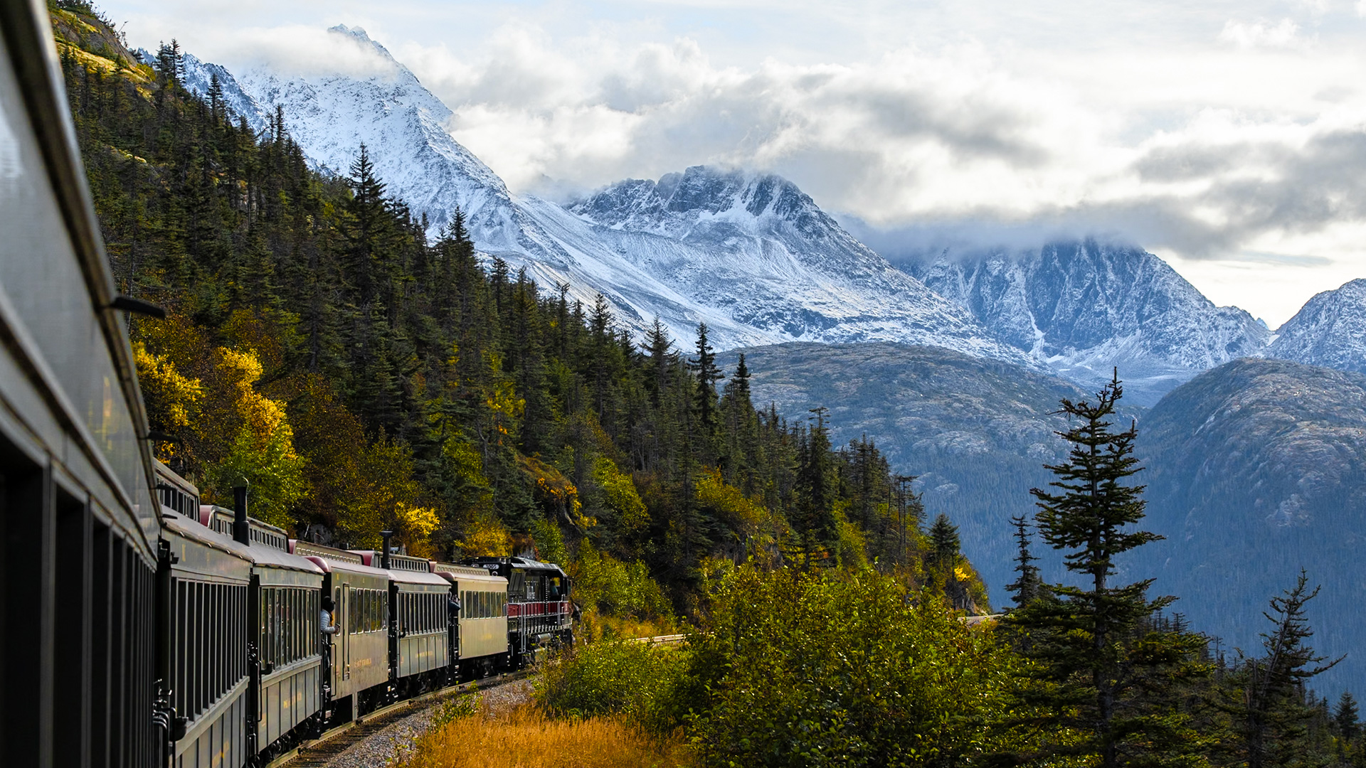

Download Assets
Download Assets
This tutorial includes 1 sample RAW file. Downloads are free with a PHLEARN account.
- Free sample files with every tutorial on PHLEARN
- New tutorials published every week
- Unlimited downloads with your free PHLEARN account
Watch the Full Series
description
The color mixer is what you should reach for when color looks flat, rather than Vibrance, which makes everything more colorful whether it needed it or not.
On Day 8 of 30 Days of Lightroom Classic we target individual colors with the Color Mixer and its targeted adjustment tool, isolate specific tones with Point Color, and look at what Calibration does differently.
This is Day 8 of our 30 Days of Lightroom Classic series. Follow along with all 30 episodes as we explore the magic of Lightroom together!
Continue Watching 30 Days of Lightroom Classic
JOIN 30 DAYS OF LIGHTROOM (FOR FREE!)
Ready to jump in? Sign up and we’ll email you a printable calendar and daily class schedule so you can get started right away!
Image Source
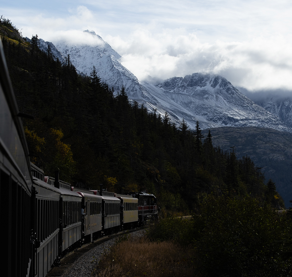
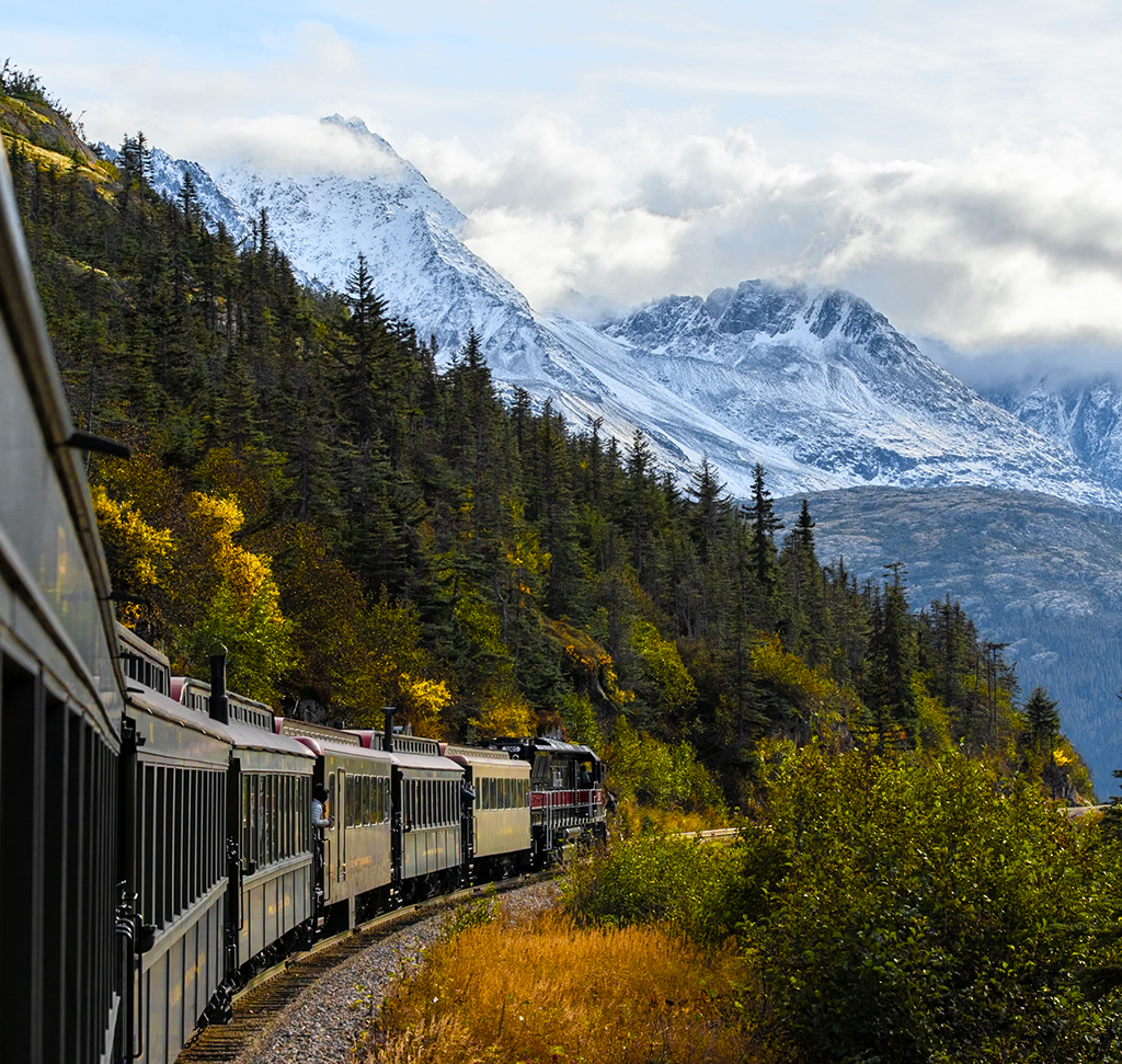
The Color Mixer Beats Reaching for Vibrance
There is a moment in most edits where the color looks flat and the instinct is to reach for Vibrance. It works, in the sense that everything gets more colorful — the leaves, the sky, the shirt, the skin, all of it, whether or not any of them needed it.
Day 8 is about the alternative: choosing which colors in a photograph get stronger and which stay put. Lightroom Classic gives you three tools for that, and using them together is the difference between a picture that looks vivid and one that looks saturated.
Start With Auto, Then Undo What It Did to Color
Auto in the Basic panel remains the right first move — it sorts out highlights and shadows and gets your tones into a sensible place. But it also nudges Vibrance up, and on some images it quietly moves individual saturation sliders in the Color Mixer too.
Before doing color work by hand, take those back. Set Vibrance and Saturation to zero, and Alt or Option-click to reset the Mixer and Point Color panels. You want to be building color deliberately, not on top of an automatic guess you cannot see.
Check White Balance First
Everything downstream depends on it. As Shot is often fine, and the presets — Daylight, Cloudy and the rest — are there when it is not. The Temperature and Tint sliders handle the rest, warming or cooling the whole frame. Get this settled before touching individual colors, because changing white balance afterwards shifts every adjustment you made.
The Color Mixer
This is the main event. The Color Mixer splits your image into eight color bands — red, orange, yellow, green, aqua, blue, purple and magenta — and lets you adjust each one independently across three properties:
Hue shifts the color itself, sliding a green towards yellow or towards aqua. Saturation controls how intense it is. Luminance controls how bright it is, which is the one people forget and often the most useful of the three.
Set Adjust to All
The panel defaults to showing Hue, Saturation or Luminance one at a time. Switch it to All and every slider is visible at once, which saves a great deal of clicking back and forth.
Use the targeted adjustment tool
The small circular icon in the corner of the panel is the reason to use the Mixer rather than fight it.
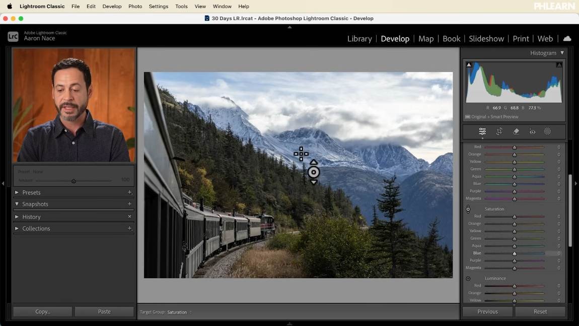
Click it, then hover over your photograph. Lightroom highlights which sliders the color under your cursor actually belongs to. Click and drag up or down on the image itself and it moves those sliders for you, weighted correctly.
This matters more than it sounds. Autumn foliage that reads as “yellow” is usually yellow and orange, and dragging on the leaves themselves adjusts both in the right proportion. Picking the yellow slider by hand would have missed half of it.
HSL or Color mode
The Adjust control switches the panel between HSL and Color.
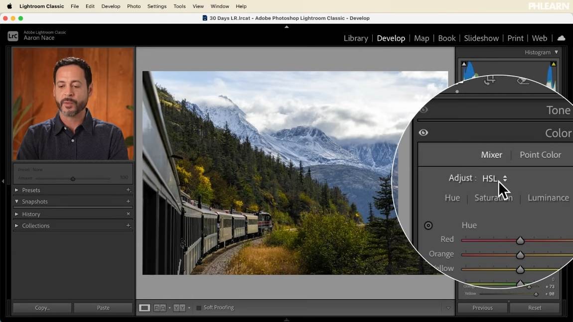
Color mode gives you a swatch per color with its own Hue, Saturation and Luminance underneath — tidier to look at, but there is no targeted adjustment tool, so you have to know which band you want before you start. HSL with Adjust set to All, plus the targeted tool, is the faster way to work.
Point Color
The Mixer works in eight fixed bands. Point Color is a separate tool for when you need something narrower than a band.

-
Click the eyedropper, then click the color in your image
If you miss, just click again. You can sample several different colors and each becomes its own editable point.
-
Adjust Hue, Saturation and Luminance for that point
These apply only to the sampled color, not to a whole band.
-
Widen or narrow the range
The range control decides how much of the image counts as “that color”. Widen it to catch more variation, narrow it to isolate one specific tone.
Point Color stacks on top of the Mixer rather than replacing it. Most images are finished with the Mixer alone; Point Color is what you reach for when one particular color still is not doing what you want.
Calibration, the Quiet Third Option
Right at the bottom of the right-hand column sits Calibration, with Hue and Saturation for the red, green and blue primaries.
Because every color in the file is built from those three primaries, shifting one produces a broad, subtle change across the whole image rather than a targeted one. Nudging the red primary moves the oranges too. Plenty of photographers build their signature look here and never touch the Mixer. It is worth experimenting with, and worth understanding that it is a different kind of control — broad and foundational rather than surgical.
Where This Usually Goes Wrong
Reaching for Vibrance instead. It is one slider doing an indiscriminate job. Two minutes in the Mixer will beat it on almost any photograph.
Ignoring Luminance. Brightening a color separates it from its surroundings far more convincingly than saturating it, and it is much harder to overdo.
Pushing Hue too far. Large hue shifts read as a filter. Small ones — nudging greens towards yellow for warmth — read as light. Unless the goal is overtly artistic, keep them subtle.
Color work before white balance. Everything you do here is relative to the white balance. Change it afterwards and you are starting again.
Forgetting Auto touched the Mixer. If a color behaves oddly before you have adjusted anything, check whether Auto already moved that slider.
Take It From Here
The Mixer with the targeted adjustment tool will handle most of what you need, Point Color covers the exceptions, and Calibration is there if you want a broader foundation. Together they replace the single Vibrance slider with actual decisions about which colors matter in your picture.
Tomorrow we move to the Color Grading panel itself, and grading shadows, midtones and highlights separately.
Quick Reference: Keys, Menus and Settings
- Start cleanBasic > Auto, then Vibrance and Saturation back to 0
- Reset the color panelsHold Alt/Option and click Reset on the Mixer and Point Color
- White balanceAs Shot, Daylight or Cloudy; Temp and Tint for warmer or cooler
- See every sliderColor Mixer > Mixer, Adjust: HSL, then All
- Adjust on the photoTargeted adjustment icon, then drag up or down on a color in the image
- One exact colorPoint Color eyedropper, click the color; Hue, Saturation, Luminance and Range
- Broad color shiftCalibration: Red, Green and Blue Primary Hue and Saturation

Free Downloads
Follow Along on the Same RAW File
Get the RAW file from the video, a train through autumn trees below the mountains, and tune its yellows, greens and blues color by color. Free with a PHLEARN account.
The Lightroom Color Mixer: Common Questions
Why use the Color Mixer instead of the Vibrance slider?
Vibrance changes every color in the photo at once. The Color Mixer lets you choose which colors get stronger or brighter and which stay as they are.
Why are my Color Mixer sliders already moved?
Auto in the Basic panel can raise Vibrance and nudge saturation in the Mixer. Set Vibrance and Saturation back to zero, then hold Alt/Option and reset the Mixer and Point Color before you start.
Should I set white balance before adjusting colors?
Yes. Leave it on As Shot or pick a preset like Daylight or Cloudy, and use Temperature and Tint if needed. Changing it later shifts every color adjustment you made.
What do Hue, Saturation and Luminance do?
Hue shifts the color itself, like a green toward yellow. Saturation is how much color there is. Luminance is how bright that color is.
How do I see all the Color Mixer sliders at once?
Leave Adjust on HSL and click All. Hue, Saturation and Luminance for every color band show together.
How do I adjust a color by clicking on the photo?
Click the small circular targeted adjustment icon, then click on the photo and drag up or down. It moves every band that color belongs to, such as the yellows and oranges in autumn trees.
Should I use HSL or Color mode?
Color mode shows one color at a time with its own three sliders, but it has no targeted adjustment tool. Aaron prefers HSL set to All with the targeted tool.
What is Point Color for?
Changing one specific color more precisely than a whole band. Click the eyedropper, click the color in the photo, then adjust its Hue, Saturation and Luminance and widen or narrow the range. You can sample several colors.
What does the Calibration panel do?
It shifts the Hue and Saturation of the red, green and blue primaries. Every color is built from those three, so the change is broad and subtle; moving the red primary also moves the oranges.
Is the sample file free?
Yes, with a free PHLEARN account. You get 1 sample RAW file, the .CR3 of a train in an autumn forest that Aaron edits in the video.
Master Photoshop, Lightroom and Photography
Join PHLEARN PRO for $12.99 a month or $99.99 a year. Cancel anytime, with a 100% money-back guarantee.





