

Download Assets
Download Assets
This tutorial includes 8 sample images and 3 sample PSDs. Downloads are free with a PHLEARN account.
- Download the sample images and PSDs from every free tutorial on PHLEARN
- New free tutorials published every week
- One free account — sign up once, then download anything
Watch the Full Series
30 Days of Photoshop · 2025 EditionOur most-watched series, updated for 2025 — watch all 30 free
description
Blending modes look like an intimidating list of twenty-seven until you notice it is divided into six groups by thin separator lines, and that each group does one thing. Learn the groups and you can stop memorizing names.
Day 18 works through all of them, then builds three real things: a photograph dropped into a picture frame with Multiply, light leaks and bokeh added with Screen, and the color of one photograph borrowed to grade another with Soft Light.
This is Day 18 of 30 Days of Photoshop, 2025 Edition — our most-watched series, rebuilt from the ground up for today’s tools.
Continue Watching 30 Days of Photoshop
JOIN 30 DAYS OF PHOTOSHOP (FOR FREE!)
Ready to jump in? Sign up and we’ll email you a printable calendar and daily class schedule so you can get started right away!
Image Source
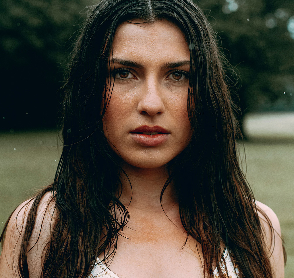
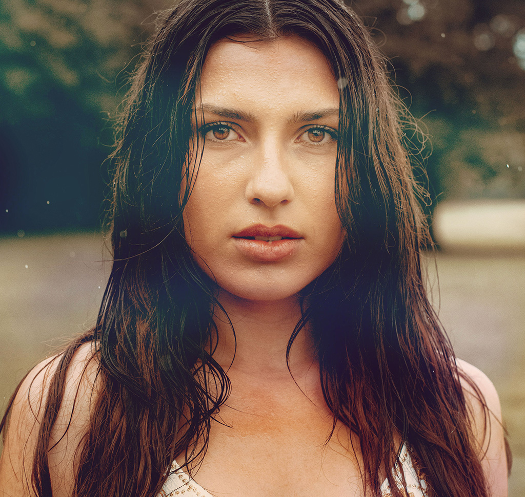
Blending Modes Come in Six Groups, and That Is the Whole Trick
The blending mode dropdown is a wall of names — Dissolve, Color Burn, Vivid Light, Pin Light, Hard Mix — and nobody memorizes it. They do not need to.
Look at the thin dividing lines in the list. There are six groups, each doing one job, and within each group you will realistically use the first one or two. That reduces twenty-seven options to about six worth knowing.
Blending Modes in Six Groups, Not Twenty-Seven
Normal
Normal and Dissolve. Normal is the default and Dissolve is almost never used.
Darken
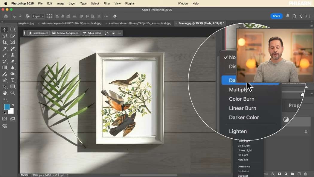
Darken, Multiply, Color Burn, Linear Burn, Darker Color. Everything here darkens: the dark pixels of your layer survive and the light ones drop away. Multiply is the one you will reach for.
Lighten
Lighten, Screen, Color Dodge, Linear Dodge, Lighter Color. The exact opposite — light pixels survive, dark ones disappear. Screen is the workhorse.
Contrast
Overlay, Soft Light, Hard Light and the rest. These combine light, dark and color at once, darkening what is dark and lightening what is light. Mostly used for color and tone work. Soft Light and Overlay are the two.
Comparative
Difference, Exclusion, Subtract, Divide. Genuinely useful for aligning layers and for special effects, and rarely used in ordinary photo editing.
Color
Hue, Saturation, Color, Luminosity. Each takes one property from your layer and leaves the rest of the image alone — Color takes the color and keeps the underlying brightness, Luminosity does the reverse.
Cycle Through the Blending Modes From the Keyboard
Press V for the Move tool first — this matters, because with a brush selected the same shortcut changes the brush’s blending mode instead. Then hold Shift and press + or – to step through the list, watching the canvas.
This is how to work when you are not sure. You do not need to know which mode is right; you need to recognize the right result when it appears.
Multiply: Put a Photograph Into a Frame
Dark subject on a light background is the classic Multiply case — and it does the job with no mask at all.
-
Drag the Artwork In and Set It to Multiply
The light background disappears, the dark subject stays. Position and scale it over the frame.
-
Notice What Multiply Does to Shadows
Because it darkens rather than replaces, any shadow already in the frame shows through and combines with the artwork. That is a shadow you did not have to fake.

The Levels Trick That Makes It Clean
Multiply only hides pure white. A scanned or photographed background is never pure white — it is faintly warm or gray, and that faint tone stays visible as a rectangle.
The fix takes five seconds. With the layer selected press Ctrl/Cmd + L for Levels, take the white point eyedropper, and click on the background. It becomes genuinely white, and Multiply makes it genuinely invisible.
Do the same in reverse for the Lighten group: use the black point eyedropper on a nearly-black background so Screen can drop it completely. If the layer is a Smart Object — which it is by default when you drag a file in — the Levels adjustment stays editable afterwards.
Screen: Light Leaks, Flares and Bokeh
-
Find an Effect on a Black Background
Light leaks, lens flares, bokeh, sparks, smoke — anything bright on near-black. This is why stock effects are shot that way.
-
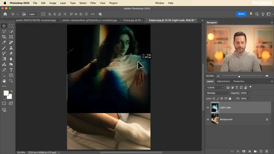
Set It to Screen and Clean the Blacks With Levels
Screen keeps the light and drops the dark. Then Ctrl/Cmd + L and the black point eyedropper on the background to remove the faint rectangle edge.
-
Duplicate and Flip It
Ctrl/Cmd + J, then Ctrl/Cmd + T and flip horizontally or vertically. One light leak becomes several, coming from different directions, without looking repeated.
-
Recolor It if the Hue Is Wrong
Image > Adjustments > Hue/Saturation and move the hue slider. A blue light leak becomes a warm one in one drag — you are never stuck with the color the stock file came in.
Soft Light: Borrow the Color of Another Photograph
This is the most interesting idea in the day. Take any photograph whose color and light you like, blur it beyond recognition, and use it to grade a completely different image.
-
Place the Color Reference on Top
Any image with color you want — the subject does not matter, because it will not be recognizable.
-
Set It to Soft Light or Overlay
At this point the reference image is still legible on top of yours, which is not the goal.
-
Blur It Heavily
Filter > Blur > Gaussian Blur with a large radius. All that survives is broad areas of color and light. As a Smart Object the radius stays adjustable.
-
Scale and Position the Color
Ctrl/Cmd + T and move the blurred layer around, watching what it does. You are effectively painting light across your image — put the bright part where you want attention drawn, usually your subject.
-
Adjust It With Levels and Hue/Saturation
Levels to control how strongly it reads, Hue/Saturation if the color is close but not right. Lower the layer opacity if the whole thing is too much.
Stack two of these — one for color, one for light — and you have a grade that no preset would produce, built from photographs you already liked.
Finish With a Gradient Map
After several colored layers, an image can feel like separate pieces. A Gradient Map at the top, opacity pulled down to 10–20%, maps a single gradient across the whole tonal range and pulls everything into one palette.
If it looks inverted, click Reverse. Then cycle through the presets with the opacity already low; several will look good and one will look right.
Play With Them
Download the sample images and build all three examples. The habit worth taking away is the levels-plus-blend-mode pairing: whenever a blend mode nearly works and leaves a faint edge, the answer is almost always an eyedropper on the black or white point rather than a mask.
Day 17 covered Blend If, which controls the same kind of blending by tonal range instead. Tomorrow, Day 19 continues the series.
Quick Reference: Keys, Menus and Settings
- Cycle the modesV, then Shift + + or Shift + -
- Drop a light backgroundMultiply
- Clean the backgroundCmd/Ctrl + L: white point eyedropper for Multiply, black point eyedropper for Screen
- Light effects on blackScreen; Cmd/Ctrl + J, Cmd/Ctrl + T and flip for a second leak
- Recolor an effectImage > Adjustments > Hue/Saturation, Hue slider
- Borrow color and lightSoft Light or Overlay, Filter > Blur > Gaussian Blur, Cmd/Ctrl + T to place it
- HarmonizeLayer > New Adjustment Layer > Gradient Map, Reverse, opacity 10 to 20%
No AI, no generative credits.
Free Downloads
Follow Along on the Same Photos
Get all 8 images, from the empty frame and birds to the light leak and bokeh, plus 3 layered PSDs for Multiply, Screen and Soft Light. Free with a PHLEARN account.
Blending Modes: Common Questions
Do I need to learn every blending mode?
No. The list is split into groups by thin lines, and you will mostly use the top one or two of each: Normal, Multiply, Screen, Overlay and Soft Light.
What do the blending mode groups do?
The Darken group keeps the dark parts of a layer and the Lighten group keeps the light parts. The Overlay group mixes light, dark and color for color work, the Difference group is for special effects, and Hue, Saturation, Color and Luminosity affect color.
Is there a shortcut to try blending modes quickly?
Press V for the Move tool, then hold Shift and press plus or minus to step through the list. With a brush selected, the same keys change the brush’s mode instead.
How do I remove a white background without a mask?
Set the layer to Multiply. Light areas disappear and dark ones stay, so dark birds on a light background drop straight into the frame, and existing shadows show through.
Why can I still see a faint rectangle after changing the blend mode?
The background is not pure white or black. Press Cmd/Ctrl + L for Levels and click the background with the white point eyedropper for Multiply, or the black point eyedropper for Screen.
How do I add a light leak or bokeh to a photo?
Use one shot on a dark background and set it to Screen, then clean the blacks with Levels. Cmd/Ctrl + J and Cmd/Ctrl + T to flip a copy gives you another leak from a different side.
How do I change the color of a light leak?
Go to Image > Adjustments > Hue/Saturation and move the Hue slider. For the bokeh the video also ticks Colorize and lowers the layer opacity.
How do I use another photo’s colors on my image?
Place it on top, set it to Soft Light or Overlay and add a big Filter > Blur > Gaussian Blur. Then Cmd/Ctrl + T to scale and move it until its light falls where you want attention.
How do I pull all the colors together at the end?
Add a Gradient Map on top, click Reverse if it looks inverted, and lower the opacity to around 10 to 20%. Then click through the presets.
Are the sample files free?
Yes, with a free PHLEARN account. You get 8 sample images and 3 sample PSDs: the photos and effects for each example, and one layered file each for Multiply, Screen and Soft Light.
Master Photoshop, Lightroom and Photography
Join PHLEARN PRO for $12.99 a month or $99.99 a year. Cancel anytime, with a 100% money-back guarantee.





