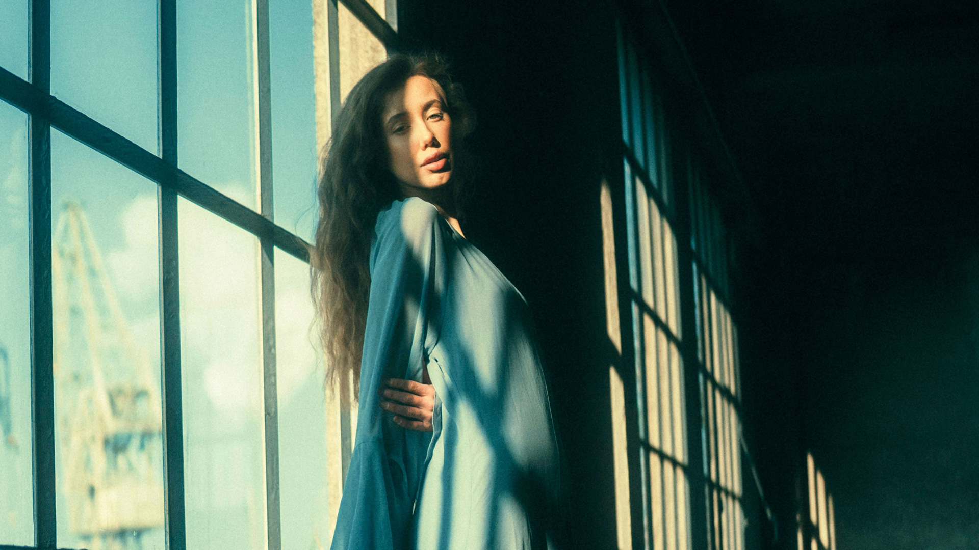

Color grading happens after the file is technically correct. It is not fixing anything — it is deciding how the photograph should feel, by putting one color into the shadows, another into the highlights, and choosing how far each one goes.
Day 21 uses the Color Grading panel inside the Camera Raw filter, which is the same panel Lightroom users already know, and finishes with the Smart Filter setting that lets you fade an entire grade back after the fact.
This is Day 21 of 30 Days of Photoshop, 2025 Edition — our most-watched series, rebuilt from the ground up for today’s tools.
Free practice files
Practice Files for This Tutorial
The 2 sample images and 2 layered PSDs from the video, so you can follow every step on the same files.
This tutorial includes 2 sample images and 2 sample PSDs.


Create a free PHLEARN account to download, or log in if you already have one. One account gets you the files for every free tutorial.
Watch the Full Series
30 Days of Photoshop · 2025 EditionOur most-watched series, updated for 2025 — watch all 30 free
description
Continue Watching 30 Days of Photoshop
JOIN 30 DAYS OF PHOTOSHOP (FOR FREE!)
Image Source
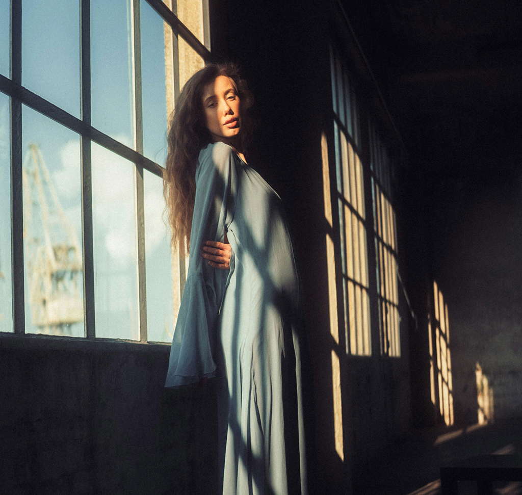
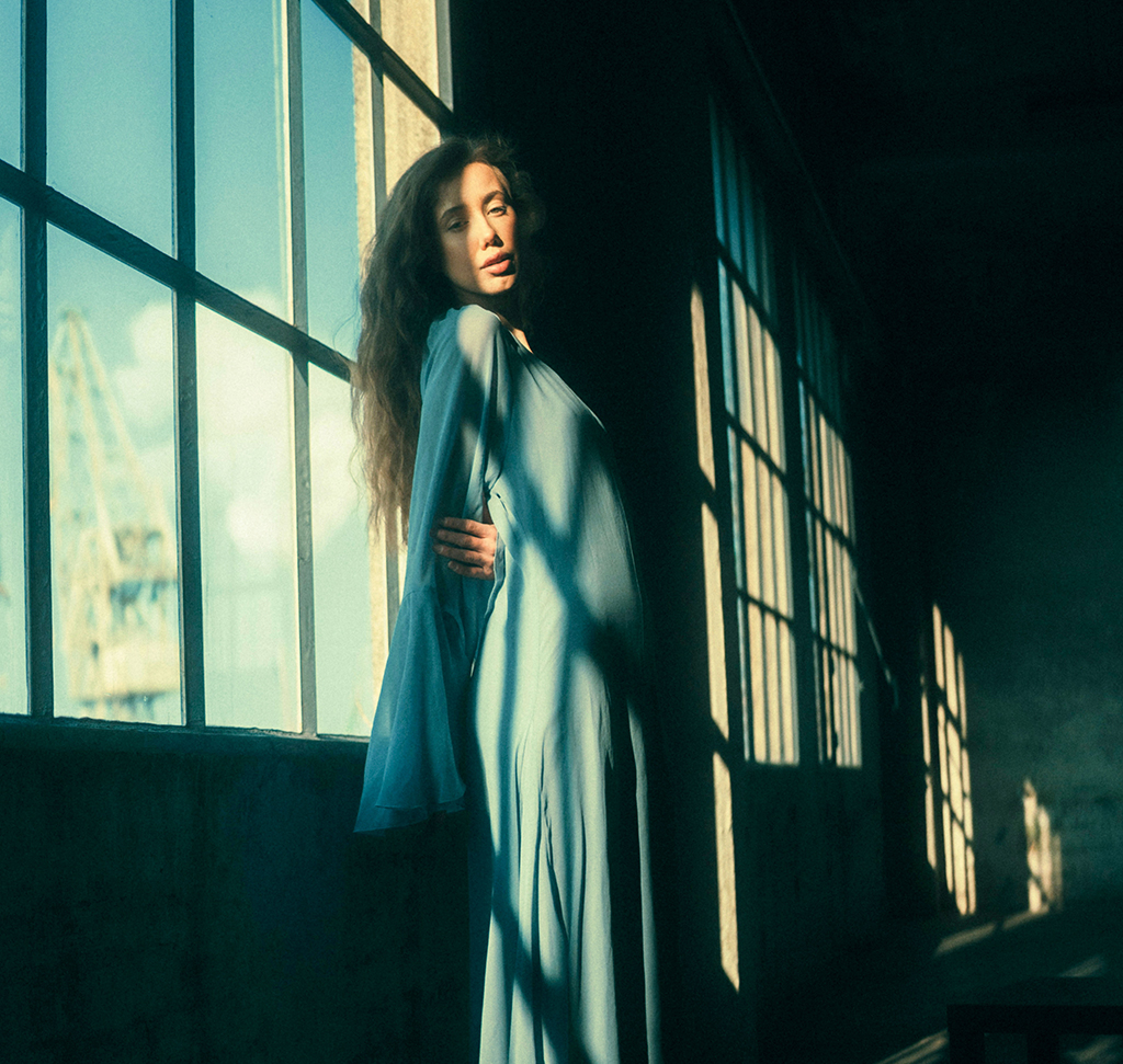
Color Grading Is What Happens After the File Is Correct
Every film you have ever watched was color graded, and almost none of it announces itself. The shadows lean one way, the highlights lean the other, and the whole thing feels like it belongs to a single world.
Photoshop has that same tool set. It lives in the Camera Raw filter, it is identical to the one in Lightroom, and it is entirely non-destructive.
Correction First, Grading Second
Day 20 was about correction — making neutral things neutral, which has a right answer. Grading has no right answer at all. It is taste, and the only test is whether you like it.
Do them in that order. Grading on top of a color cast means fighting a problem you could have removed in one click.
Smart Object First, Again
Filter > Convert for Smart Filters, then Filter > Camera Raw Filter. Grades are the thing you most often want to revisit, weaken or throw away entirely, and this is what makes all three possible.
The Color Grading Move That Does Most of the Work
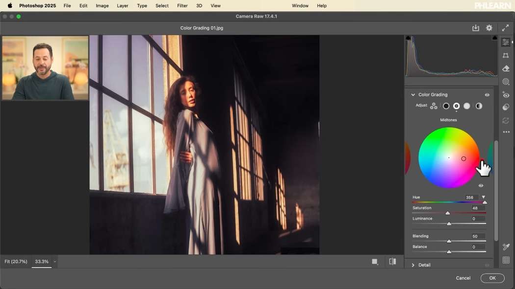
Open the Color Grading section in the right-hand panel. The buttons across the top switch how the same controls are displayed.
Three-Way
Shadows, midtones and highlights as three small wheels at once. Good for an overview, cramped for fine work.
Single Wheel
One large wheel for one tonal range, with Hue, Saturation and Luminance sliders beneath it. This is where to work — the precision is worth the extra clicking.
Global
One color across the entire image regardless of brightness. Occasionally what you want, but it throws away the thing that makes grading interesting: different colors in different tonal ranges.
A Method That Works Every Time
Dragging a point around a color wheel and hoping is how most people approach this. A repeatable order makes it much faster.
-
Push Saturation Up to About 50% First
Deliberately too far. You cannot judge a hue you can barely see, so exaggerate it while you choose.
-
Now Find the Hue
Rotate through the wheel with the saturation high. The right color announces itself immediately at this strength.
-
Pull the Saturation Back Down
To wherever it stops looking like an effect. This is almost always much lower than you expected while you were choosing.
-
Set the Luminance
The slider people skip. Lifting or lowering the brightness of a single tonal range is what gives a grade depth rather than just tint — slightly lifted shadows read as film, slightly dropped highlights read as restraint.
-
Repeat for the Other Two Ranges
Shadows, midtones, highlights. Same four moves each time.
Cool Shadows, Warm Highlights
If you want one starting point that works on almost anything: blue or teal into the shadows, orange or gold into the highlights. It is the most common grade in cinema for a reason — it exaggerates a separation that real daylight already produces, so it reads as natural even when it is pushed.
Then break the rule deliberately. Deep reds against deep greens, or warmth in the shadows against cool highlights, will sometimes produce something better precisely because it is unexpected. Try the obvious version first, then try the opposite.

Blending and Balance
Two sliders at the bottom of the panel that most people never touch, and they are what make a grade sit properly.
Blending
How much the three ranges bleed into each other. Low values keep shadow color strictly in the shadows with a visible transition; higher values let them mix so the grade feels continuous.
Balance
Where the boundary between “shadow” and “highlight” sits. Push it one way and more of the image counts as shadow, so the shadow color dominates. It is the fastest way to shift the emphasis of a grade without changing any of the colors.
Press and Hold the Eye
There is a small eye icon next to the Color Grading heading. Press and hold it for a live before-and-after of just this panel — not the whole filter, only the grade. The toggle at the bottom of the Camera Raw window compares everything at once.
Use both constantly. Color work drifts, and comparison is the only defence.

Fade the Whole Grade Afterwards
This is the feature worth knowing about, and it is nearly invisible in the interface.
-
Find the Small Icon Beside the Smart Filter Name
In the Layers panel, to the right of “Camera Raw Filter”, there is a tiny sliders icon.
-
Double-Click It
The Blending Options for that filter open — a blend mode dropdown and an opacity slider.
-
Lower the Opacity
The entire grade fades proportionally. Everything you built at once, dialled back to 60% or 40%, without reopening Camera Raw or touching a single slider.
The blend mode dropdown is there too, and setting a grade to Soft Light or Multiply produces results worth exploring.
Your Eyes Adapt, So Walk Away
The most useful advice in the whole tutorial has nothing to do with sliders. Your eyes normalize to whatever they have been looking at, so a grade that seemed subtle after twenty minutes of work will often look absurd tomorrow.
Finish the grade, then leave it. Come back after a couple of hours, or the next day. Send a screenshot to your phone and look at it on a different screen in different light. What survives that is a grade you can trust.
Grade Two of Your Own
Download both sample images — one moody, one bright — because the same technique behaves very differently on each. Then grade something of yours, walk away, and come back to it. Almost every photograph benefits from a little grading; the discipline is in stopping earlier than feels right.
Tomorrow, Day 22 covers correcting exposure. For a much deeper treatment of color and composition together, our PRO Master Color Theory and Composition in Photoshop goes considerably further.
Quick Reference: Keys, Menus and Settings
- Make it editableFilter > Convert for Smart Filters, then Filter > Camera Raw Filter
- Zoom and moveCmd/Ctrl + + to zoom in; hold Space and drag
- Grade one rangeColor Grading panel: Saturation to about 50%, find the Hue, lower Saturation, set Luminance
- ComparePress and hold the eye beside Color Grading; the toggle at the bottom compares everything
- Mix the rangesBlending and Balance sliders at the bottom of the panel
- Reopen the gradeDouble-click Camera Raw Filter in the Layers panel
- Fade the gradeDouble-click the icon beside the filter name, then lower Opacity or change the blend mode
No AI, no generative credits.
Image source
Free Downloads
Follow Along on the Same Photos
Get a moody artistic photo and a bright engagement photo to grade, plus 2 layered PSDs with the grade applied as a smart filter. Free with a PHLEARN account.
Color Grading in Photoshop: Common Questions
Should I correct color before I color grade?
Yes. Correction makes neutral things neutral and has a right answer; grading is taste. Grading on top of a color cast means fighting a problem you could have removed first.
Why convert the layer to a smart object first?
Choose Filter > Convert for Smart Filters, then Filter > Camera Raw Filter. The grade lands as a smart filter you can switch off and on, or double-click to reopen and change at any time.
Which Color Grading view should I use?
Three-Way shows shadows, midtones and highlights at once. Working on one range at a time gives you a larger wheel with Hue, Saturation and Luminance sliders and more control. Global puts one color across the whole image.
How do I pick the right color for each range?
Bring Saturation up to about halfway so you can see the hue, rotate through the wheel until a color works, then pull Saturation back down. Finish with the Luminance slider to make that range lighter or darker.
What colors give a cinematic look?
Cool shadows and warm highlights is the classic starting point. There is no right or wrong, though, and unexpected pairings like deep reds against deep greens can look even better.
What do the Blending and Balance sliders do?
Blending sets how much the shadow, midtone and highlight colors mix into each other. Balance moves the line between shadows and highlights, so one range’s color takes over more of the image.
How do I see a before and after of just the grade?
Press and hold the small eye icon next to the Color Grading heading. The toggle at the bottom of the Camera Raw window compares all of your Camera Raw changes at once.
How do I make my color grade more subtle?
In the Layers panel, double-click the small icon to the right of Camera Raw Filter to open its Blending Options. Lower the Opacity and the whole grade fades, or try a blend mode like Multiply or Screen.
Why does my grade look too strong the next day?
Your eyes get used to the colors you have been staring at. Take a break of a couple of hours or a day, or send a screenshot to your phone, and check whether you still like it.
Are the sample files free?
Yes, with a free PHLEARN account. You get 2 sample images and 2 sample PSDs: one moody photo and one bright one to grade, plus layered files with the grade applied to a smart object.
Master Photoshop, Lightroom and Photography
Join PHLEARN PRO for $12.99 a month or $99.99 a year. Cancel anytime, with a 100% money-back guarantee.





