
Download Assets
Download Assets
This tutorial includes 2 sample images and 1 sample PSD. Downloads are free with a PHLEARN account.
- Download the sample images and PSDs from every free tutorial on PHLEARN
- New free tutorials published every week
- One free account — sign up once, then download anything
Watch the Full Series
30 Days of Photoshop · 2025 EditionOur most-watched series, updated for 2025 — watch all 30 free
description
Match color in Photoshop by hand. Two buttons claim to do it for you — the old Match Color command and the Neural Filters’ Color Transfer. Both are useful for a fast starting point, and neither gives you any control over the result.
The manual method is three minutes slower and gives you all of it. Read the source with the Eyedropper, then match color with Levels one channel at a time — pulling the Blue channel’s output down to warm the image, so highlights and shadows can shift by different amounts.
This is Day 25 of 30 Days of Photoshop, 2025 Edition — our most-watched series, rebuilt from the ground up for today’s tools.
Continue Watching 30 Days of Photoshop
JOIN 30 DAYS OF PHOTOSHOP (FOR FREE!)
Ready to jump in? Sign up and we’ll email you a printable calendar and daily class schedule so you can get started right away!
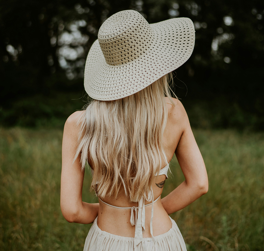
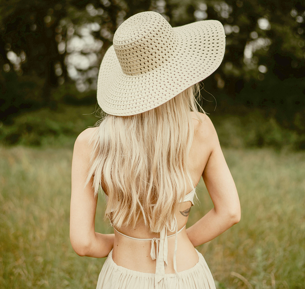
Match Color With Levels, Because the Automatic Tools Guess
Photoshop has two buttons that claim to do this for you. Image > Adjustments > Match Color has been there for years, and the Neural Filters’ Color Transfer is the modern version. Both work by looking at a source image and making a judgement about your target, and both are useful when you want a starting point fast.
Neither gives you control. They decide how much, where, and in which tones — and when the result is nearly right you have no dial to turn. The manual method here is slower by about three minutes and gives you the whole thing: read the source with the Eyedropper, then match color with Levels one channel at a time.
Why Do It By Hand
You Can See What You’re Matching
Sampling the source with the Eyedropper forces you to name the thing you’re copying — warm yellow highlights, cool blue shadows — rather than hoping an algorithm noticed it.
Highlights and Shadows Move Independently
This is the part automatic tools flatten. A photograph’s look usually lives in the split between warm highlights and cool shadows, and Levels lets you set each end separately.
It Stays Adjustable
Done on a Smart Object, every slider can be reopened and changed. Neural Filters bake in.
Read the Source Image First
-
Put Both Images in One Document
Drag the source photograph into the same file as your target and use the Crop Tool (C) to expand the canvas so they sit side by side. Judging color from two separate windows is guesswork; judging it with both on screen is not.

-
Sample the Highlights and Shadows With the Eyedropper
I for the Eyedropper. Click into a bright area of the source, then a dark one, and actually look at the values. You’re after the direction of the cast in each — “the highlights are warm and yellow, the shadows lean blue” is exactly the note you need.
-
Convert the Target Layer for Smart Filters
Filter > Convert for Smart Filters. Do this before you adjust anything — it’s what lets you reopen the Levels dialog later instead of undoing and starting over.
Match the Color Channel by Channel
-
Open Levels and Start on RGB
Cmd/Ctrl + L. Before touching color, get the overall brightness and the depth of the shadows into the same range as the source. Matching color on top of mismatched tone never works.

-
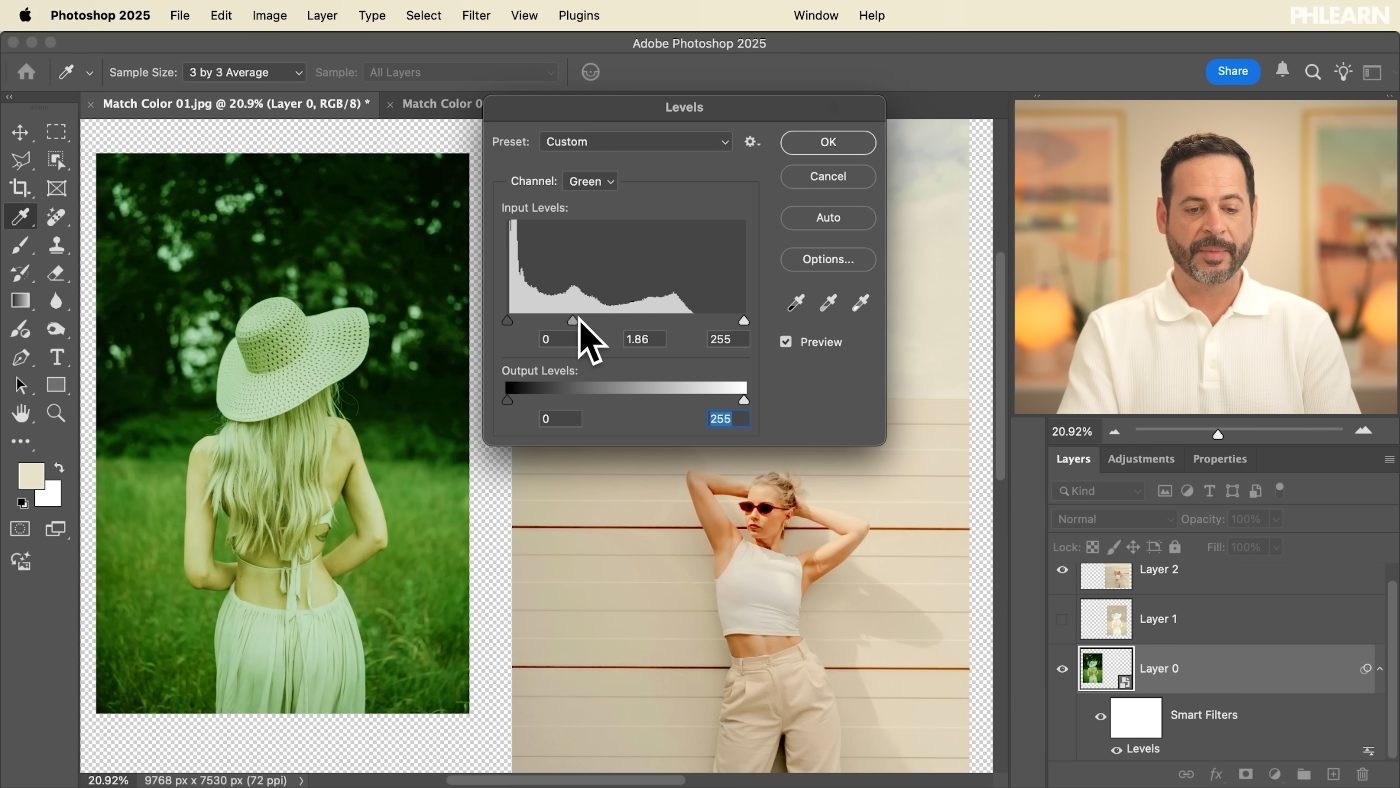
Switch to the Red, Green and Blue Channels One at a Time
Each channel has its own sliders. This is where the actual matching happens — and it’s the control the automatic tools don’t expose.
-
Use the Blue Channel’s Output Levels to Add Yellow
The single most useful move in this whole process. Blue and yellow are opposites, so pulling the output slider down on the Blue channel pushes the image yellow — and doing it on the output rather than the input lets you warm the highlights and the shadows by different amounts.
-
Compare Against the Source and Keep Adjusting
Both images are in the same document, so glance across rather than guessing. Nothing is committed — the Smart Object means you can reset at any point.

Finish and Get One Image Out
-
Dial It Back With Opacity If It’s Too Strong
A partial match is very often more convincing than a total one, especially between photographs shot in genuinely different light.
-
Right-Click the Layer and Choose Export As
This gets the adjusted image out on its own while leaving your working document — with both photographs still in it — intact for reference.
Where Color Matching Goes Wrong
Tone Was Never Matched First
If one image is brighter or flatter than the other, no amount of channel work will make the colors agree. RGB first, always.
The Whole Image Got One Cast
Warm everything equally and it reads as a filter. The highlights and shadows need to move by different amounts.
Input Sliders Used Where Output Was Needed
Input clips the ends of the range; output compresses it. For a color cast you almost always want output.
The Match Is Too Complete
Two photographs that agree perfectly on color but disagree on light direction look stranger than two that don’t quite match at all.
It Wasn’t a Smart Object
Then the first thing you want to change costs you the whole adjustment.
When to Use the Automatic Version Instead
None of this means the one-click tools are useless. If you want to try eight different looks quickly, Harmonize or Color Transfer will show you eight looks faster than you can build one by hand, and that’s a real advantage when you’re still deciding.
The manual method is for when you already know what you want. A client’s brand palette, a series that has to look consistent, a composite where two photographs must agree exactly — those need a specific result, and a tool that guesses can’t deliver a specific result. Learning to match color with Levels also teaches you to read color in a way that clicking a filter never will, which is the part that stays useful long after this particular technique.
Match Two Photographs Today
Pick a photograph whose color you admire and one of your own. Drag them into one document, expand the canvas, and sample the source’s highlights and shadows with the Eyedropper. Convert your image for Smart Filters, open Levels, fix the tone on RGB, then work the Red, Green and Blue channels — pulling the Blue output down to warm it. Download the free sample images if you’d rather practice on ours. For matching color across a full composite, our PRO course Ultimate Guide to Manual Compositing takes it much further.
Quick Reference: Keys, Menus and Settings
- Side by sideDrag the source into the same document, C for Crop to expand the canvas, Enter
- Read the sourceI for the Eyedropper, click a highlight and a shadow
- Keep it editableFilter > Convert for Smart Filters
- Open LevelsCmd/Ctrl + L, or Image > Adjustments > Levels; match brightness on RGB first
- Warm the highlightsBlue channel, drag the white output slider left
- Reset LevelsHold Alt/Option and click Reset
- Export one imageRight-click the layer > Export As > JPEG
Free Downloads
Follow Along on the Same Photos
Get the source photo, the photo you match to it, and a layered PSD with the Levels settings for every channel. Free with a PHLEARN account.
Matching Color With Levels: Common Questions
Why not just use Image > Adjustments > Match Color?
It guesses, gives you only Luminance, Color Intensity and Fade to work with, and applies straight to the layer. Neural Filters > Color Transfer also guesses. Levels lets you decide exactly how much changes in the highlights and shadows.
How do I compare the two photos while I work?
Drag the source photo into the same document as your target, press C for the Crop tool and expand the canvas so both sit side by side.
How do I work out what colors the source photo has?
Press I for the Eyedropper and click a bright area, then a dark one. In the sample, the clouds read as a light yellow rather than white, so the goal is warm, slightly darker highlights and lighter shadows.
How do I keep the Levels adjustment editable?
Choose Filter > Convert for Smart Filters first, then press Cmd/Ctrl + L. Levels becomes a smart filter you can switch off and on, or double-click to change.
What is the difference between input and output levels?
Input sliders set the black point, midtones and white point. Output sliders make the blacks lighter or the whites darker. To start over, hold Alt/Option so Cancel turns into Reset.
Should I match brightness or color first?
Brightness. On the RGB channel, get the overall light and the depth of the shadows close to the source before you touch the color channels.
How do I add yellow to the highlights with Levels?
Use the Blue channel, since blue and yellow are opposites. Drag the white output slider to the left: the highlights turn yellow and get slightly darker. Red pairs with cyan and green with magenta the same way.
What if the color match looks too strong?
Double-click the small icon beside Levels in the Layers panel and lower the Opacity. A partial match is often more convincing than a total one.
How do I export just one image from the side-by-side document?
Right-click that layer, choose Export As and pick JPEG. Only that layer is exported, and your working document stays as it is.
Are the sample files free?
Yes, with a free PHLEARN account. You get 2 sample images and 1 sample PSD: the source photo, the photo you match to it, and the layered file with the Levels adjustments per channel.
Master Photoshop, Lightroom and Photography
Join PHLEARN PRO for $12.99 a month or $99.99 a year. Cancel anytime, with a 100% money-back guarantee.





