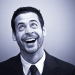
description
Part one of this movie poster build is all color and light. A Hue/Saturation layer set to Colorize, kept above everything else so it has the final say, establishes the monochromatic base. From there Blend If does the real work: a darkening Curves layer restricted so it only lands where the image is already dark, a brightening one restricted the opposite way, and a third narrowed down to just the specular highlights. A radial gradient set to Lighten adds the glow.
Enjoying This Free Tutorial?
We publish a new free tutorial every week, each one with sample images and PSDs you can download and follow along with. Sign up and they land straight in your inbox, along with early word on sales, events and subscriber-only offers.

Creating a Movie Poster, Part 1: Color, Light and Glow
Turning a straight-out-of-camera photo into a stylized, monochromatic movie poster look comes down to a handful of Curves and Blend If techniques layered together. This first part of a two-part series builds the coloring, shadow and highlight structure, and a glowing accent light, working from a reference image the whole way through.
Working With a Reference Image in Your Document
Keeping the reference poster open right inside the working document makes it much easier to judge how far to push each adjustment.
-
Bring the Reference Into Your Document
Bring a reference image right into your document and press Cmd/Ctrl+T to resize it, keeping it visible as a guide for the dodging, burning, and color decisions to come.
Creating a Monochromatic Color Base With Colorize
The reference poster’s look is largely built on one dominant color rather than a full range of hues, which Hue/Saturation’s Colorize option handles directly.
-
Add a Hue/Saturation Layer and Enable Colorize
Add a Hue/Saturation adjustment layer, click Colorize, then choose a blue-green hue and lower the saturation and lightness to taste.
-
Lower the Layer’s Opacity
Reduce the Colorize layer’s opacity so some of the image’s original color information still shows through rather than a completely flat single hue.
Why the Colorize Layer Should Sit Above the Curves Adjustments
Placing the Colorize layer above the Curves adjustments that come next means it has the final say over the image’s overall color. If Curves layers sat above it instead, their individual color pushes could shift the final result away from the intended monochromatic look in ways that are hard to predict.
Darkening One Side of the Face
The reference image has one side of the face sitting almost entirely in shadow, which the current photo needs pushed toward as well.
-
Add a Curves Layer and Darken It
Add a Curves adjustment layer and drag the curve down, then press Cmd/Ctrl+I to invert the mask to black.
-
Paint the Darkening In With a Soft Brush
Using a large, soft white brush, paint over the side of the face that should read darker, without trying to define the whole image with this one layer.
Using Blend If to Create Natural-Looking Shadows
Painting a shadow in by hand can look flat and obviously edited unless it’s restricted to areas that are already dark.
-
Add a Darkening Curves Layer and Paint Into Shadow Areas
Add another Curves adjustment layer, drag it down significantly, and paint it visible over the existing shadow areas of the face.
-
Restrict It With Blend If From the Right
Double-click the layer to open Blending Options, and in the Blend If section, hold Alt/Option and drag the underlying layer’s white slider from the right toward the left, which hides the effect wherever the layer below is already lighter.
Why Blend If Makes a Painted Shadow Look Natural
A shadow painted directly onto the image with a brush shows up everywhere you paint it, including areas that are already light, which reads as an obvious edit. Restricting the effect with Blend If so it only appears where the underlying layer is already dark keeps the added shadow confined to areas that would realistically be shadowed in the first place.
Enhancing Highlights With the Opposite Blend If Range
The same technique works in reverse to bring out and strengthen the image’s existing highlights.
-
Add a Brightening Curves Layer
Add a Curves adjustment layer and drag the curve up significantly, then paint it visible over some of the lighter areas of the face.
-
Restrict It With Blend If From the Left
Open Blending Options again, hold Alt/Option, and this time drag the underlying layer’s black slider from the left toward the right, so the brightening only shows up where the layer below is already lighter.
Adding Small Specular Highlight Accents
A few very targeted bright spots add a final touch of dimension to the skin.
-
Add Another Curves Layer With a Narrow Blend If Range
Add another Curves adjustment layer, and in its Blend If settings, bring the left-side slider in further to isolate just the very brightest points, then paint those in as small, specific highlight spots.
Why Small Specular Highlights Add Life to Skin
A few tiny, bright accent points mimic the way real skin catches specular reflections of light, which reads as more three-dimensional than an evenly lit surface. Grouping these highlight, shadow, and Blend If layers together with Cmd/Ctrl+G keeps them organized as one cohesive adjustment.
Adjusting Overall Saturation and Comparing to a Reference
A top-level Hue/Saturation layer gives final control over the whole image’s color intensity while comparing against the reference throughout.
-
Add a Top-Level Hue/Saturation Layer
Add a new Hue/Saturation adjustment layer above everything else and adjust saturation up or down to taste, since a layer placed here overrides any color shifts introduced by the layers beneath it.
-
Compare Regularly Against the Reference Image
Keep toggling back to the reference image throughout the process, using it as a guide for style and direction rather than trying to match it exactly.
Creating a Radial Glow With the Gradient Tool
A soft, colored glow in the corner of the frame adds one more atmospheric touch before the eyes and text are handled in part two.
-
Set Up a Radial Foreground-to-Transparent Gradient
On a new layer, press G for the Gradient tool, open the gradient editor and choose the foreground-to-transparent preset, then select the radial gradient style and pick a color.
-
Drag Out the Glow and Set It to Lighten
Click and drag to create the radial glow, then change the layer’s blending mode from Normal to Lighten so it brightens rather than darkening any highlights it overlaps, adjusting opacity to taste.
Why This Approach Works
Blend If is what makes every shadow and highlight adjustment in this tutorial look painted by light rather than by hand, since it automatically restricts each effect to areas that were already dark or already light in the underlying image. Building the monochromatic color base with Colorize above all the tonal work keeps that color consistent no matter how many Curves layers get added beneath it, and working from a reference image throughout, without copying it exactly, keeps the result guided without becoming a slavish reproduction. None of these techniques are unique to a movie-poster look either — the same Blend If and reference-driven workflow applies to matching any stylized look you find and want to learn from.
Final Thoughts
Getting a look like this right starts before Photoshop even opens — a photo lit with the right kind of directional, scraping light gives you something to actually work with, while flat lighting leaves nothing for Curves and Blend If to enhance. Part two of this series picks up with the eyes and the poster’s text treatment to bring the whole composition together.
Quick Reference: Keys, Menus and Settings
- Size the referenceCmd/Ctrl + T
- One-color baseHue/Saturation, Colorize, blue-green hue, saturation and lightness down, lower opacity; keep it above the Curves
- Darken one sideCurves down, Cmd/Ctrl + I, large soft white brush
- Natural shadowsDouble-click the layer, Blend If: Alt/Option-drag the Underlying Layer’s white slider right to left
- Brighter highlightsCurves up, Blend If: Alt/Option-drag the black slider left to right
- GroupShift-click the layers, Cmd/Ctrl + G
- Radial glowG, Foreground to Transparent, radial; blend mode Lighten, lower opacity
No AI, no generative credits.
Movie Poster Look, Part 1: Common Questions
Why keep the reference poster inside my document?
It lets you judge the dodging, burning and color as you go. Use it as a guide for style and direction, not something to copy exactly, and never use someone else’s image in your own.
How do I get a one-color, monochromatic look?
Add a Hue/Saturation adjustment layer, click Colorize and pick a blue-green hue. Lower the saturation and lightness a little, then lower the layer’s opacity so some original color shows through.
Should the Colorize layer go above or below the Curves layers?
Above. If the Curves layers sit on top, they can shift the color in ways you don’t want. With Hue/Saturation on top, it has the final say.
Why does my painted shadow look fake?
It shows everywhere you paint, even on light areas. Double-click the layer and, under Blend If, hold Alt/Option and drag the Underlying Layer’s white slider from the right toward the left, so the darkening stays where the photo is already dark.
How do I make highlights stronger only where it’s already bright?
Use a brightening Curves layer and do the opposite in Blend If: hold Alt/Option and drag the Underlying Layer’s black slider from the left toward the right.
How do I add small specular highlights to skin?
Add another brightening Curves layer and bring the left Blend If slider in further, so only the brightest points take the effect. Paint it in as small spots, then group the layers with Cmd/Ctrl + G.
How do I control the color after all the Curves layers?
Adjust saturation on a Hue/Saturation layer at the top of the stack. Because it sits above everything else, it cancels out color shifts from the layers below.
How do I add a soft colored glow in the corner?
On a new layer, press G, pick the Foreground to Transparent gradient and the radial style, and drag out the glow. Change the blend mode from Normal to Lighten so it doesn’t darken any highlights, then lower the opacity to taste.
Will this work on any portrait?
It needs the right lighting first. Light that scrapes across the face gives Curves and Blend If something to work with, and it doesn’t have to be expensive; even desk lamps can do it.
From the Magazine View all
Stories, interviews and guides for photographers, new every week.
 BusinessHow to Compete With AI: Give Your Clients MoreEveryone has the same tools now, and your clients know it. The way to compete is to give them more.
 EditingLightCraft vs Lightroom: Is the Free Clone Any Good?The free clone on the same RAW files: what matches, what breaks and who should switch.
 EditingHow to Tell If a Photo Is AI, and Prove Yours Is RealThe tells that still work in 2026, why detectors disagree, and how to prove your own photos.
Master Photoshop, Lightroom and Photography
Join PHLEARN PRO for $12.99 a month, or $99.99 a year (save 36%). Cancel anytime, with a 100% money-back guarantee.