
Download Assets
Download Assets
This tutorial includes 1 sample image and 1 sample PSD. Downloads are free with a PHLEARN account.
- Download the sample images and PSDs from every free tutorial on PHLEARN
- New free tutorials published every week
- One free account — sign up once, then download anything
Watch the Full Series
30 Days of Photoshop · 2025 EditionOur most-watched series, updated for 2025 — watch all 30 free
description
Levels vs curves is the question behind the two adjustments photographers reach for most, and the question that never goes away is what the difference actually is. The honest answer: almost nothing. Every control in levels has an exact equivalent in curves.
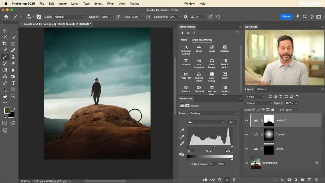
Day 7 puts them side by side, shows which control maps to which, explains the single genuine difference between them, and then uses both with layer masks to lift a subject, darken a sky and recolor it through the individual RGB channels.
This is Day 7 of 30 Days of Photoshop, 2025 Edition — our most-watched series, rebuilt from the ground up for today’s tools.
Continue Watching 30 Days of Photoshop
JOIN 30 DAYS OF PHOTOSHOP (FOR FREE!)
Ready to jump in? Sign up and we’ll email you a printable calendar and daily class schedule so you can get started right away!
Image Source

Levels vs Curves: One Real Difference, Not Ten
Ask ten photographers what the difference is between levels and curves and you will get ten different answers, most of them vague. The straight version is this: they do the same job, through the same math, on the same data. One of them just gives you more places to grab it.
Learning both is not necessary. Learning what each control does — and recognizing it again in the other panel — is, because it means you can follow any tutorial regardless of which one the instructor happens to prefer.
The Two Graphs in a Levels Adjustment
Input Sliders (the Top Row)
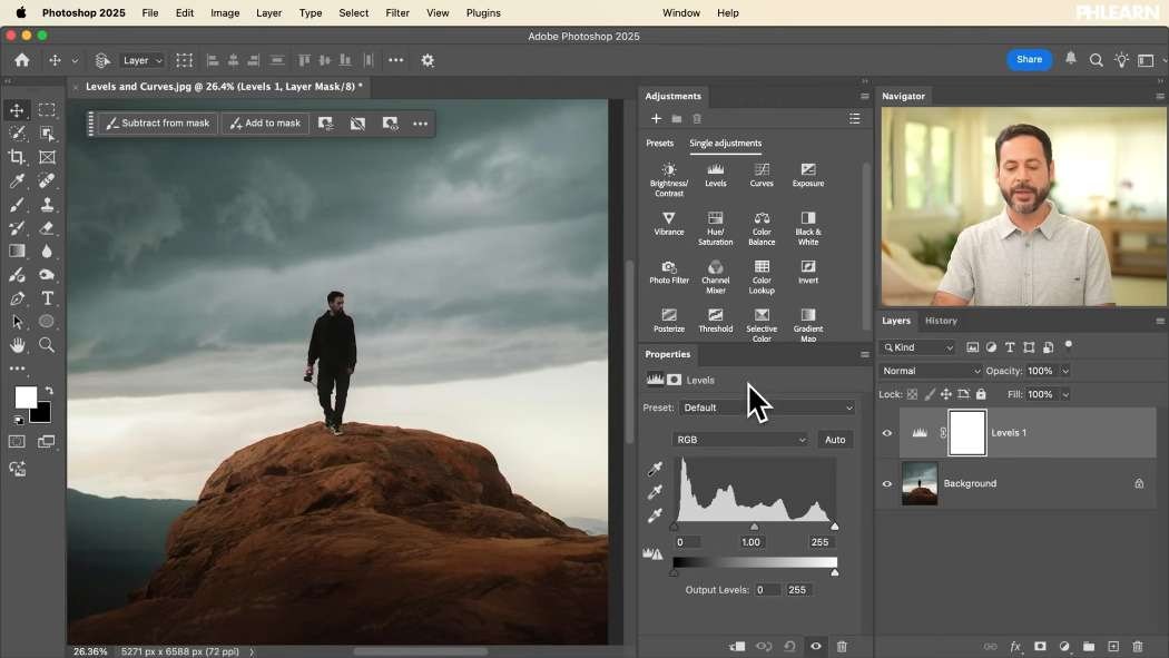
Three handles under the histogram. Drag the black point right and everything to its left becomes pure black. Drag the white point left and everything to its right becomes pure white. Both destroy detail at the ends, which is sometimes exactly what you want and often not.
The midpoint between them is the one you will move constantly. It brightens or darkens the midtones without clipping either end, and on most photographs it is the only slider you need.
Output Sliders (the Bottom Row)
These do the opposite: they limit the range rather than expand it. Pull the left handle right and your darkest pixel becomes gray instead of black. Pull the right handle left and your brightest pixel stops short of white.
Lifted blacks and capped whites are the entire recipe for a faded, filmic look, and this is where it comes from. They also work independently of the input sliders, so you can crush the blacks and lift them to gray in the same adjustment.
Every Levels Control Has a Twin in Curves
The curves graph looks nothing like the levels graph, which is most of why people find it intimidating. Line the controls up and it stops being mysterious.
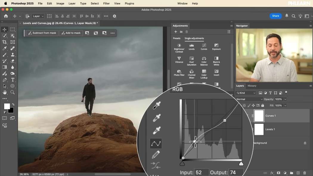
Dragging the curve’s bottom-left point to the right is the levels black point. Dragging that same point straight up is the levels output-shadow slider. The top-right point moved left is the white point; moved down is the output-highlight slider. Clicking the middle of the line and pulling it up or down is the levels midpoint.
That is four for four. Put a levels and a curves adjustment side by side and make the same move in each — the image responds identically, because it is the same operation.
The One Real Difference: How Many Points You Get
Levels gives you five fixed handles. Curves lets you add as many points along the line as you want, and that is the entire distinction.
The classic demonstration is an S-curve: one point in the shadows pulled down, one in the highlights pushed up. Darks get darker, brights get brighter, contrast increases — and there is no way to do it in a single levels adjustment, because levels has nothing between its midpoint and its endpoints. Invert the S and you flatten contrast instead.
Beyond that you can add a third and fourth point and shape the response of one narrow slice of tone without touching its neighbors.
There is also a control worth knowing about in the Properties panel: the small hand-and-arrows icon (targeted adjustment). Switch it on, click somewhere in the photograph, and Photoshop finds that exact brightness on the curve for you. Drag up or down and you are adjusting that tone. It is far more direct than guessing which part of the line corresponds to your subject’s face.
The Three Eyedroppers
Black Point and White Point
Both panels carry the same three eyedroppers. Take the black one and click something that should be pure black — the shadow side of a dark jacket — and Photoshop remaps the whole image so that it is. Same with white on something that should be paper-white, like a bright cloud. Two clicks and the tonal range is set.
The Gray Eyedropper Is a White Balance Tool
This one surprises people, because it changes color rather than brightness. Clicking with it tells Photoshop “make this exact pixel neutral 50% gray”, and it shifts every color in the image to comply. Click something slightly yellow and the whole photograph goes cooler. Used on a genuinely neutral surface it is a one-click white balance; used carelessly it wrecks the color.
Color Channels: Where They Get Interesting
The dropdown reading RGB is doing more work than it looks. Switch it to a single channel and every slider you already know now acts on that channel alone, pushing toward the color or away from it — and away from a color means toward its opposite.
Red pushes against cyan, green against magenta, blue against yellow. Move the red midpoint left and reds increase; move it right and cyan increases.
Split Toning With the Output Sliders
The per-channel output sliders are how you build the blue-shadows-and-warm-highlights look that has been a cinema staple for two decades. In the blue channel, lift the shadow output to put blue into the darks and lower the highlight output to put yellow into the brights. One adjustment layer, one channel, and you have split-toned the image.
When Not to Use Them for Color
Worth saying plainly: for ordinary warming, cooling and general color balance, the Color Balance adjustment does exactly the same thing with a far better interface. Its shadows/midtones/highlights tabs with cyan-red, magenta-green and yellow-blue sliders are the levels channel sliders, just labeled in a way you can read at a glance.
Reach for channels in levels or curves when you want tonal and color control in the same move — darkening the highlights while warming them, for instance. For a plain color cast, use the tool built for it.
Put Them to Work With Masks
-
Lift the Subject With a Curves Layer
Add a curves adjustment. Use the targeted adjustment tool to click your subject and pull that tone up, then click the brightest part of the sky and pull it down so the highlights do not blow out. Add a third point on the face if it needs it.
-
Mask It to the Center
Click the mask, take the Gradient tool with the black-to-white radial preset, drag from your subject outward and tick Reverse. The brightening now falls off toward the edges of the frame. Drag again with a longer pull to widen the falloff.
-
Darken the Sky With a Levels Layer
Add levels, push the midpoint toward the shadows, then mask it with a linear gradient dragged from the top of the frame down. The sky goes moody and the foreground is untouched.
Neither adjustment is doing anything clever. The mask is what turns a global adjustment into a local one, which is the actual skill.
Recolor a Sky Through the Channels
-
Select the Sky
On the background layer, run Select > Sky. It will usually miss a patch or two — add them with the Quick Selection tool rather than starting over.
-
Add a Levels Layer With That Selection Live
The selection becomes the mask automatically. If the edges are ragged, Alt/Option-click the mask thumbnail to view it directly and paint white over anything that should have been included.
-
Work Through the Channels
With the sky isolated, move the red midpoint for warmth or cyan, the green for green or magenta, the blue for blue or yellow. Then use the output sliders to darken the highlights while tinting them. Push further than feels sensible and pull back — skies tolerate a lot more than skin.
Pick the One That Makes Sense to You
If the curves graph clicks for you, use curves and never open levels again. If five labeled handles are easier to reason about, levels will do 90% of the same work. Neither is more professional than the other; there is no hidden capability in curves beyond the extra points.
Download the sample file and try the mapping for yourself — stack a levels and a curves layer, make the same adjustment in each, and toggle between them. Once you can see that they are the same tool, the intimidating one stops being intimidating.
Day 6 covered the layer masks doing the localizing here. Tomorrow, Day 8 is about changing any color in a photograph.
Quick Reference: Keys, Menus and Settings
- Levels slidersInput: black point, midpoint, white point; Output: lift the blacks, lower the whites
- Same moves in CurvesBottom-left point right or up, top-right point left or down, click the middle to lift midtones
- Add contrastS-curve; targeted adjustment (hand) icon to click a tone in the photo and drag
- EyedroppersBlack, gray and white point; gray sets white balance
- Color by channelRGB dropdown > Red (vs cyan), Green (vs magenta), Blue (vs yellow)
- Make it localClick the mask, G, Black to White: Radial with Reverse for the subject, Linear from the top for the sky
- Recolor the skySelect > Sky, add with Quick Selection, then Levels; Alt/Option-click the mask to check it
Free Downloads
Follow Along on the Same Photo
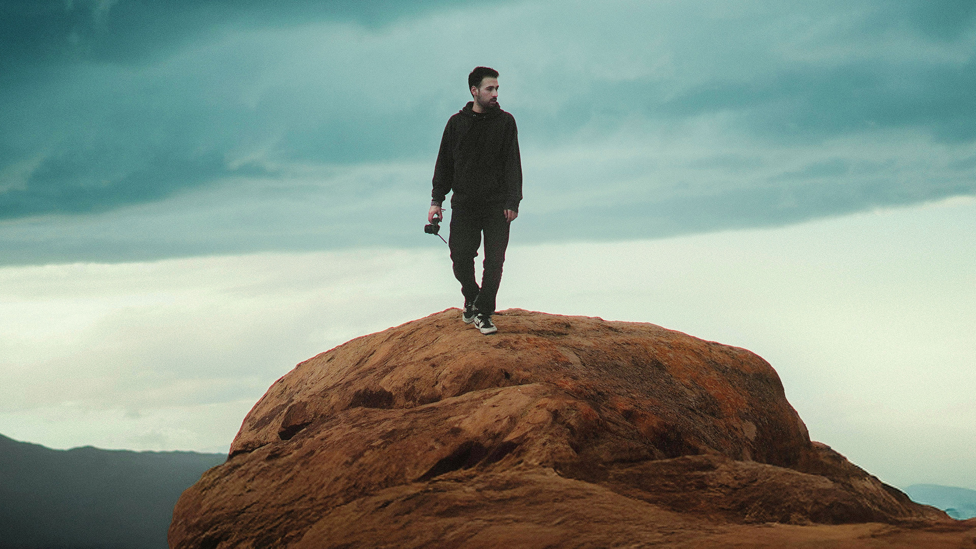
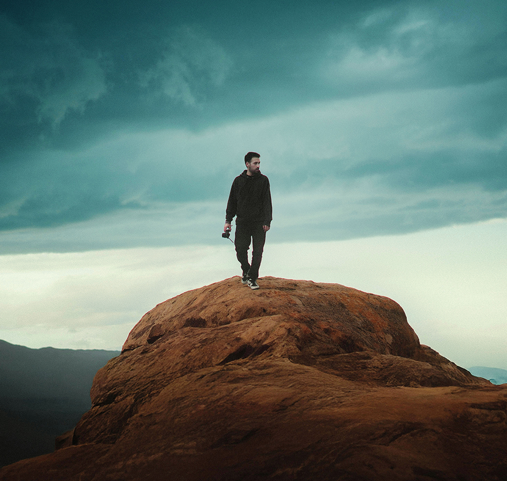
Get the sample photo and the layered PSD with the masked Levels and Curves adjustment layers, including the recolored sky, so you can toggle them and compare. Free with a PHLEARN account.
Levels vs Curves: Common Questions
What is the difference between Levels and Curves?
They do the same job. Every Levels slider has a matching move in Curves. The one real difference is that Levels has five fixed handles, while Curves lets you add as many points as you want.
Should I learn Levels or Curves?
Whichever makes more sense to you. Levels is easier to start with, Curves gives you more control in the midtones, and neither is more professional.
What do the three sliders under the Levels histogram do?
The black point turns everything to its left pure black, the white point turns everything to its right pure white, and the middle slider brightens or darkens the midtones. The middle one is the one you’ll use most.
How do I get faded, gray blacks?
Use the Output Levels slider at the bottom of Levels: drag the left handle right and the darkest pixel becomes gray instead of black. In Curves, drag the bottom-left point straight up.
How do I add contrast with Curves?
Make an S-curve: pull a point in the shadows down and push a point in the highlights up. Reverse the S to lower contrast instead.
How do I adjust one specific tone in Curves?
Turn on the targeted adjustment icon (the hand) in Properties, click that area of the photo and drag up or down. To remove a point, drag it off the graph.
Why did the middle eyedropper change my colors?
The gray eyedropper sets white balance. It makes the pixel you click a neutral 50% gray and shifts every color to match, so click something that should be neutral.
How do I add color with Levels or Curves?
Change the RGB dropdown to a single channel. Red works against cyan, green against magenta and blue against yellow. For a plain color cast, the video recommends Color Balance instead.
How do I change the color of just the sky?
Run Select > Sky on the background layer, add missed areas with the Quick Selection tool, then add a Levels layer so the selection becomes its mask. Work through the color channels from there.
Are the sample files free?
Yes, with a free PHLEARN account. You get 1 sample image and 1 sample PSD: the photo and the layered file with the Levels and Curves adjustment layers.
Master Photoshop, Lightroom and Photography
Join PHLEARN PRO for $12.99 a month or $99.99 a year. Cancel anytime, with a 100% money-back guarantee.





