
Download Sample Images
Download Assets
This tutorial includes 2 sample images. Downloads are free with a PHLEARN account.
- Free sample files with every tutorial on PHLEARN
- New tutorials published every week
- Unlimited downloads with your free PHLEARN account
description
Learn how to make a cut-out subject actually belong in a new background in Photoshop. We’ll clip a single Curves adjustment to the subject, match the background’s brightness and contrast on the composite curve, then work the red, green and blue channels one at a time until the color agrees with the scene behind.
This tutorial is part of our Quick Tips series — short, focused Photoshop techniques you can pick up in a couple of minutes.
Enjoying This Free Tutorial?
We publish a new free tutorial every week, each one with sample images and PSDs you can download and follow along with. Sign up and they land straight in your inbox, along with early word on sales, events and subscriber-only offers.
Image Source
Make a Cut-Out Subject Belong in Its New Background
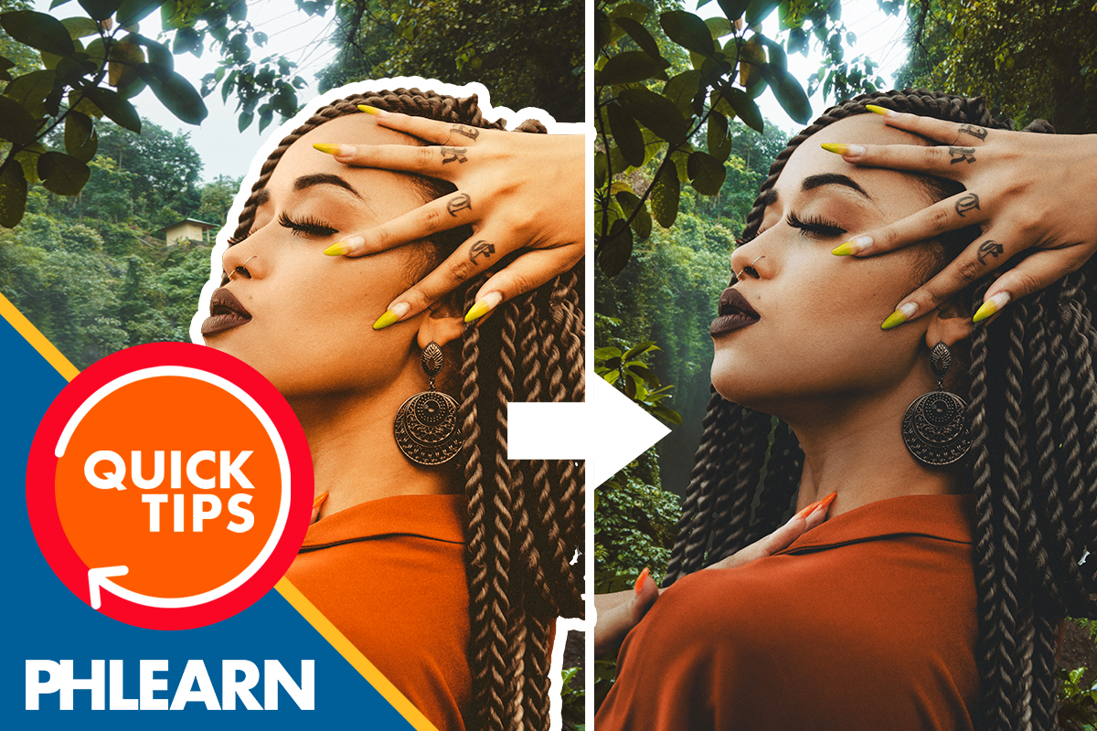
A clean cut-out is only half a composite. Drop a person onto a new background and the selection can be perfect while the picture still looks wrong, because the two halves were photographed under different light.
The fix is a single Curves adjustment clipped to the subject, worked one channel at a time. You read what the background is doing — how bright it is, how contrasty, what color it leans — and push the subject toward it.
No AI, no generative credits, no plugins. One adjustment layer and four curves.
Read the Background First
Before touching a slider, look at what you are matching to. In this composite the subject was lit brighter than the forest behind her, the forest is lower in contrast, and it carries a strong green cast with blue in the brightest areas.
That description is the entire recipe. Every step below is just carrying it out.
Clip a Curves Layer to the Subject
-
Add a Curves adjustment layer.
Create it directly above the subject layer, with the background layer sitting underneath.
-
Clip it to the subject.
Clipping confines the adjustment to the subject alone. Without it you would be color-grading the background too, and the background is the thing you are trying to match.
Match Brightness and Contrast
Work on the composite RGB curve before touching any individual channel.
-
Lower the curve to darken the subject.
The background here is darker than the subject, so the whole curve comes down until the two read at the same level.
-
Lower the highlights and raise the shadows.
Pulling both ends toward the middle flattens the curve and decreases contrast. Backgrounds shot in shade or at distance almost always have less contrast than a foreground subject, and matching that is what stops the subject looking pasted on top.
Match Color, One Channel at a Time
Now switch the channel dropdown at the top of the Curves panel and treat each color separately. The logic is the same every time: add what the background has, remove what the subject has too much of.
-
Red channel — take red out of the highlights.
The subject is warmer than the scene, so pull the top of the red curve down. In the tutorial the highlight point moves to roughly Input 255, Output 234.
-
Green channel — add green through the midtones.
The forest is green, so the subject needs green to sit in it. The midpoint rises to about Input 127, Output 138.
-
Blue channel — add blue, weighted to the highlights.
Sky light is blue and it lands hardest on the bright areas. The midtone lifts slightly, near Input 128, Output 136, and the highlight end lifts further, around Input 228, Output 255.
Treat those numbers as the shape of the move rather than a preset. They are correct for this pairing of subject and background and will be wrong for yours — what transfers is the reasoning.
What Trips People Up
The whole image shifts color
The Curves layer is not clipped. Unclipped, it grades the background along with the subject and the gap between them never closes.
The subject looks flat and muddy
Contrast came down too far. Match the background’s contrast, do not go below it.
The skin turns green
The green channel was pushed across the whole range instead of the midtones. Anchor the curve near the highlight and shadow ends first, then move only the middle.
When to Use It, and When Not To
Use it when the subject and background are broadly compatible — similar direction of light, similar time of day — and only need reconciling.
Don’t expect it to rescue a subject lit from the left dropped into a scene lit from the right. Curves can match brightness, contrast and color, but it cannot move a shadow.
More Free Photoshop Tutorials
- How to Create and Use Layer Masks in Photoshop
- How to Cut Out a Person Fast with Select and Mask
- How to Use Blending Modes in Photoshop 2025
- Three Ways to Use Blend If in Photoshop
Download the Practice Files
Grab the sample images and follow along. Everything in this tutorial uses standard Photoshop tools — no AI, no generative credits, no plugins.
Related Tutorials
Master Photoshop, Lightroom and Photography
Join PHLEARN PRO for $12.99 a month or $99.99 a year. Cancel anytime, with a 100% money-back guarantee.





